Voomie
Voomie isn’t your average supplement brand, and that’s kind of the point. Built for people with busy brains, Voomie is bold and bright, featuring functional formulas that actually fit your life. We developed the brand including naming, brand strategy, visual identity, packaging and website. The result? A playful, punchy brand that feels like a burst of energy in every detail.
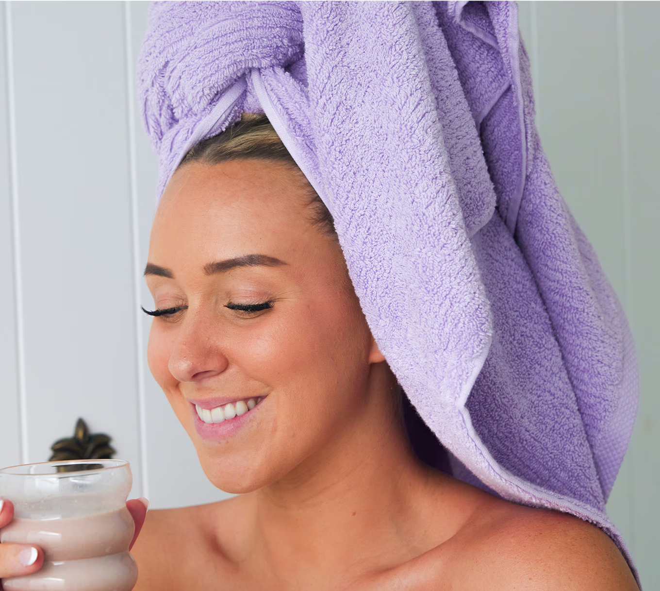
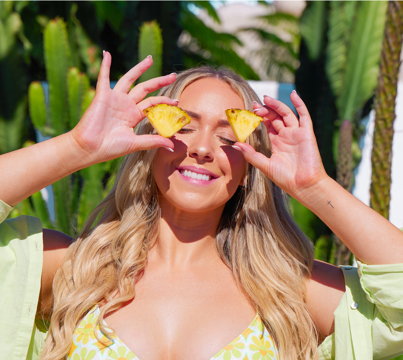
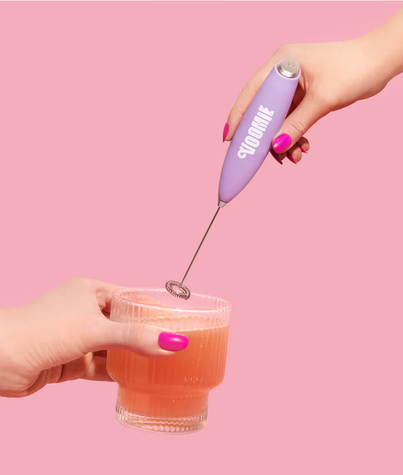
Credit: Product and lifestyle photography provided by Voomie and their team.
The Idea
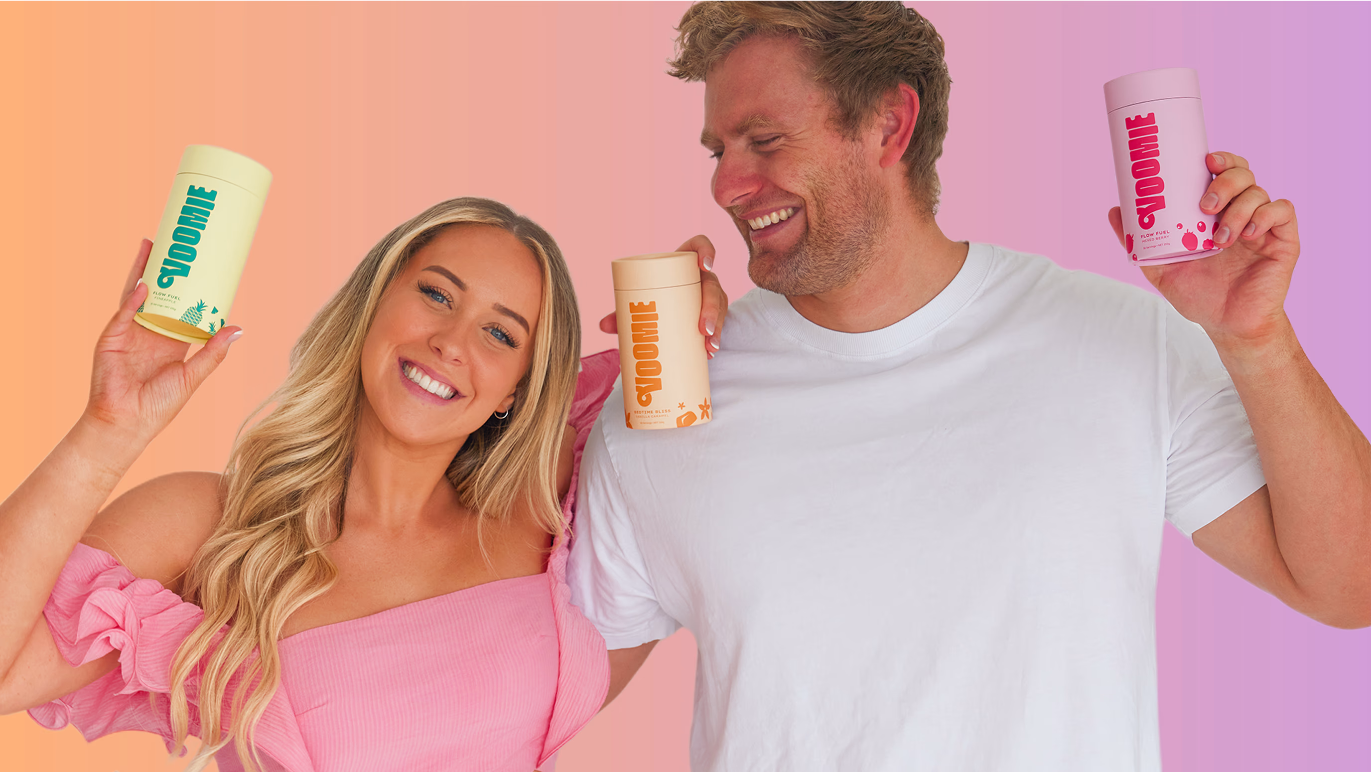
What do you do when your thoughts keep going and going and going and *okay stop* and you need a natural way to mellow out the busy brain? You get together with your wholesome partner and create a fun and funky supplement for everyday people to conquer the world (or at least the day) on their own terms. Sure, there were already products out in the big wide world of disorganised store shelves, products that claimed to regulate mood, boost productivity, and slow those racing thoughts down from Mach 5 but they weren’t the vibe.
I mean, MORE pills full of random ingredients packed in medicinal bottles? No thank you. So instead they harnessed their creativity, got their research on, and created Voomie, a brand helping you take on your day, your way!
I mean, MORE pills full of random ingredients packed in medicinal bottles? No thank you. So instead they harnessed their creativity, got their research on, and created Voomie, a brand helping you take on your day, your way!

The Brief and Name
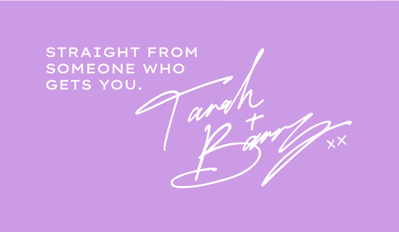
Tarah & Barry set out to create a lifestyle supplement that was as playful and relatable as they are. They wanted something simple, easy, and authentic, a brand that felt like a friend, not a prescription. Before it was Voomie, we were deep in the naming lab: dozens of names, hundreds of ideas, until we found the one. Voomie. Funky, fun, and full of energy. With a name like that, clean minimalism wasn’t going to cut it, the brand needed colour, character, and clarity to match.
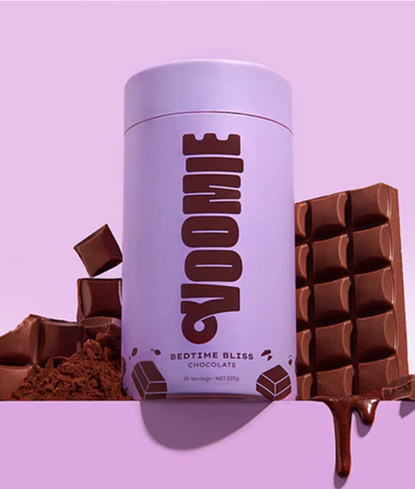
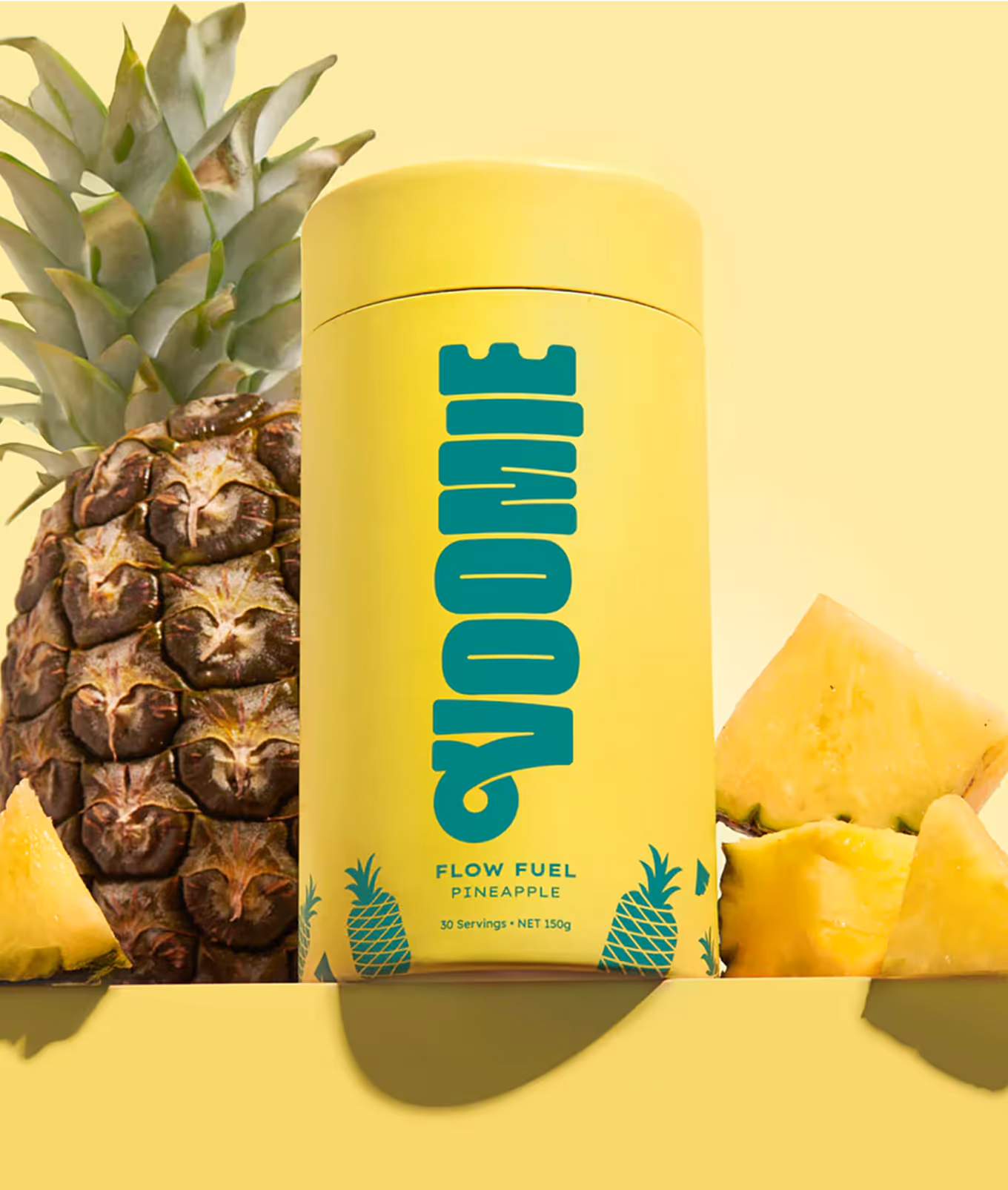
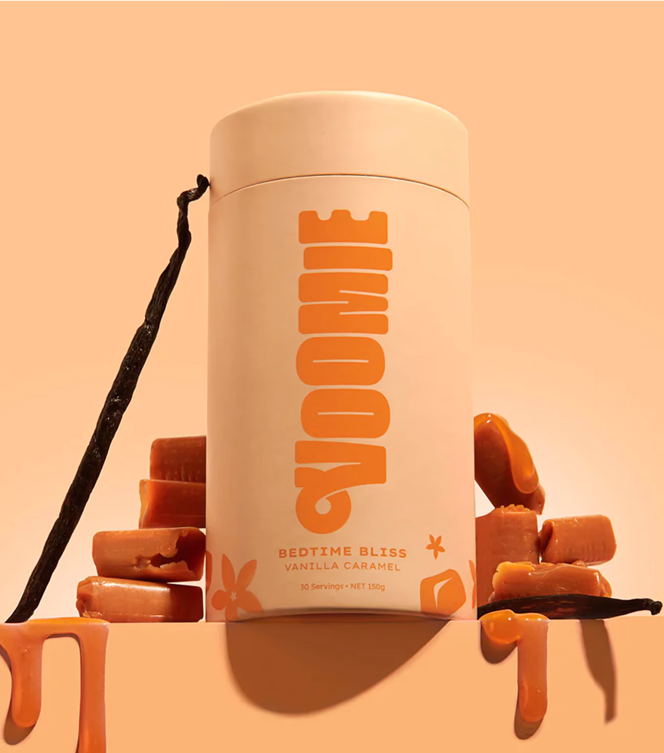
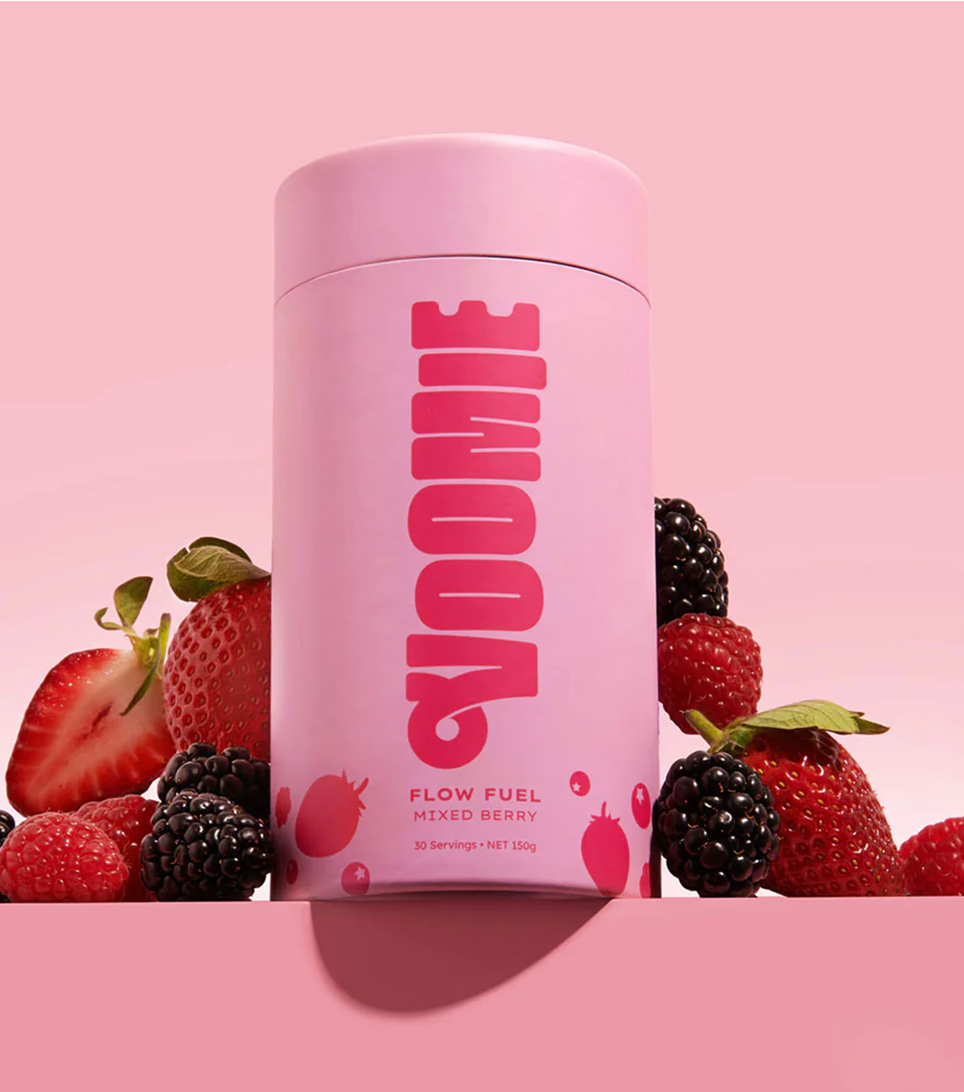
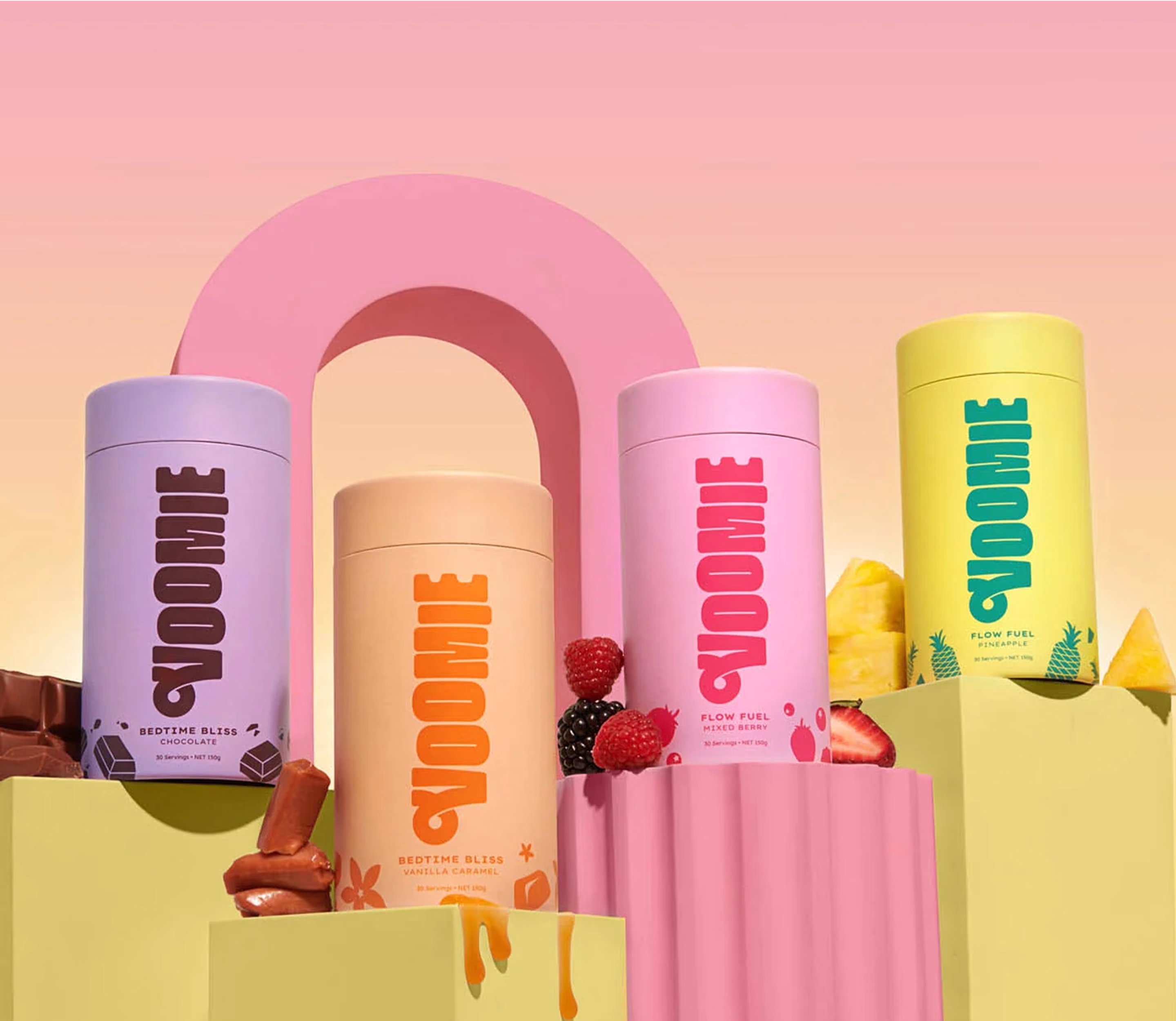
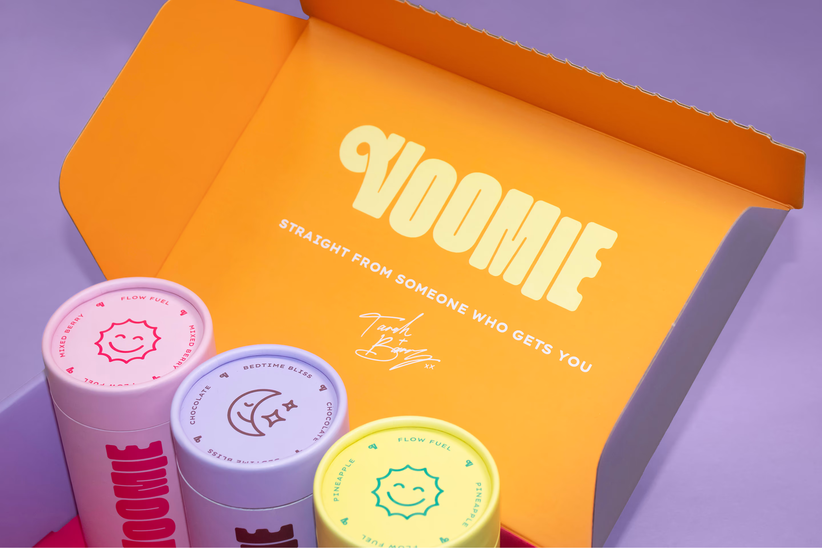
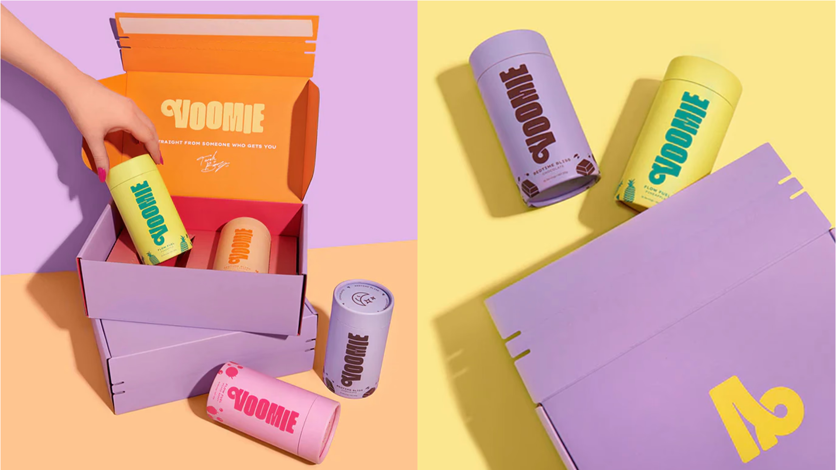
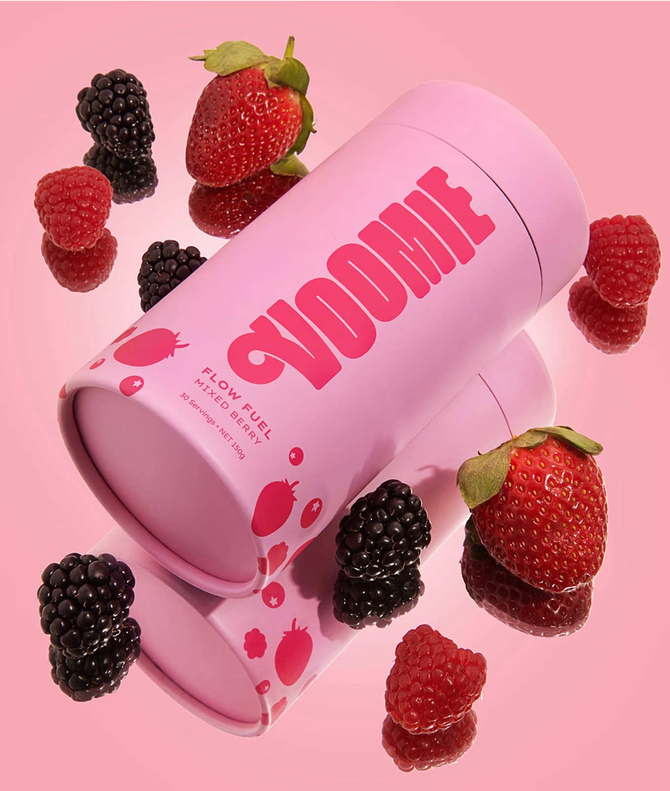
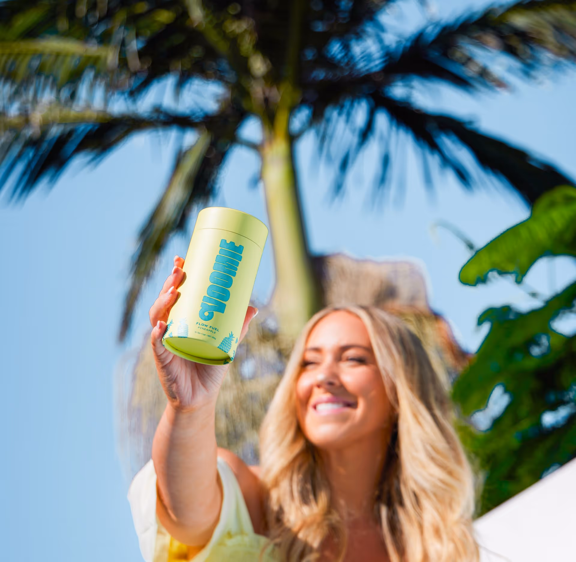
Icons and Colours
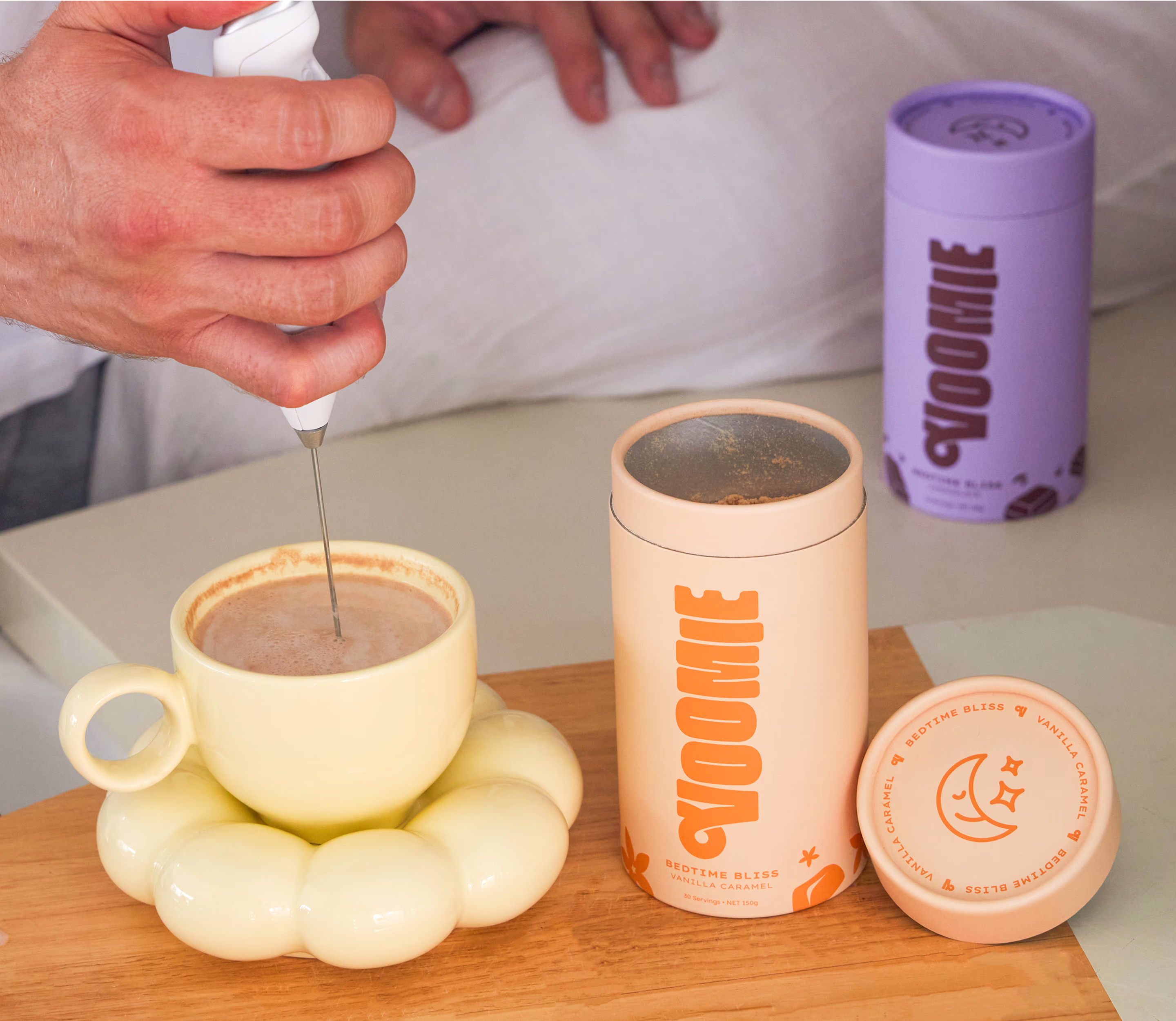
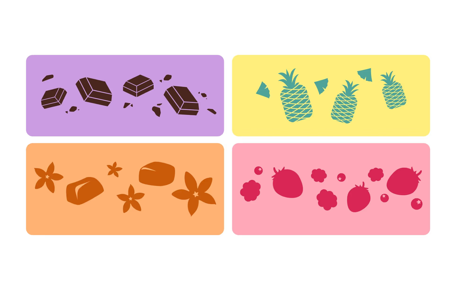
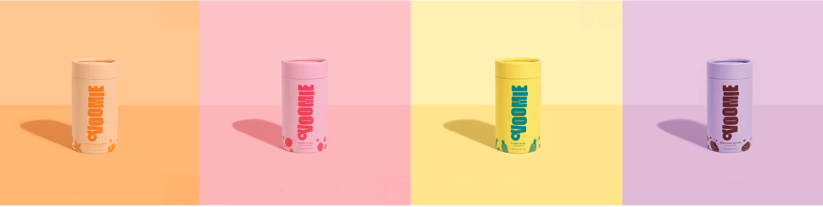
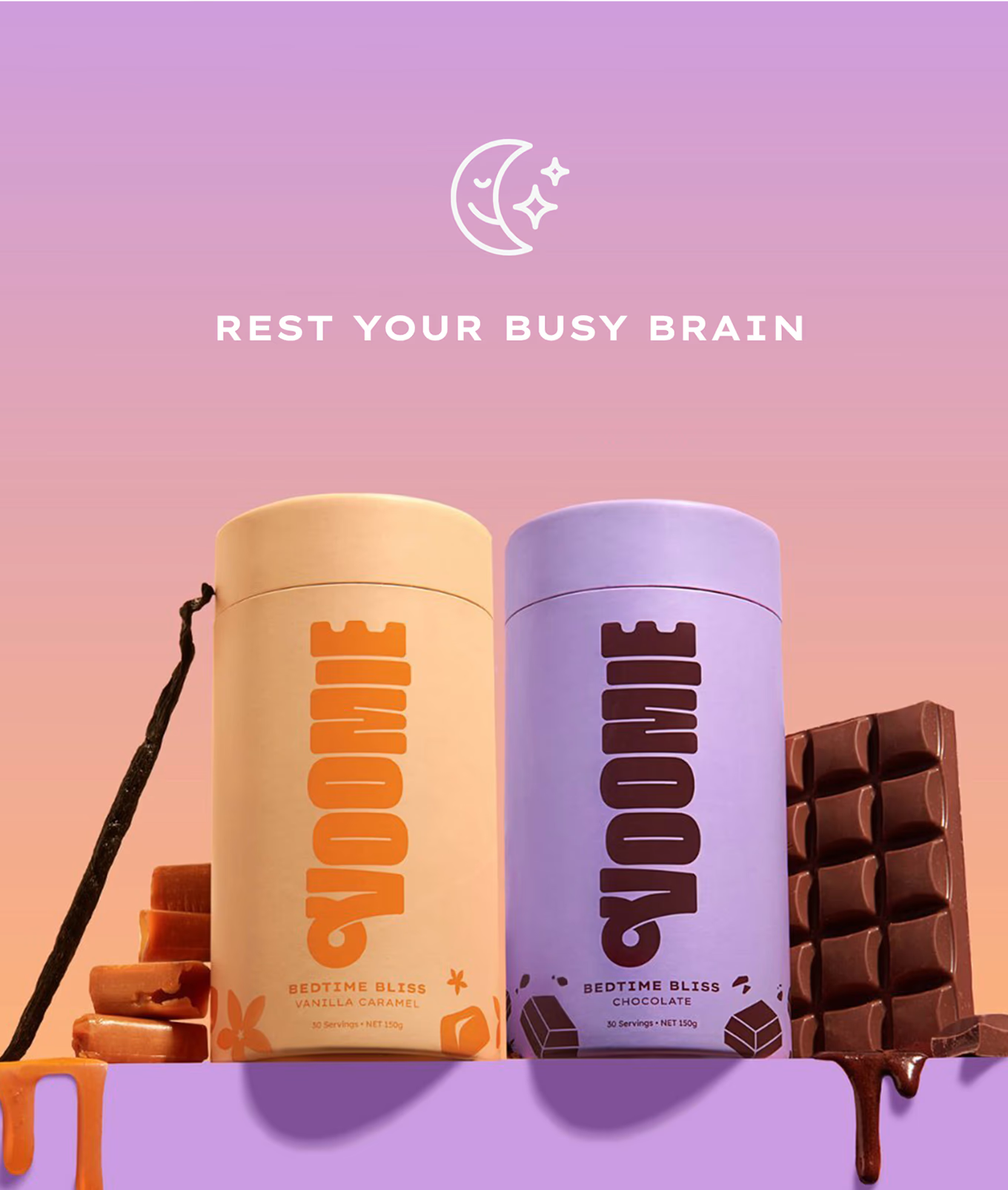
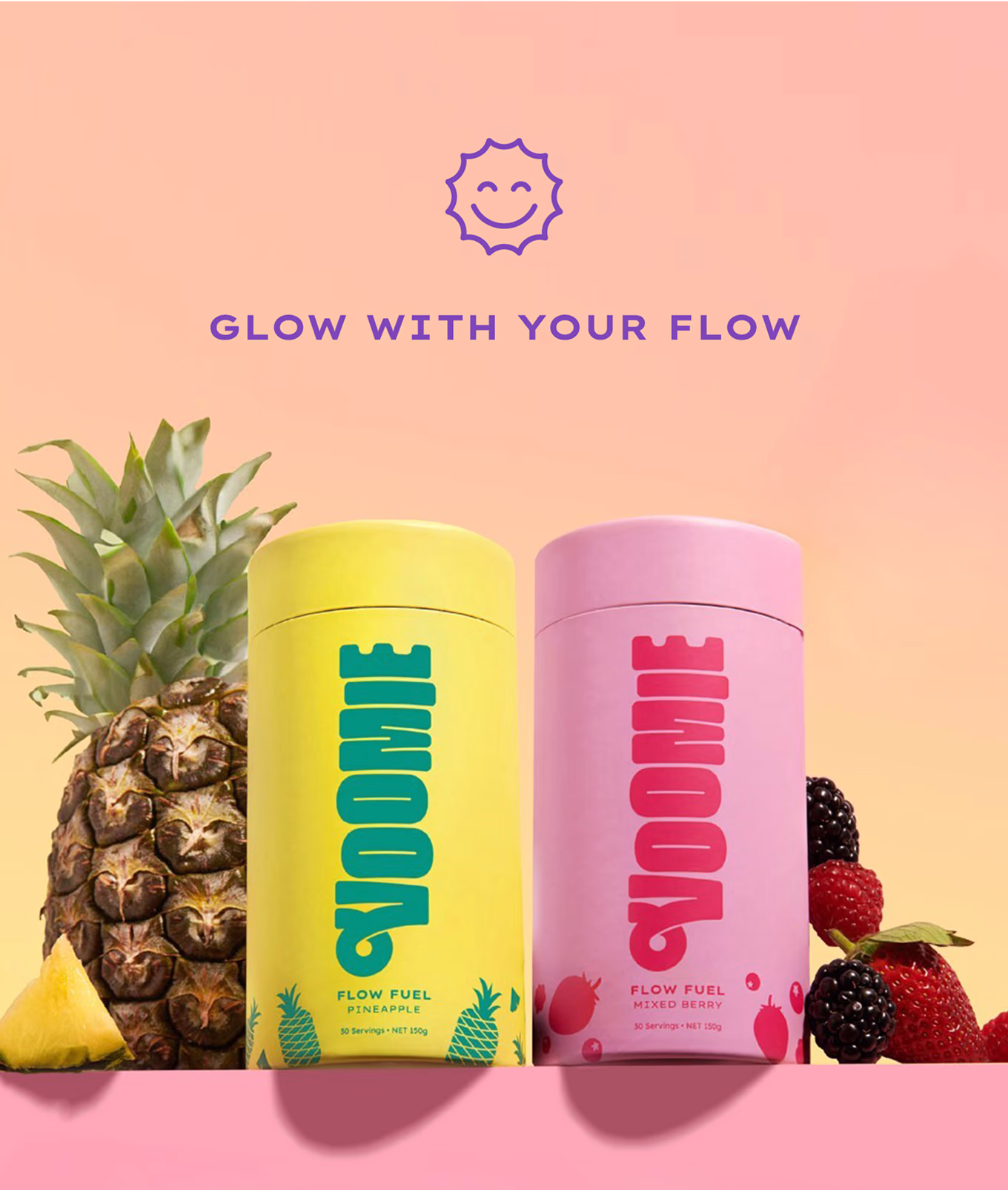
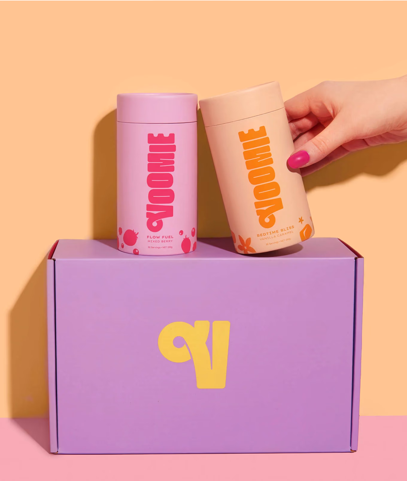
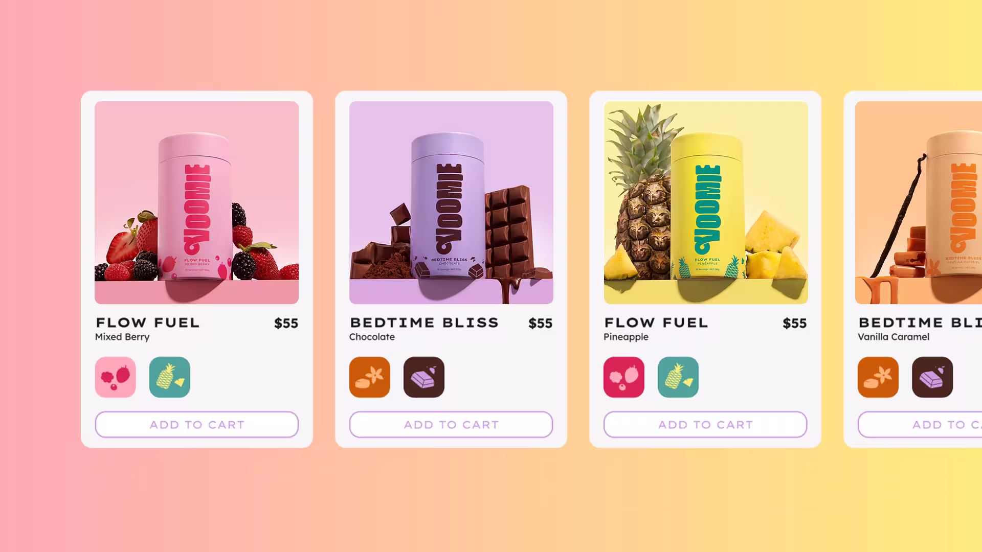
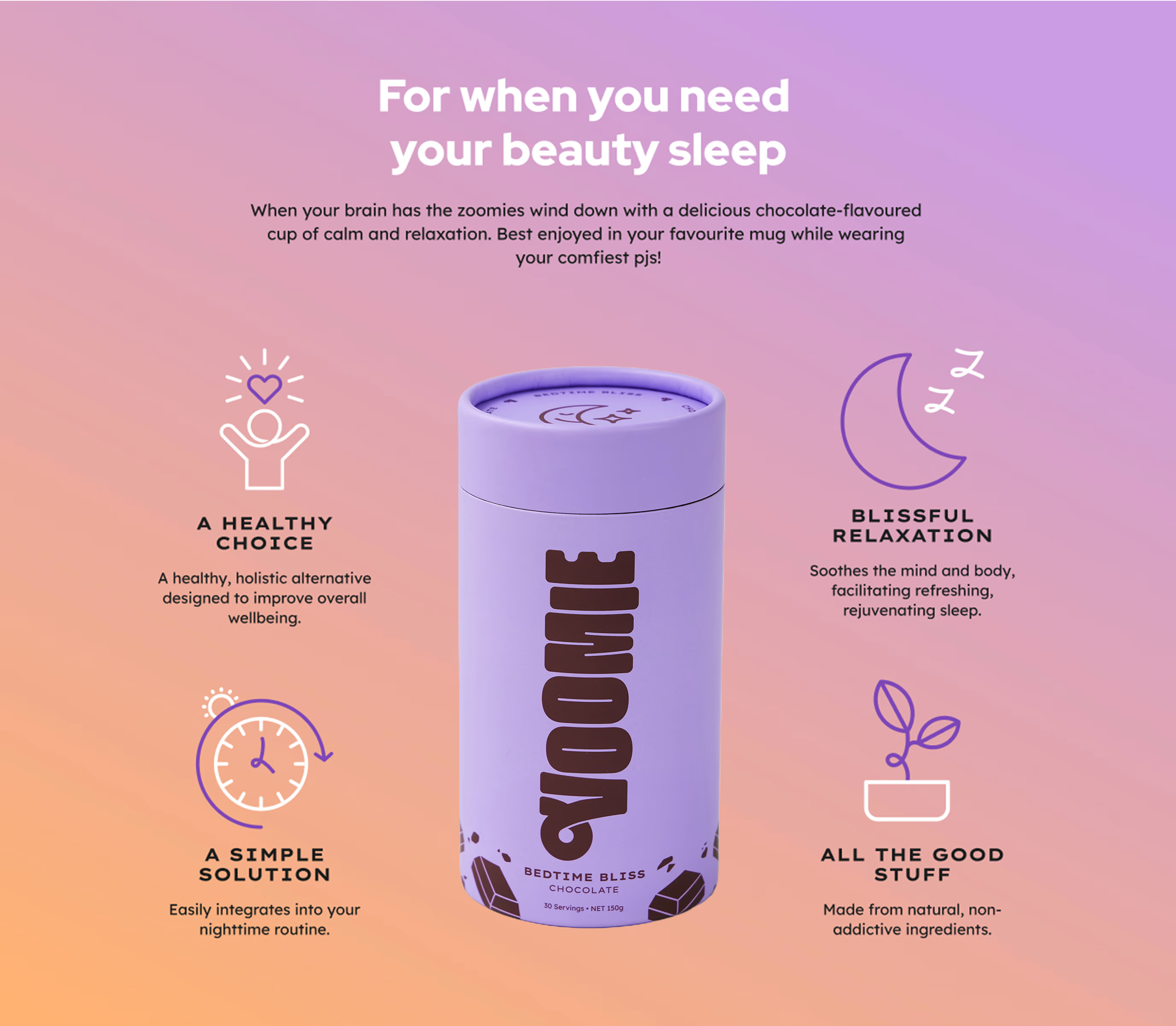
The best way for a tangible, product-based brand like Voomie to communicate its personality was through packaging. Each flavour was given a bold, unmistakable colour: pink for mixed berry, purple and brown for chocolate, all designed to stand out on shelves and instantly cue what’s inside. The packaging followed a clear visual hierarchy to guide the eye, with custom flavour icons wrapping around the base to take users on a little journey. Sun and moon symbols on the lid helped signal the product’s purpose, while gradients inspired by dusk and dawn reflected the shift from chaos to clarity.
Every design detail, from colour to iconography, was crafted to be intuitive, playful, and easy to use, blending functional clarity with Voomie’s bold, feel-good energy.
Every design detail, from colour to iconography, was crafted to be intuitive, playful, and easy to use, blending functional clarity with Voomie’s bold, feel-good energy.

Shaping the brand
We developed a playful and empowering tone of voice for Voomie, using language that’s relatable with a little bit of cheek. Messaging lines like “Reset Your Busy Brain” and “Glow With Your Flow” captured the brand’s personality in a way that felt fresh, human, and memorable.
These micro-moments of language helped build a consistent and engaging brand experience across packaging, digital, and beyond, showing how strategic voice can turn simple words into a powerful part of a brand's DNA.
These micro-moments of language helped build a consistent and engaging brand experience across packaging, digital, and beyond, showing how strategic voice can turn simple words into a powerful part of a brand's DNA.
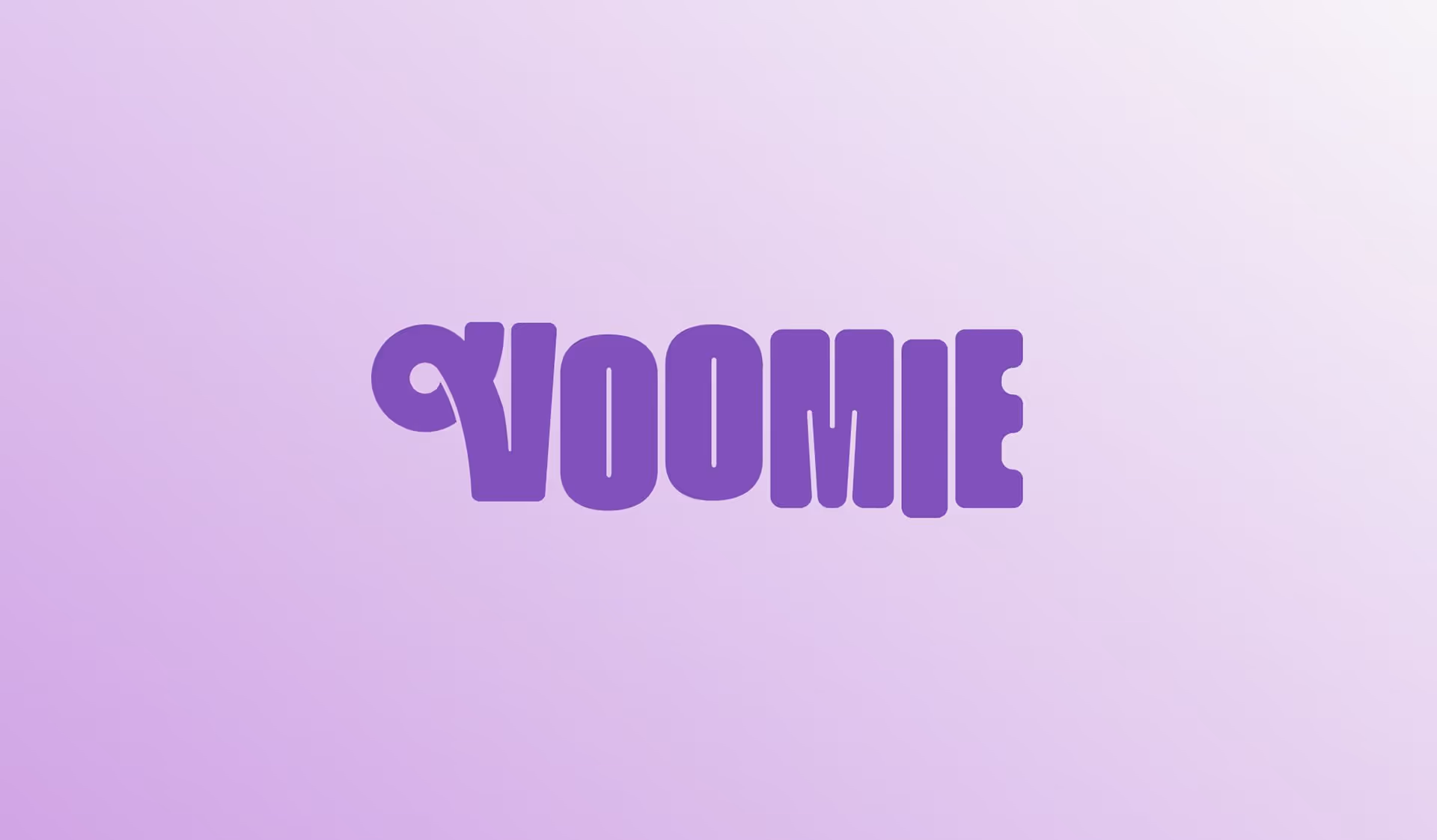
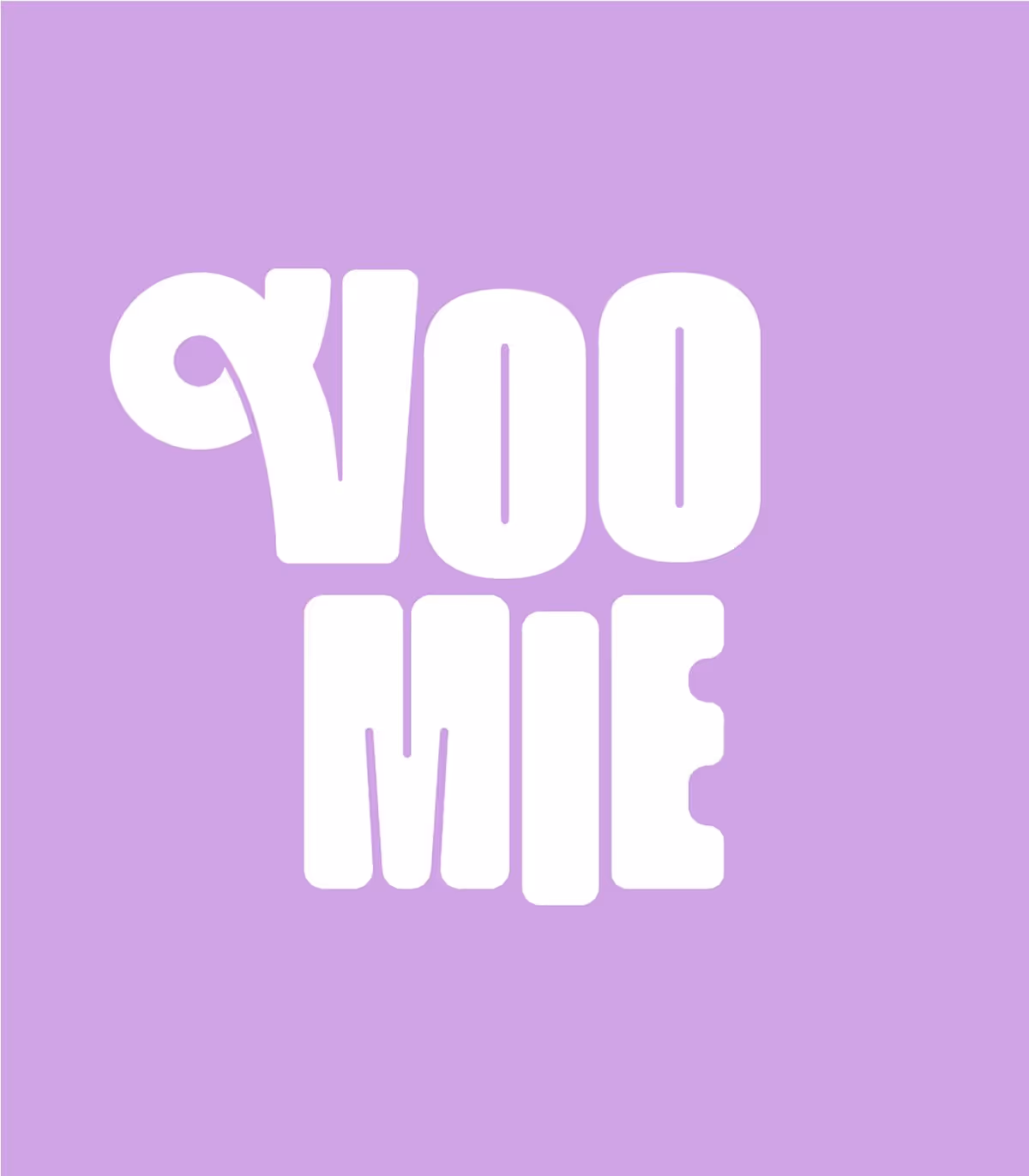
The Logo
A lot of brands want to represent the calming aspect of their products, which can lead to logos and icons that feel a bit, what’s the word, boring. They wanted to feel playful, fun, and most importantly, relatable. Voomie’s swirl highlights the looping, jumping, bounciness of someone with the zoomies. The start of the loop merges with stylized ‘V’ indicating that the brand and the product are connected with the zoomies. It’s not a separate thing that needs to be judged or isolated, it’s part of the community and the founders.
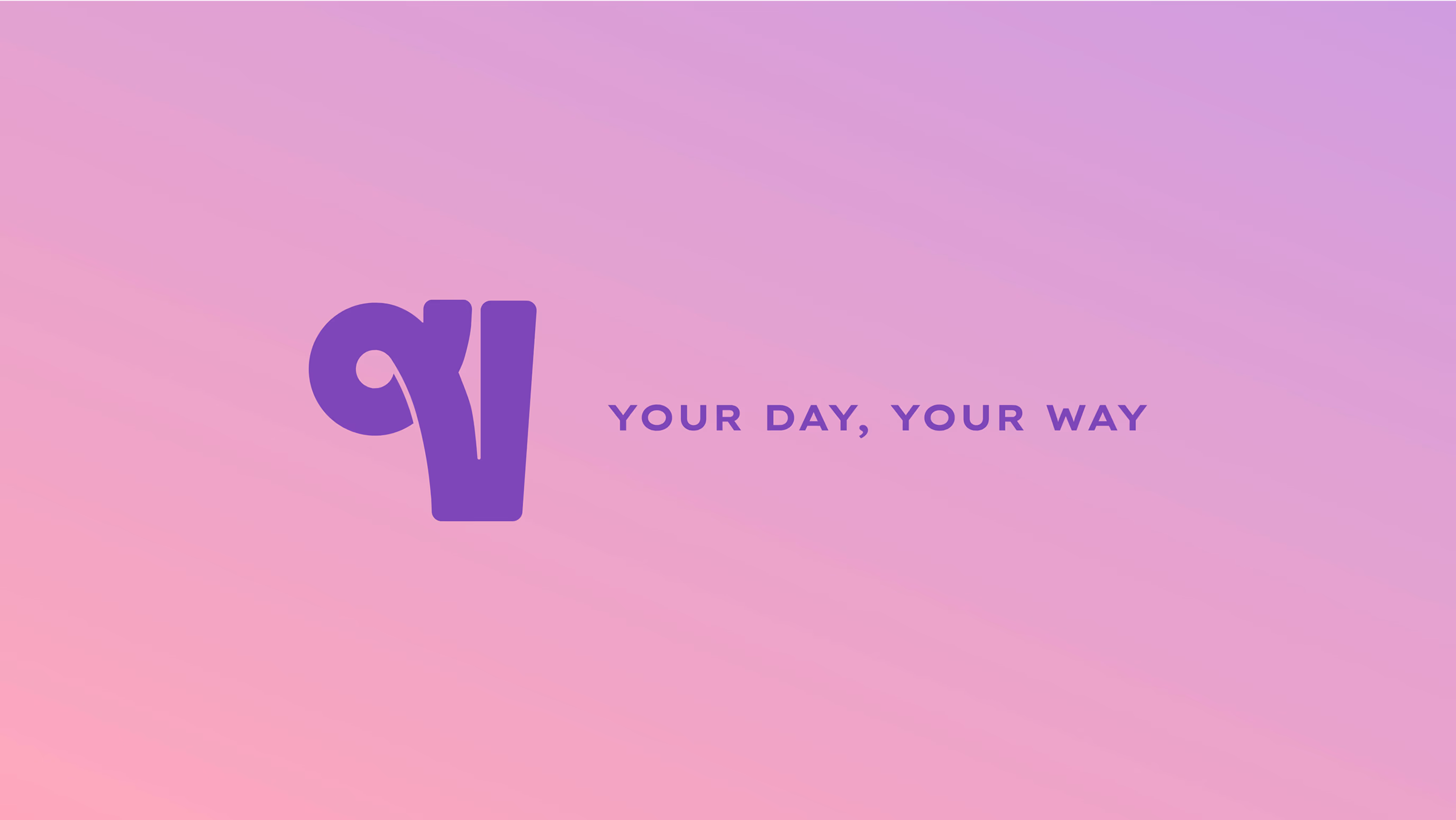
We developed the tagline “Your Day, Your Way” to capture Voomie’s empowering, no-pressure approach to wellness. Simple and memorable, it reflects the brand’s mission to support busy brains without prescribing a one-size-fits-all solution. More than just a catchy phrase, it became a strategic anchor, shaping the tone of voice and guiding the brand across packaging, web, and beyond.
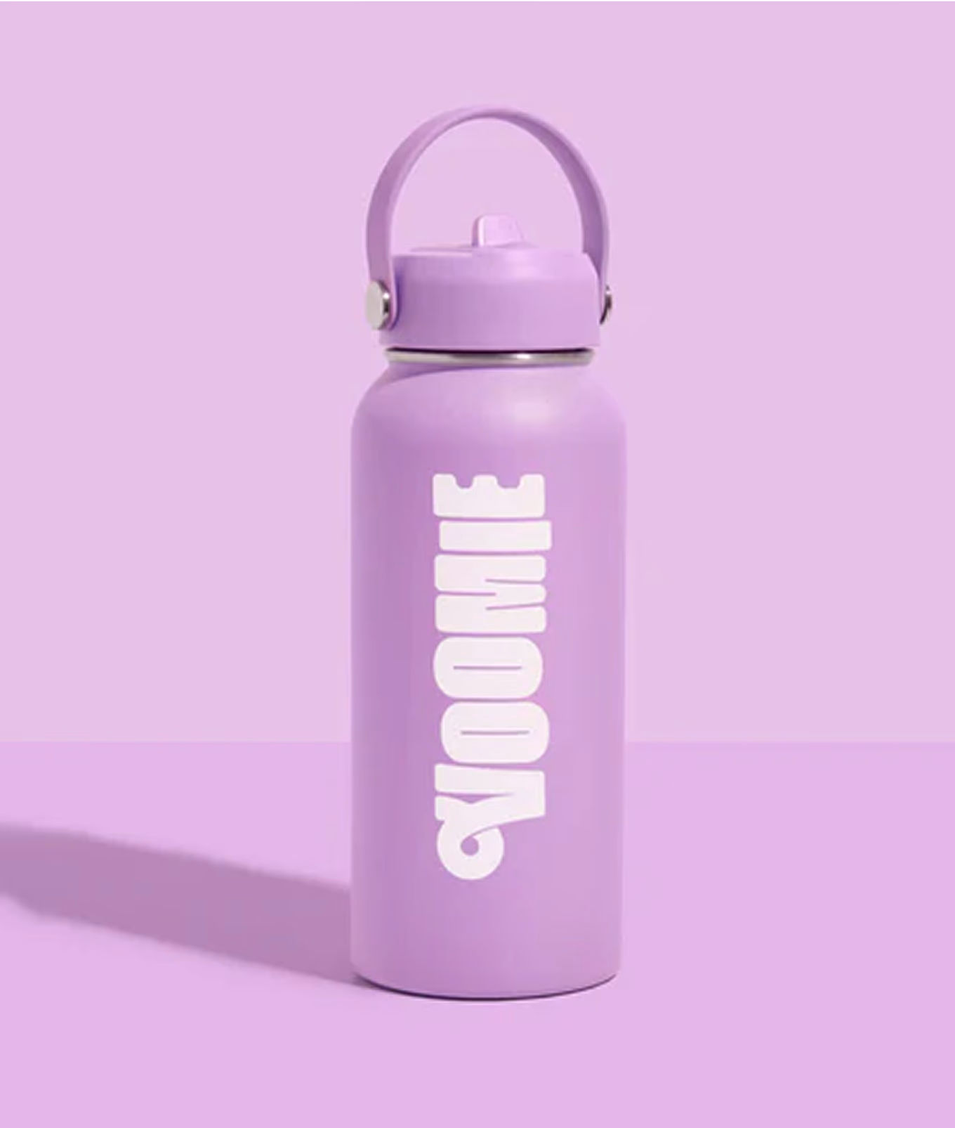
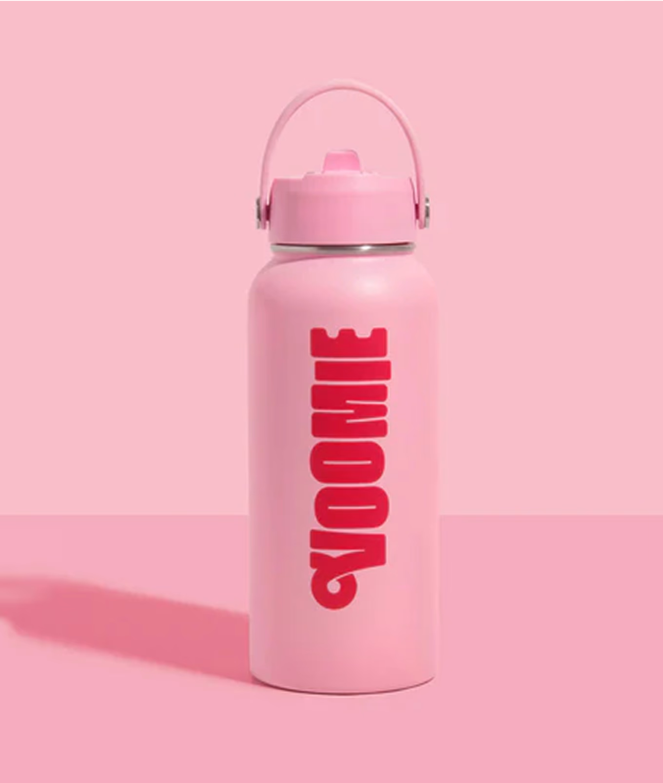
Touchpoints
Voomie was designed from the beginning to be a relatable lifestyle brand with a focus on experiences. From the product’s ease of use to the playful messaging, Voomie encourages its community to get involved. And its touchpoints bring that same invitational fun of the brand to life, showing off the vibrant colours and unapologetic boldness of their identity. Repping the colours (literally) brings you into the fold, extending the online presence of Tarah & Barry’s audience into a physical sense of belonging.


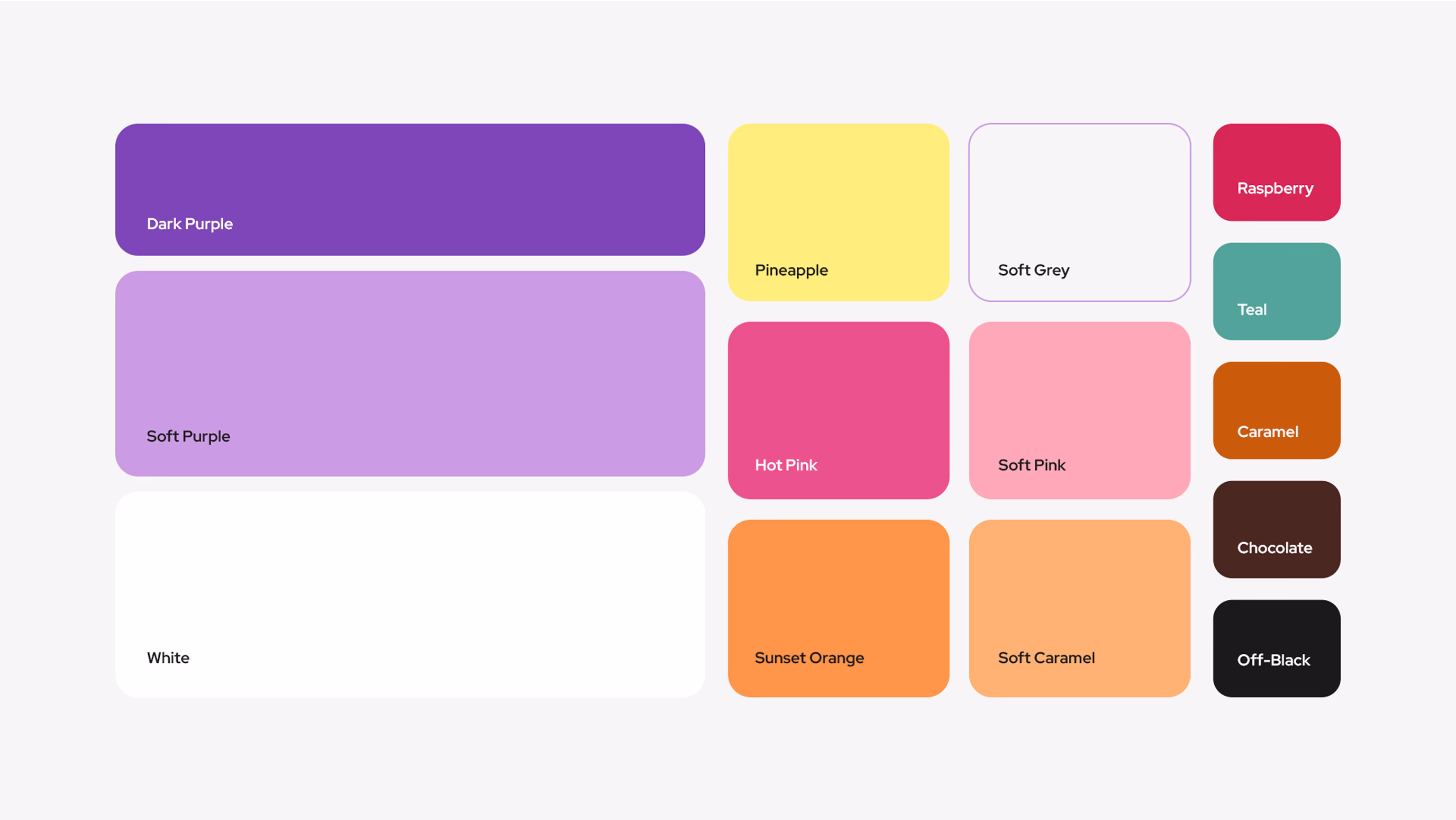
reason behind Colour Palette
The Voomie colour palette was designed to visually express the contrast between a busy brain and a calm one, the “before and after” of taking Voomie. Soft, calming pastels represent clarity, balance, and focus, while bold, vibrant colours bring the energy and noise of an overactive mind to life. This intentional juxtaposition creates a dynamic visual language that reflects the product’s purpose; supporting the shift from chaos to calm, and helping people feel more in control. It’s a palette that not only looks good, but tells a story, one that’s instantly relatable to the Voomie community.

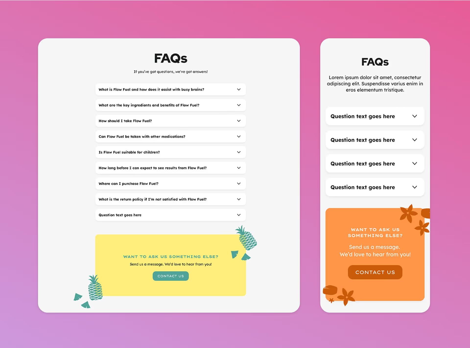
Website
This relatable and empowering brand identity, along with the message behind it, was rolled out across all touchpoints. From the physical product and fun merch to the packaging and custom website, the Voomie identity was expressed clearly and consistently on all fronts.
But did someone say website? The collab of the century happened when Rivyl’s webslingers and designer artistes came together to craft the Voomie site. The most important thing T-Dizzle & Bazza wanted was to ensure the user experience was smooth, simple, and accessible to all people. We designed the website to be as streamlined as possible, reducing the number of clicks it took for customers to get from homepage to purchase page. Reducing the friction, like…yeah we can’t say that.
But did someone say website? The collab of the century happened when Rivyl’s webslingers and designer artistes came together to craft the Voomie site. The most important thing T-Dizzle & Bazza wanted was to ensure the user experience was smooth, simple, and accessible to all people. We designed the website to be as streamlined as possible, reducing the number of clicks it took for customers to get from homepage to purchase page. Reducing the friction, like…yeah we can’t say that.

Result
Taken all together: the packaging, the colour, the empowering voice, the relatable message, the personality of the brand, and founders who understand what it’s like, it’s no wonder they’re a hit with zoomie humans the world over! Fortunately, there’s a supplement for that. A vitamin for the zoomies, some might say!