Rakifi
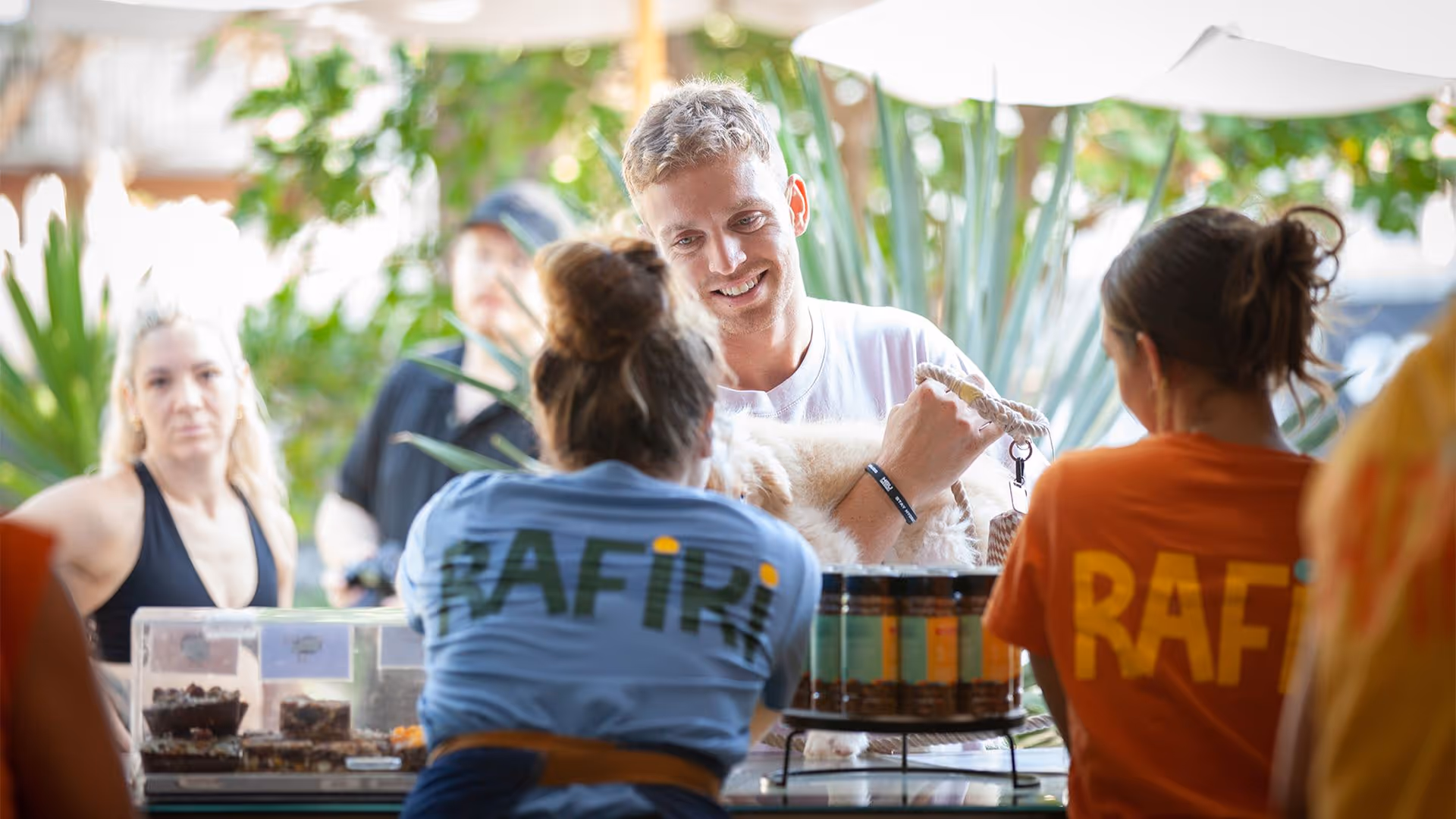
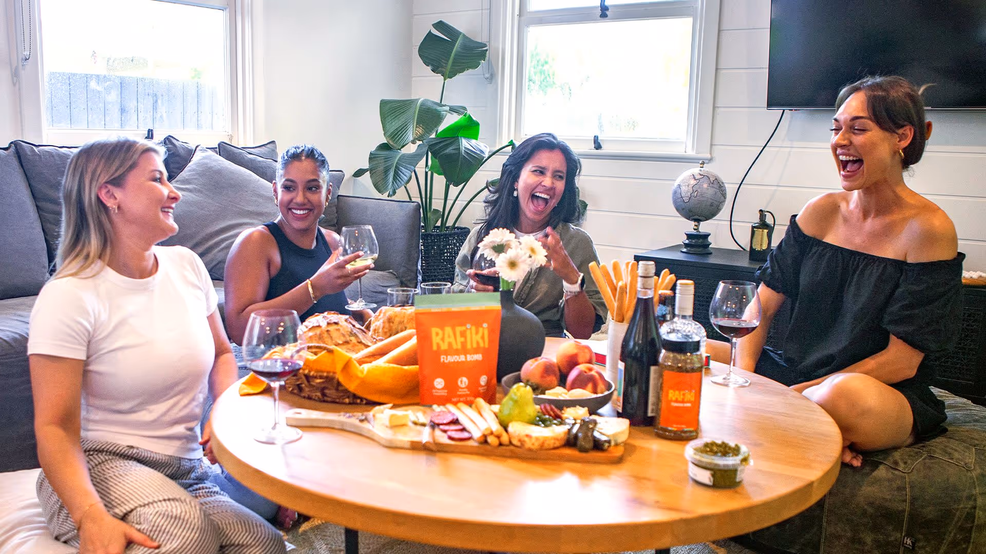
Rafiki isn’t just about food — it’s about connection. A bold, bright brand rooted in flavour, fun, and bringing people together. We partnered with Rafiki to build the brand from scratch: from strategic foundations to a loud-and-proud visual identity, packaging that practically dances off the shelf, and a website as vibrant as the product itself. The result? A food brand that dares to delight — and makes every meal a celebration.
Rafiki reawakens the soul and fills the hearts. It’s a next generation condiment that brings people together, inspires lively connection, and enriches memories with a taste that lingers in the mind and on the palate. Giving people a taste of Africa, we encourage celebration, sharing, and confidence in the kitchen.


Bright, Bold and Full of Spice!
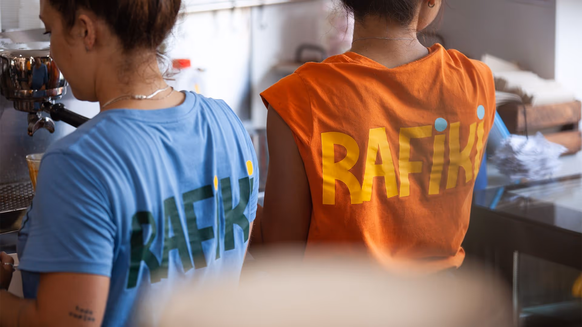
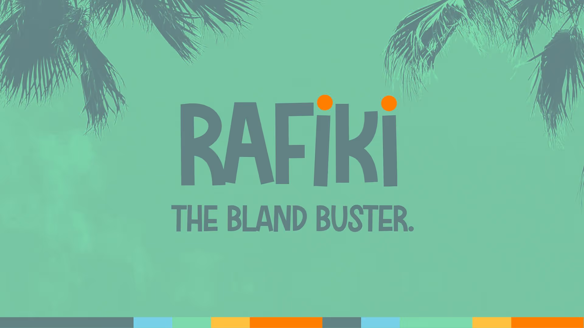
The Rafiki visual identity is an unmistakable explosion of colour, shape and positive expression. We designed a dynamic visual identity supported by a vibrant palette, bold expressive type and a graphic language that feels alive. The result is a brand that dances off the shelf and screen, full of energy!


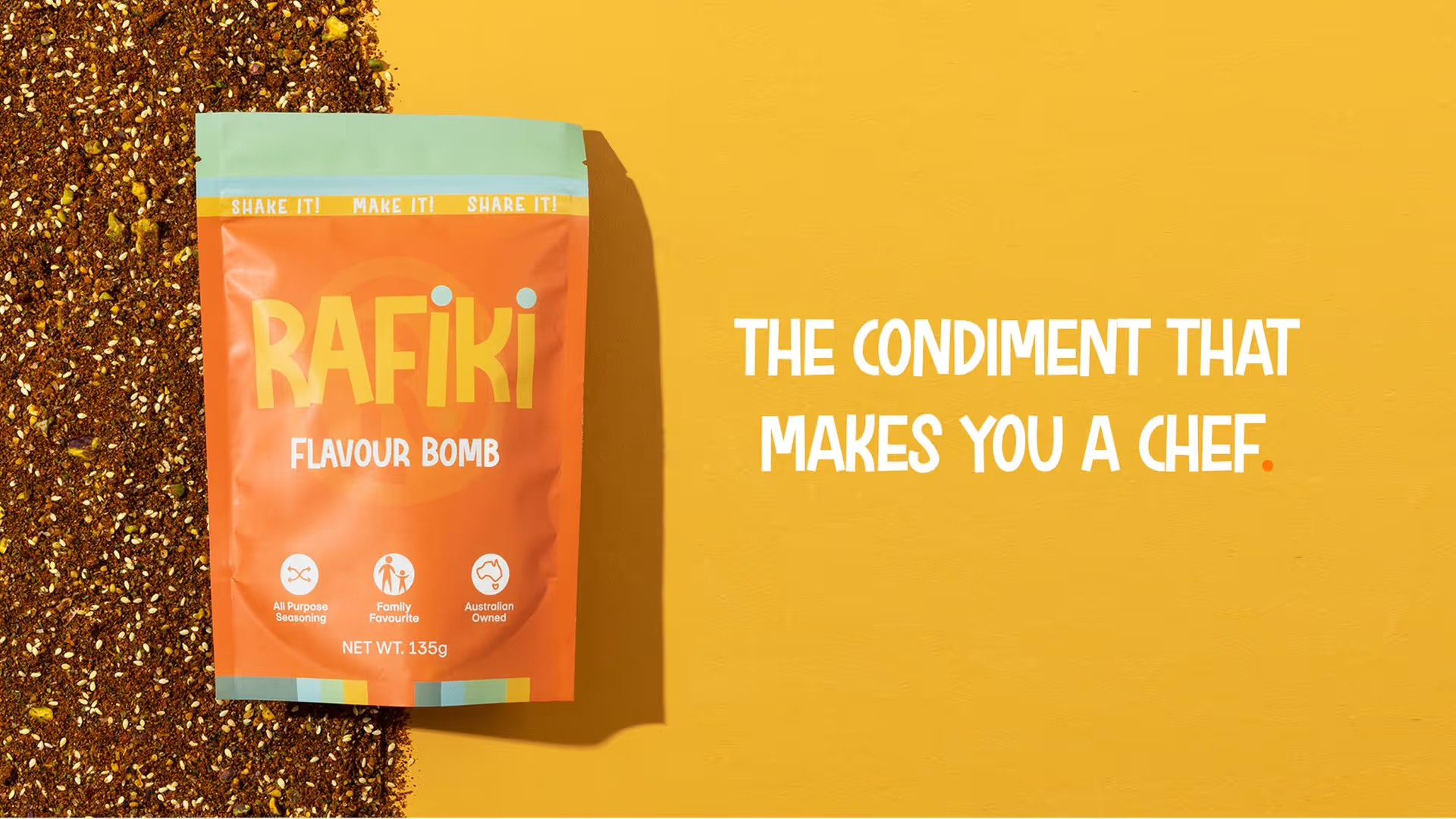
Rafiki the Confidence Condiment
Rafiki’s tone of voice is full of cheek, energy and culinary pep talks. We created a verbal identity that speaks to every level of home cook, from the totally terrified to the taste-obsessed. The copy celebrates the magic of flavour, with playful taglines, unexpected turns of phrase, and a conversational tone full of colour and taste that lingers on the mind.

Creative Direction
The Rafiki brand was built to burst with flavour, visually and emotionally. We used bold, expressive colours and African-inspired patterns to reflect the energy of the product and connect back to its cultural roots. Palm tree motifs nodded to Rafiki’s Mermaid Beach café, adding warmth and familiarity. Every element from the logo to the colour palette was designed to spark curiosity, inspire creativity in the kitchen, and make Rafiki a statement piece on any table.
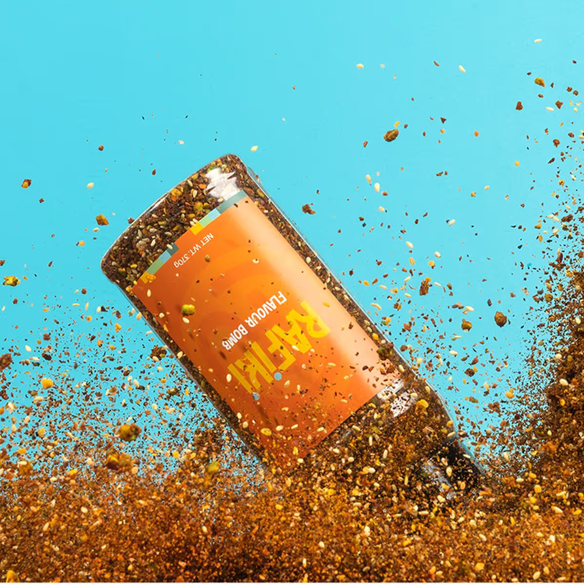

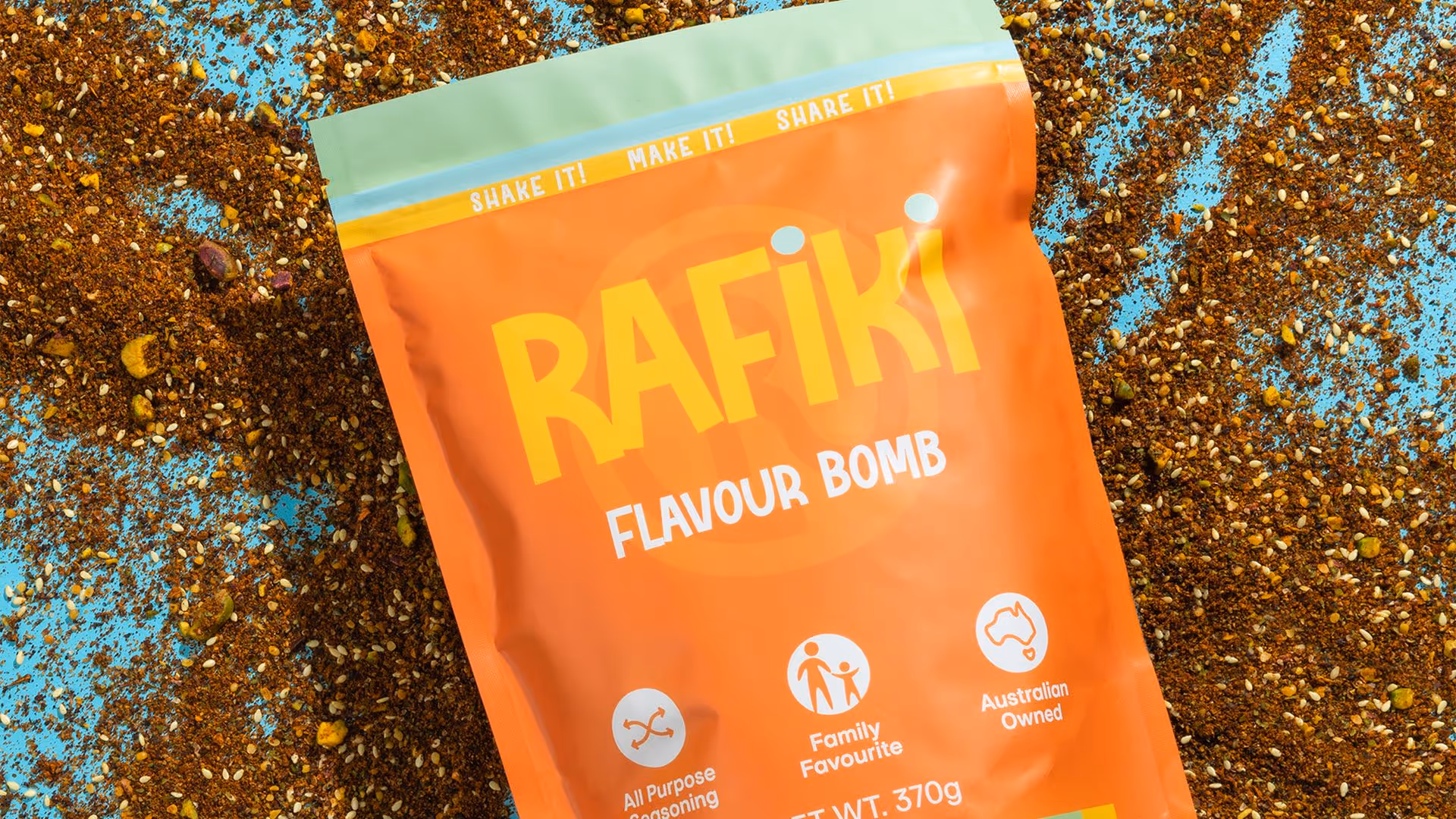
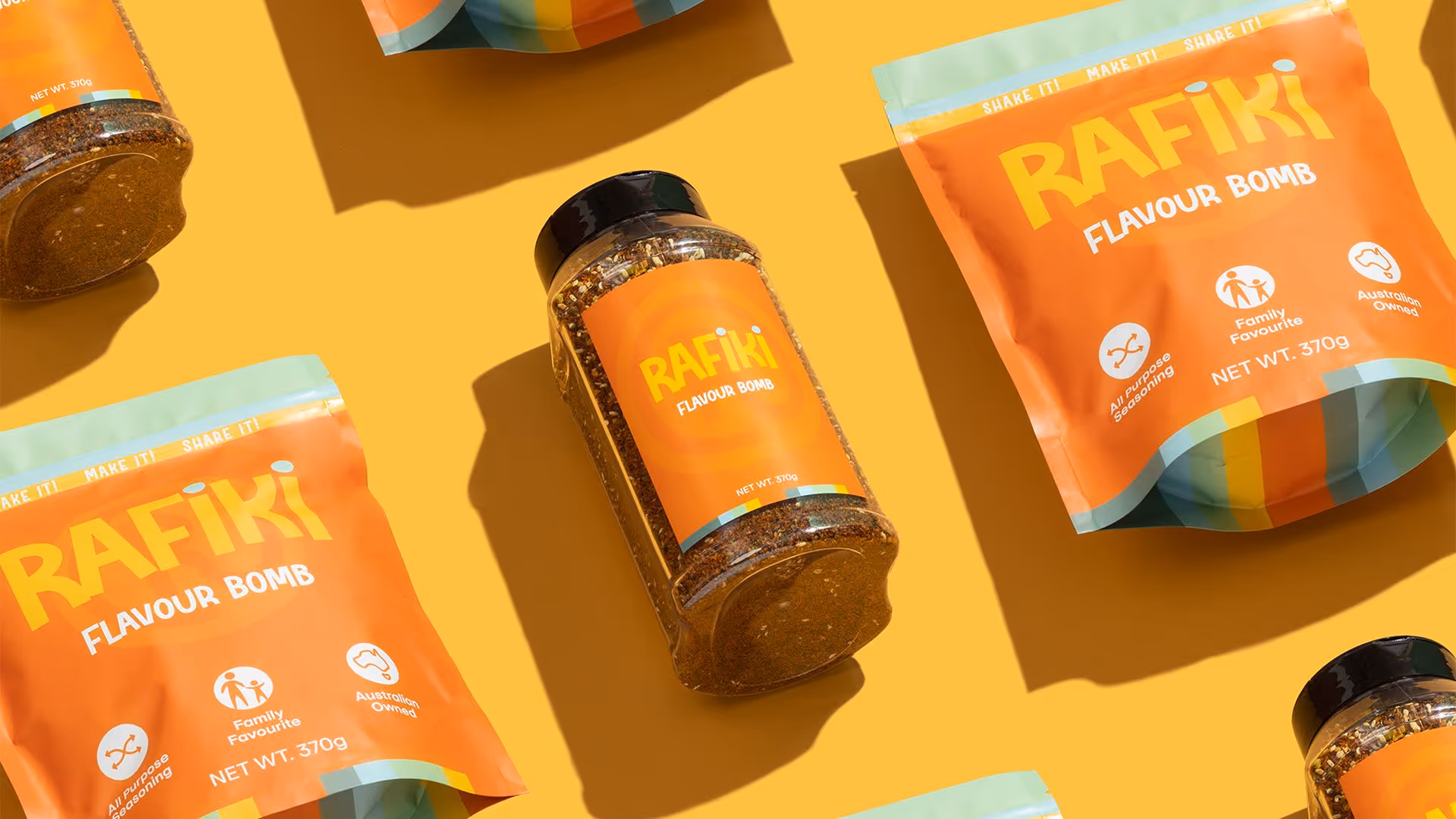
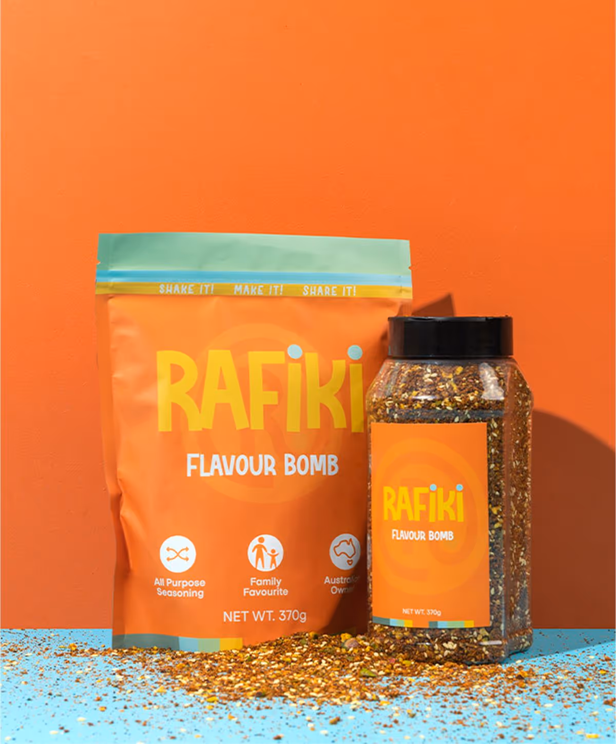
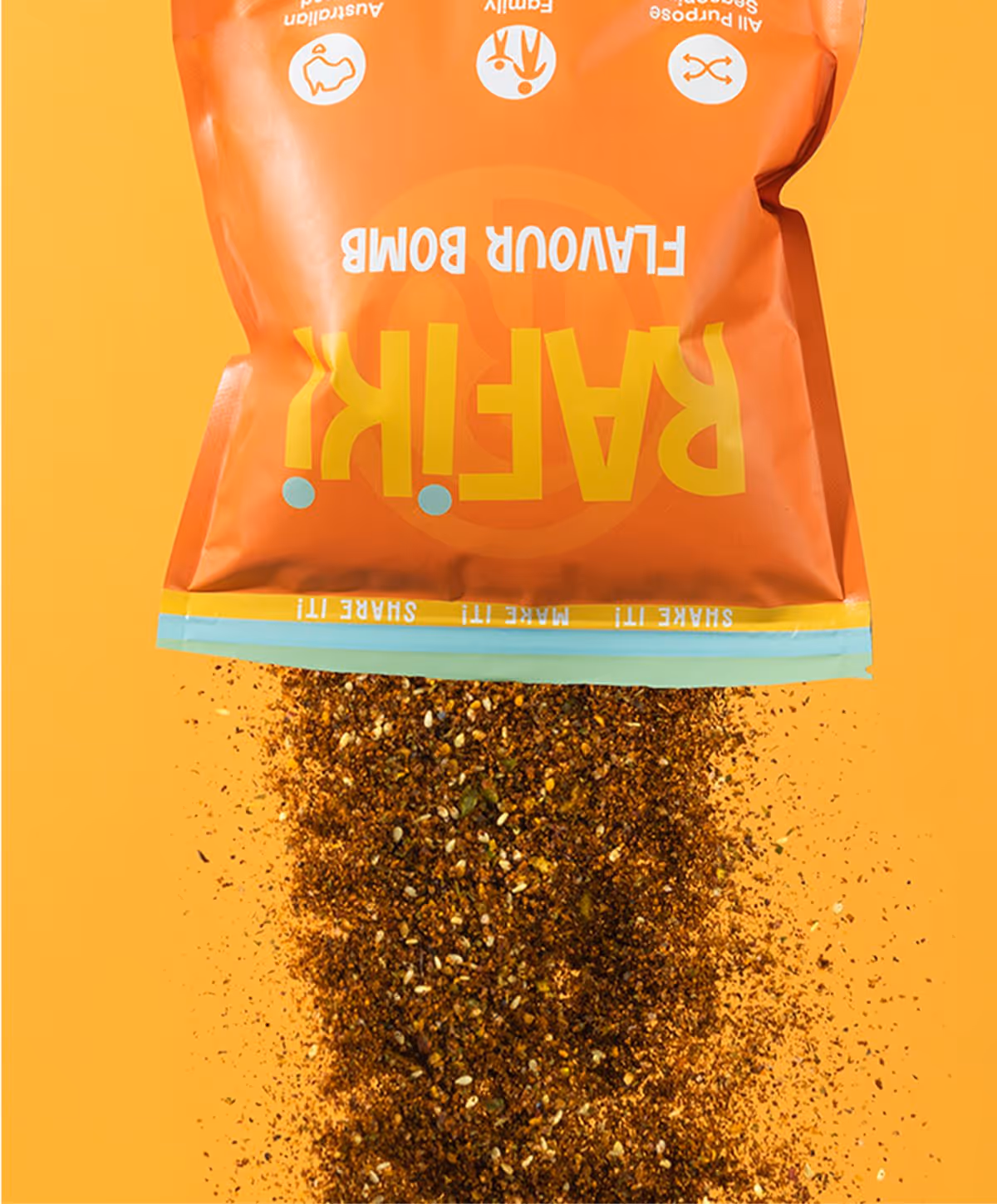
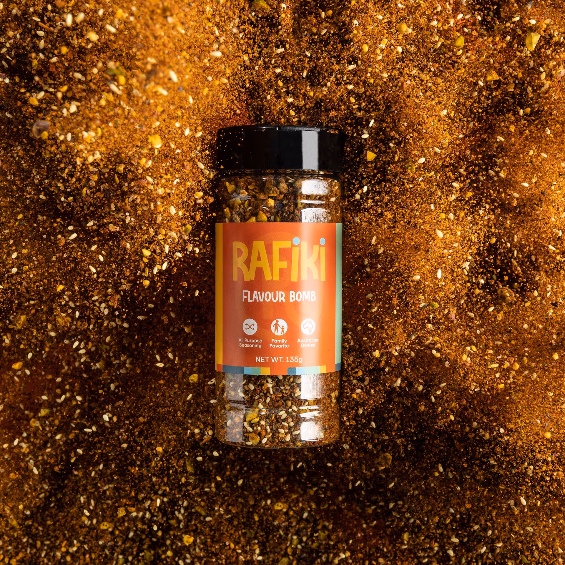
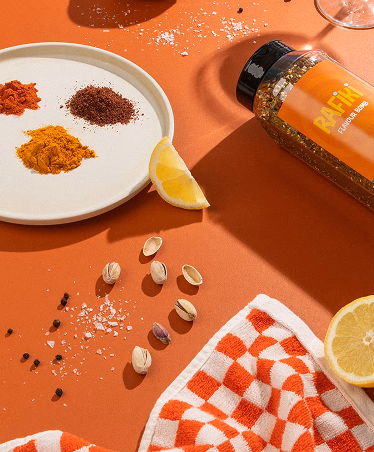
Packaging
Rafiki’s packaging was designed to feel as bold and vibrant as the flavours inside. Strong colour, layered patterns, and palm tree motifs created visual depth, while transparent papers and acrylic boxes added a sense of discovery and shelf appeal. Every element was crafted to reflect the brand’s commitment to creativity, curiosity, and standing out at the table.