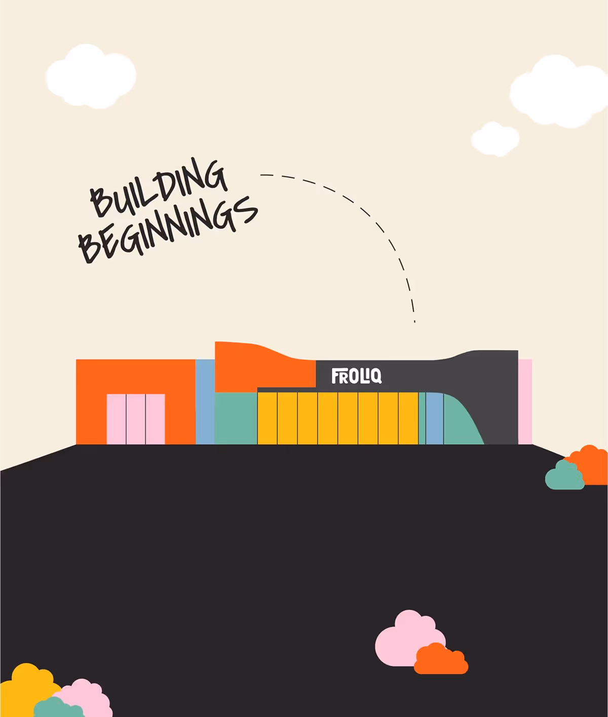
Froliq
An endless journey of discovery and joyful adventures awaits the tiny tots and parents with Froliq, a modern childcare focused on nurturing every aspect of children’s growth and development.

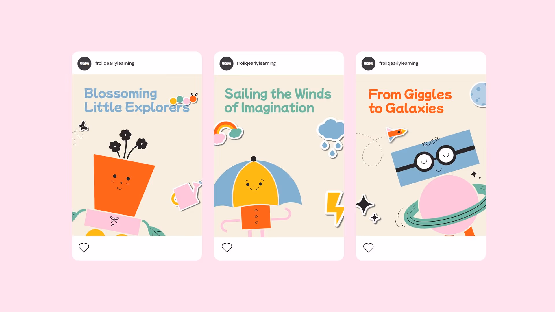
Froliq is an inclusive destination, determined to spearhead the childcare industry with a modern research-based approach to learning. They wanted to create a place where kids can let curiosity run amok. A world where every day is a new adventure full of discovery, giggles, fun, and endless growth. And amidst a plethora of childcare centres with the same-old messaging and visuals, Froliq wanted to stand out. They wanted to build a world where children sing together, tell stories together, and come back more excited than ever. Enter Rivyl.

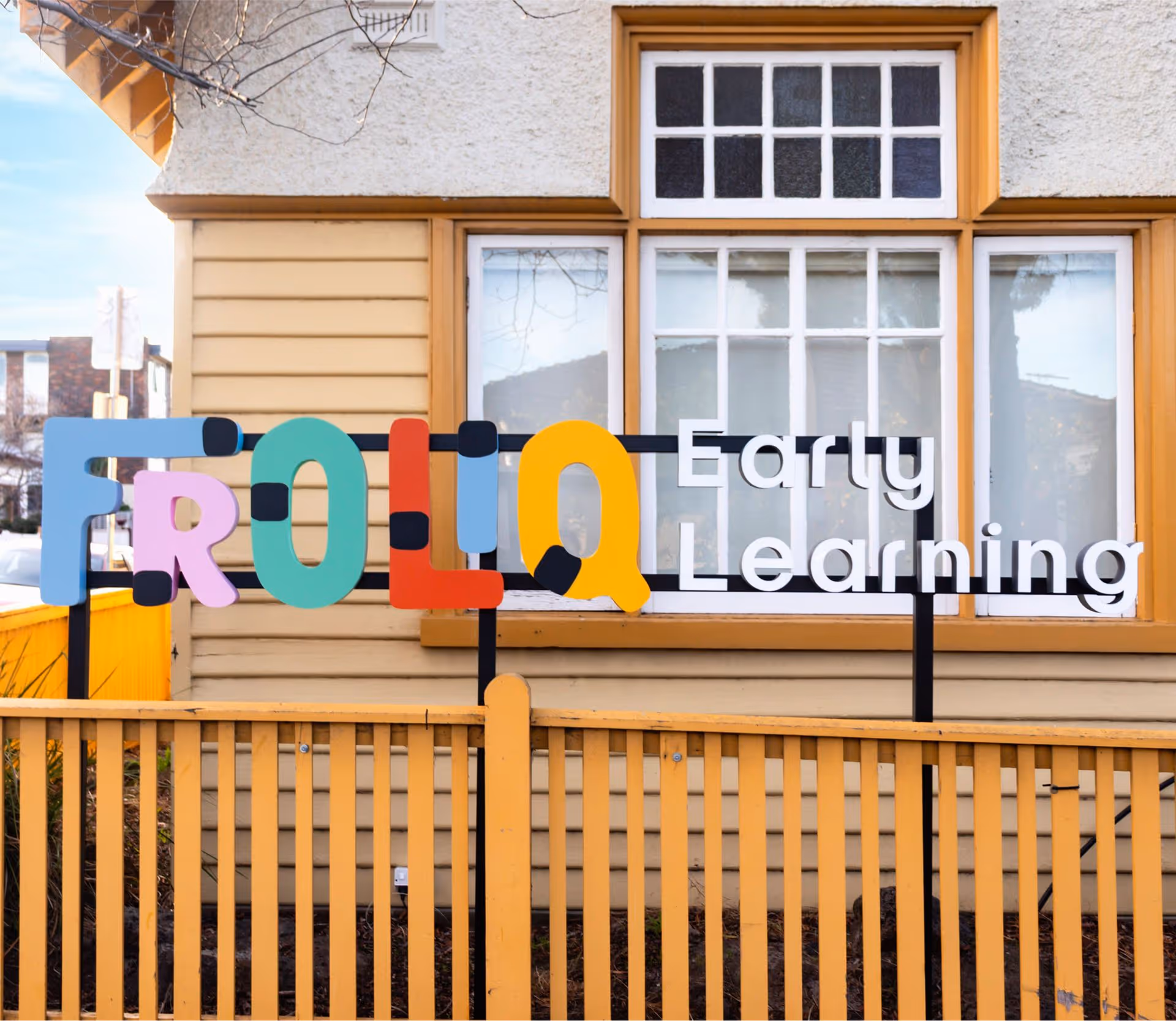
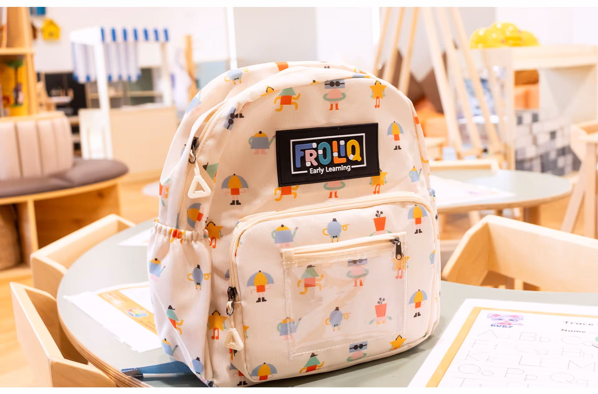
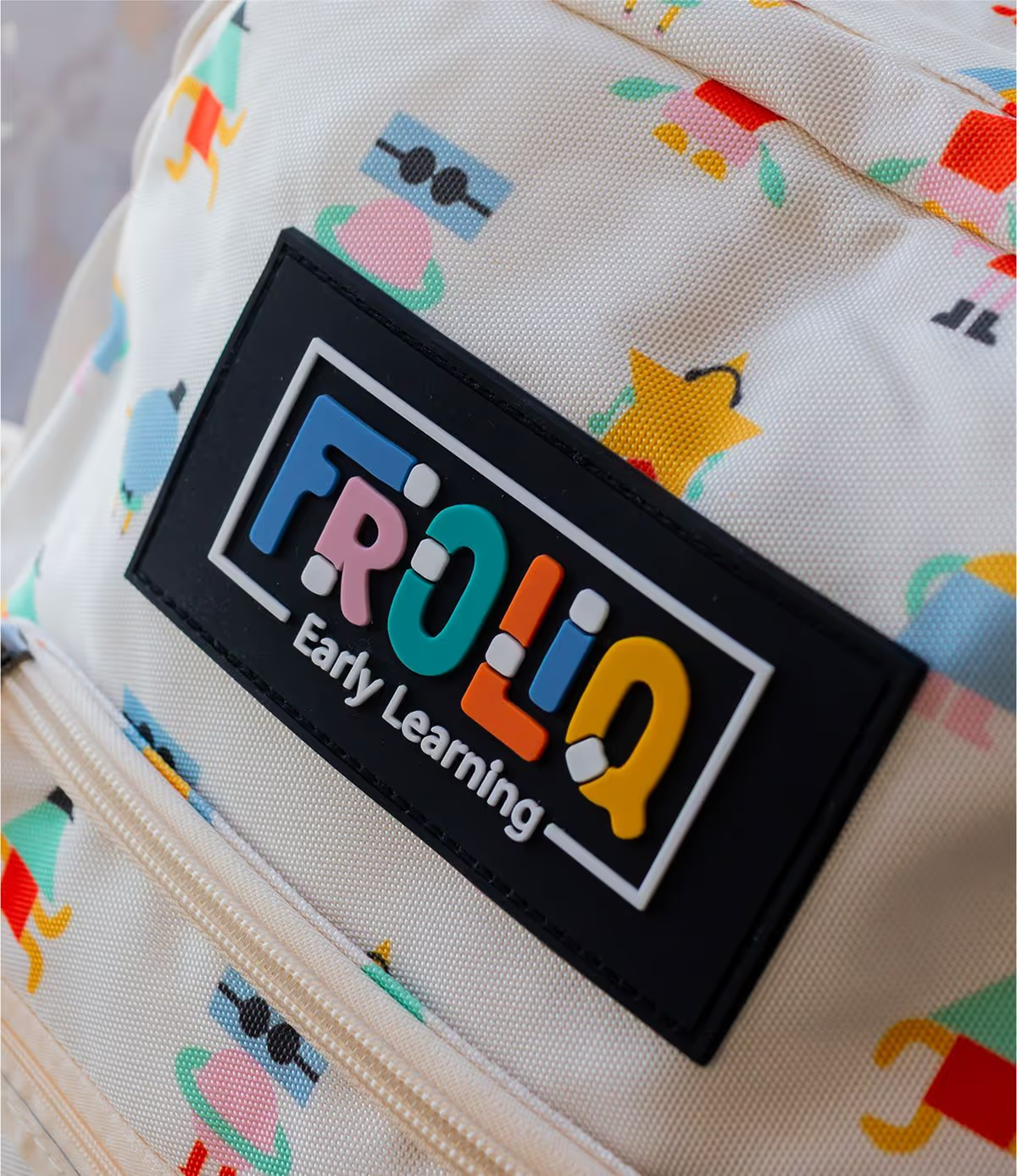
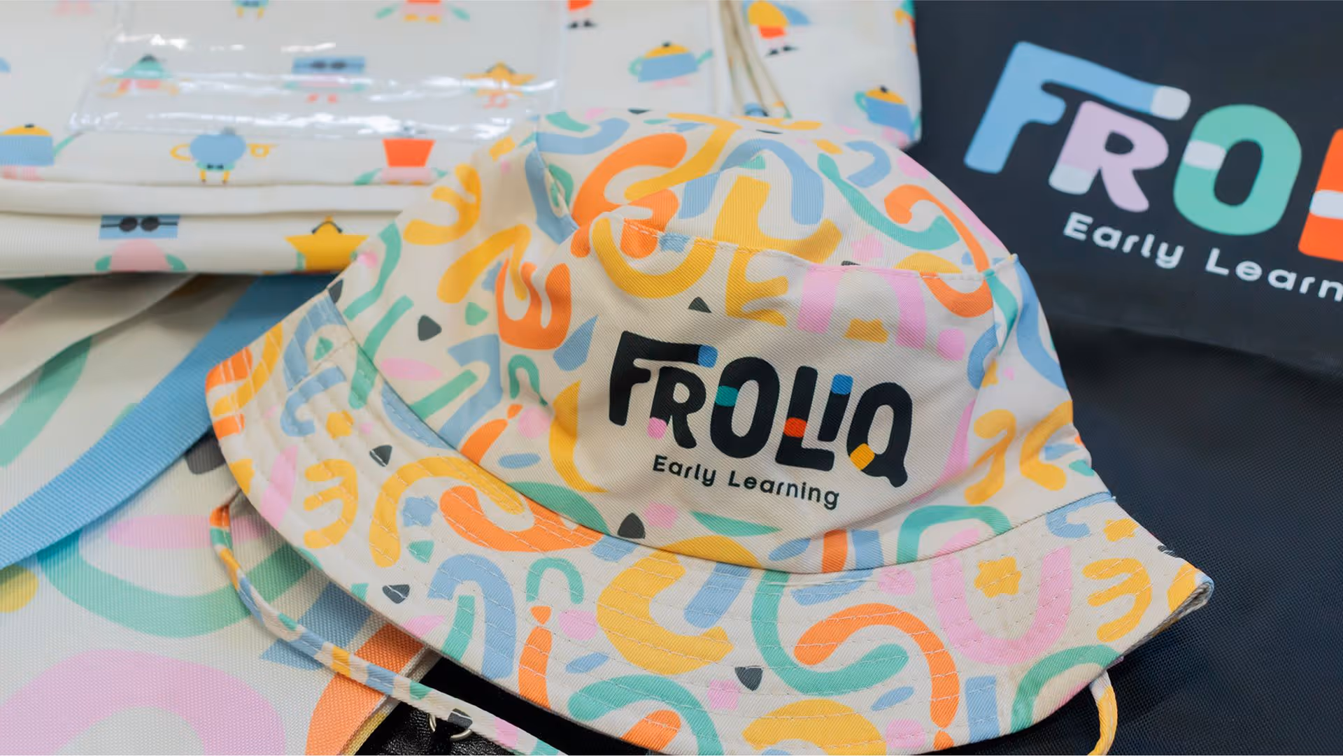
Froliq is a positive, playful sounding name with a clever twist - a combination of “frolicking” and “IQ.” It is short yet conveys a lot at the same time. So, taking inspiration from the name, we created an organic wordmark with custom clustered letters. This exudes a delightful sense of whimsy with a touch of sophistication.

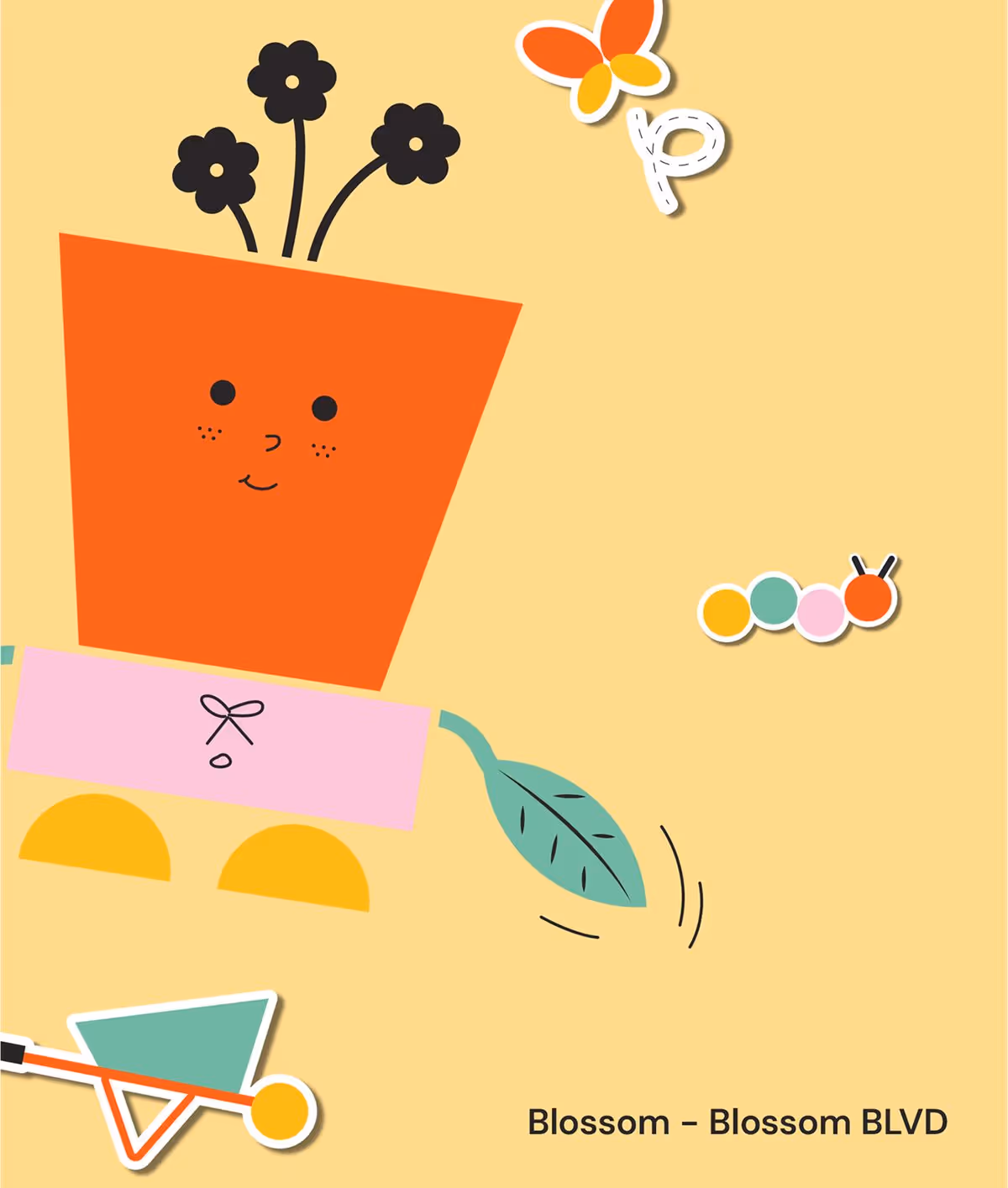

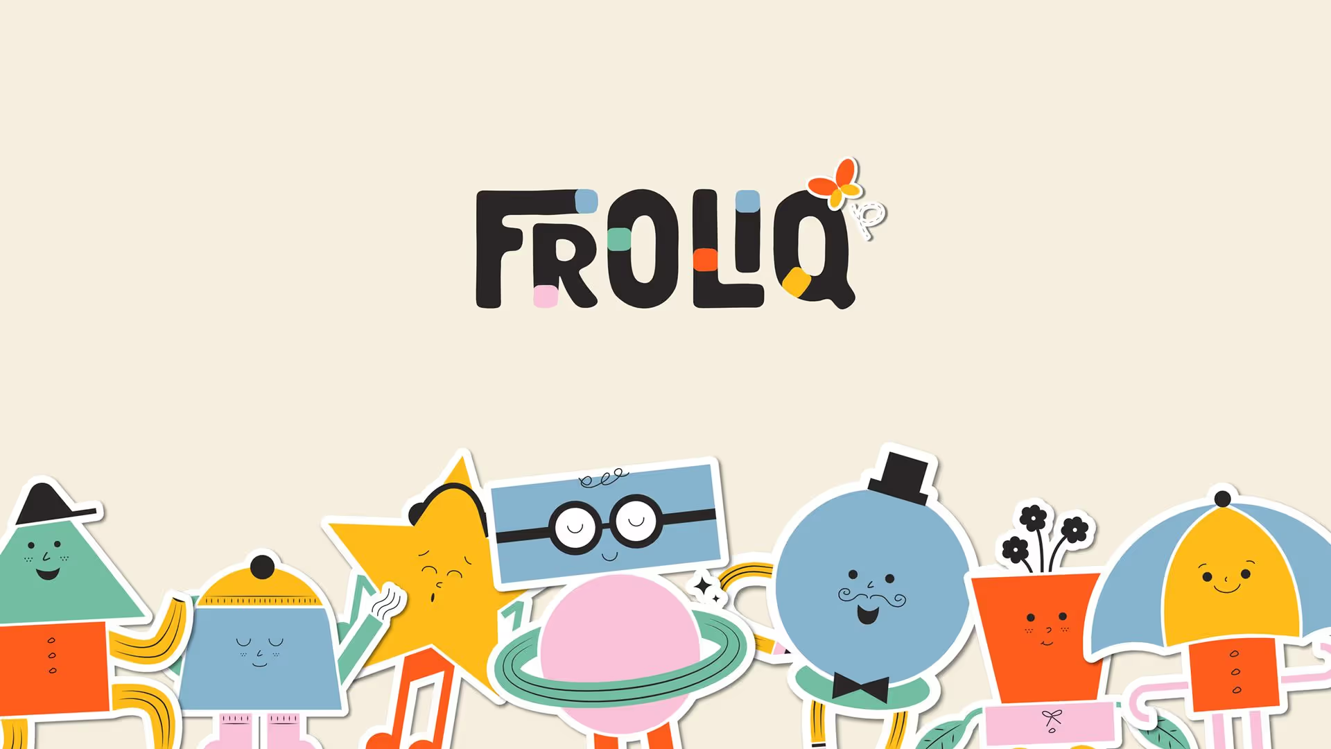
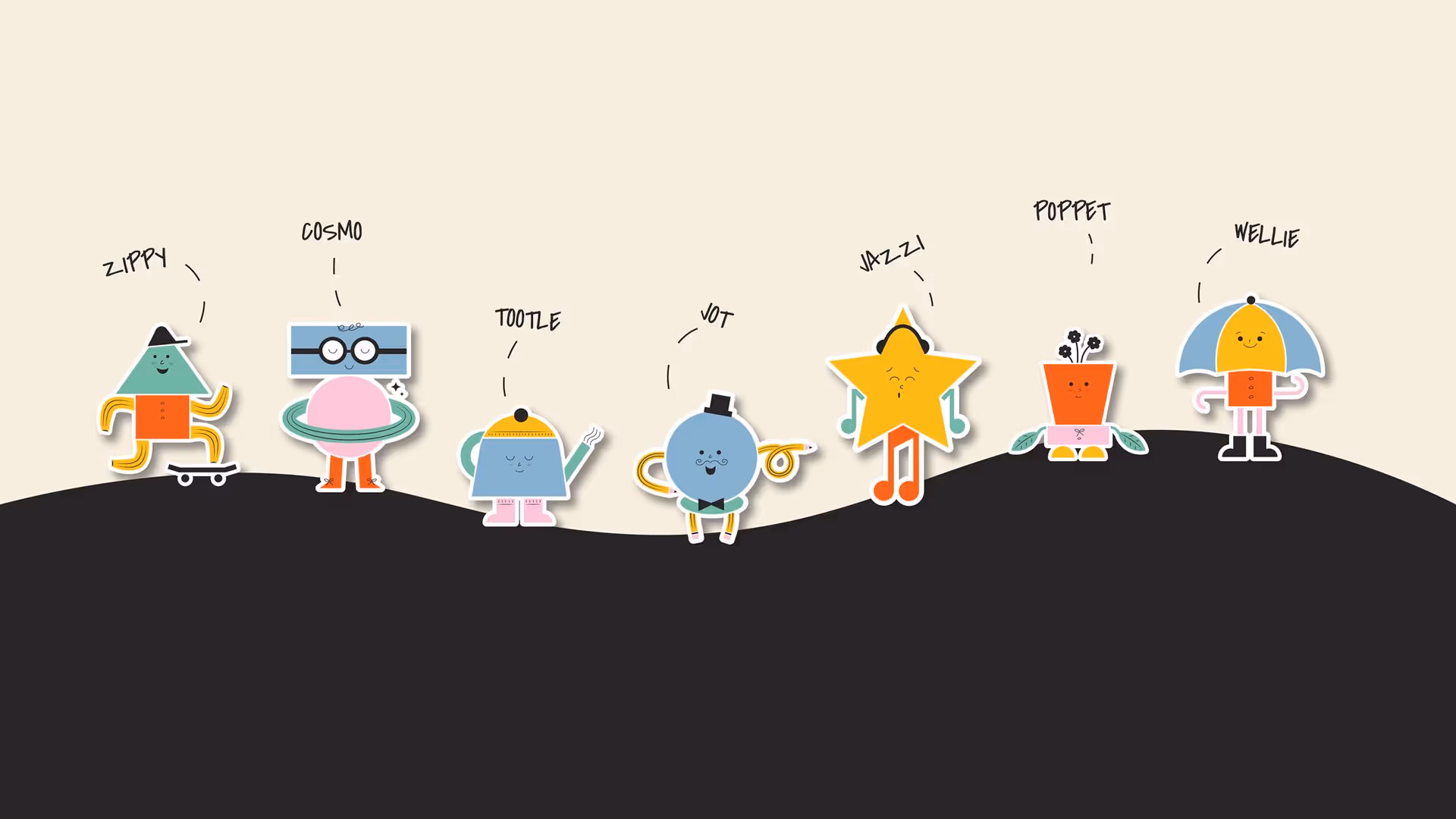
Our design and copywriting teams worked closely together to create characters that aligned with the Froliq world we had envisioned. With several internal rounds of naming and several more for brainstorming the world around each character, the result was a solid suite where each character has its own place and its own world for the curious tots to explore.


Characters and Icons
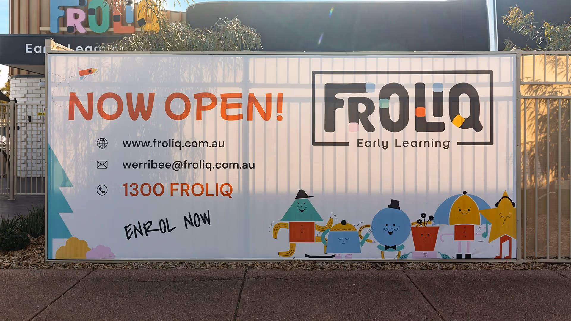
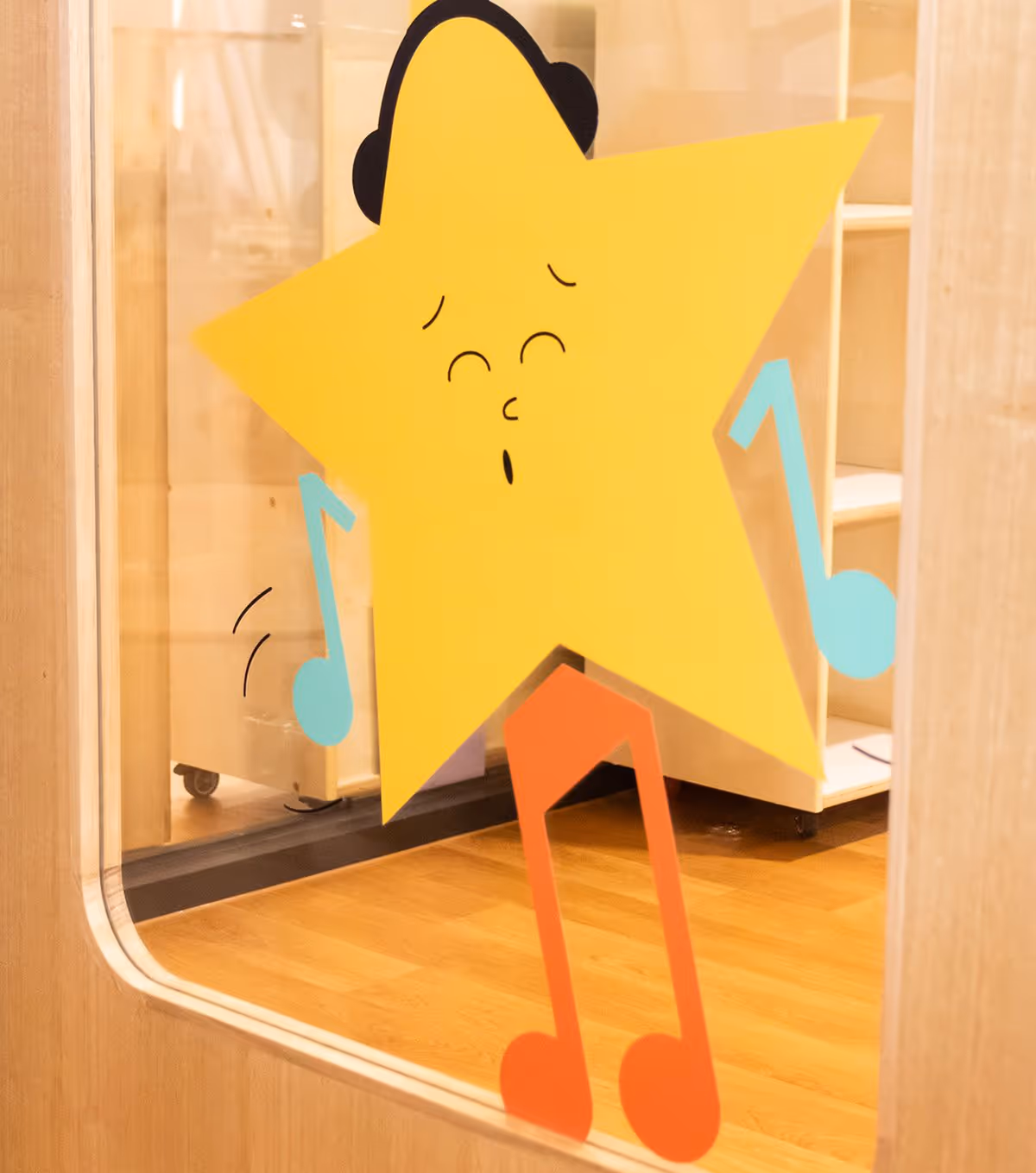
Now that we had a compelling cast of characters, each complete with its own “backstory”, what better way to bring them to life than through stickers that we could stick on the walls around the centre. So, we created a whole collection of custom stickers for each character. Each sticker and design bringing Froliq’s world a step closer to reality. Let’s just say this is branding world building in a whole new level.


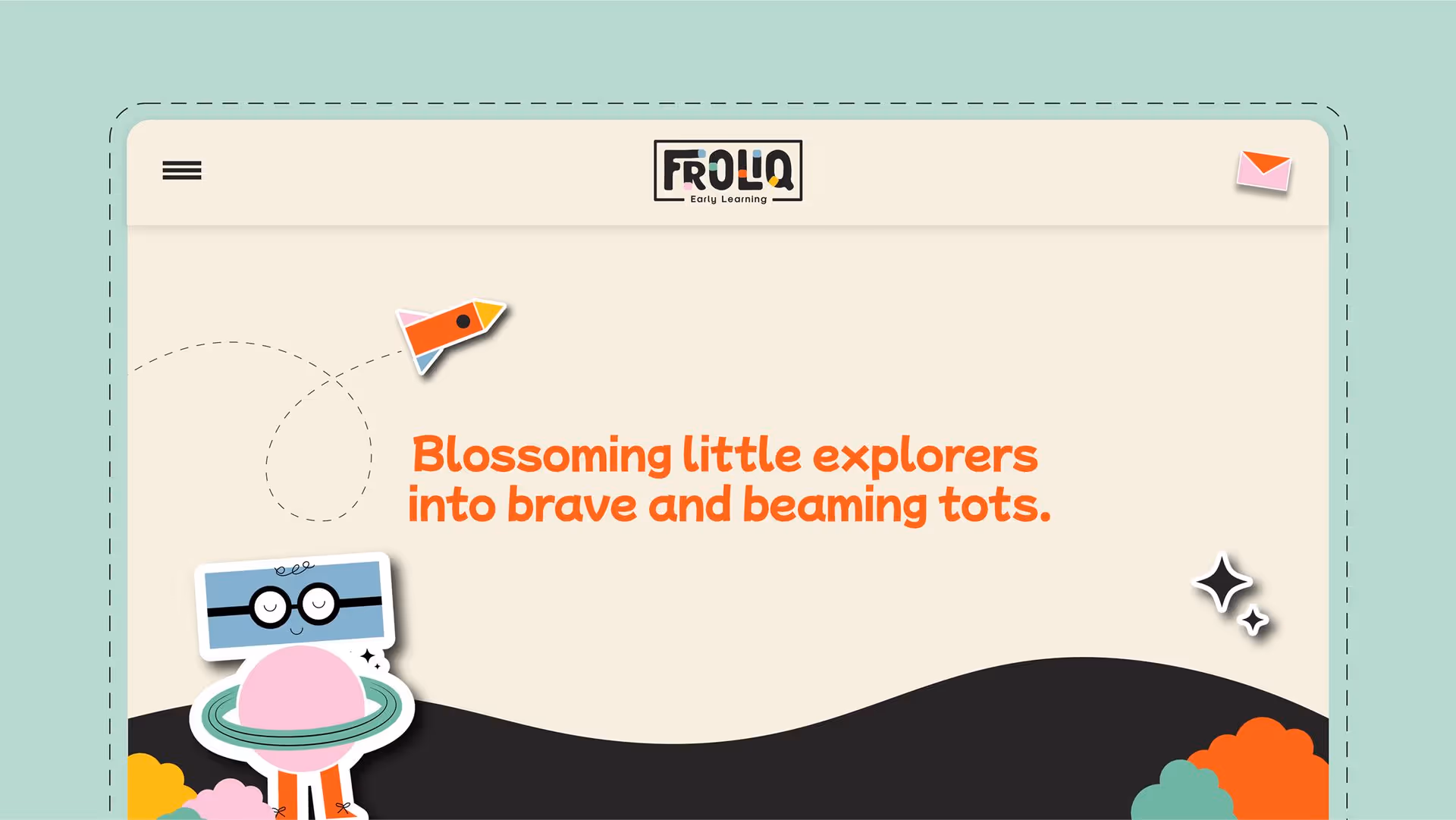

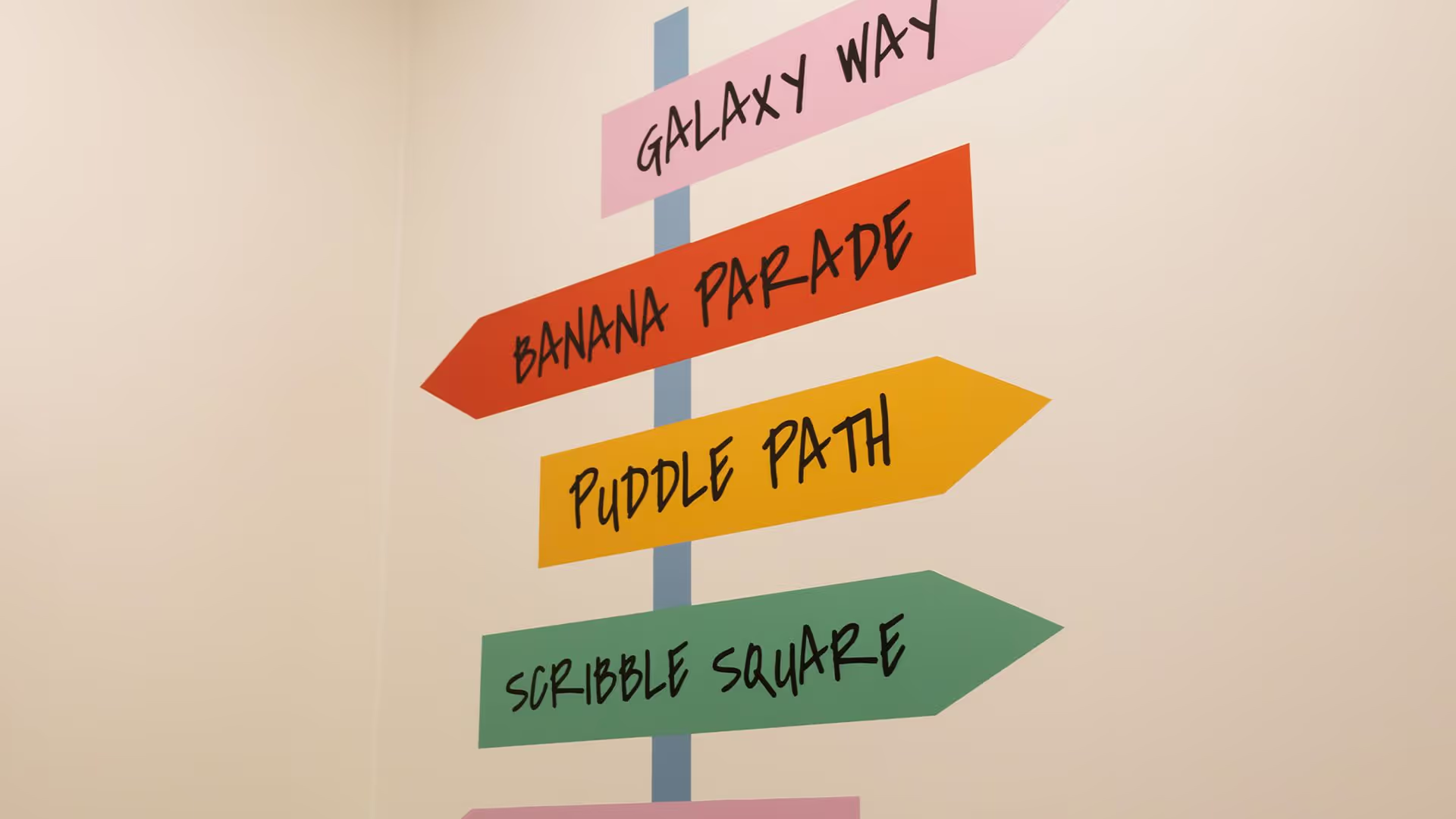
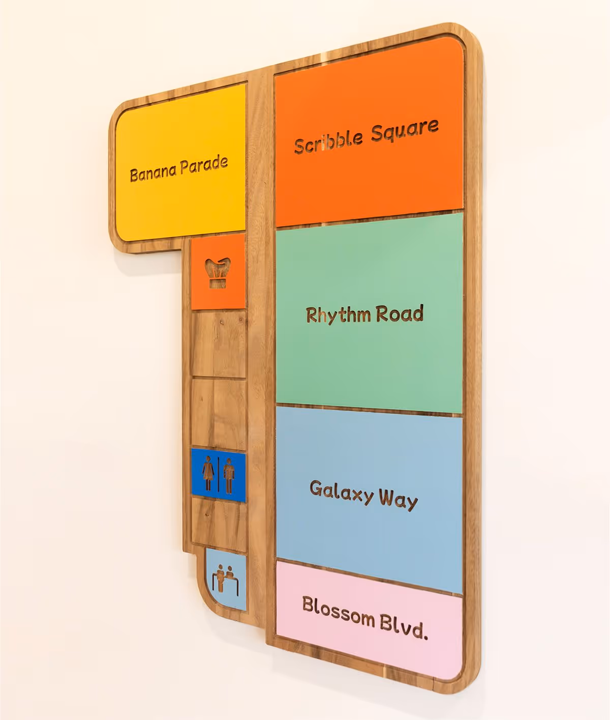
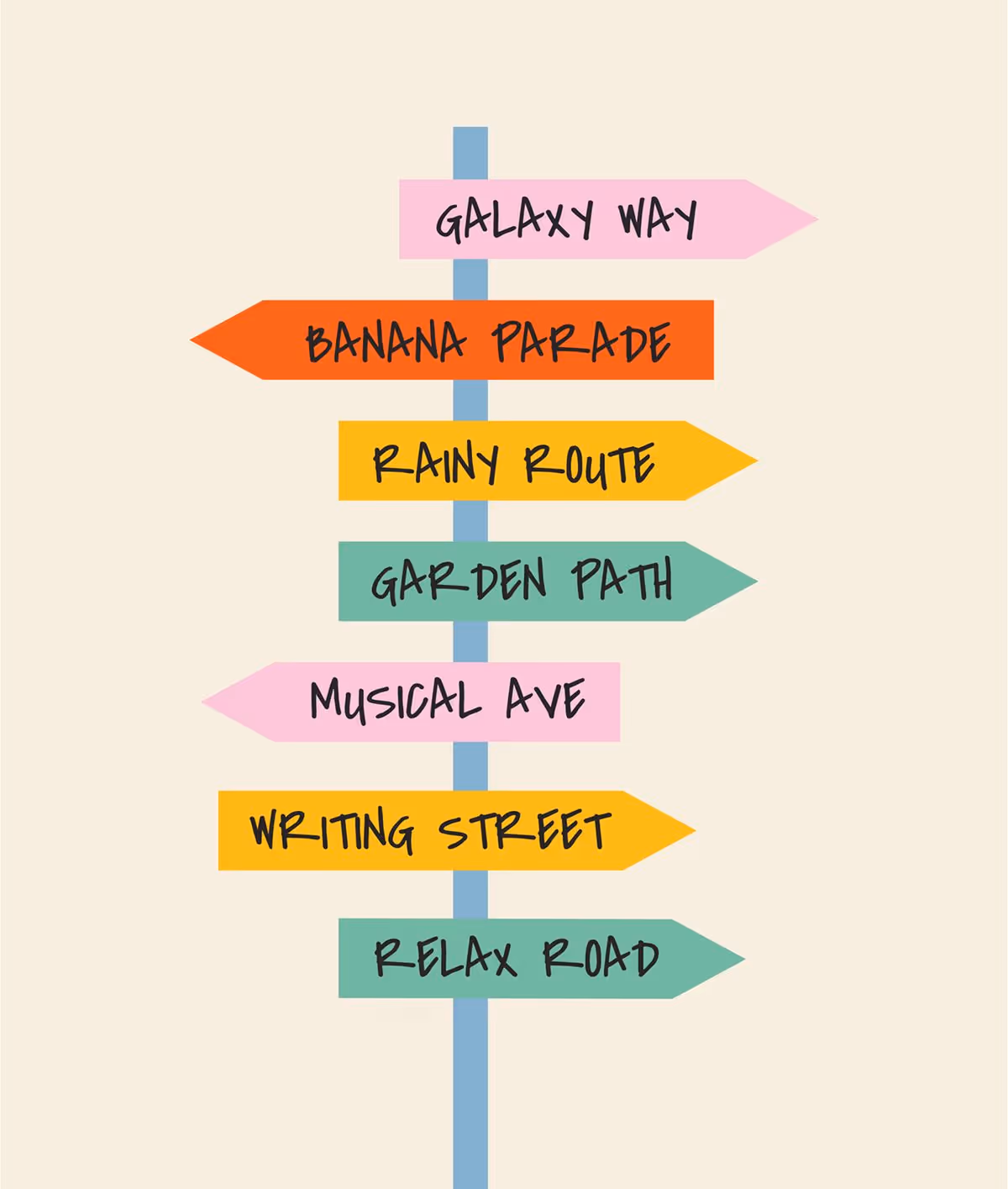
To make this sense of adventure, exploration, and discovery even more spellbinding, we used dashed lines and scribbles. They bring out a map-like feature to life for the brand as parents and the Froliq team build the blocks for children to thrive in.


For Imran and Omar, it was not about creating another cookie-cutter childcare centre. It was about creating something that leaps out at the imagination. Just hearing them talk about their vision for a childcare centre was enough to get our creative juices flowing. We had a unique opportunity. A chance to create a brand-spanking new identity for them, the name, the strategy, the visuals, the whole lot. Our band of mavericks were giddy with excitement. After multiple workshops, we knew they wanted a “froliqsome” brand voice to complement an equally vibrant visual identity. The end result left Imran, Omar, and everyone at Rivyl thrilled to bits.