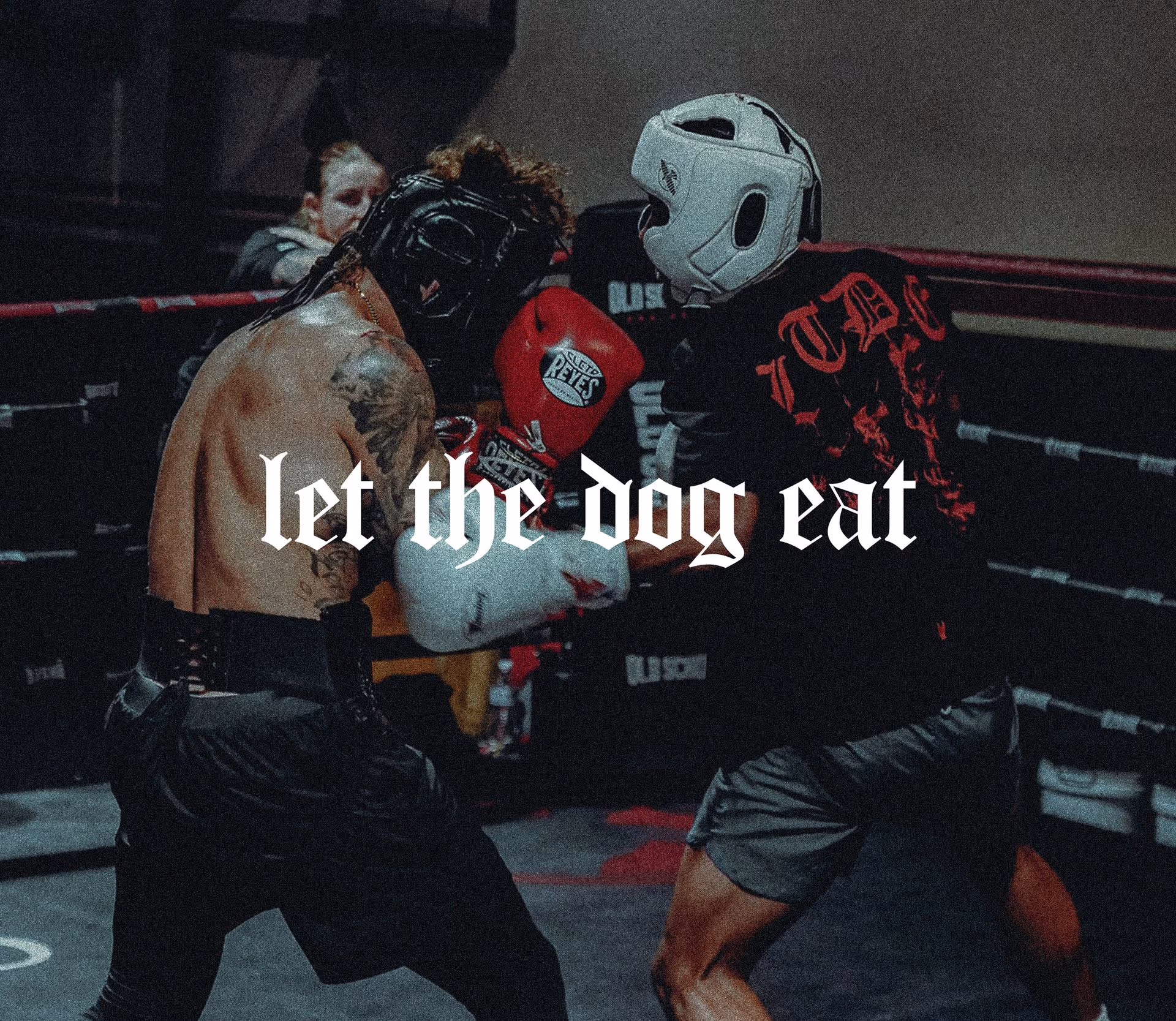
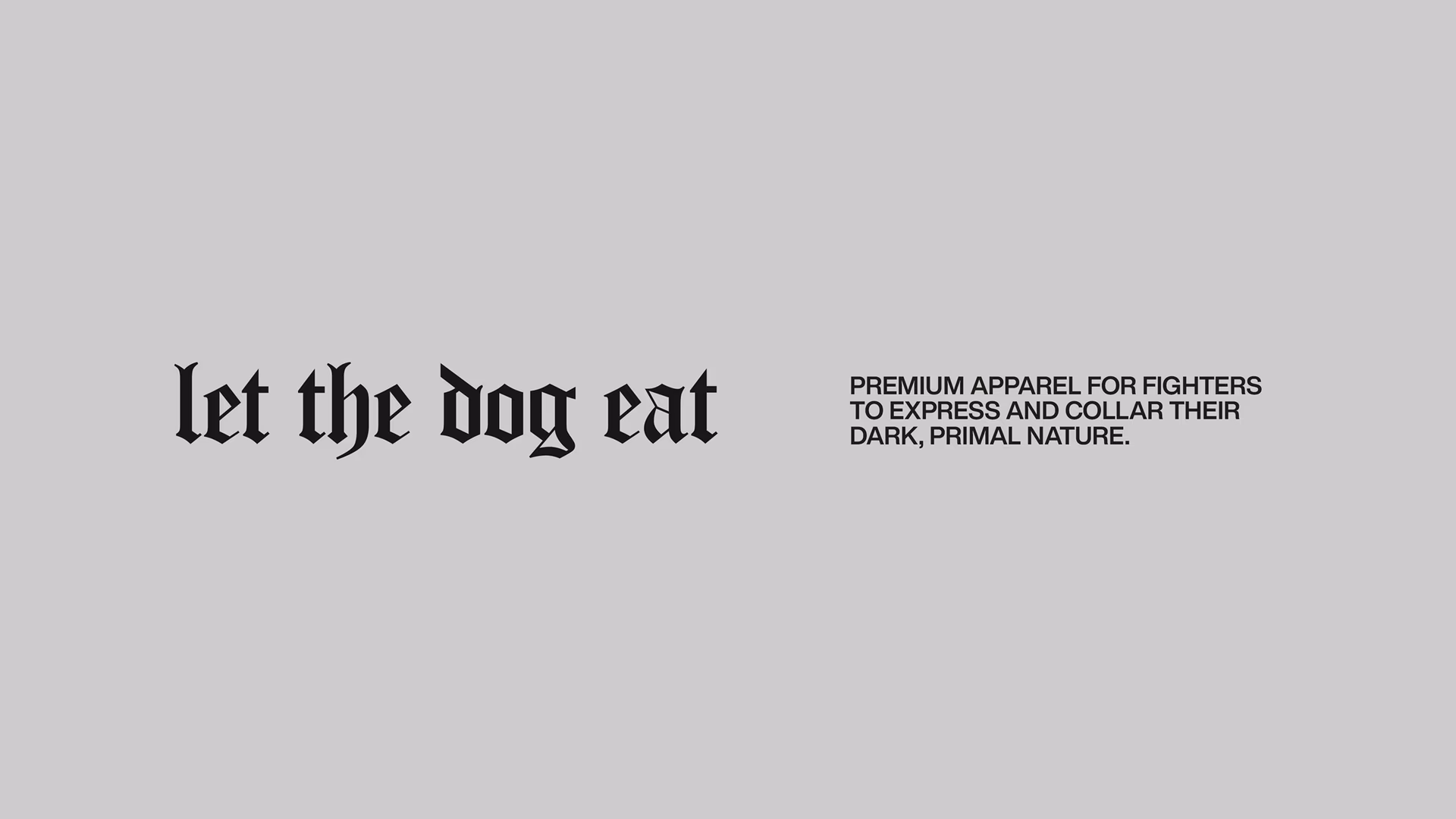
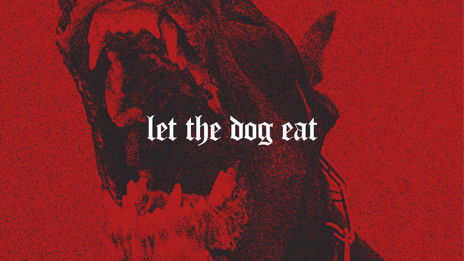
Let The Dog Eat
When Let The Dog Eat came to Rivyl, they weren’t just launching a line of apparel, they were igniting a mindset. A bold, emotional, and deeply human brand built for athletes who move through the world with grit, discipline, and hunger. At, Rivyl. we took that fire and shaped it into something iconic. A brand born from raw conviction, brought to life through powerful language, primal visuals, and a brand identity that refuses to play small. Let The Dog Eat isn’t here to blend in, and we made sure of it.
About
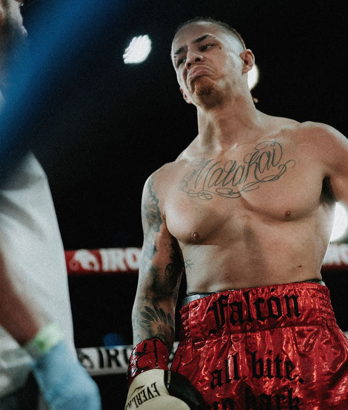
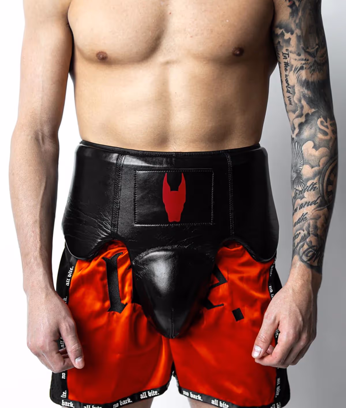
Let The Dog Eat was created to challenge the idea that darkness should be hidden. In a world obsessed with surface-level positivity, this brand gives space to the raw, unfiltered side of ambition; the hunger, the pain, the primal force that drives people forward. Let The Dog Eat is a declaration of freedom. They create premium sports apparel that gives fighters the space to confront and collar their primal nature.

Brief
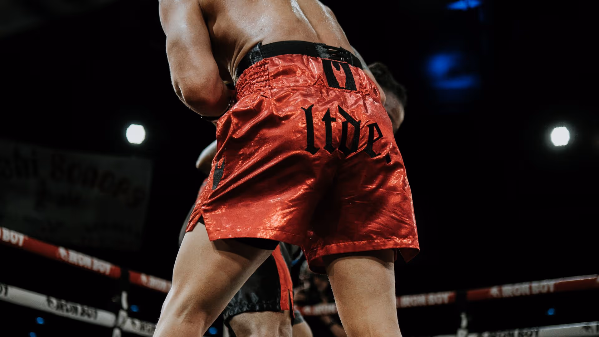
This founder has a strong, visceral vision for their brand. He was hunting for a branding agency that would embody, and capture their vision to it’s fullest. He wanted strong, consistent and iconic. Rivyl sweated over the details, working to enhance, tidy and sharpen the existing visual identity and shape the poetic voice for a niche audience. Balancing themes of physical masculinity, focusing aggression, black depression and a menacing exclusivity we worked to bring combat sports together with the aspiration of high fashion to make LTDE distinctive. Now with a community of +117k followers in under 3 years, LTDE is proof that speaking with intent results in branding power.
Strategy and Tone
We took a raw, emotionally-charged vision and turned it into a brand that knows exactly what it stands for. Through workshops, deep dives, and a healthy dose of challenge, we helped LTDE distill its unfiltered energy into a sharp tone of voice; aggressive, articulate, and consistent across every touchpoint. Strategy for LTDE wasn’t about softening the edges, it was about sharpening the message.


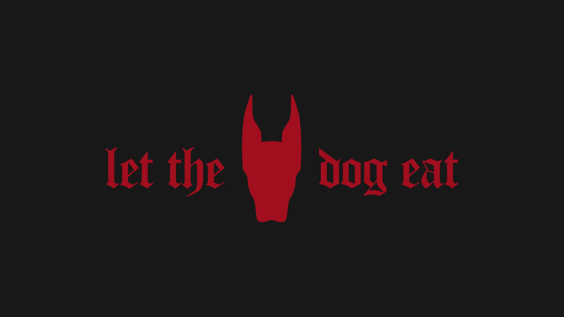
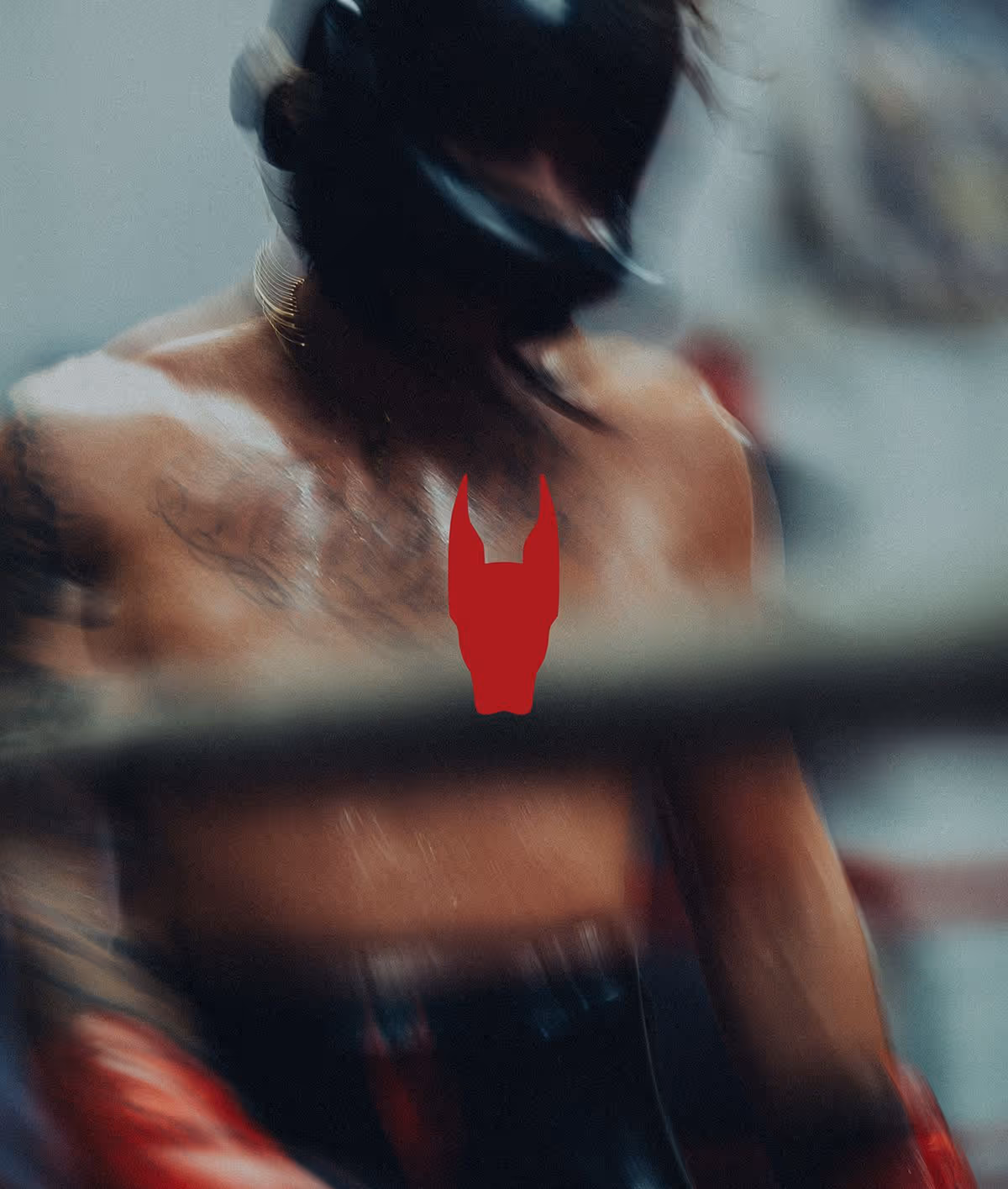
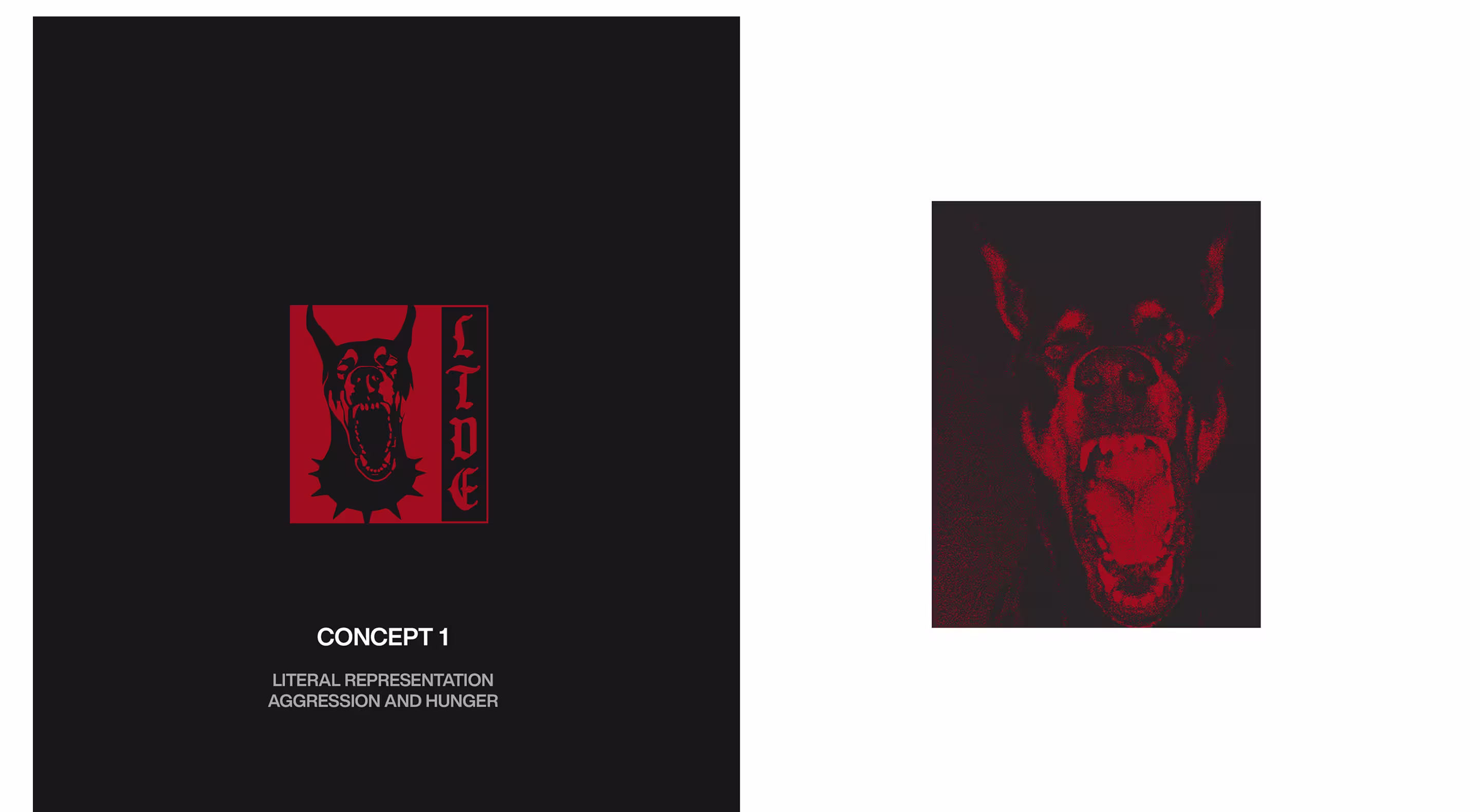
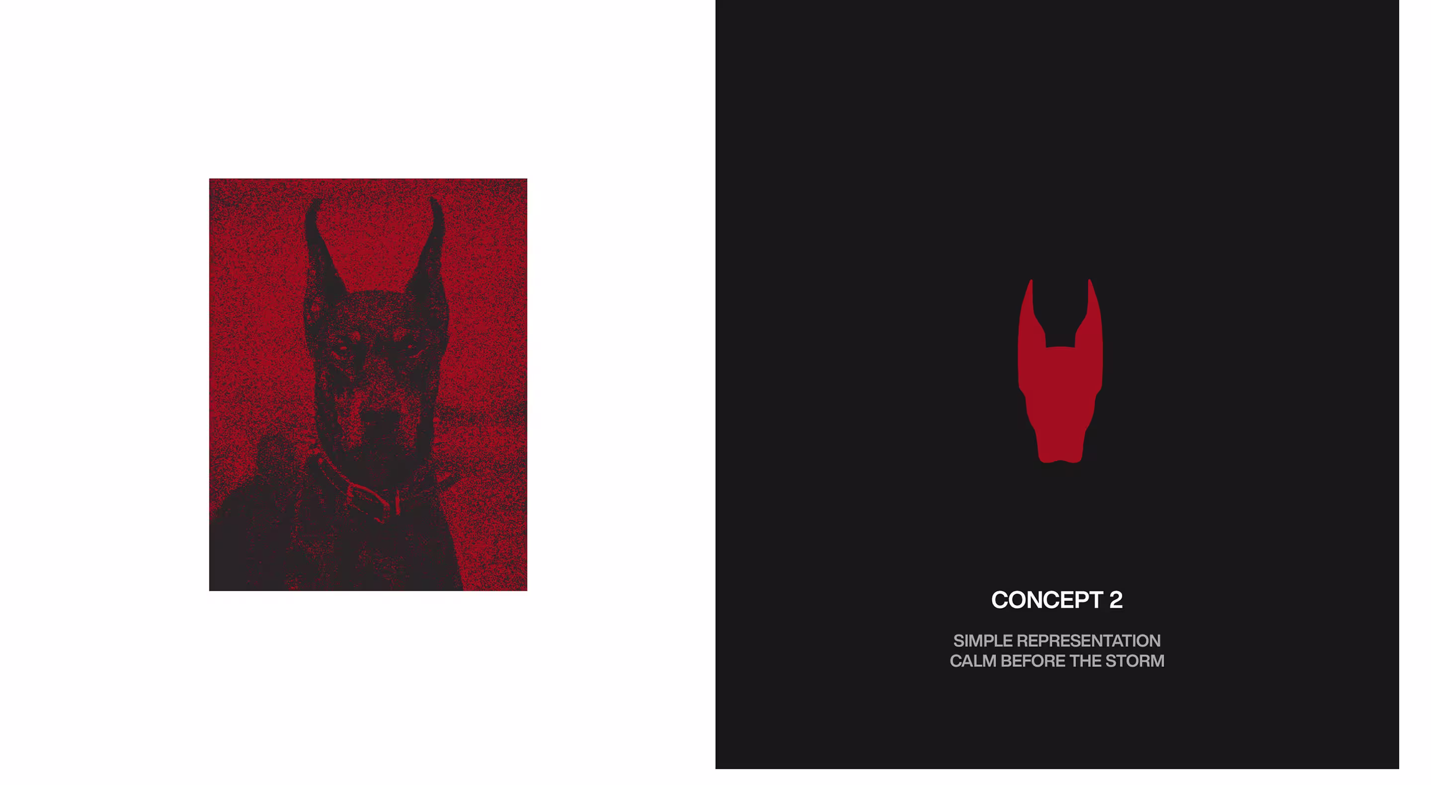
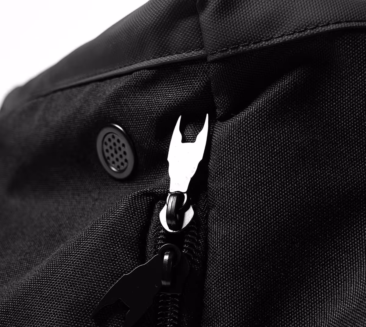
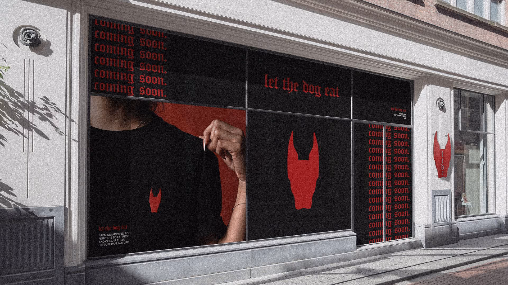
Logo
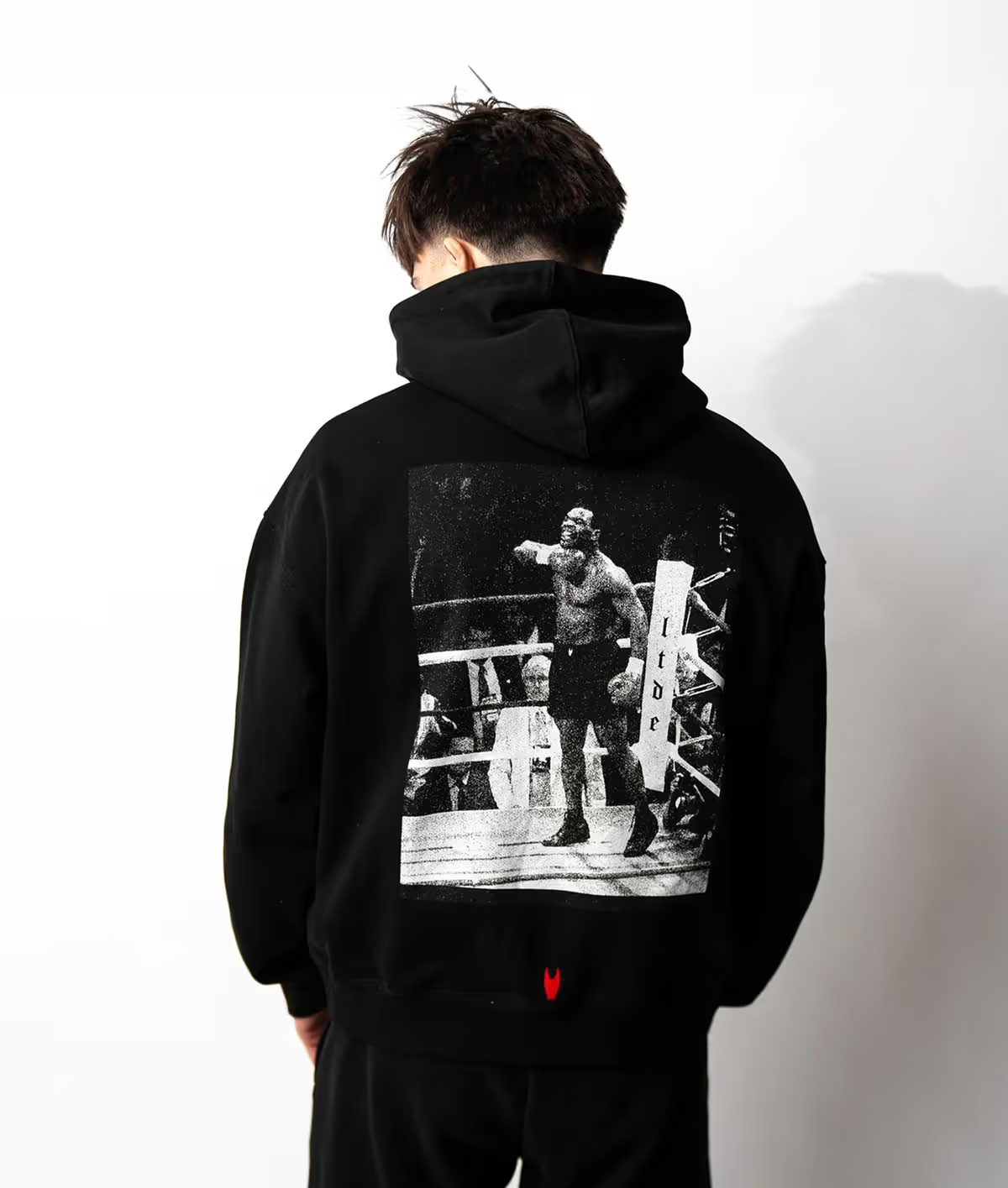
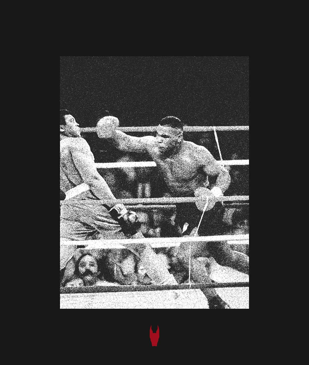
The LTDE founder came to us with a clear vision, mid-snarl, all teeth and aggression. Together, we explored that direction, but with our experience in streetwear and branding, we knew there was more longevity and commercial impact in the restraint. We designed the logo into a sharper, more minimal mark, one with tension, confidence, and versatility. Clean enough to sit with any apparel graphic, and strong enough to stand alone.
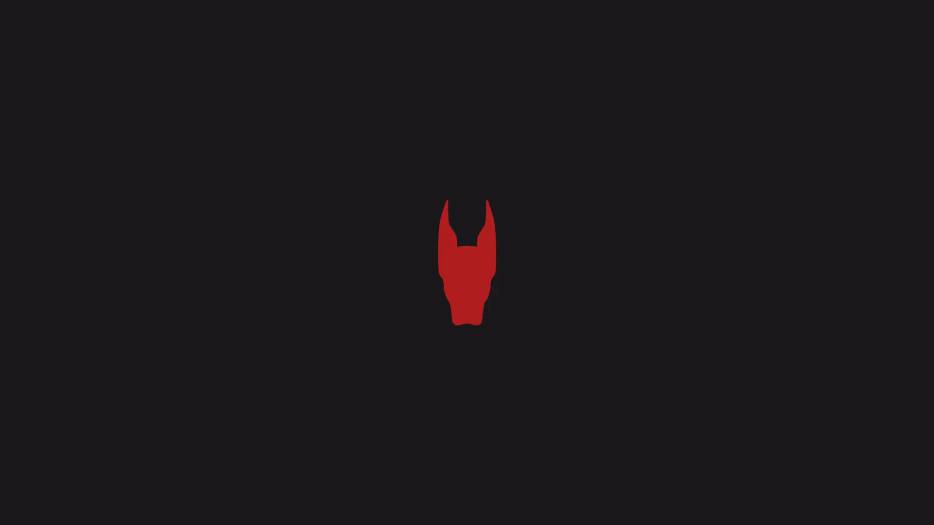
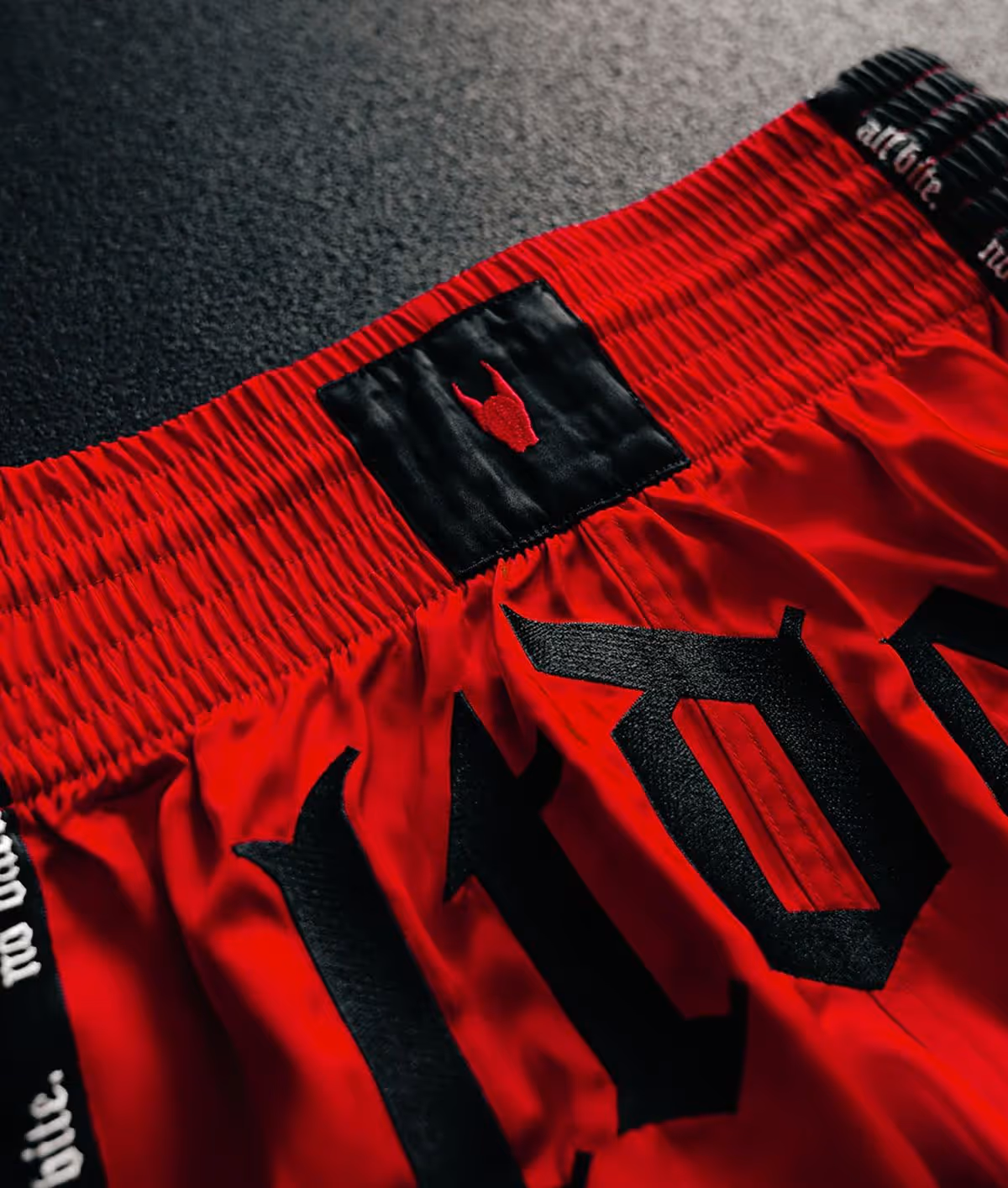
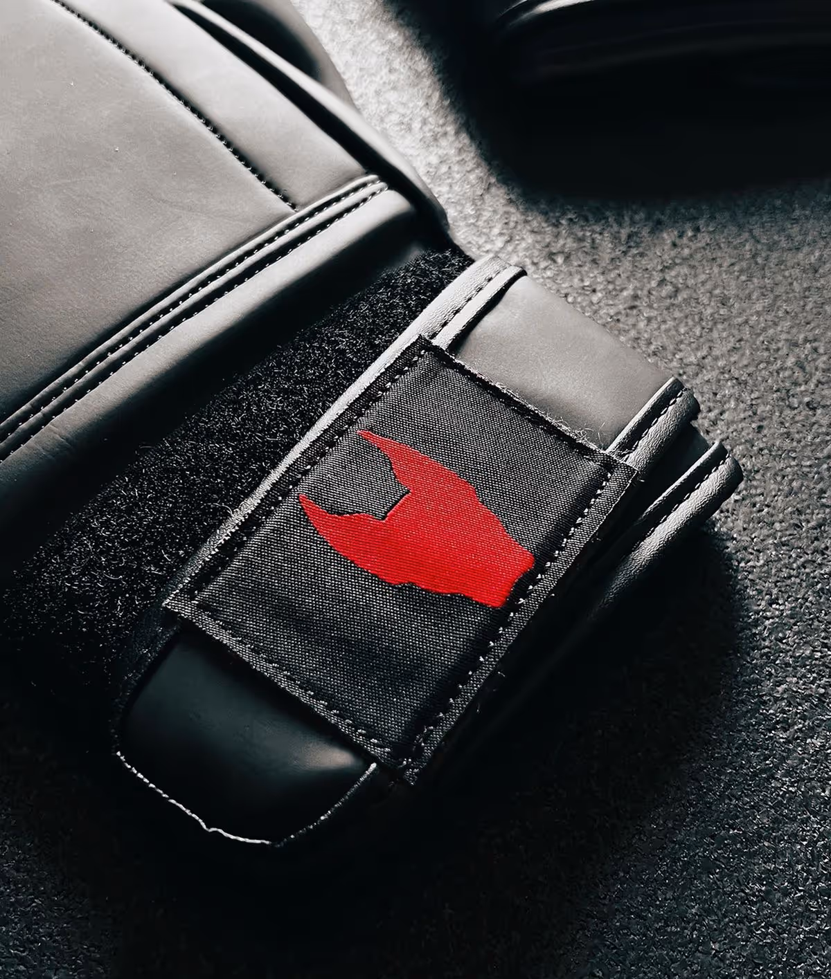
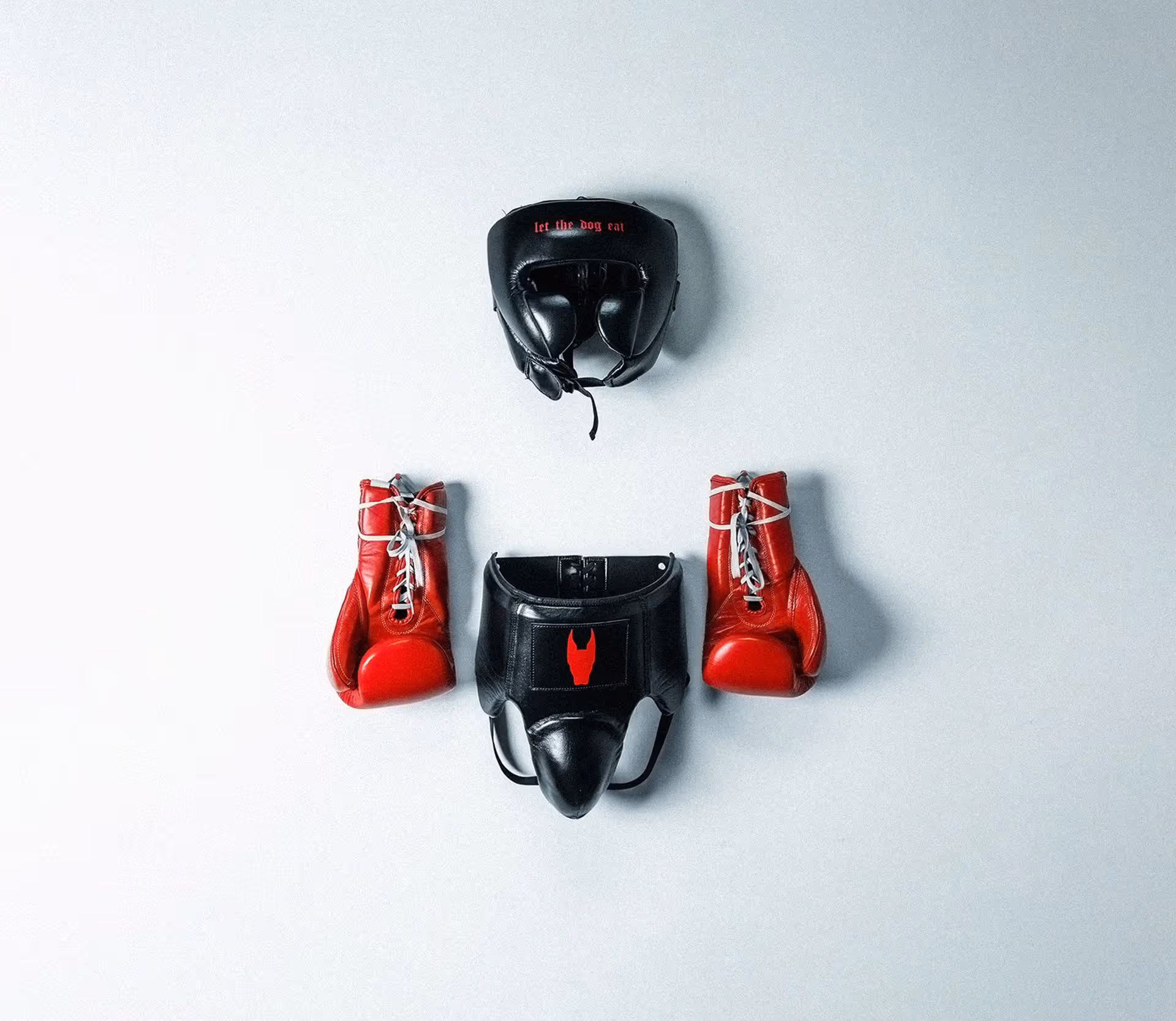
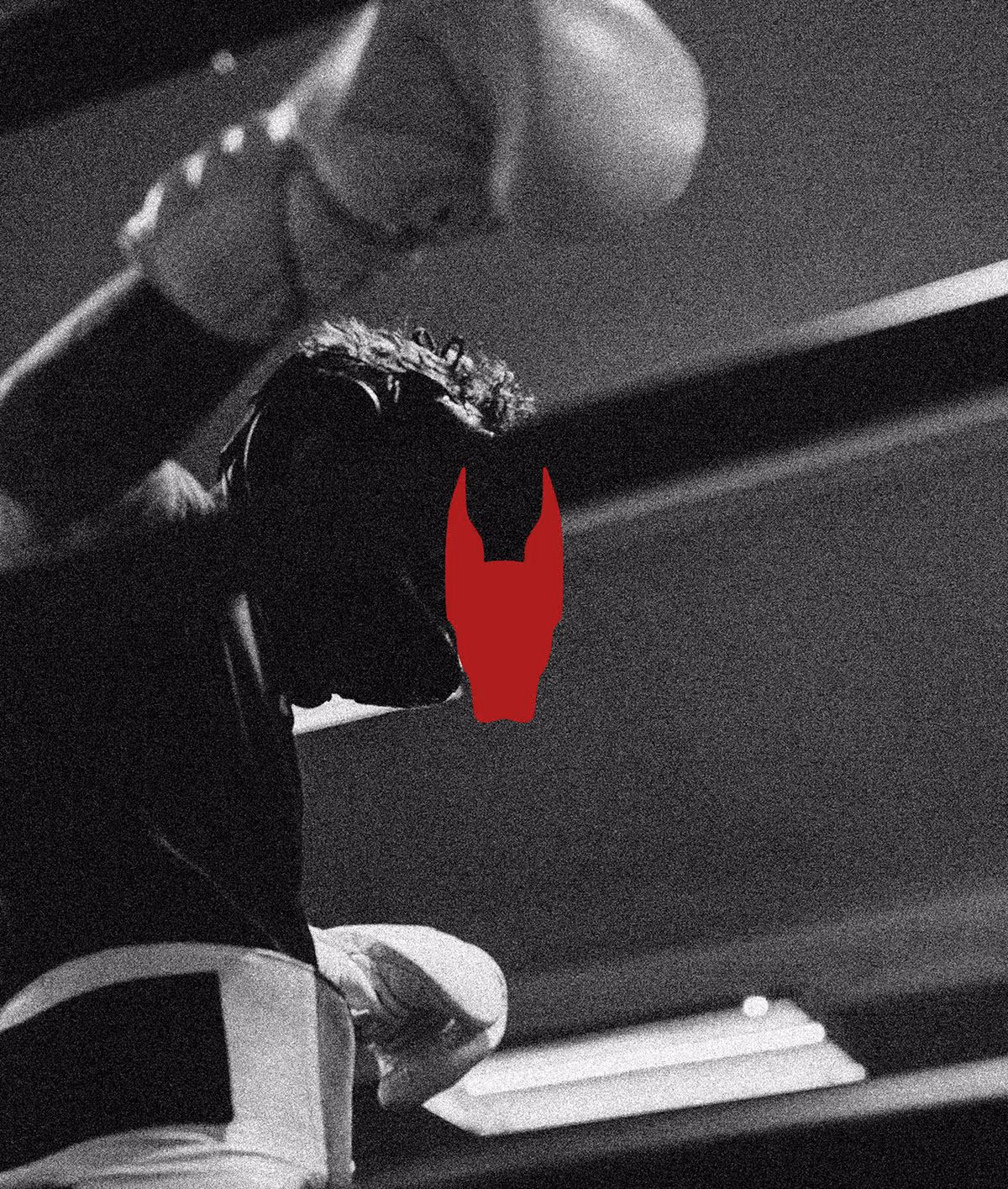
Icons and Colours
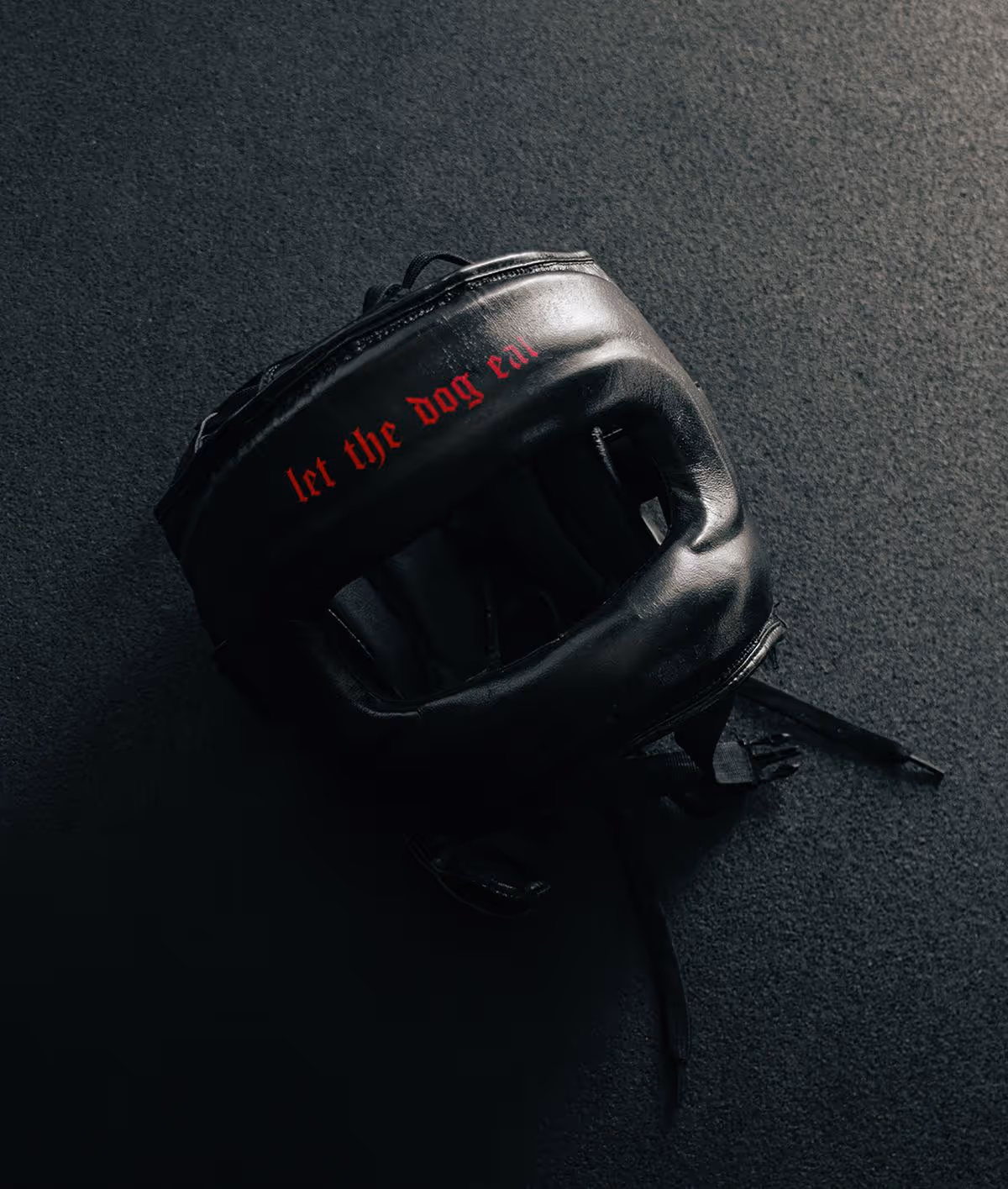
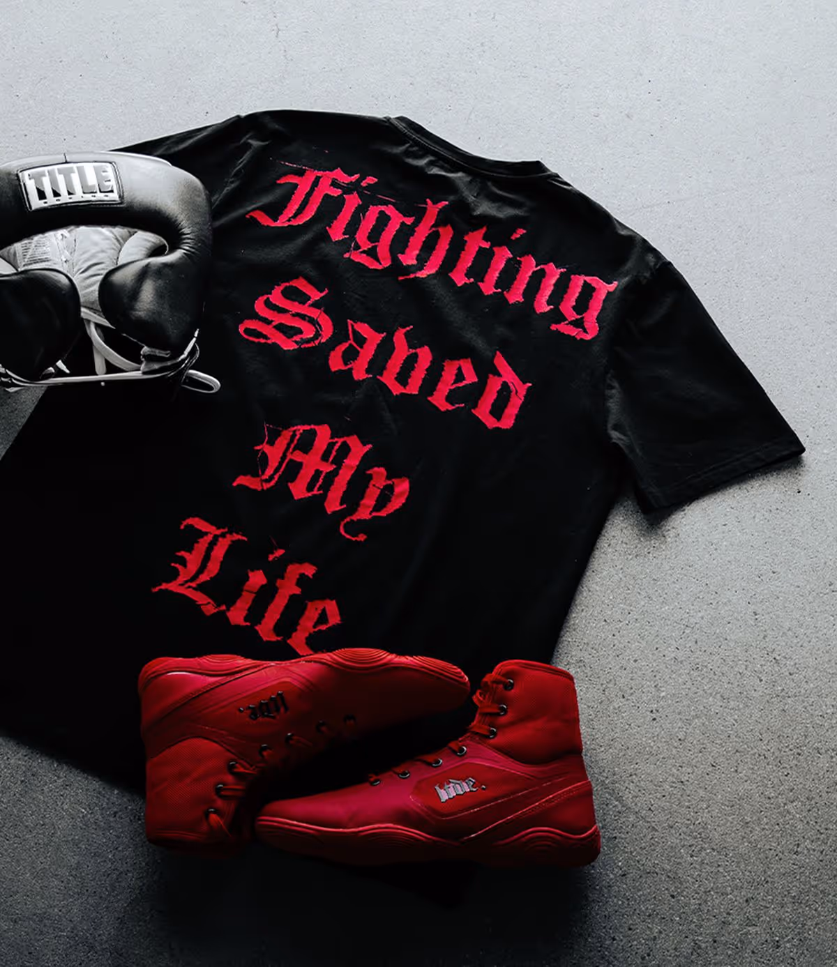
Red was already a key part of LTDE’s identity, intense, raw, and vicious. We didn’t want to lose that hype, so we refined the tone for better legibility and performance across print and digital. The result, a sharper, more considered use of red that keeps the intensity, but with more visibility and versatility.
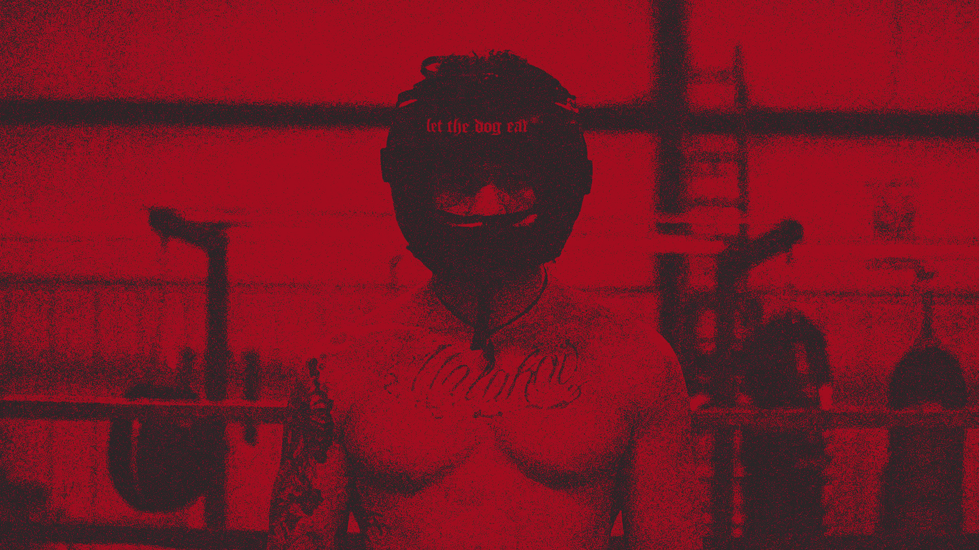
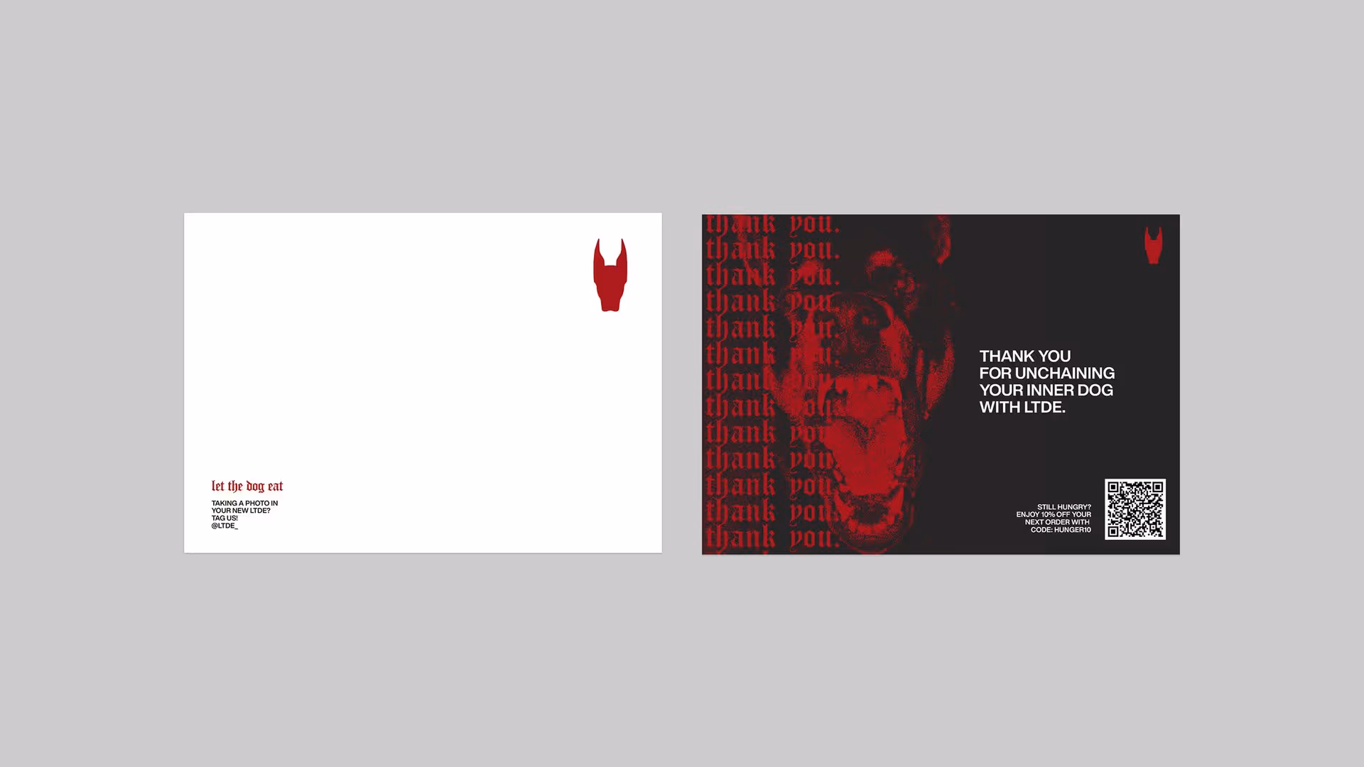
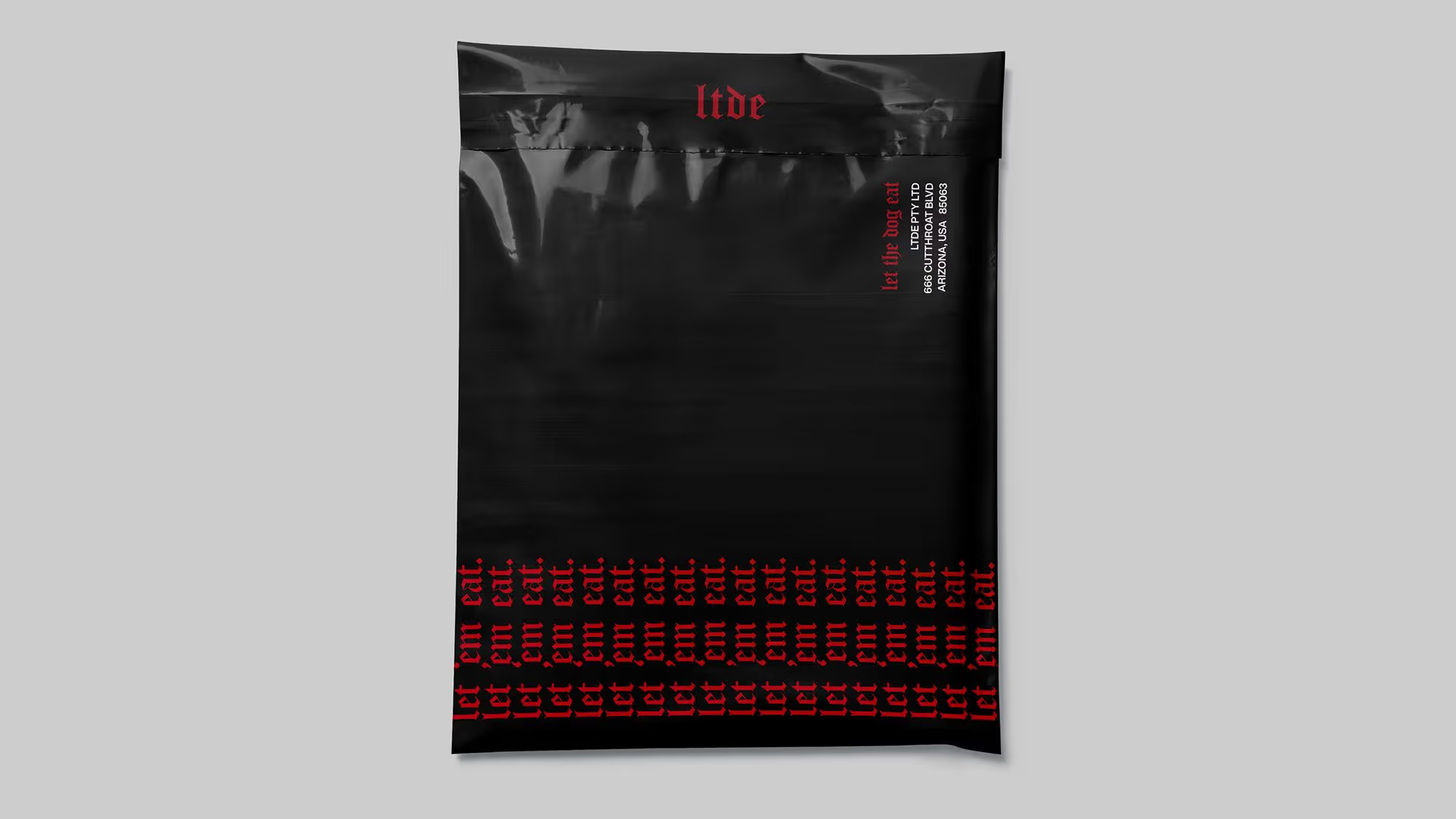
TouchPoints
We kept the touchpoints stripped back and intentional, letting the brand’s tone and visuals do the heavy lifting. By removing anything unnecessary, we gave LTDE’s message more space to hit harder, allowing the brand’s aggression and identity to land with more weight.
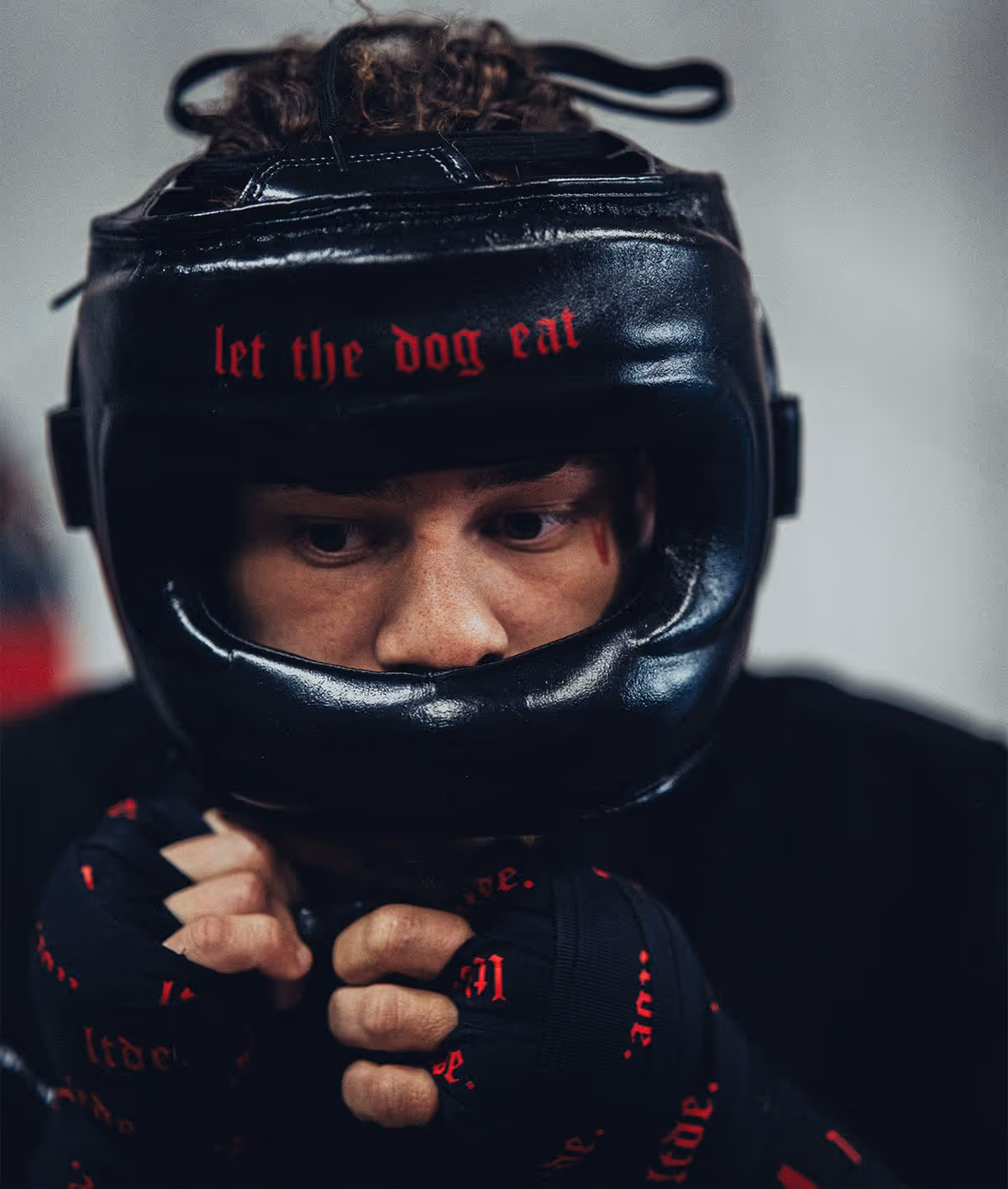


Messaging
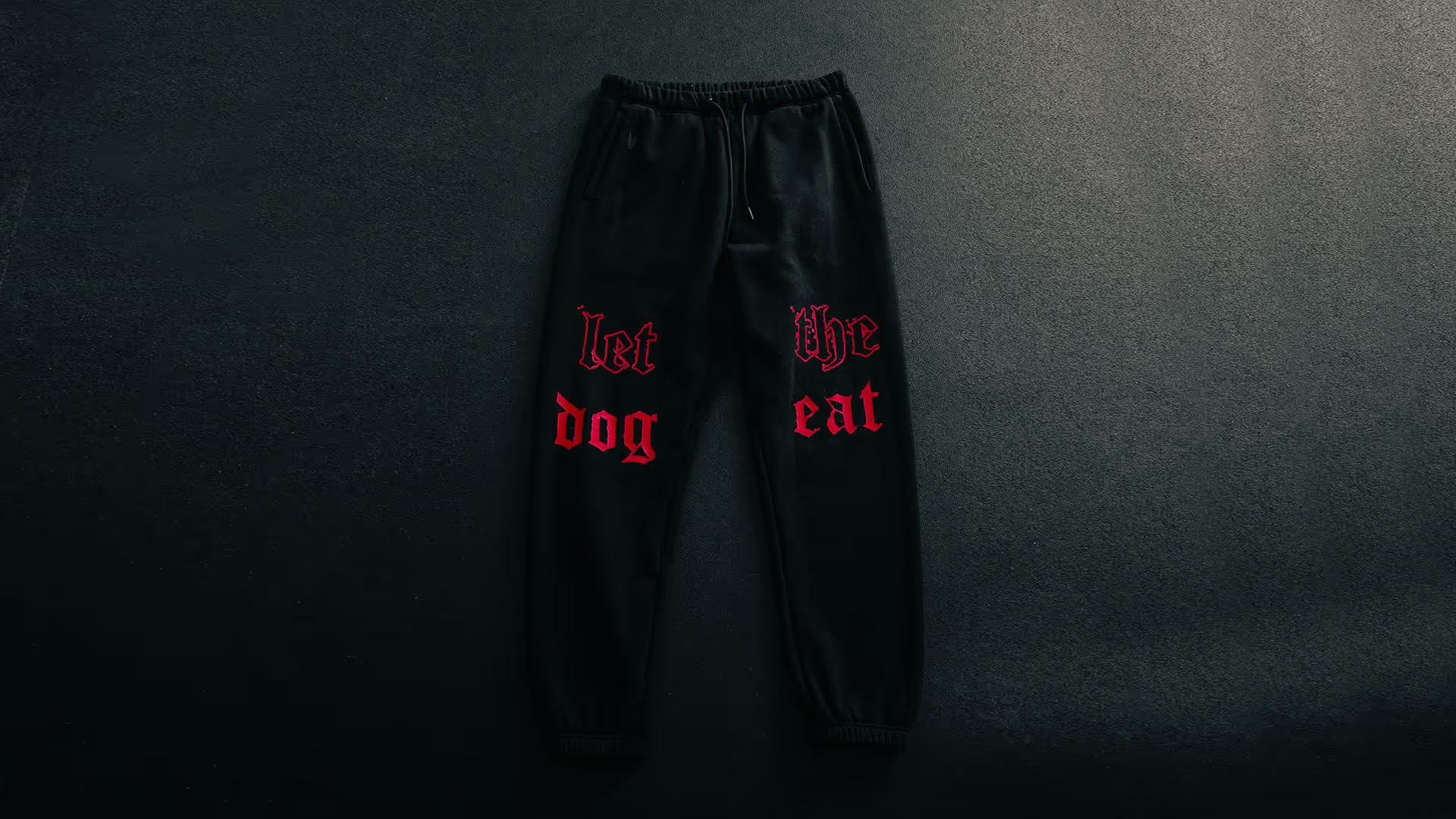
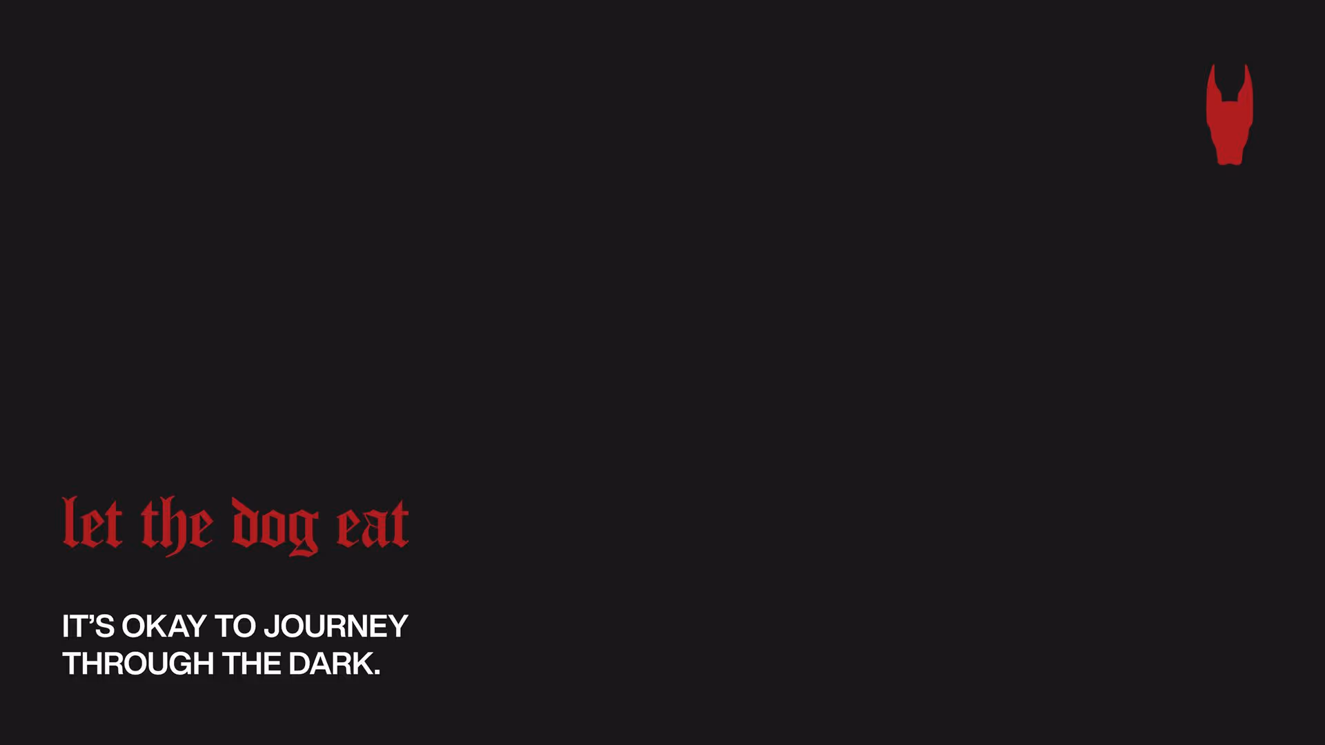
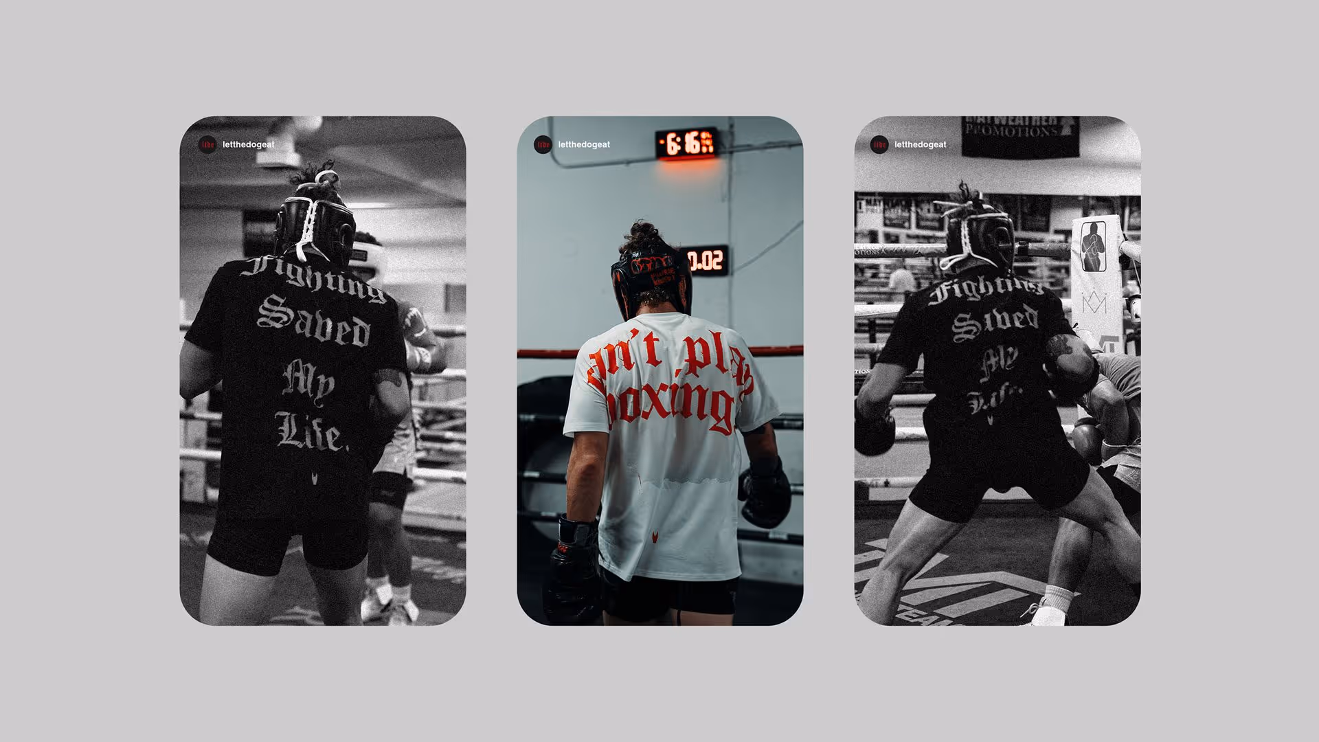
We developed messaging that amplified the brand’s intensity and gave its attitude a voice. Every line was built to speak directly to the LTDE audience; driven, obsessive, and unrelenting. From “Unchain Your Hunger” to “It’s okay to journey through the dark,” we created language that felt more like a mindset than marketing. A mindset the audience could claim as their own.


Drawing from luxury fashion, we used negative space to create a sense of restraint and control, while letting the red logo become the hero. It’s simple, deliberate, and confident, giving the brand edge without overstatement. The packaging feels elevated, but still rooted in LTDE’s raw, gritty DNA.
Result
What started as a raw, personal idea became a fully realised brand identity built in close collaboration with Rivyl. In under three years, LTDE has grown to a community of 117k+, expanded its product range, and established itself as a serious player in the fighting-streetwear space. Proof that when brand strategy and design is clear, creative, and unapologetic, it delivers.