Toast
Toast is a modern finance brokerage on a mission to become the #1 in Australia. Led by Scott Baker, a well-established personal brand in the industry, Toast needed a bold and future-forward identity that would set it apart from traditional financial institutions. With a strong presence on social media and a content-rich strategy, the brand had to be as visually compelling as it was strategic.
The brief
The brief was clear: create a visually immersive brand that captures attention, stands out in a competitive market, and reflects both trust and innovation. The identity needed to be modular, allowing for the seamless integration of sub-brands under the Toast umbrella. Above all, the look and feel had to resonate with an under-45 audience while maintaining credibility within the finance sector.


the Strategy
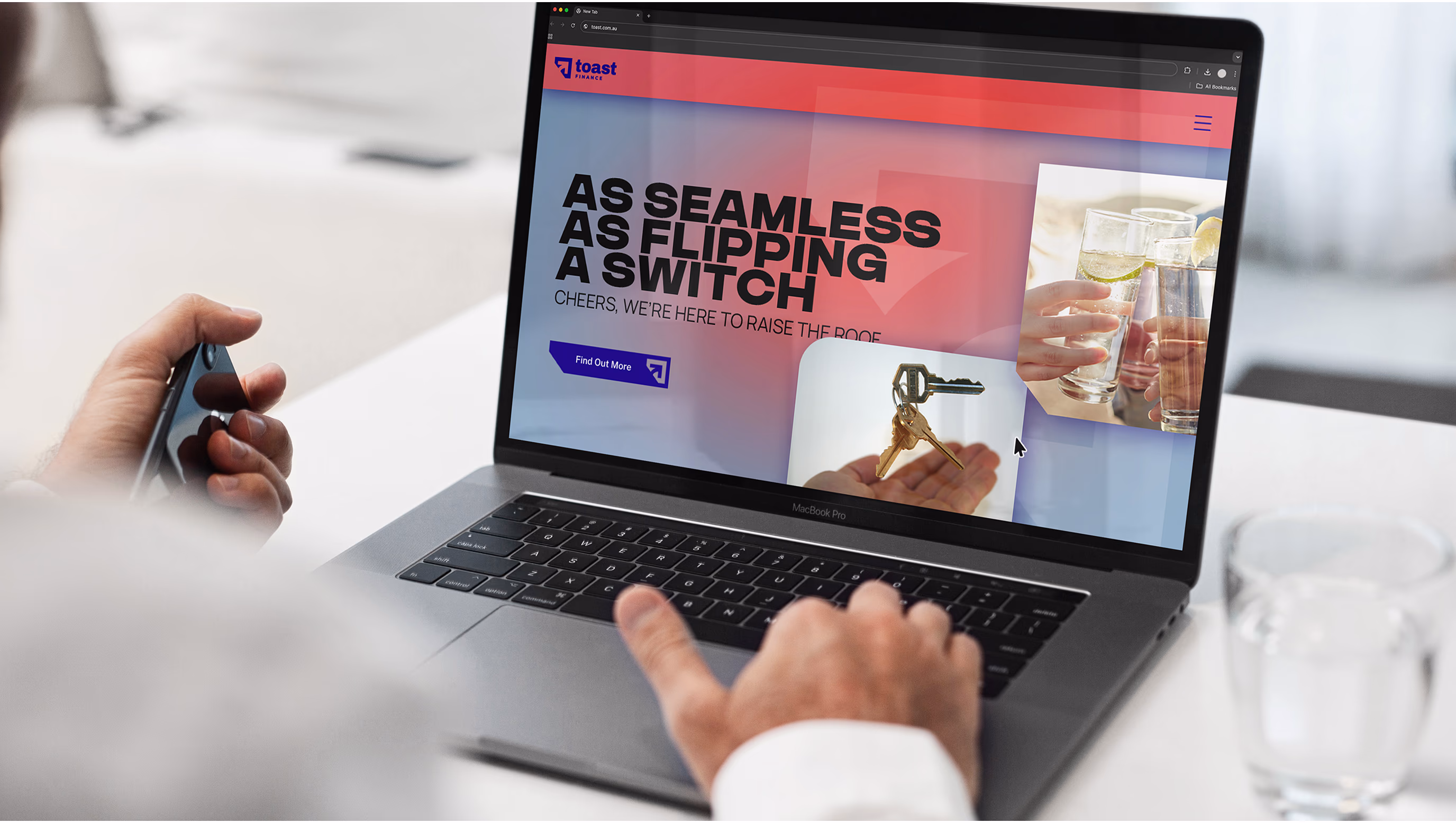
We approached Toast with a strategy focused on disruption and adaptability. The identity had to break away from the clichés of finance branding, no bland colours or generic trust symbols. We designed a flexible brand system that could grow with the business, support multiple content formats, and stay visually magnetic across digital platforms, especially social media.

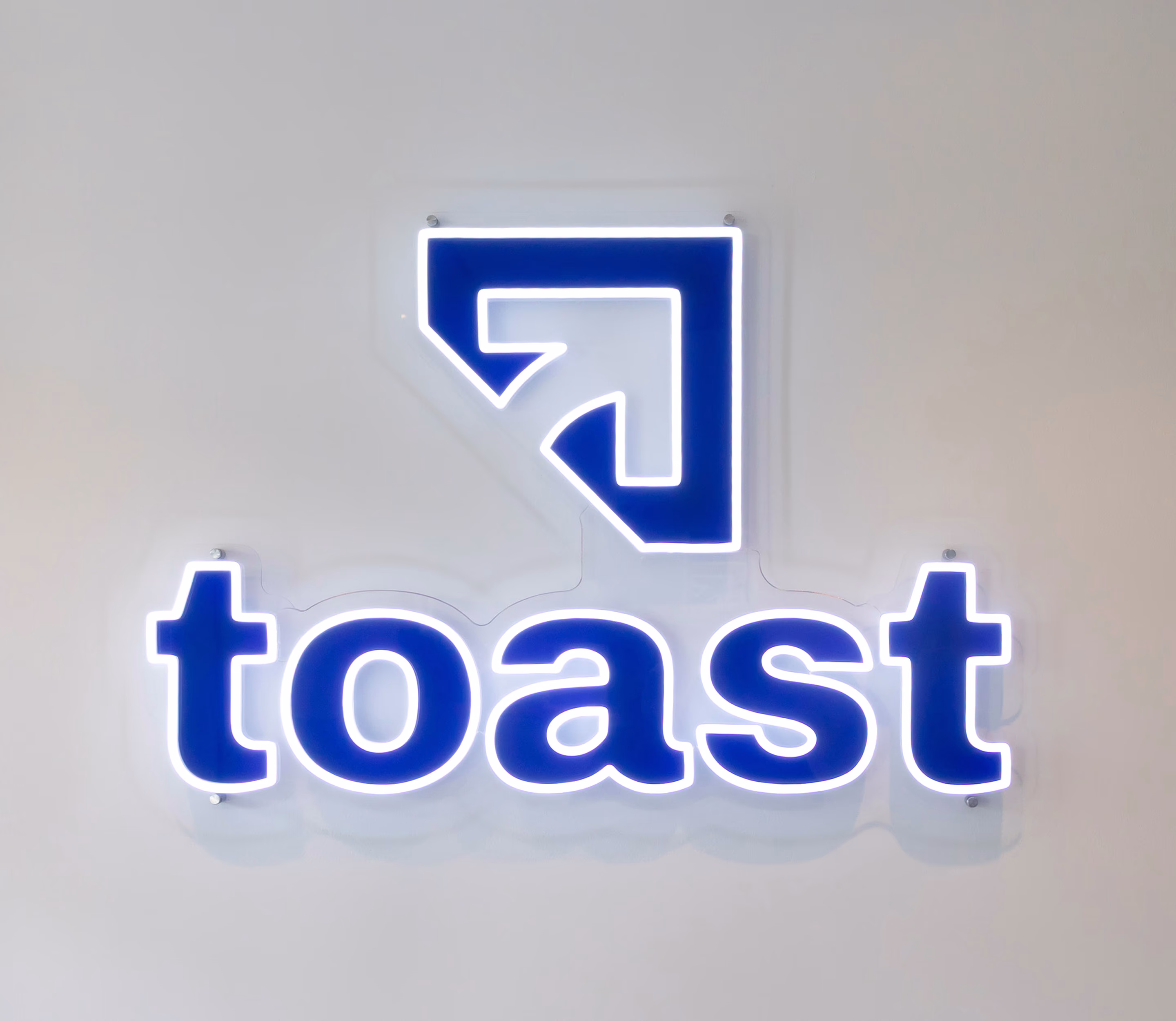
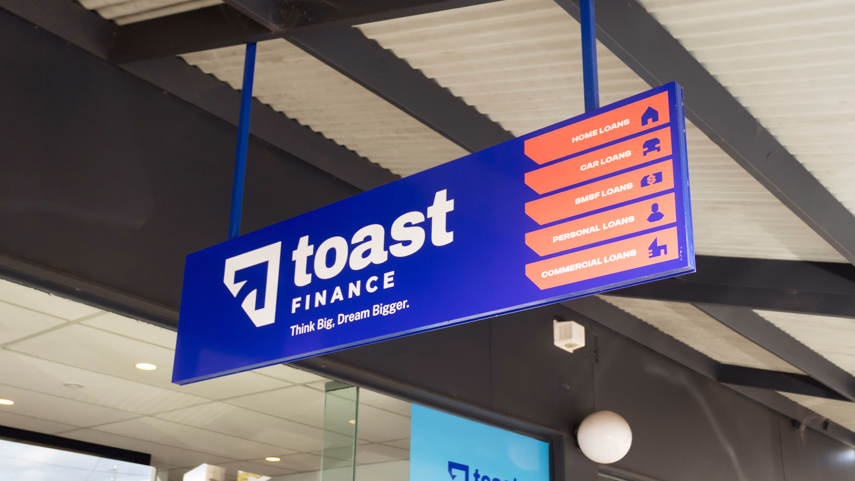
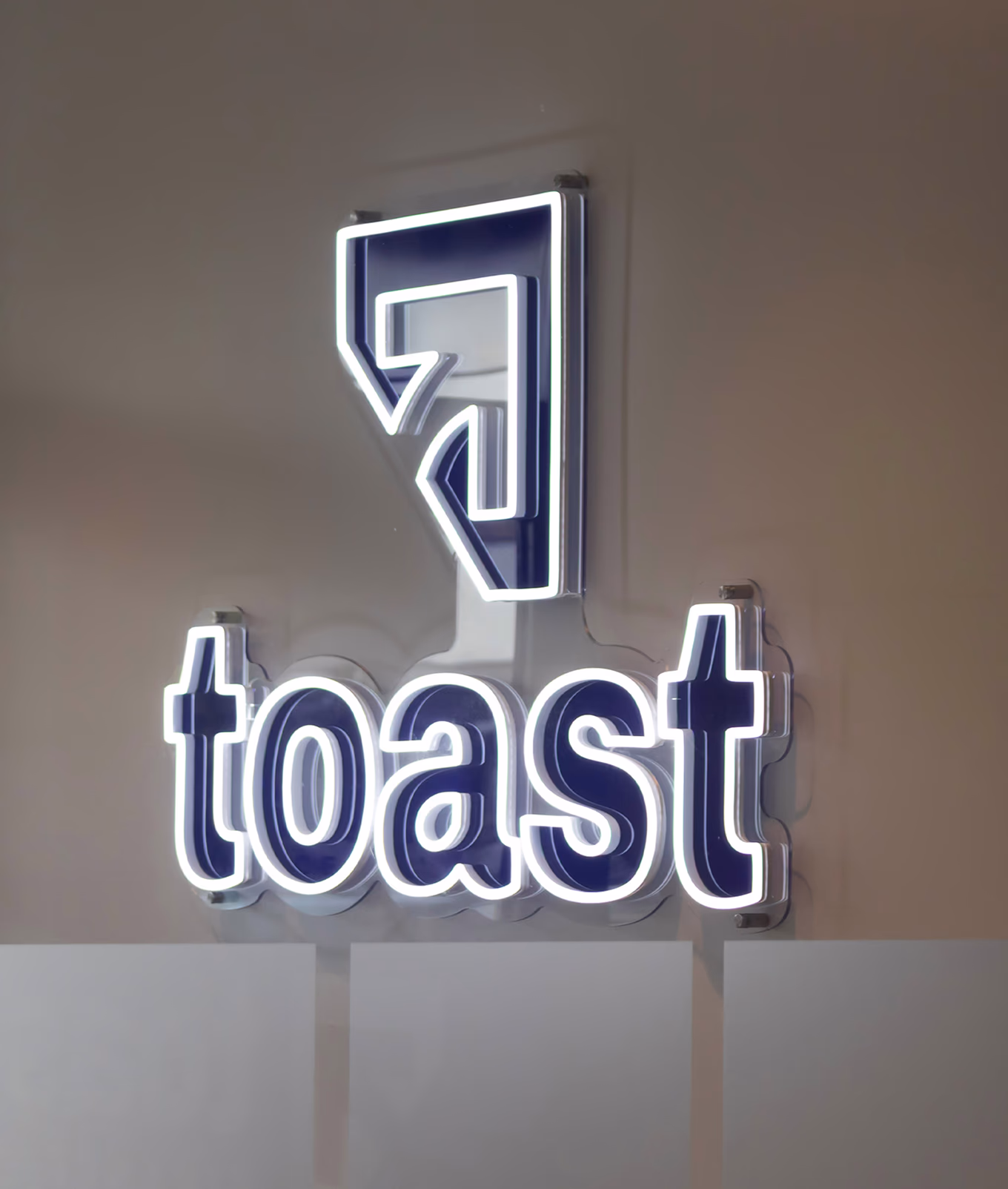
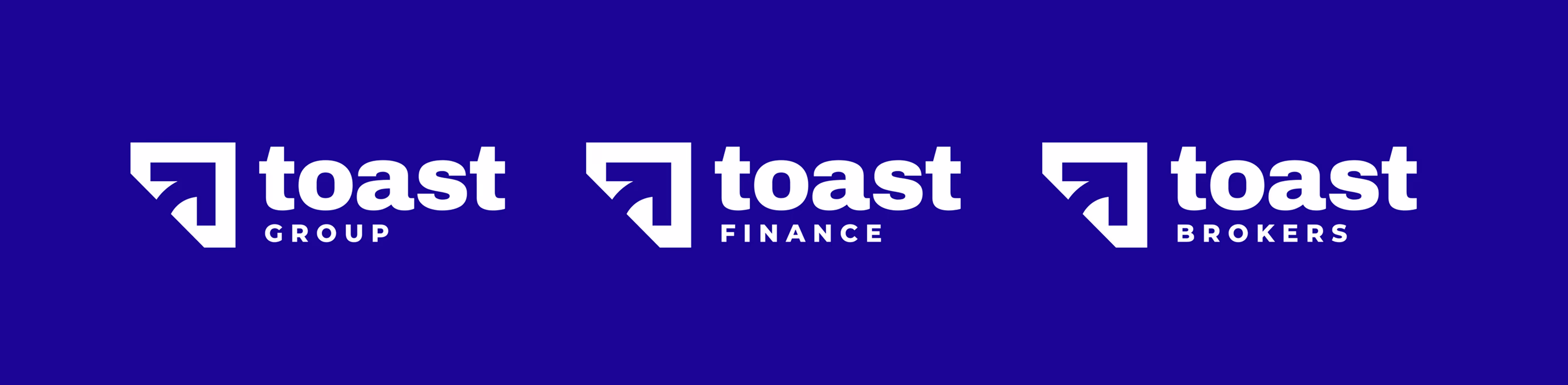
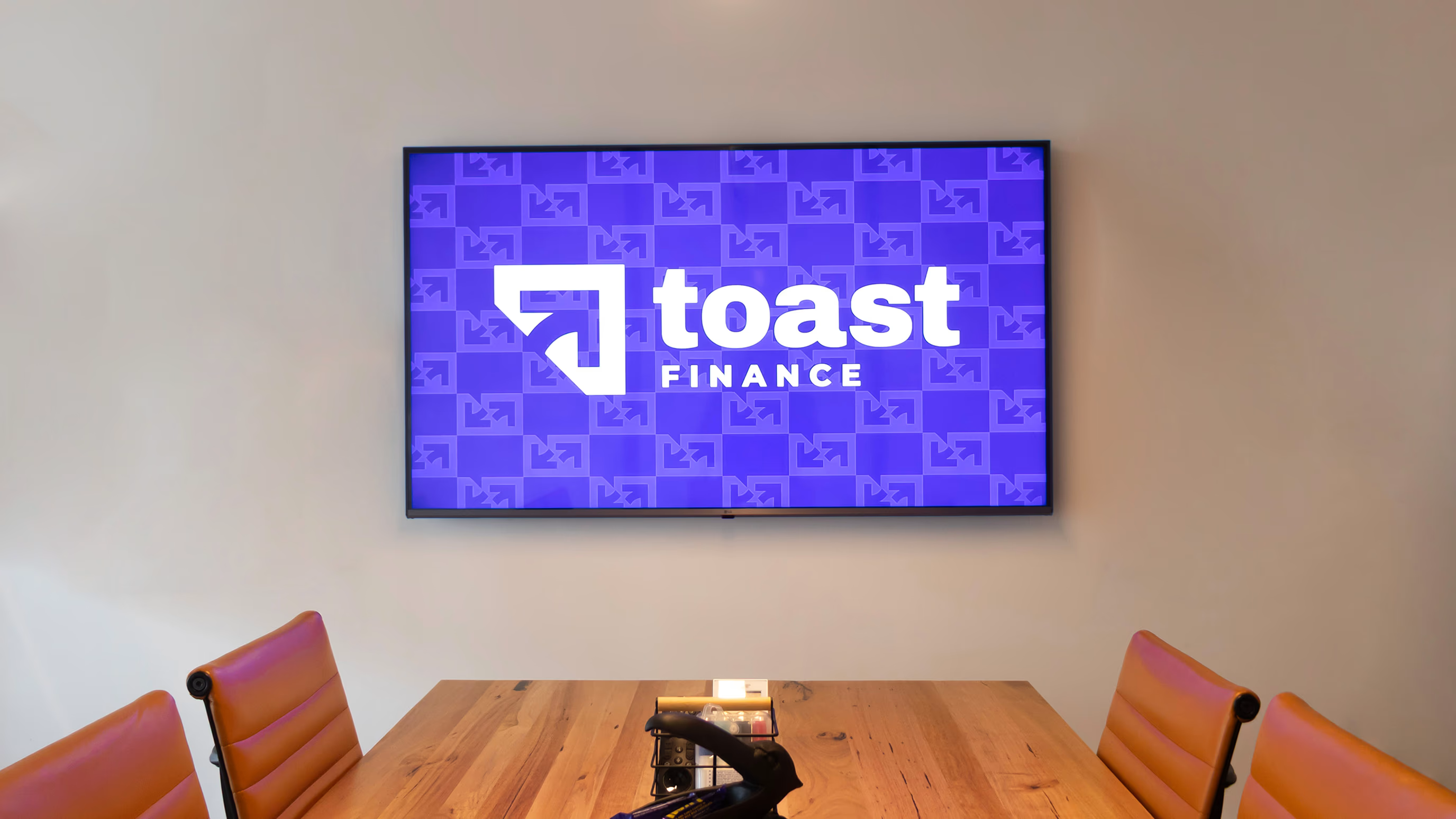
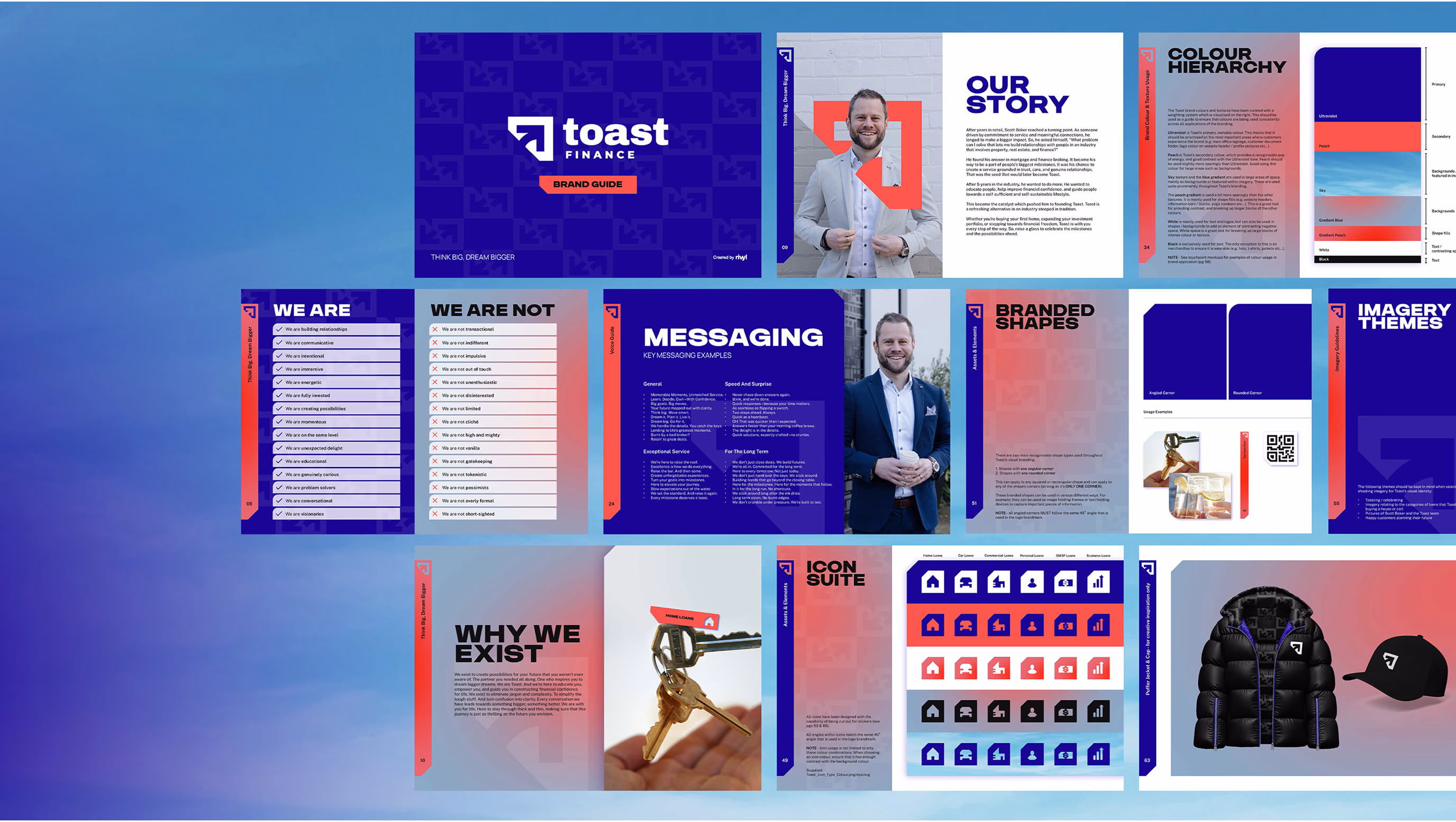
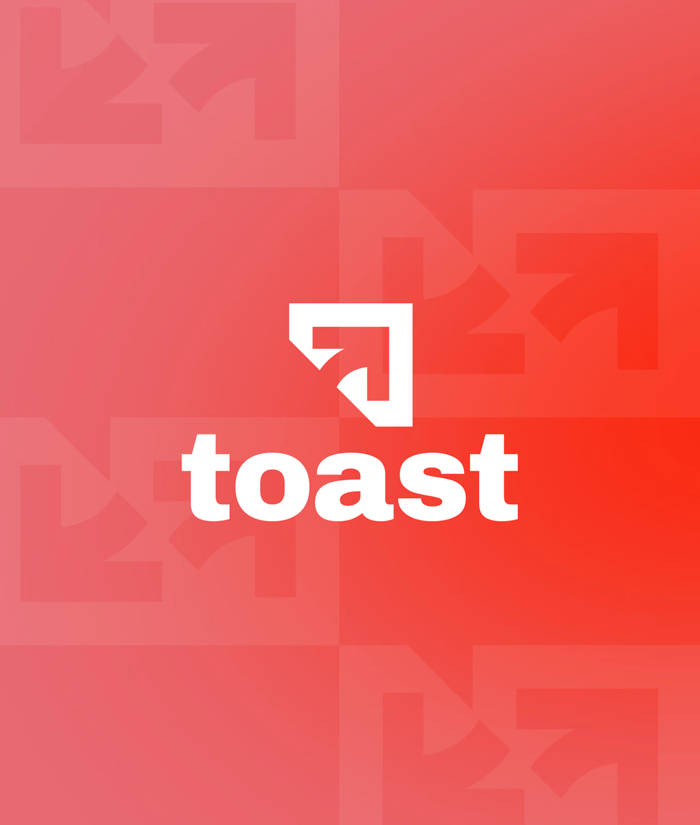
tHE LOGO
The Toast logo is a modular system designed to evolve with the brand. It features a core identity with interchangeable by-lines that reflect various sub-sectors within the business. The design maintains cohesion while allowing for flexibility, a visual toolkit that’s inherently Toast.


THE NAME
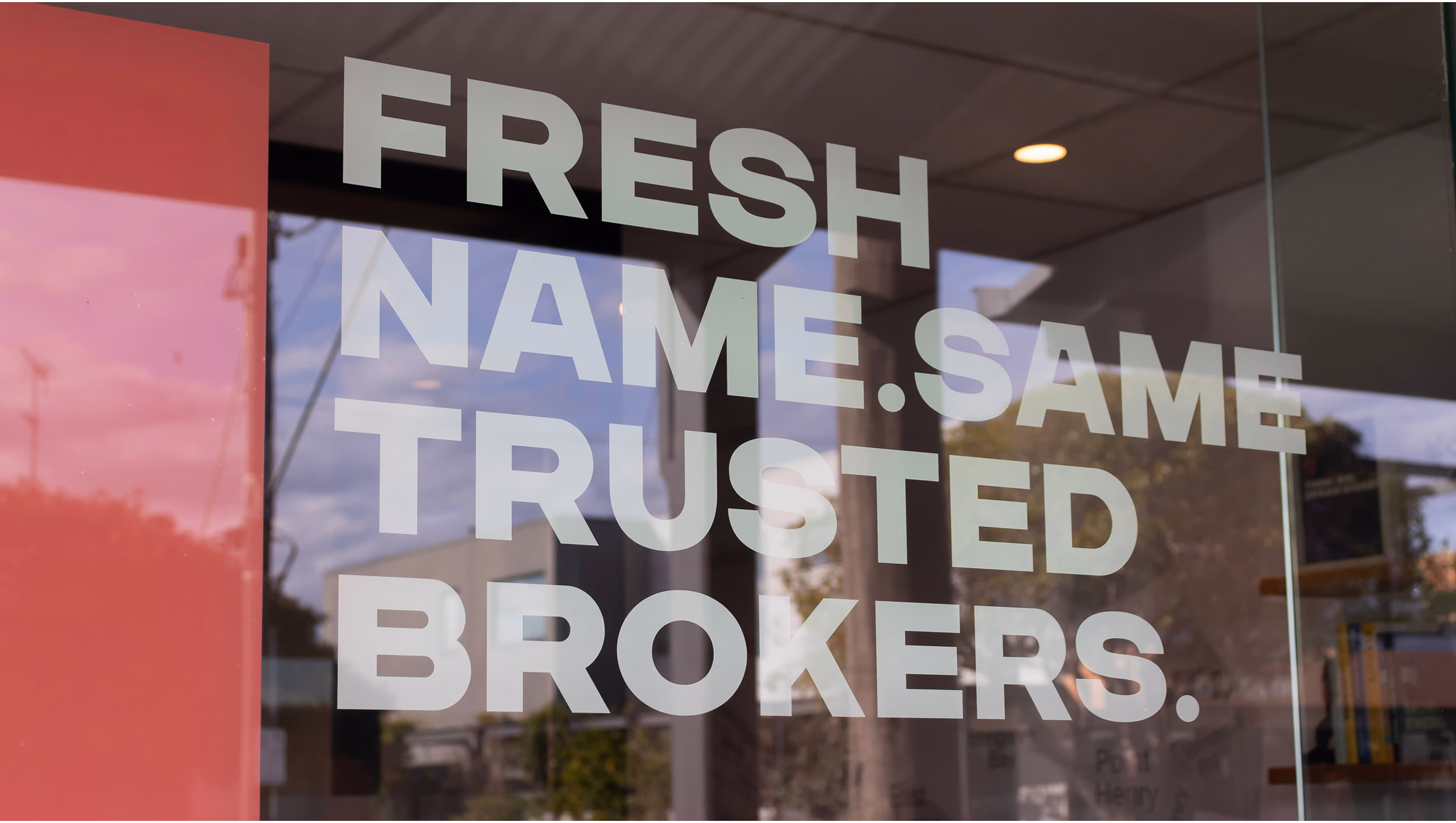
Designed to stand out in their industry, as a finance and mortgage broker start up, Toast needed a name with cut through, uniqueness, that sent a strong signal of their appetite to do things differently. Rivyl went with an abstract name. One that intrigues but is still approachable, grabs attention and feels fresh, and sounds buzzy yet not too literal. Tapping into the idea of celebration, toasting success, gathering in honour of their client’s milestones, achieving their goals and cheering on their wins, Toast was a team favourite. The name has been received with open arms by their growing community and helped Toast put their name on the map in a competitive market.
colours and icons
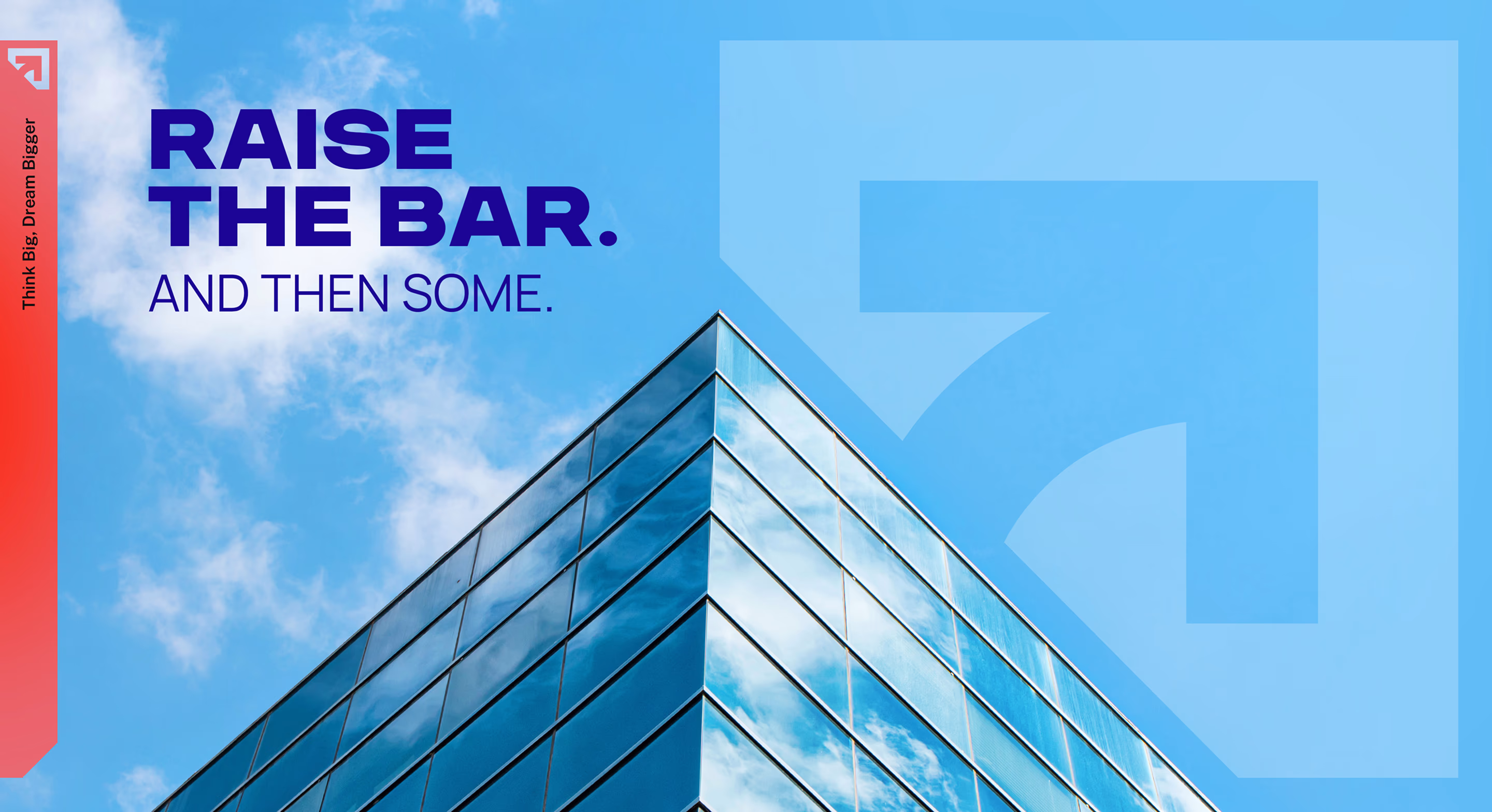
We crafted a vibrant, optimistic colour palette that pulses with youthful energy. The colours were intentionally chosen to feel fresh and positive, standing in sharp contrast to the muted tones of traditional finance.


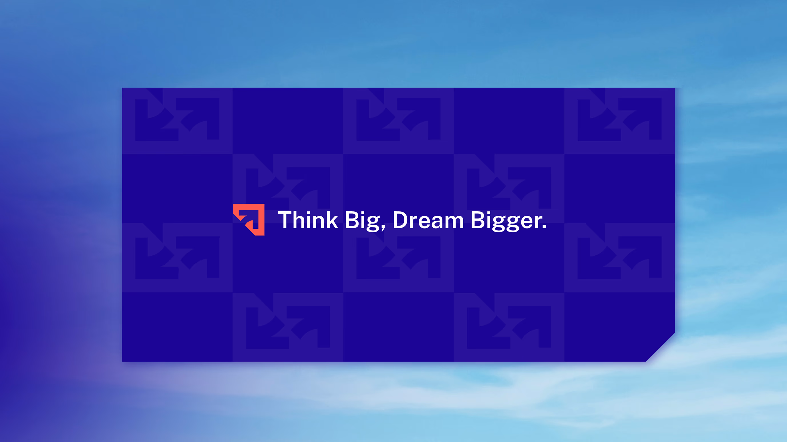
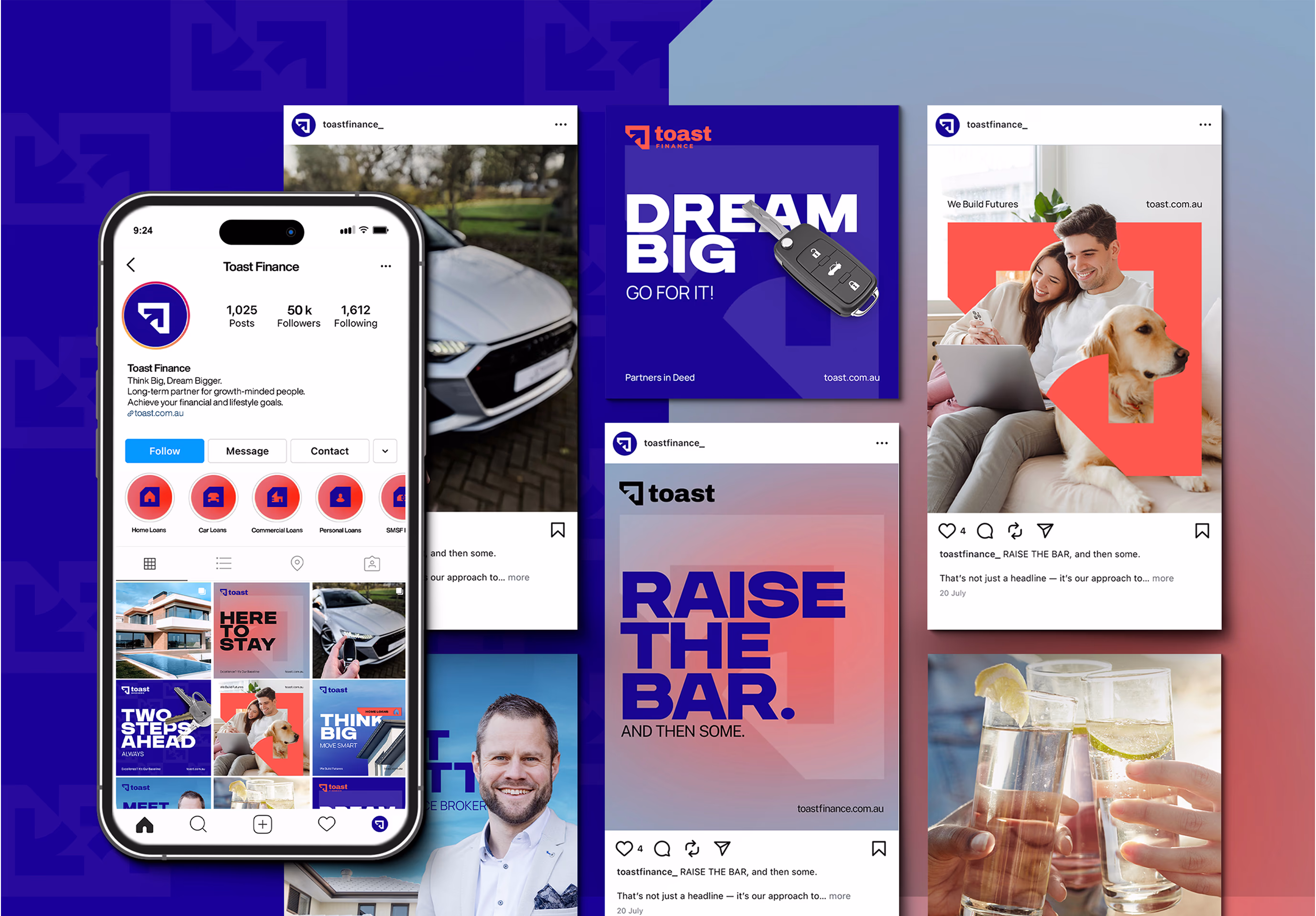
Touchpoints and Messaging
Rivyl crafted Toast’s messaging to be sharp, relatable, and human, echoing the personality of founder Scott Baker. We developed a brand voice that feels warm and confident across all digital platforms, avoiding corporate jargon in favour of real, clear communication. Visual energy is enhanced through immersive design elements, strategic accent use, and messaging that builds recognition.


TONE OF VOICE
By humanising finance and speaking in a tone that resonates with an under-45 audience, the messaging directly supports Toast’s goal of becoming Australia’s most recognised brokerage brand. It positions the business as approachable yet expert, helping to break down the barriers and jargon typically associated with finance.
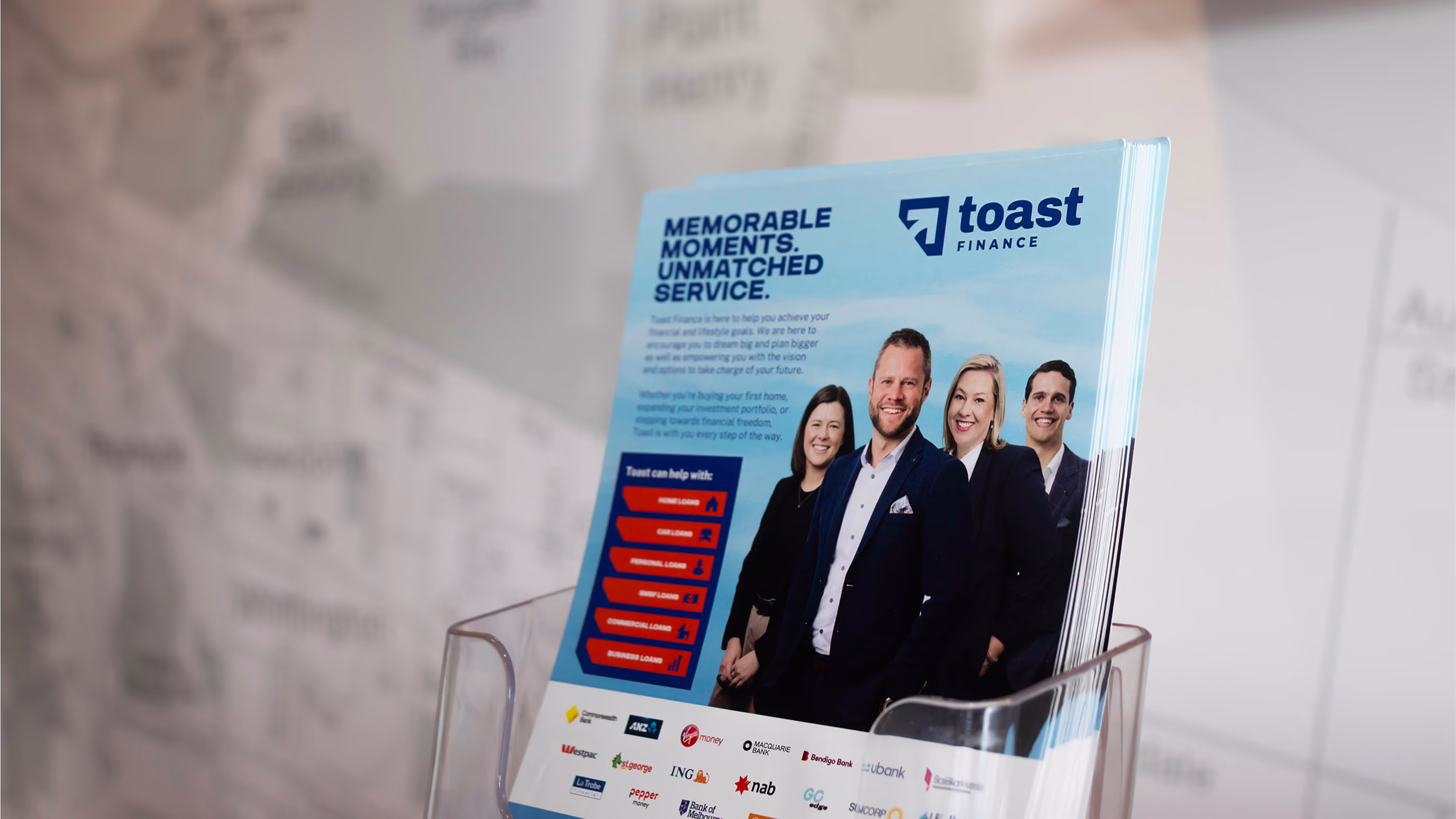
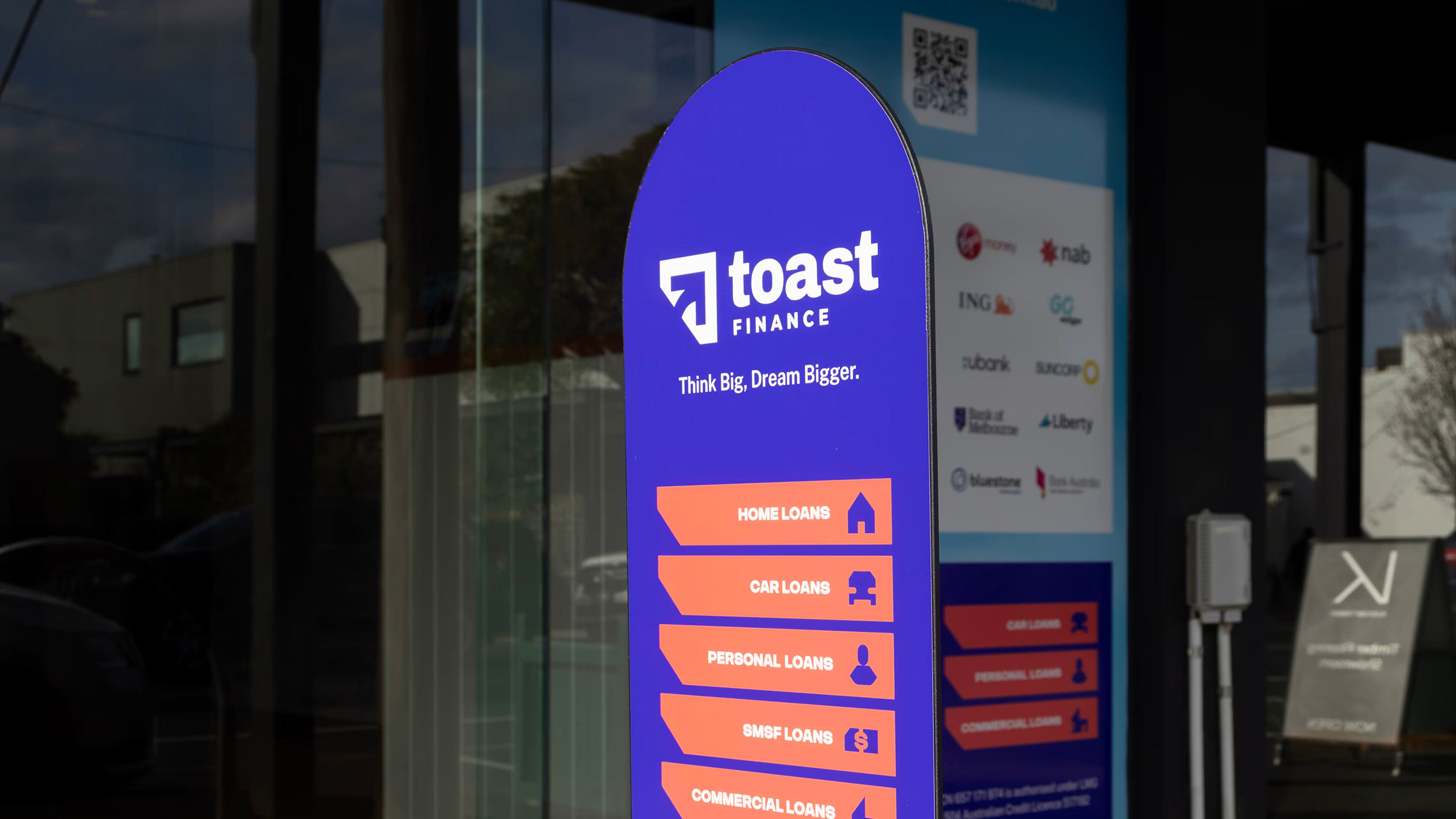
collateral
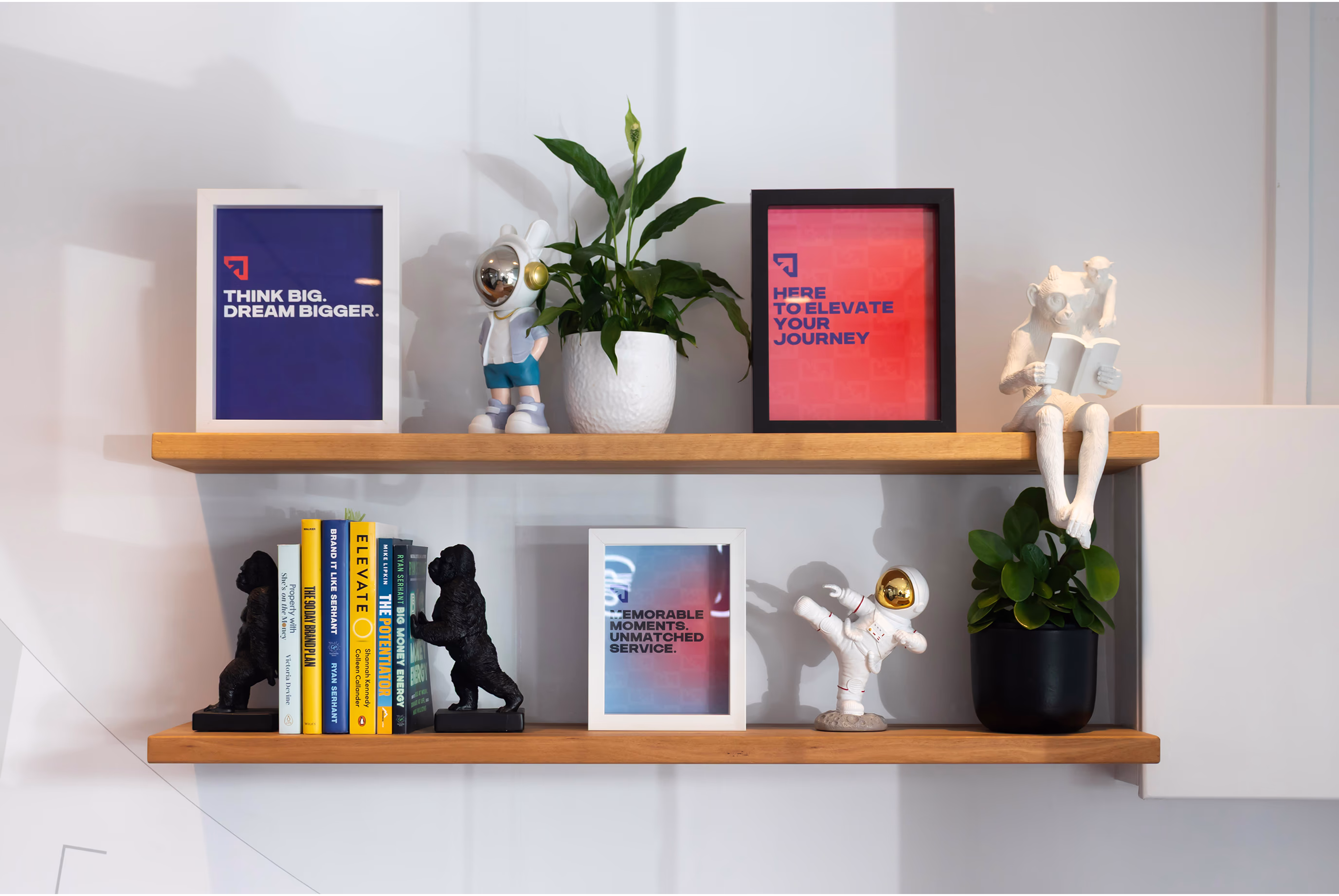
Toast’s collateral, from onboarding kits to merch, was designed to surprise and delight. We used bold visuals and messaging that reflect the brand’s energetic personality, while ensuring every physical touchpoint reinforces trust and professionalism. Physical materials are clean and professional, featuring the core blue palette with accent pops used for headline or emphasis. This helps maintain visual consistency with digital channels, while adding just enough personality to feel inviting.

Results
Toast launched with strong traction, immediately standing apart in the brokerage market. The bold visuals and modular identity supported rapid content production and resonated with a younger demographic. The brand quickly gained visibility on social media and strengthened its position as a leader in modern finance.