Nutrition Warehouse
Nutrition Warehouse came in with strong brand recognition, but the look and feel needed an update. They partnered with Rivyl to modernise their identity, building on what their customers already knew and loved while future-proofing the brand for continued growth and relevance.
About
Nutrition Warehouse is one of Australia’s leading sports supplement retailers, built on straight-up results, good chat, and a deep connection to the fitness community. Whether chasing gains or just in need of honest advice, their are always ready with tips, stories, and a bit of banter. It’s more than a store, it’s a go-to hub for anyone serious about their fitness.
Brief
They wanted a bold, standout identity that resonated with the fitness and health enthusiast, and merch that people would actually want to wear. The design needed to be fresh yet faithful, and scalable across multiple platforms including marketing, retail, and expo environments.
Strategy
We centred the strategy around building cohesion, clarity, and wearable appeal. By unifying every element, logo, mascot, colour, icons, and messaging, we created a brand identity that felt energetic, relatable, and ready for expansion. Every touchpoint needed to work as part of a bigger, flexible ecosystem.
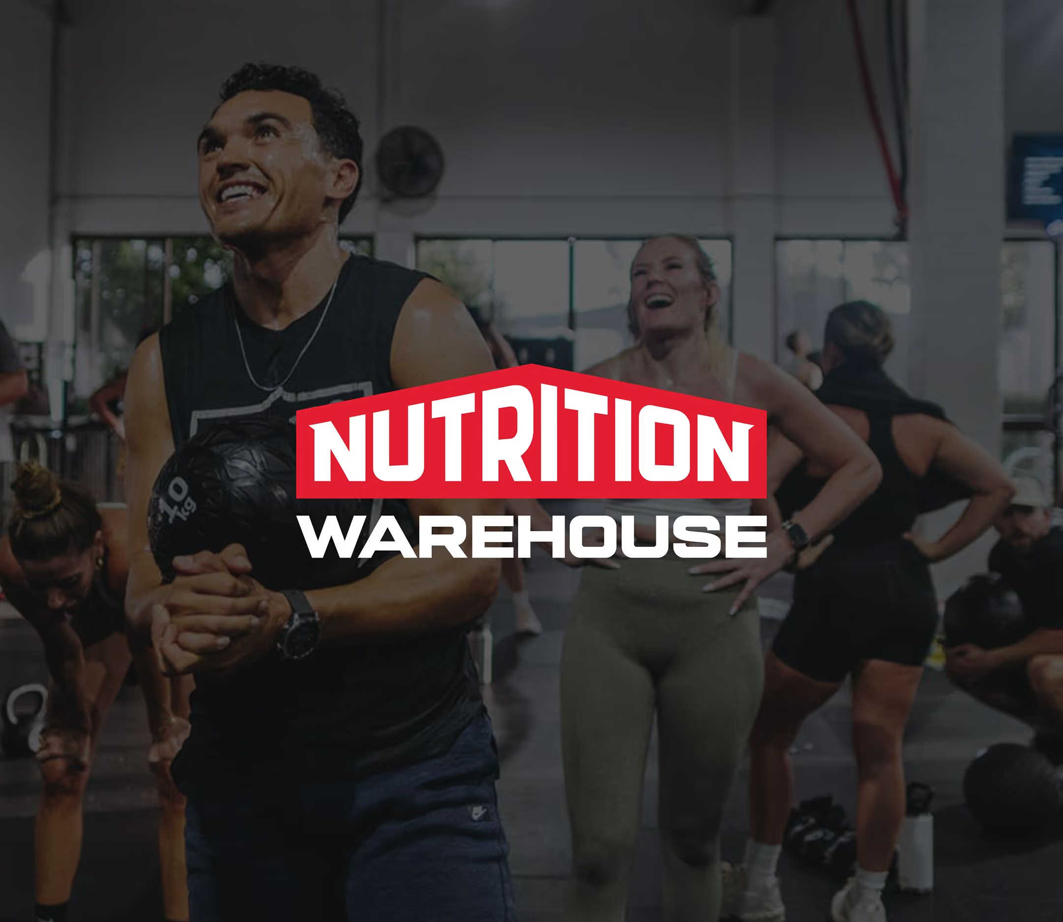
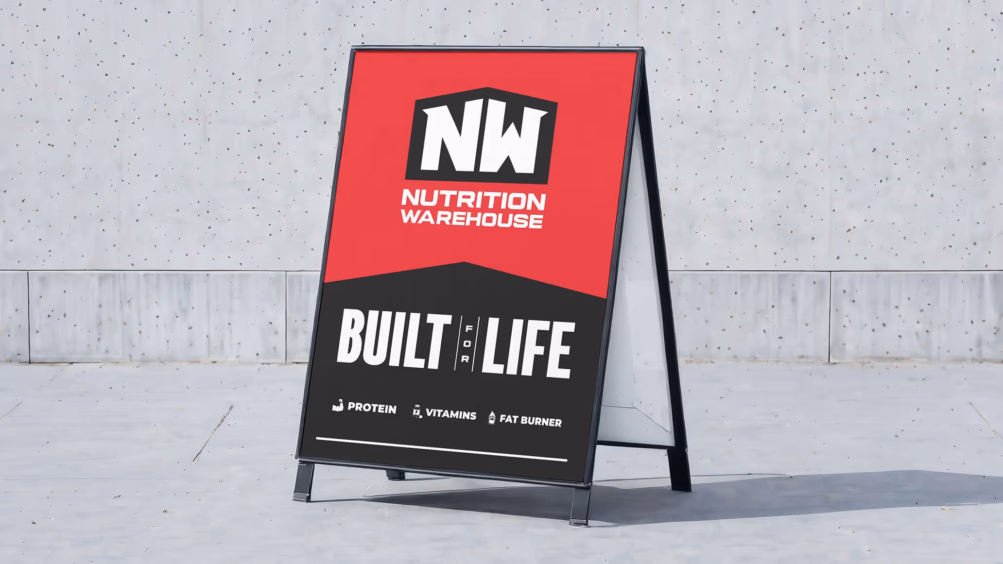
Logo
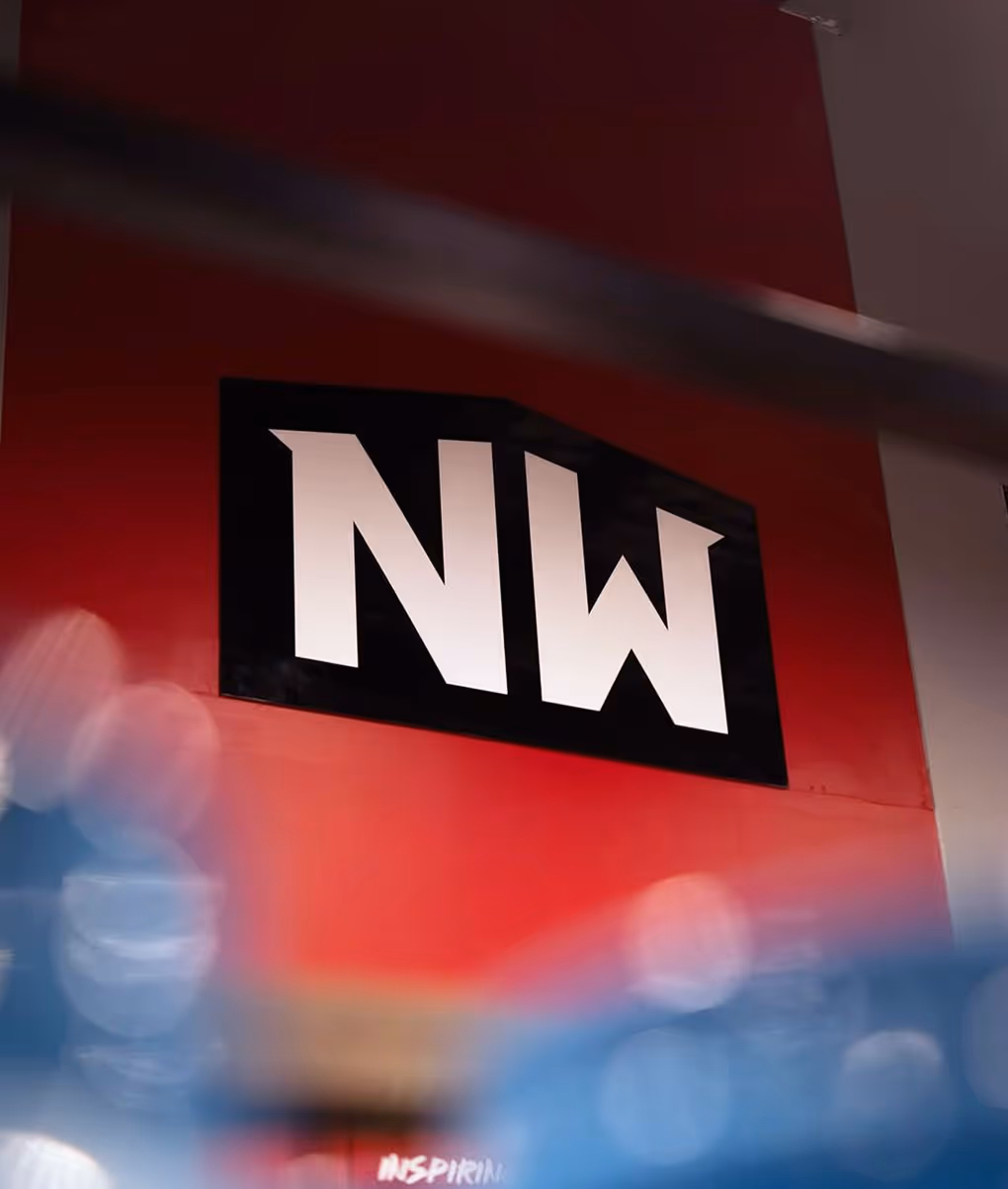
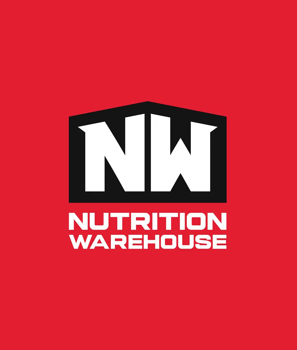
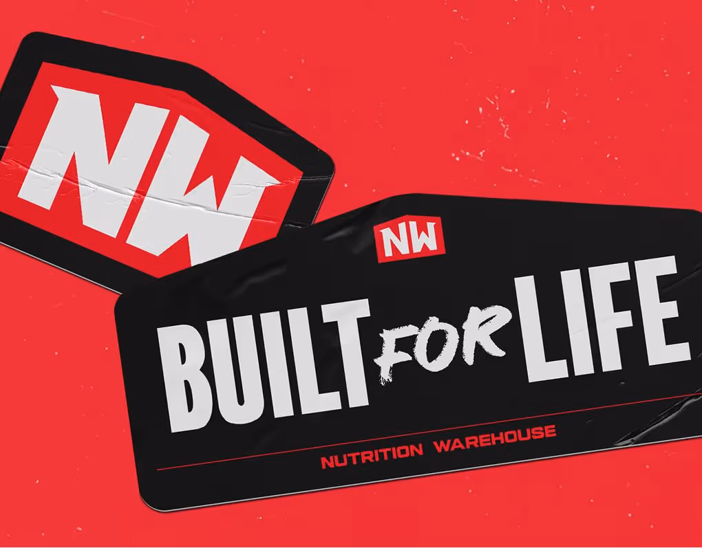
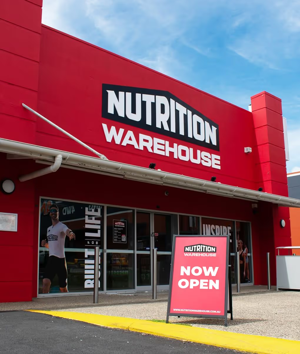
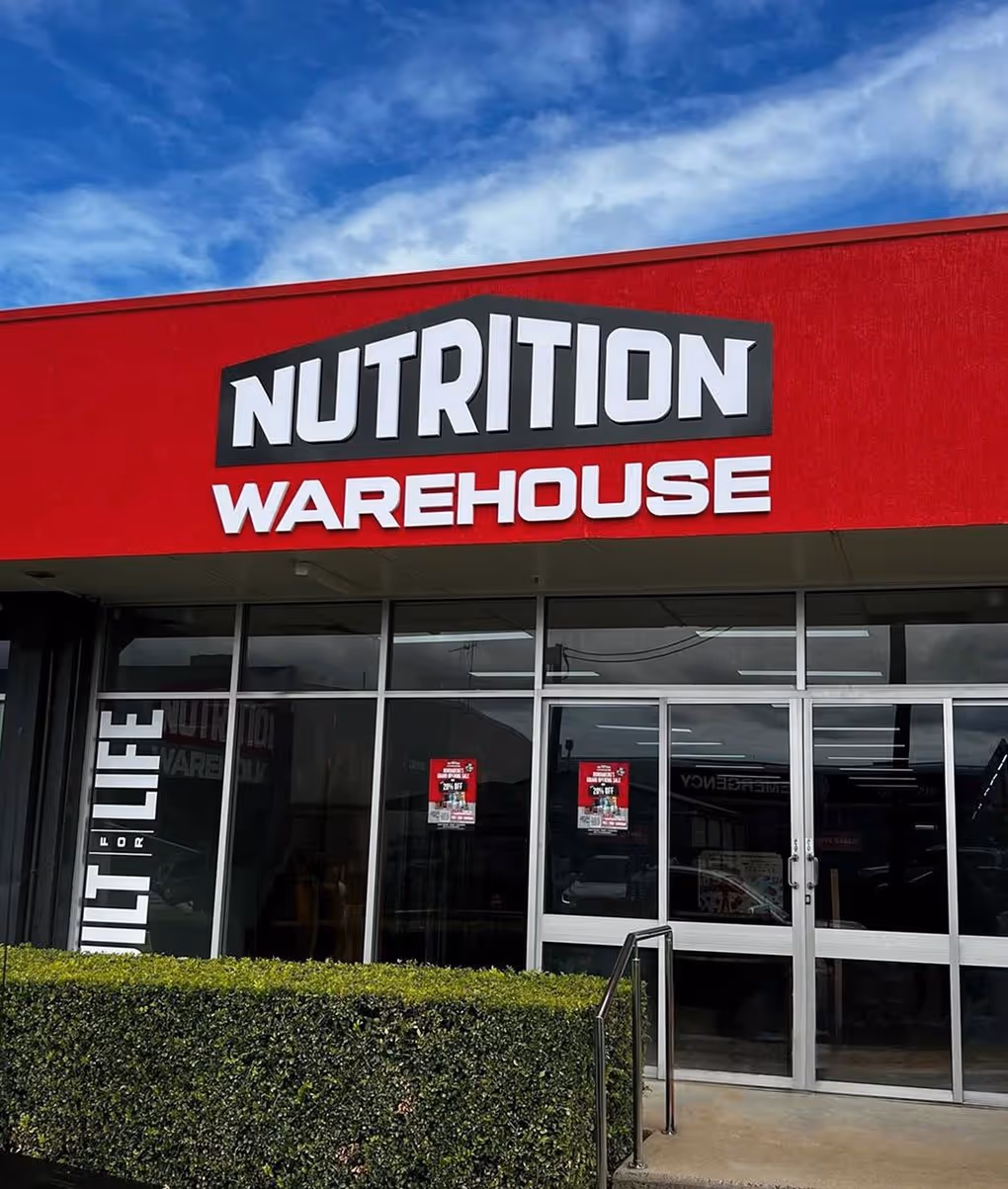
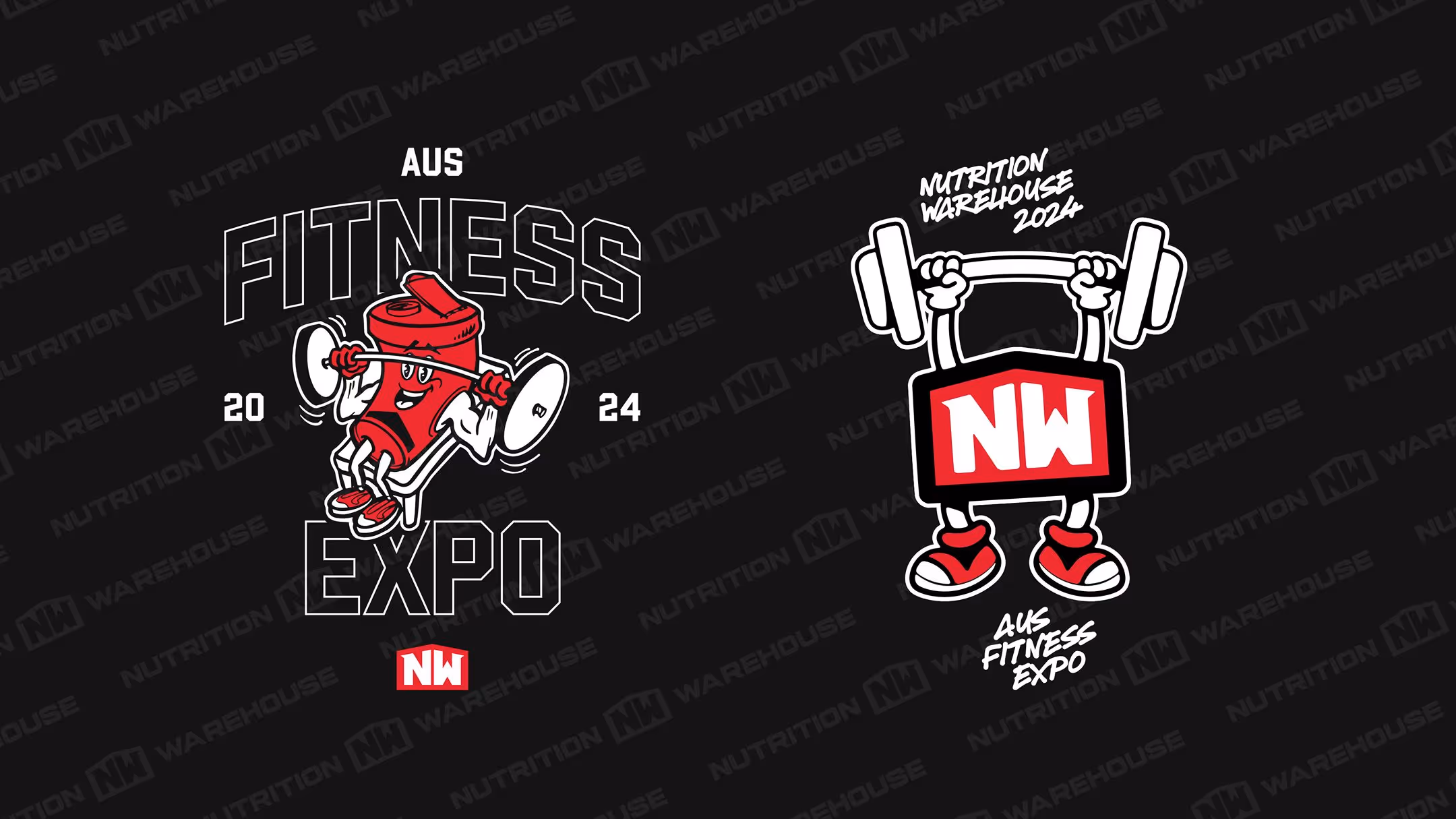
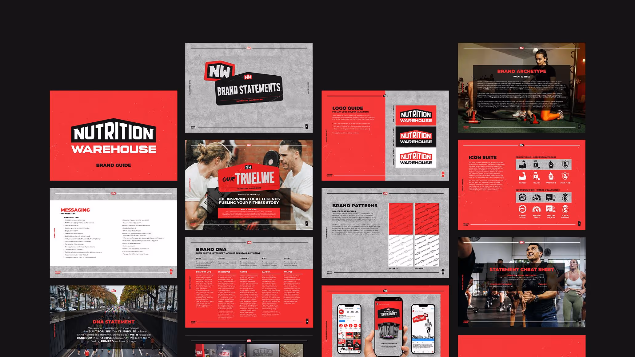
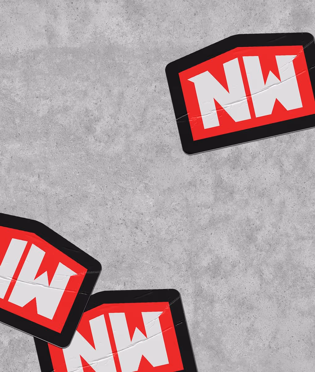
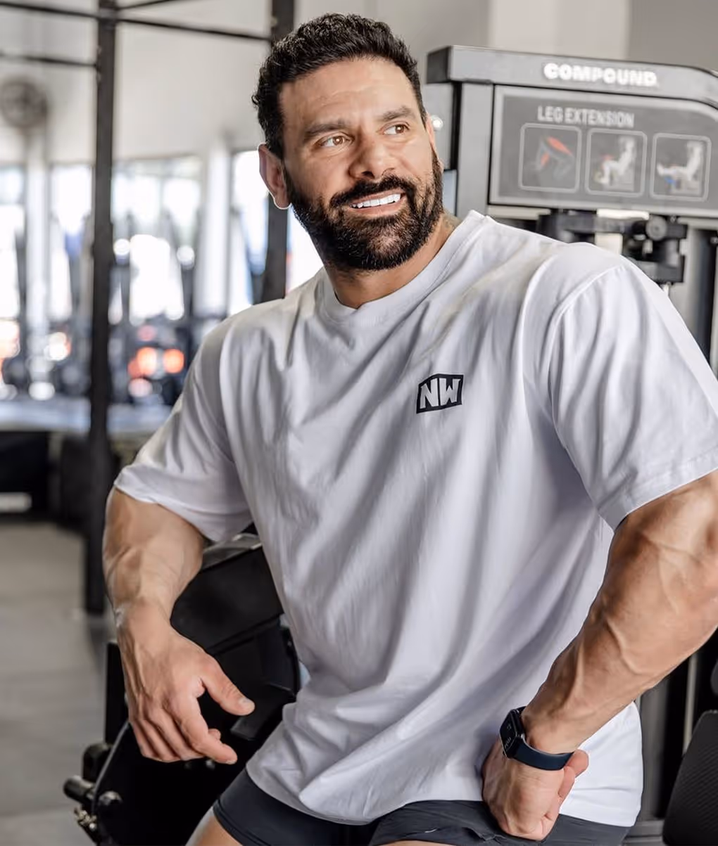
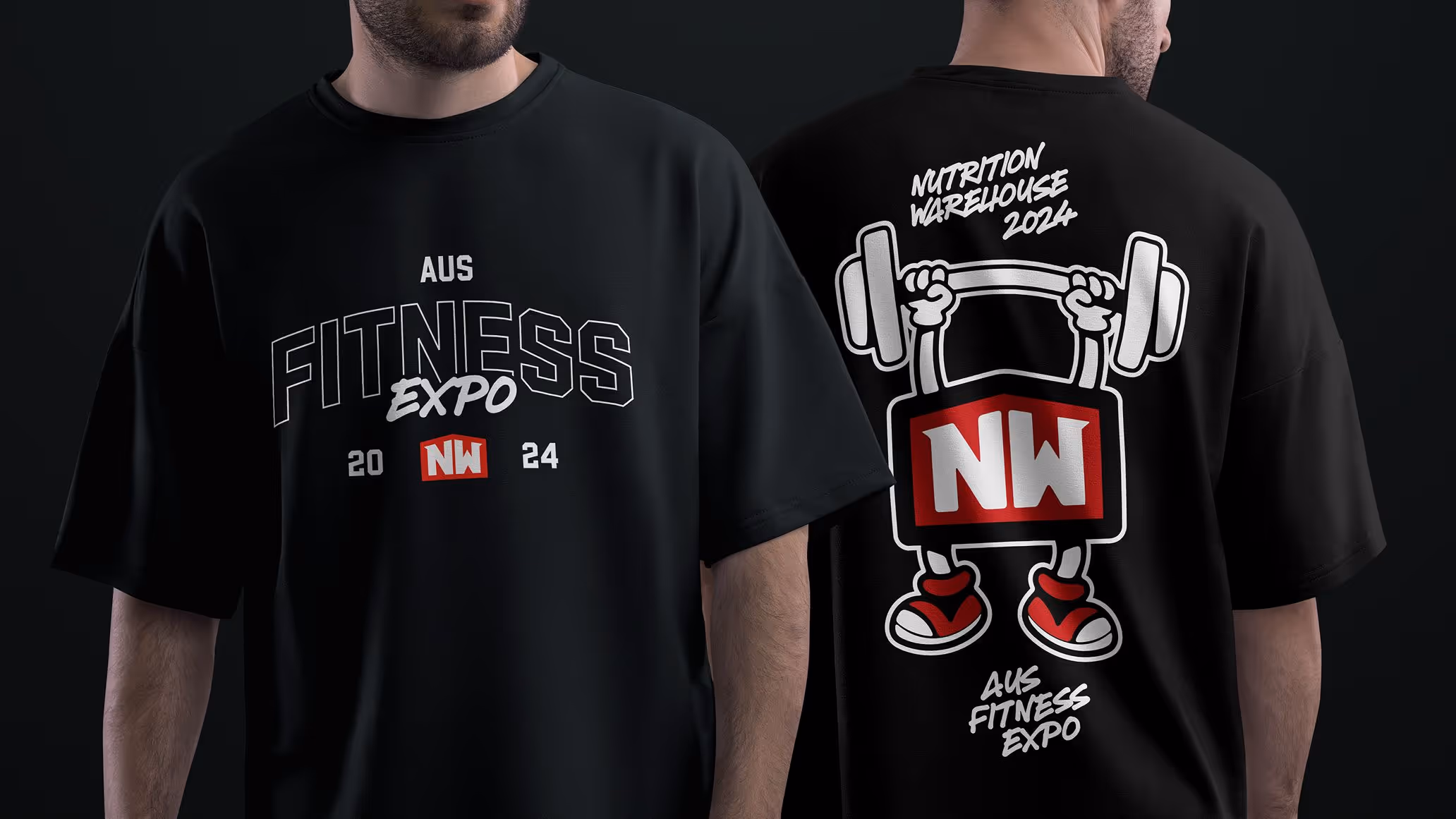
We modernised Nutrition Warehouse’s original logo by refining the structure, improving legibility, and crafting a bold wordmark that feels fresh while honouring the brand’s legacy. A key addition was the compact ‘NW’ brandmark, a clean, recognisable asset designed to scale effortlessly across digital, print, and merchandise. As the hero of the refreshed identity, the new logo had to be sharp, versatile, and built to carry the brand forward with clarity and impact.
Icons and Colours
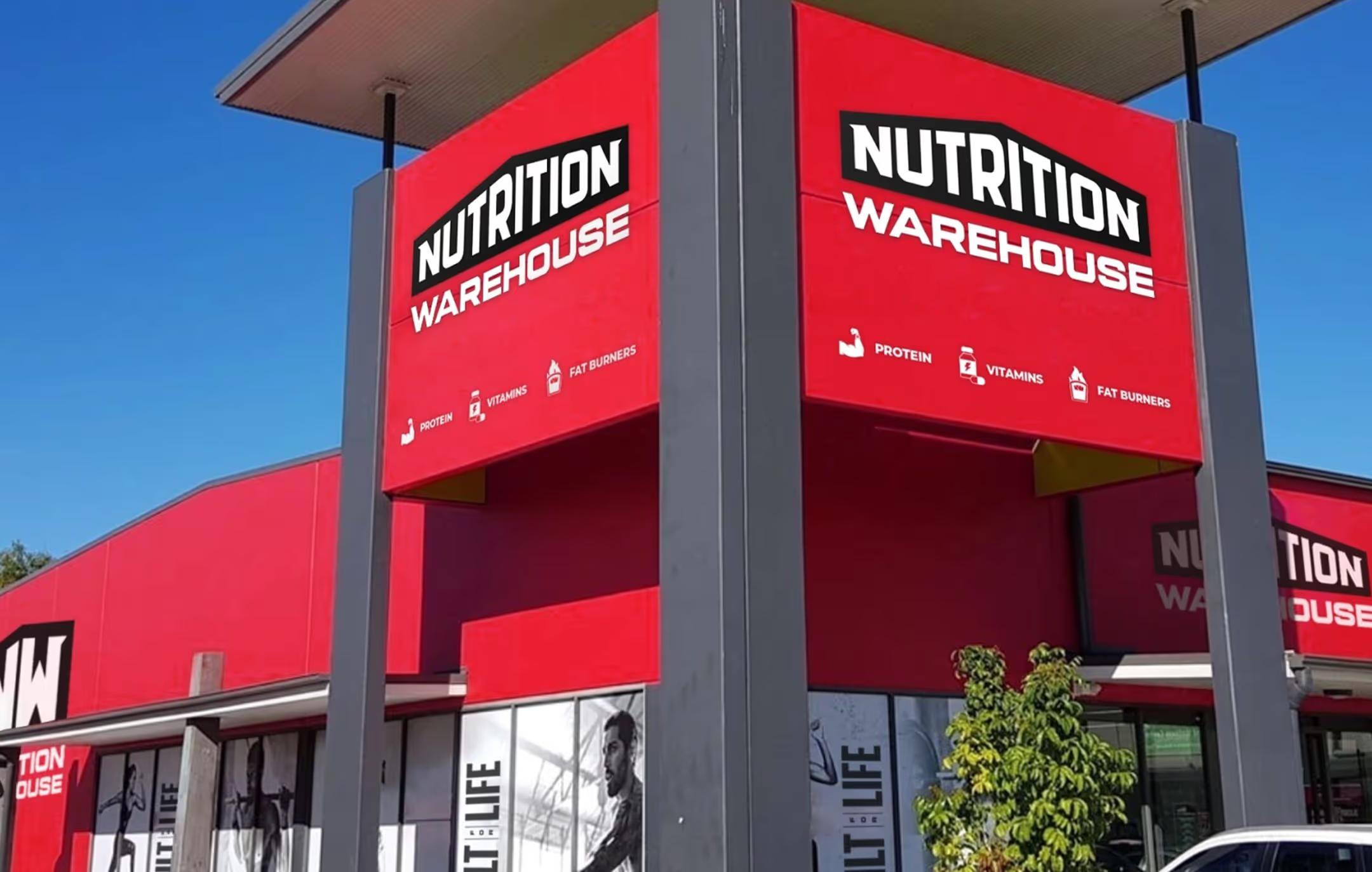
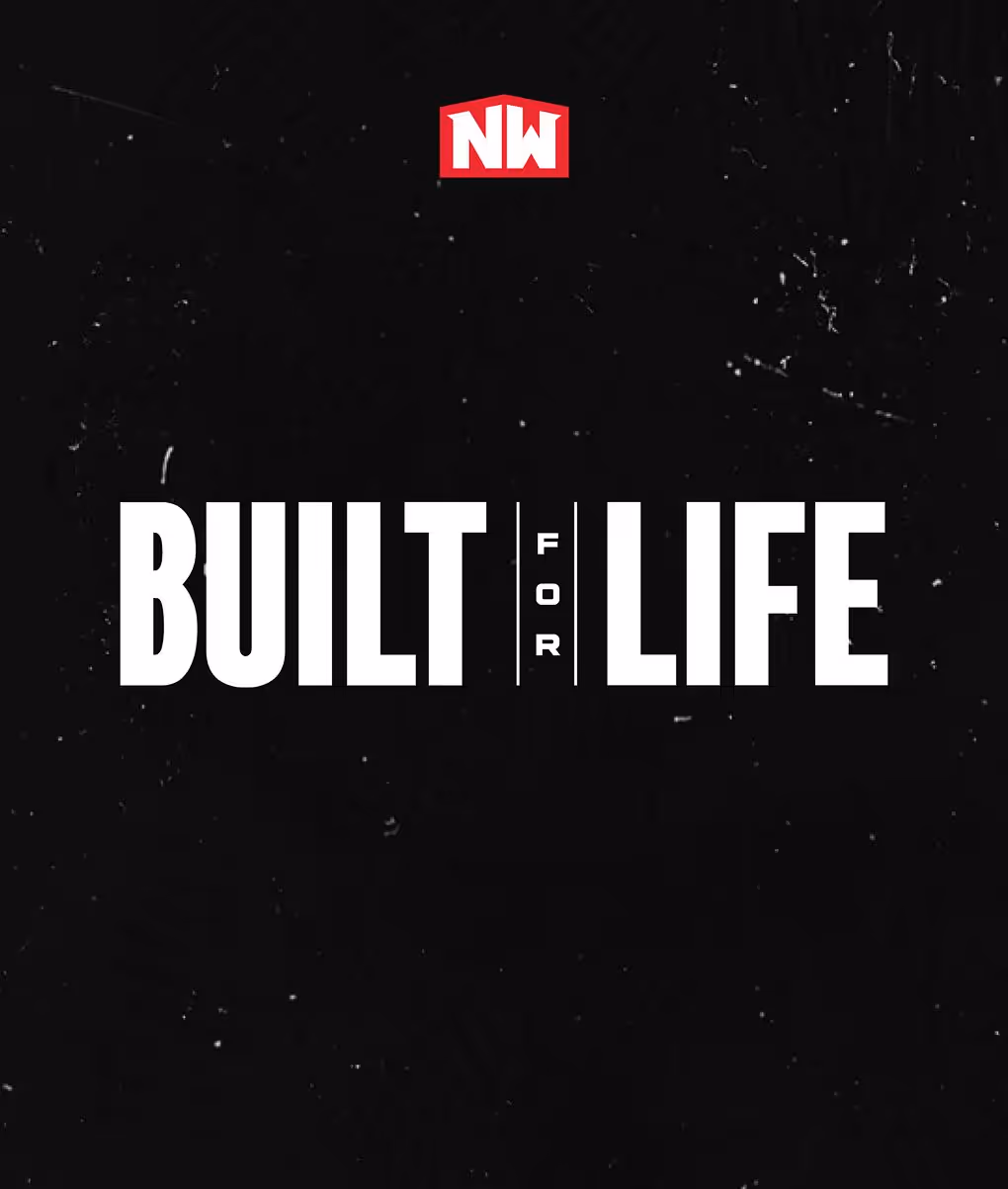
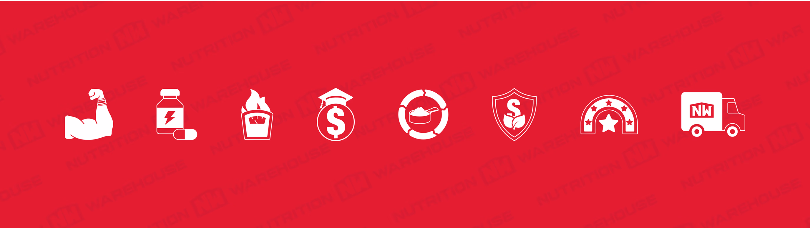
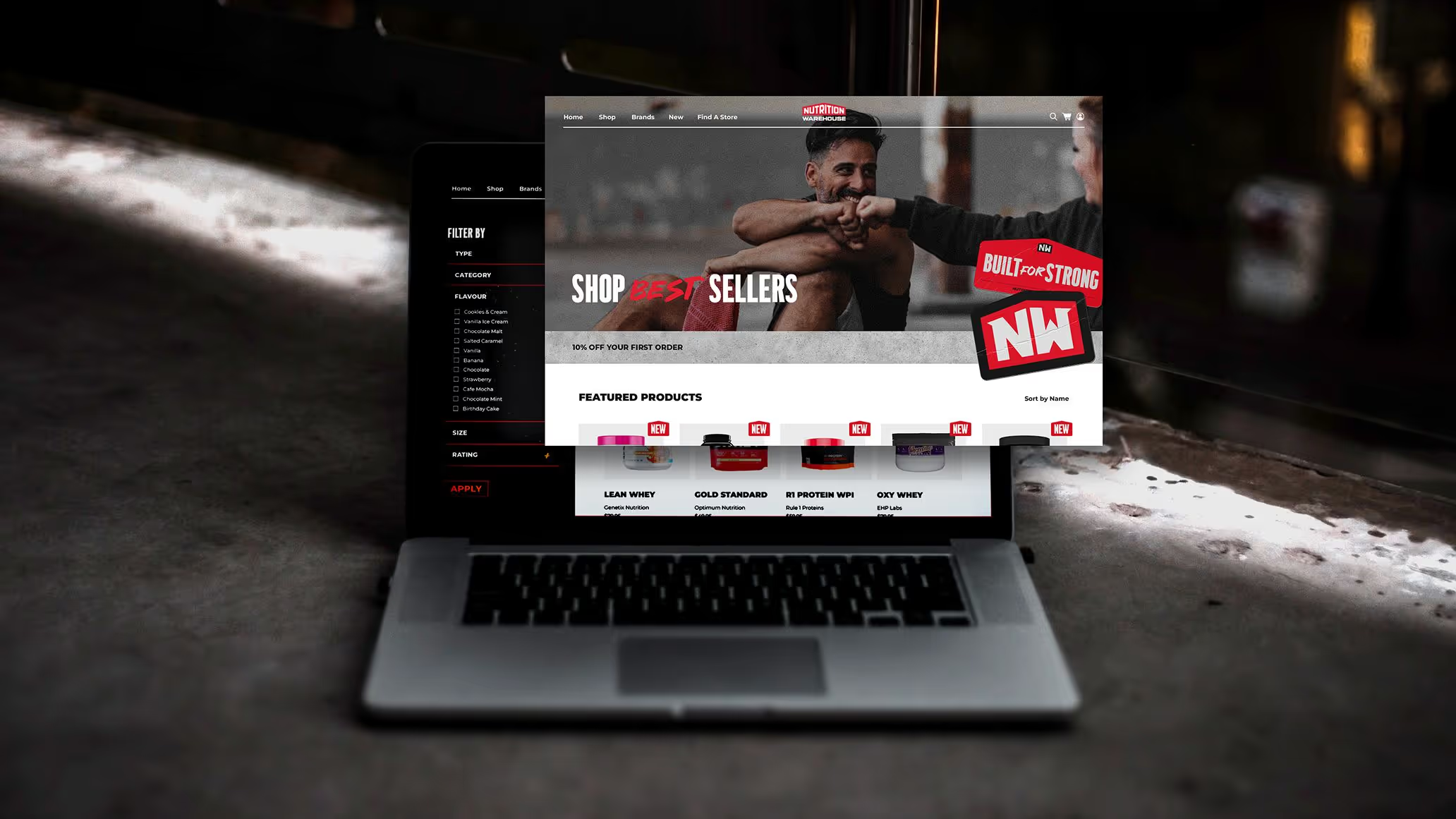
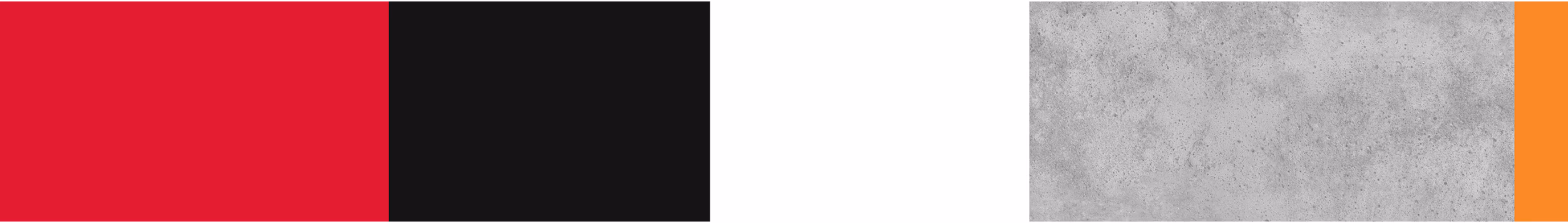
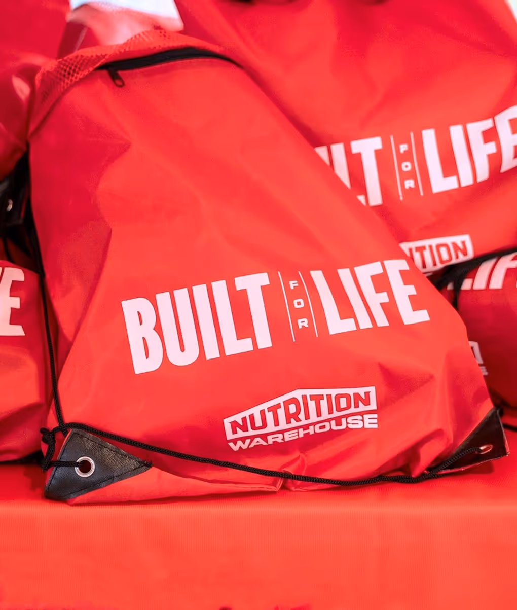
We developed a custom icon suite to support Nutrition Warehouse’s extensive website, improving navigation across categories and key product features. Visually, we refined their core red, making it bolder, more usable across print and digital, and better balanced within a full, flexible palette. To ground the energy of the brand, we introduced raw textures like concrete and gritty backgrounds, adding depth and attitude to the “Built for Life” message.
Touchpoints
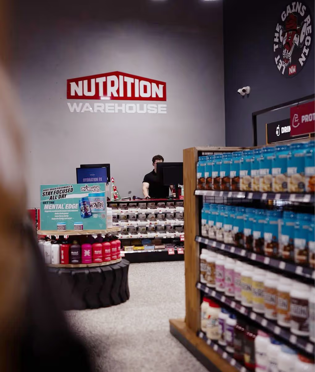
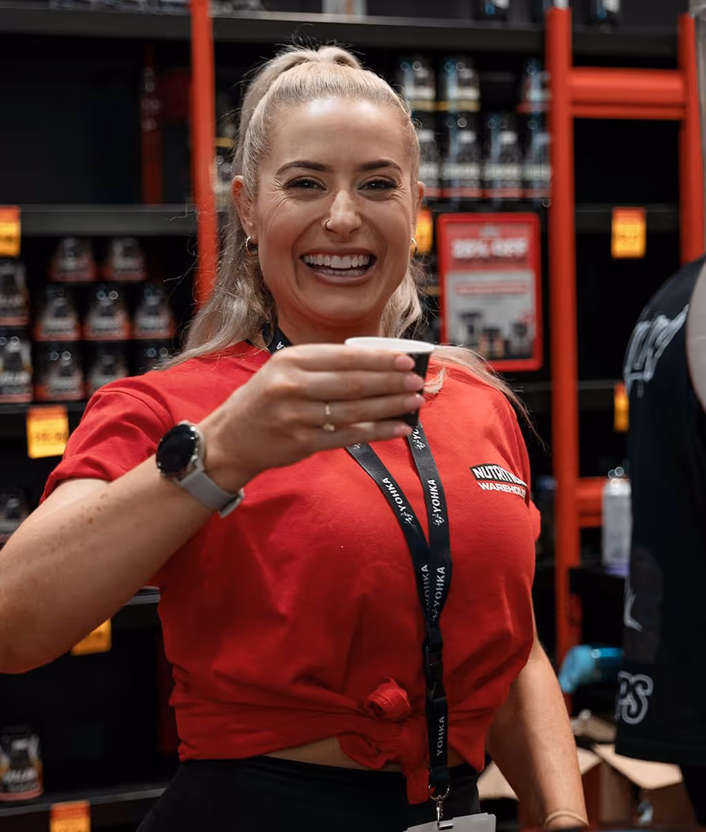
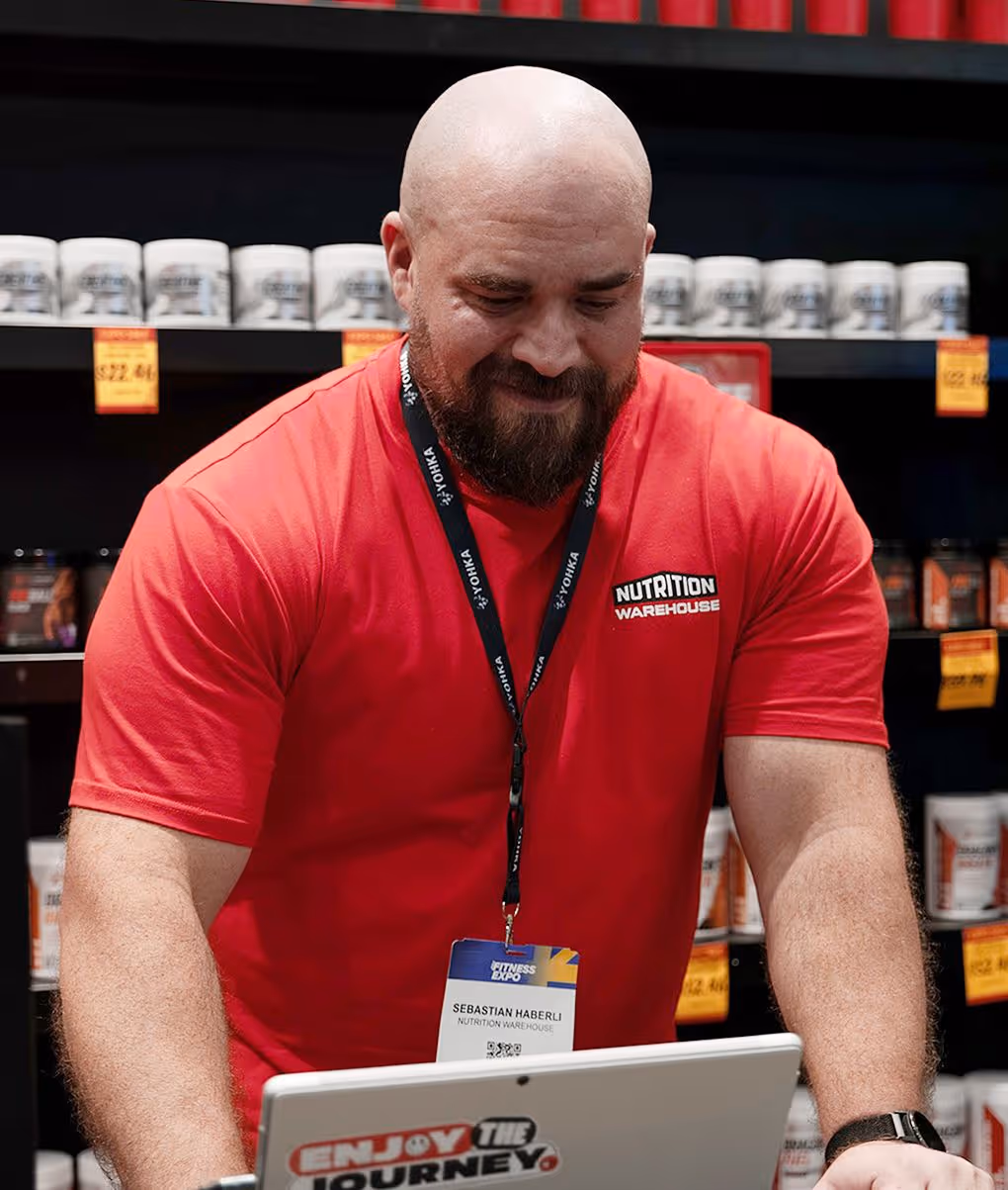
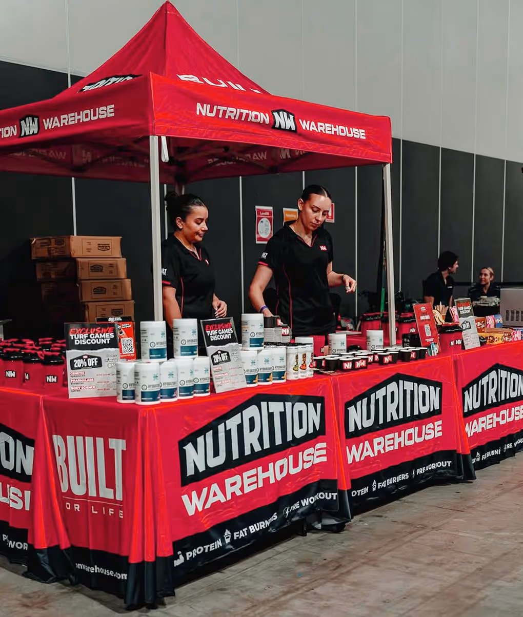
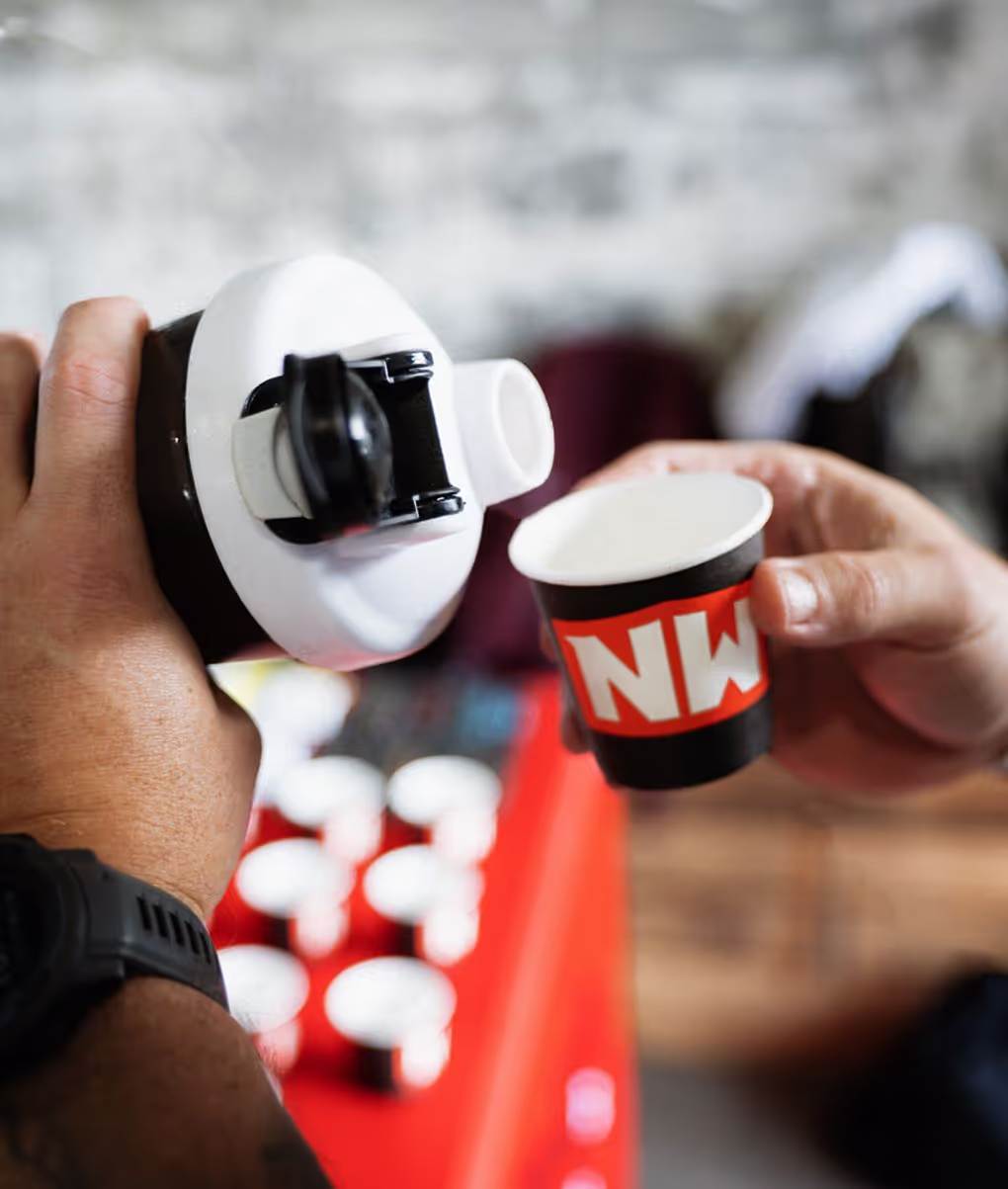
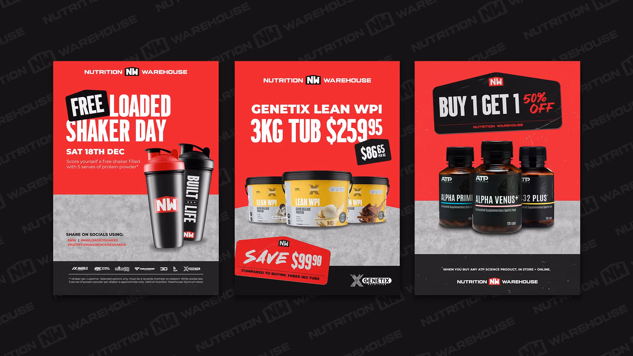
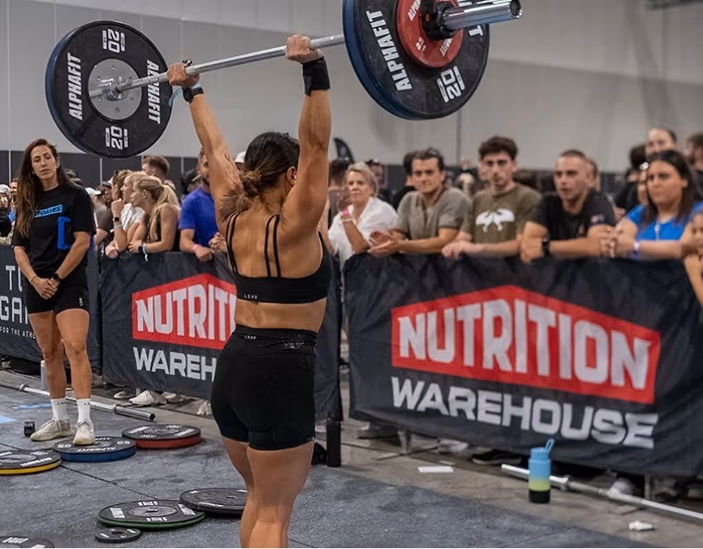
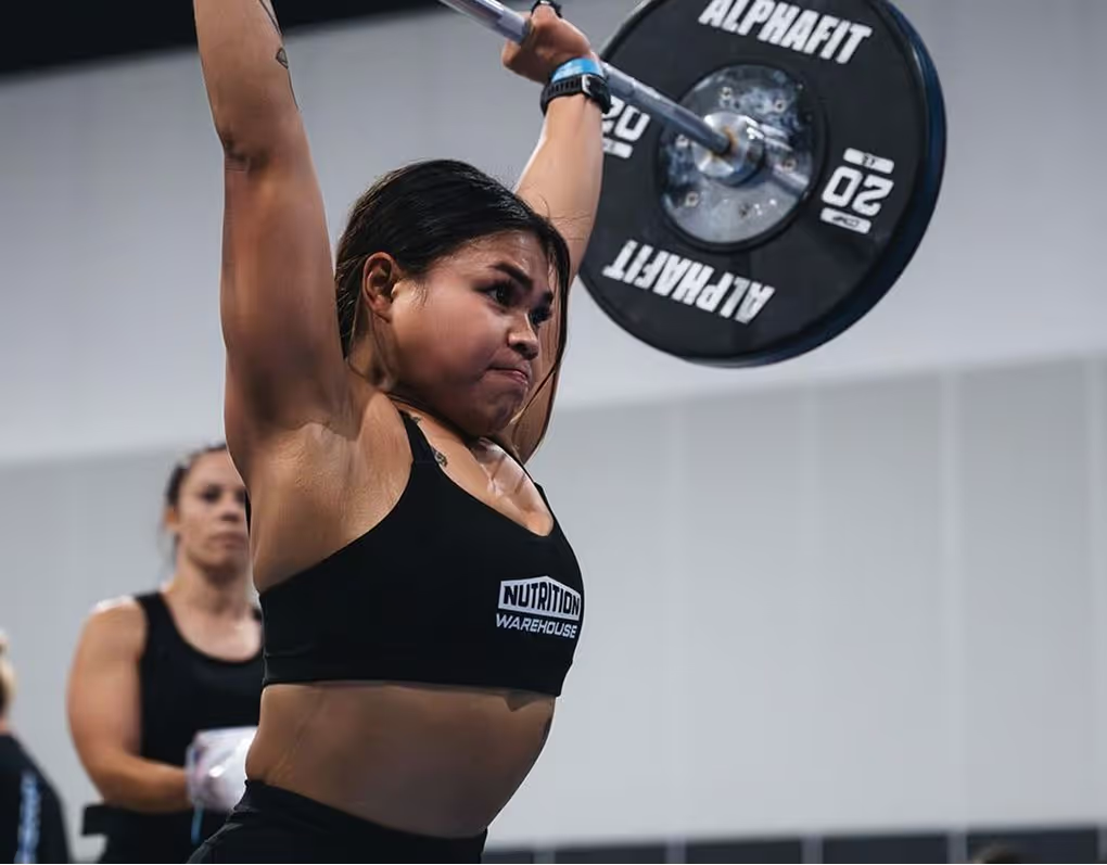
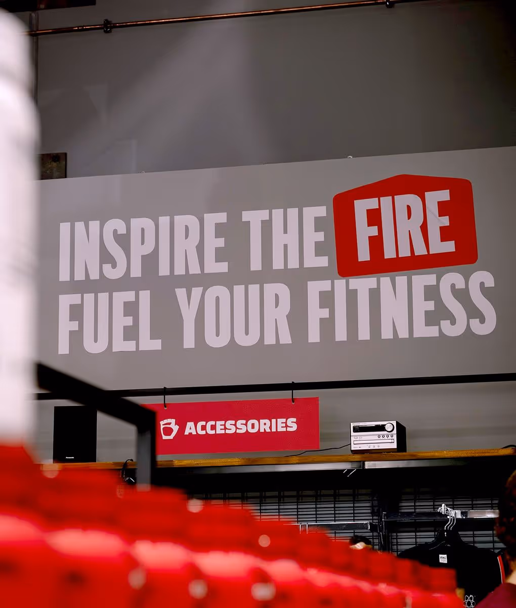
We embedded the “Built for Life” ethos across every brand interaction, from product packaging and in-store signage to merch, digital, and social. Messaging was crafted to be concise, motivating, and instantly recognisable, creating a consistent voice that reinforced the brand’s values at every step. This approach not only built trust with existing customers, but also strengthened brand recall and connection with a wider fitness audience.
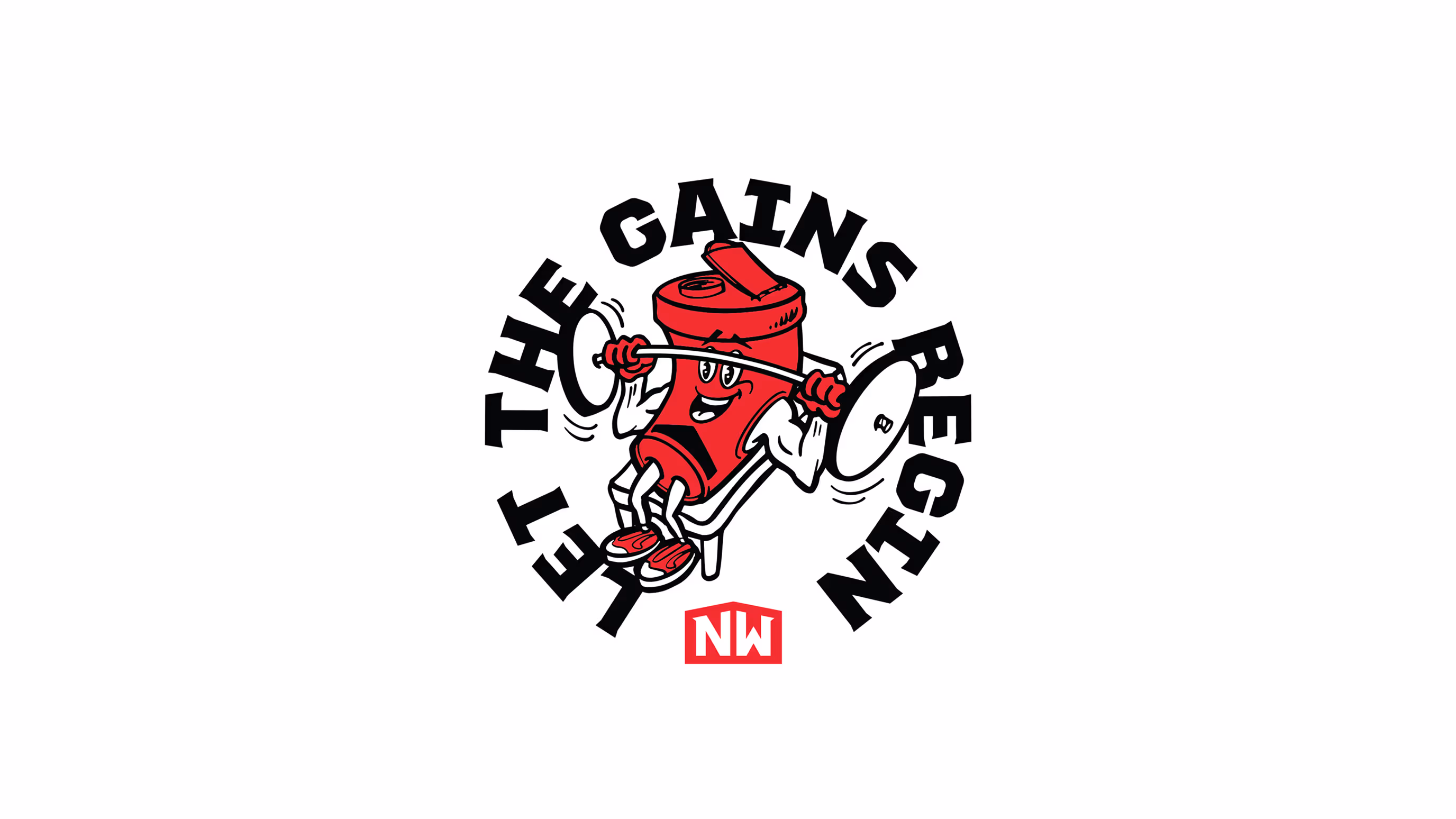
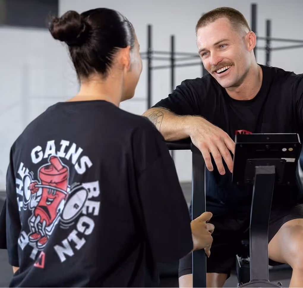
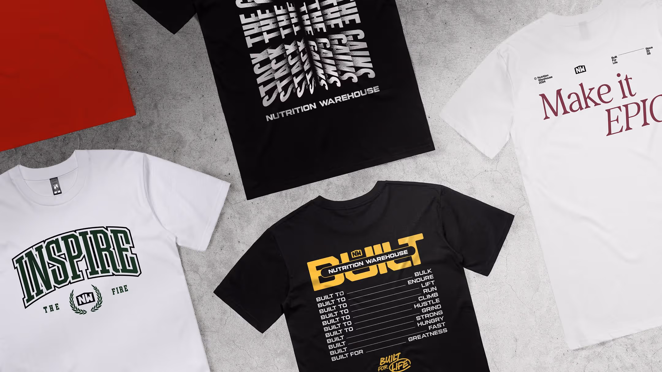
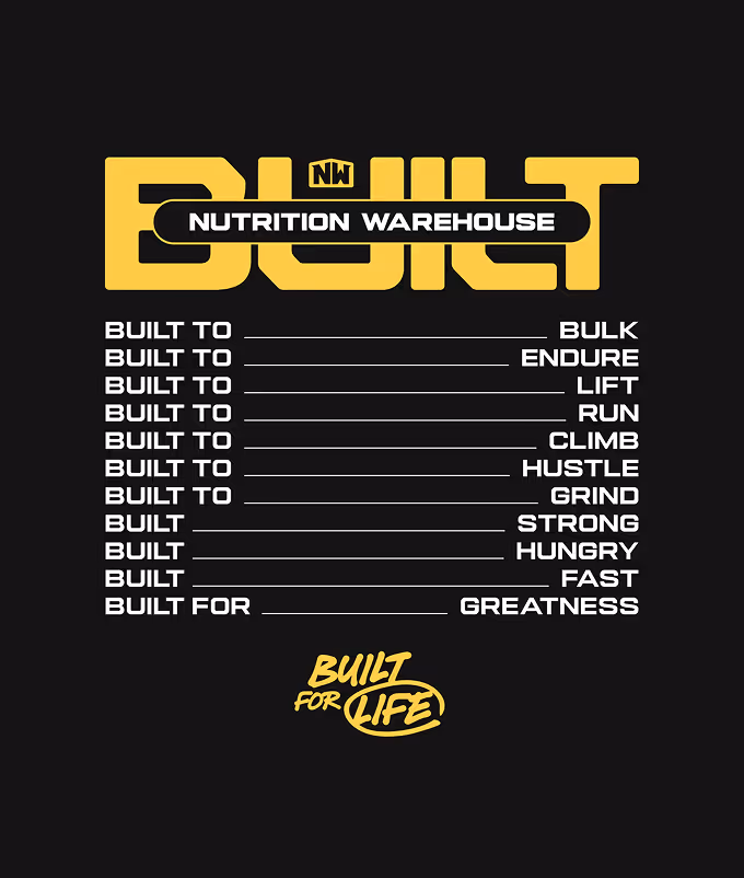
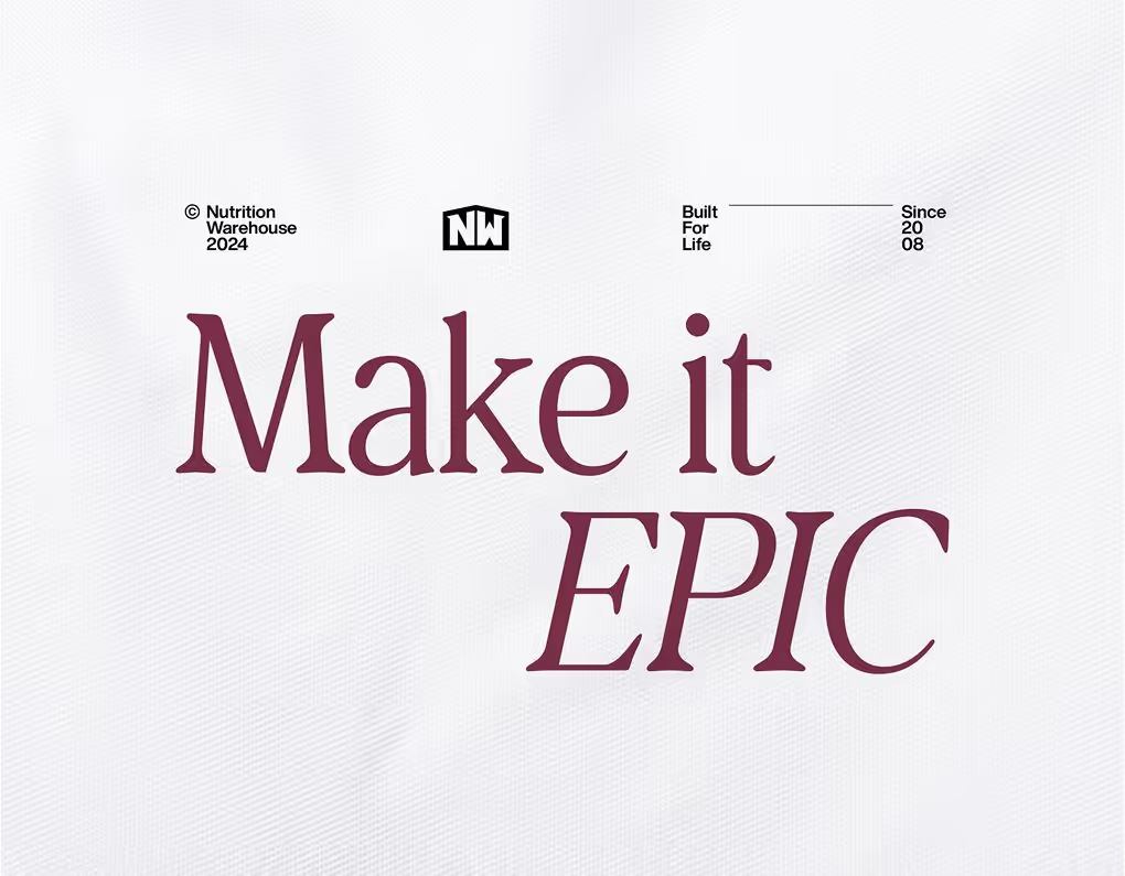
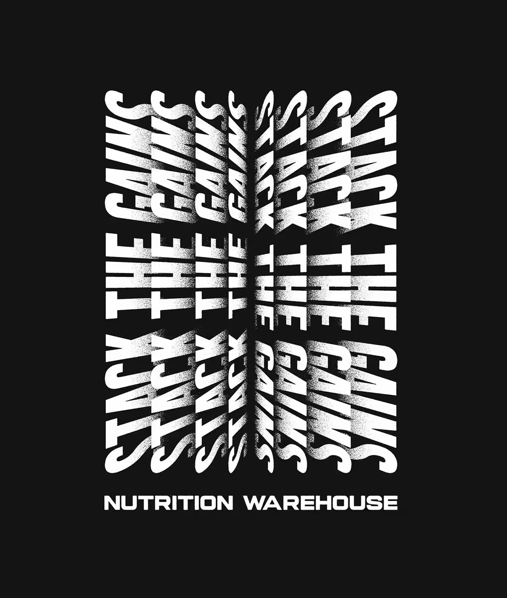
Messaging & Merch
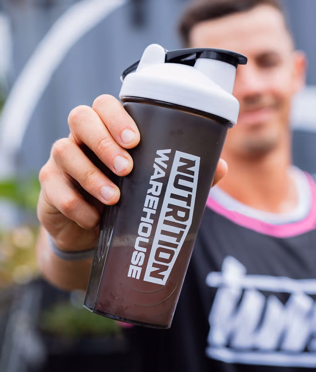
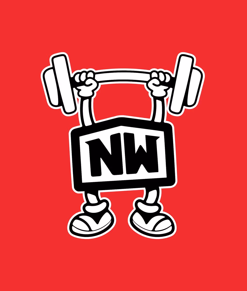
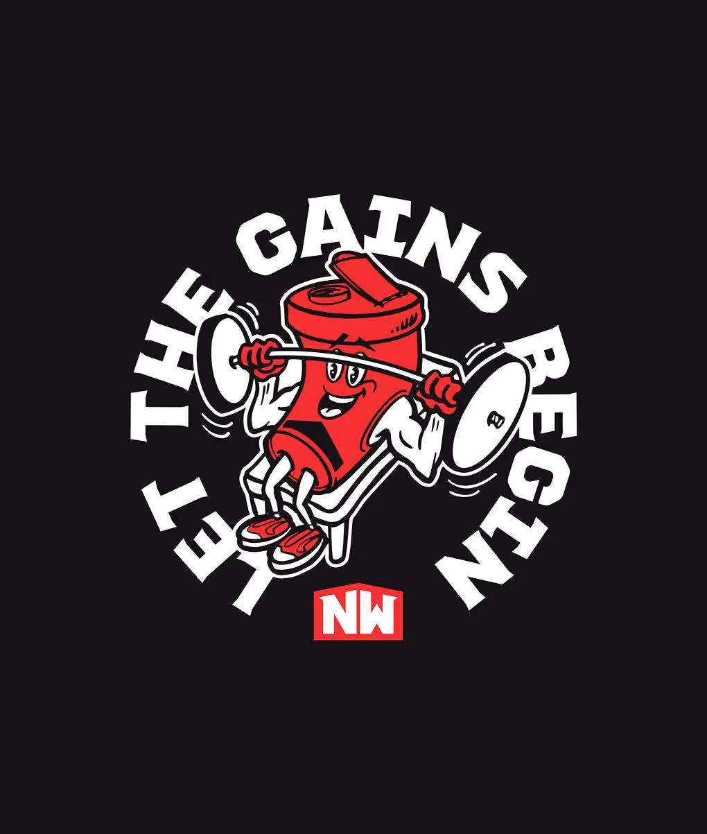
Merch was a major focus for Nutrition Warehouse, not just as branded gear, but as a way to connect with the fitness community through culture-led design. We created wearable, hype-driven campaign pieces that tapped into the rise of fashion-style gym merch, bringing Mr Sippy and bold typographic treatments into the mix. These examples were designed as campaign-specific extensions and sit outside the core brand design, giving the team flexibility to go big at expos and in the gym without compromising the master brand.
.avif)
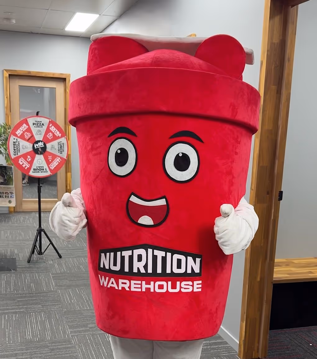
Mascot
Mr Sippy, their existing mascot, was brought into the brand world as a fun, supporting character; a perfect fit for lifestyle merch and campaign moments. We adapted him for use in both digital and print, giving him new life beyond the costume and making him an instantly recognisable icon for the brand’s growing fitness community.

Result
The refreshed brand delivered serious milage. Nutrition Warehouse now has a modern, unified identity, merch that sells itself, and a website that drives engagement across Australia and New Zealand. With a consistent, scalable tone and design across every touchpoint, the brand is equipped to keep growing, loud, bold, and “built for life”.