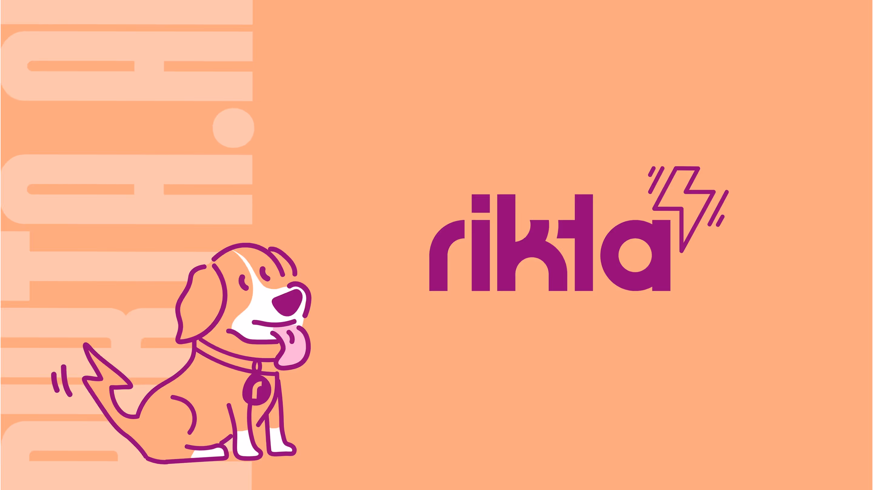
Rikta
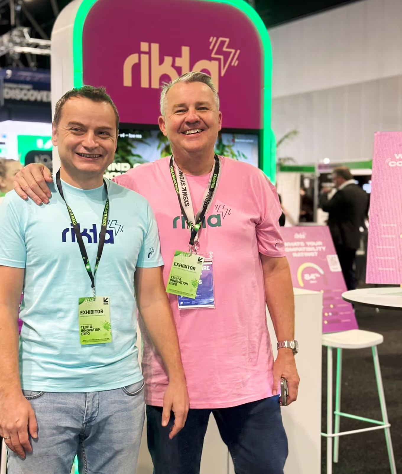
RIKTA, a new player in the HR tech space, needed a brand as bold and innovative as their mission: to make hiring in the hospitality industry human again. Rivyl delivered a complete brand identity - from strategy and logo, to the website and UX/UI kit - designed to be youthful, engaging, and, crucially, accessible.
About
In the often-stale world of HR tech, RIKTA, an AI-powered human resources SaaS startup, aimed to be anything but corporate. Founder and CEO, Bruce Mackenzie, was determined to disrupt the hiring landscape for large, volume-focused enterprises in hospitality, health and event management. His vision? To empower employees and make the hiring process feel genuinely human whilst aligning true compatibility, a stark contrast to the impersonal, business-focused approach of many existing HR solutions.


Brief
RIKTA's core belief is to ensure everyone is partnered with a workplace where their values and skills can thrive. However, translating this people-first philosophy into a vibrant, youthful brand that could cut through the noise, while also meeting stringent accessibility requirements and maintaining a professional presence, presented a significant challenge. They needed a brand as bold as their mission. The brief was clear: create a brand that radiated youthfulness and energy, instantly differentiating RIKTA from its competitors.
A key internal challenge was to balance this bold, expressive design and engaging interface, with the critical need for accessibility, particularly in font and colour choices throughout the app. The brand needed to be exciting, yet inclusive. Youthful yet professional. Engaging yet c-suite appealing.
A key internal challenge was to balance this bold, expressive design and engaging interface, with the critical need for accessibility, particularly in font and colour choices throughout the app. The brand needed to be exciting, yet inclusive. Youthful yet professional. Engaging yet c-suite appealing.


Strategy and Touch Points
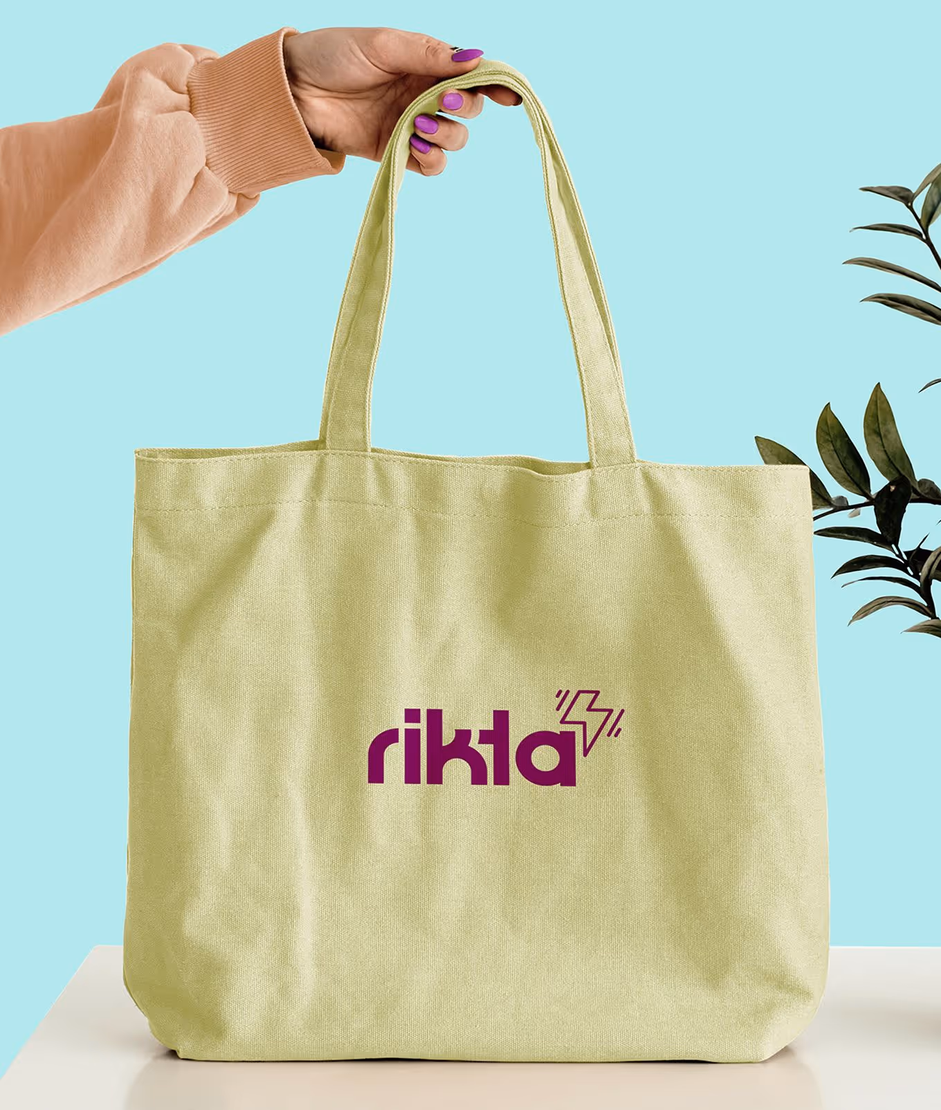
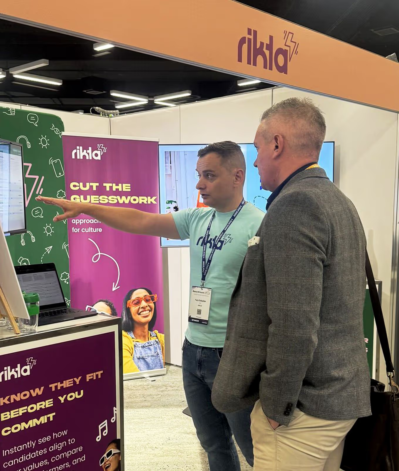
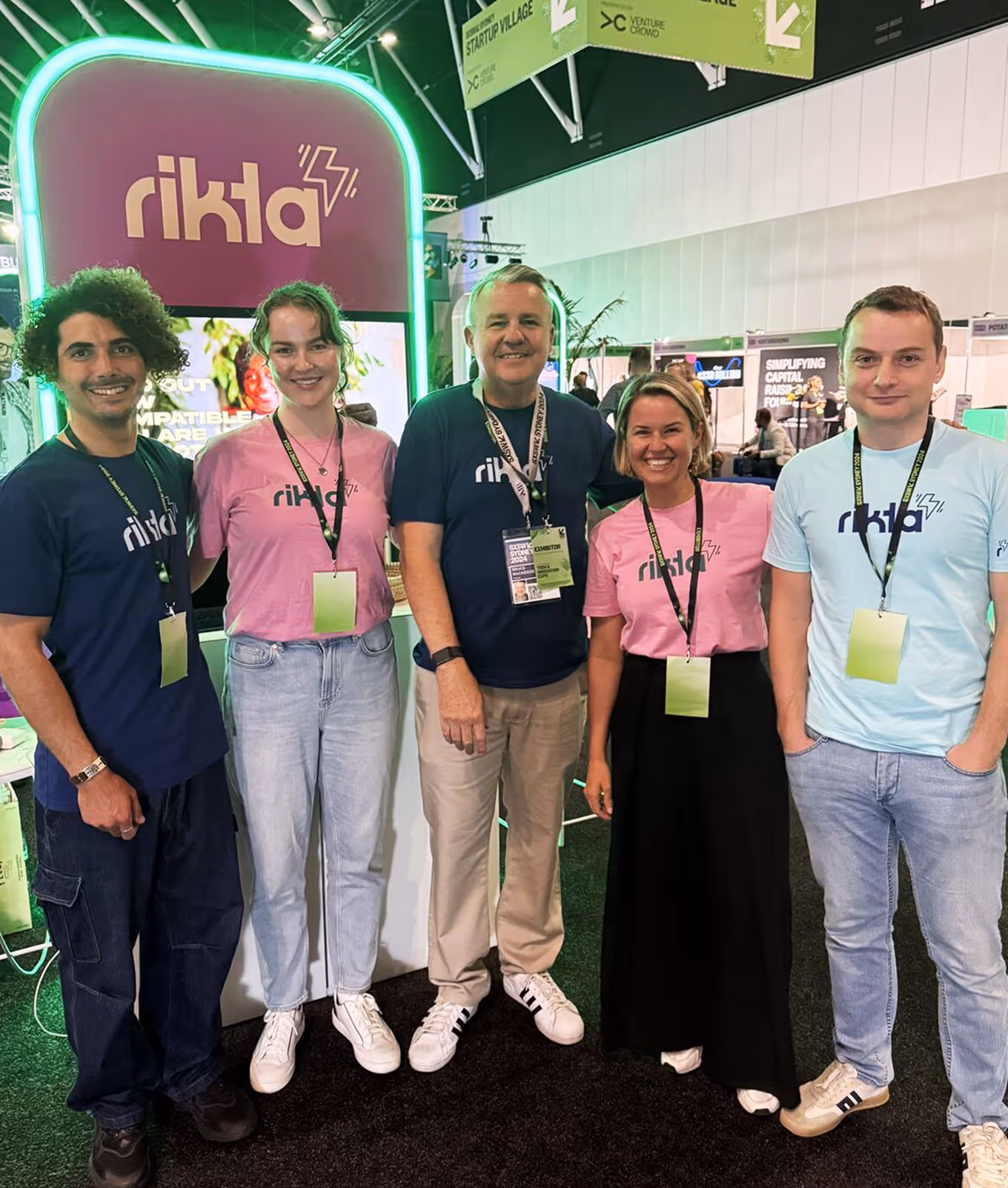
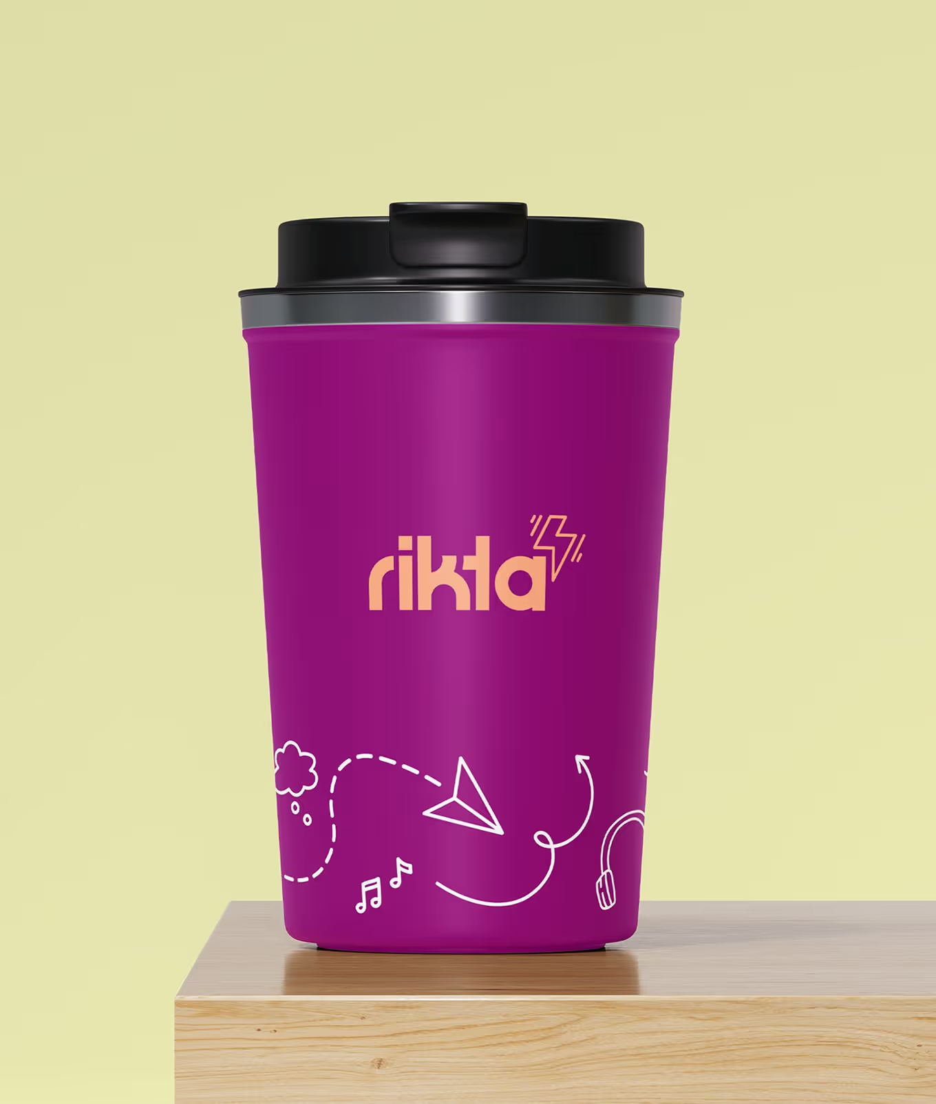
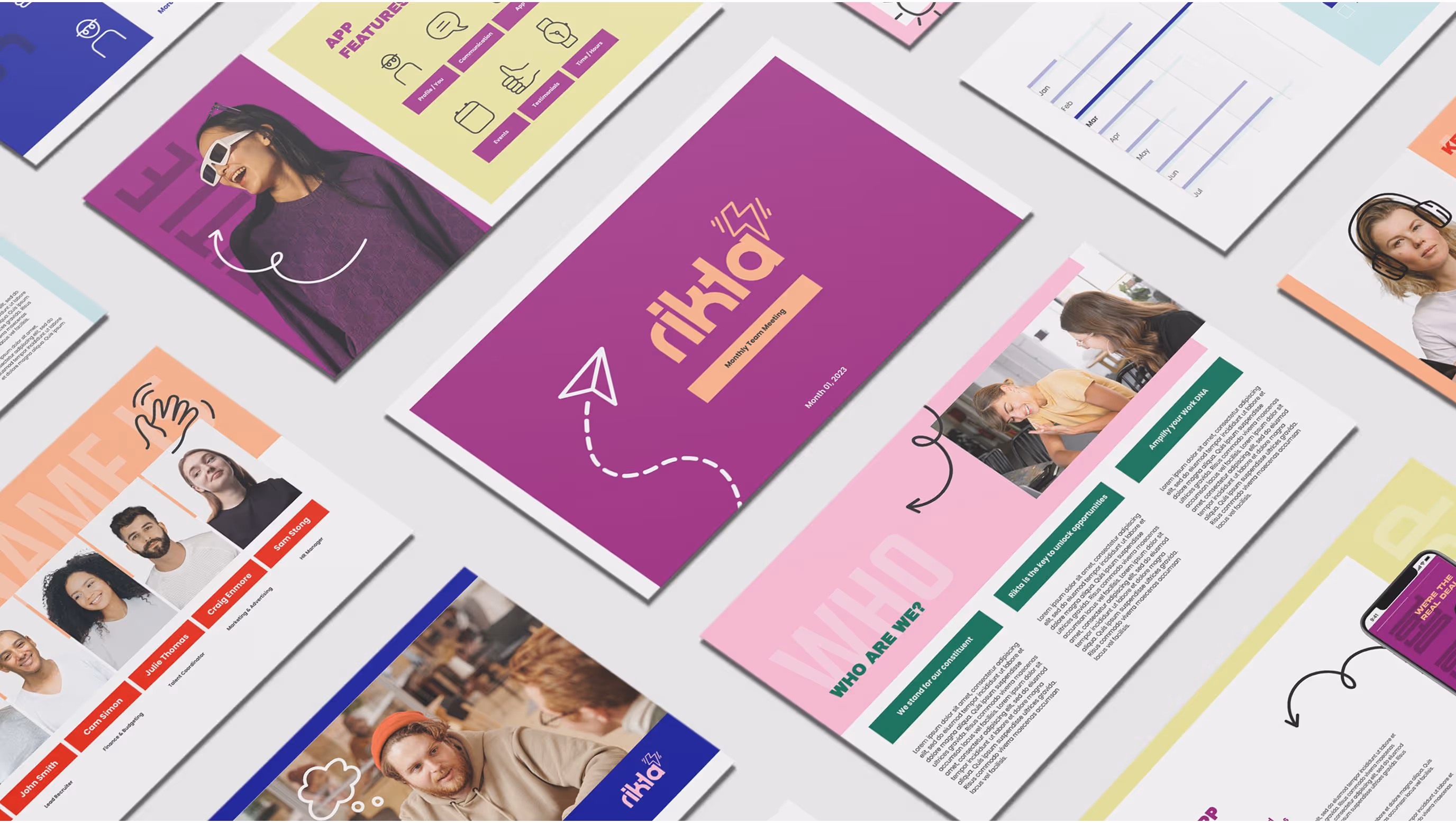
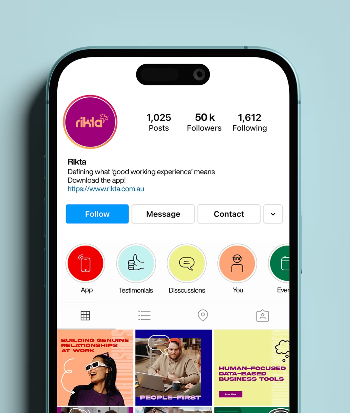
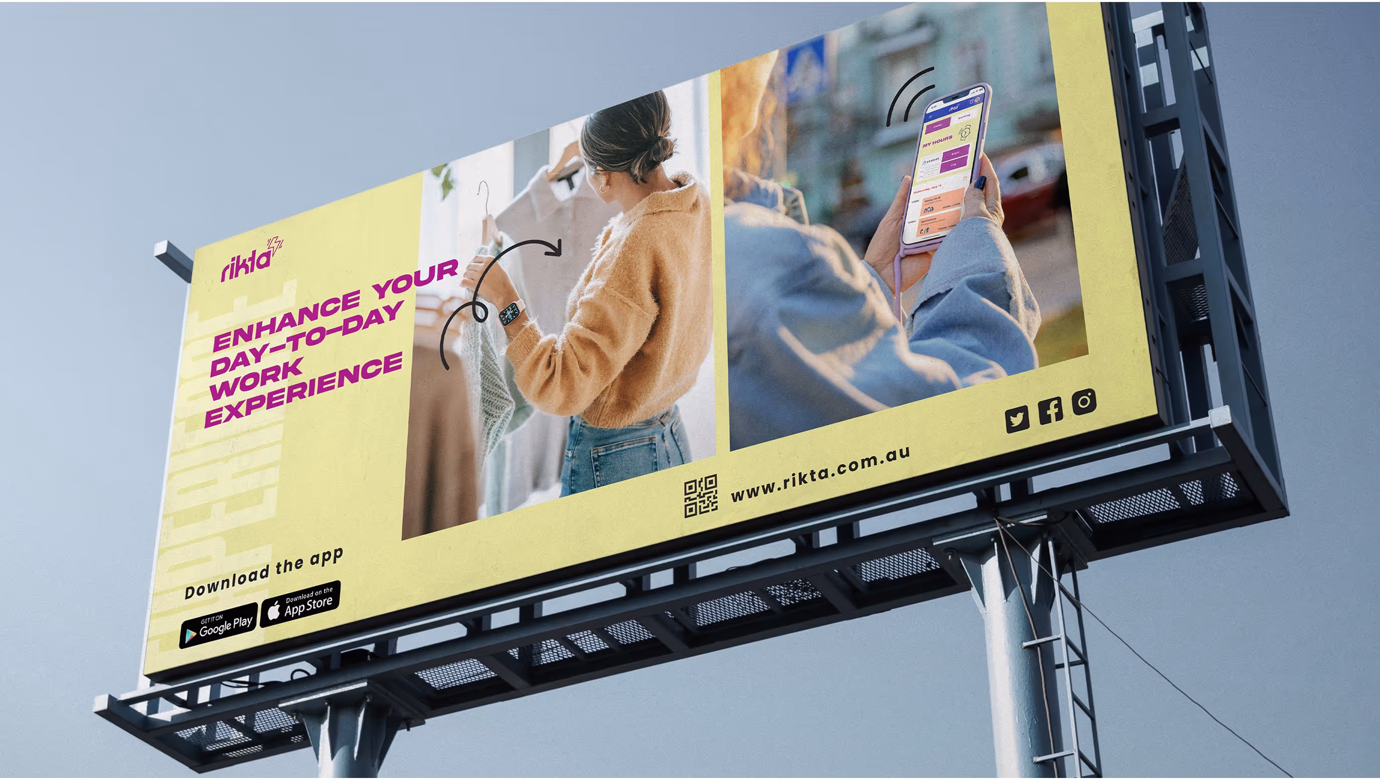
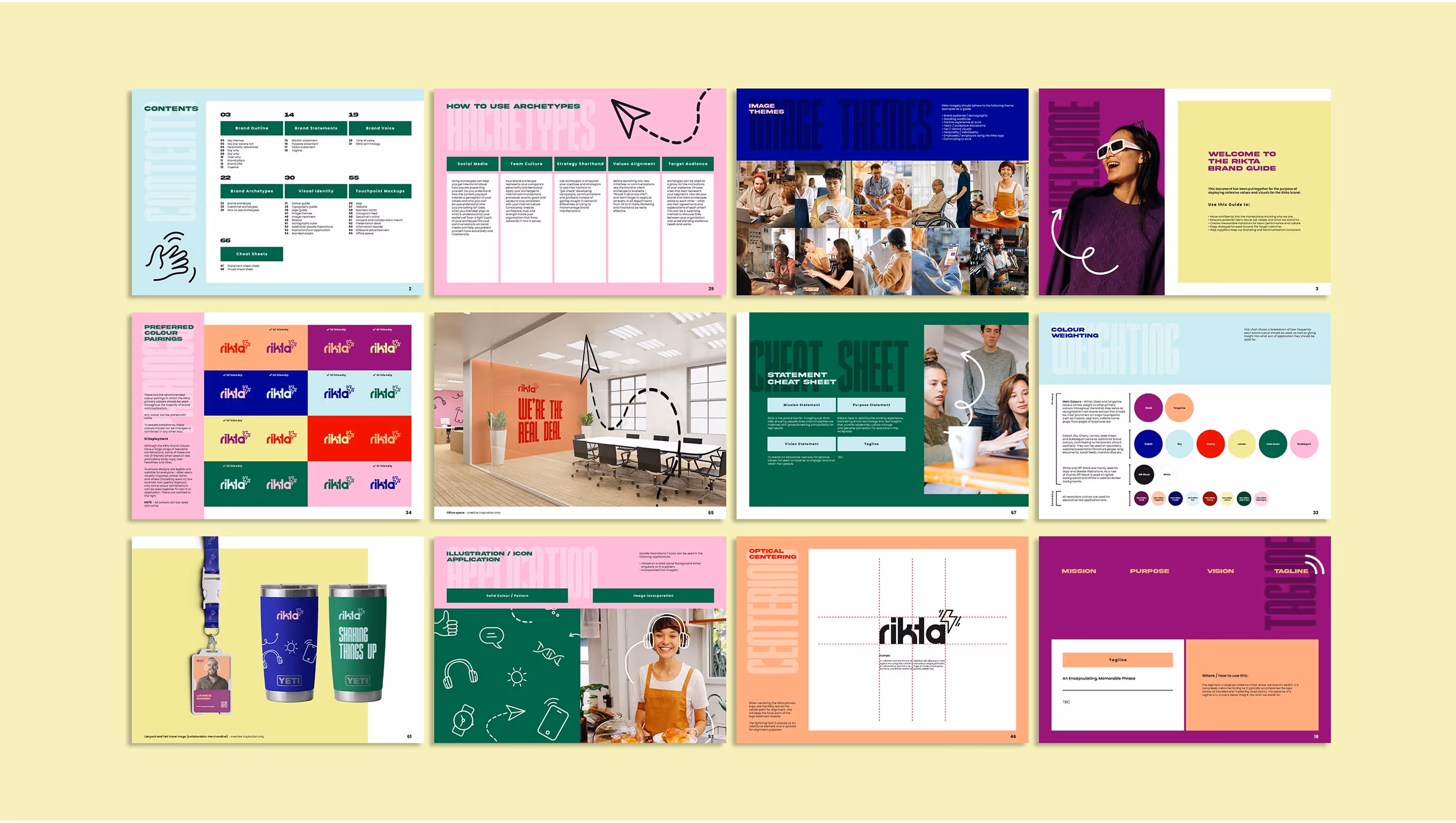
Our strategy focused on making RIKTA feel radically human, approachable, energetic, and easy to connect with, without losing credibility. The brand system was designed to live beyond digital, with playful yet purposeful applications across UX/UI design, collateral, packaging and merchandise. Every touchpoint was an opportunity to bring warmth into the HR space, turning the brand into something people were excited to engage with.

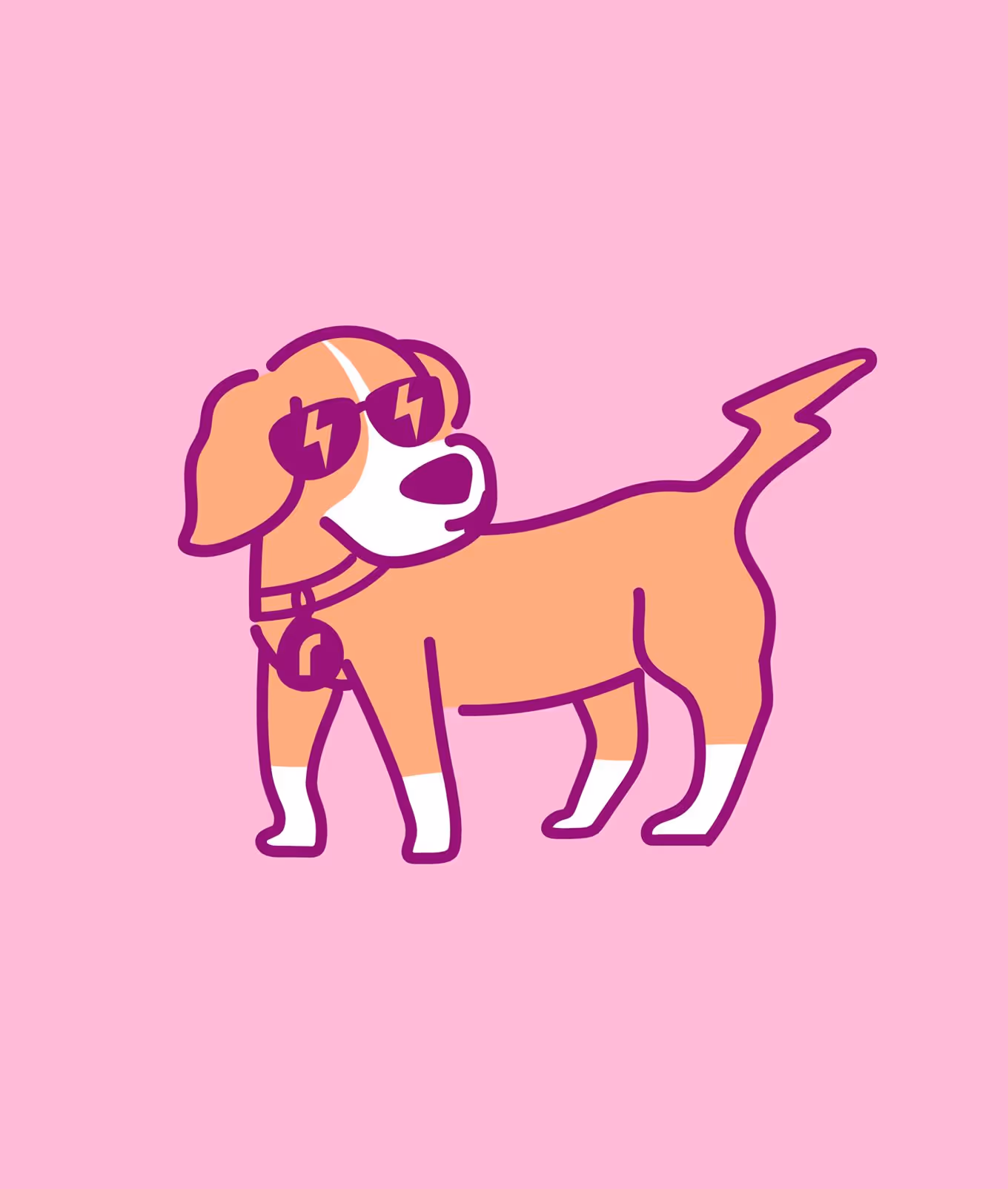
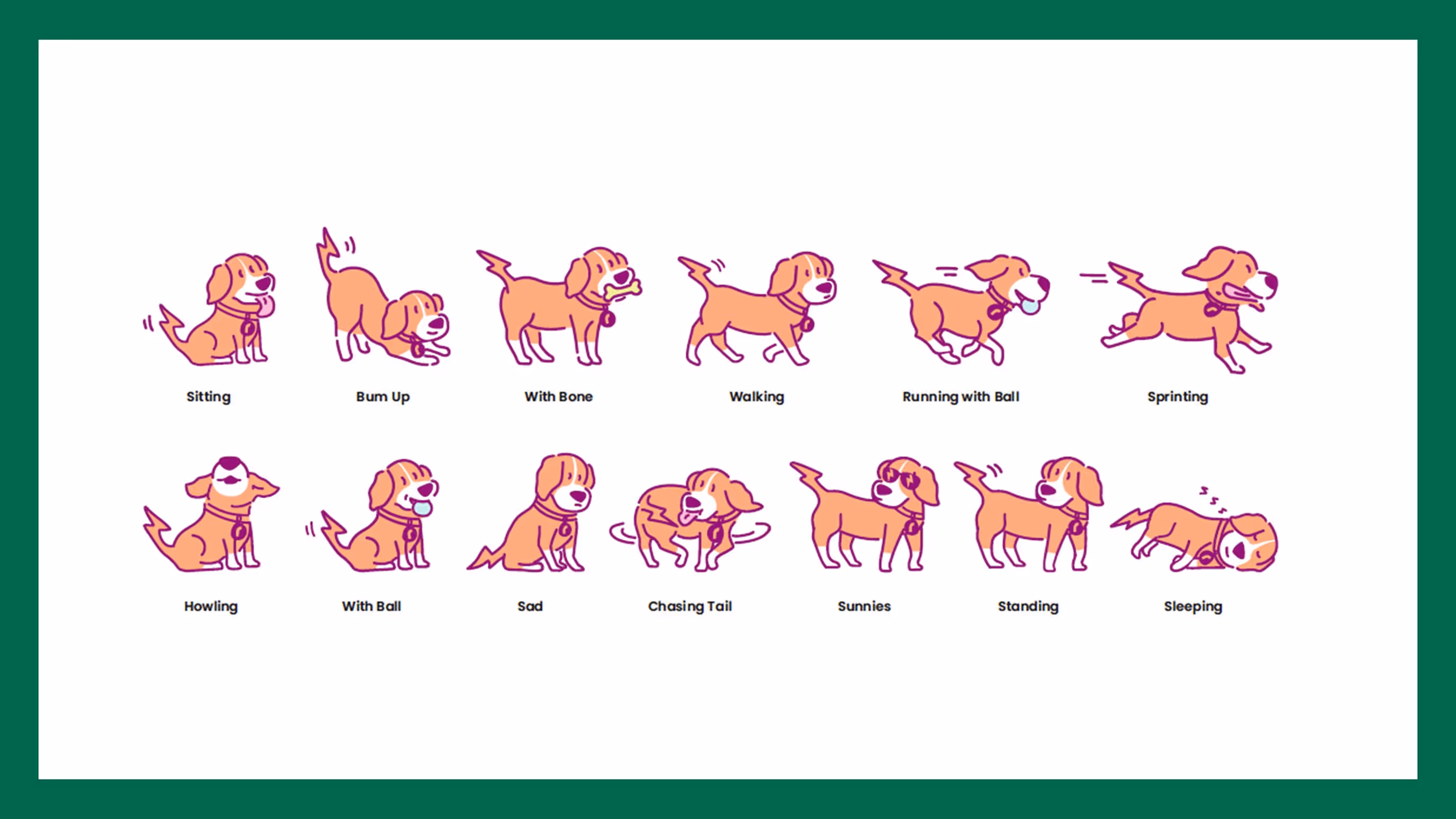
Icons and illustrations
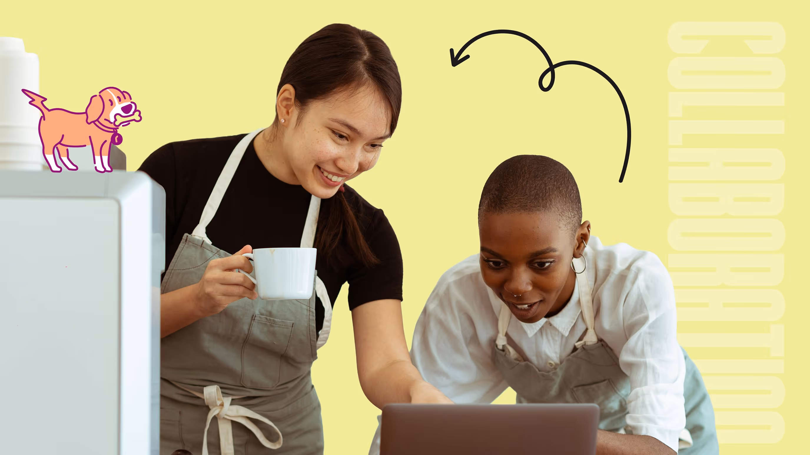
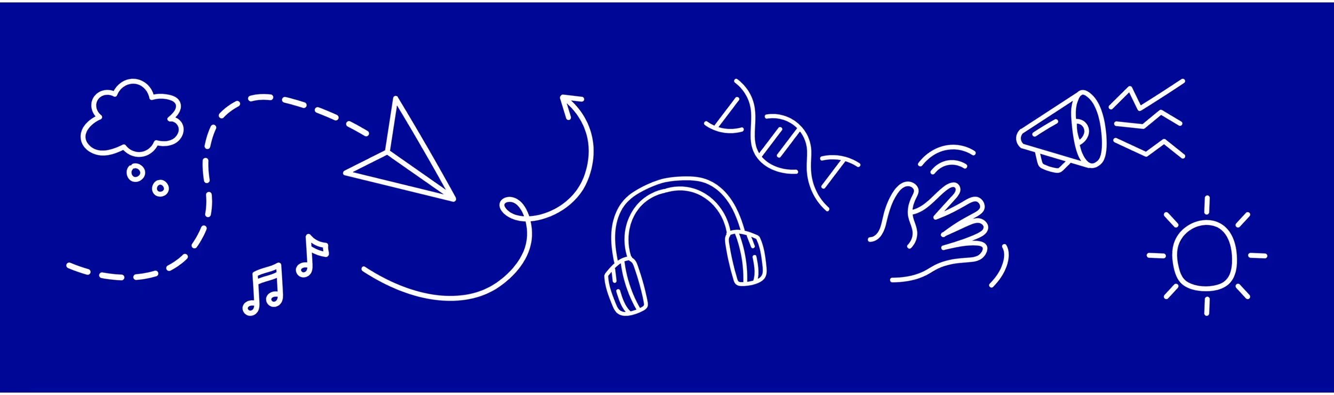
To infuse RIKTA's brand with a genuinely human touch, we developed a suite of custom, doodle-style icons and illustrations. These aren't just decorative flourishes; they're a strategic tool to foster approachability and conversation. The hand-drawn style adds personality, making the brand feel less corporate and more personal.
They can be adapted to complement specific text or imagery, even overlaid on staff photos to showcase individual interests. They’re customisable and personal. This emphasises the human point of view in the user experience, ensuring RIKTA's audience feels seen and understood.
They can be adapted to complement specific text or imagery, even overlaid on staff photos to showcase individual interests. They’re customisable and personal. This emphasises the human point of view in the user experience, ensuring RIKTA's audience feels seen and understood.

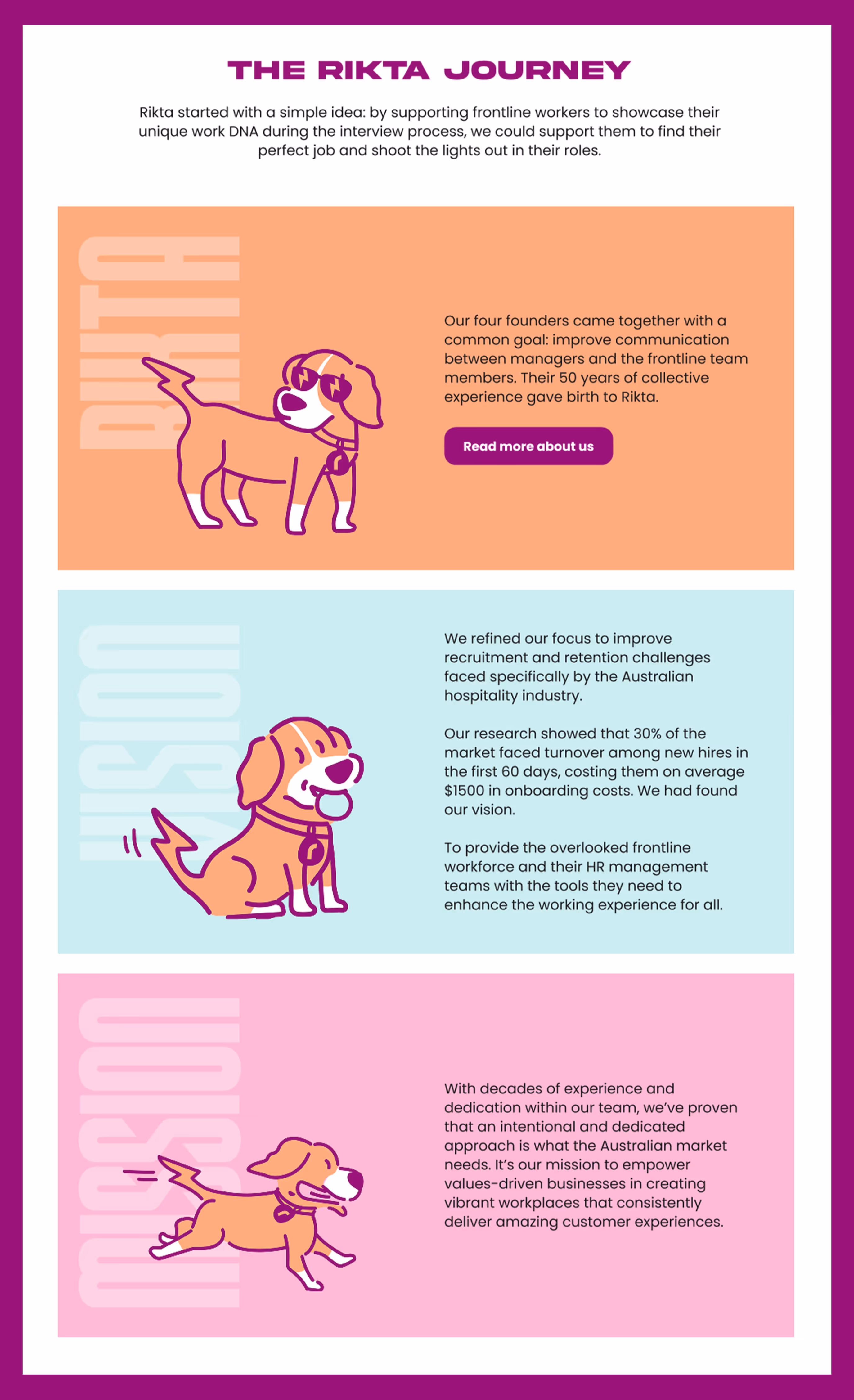
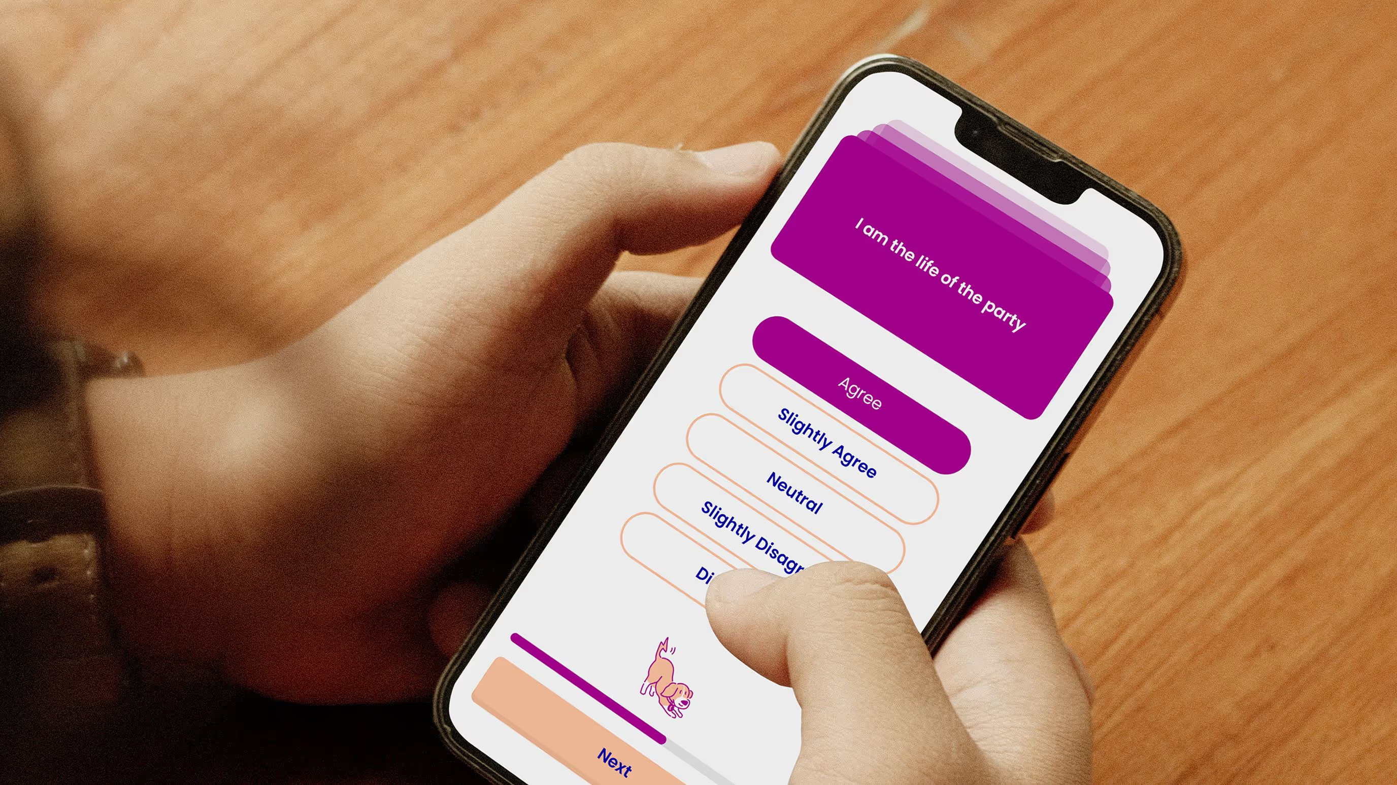
Website / Messaging
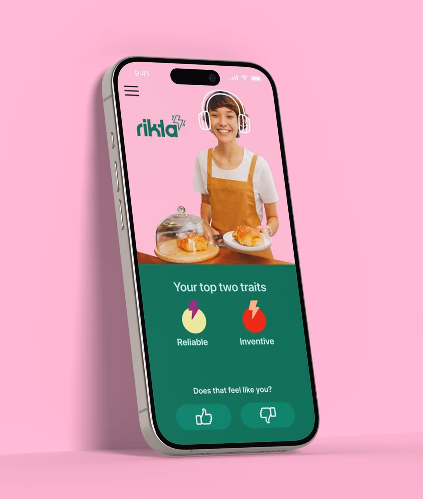
We designed and built RIKTA’s website from the ground up, crafting a seamless UX that guides users through the platform’s mission, offering, and personality. The UI strikes a balance between youthful energy and professional clarity, supporting strong, human-first messaging like “a new way to work” and “the RIKTA journey.” Navigation was kept clean and intuitive, ensuring users could find what they needed quickly and stay focused on the experience. Every page was built to educate, inspire trust, and drive action, without ever feeling corporate.

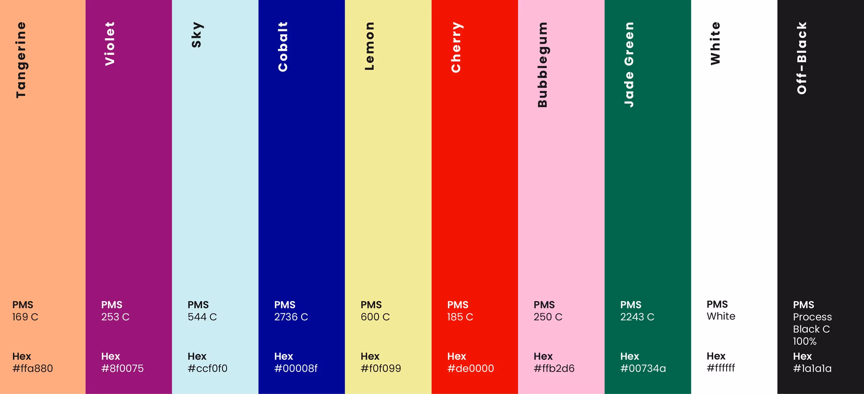
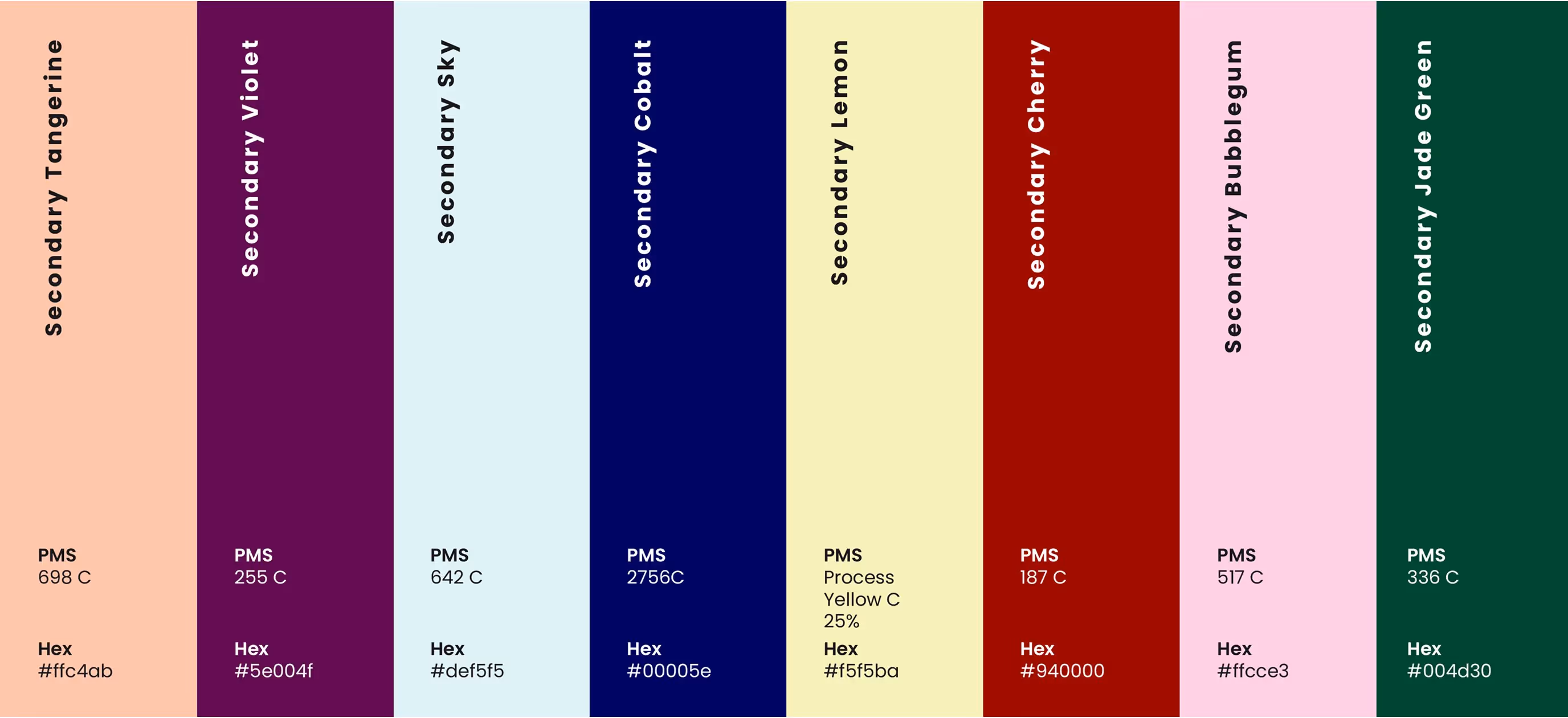
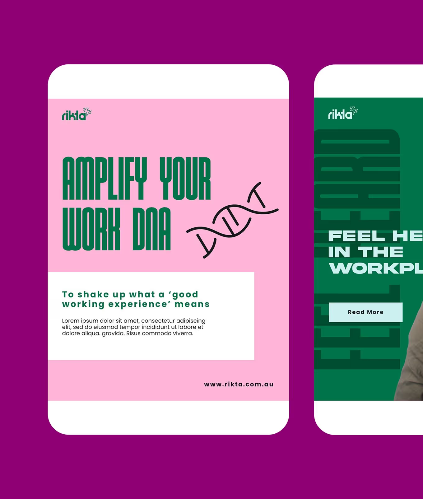
Colour - Typography
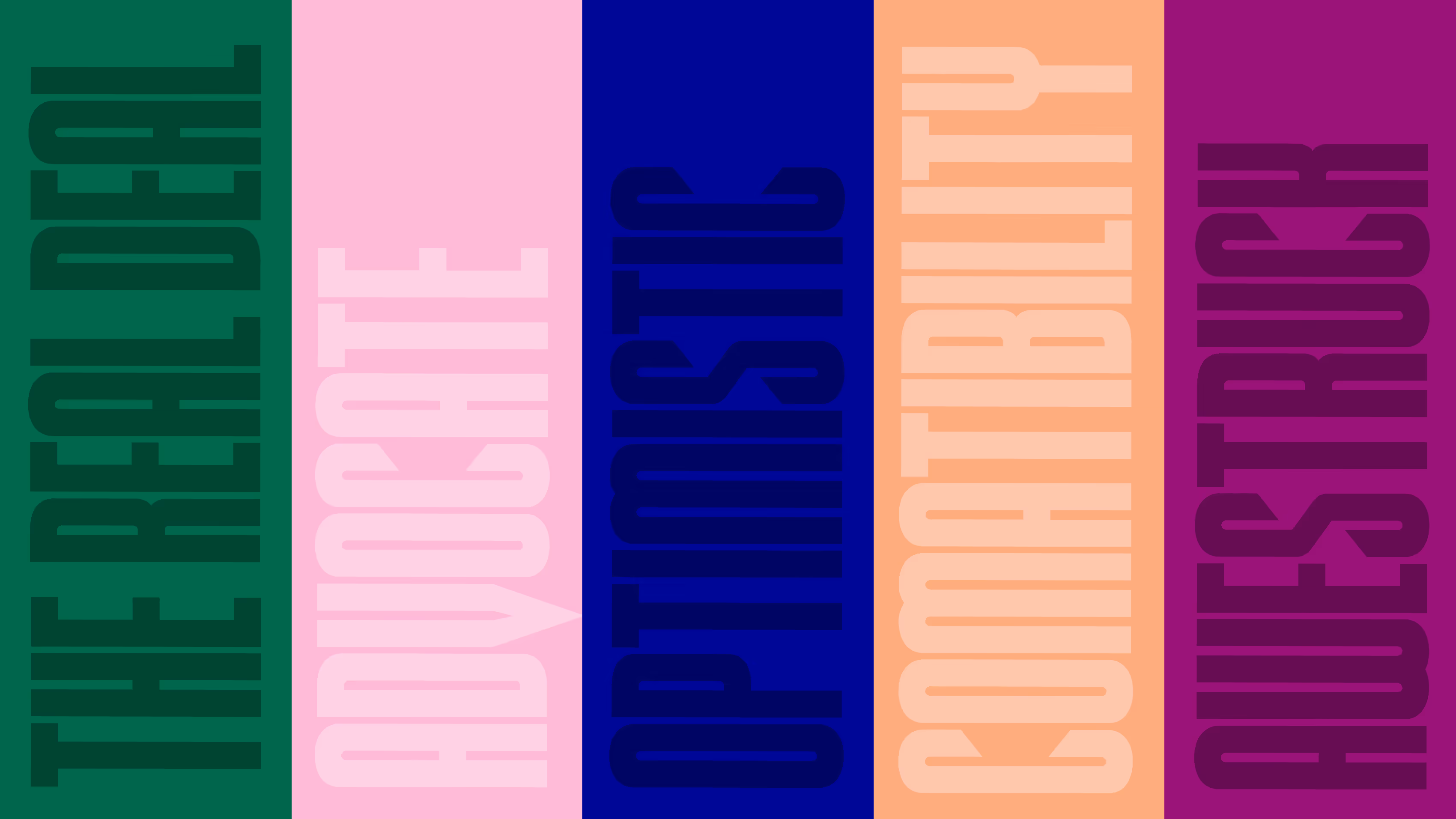
RIKTA's visual identity explodes with a vibrant, anything-but-boring color palette. We crafted a wide-ranging primary palette to ensure the brand always feels fresh and captivating, reflecting their mission to disrupt the traditionally bland HR tech space. Crucially, a secondary palette was developed to provide high-contrast options, guaranteeing full accessibility across their website and app.
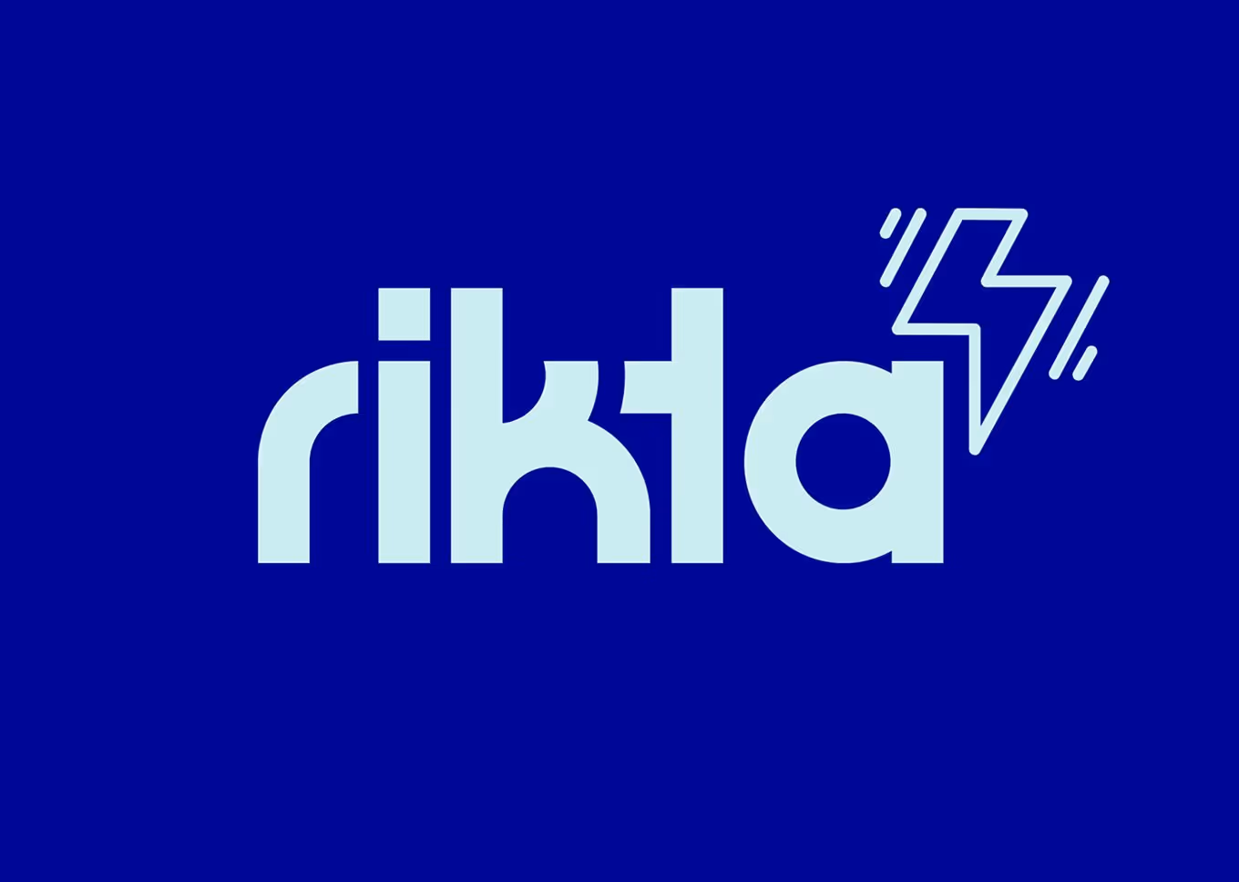
The typography is equally dynamic. We paired the bold, decorative "Bowser" font (perfect for making a statement) with the highly legible "Akira" for all web and UI applications, ensuring both impact and inclusivity.
The typography is equally dynamic. We paired the bold, decorative "Bowser" font (perfect for making a statement) with the highly legible "Akira" for all web and UI applications, ensuring both impact and inclusivity.

Result
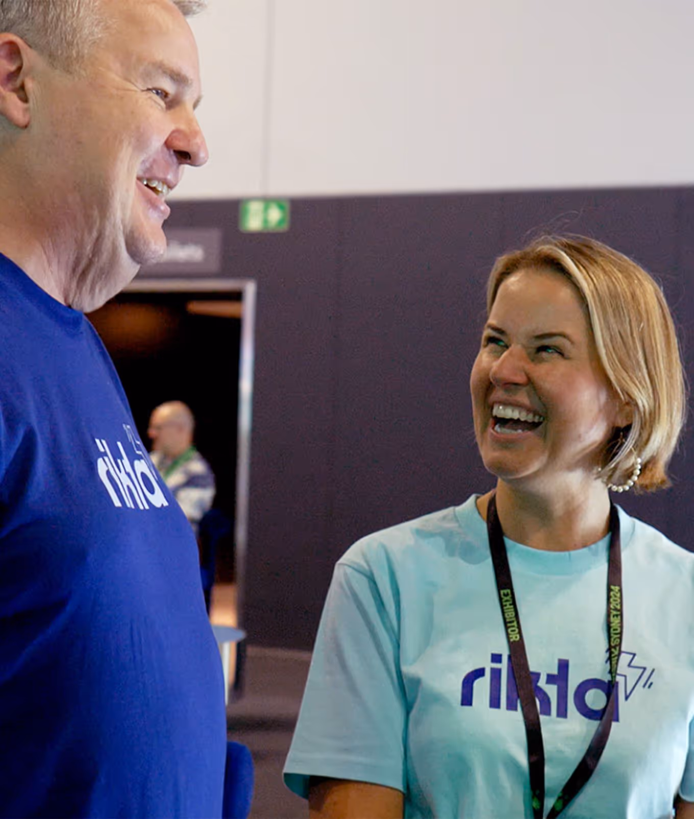
Overall, the client was ecstatic with the creative outcome. They particularly appreciated the thoughtful blend of hand-drawn elements, which added a unique, personal touch to the design.
