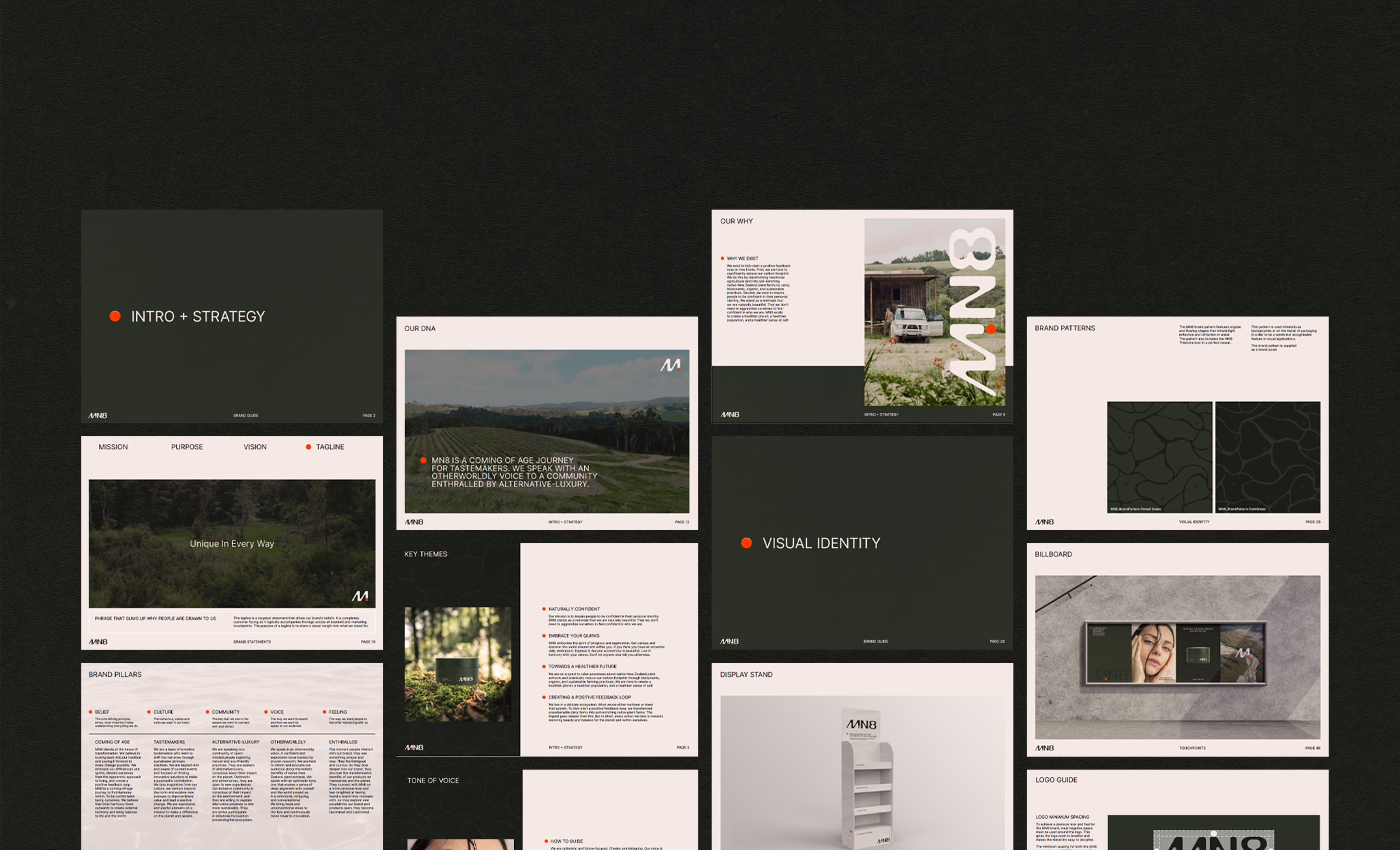
MN8
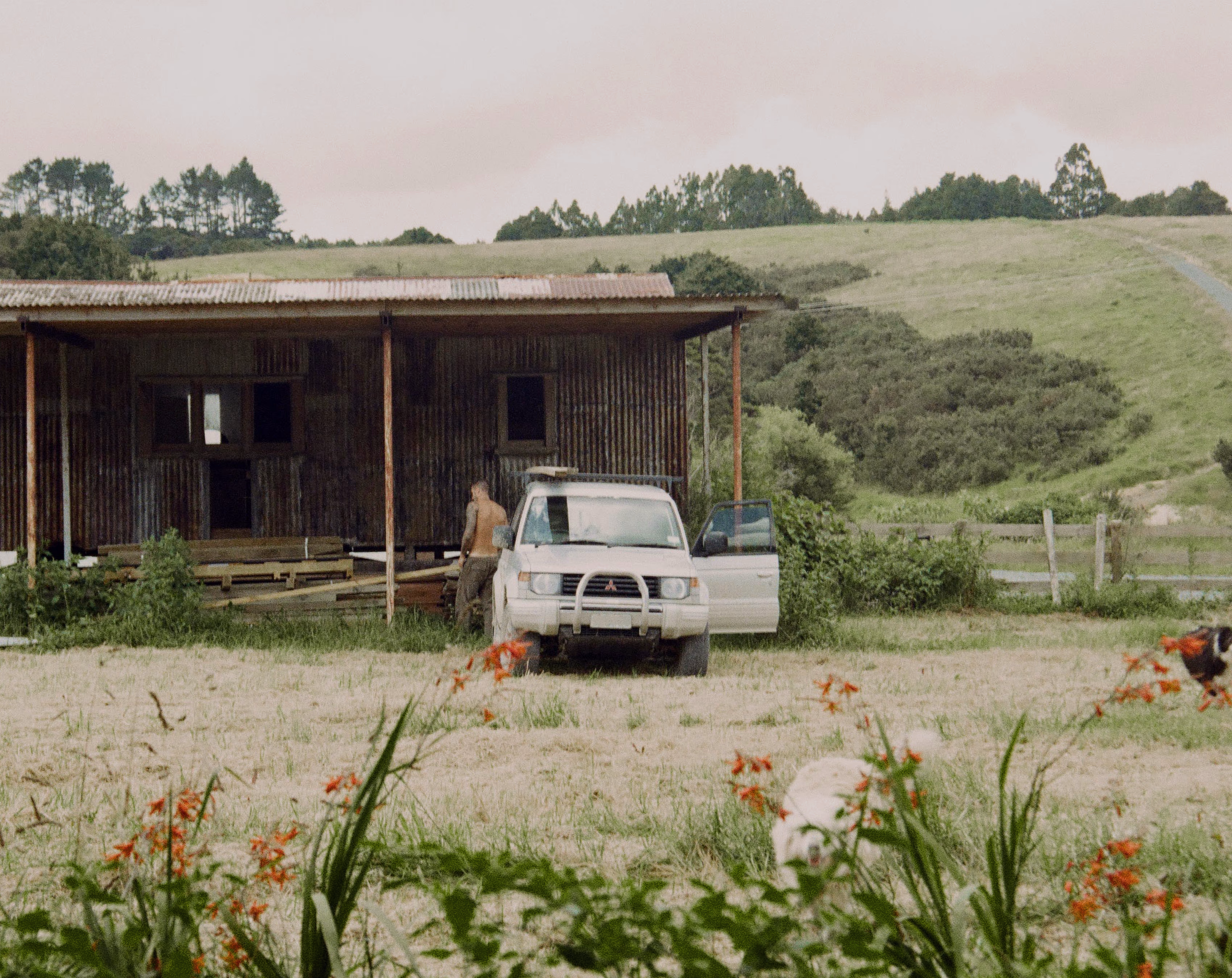
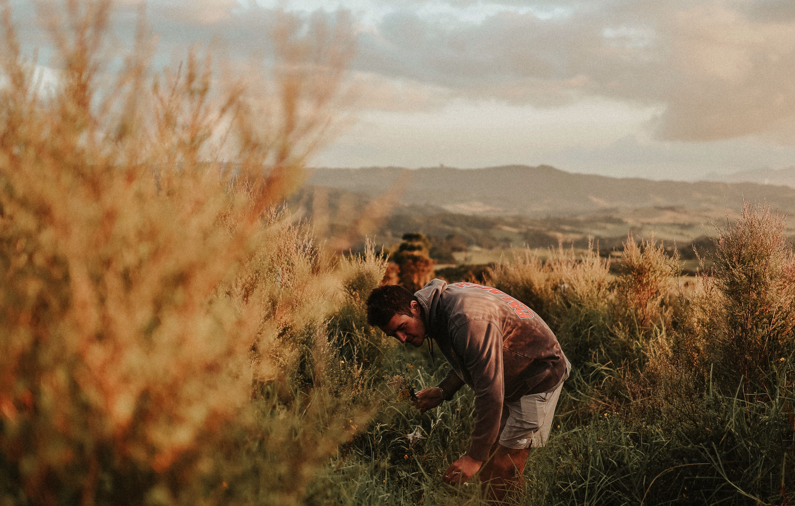
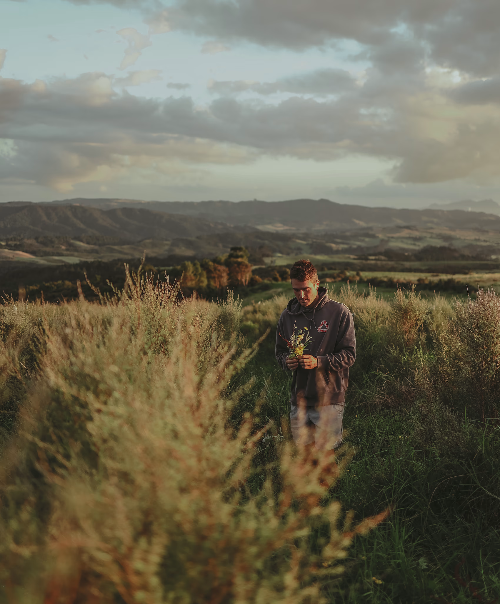
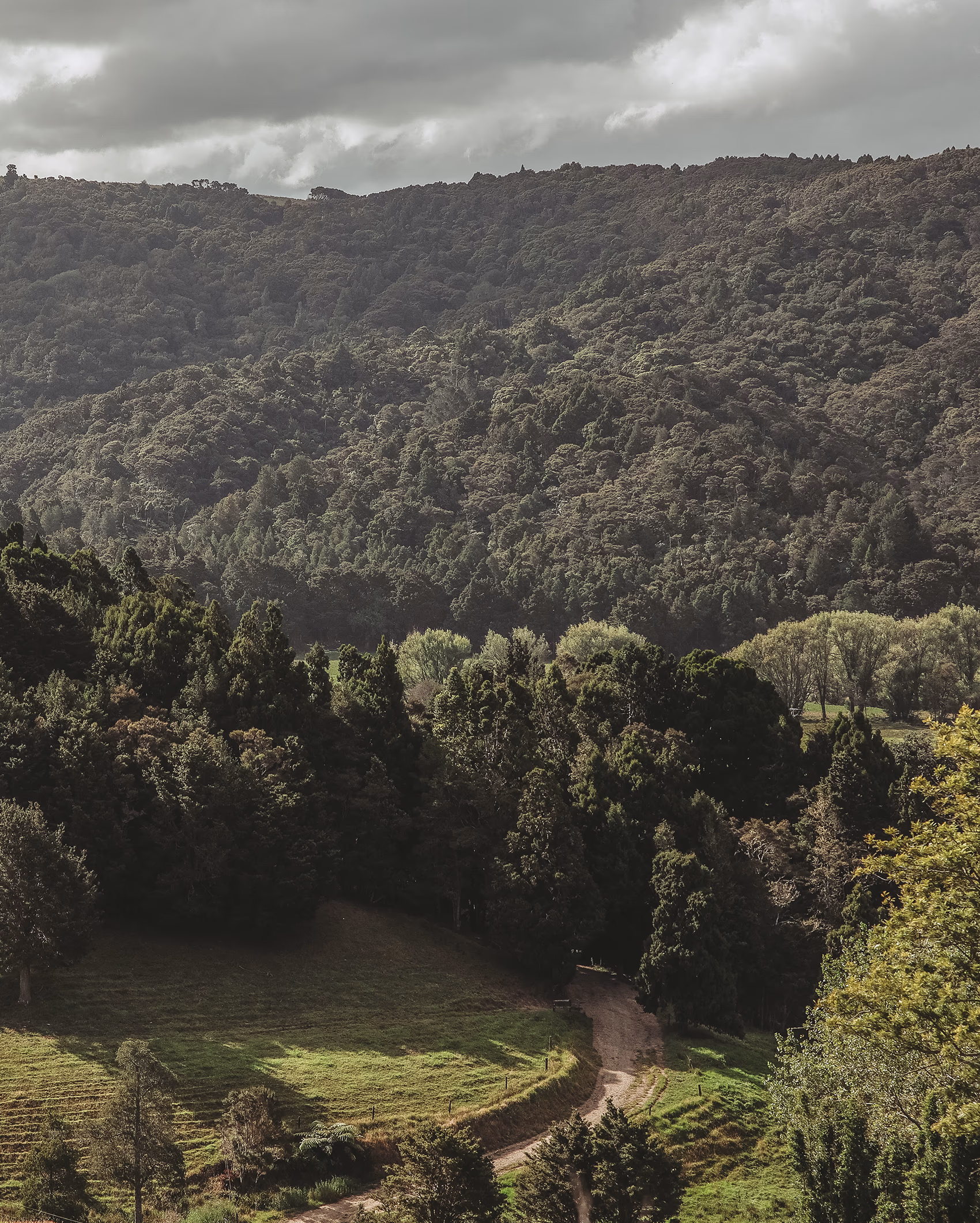
MN8 is a premium New Zealand skincare brand powered by full-spectrum Mānuka Gold Extract™. A potent, CO₂-extracted formulation developed from plants grown on a once-degraded Northland dairy farm, now fully regenerated. Built on a mission to restore land, skin and confidence, MN8 merges modern science with nature’s complexity to deliver high-performance skincare with real purpose. Our scope included brand strategy, naming, copy and voice, visual identity, packaging design, and the full e-commerce website. From the ground up, we shaped MN8’s bold, regenerative vision into a cohesive brand that feels premium, powerful and deeply connected to the land it comes from.
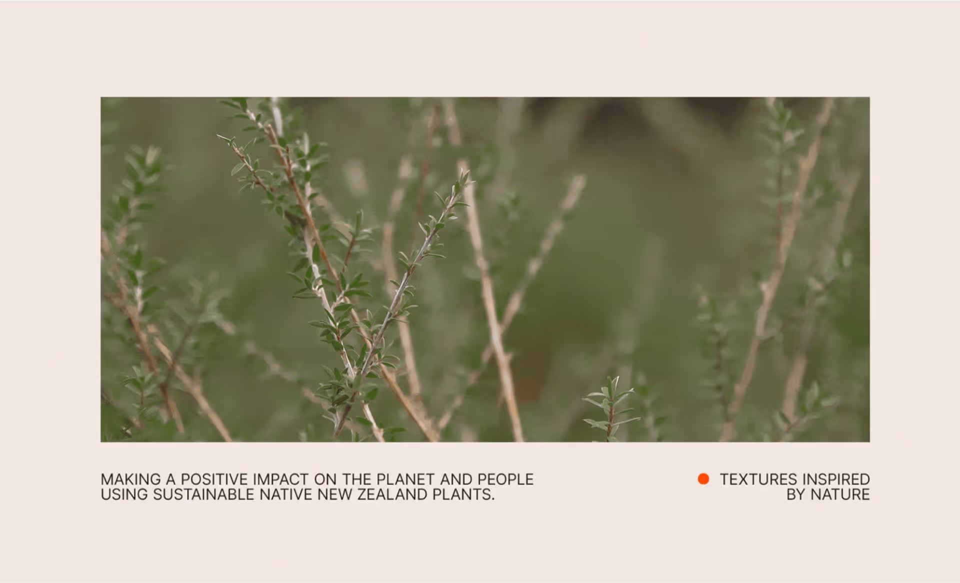
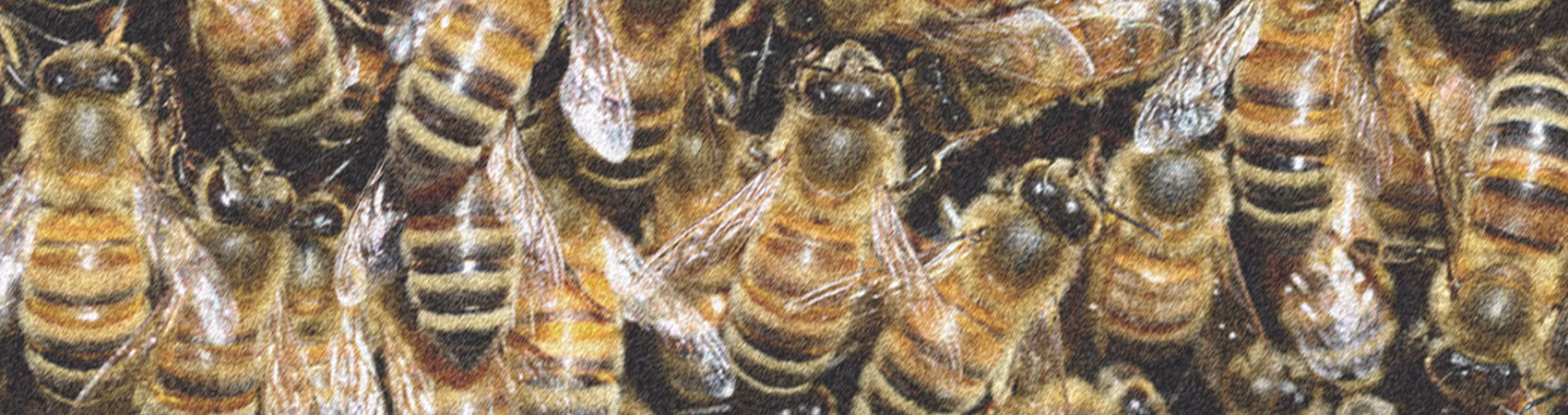
MN8 crafts effective skincare solutions that empower people to embrace their uniqueness and live with confidence. Making a positive impact on the planet and people using sustainable native New Zealand plants.
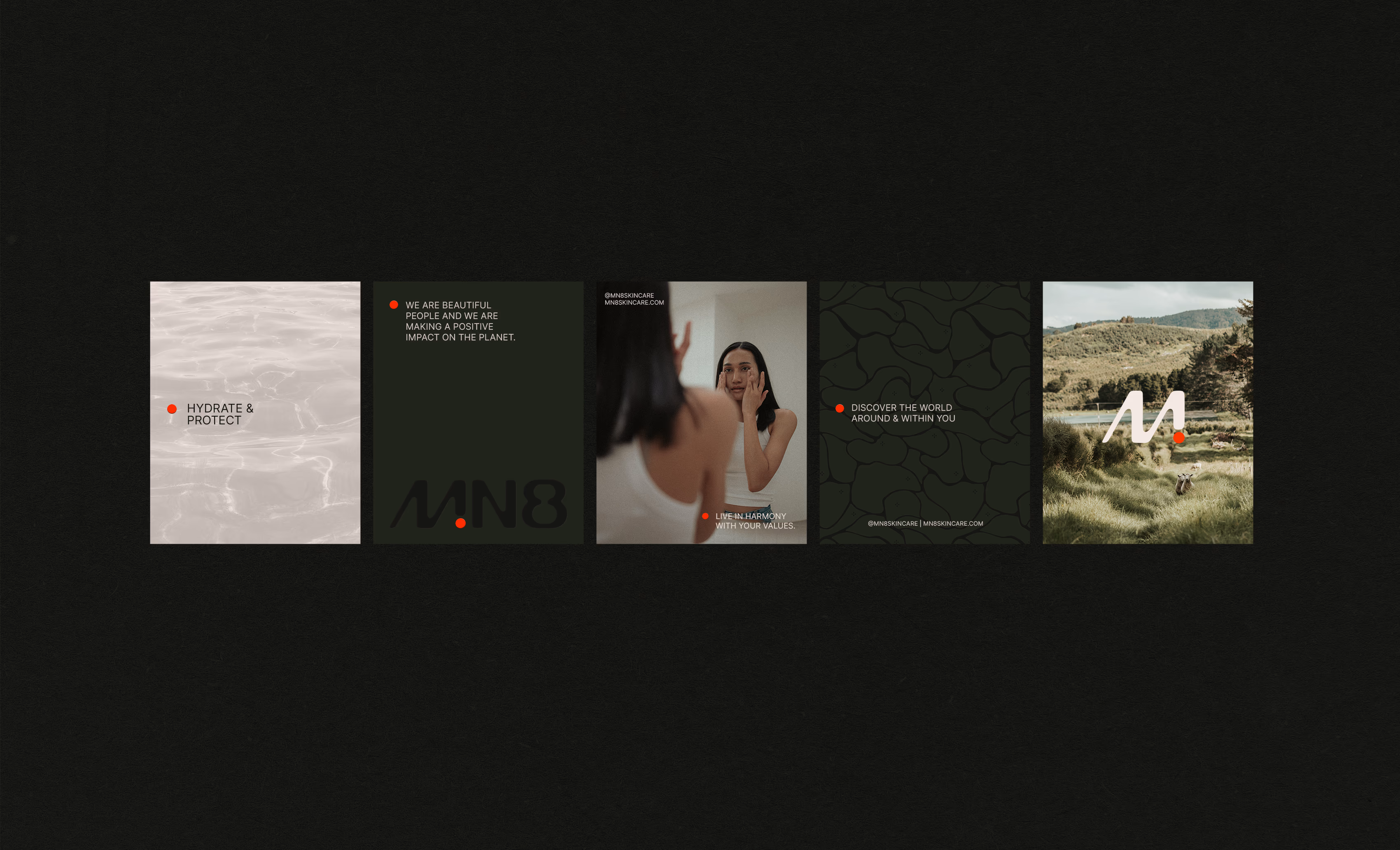
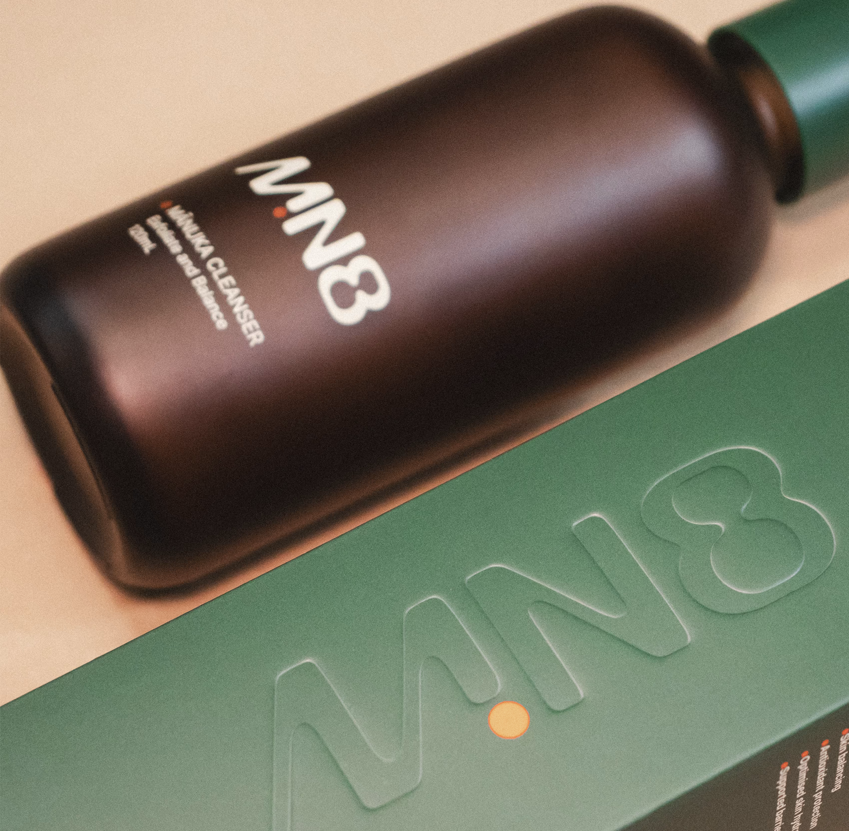
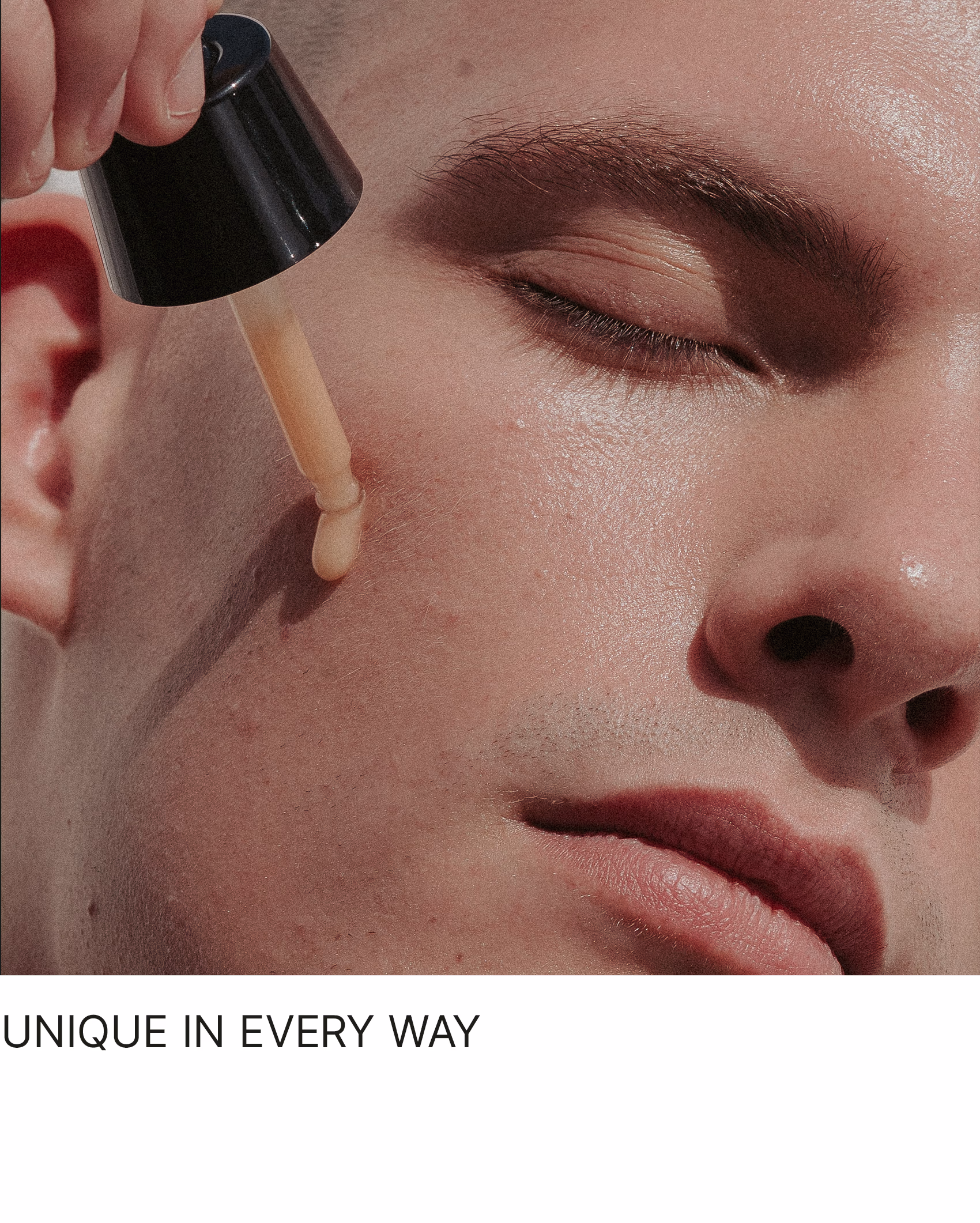
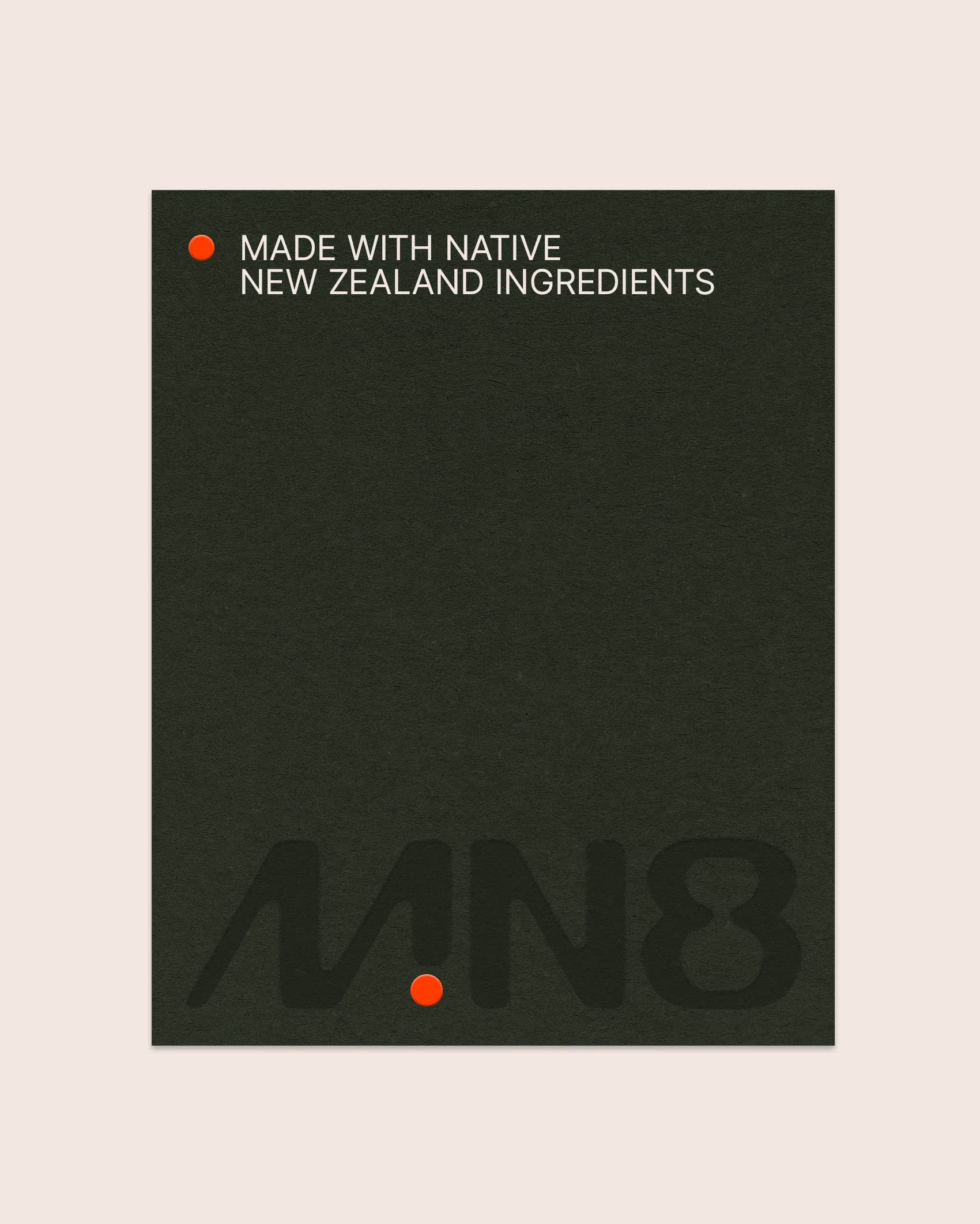
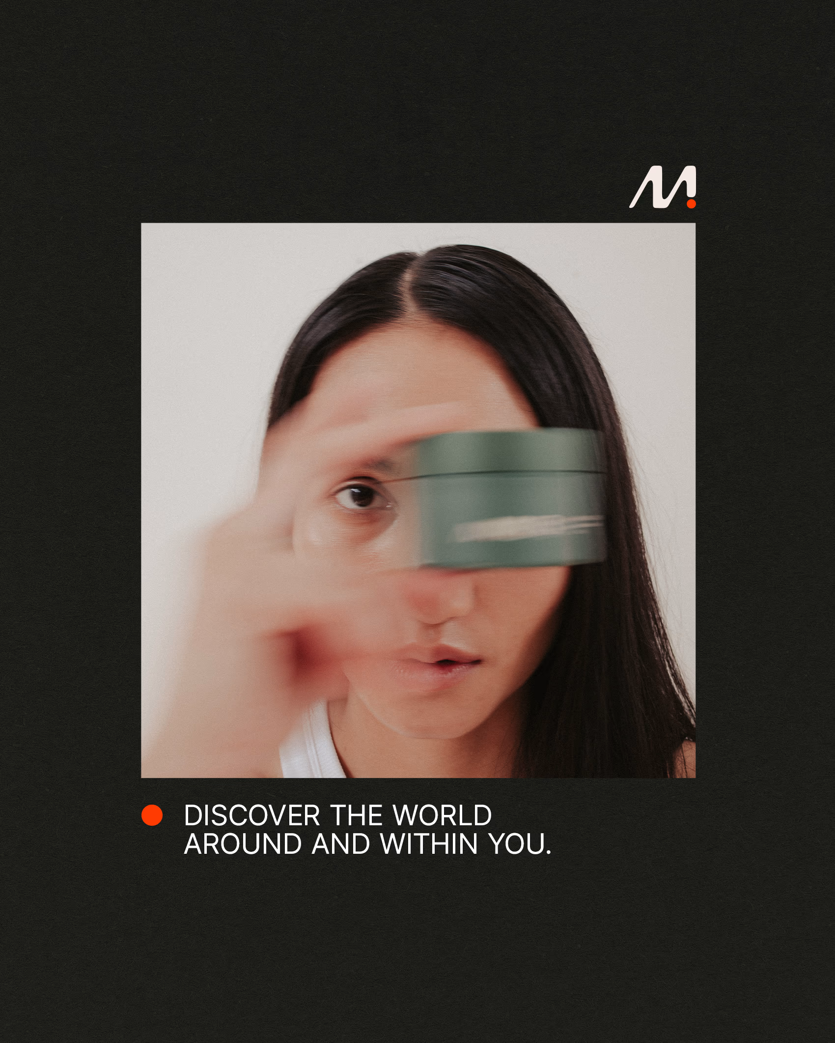
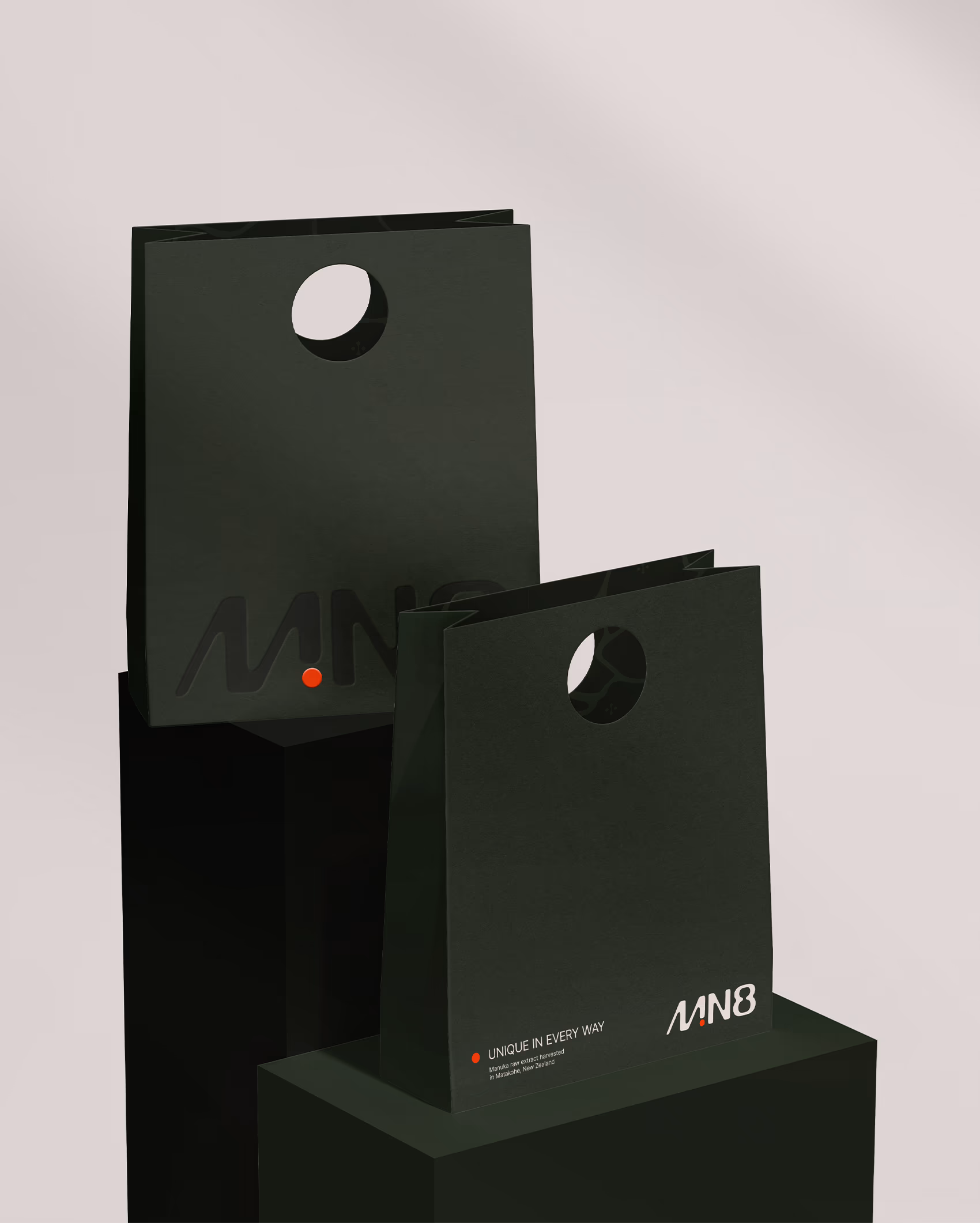
The brand centres around its hero ingredient, Mānuka Gold Extract. This powerful ingredient is visualised by the brand’s recognisable orange dot: a glowing motif that appears across packaging and digital touchpoints, unifying the brand through a symbol of purity, potency, and nature-led efficacy.


Naming & Brand Strategy
Pronounced “emanate,” this name blends the meaning and phonetics of a real word with the visual edginess of an acronym to create something contemporary, aesthetic, and relevant to modern audiences. Defined as “to emit a sensation, feeling or quality” it reflects both the natural origins of the product and the way customers express their ethos in sustainability by choosing to invest in MN8.

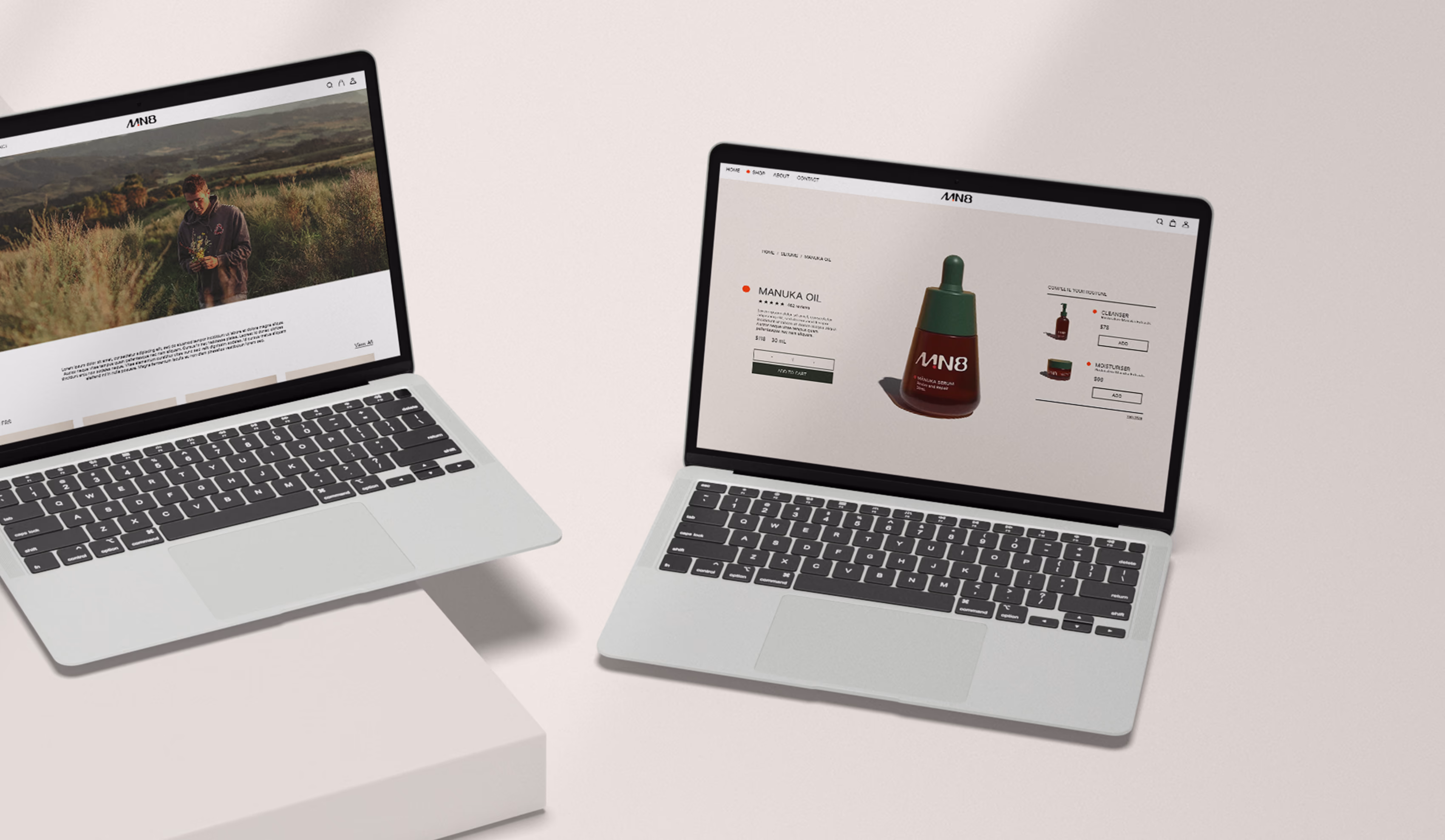
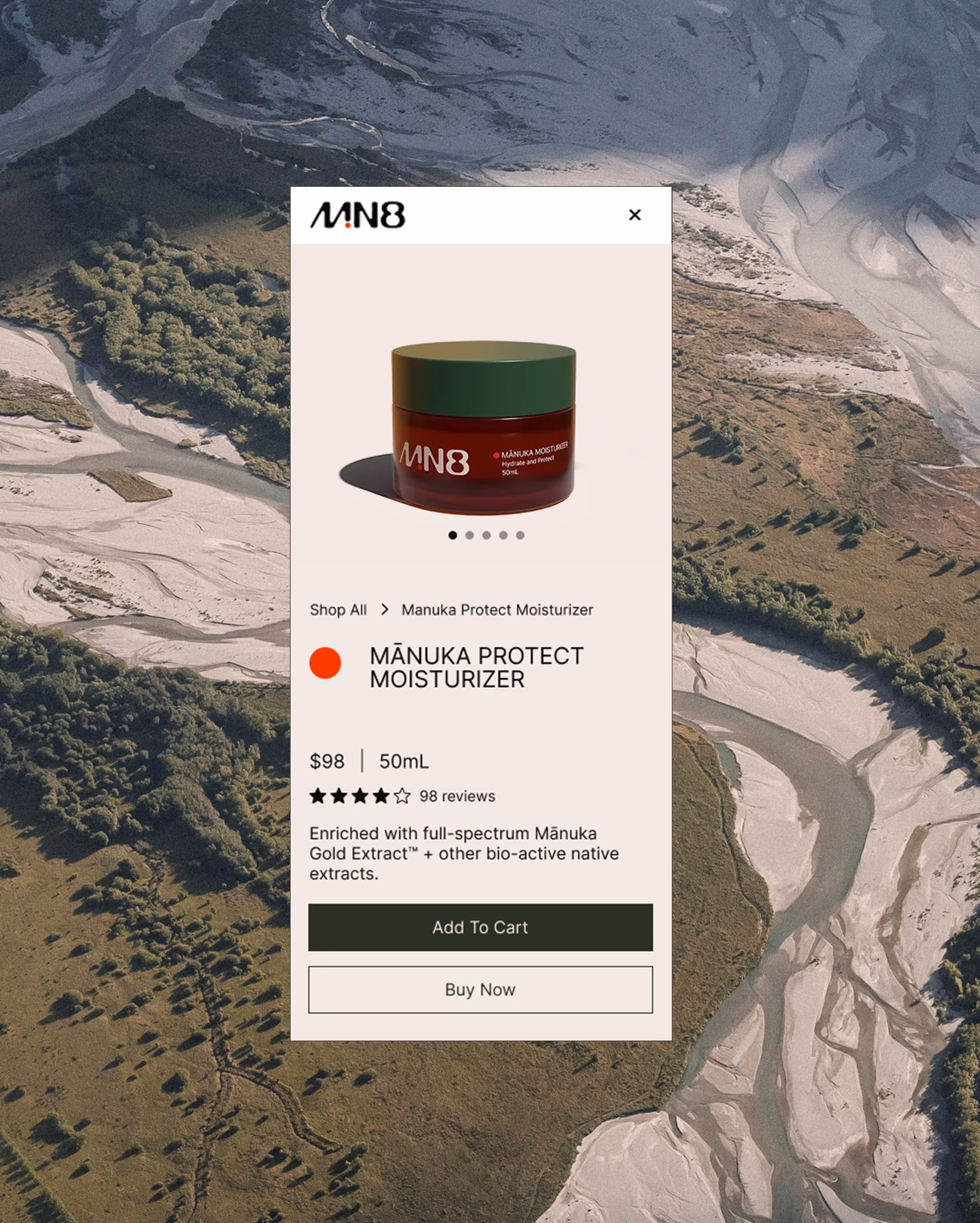
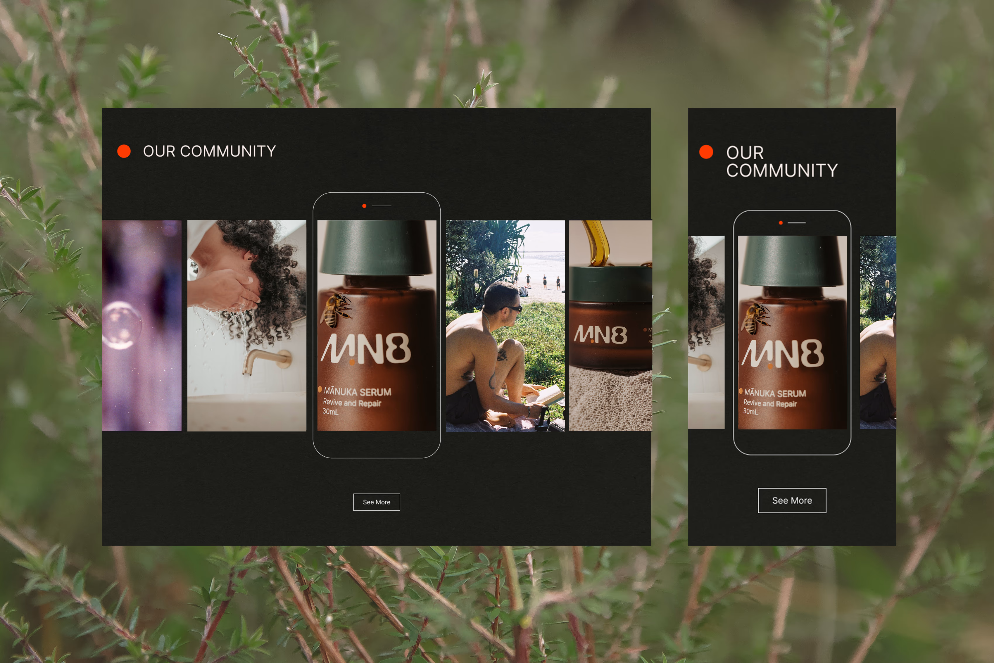
E-commerce Website Design
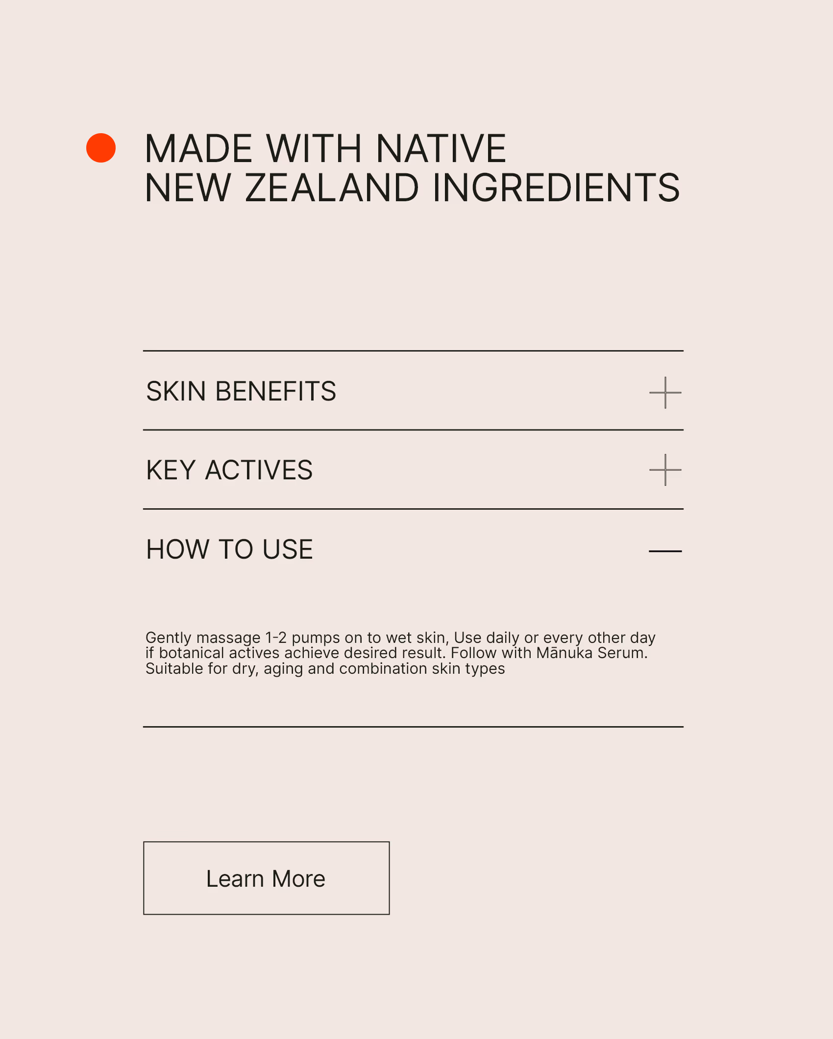
A focus on a clean, intuitive design that puts MN8 products and the photography of their regenerative NZ farm, front and centre. A subtle scientific aesthetic was incorporated to convey trustworthiness, while also sparking the curiosity and exploration inherent to the MN8 brand. The website's design aims to go beyond surface-level communication with engaging animations and interactive elements, inviting users to immerse themselves in the fascinating MN8 world.

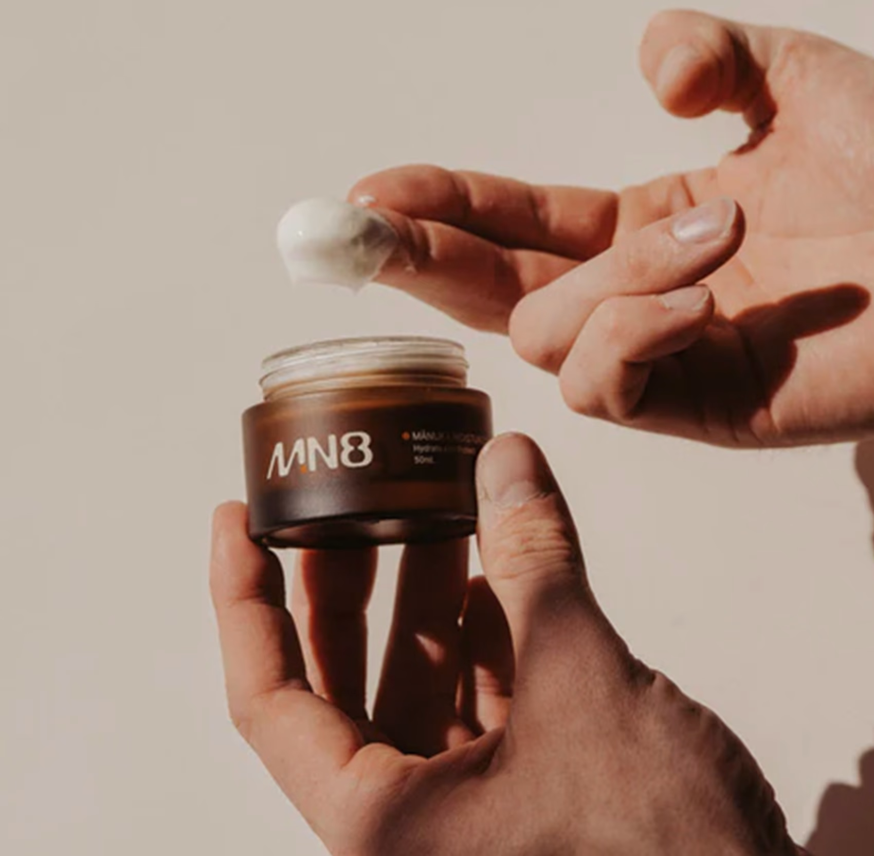

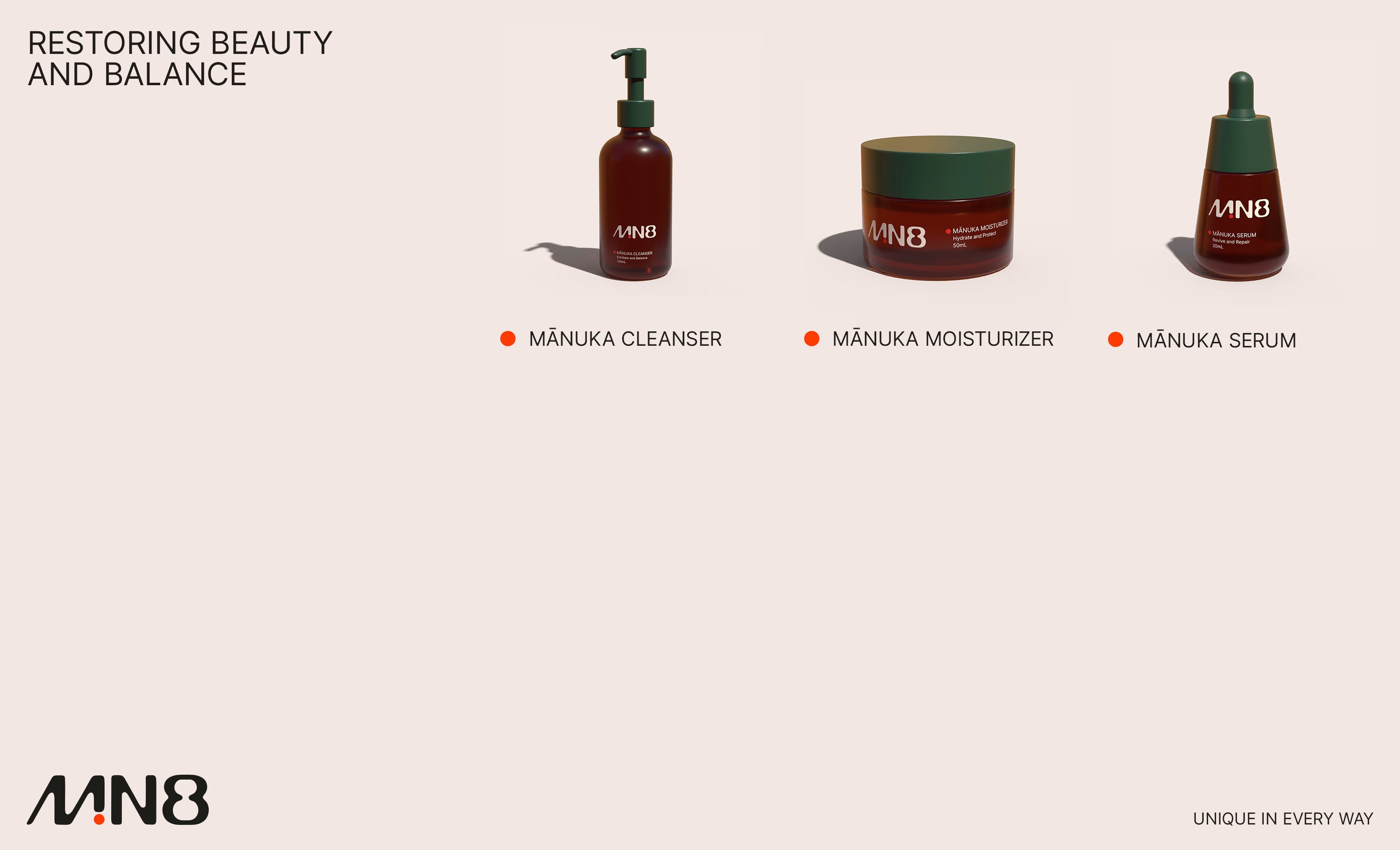
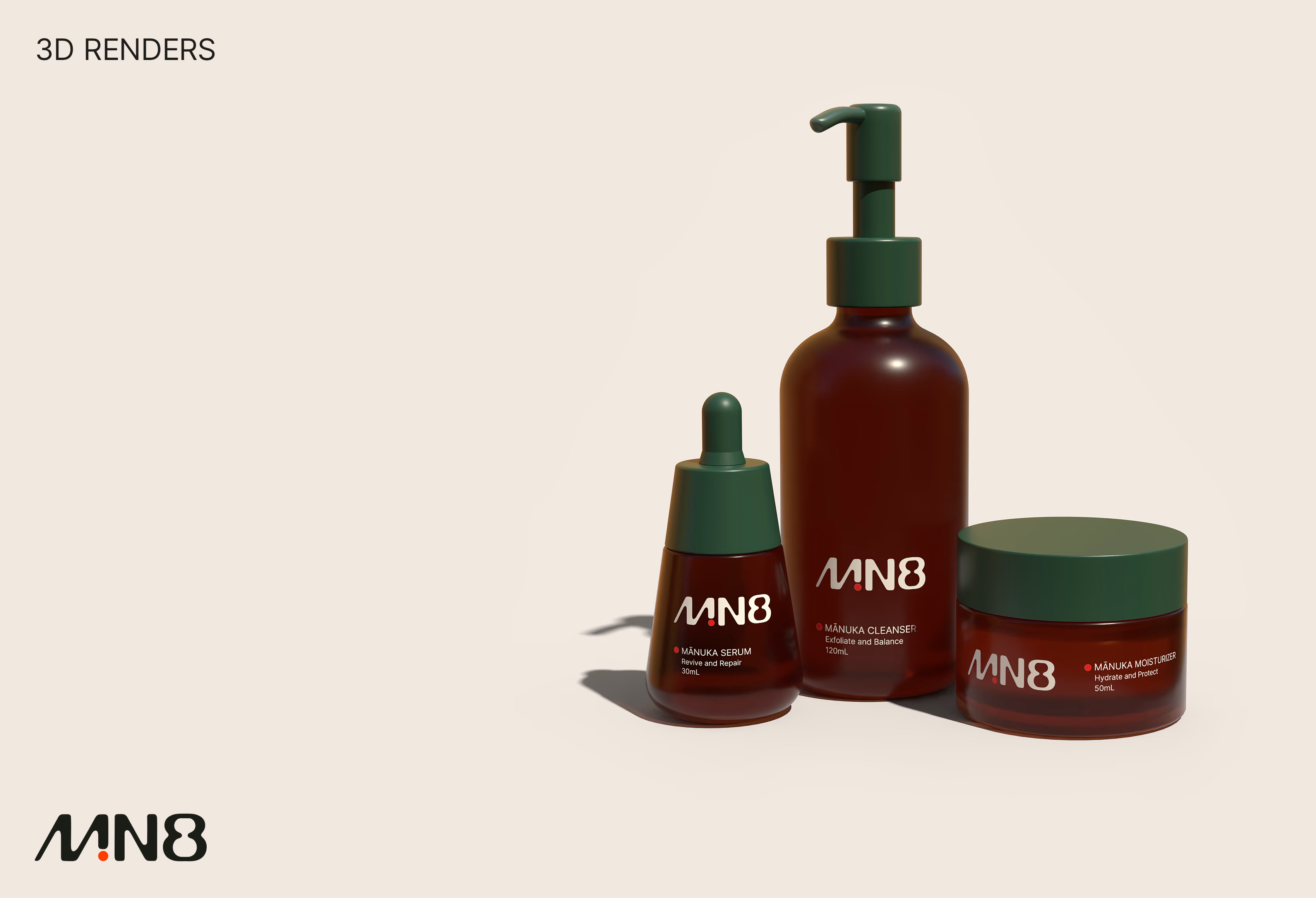
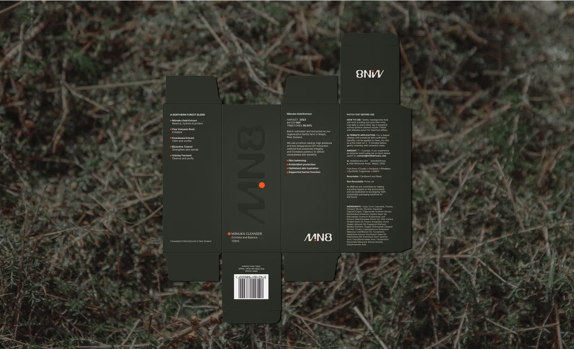
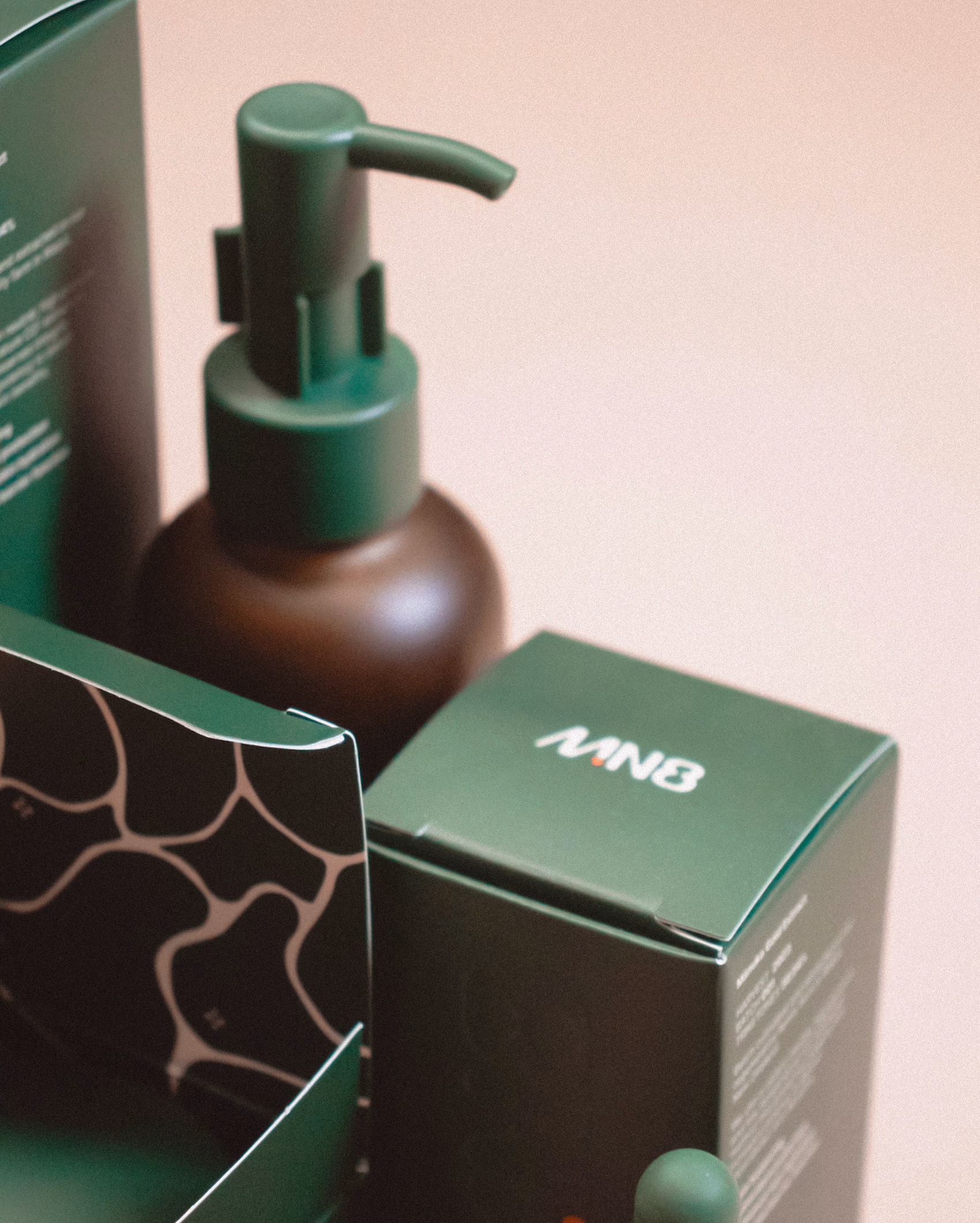
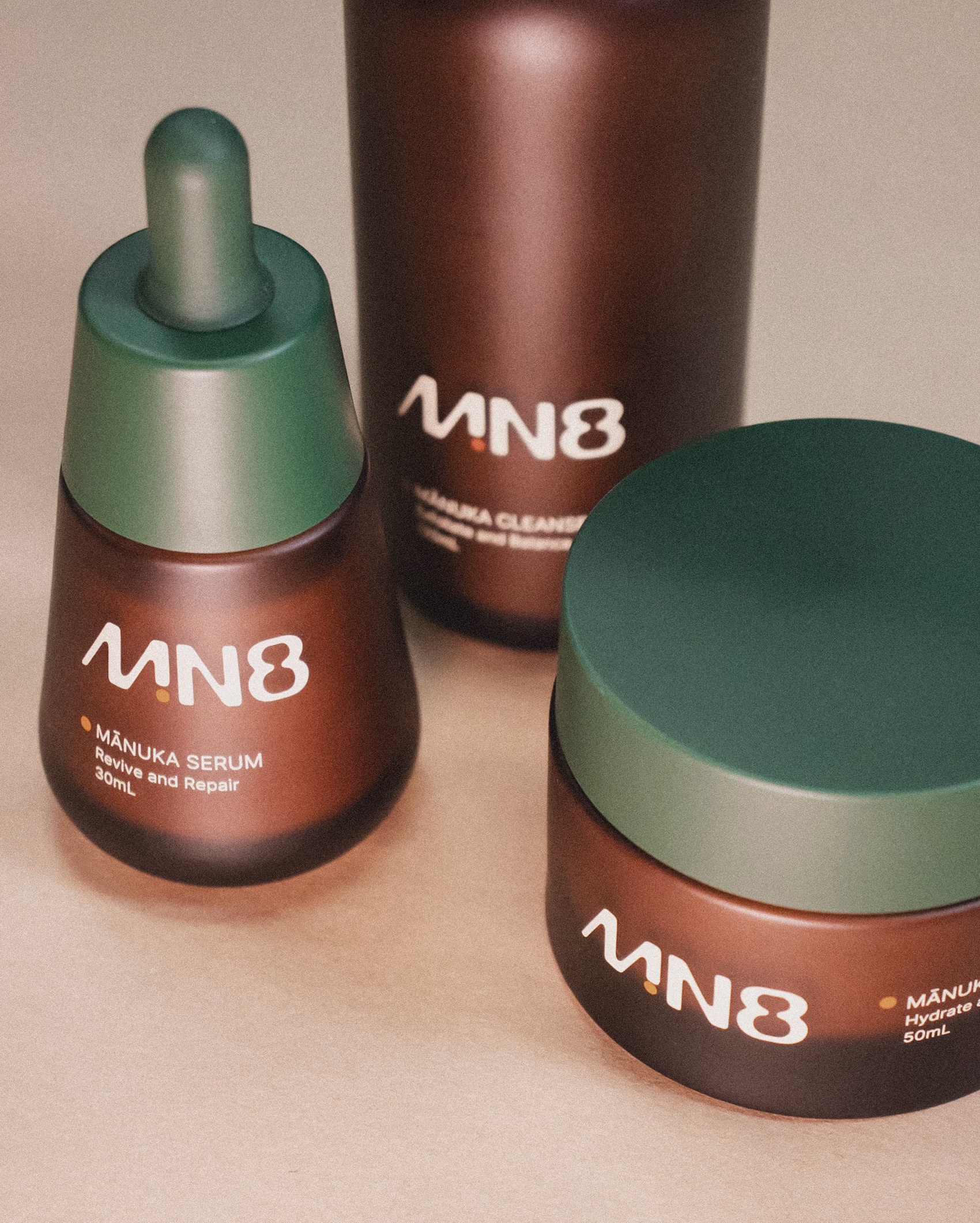
Packaging design and 3d modelling
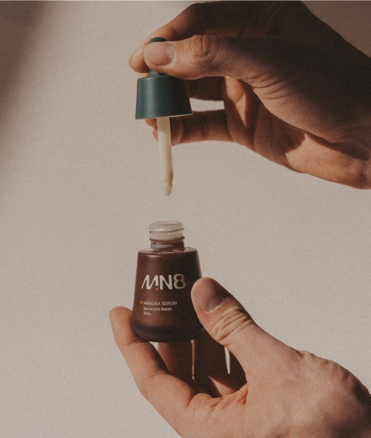
Housed in amber glass jars and bottles with deep green pumps and lids, the packaging balances a minimal, scientific aesthetic with subtle botanical cues. This clean visual language signals both efficacy and sustainability, aligning with MN8’s regenerative farming practices. To support digital storytelling, each product was also meticulously 3D rendered, allowing the website experience to mirror the tactile quality and detail of the physical packaging.

Visual Identity
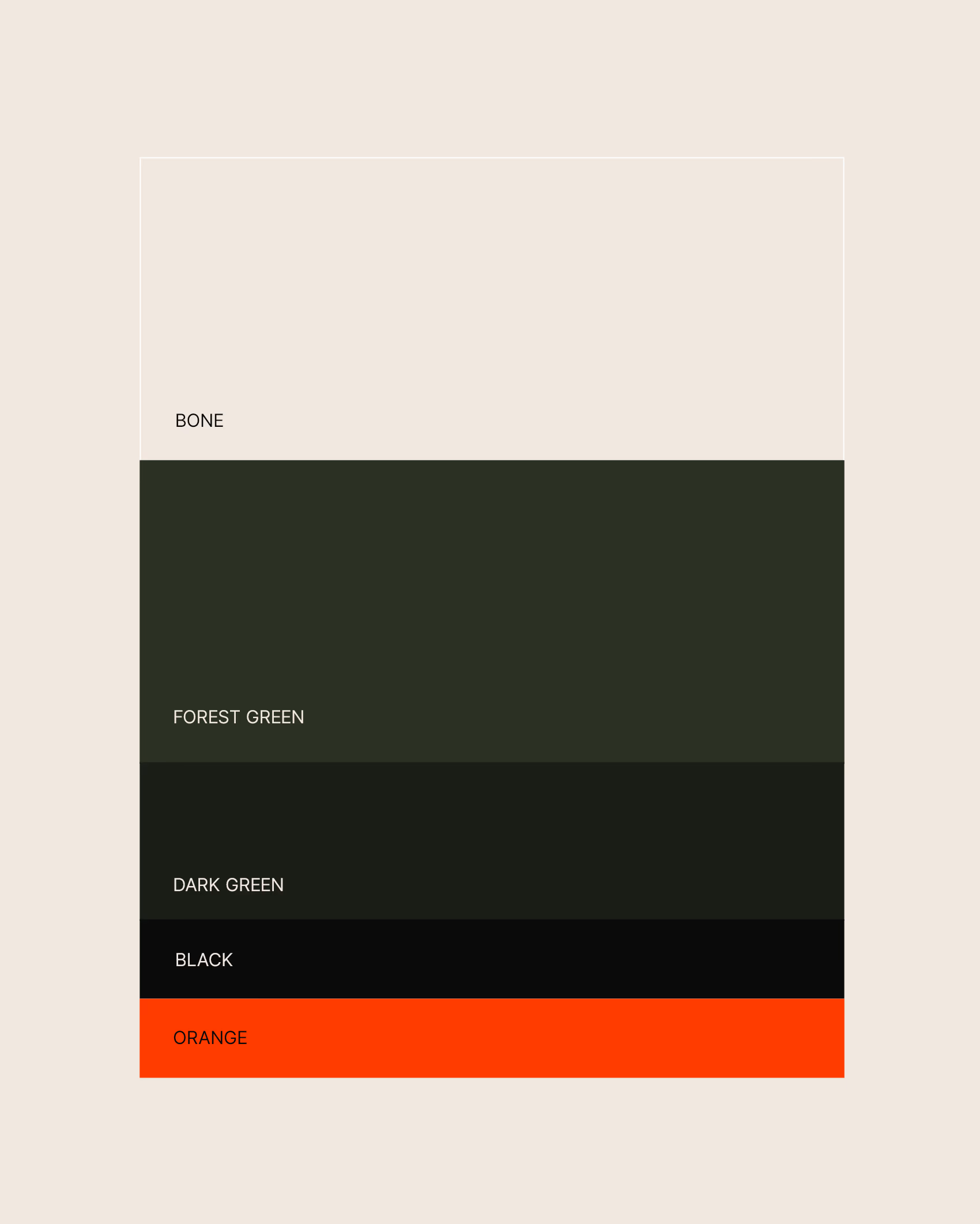
Grounded in clarity and intention. Generous breathing space, clean typography, and a considered use of the bright orange dot, the brand’s hero motif, are working together to create a sense of quiet confidence and focus. Textures drawn from nature are layered subtly throughout the brand, reinforcing its botanical roots and regenerative ethos. Every design element is purposeful, balancing scientific precision with natural beauty.