BKT
BKT is Australia’s first nanoplasty-only hair salon, pairing specialist haircare products with expert-led training to help stylists create hair that transforms lives. What began as $600 for founder Leticia Prado has evolved into a brand defined by freedom, mastery, and allure, but they needed branding that reflected the beauty behind every transformation.
Credit: Photography by BKT
What BKT Needed
BKT came to us with a mission to make their brand known globally, for stylists who want to master the art of creating beautiful, transformative hair, and for customers who seek the freedom that comes with it. They needed a rebrand that carried emotional depth while reflecting the same polish, sophistication, and effortless beauty that define the results they deliver.


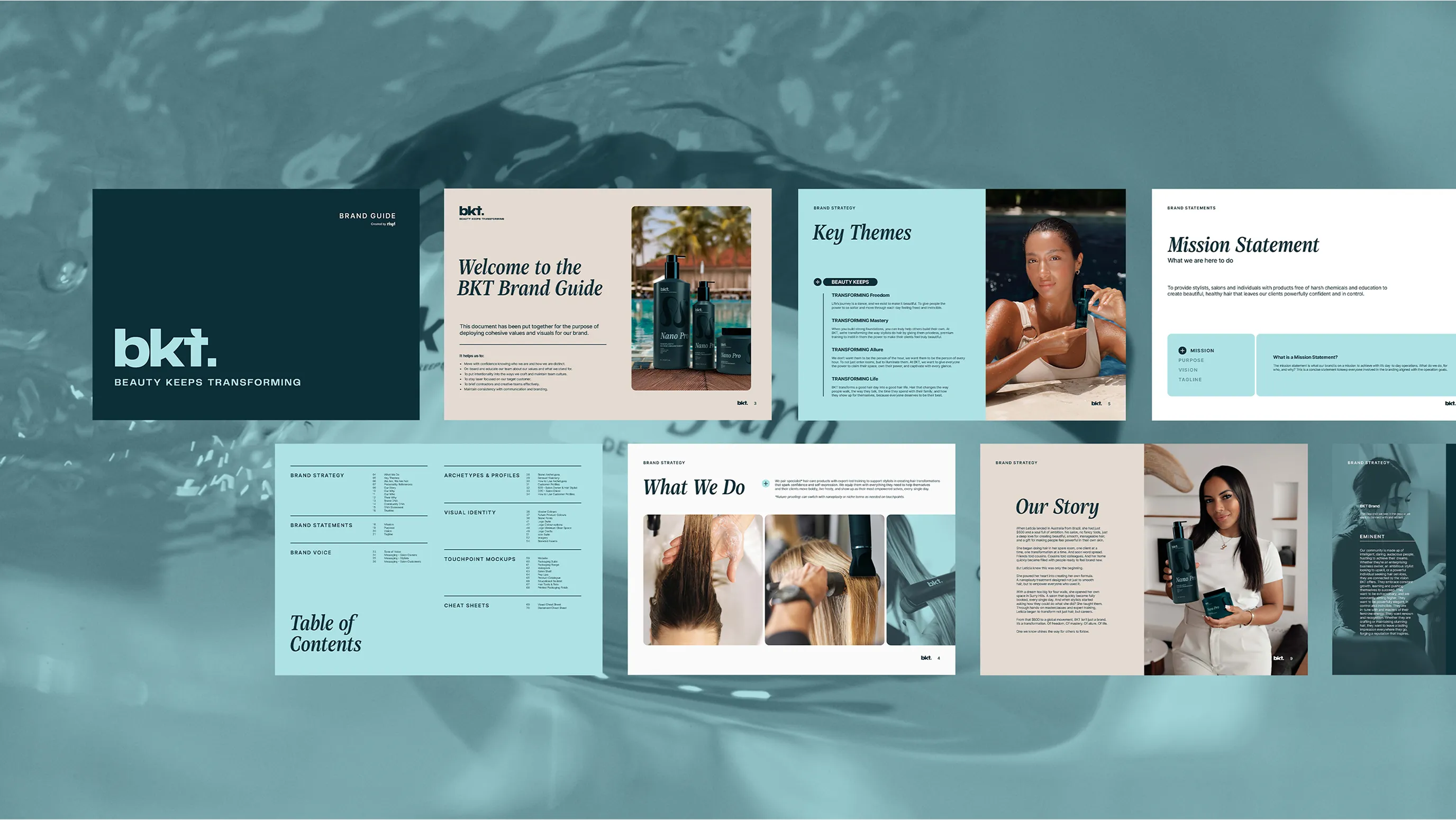
Transforming the brand
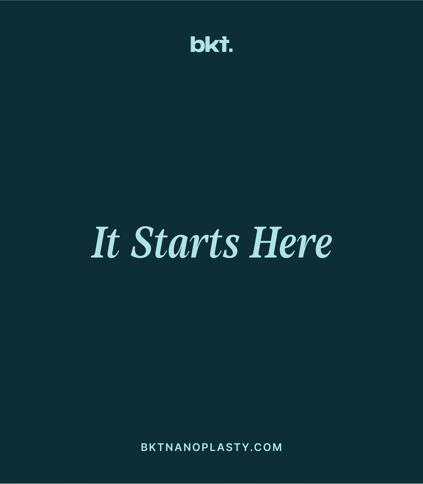
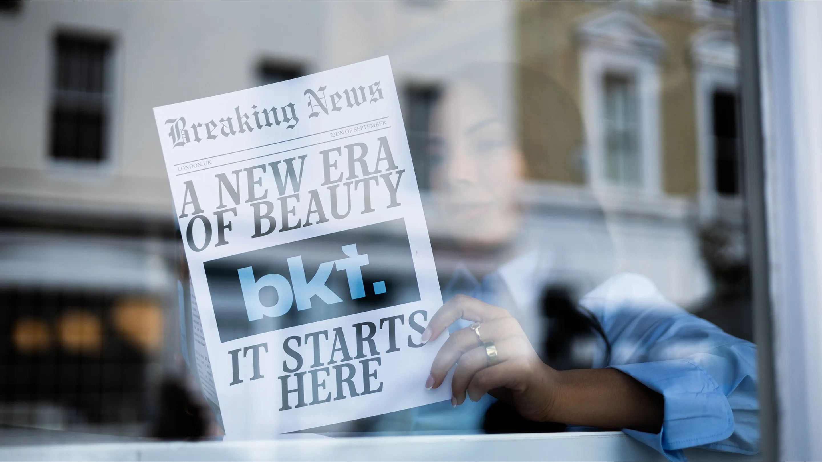
Our strategy centred on the name Beauty Keeps Transforming. While “transforming” existed in the name, it had no clear meaning, so we built the brand around giving it one, defining distinct B2B and D2C themes of transforming life, transforming confidence, and transforming freedom. The new tagline ‘It starts here’ reinforces this sense of change, with flexible variations like ‘Mastery starts here’ or ‘Freedom starts here’ to keep it dynamic. The newly developed tone of edgy opulence balances refined polish with bold emotion, helping BKT communicate its purpose: a brand that empowers stylists and customers to overcome anything.
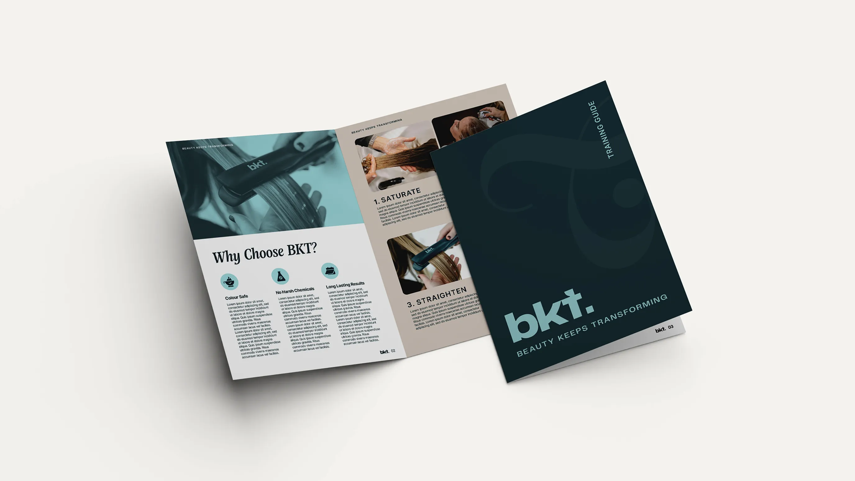
A Timeless Design
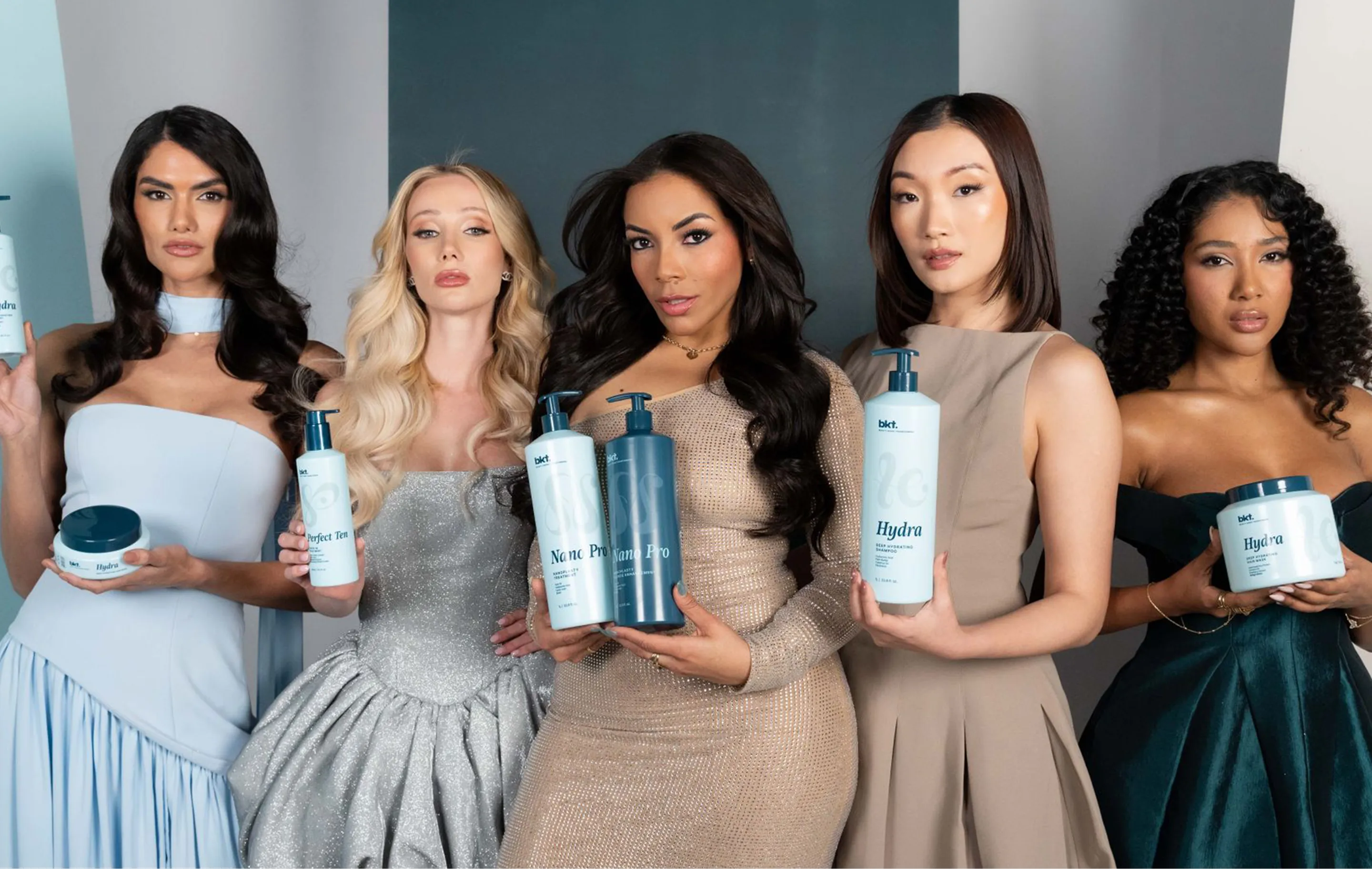
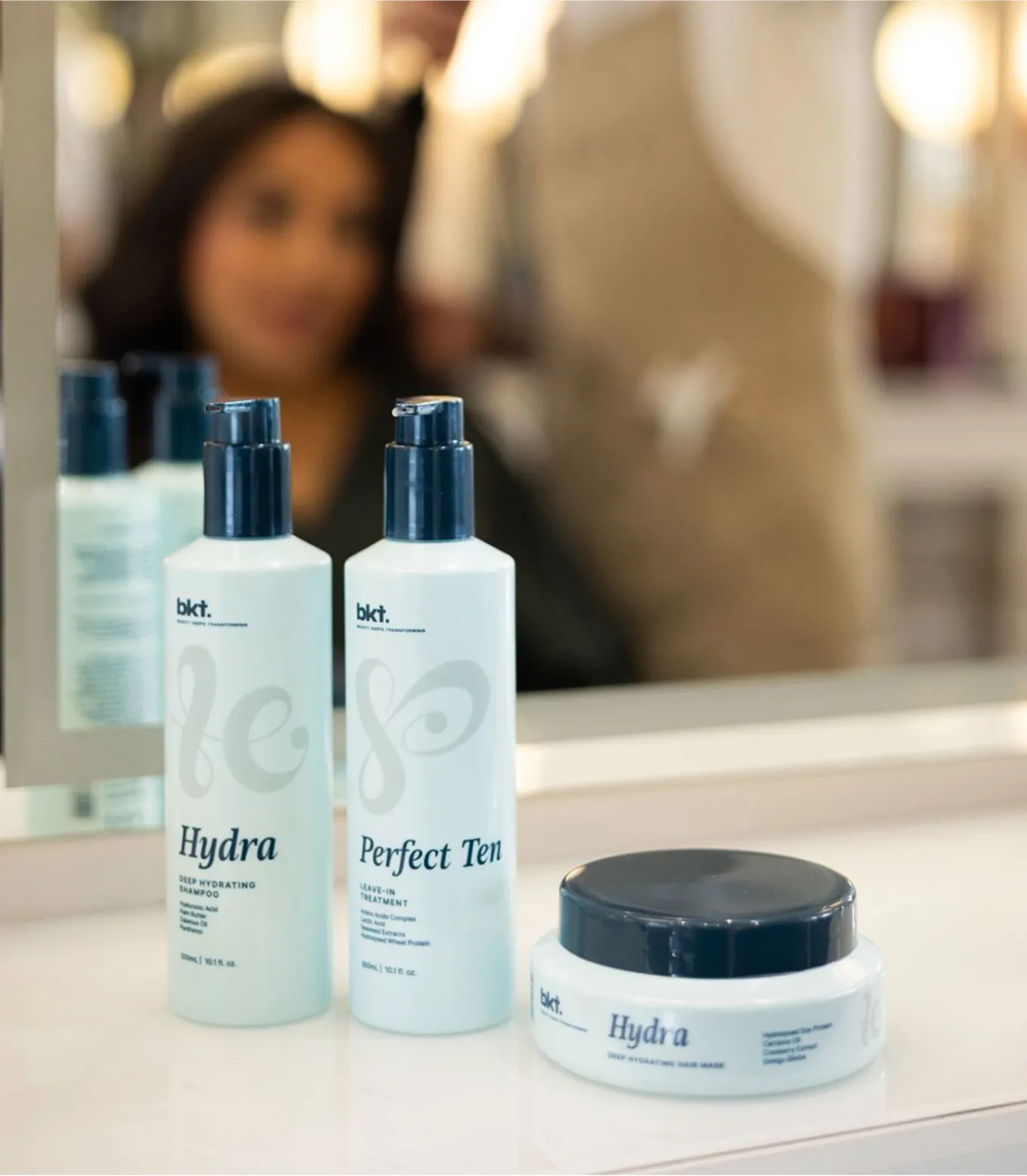
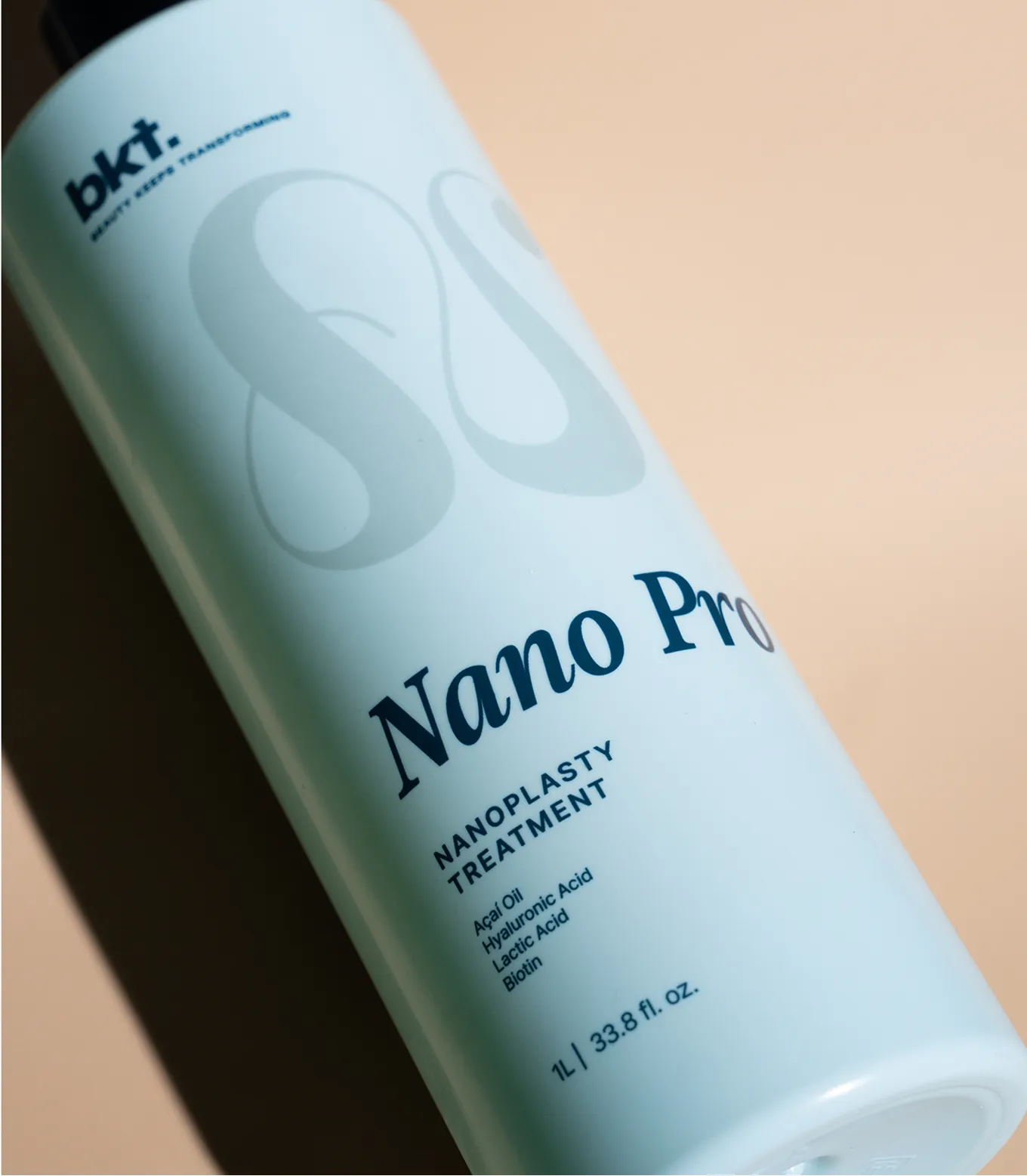
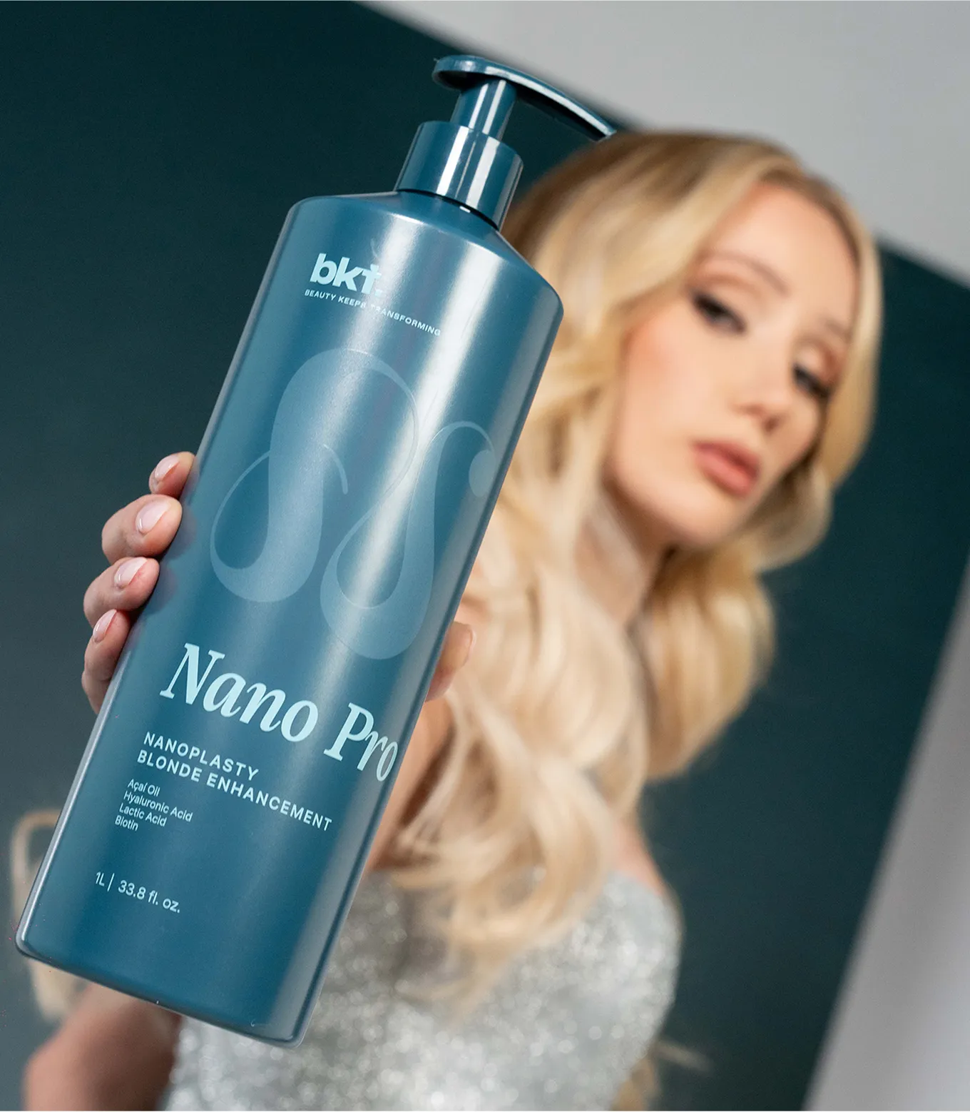
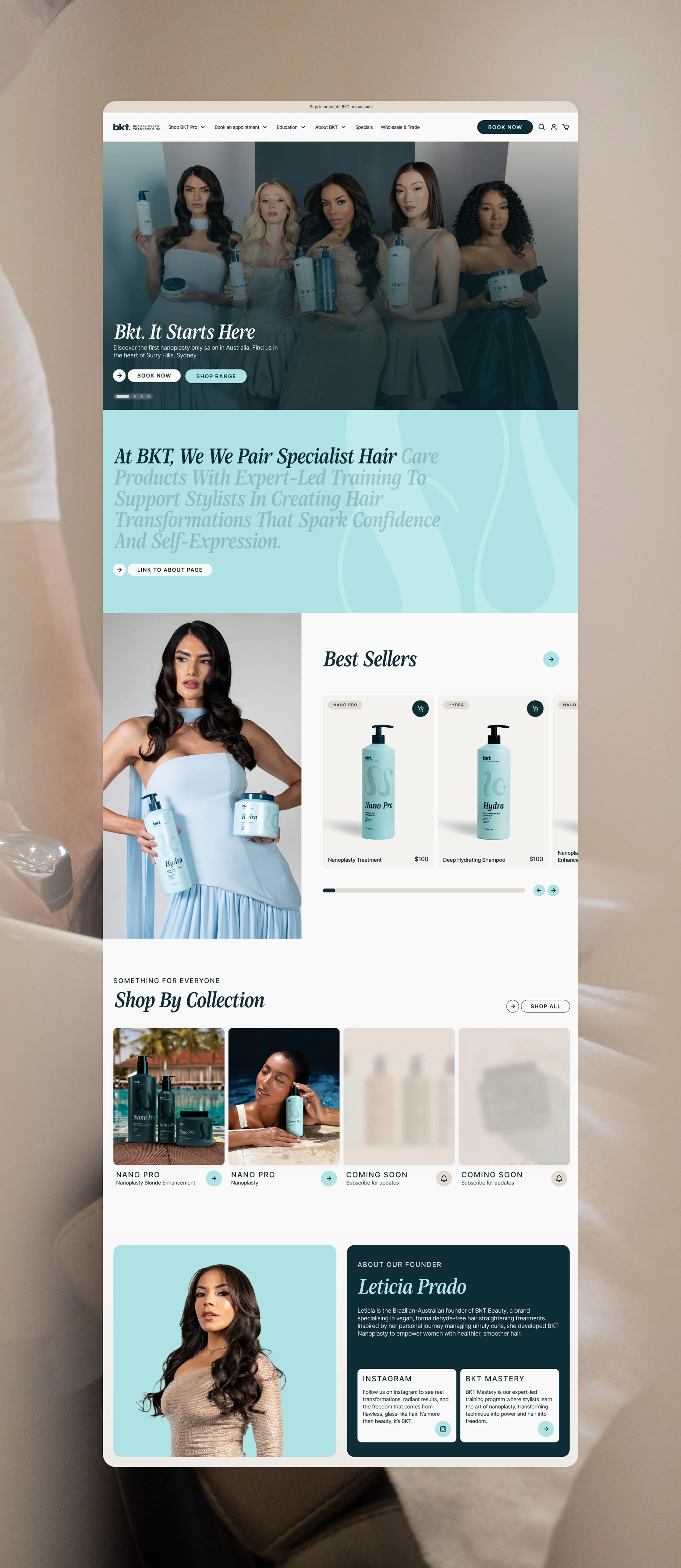
Visually, BKT needed a brand that felt premium, professional, and effortlessly beautiful, whilst moving beyond their black, gold, and white packaging that felt oversaturated in the industry. We created a new colour palette inspired by the fresh, natural tones of Brazilian beaches, with aqua blue and dark teal forming the foundation and sand and white adding warmth. Every design choice, from the bold geometric logo with inktraps to the full stop in “bkt.”, created a contemporary, timeless edge that let the packaging’s colours and motifs take centre stage.
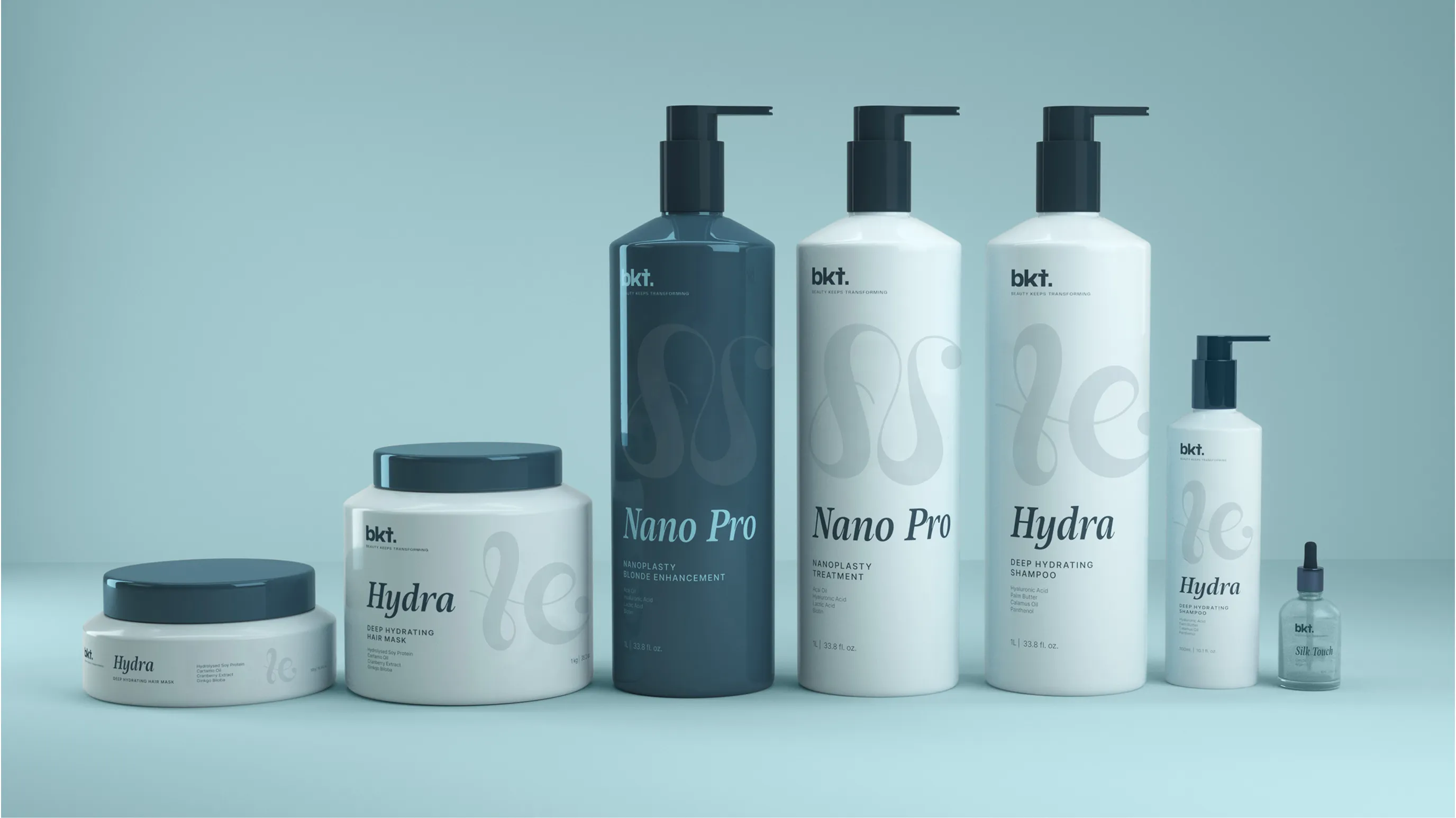

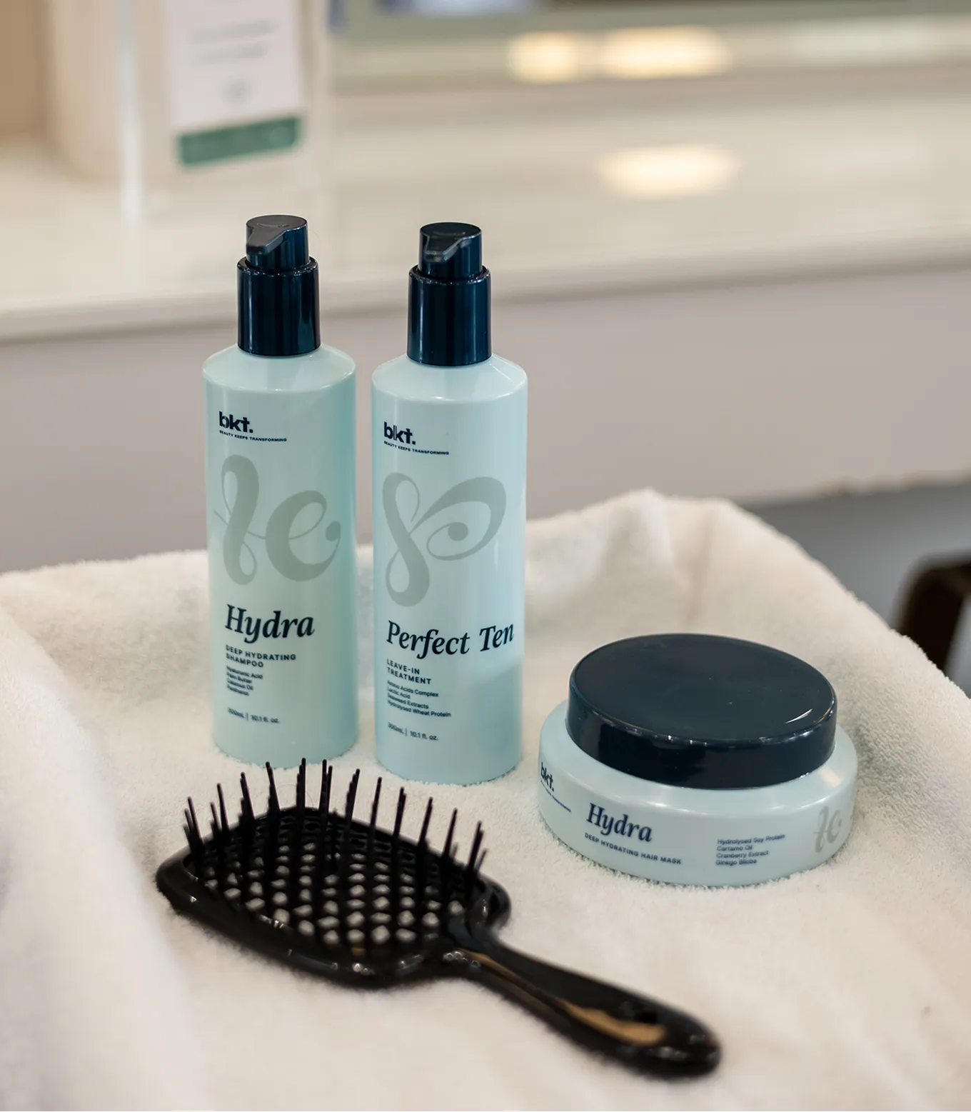
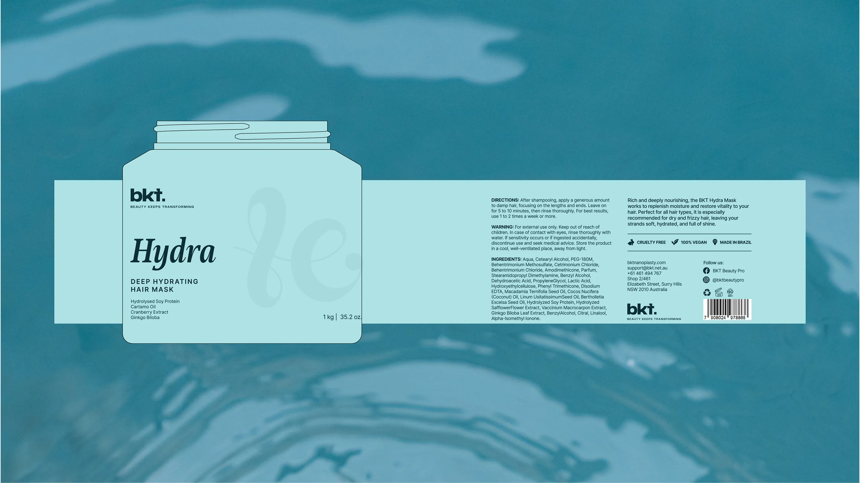
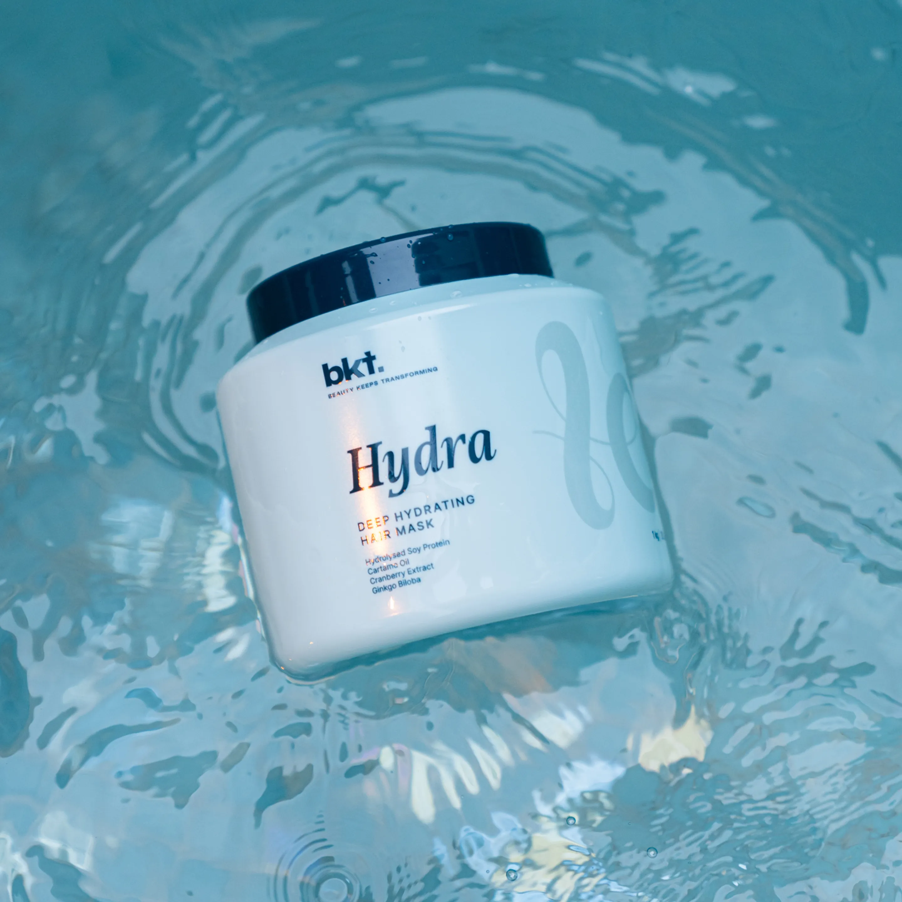
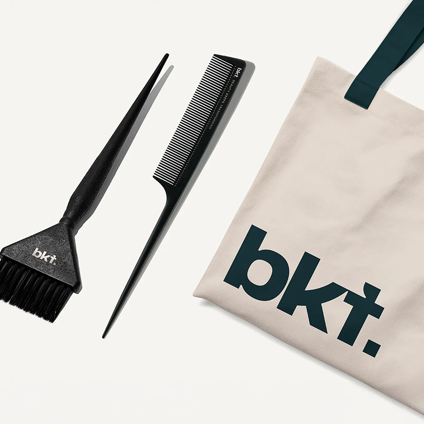
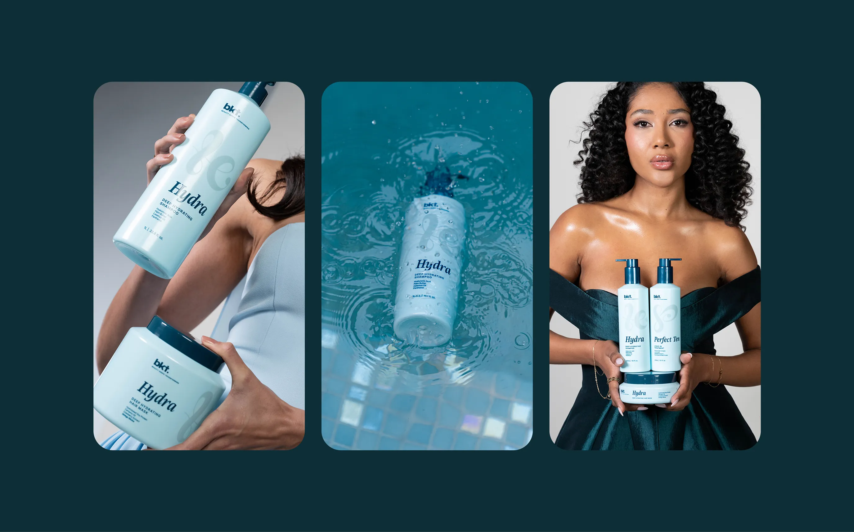
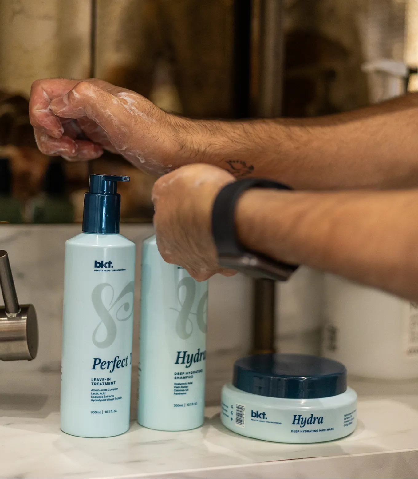
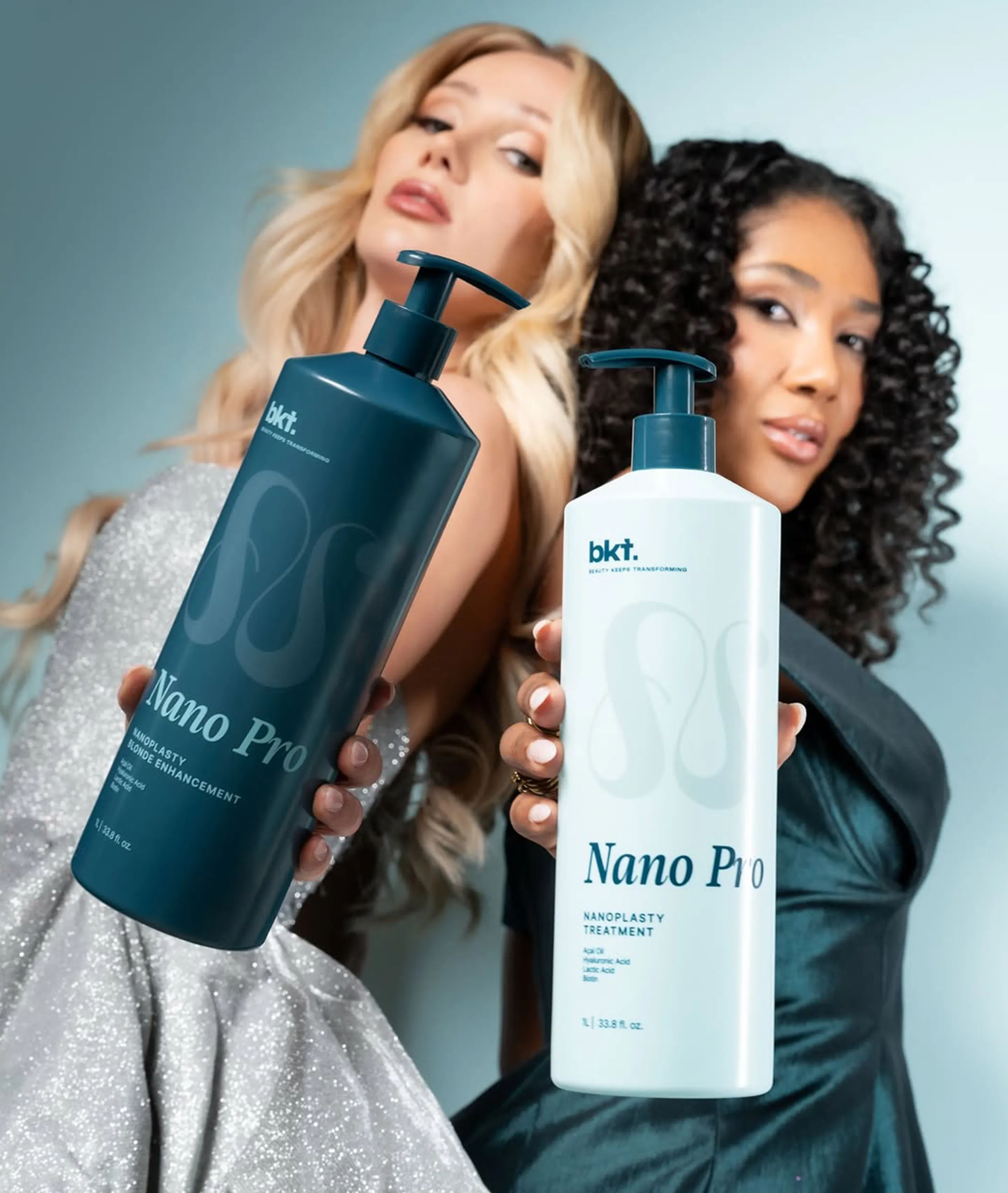
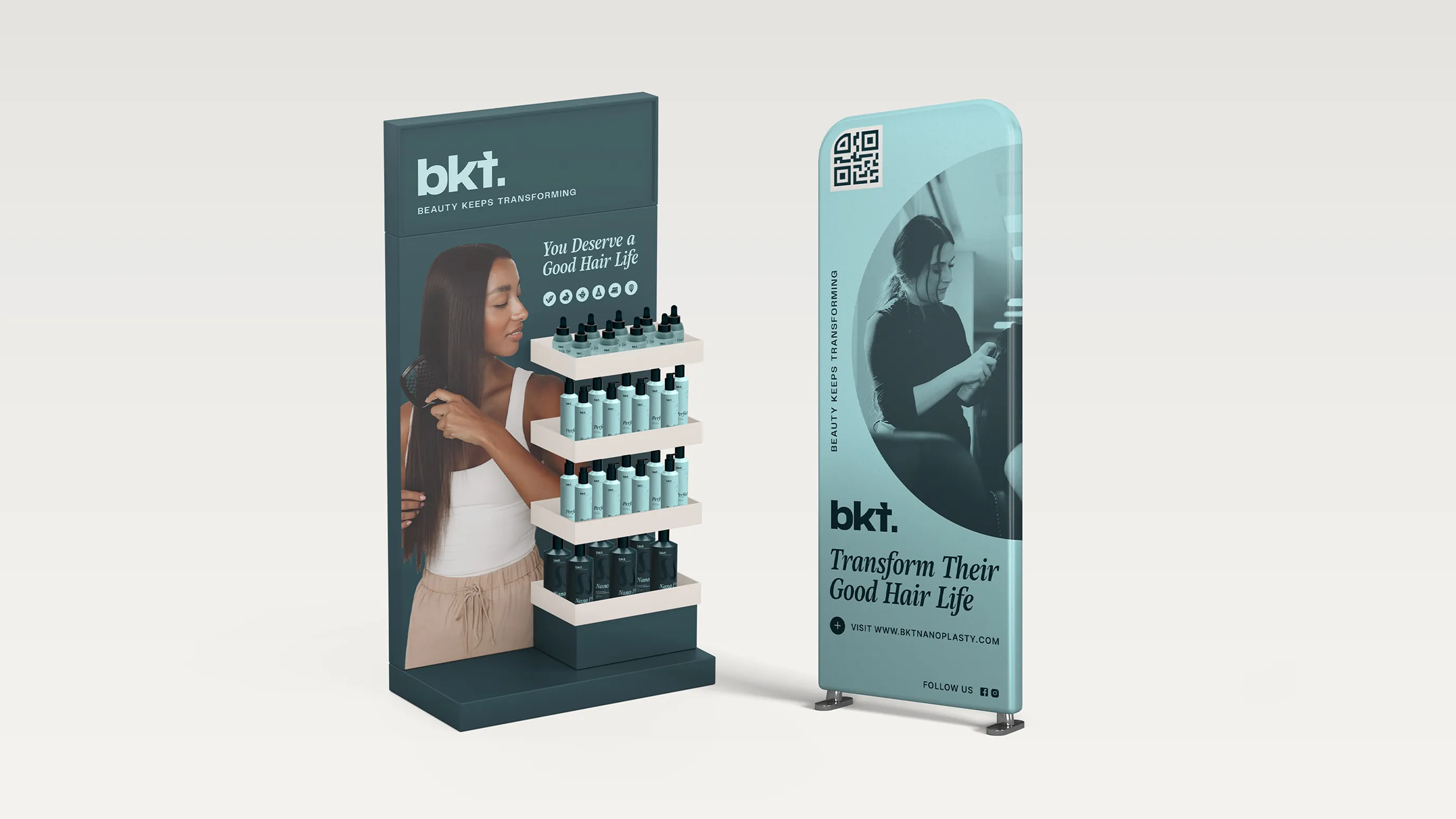
A Shelf Standout
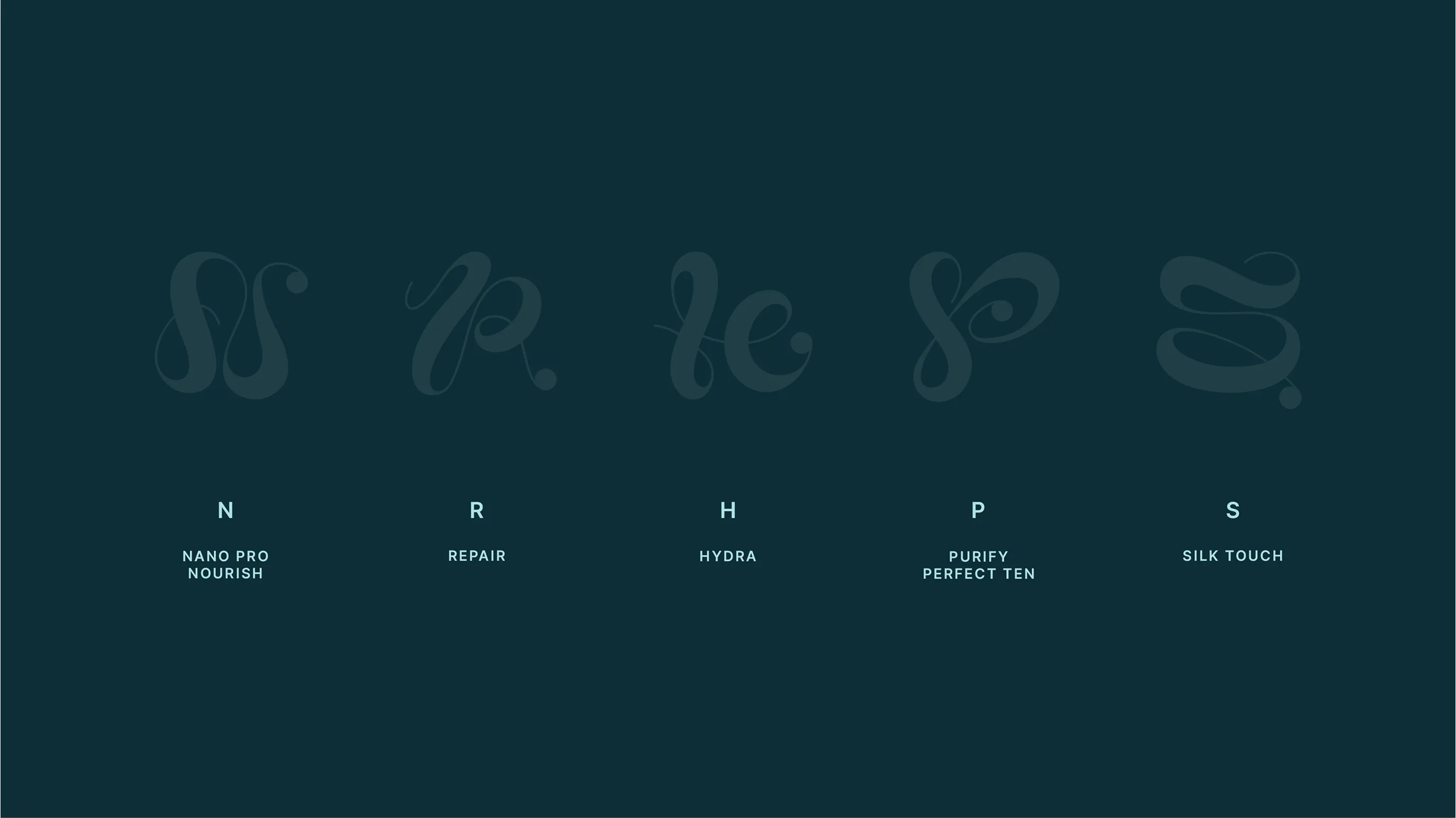
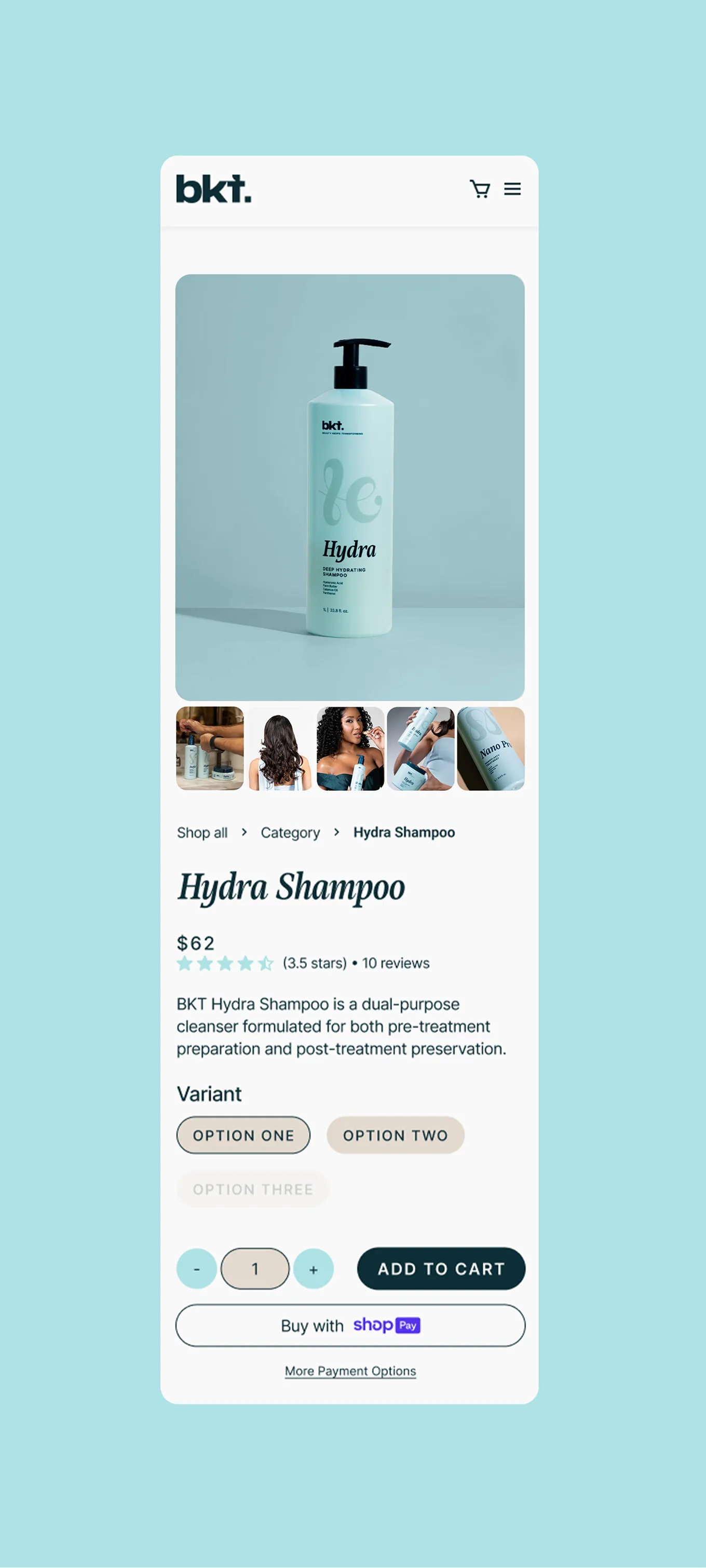
A key stand out was the decorative letter system featured on every bottle, with a large flowing letter matching the first letter of each product name (for example, “N” for Nano Pro). Designed with organic curves that move like hair, these letters evoke transformation and fluidity, while the spot UV finish adds a tactile, dimensional touch. All bottles are unified with dark teal pumps and lids, and the modular system allows the decorative letter to be swapped across products, maintaining cohesion while enabling easy expansion.
Crafted for credibility and elegance
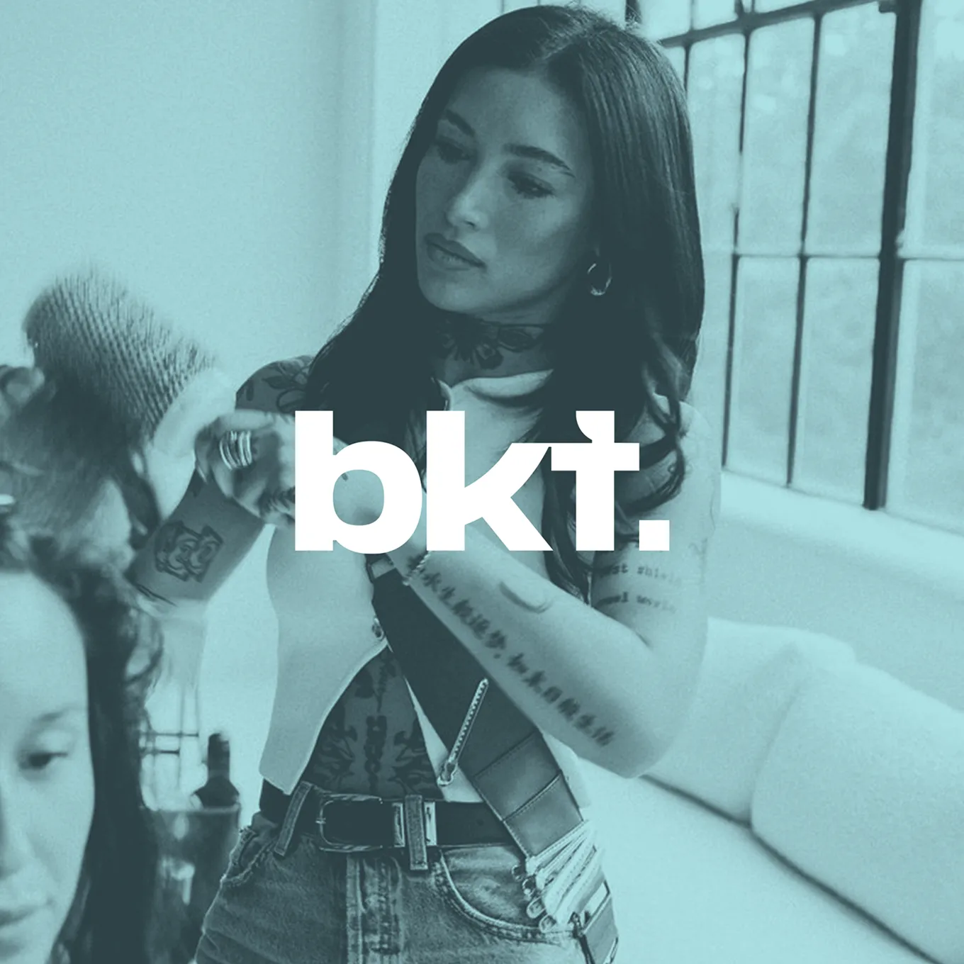
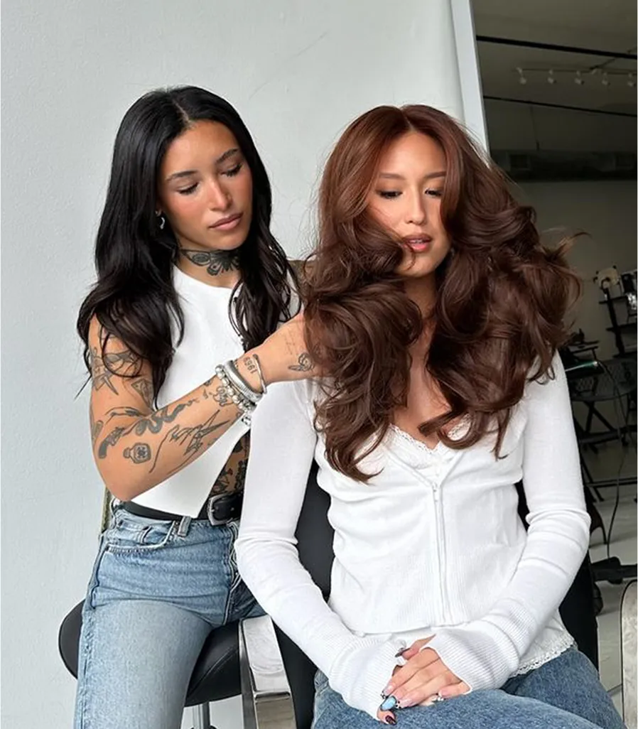
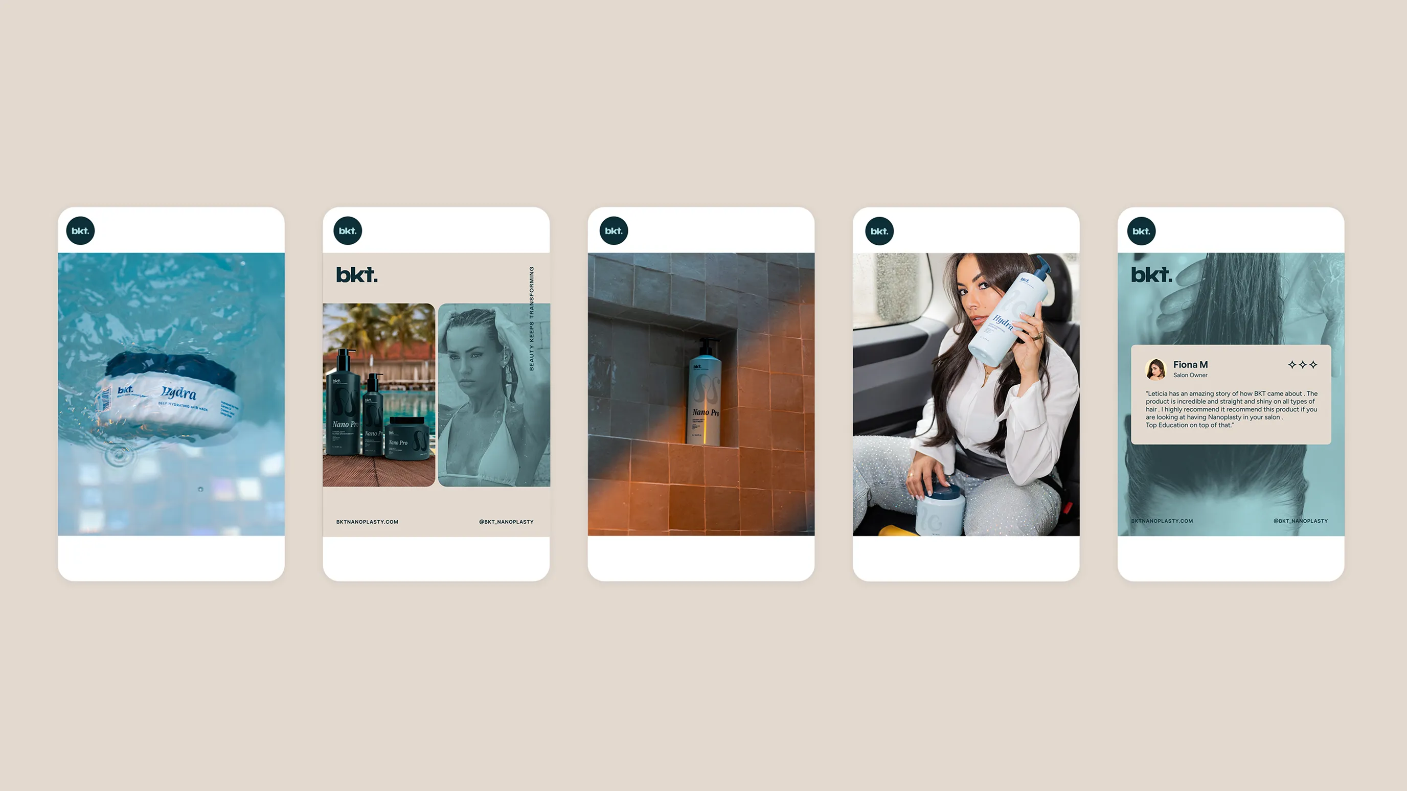
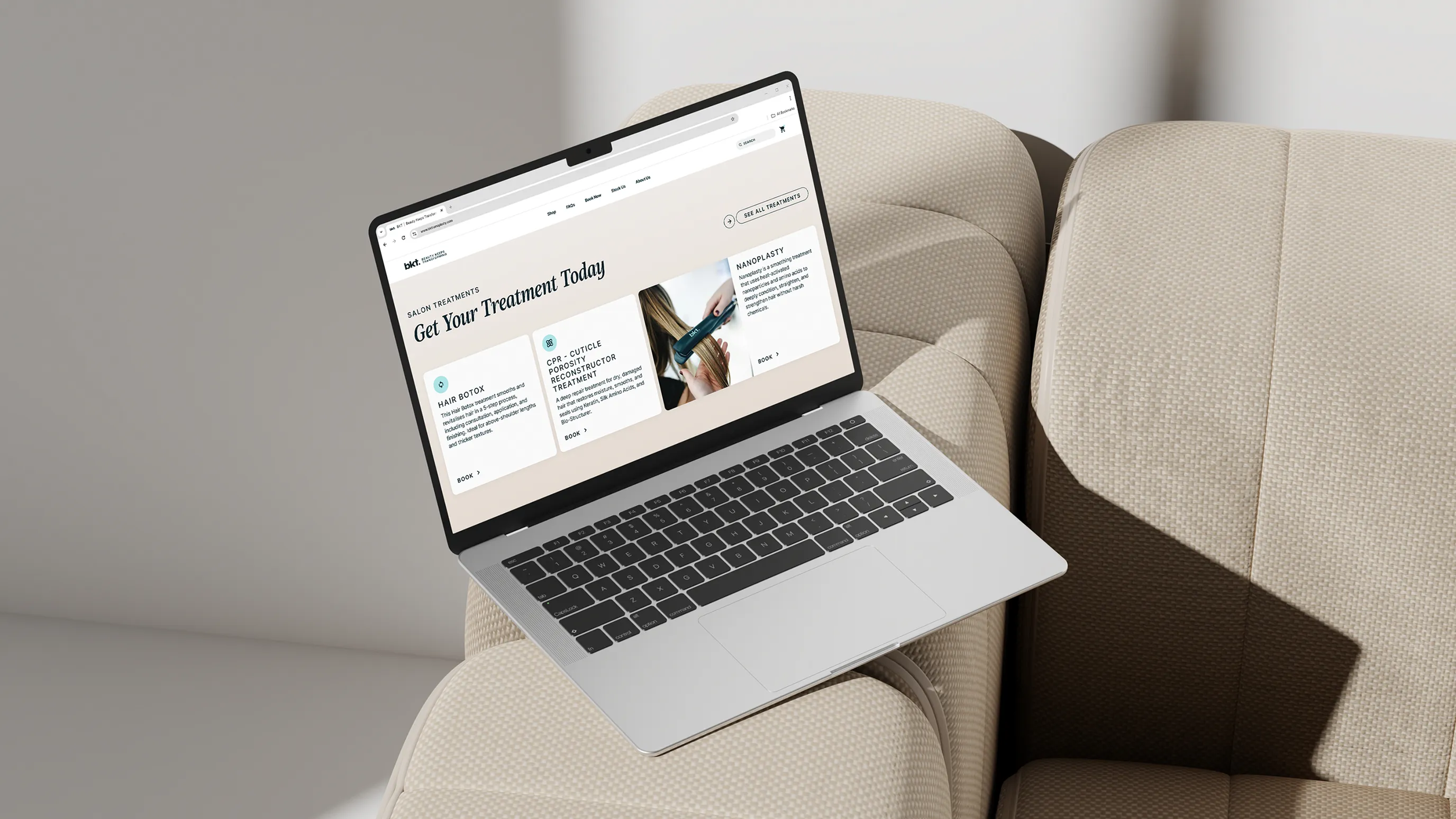
We designed a website that balances technical expertise with aspirational appeal. Every detail was crafted to build trust and evoke luxury, from clean bento box layouts that structure information, to dark teal callouts that add depth and sophistication. Photography played a defining role in the site’s credibility, with BKT’s team bringing the brand’s refined aesthetic to life through elegant, editorial imagery in soft blue and sand tones. The result is a site that feels both credible and captivating, a seamless reflection of BKT’s mastery and modern elegance.

The Result
The result is an elevated brand that brings Leticia’s original vision to life while providing cohesion and flexibility across all touchpoints. From strategy to packaging and brand visuals, every element embodies the beauty and allure of the products while inspiring confidence and empowerment. The brand is now positioned to scale with impact, helping stylists and customers alike feel they can overcome anything and transform their lives.