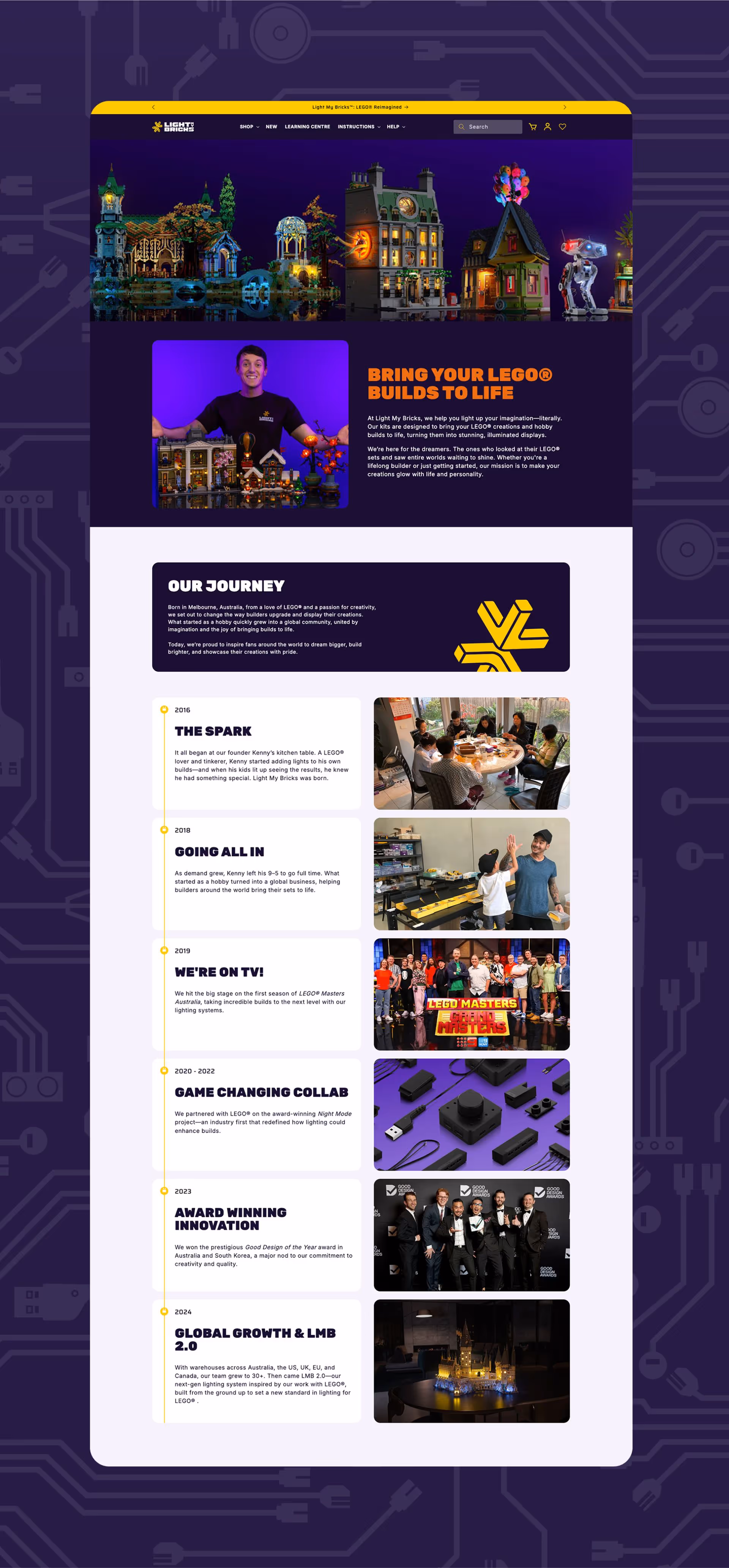
Light My Bricks
Light My Bricks, a leader in Lego lighting, was battling a frustrating problem: relentless copycats. They needed a brand identity so strong and unique that imitation would be futile. Rivyl stepped in and didn't just tweak things; we ignited a full-blown brand revolution.

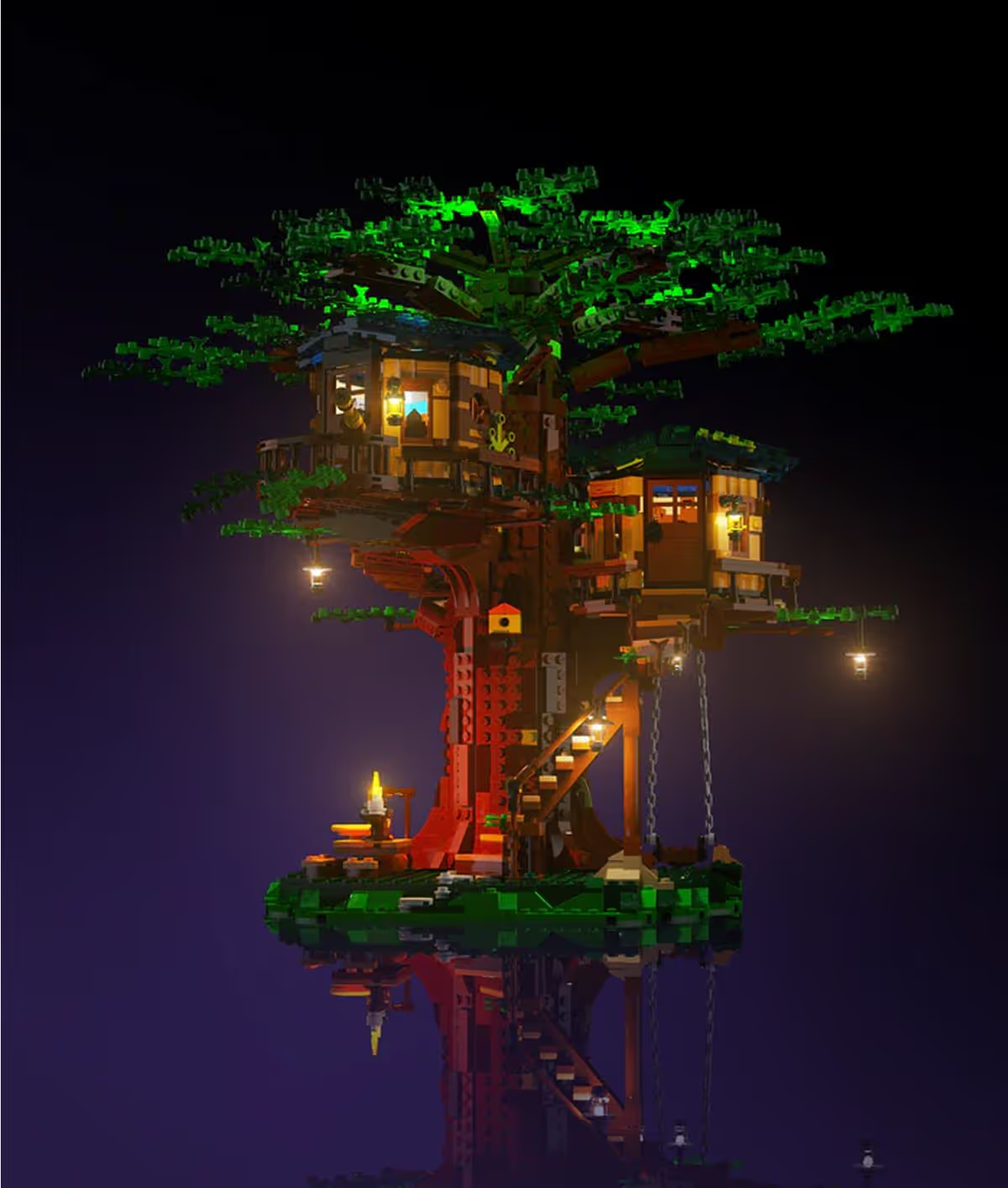
LEGO® reimagined
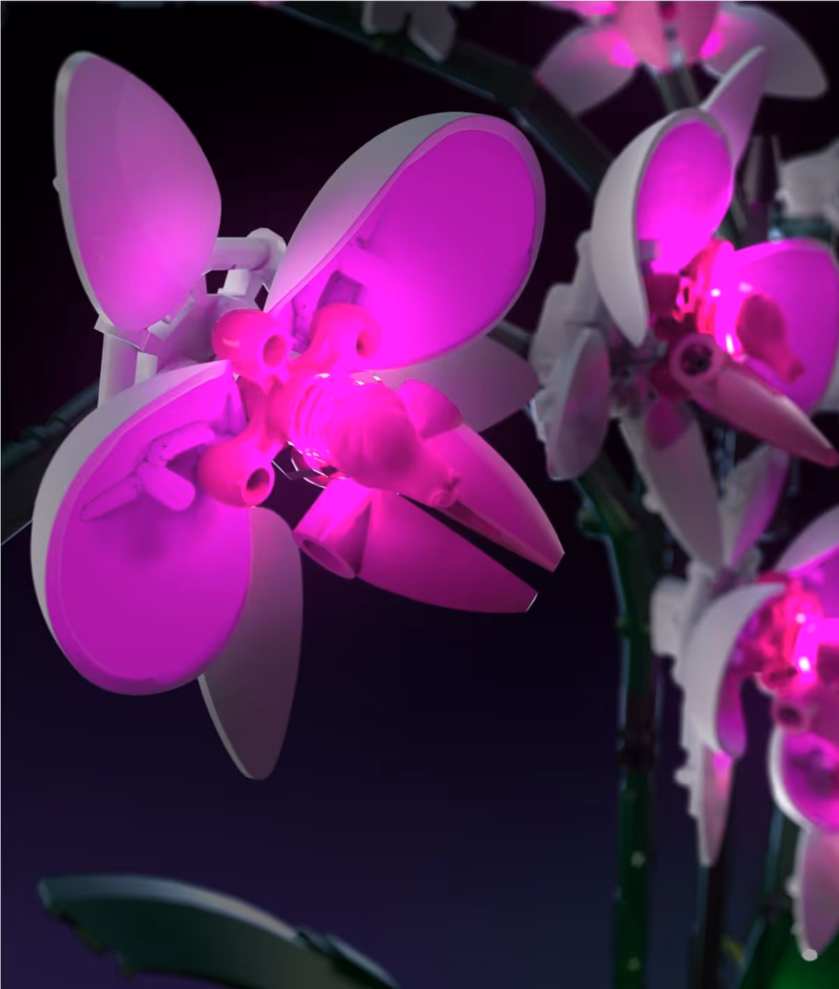
Light My Bricks is here to transform your LEGO® collection right from the start. LEGO® brought to life in new, innovative ways. Adapting alongside new LEGO® designs to keep pace with a collector’s eagerness and enhancing the entire experience in every way.


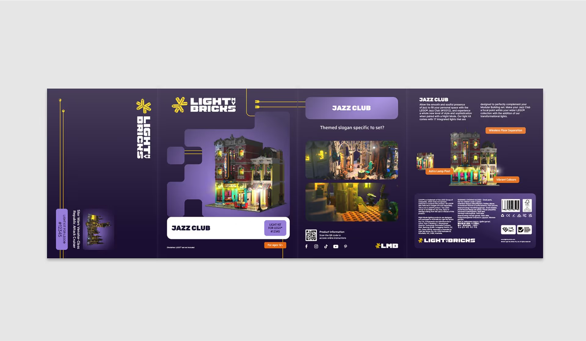
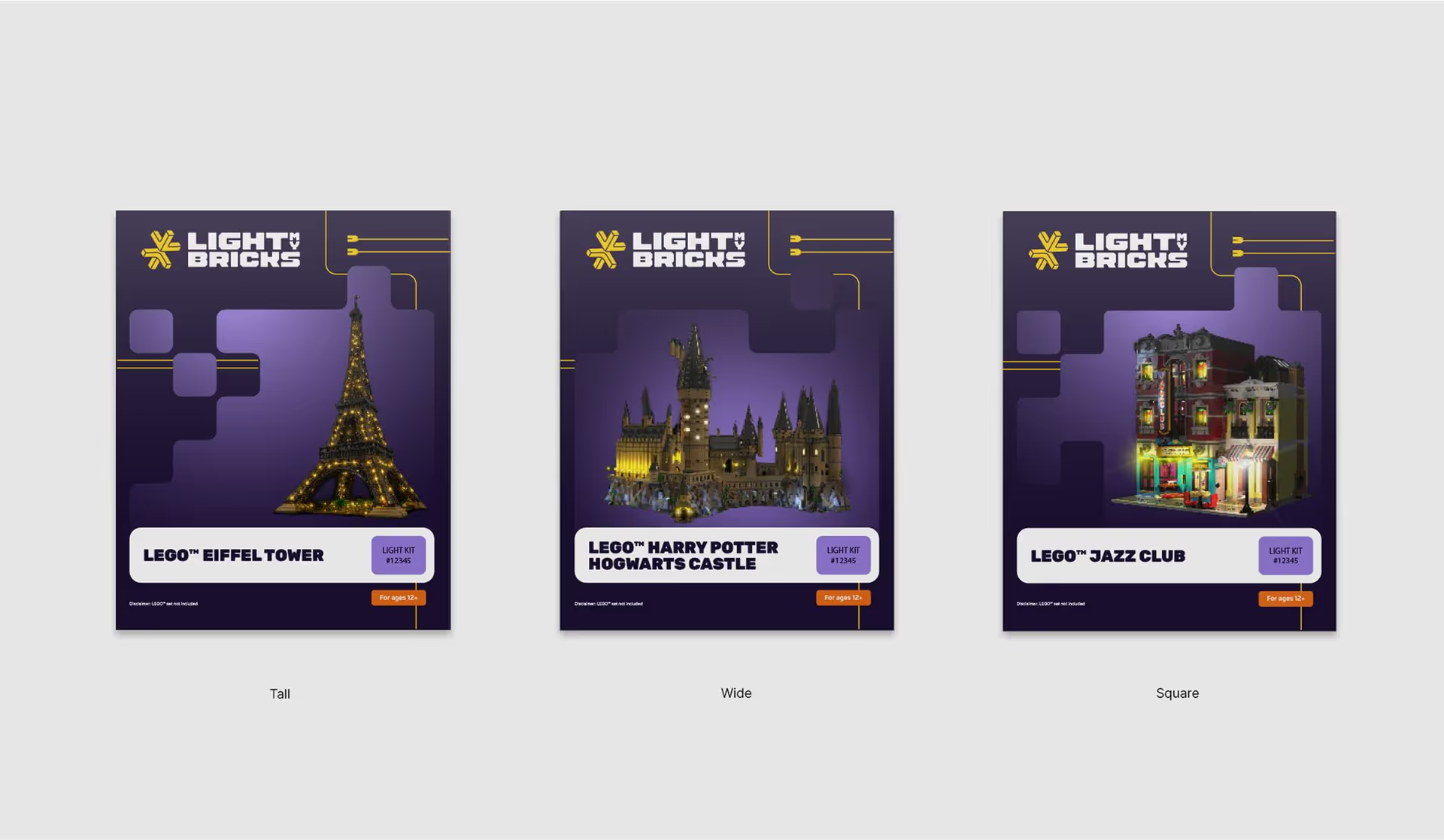
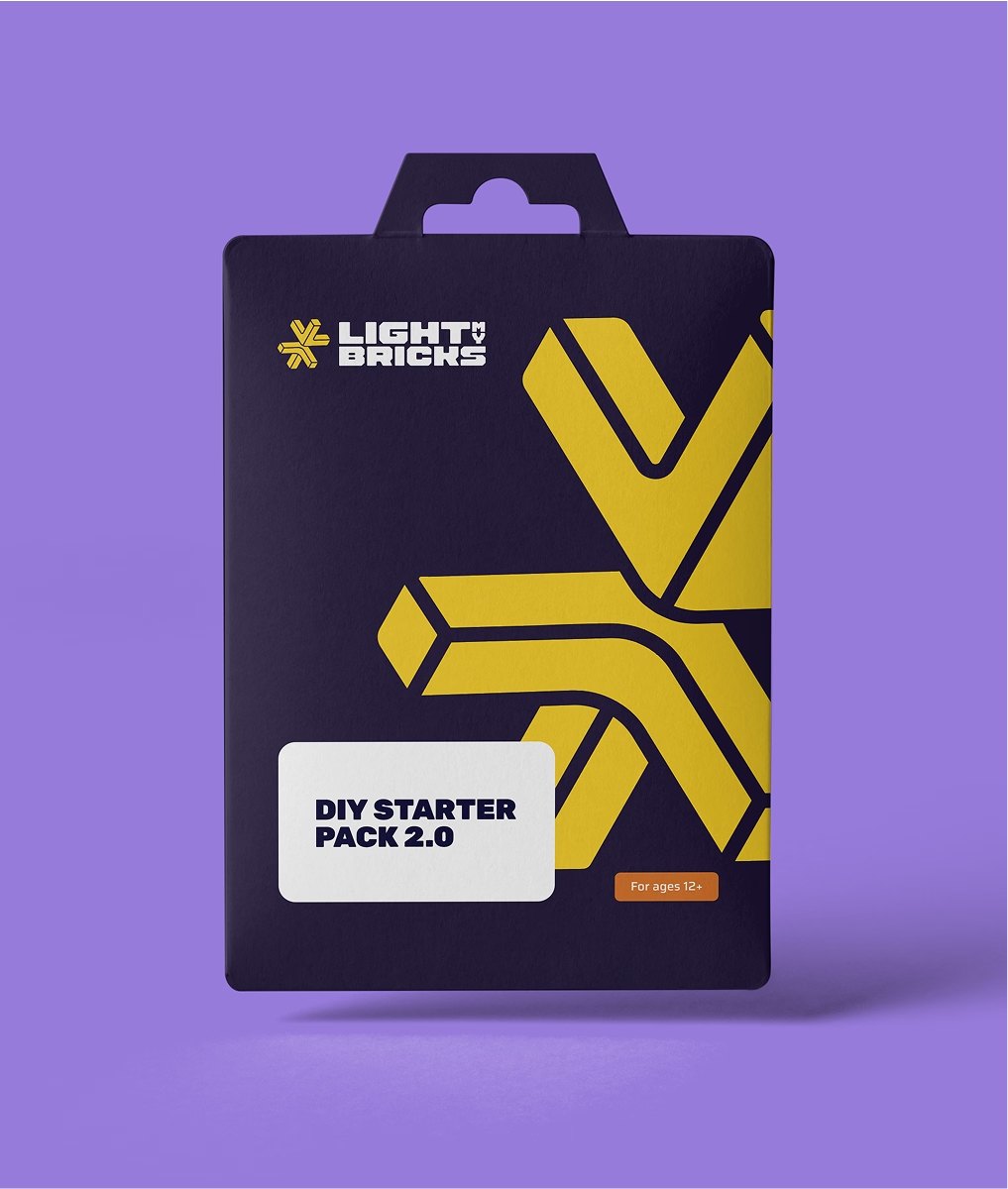
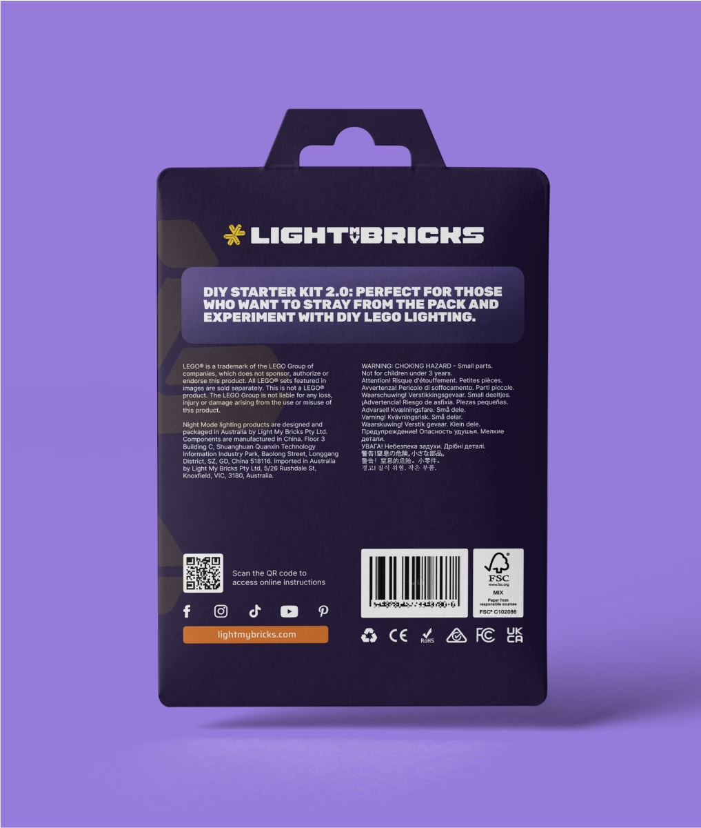
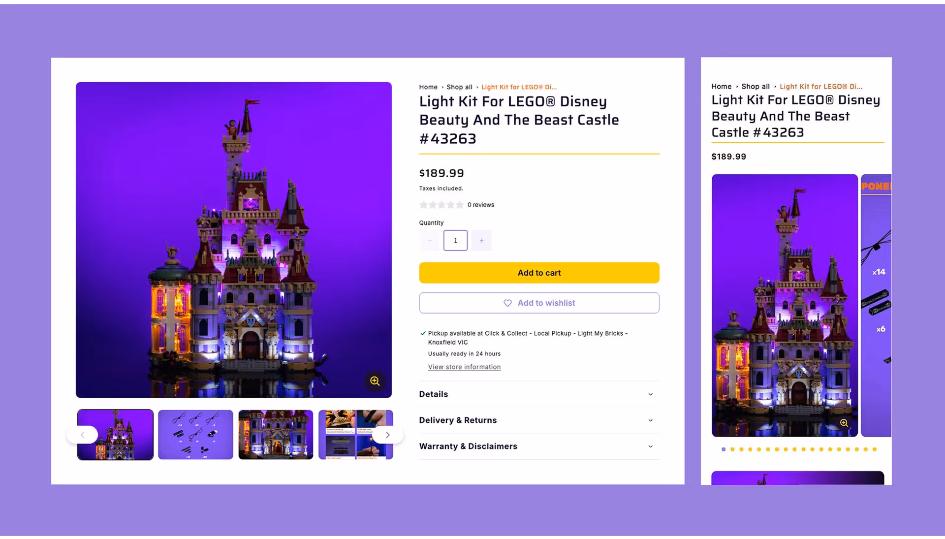
Modular Packaging System
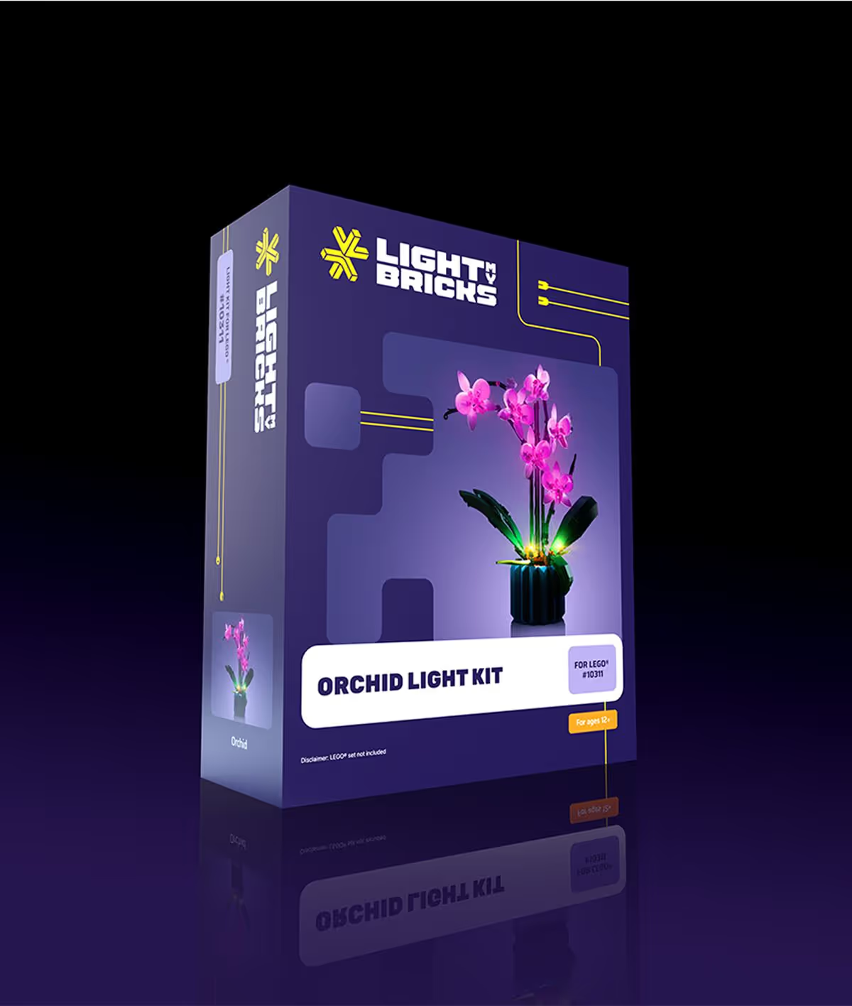
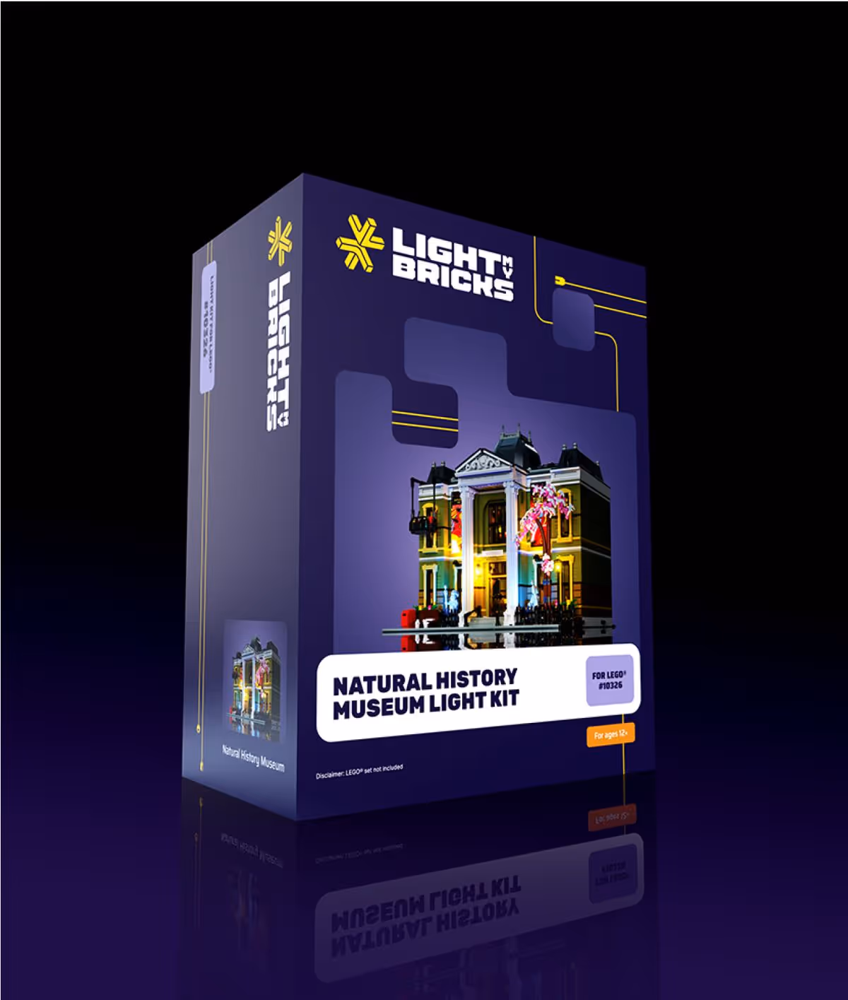
Packaging was reimagined to feel eye-catching, good quality and practical. With clear hierarchies and a bold and recognisable graphic style, we designed a system that makes unboxing part of the whole experience. The modular design system supports a wide SKU range while maintaining a unified shelf presence and feels like part of a collectible series.


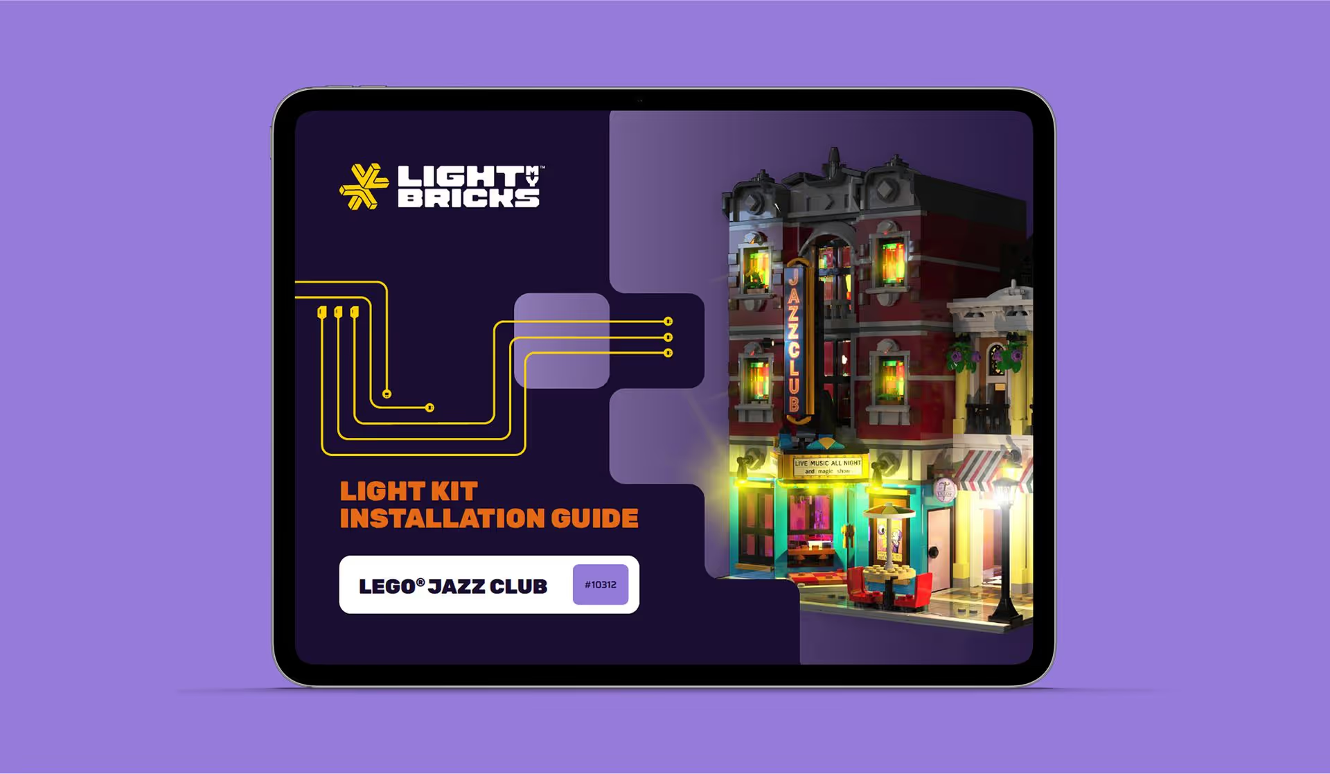
LMB Instruction Manuals
We designed a flexible digital manual system that could scale across Light My Bricks’ entire product range. Built with clarity and consistency at its core, the templates establish a strong visual foundation, allowing the team to create detailed, easy-to-follow guides for every kit. Designed for digital use, the layouts prioritise legibility, simplicity, and step-by-step flow, making the building experience smooth from start to finish.


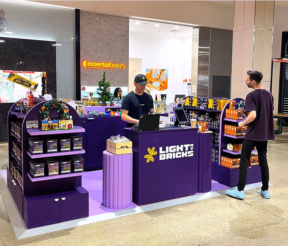
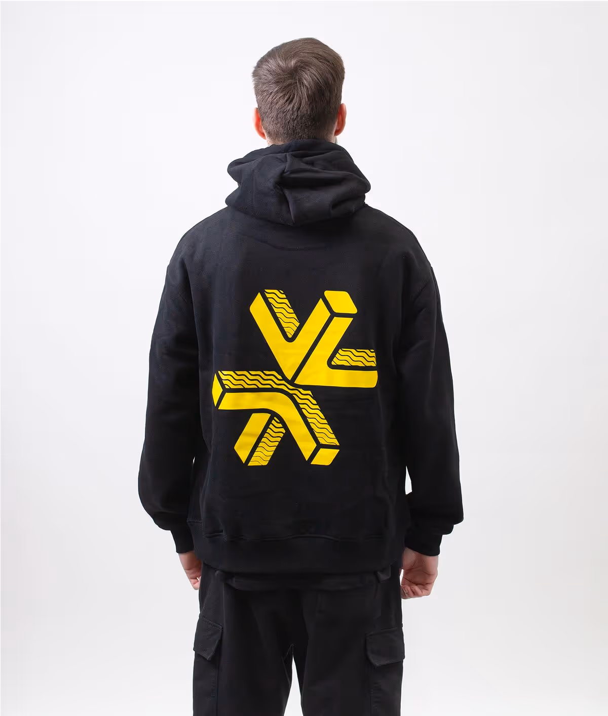
Ownable logo and recognisable colour
The Light My Bricks brand identity was built to be unmistakably ownable. Playful, imaginative, and instantly recognisable. At its heart is a logo that sparks with meaning: an abstract representation of two LEGO® bricks and the moment a light comes to life. Surrounding the mark is a cohesive visual system designed to reflect both the technical precision of a build and the creativity it unlocks.
A custom purple became a signature photographic backdrop. With third parties frequently using Light My Bricks’ imagery without permission, this hero colour gave the brand a clear and unique visual fingerprint, instantly linking product photography back to its source.
The typography strikes a balance between function and fun: clean and legible, yet full of personality that speaks to the LEGO® world. Supporting graphic elements mirror the modular nature of building, grids, lines, and blocks that shift and reconfigure to tell a story of imagination brought to light.


Vibrant & Imaginative
Capturing a spirit of imagination and creativity, the brand celebrates the joy of building and the magic of light. From brand to box to website, every element was designed to feel cohesive, playful, and full of possibility, inviting users of all ages to see their builds in a whole new light.

Large scale Ecom Website
We designed a large-scale e-commerce site built to perform across multiple regions, languages, and currencies. The experience is visually engaging yet deeply functional. Making it easy for users to discover products, find support, and shop with confidence. The result is a global platform that not only looks great, but converts.


Check out the team at Light my bricks!
To bring the story to life, Light My Bricks shared a beautifully produced video showcasing their product in action and the passionate team behind it. All video content and select photography featured in this case study were generously supplied by the Light My Bricks team, huge thanks to them for capturing the magic so well.
