Iyvos
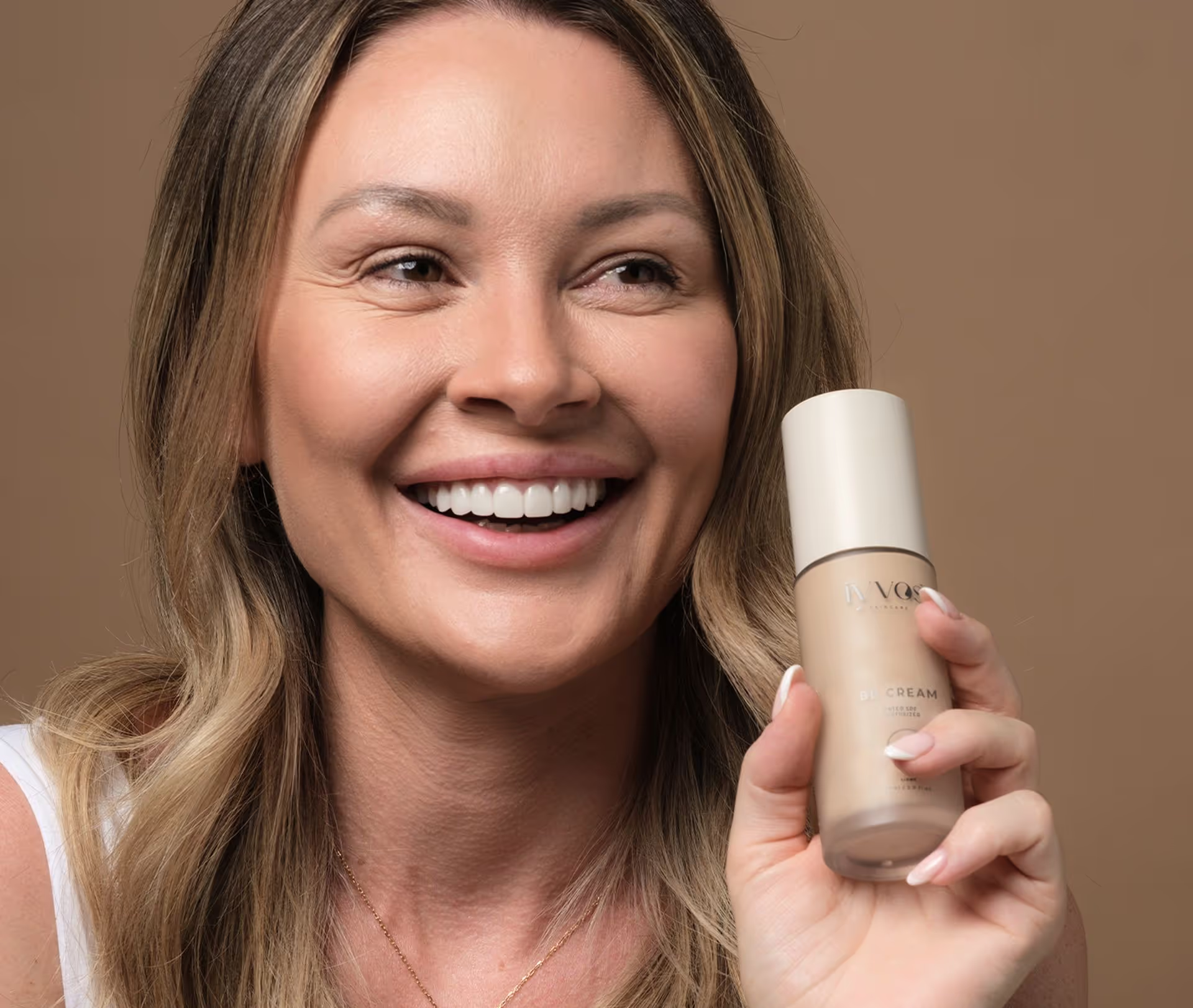
Founded by Gabrielle Singh, a seasoned dermal therapist and clinic owner, Iyvos evolved from her initial brand Cosmology Skincare. Drawing on her own journey through acne and clinical skin practice, Gabrielle created a skincare line that addressed real needs with empathy, education, and science-backed formulas.
Naming Iyvos
Pronounced [ee-vos]
Elevated, original and effortless. Drawing on Gabrielle’s Maltese heritage and desire for something short, warm-toned, and phonetically smooth, we created a name that evokes aspiration without relying on trends or clichés. Our strategic naming process delivered a word with no prior meaning, allowing Iyvos to define its own story and sit proudly alongside the world’s most desirable beauty brands.
Elevated, original and effortless. Drawing on Gabrielle’s Maltese heritage and desire for something short, warm-toned, and phonetically smooth, we created a name that evokes aspiration without relying on trends or clichés. Our strategic naming process delivered a word with no prior meaning, allowing Iyvos to define its own story and sit proudly alongside the world’s most desirable beauty brands.

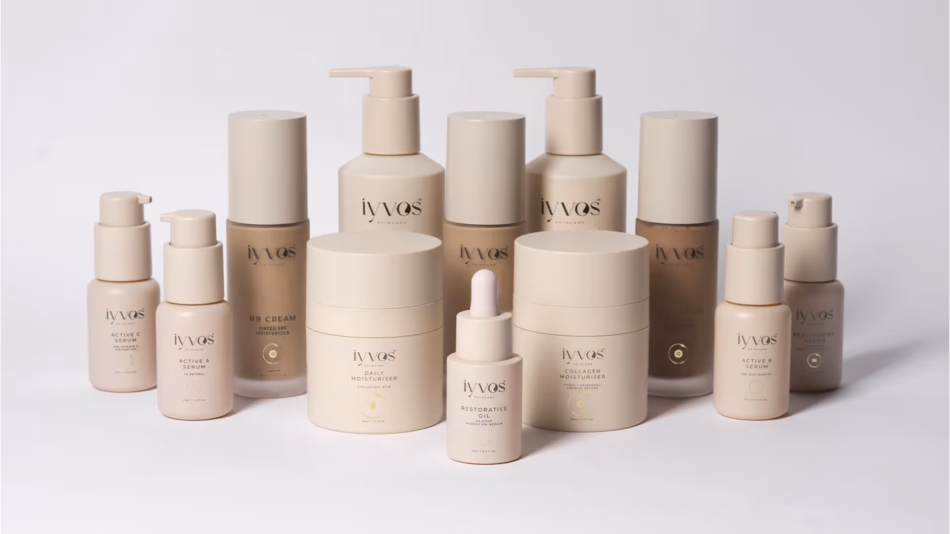
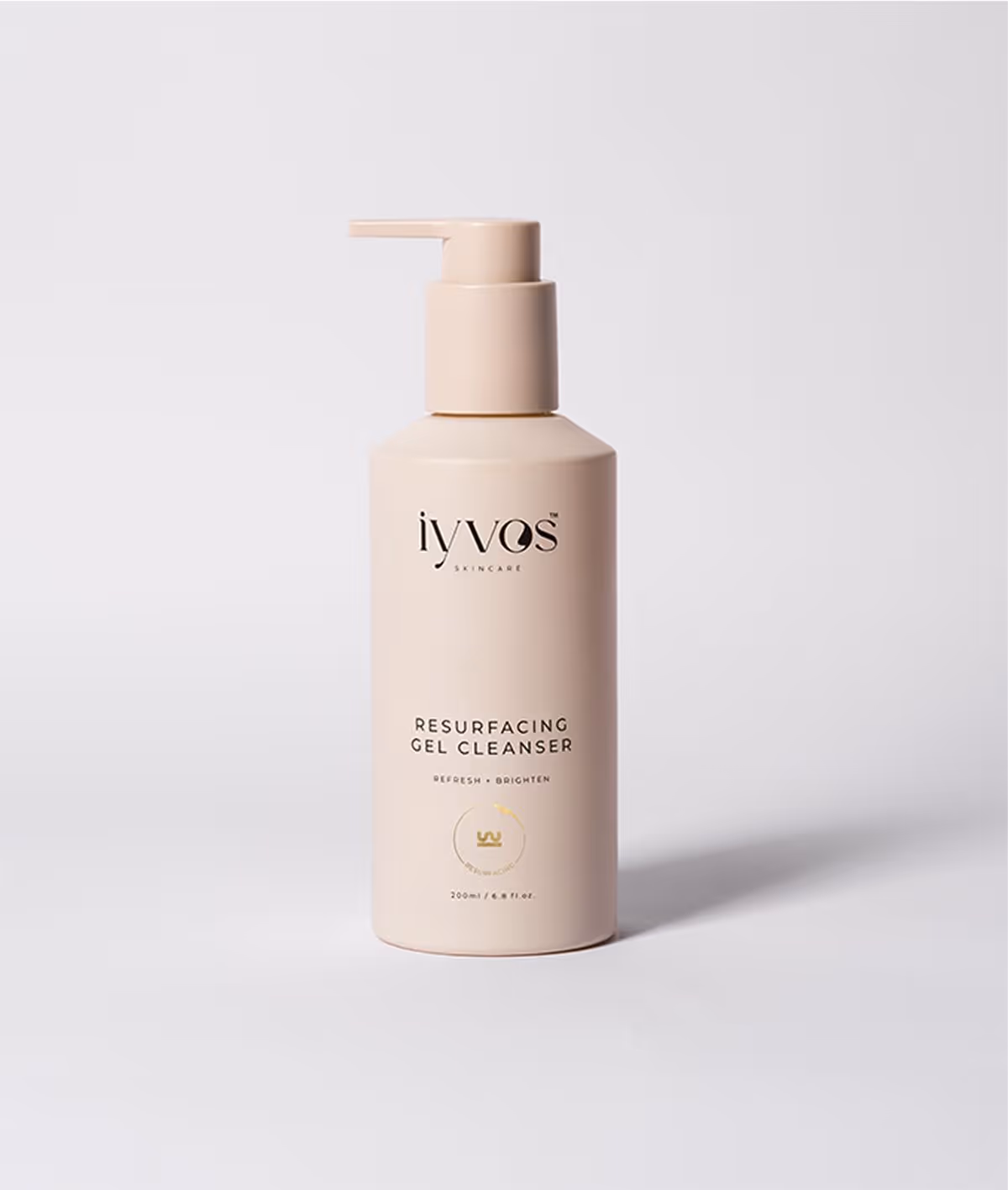
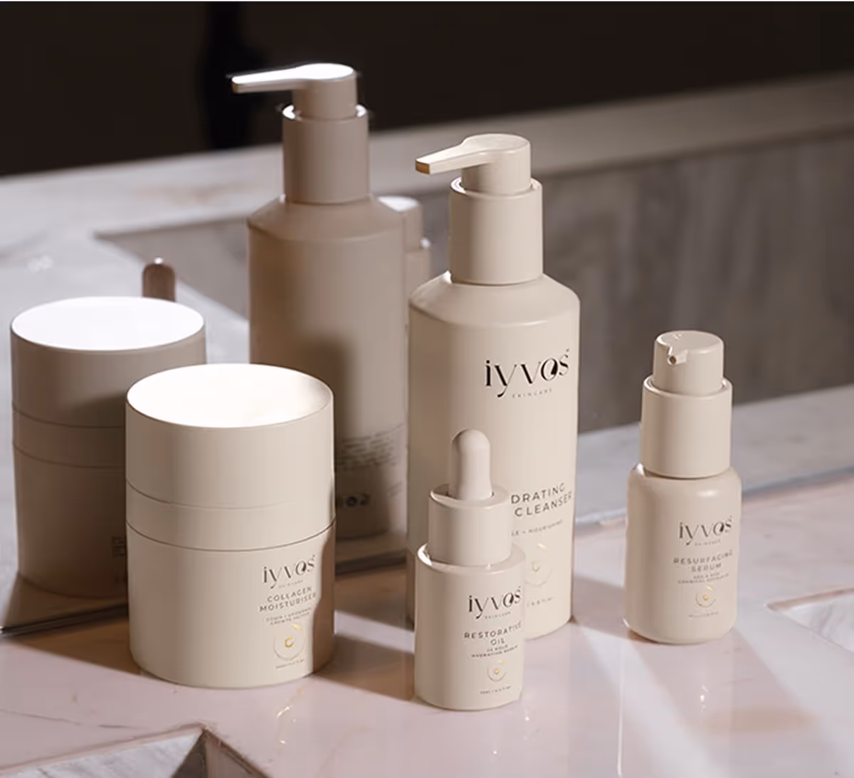
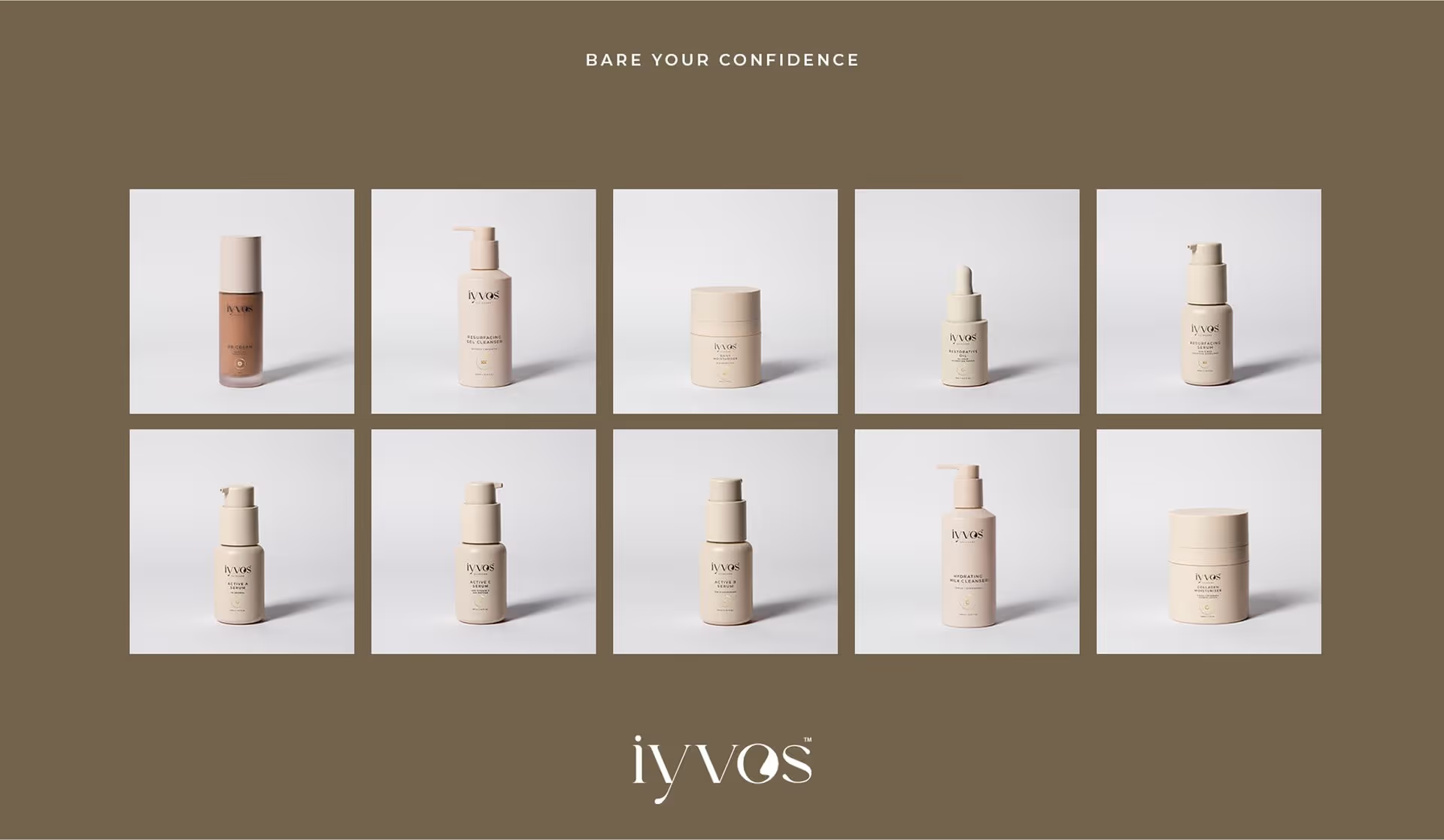
Luxurious and Intentional Packaging System
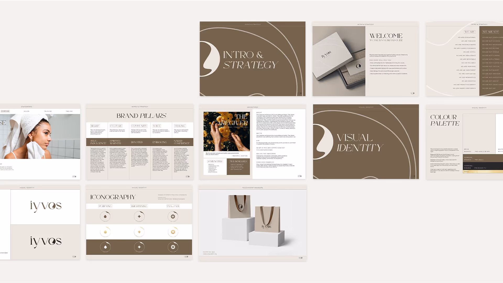
To support Iyvos’ growing product range, we created a scalable packaging system that balances structure with luxury. Subtle layout shifts, consistent typography and refined finishes. Soft-touch materials, blind embossing and gold foil to ensure each product feels distinct yet cohesive. The result is a packaging suite that’s both elegant and built to grow.

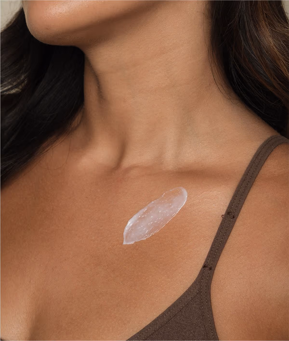
Naked Confidence
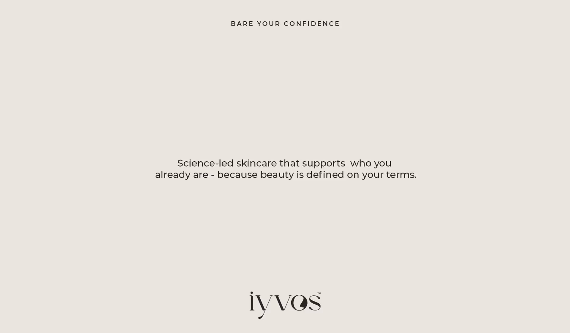
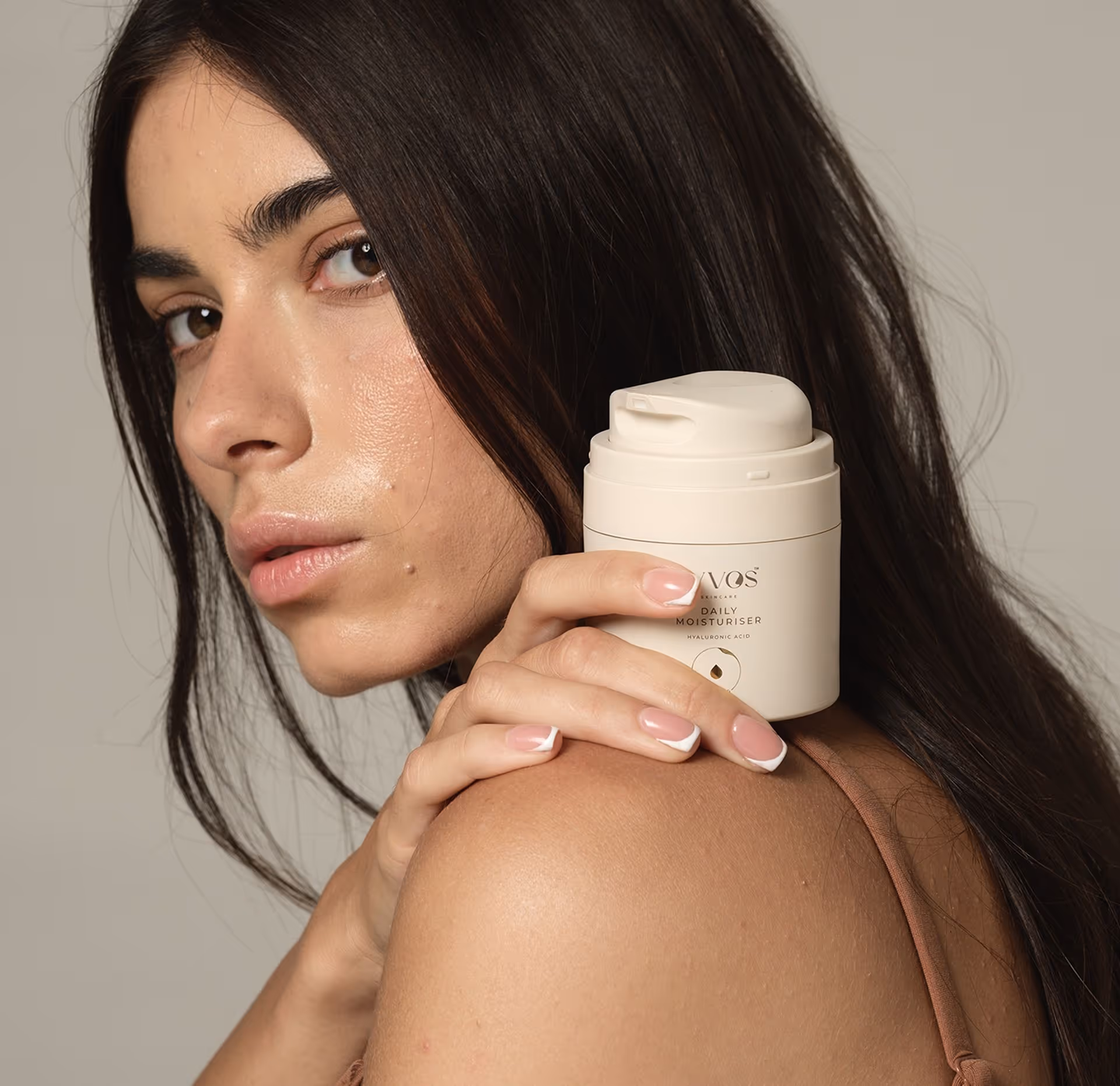
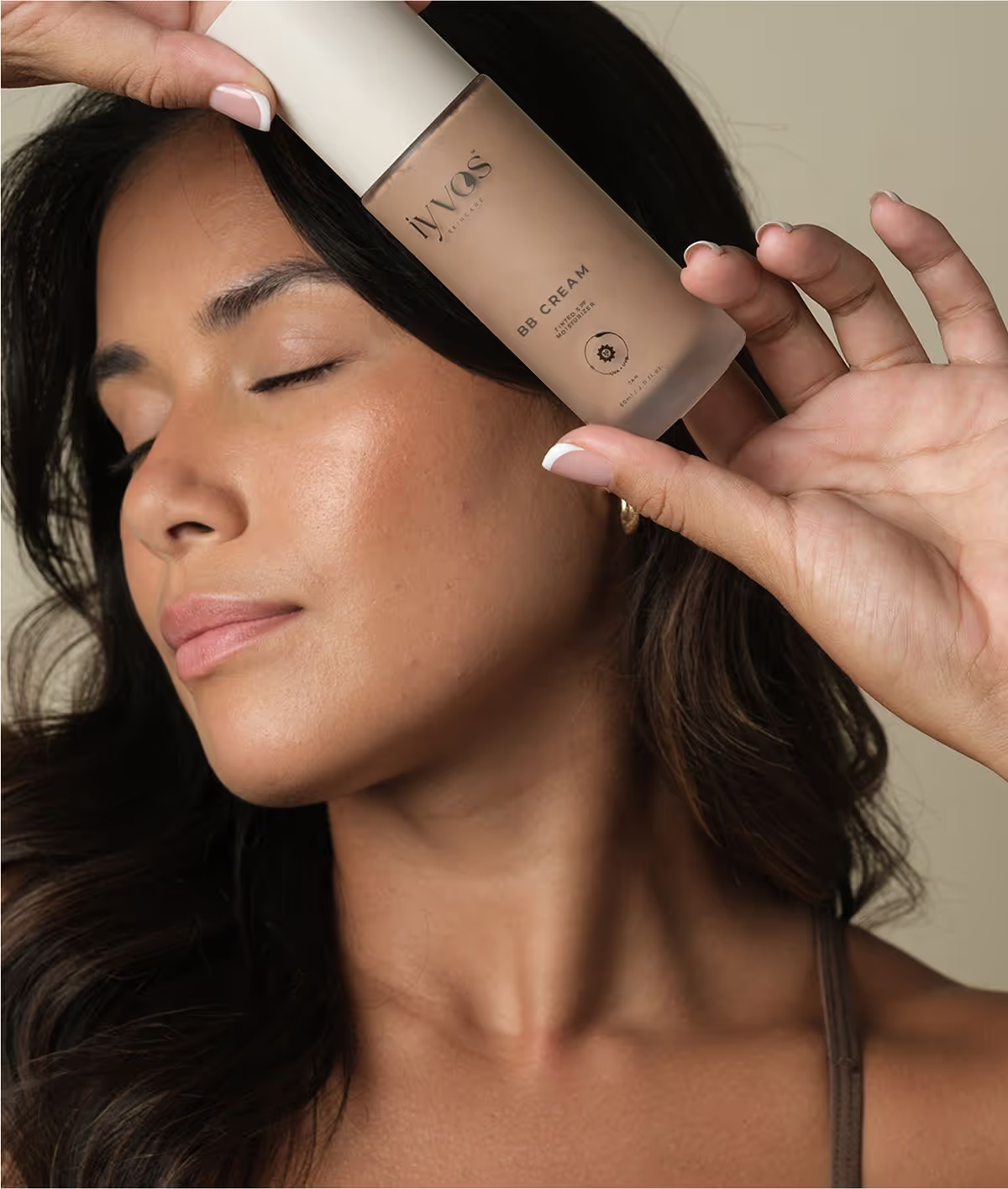
Rooted in real skin journeys and emotional honesty, Iyvos’ brand strategy centres on the idea of naked confidence, a celebration of self, backed by science. We helped define a positioning that shifts the focus from fixing flaws to embracing skin as a source of power. The brand honours both clinical efficacy and emotional resonance, creating a space where skincare becomes a ritual of self-expression.

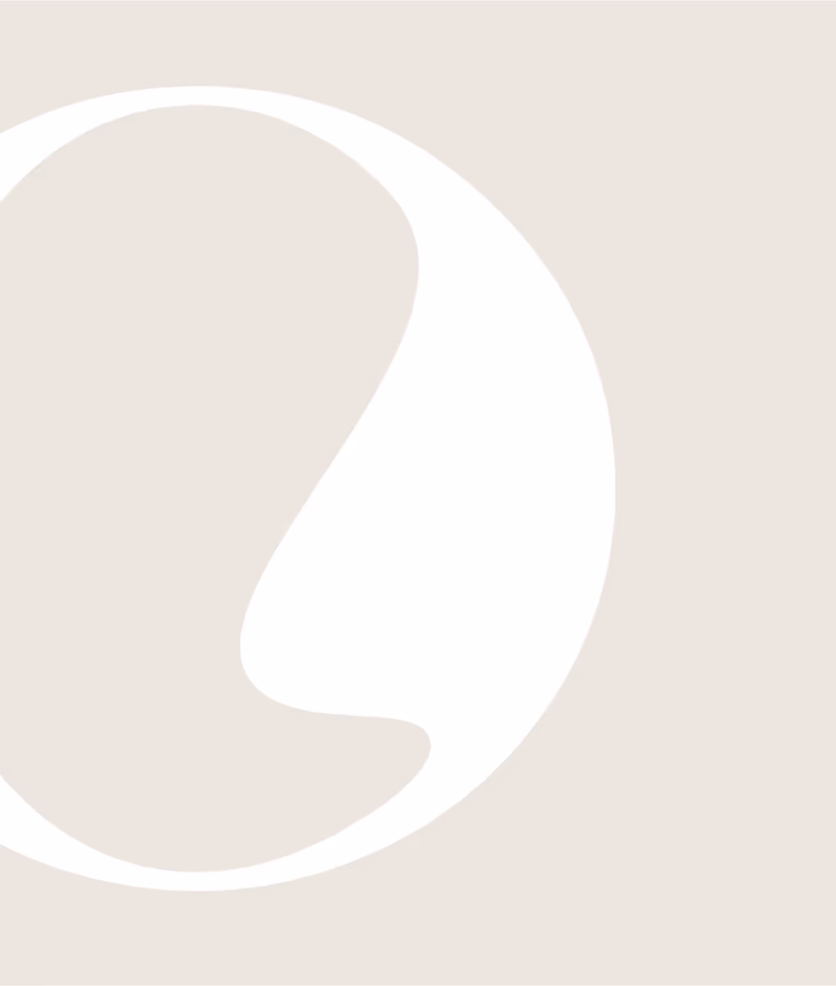
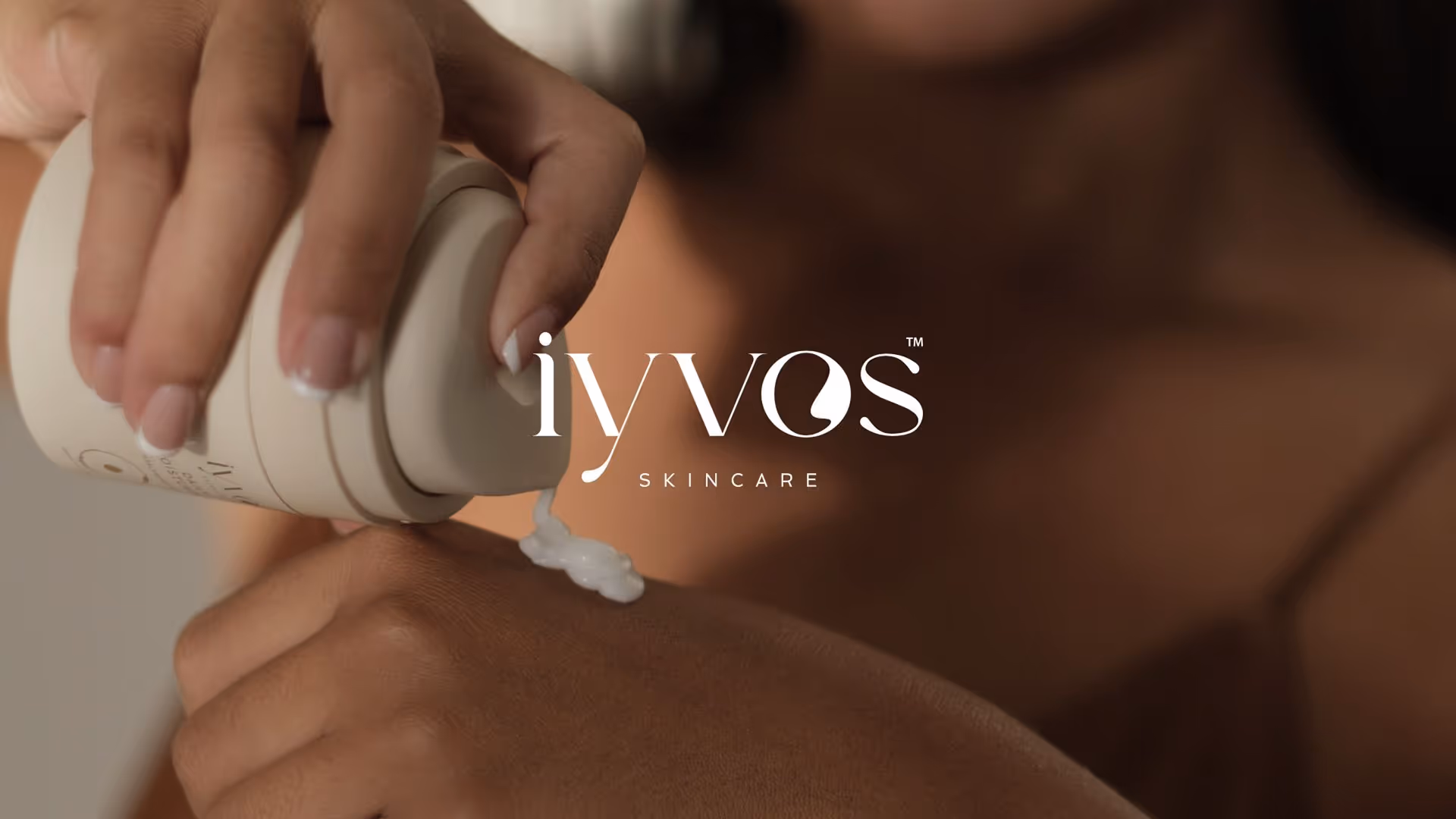
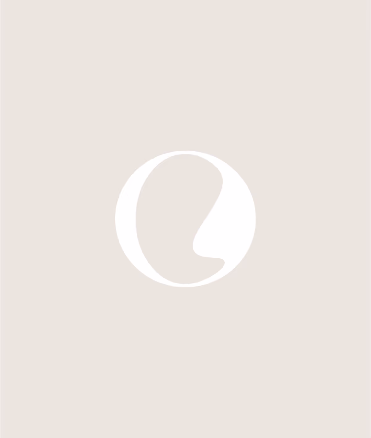
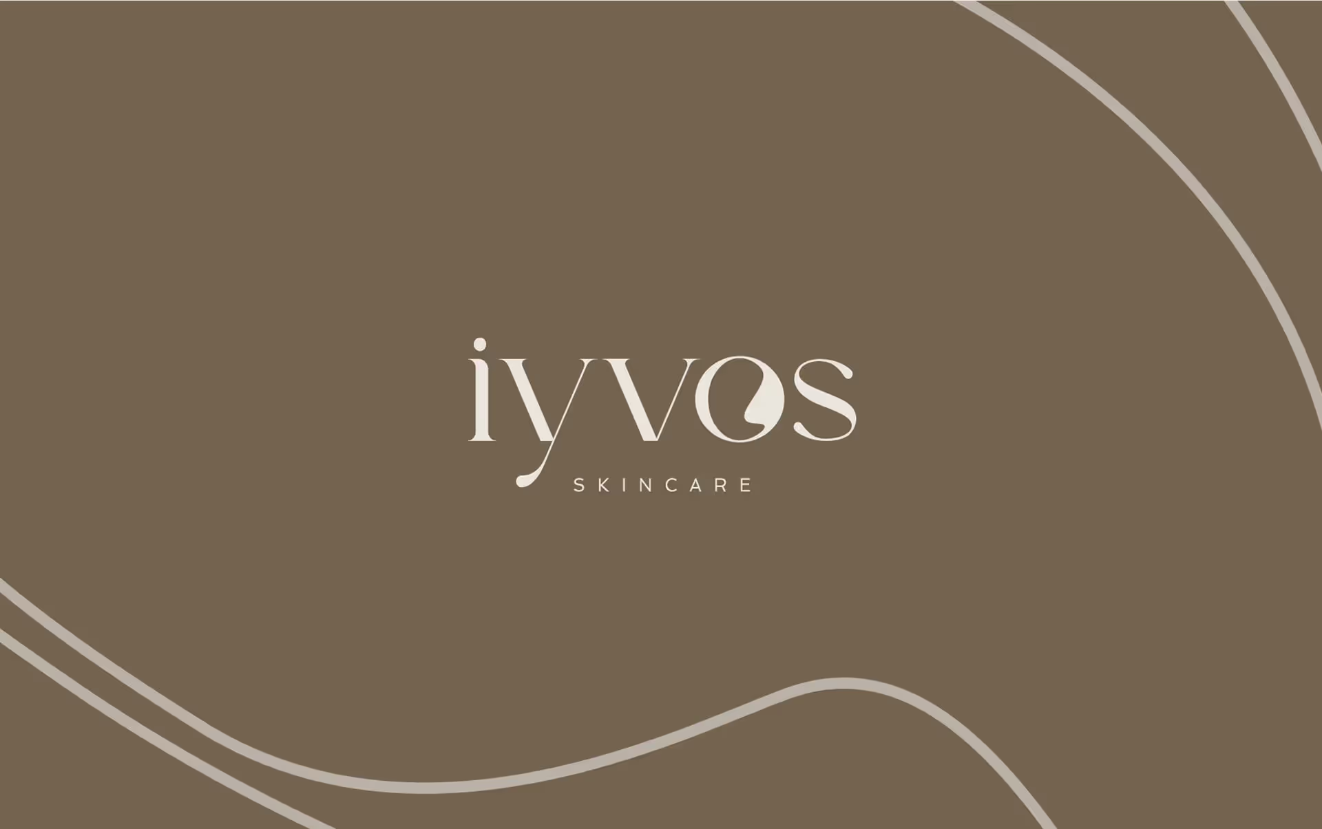
Effortless Logo Suite
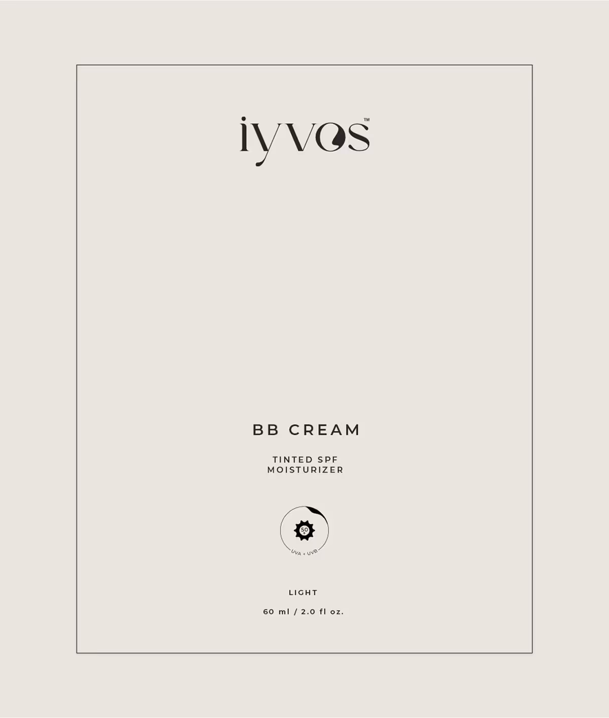
The Iyvos logo was designed to be as refined and intentional as the skincare it represents. The custom wordmark balances clean, confident letterforms with subtle softness, reflecting the duality at the heart of the brand: clinical yet nurturing, strong yet gentle. At its centre is a distinctive “O” a signature brandmark inspired by the organic shapes of skin contours or a droplet of product in motion.

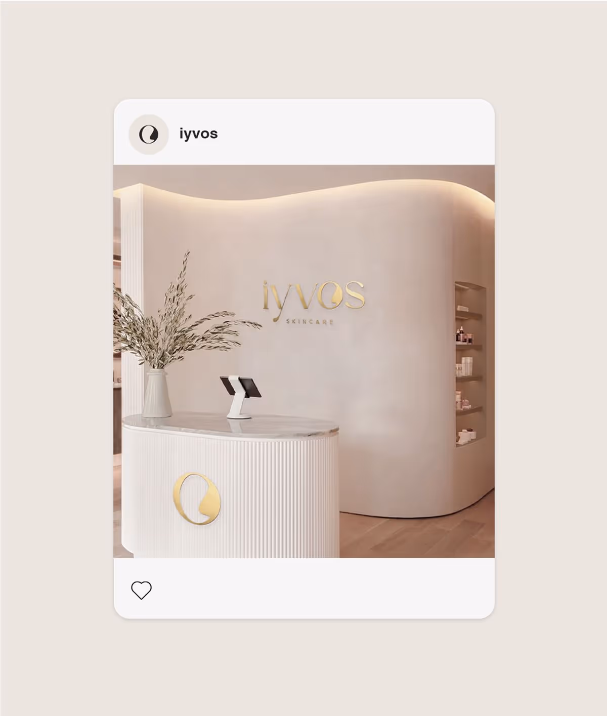

Elevating the Physical Experience
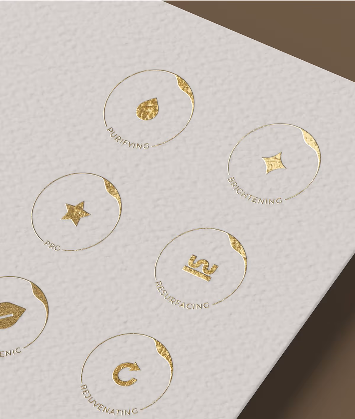
To reinforce the brand’s premium positioning, we introduced considered touches of gold foil across the Iyvos packaging system. Used sparingly and with intent, on logos, borders and key accents. The foil adds a layer of quiet luxury without overpowering the clean, minimal design. Paired with soft-touch finishes and warm neutral tones, the gold detailing catches the light and brings a sense of indulgence to the everyday ritual of skincare.
Carefully CUrated
The Iyvos colour palette was carefully curated to evoke warmth, elegance, and calm. Soft neutrals like shell, stone, and espresso create a grounded, premium feel that complements the natural tones of skin and interior spaces. Typography blends an editorial serif with a modern sans-serif to strike the perfect balance between authority and softness. Together, the colour and type systems create a visual language that feels sophisticated, timeless, and deeply considered.
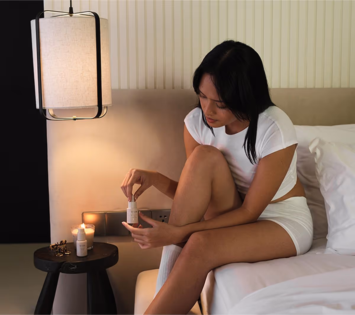
The rebrand elevated Iyvos into a premium space where skincare meets self-celebration. The new name holds its own among global beauty icons, while the refined visual identity is both timeless and scalable. Gabrielle’s story remains at the heart of the brand, now framed within a more aspirational, desirable world. From unboxing to application, every touchpoint invites users into a ritual of calm, confidence and care.