UNITE
UNITE came to Rivyl with a clear mission: redefine athlete representation by giving control back to the talent. Our task was to build a bold, strategic brand rooted in empowerment, unity, and lasting impact. We delivered a brand identity that speaks with authority, acts with integrity, and connects athletes with opportunity, on their terms.
You’re more than just a name on the back of a shirt. UNITE is here to change the game and put athletically-minded people in control of their brand equity. We’re a team of elite specialists equipping sporting individuals and businesses with the right marketing, financial, and business tools to leverage their organic potential into life-changing success.

LOGO
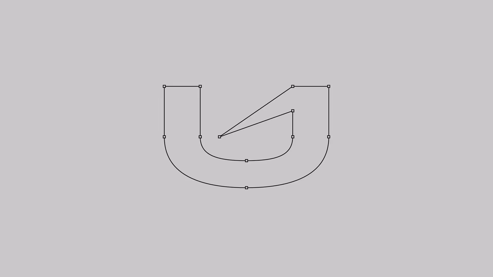
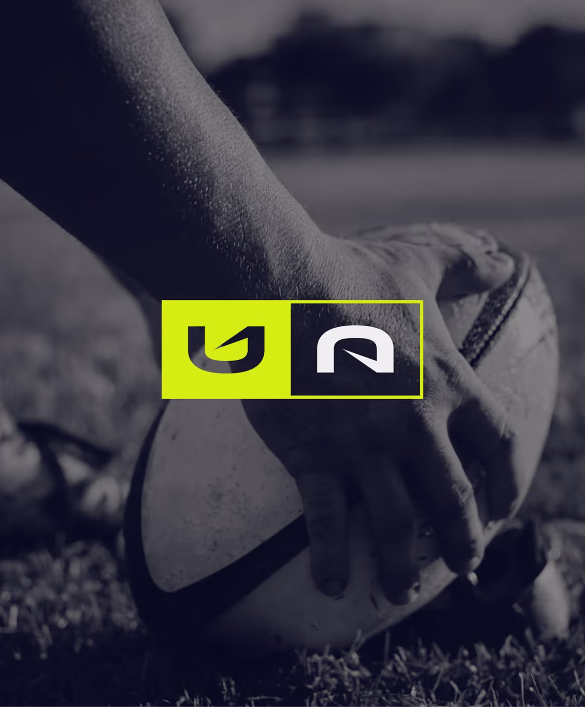
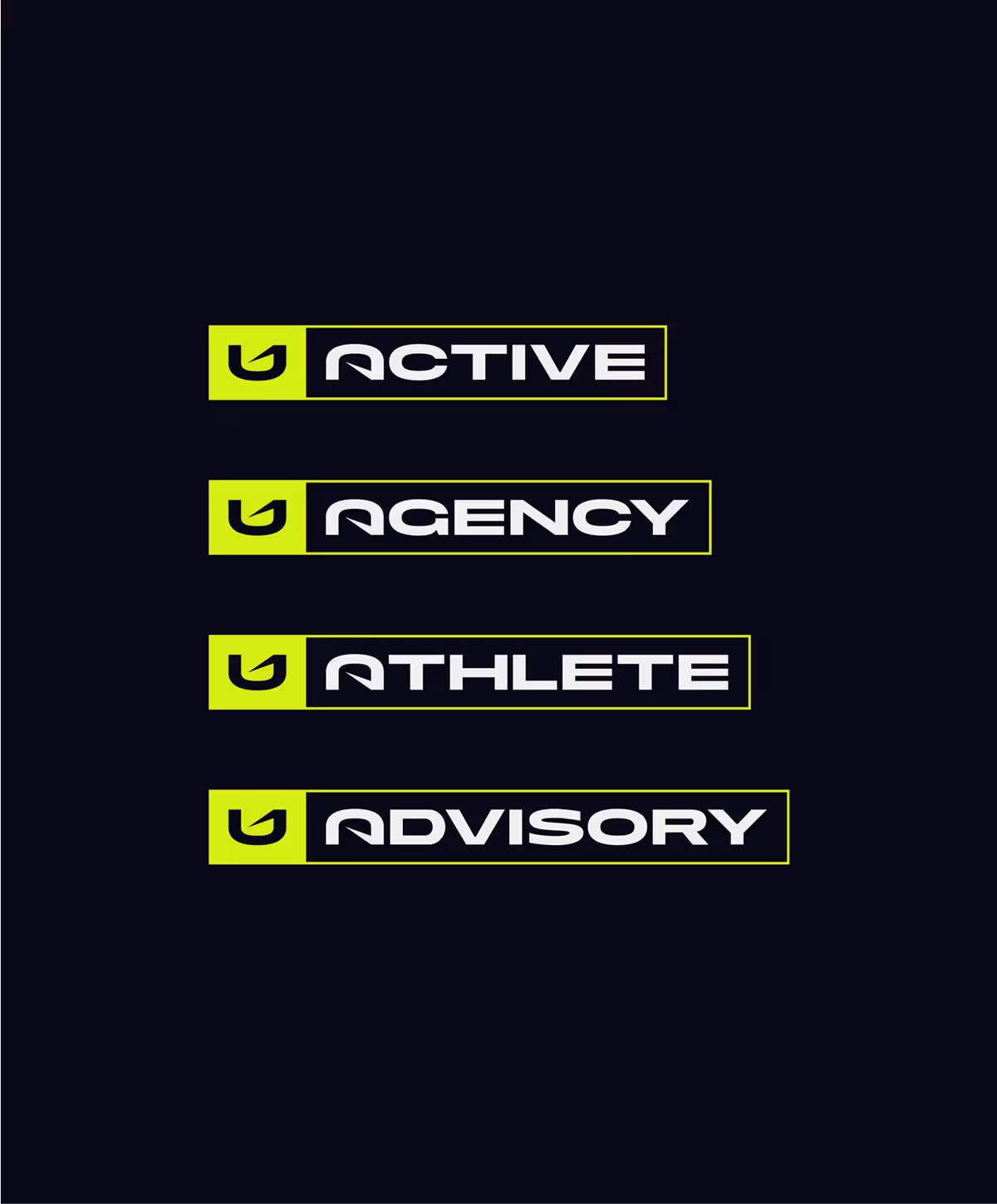
The UNITE wordmark is clean, bold, and designed for premium impact. Its defining feature (the upward arrow carved into the ‘U’) symbolises progress, movement, and pathways forward. Alongside this, the modular “UA” lock-up uses mirrored letterforms to unify the core brand with its many sub-brands. Simple yet versatile, the system is built for recognition, scalability, and strategic expansion.

BRAND STRATEGY
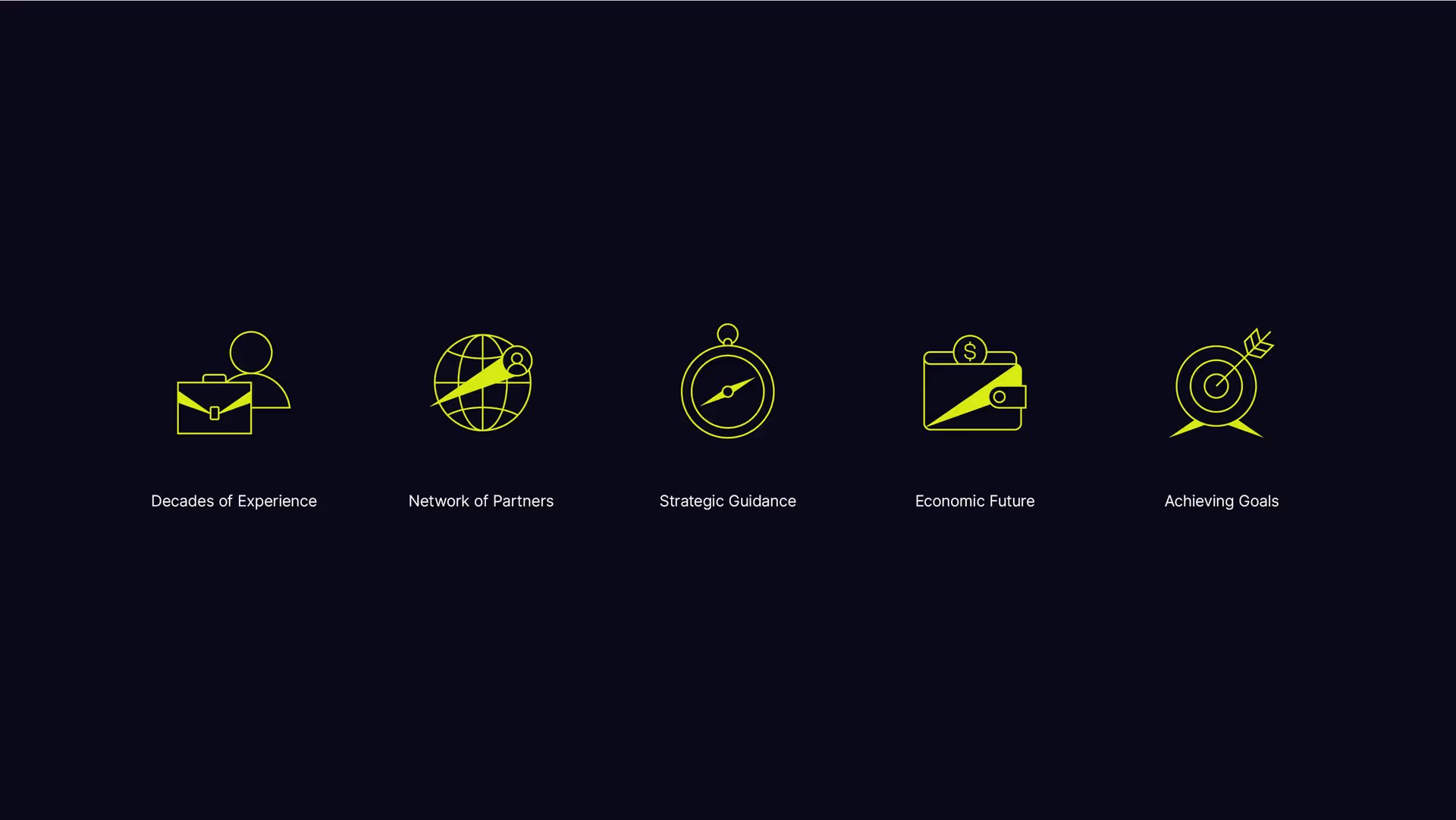
UNITE is a bold sports agency built on athlete-first values. We crafted a brand strategy rooted in empowerment, unity, and global ambition. From tone to vision, every element was designed to reflect UNITE’s four themes (Total Strategic Guidance, United, You Call The Shots, and Amplifying You). Our approach fused strategic clarity with creative edge, positioning UNITE as both advocate and amplifier. Unite became a brand that leads with purpose and puts talent at the front of the sprint.


Heading
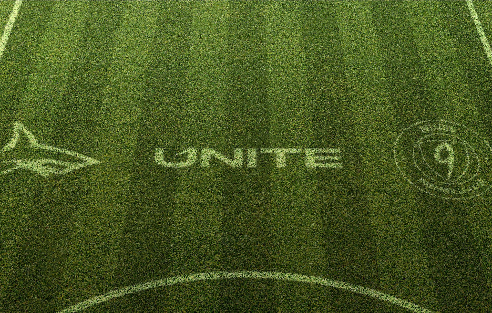
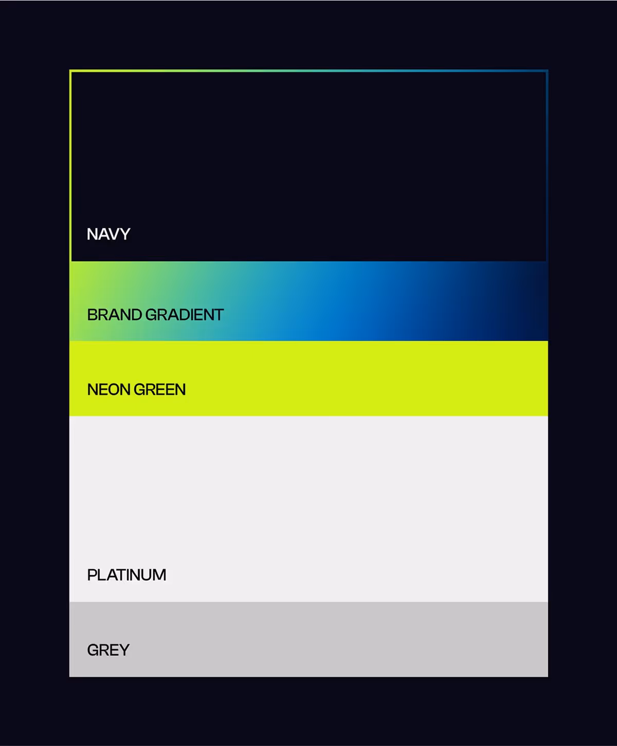
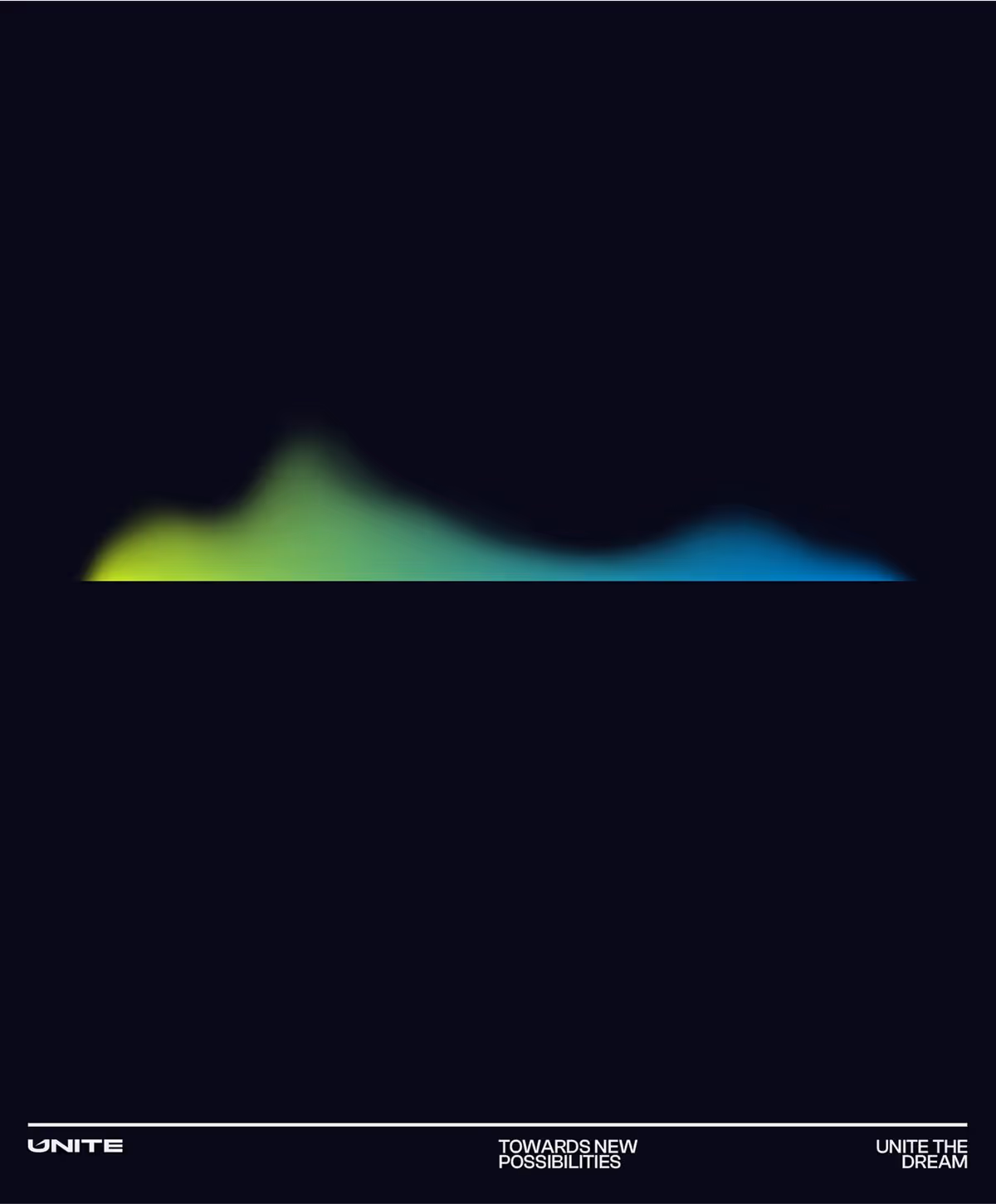
The colour palette pairs deep navy with a vivid gradient - a visual metaphor for energy, adaptability, and modernity. The gradient evokes momentum and fluidity, while the absence of traditional team colours ensures neutrality across a wide athletic roster.

DESIGN ELEMENTS
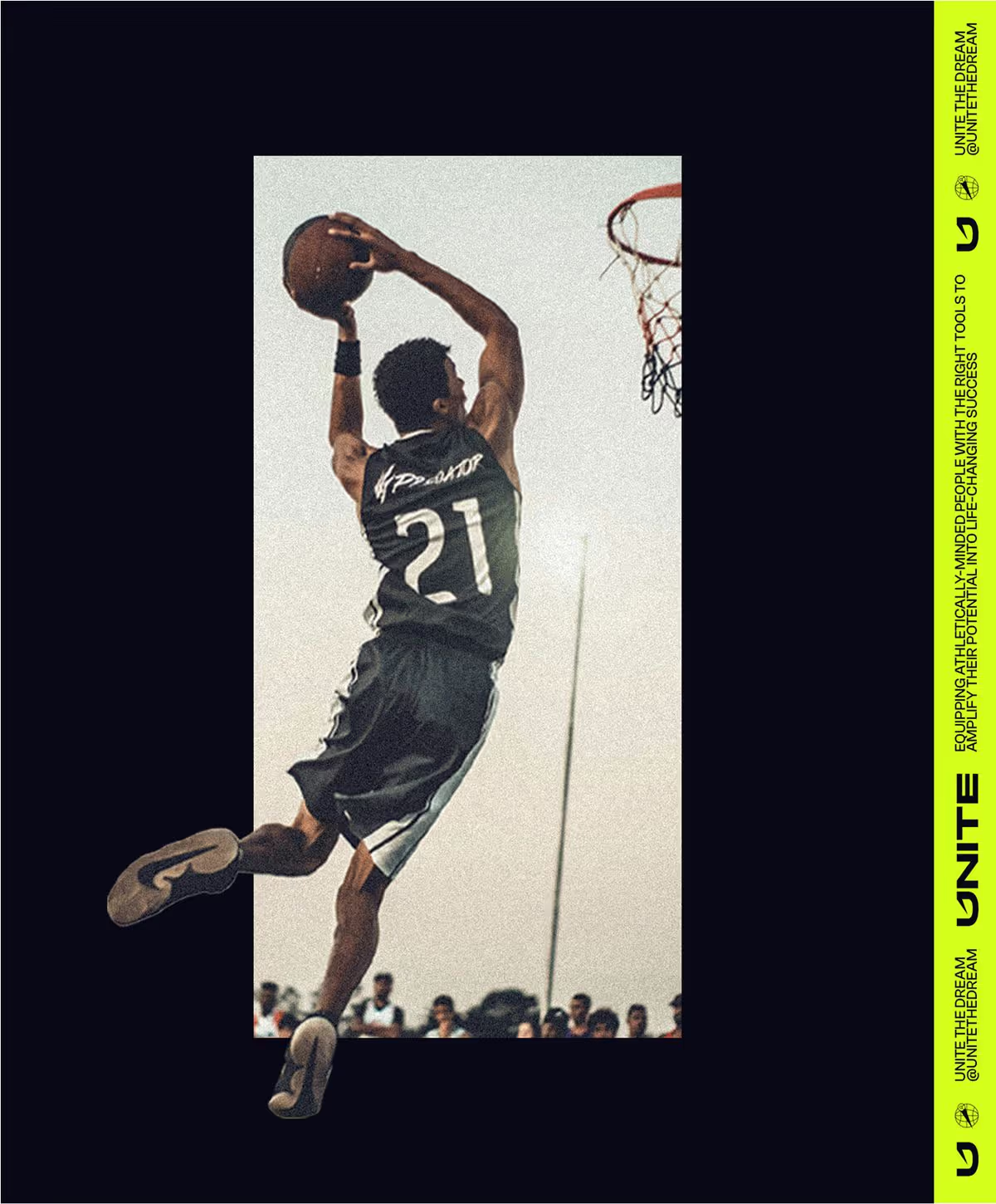
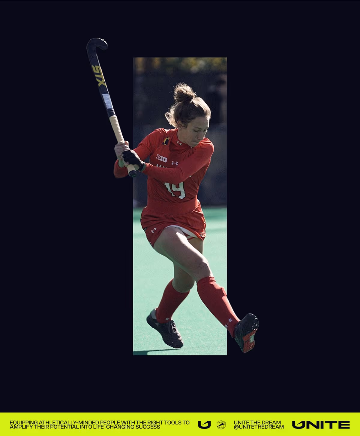
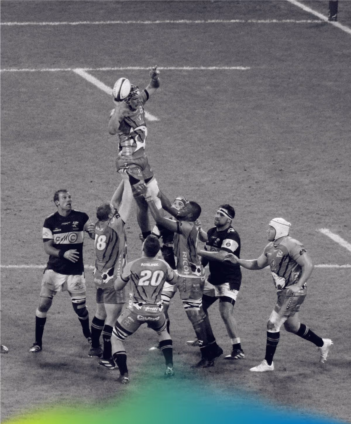
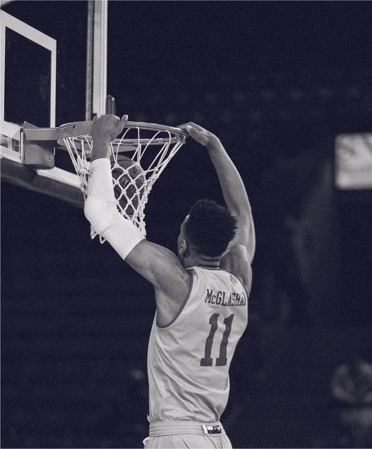
UNITE’s deep-etch photography style isolates each athlete in bold, cut-out silhouettes - placing them front and centre. These visuals symbolise breaking boundaries and pushing limits, directly mirroring the brand ethos. Paired with the UNITE text banner - featuring modular logos and utilitarian typography - this approach draws inspiration from Nike-style editorial layouts, blending sport and precision seamlessly.


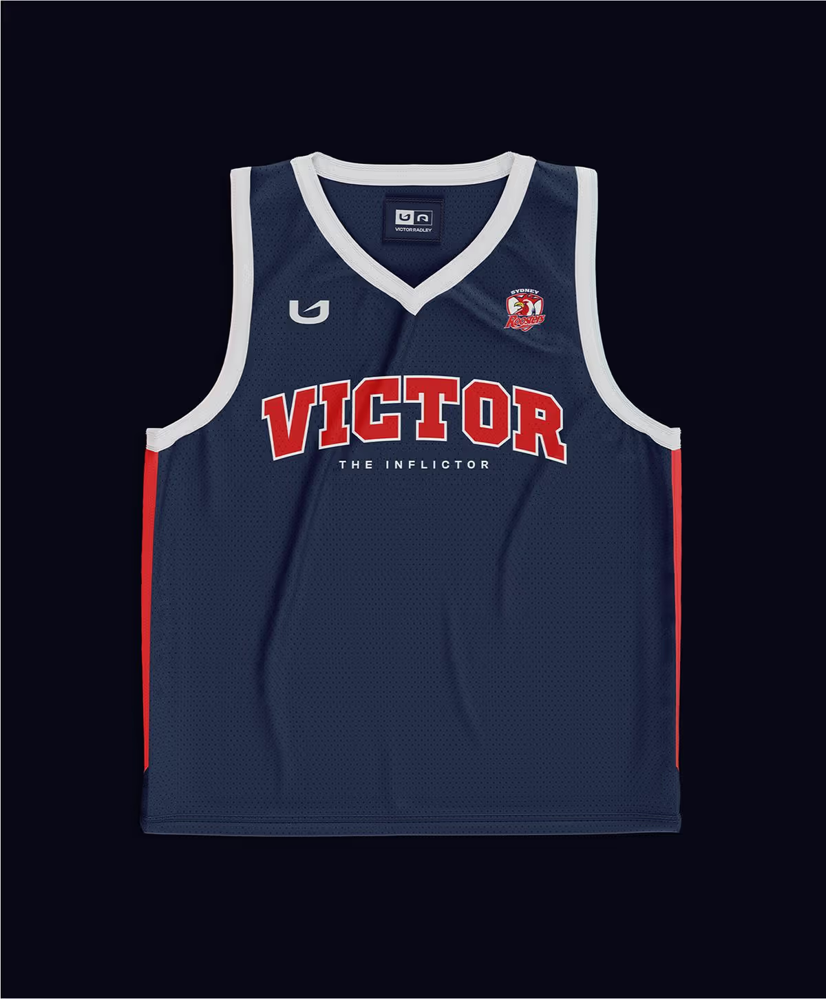
ATHLETE COLLABORATIONS
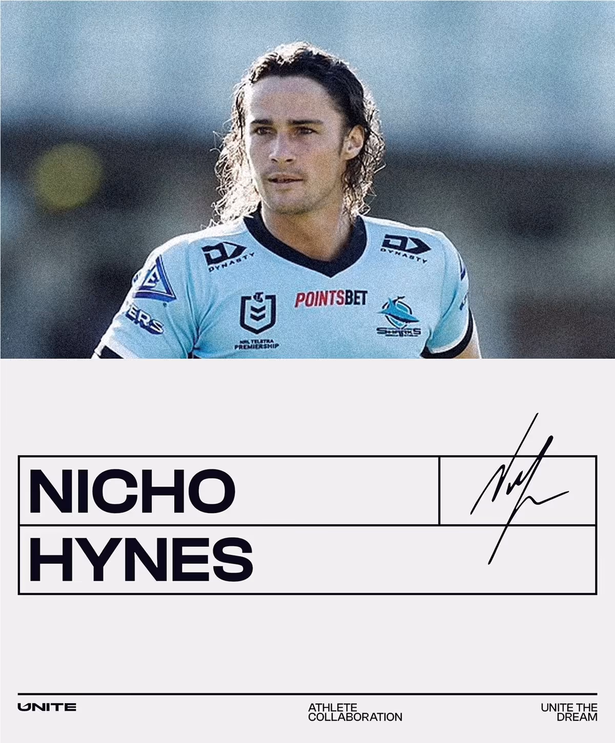
To showcase athlete partnerships, we introduced clean, typographic panels featuring each athlete’s name in their own handwriting or signature. These are contrasted with a branded gradient mist effect: soft, dynamic, and unmistakably UNITE. Together, they bring personal recognition and atmospheric drama to every touchpoint.


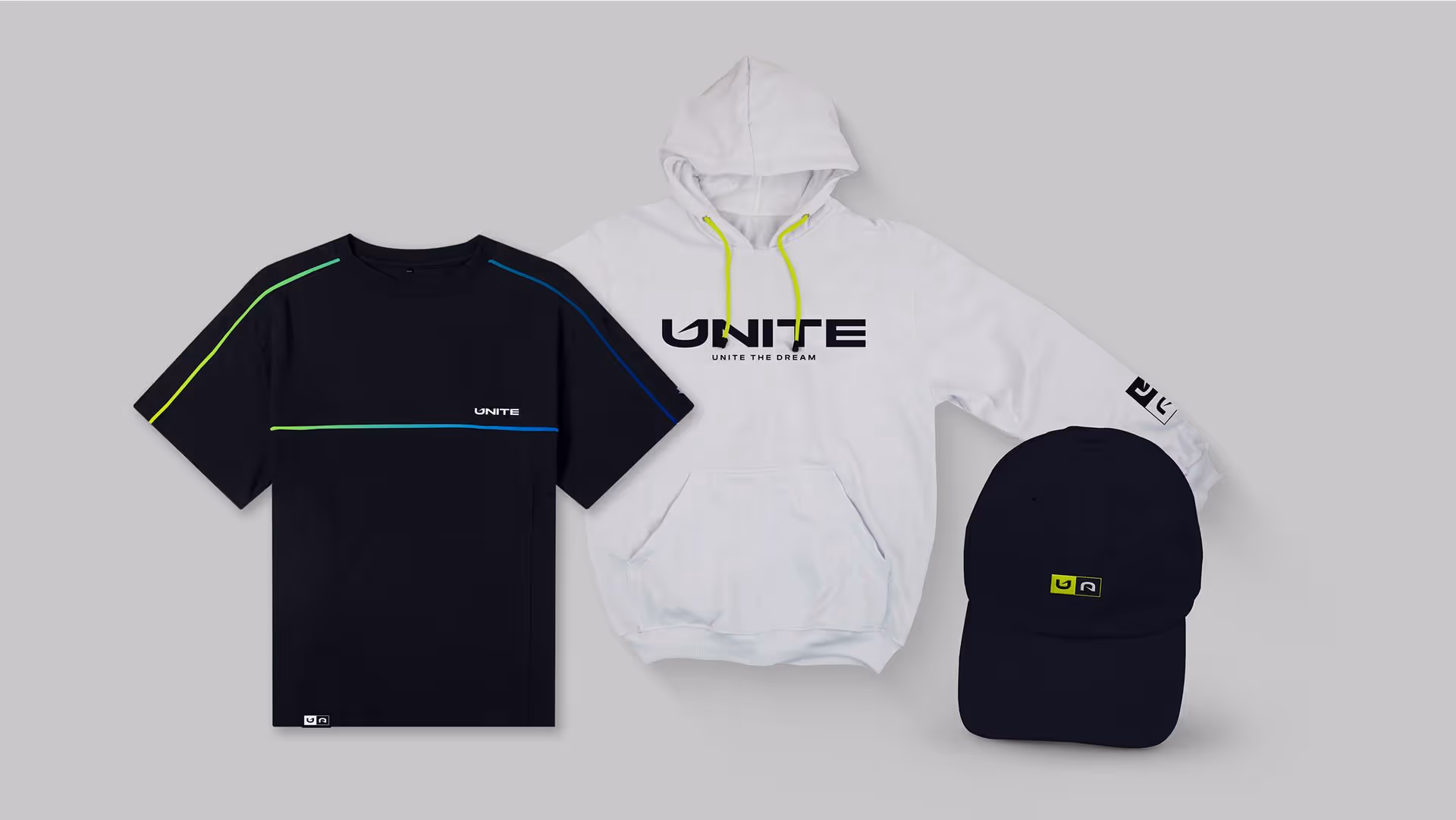
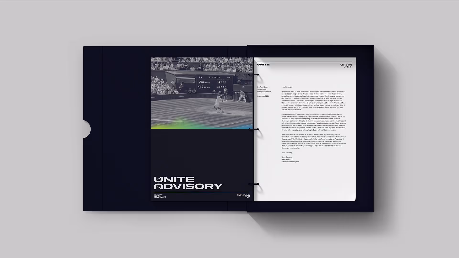
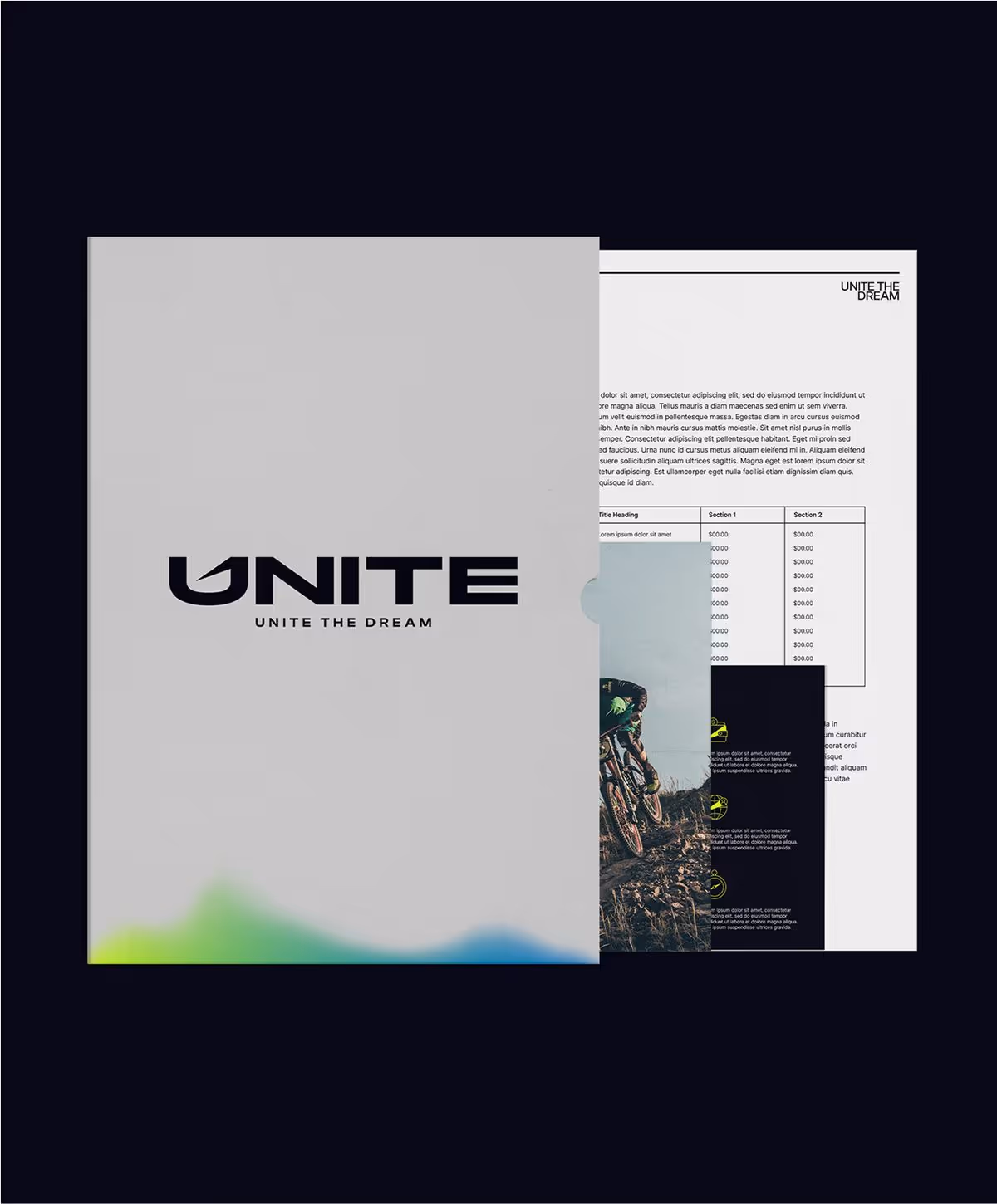
With a house of sub-brands and a client base spanning individuals to institutions, UNITE’s visual identity needed to be versatile. We developed an expansive suite of branded applications - from digital and social templates to signage, merchandise, and presentation collateral, maintaining a consistent brand feel across every touchpoint.


UNITE is a full-scale system built to empower athletes. From brand strategy to design execution, every element speaks to the mission: equipping sport-minded people with the right tools to turn their natural potential into life-changing success. Clean. Strategic. Unapologetically bold.