Skinistry
Rivyl loves a client willing to push the boundaries, stand out in the market, and double down on their strategic stance and we met our match in Skinistry. The founder, Jess, embraced a vision of taming the anarchy, worshiping simplicity, unmasking the cheat codes and capturing converts to their skin-care ‘cult’ with zeal. And the strategy, plus buckets of passion, is working with +5k followers in the 4 months post launch.
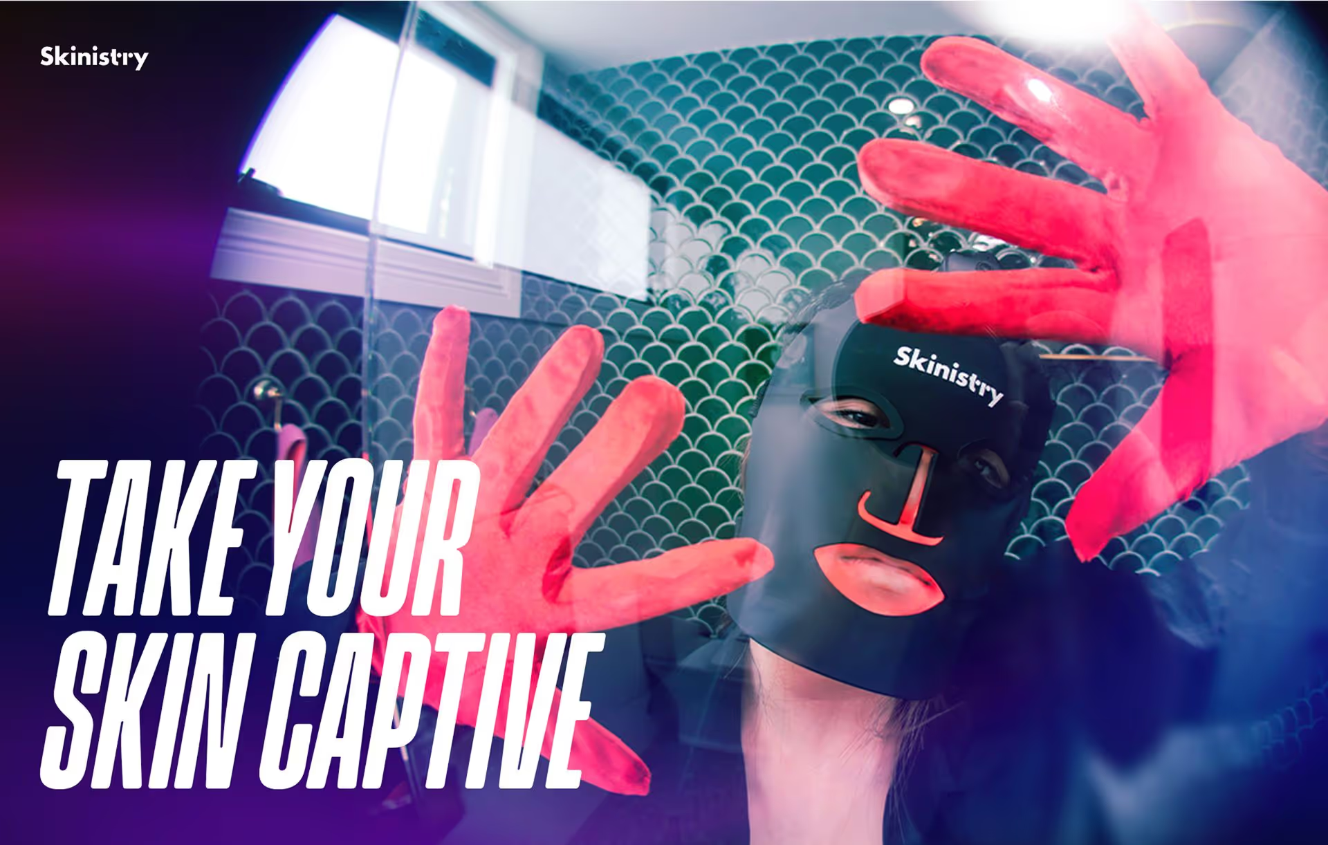
Jess came in strong with her research, dot points on her vibe and style, brand name and logo already sorted. Rivyl helped to connect the pieces of her vision for ‘a ministry of skin’. Pitching a bold direction that would help to get cut through and attention in the digital sphere. Edgy, audacious, ironic; the strategy hinged on inverting expectations for what this product category would expect. If it was white, we made it black. If it was pretty we made it provocative. If it was calm we made it loud. It’s aspiration in the age of TikTok, where influencers hold more sway than celebrities and stopping the scroll is more critical than crowd pleasing. Using disruption as a key communication feature meant that we went dark mode instead of the standard airy and tranquil ‘beauty calm’.
Typography
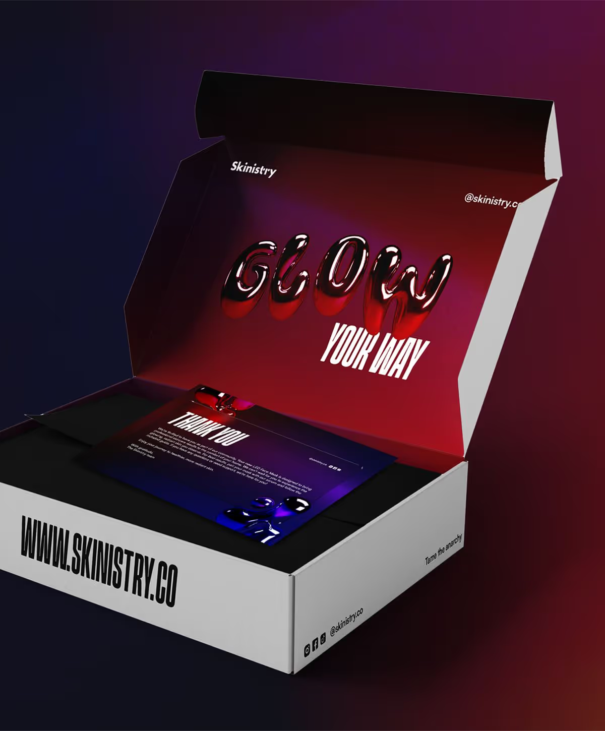
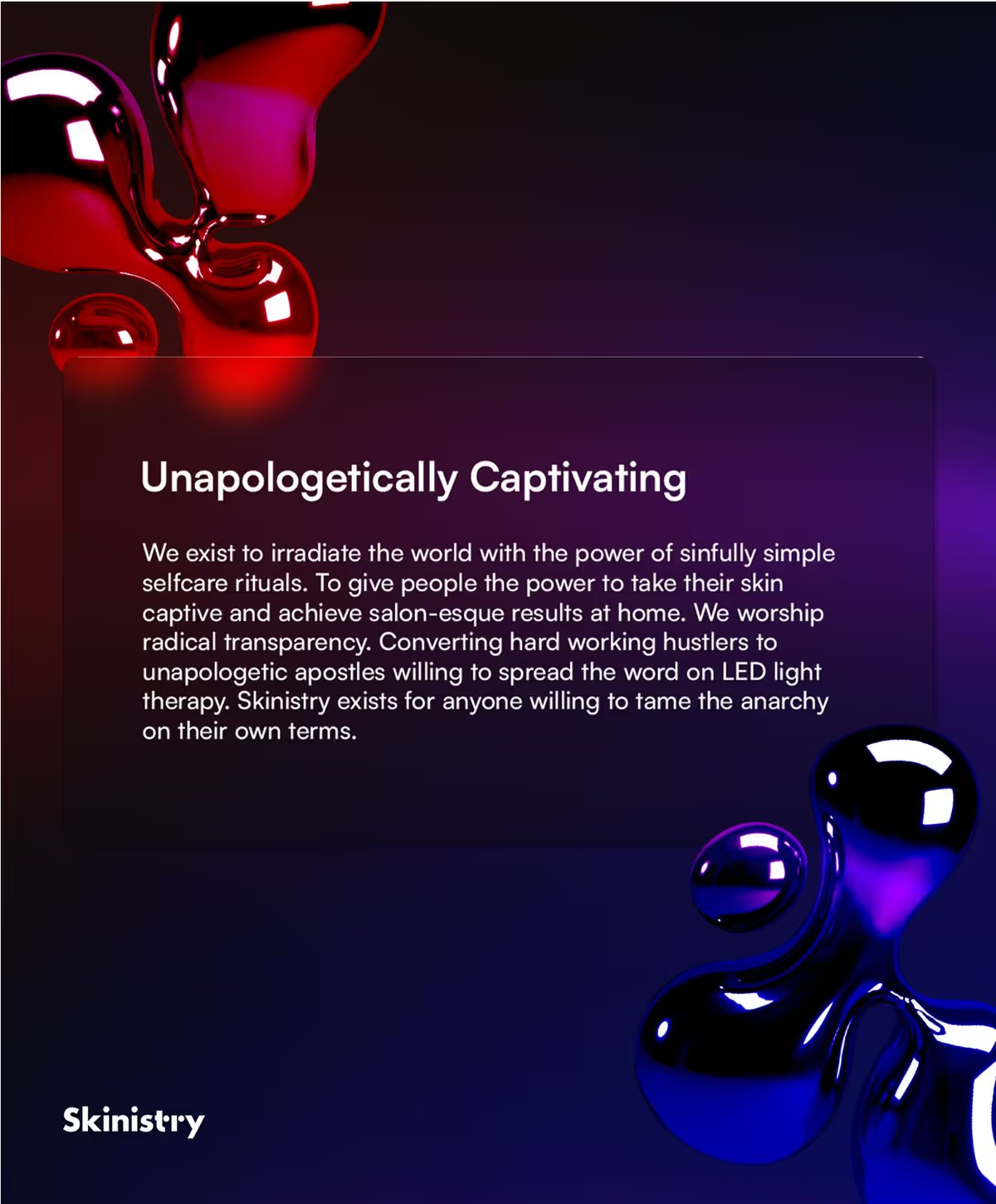
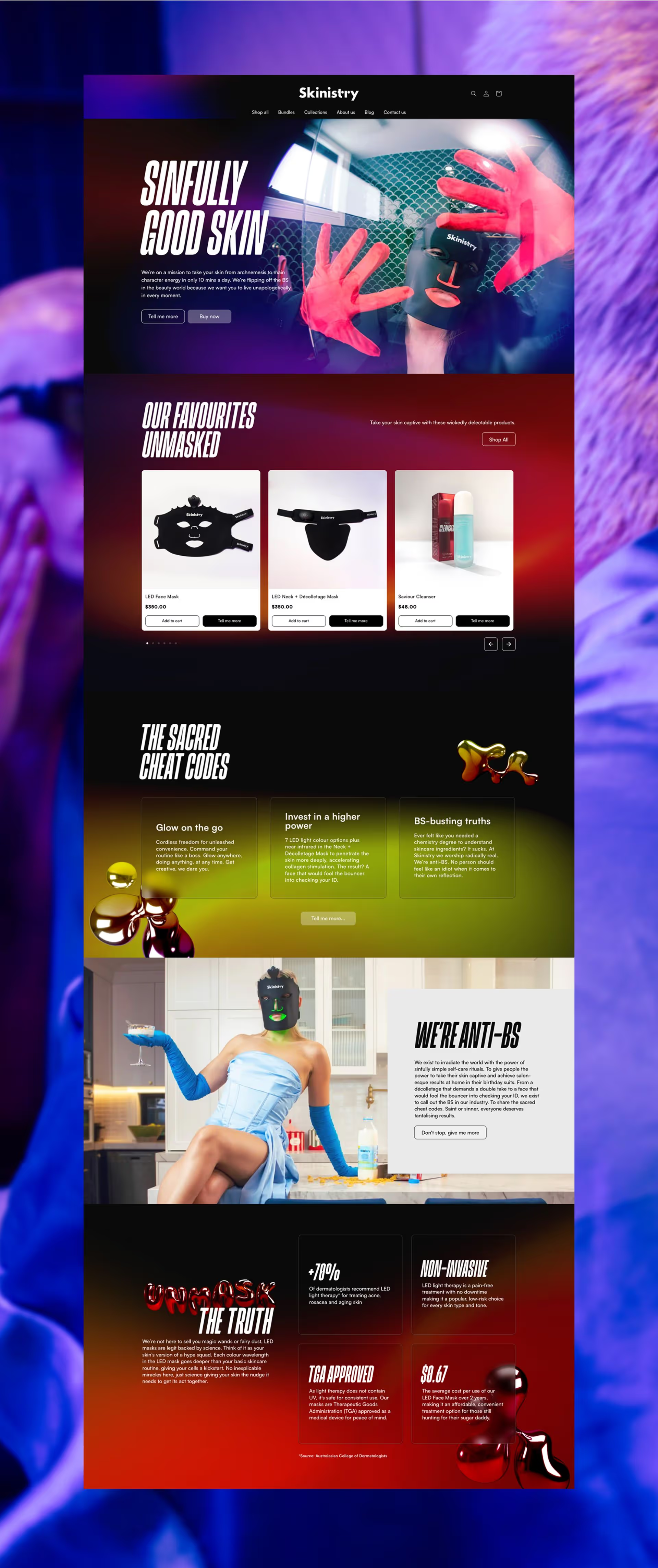
The typographic system strikes a confident balance between structure and spontaneity. The italic condensed headline font delivers a disruptive punch, grabbing attention with unapologetic energy. Paired with decorative 3D bubble text, rendered in a glossy chrome, the typography feels playful yet polished. The mirrored finish hints at skincare’s luminous effect, while the RGB tones reflect LED light colours to ground the visual language in science and performance.


Creative Direction
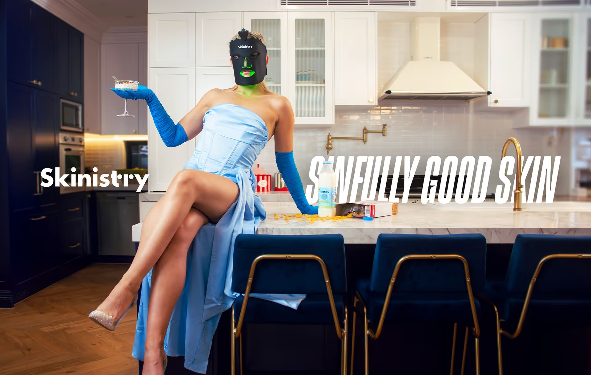
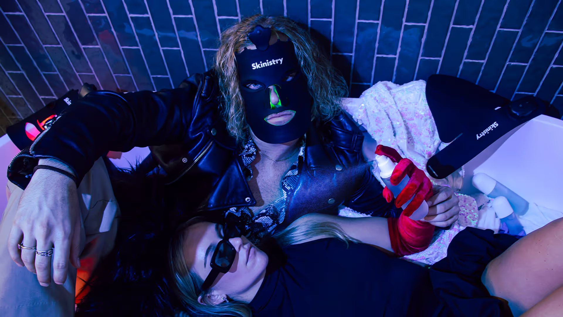
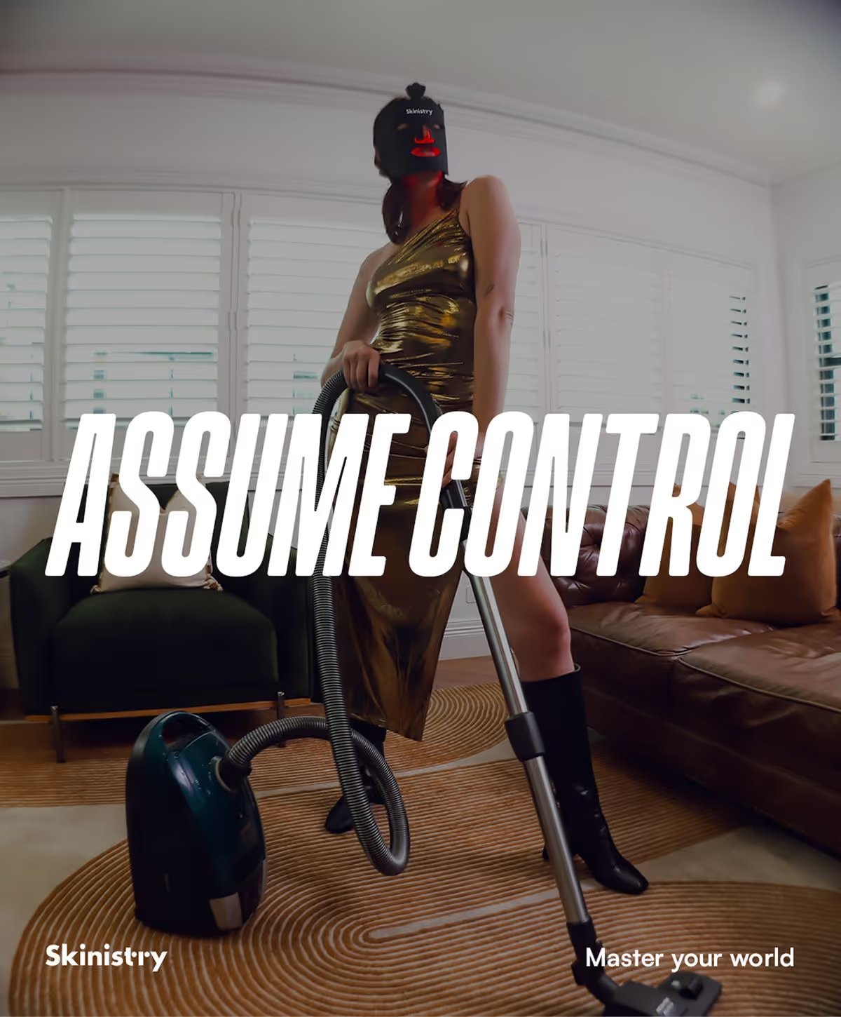
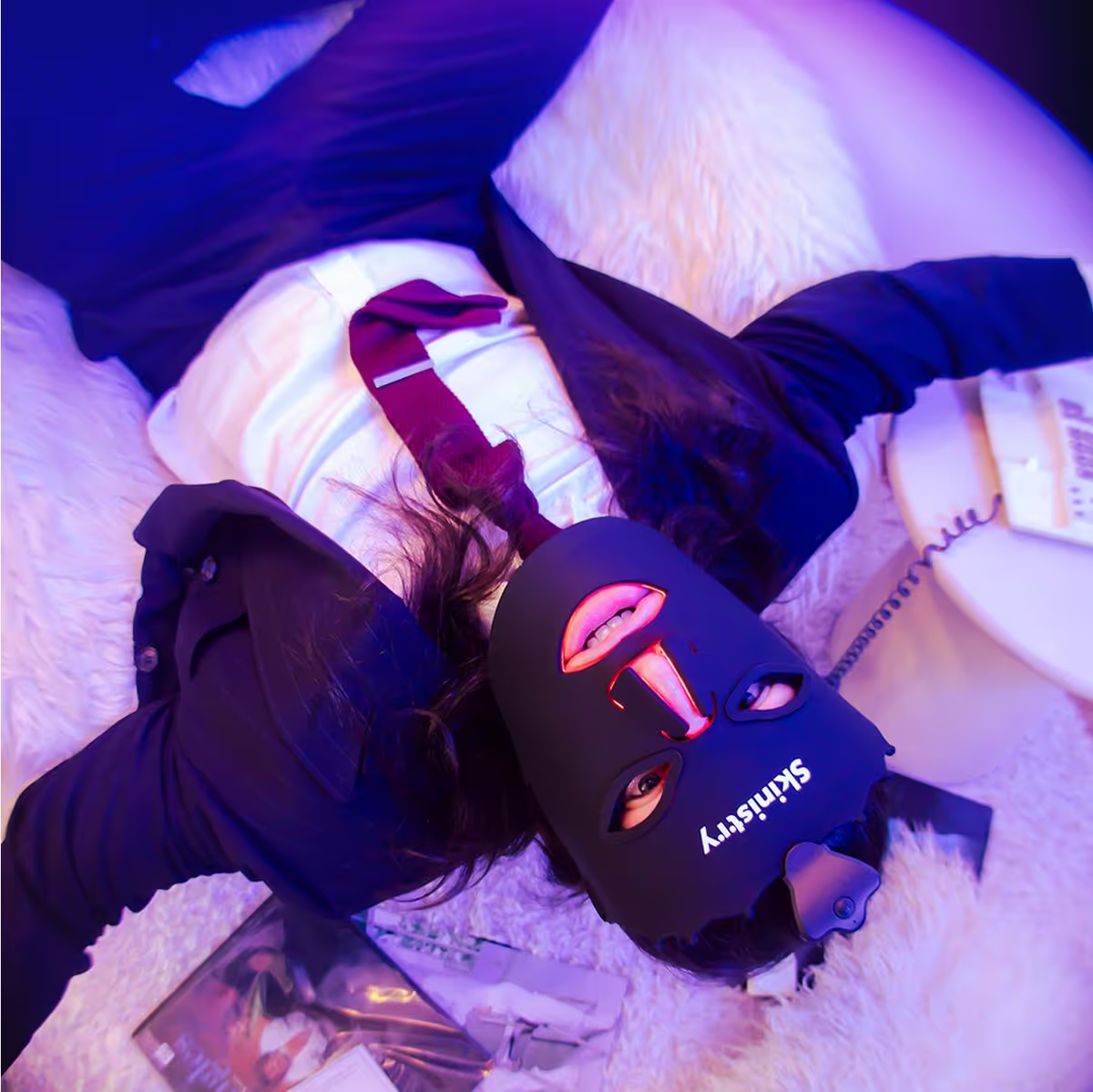
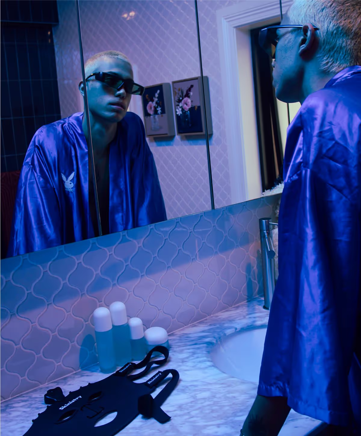
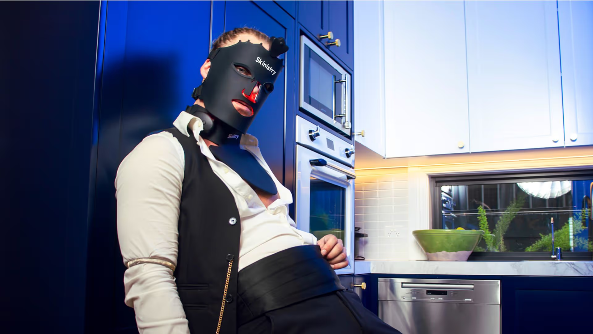
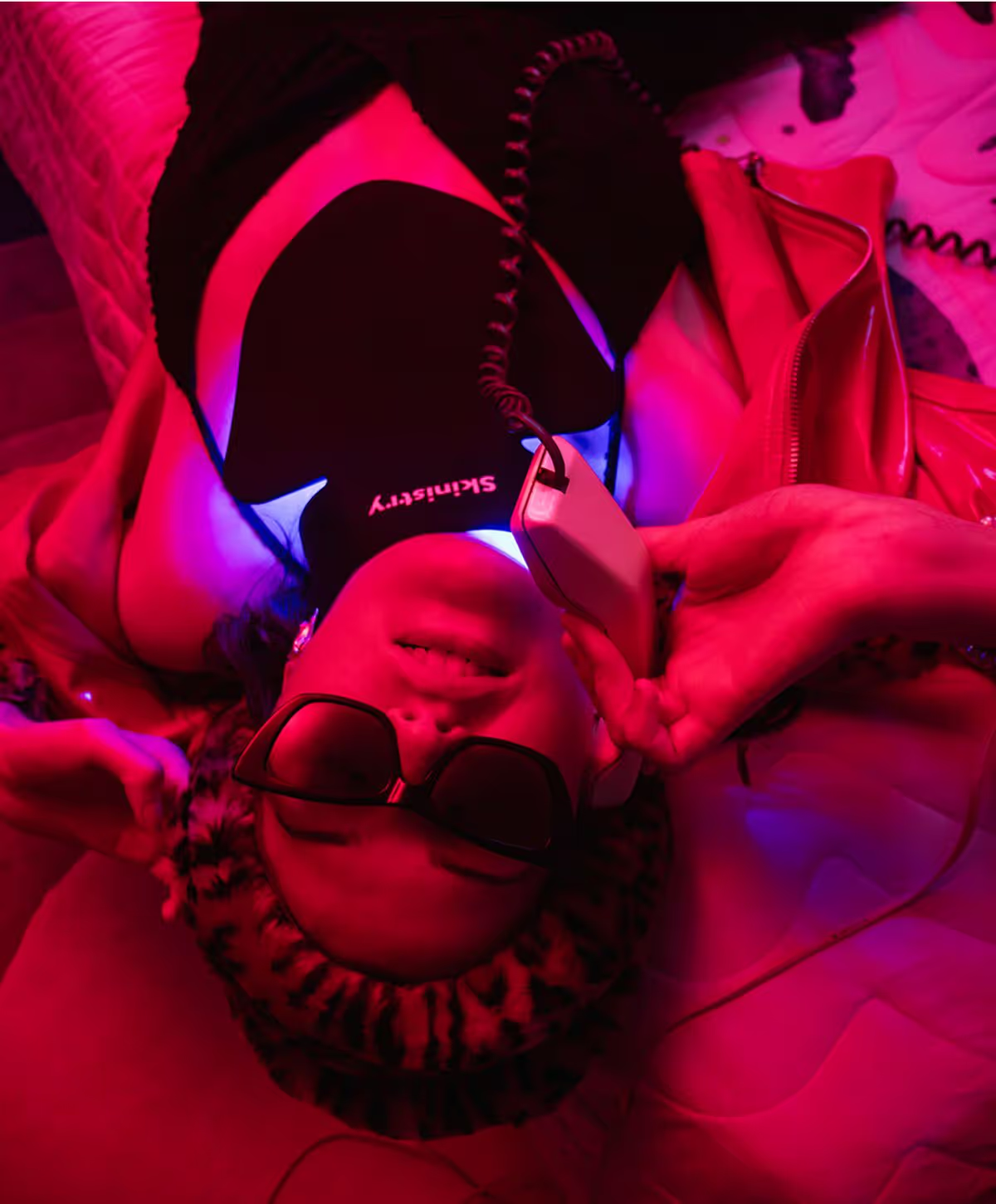
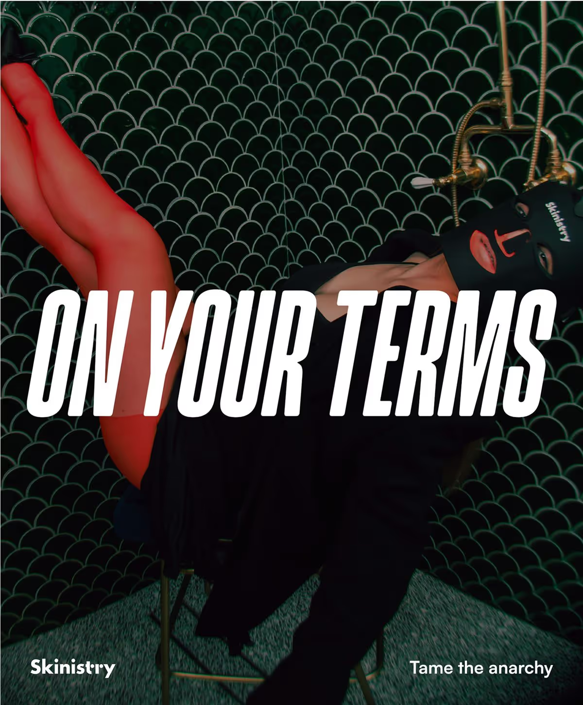
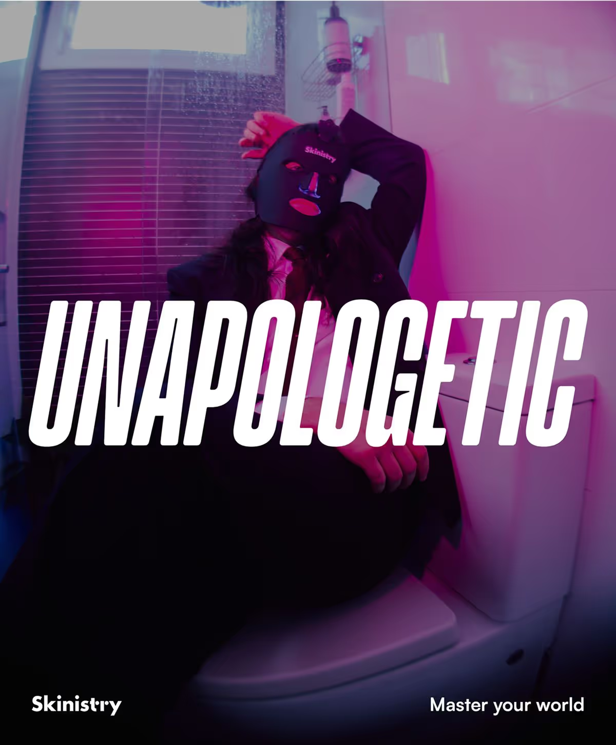
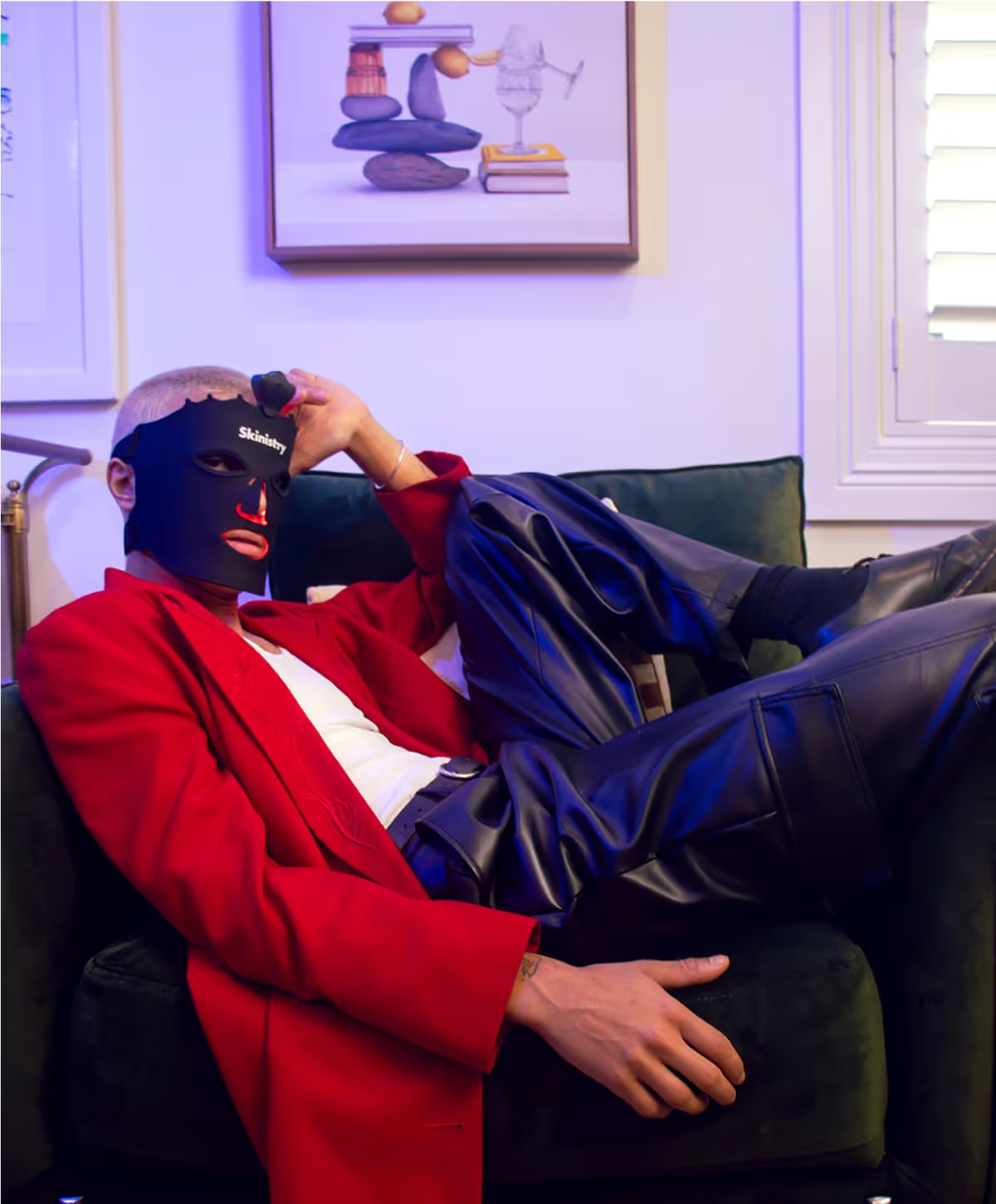
High fashion, at home. Photography reimagined everyday skincare as a moment of power and poise, blending high-fashion editorial styling with mundane domestic settings: LED face masks worn in the kitchen, bathrooms, and bedrooms - wherever real self-care happens. Juxtaposing sleek, futuristic beauty tech with soft, lived-in spaces, the imagery positions Skinistry as effortlessly premium and intimately relatable.

Taking inspiration from disruptive high-fashion editorials, the LED masks, with their alien-like glow and unusual silhouette, already made a visual statement - so we leaned into that absurdity. By styling them in unexpected, exaggerated poses and luxurious fashion looks within domestic spaces, we turned skincare into performance art. The contrast between high-end polish and everyday environments created a visually jarring, yet irresistibly compelling narrative.
Website
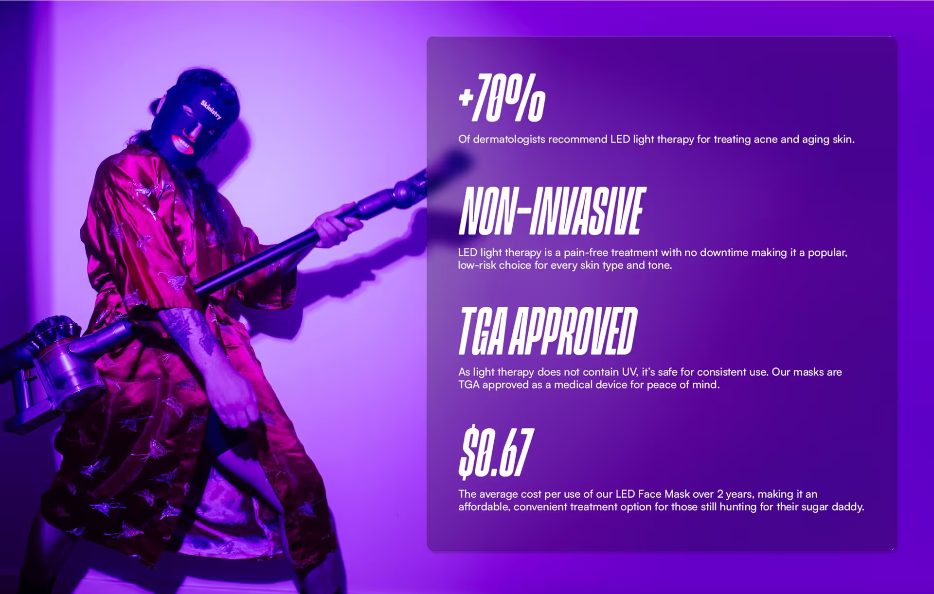
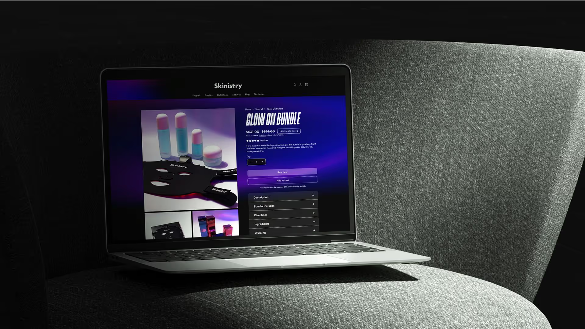
The website brings Skinistry’s identity to life through immersive visuals and movement. LED gradients, glassmorphism elements, and animated bubble typography add layers of depth and dimension. Interactive features and unexpected transitions make the experience feel dynamic, while structured layouts ensure clarity and accessibility. It’s informative, but never clinical - a digital space that feels as fresh and energised as post-mask skin.


Packaging
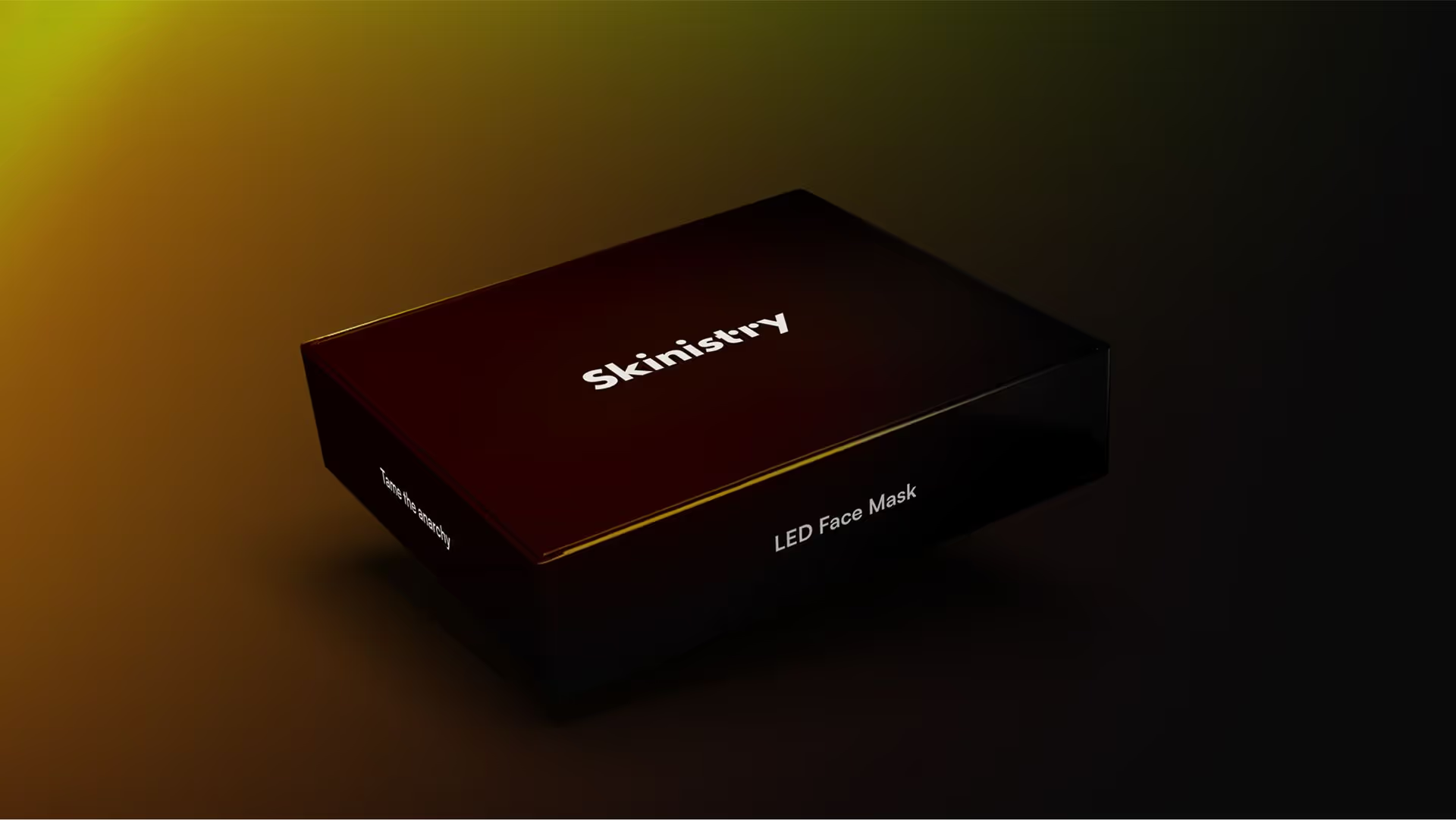
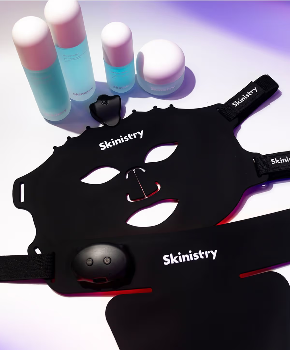
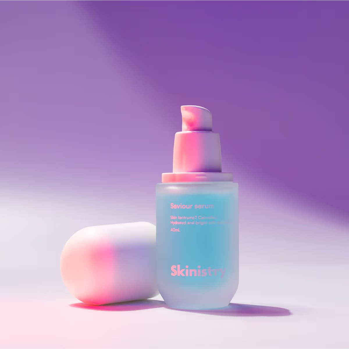
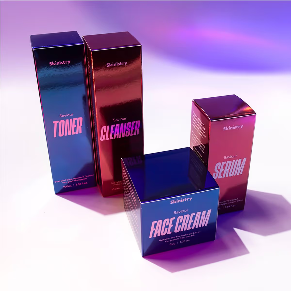
From frosted glass bottles with curved, glossy silhouettes to reflective chrome-finish boxes in LED-inspired tones, every detail of the packaging reinforces the brand's visual DNA. The skincare range features smooth, premium textures that echo the softness of the glassmorphism effects of the glossy chrome decorative text, creating cohesion across mediums. Even the materials - reflective, and tactile - play into the contrast of light and shadow that defines LED therapy itself.
Skinistry isn’t just another skincare brand - it’s a full-spectrum system of visual delight, scientific credibility, and everyday luxury. Designed to be touched, worn, and admired.
Skinistry isn’t just another skincare brand - it’s a full-spectrum system of visual delight, scientific credibility, and everyday luxury. Designed to be touched, worn, and admired.
