The Sweetstakes
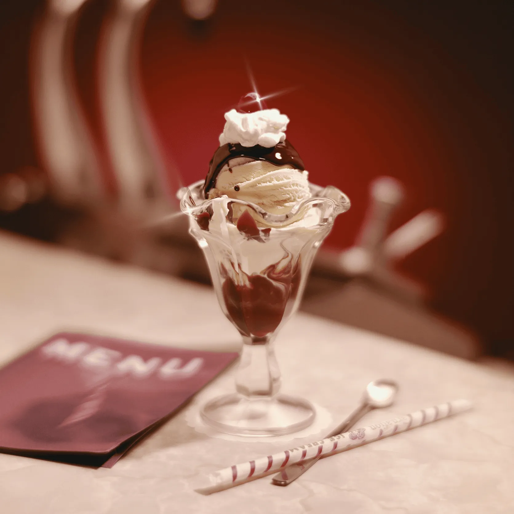
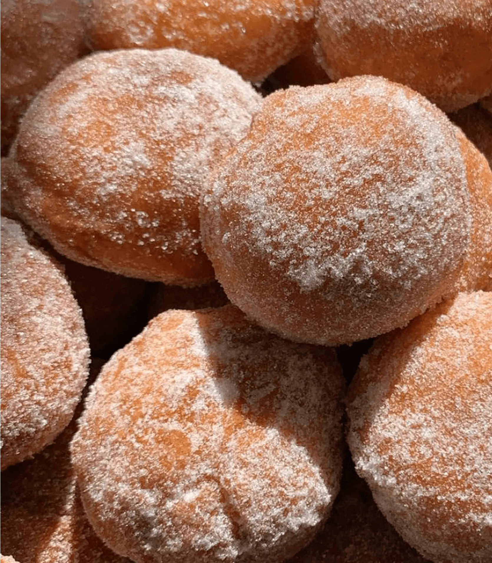
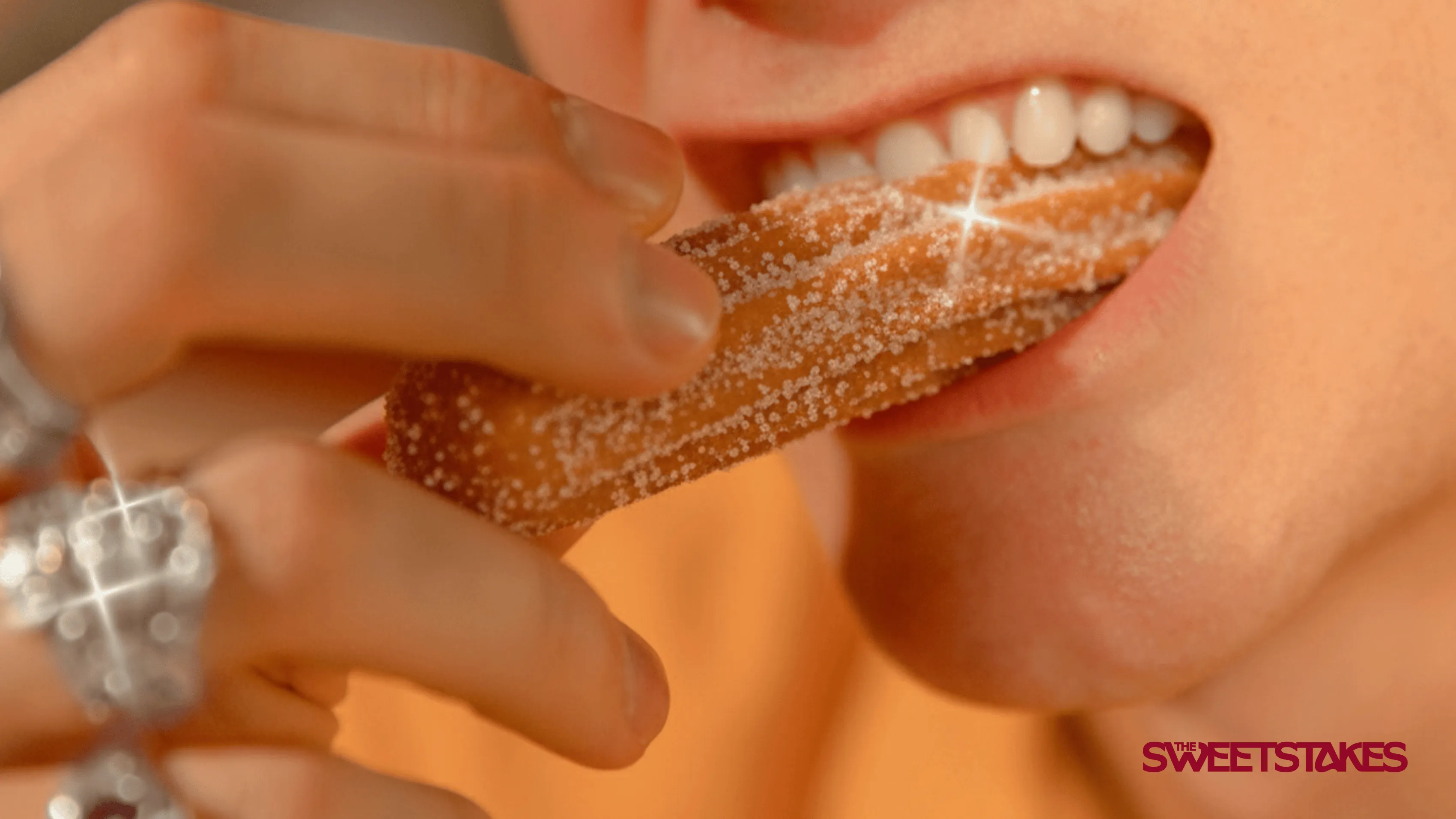
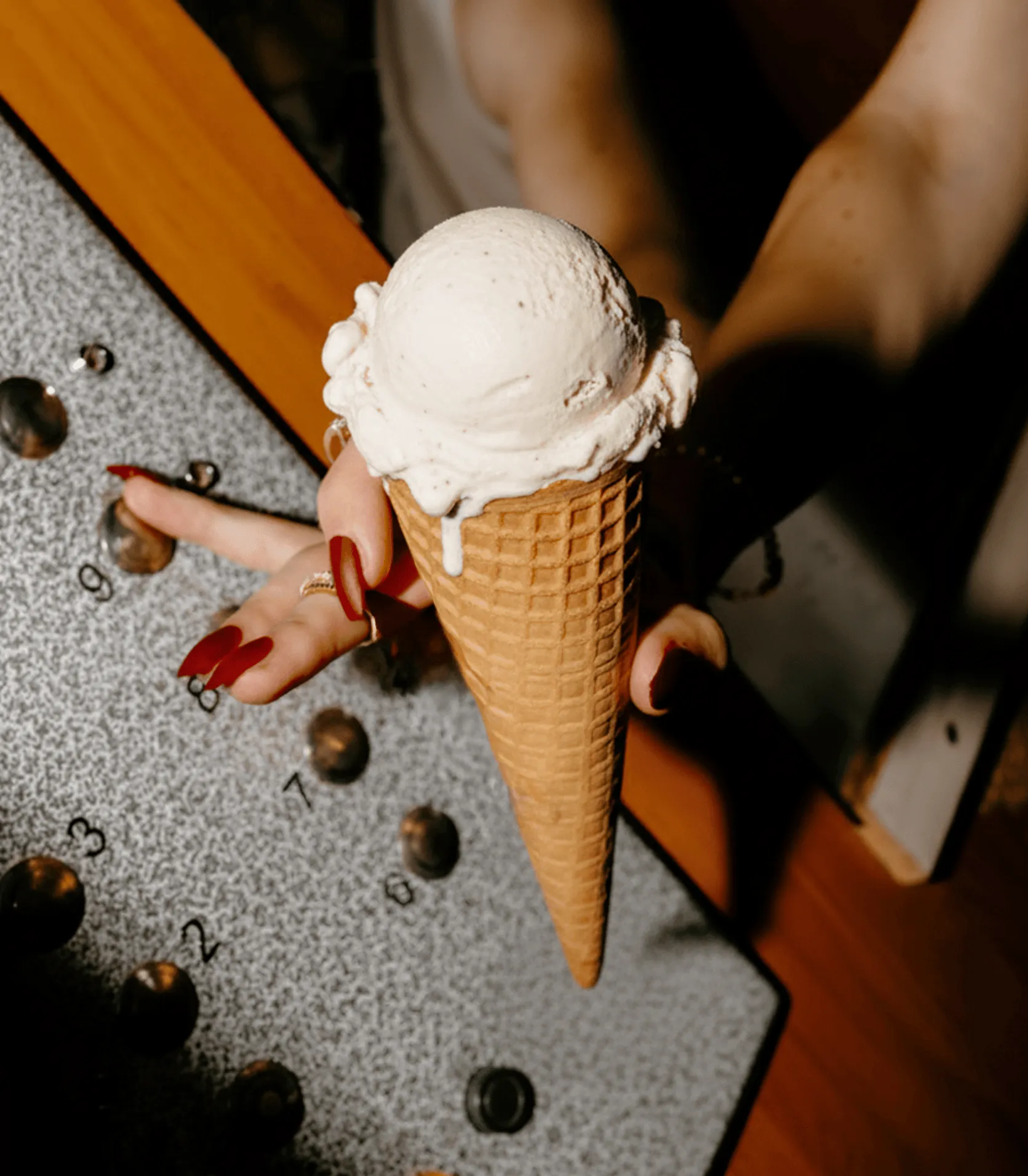
The Sweetstakes is an invitingly cheeky dessert brand delivering unforgettable experiences for corporate and personal events across Melbourne. Specialising in elevated desserts, they turn every catered occasion into an iconic celebration. With a playful yet sophisticated personality, The Sweetstakes makes every bite feel like a victory, creating lasting memories for guests.
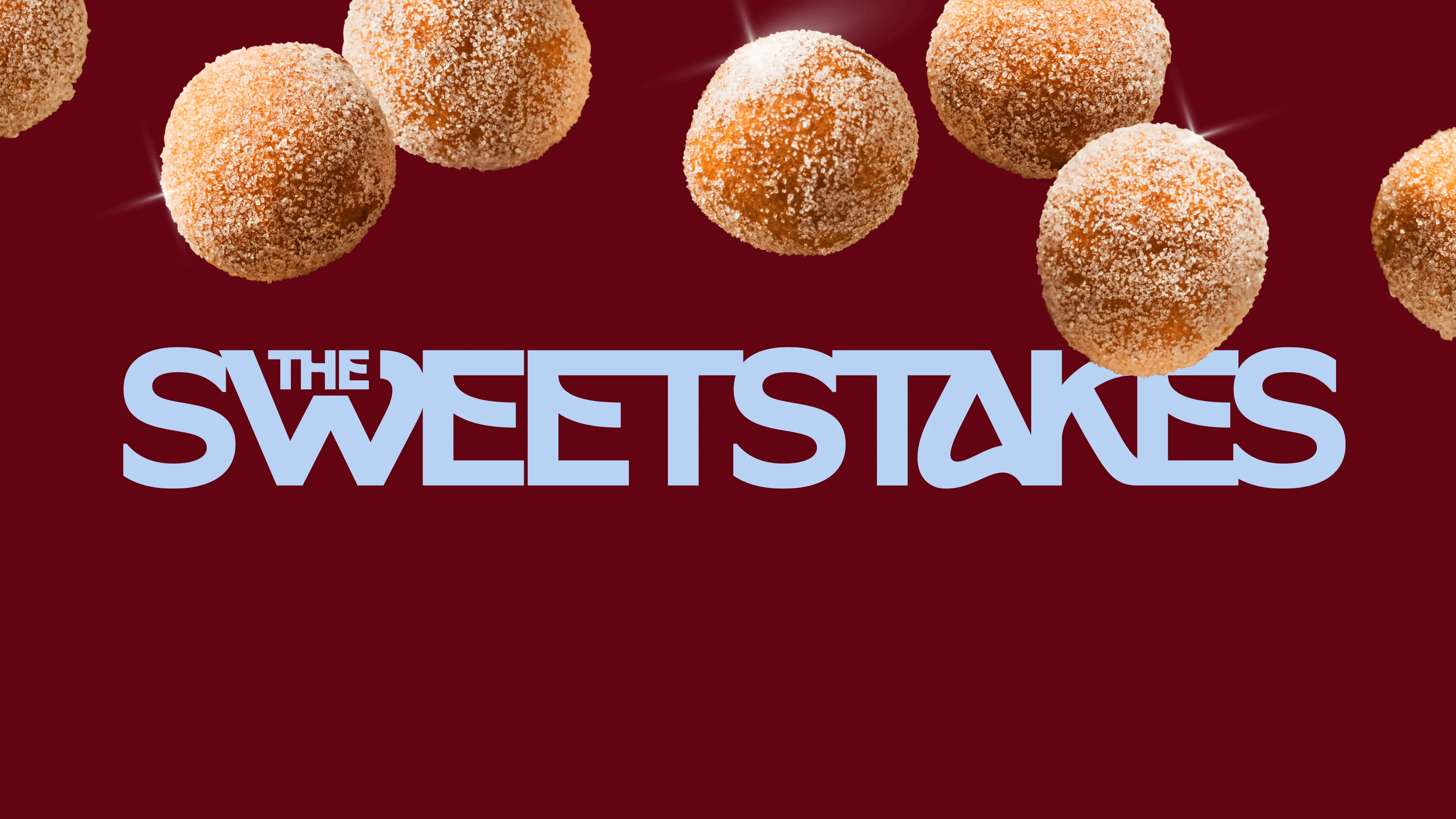
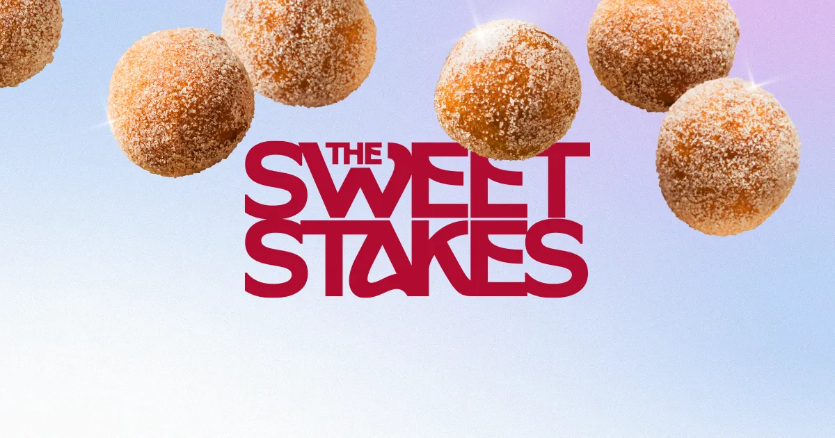
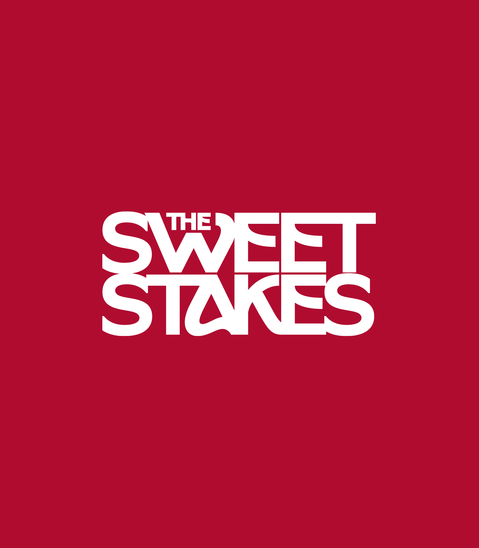
Donut panic to ‘The Sweetstakes’
The client approached us to reposition and elevate their brand from Donut Panic to something more glamorous and versatile. They needed a new name and elevated brand visuals that could appeal to high-end, black-tie events whilst still reflecting their fun, bubbly personality. The brand identity had to encompass a wider suite of desserts, drive repeat bookings, and become the kind of brand guests never stop raving about.
Our strategy was to balance sophistication with playfulness. The rebrand needed to capture the excitement of ‘high-stakes hospitality’ while keeping the bright, fun energy the’ve become known for.
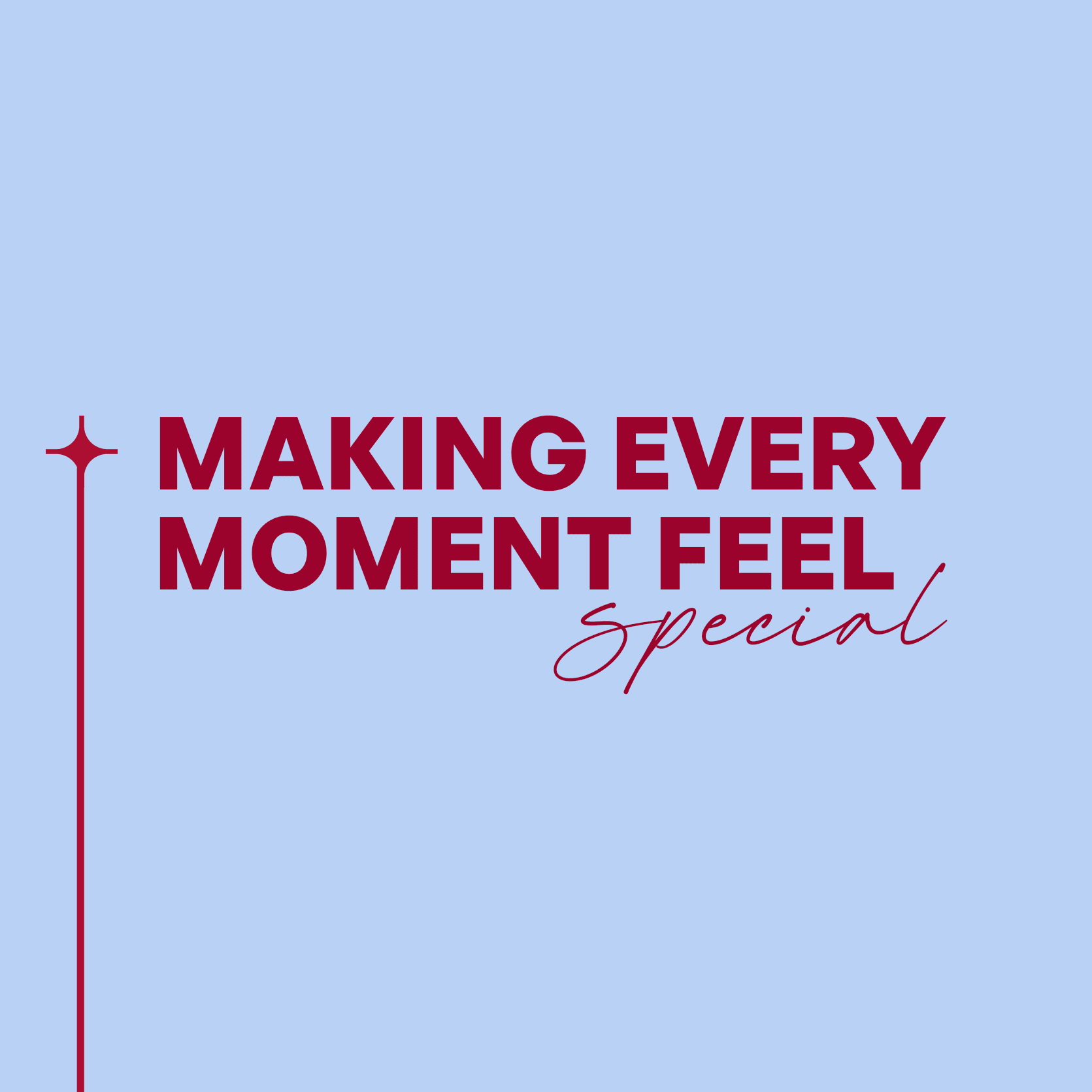
We developed their tone and messaging that positioned them as the dessert brand that delivers “the taste victory” and “sugar-fueld fun.” Their tagline ‘Bet On The Best’ encapsulates their promise: to give Melbourne the taste of the sweet life they’ll never forget.
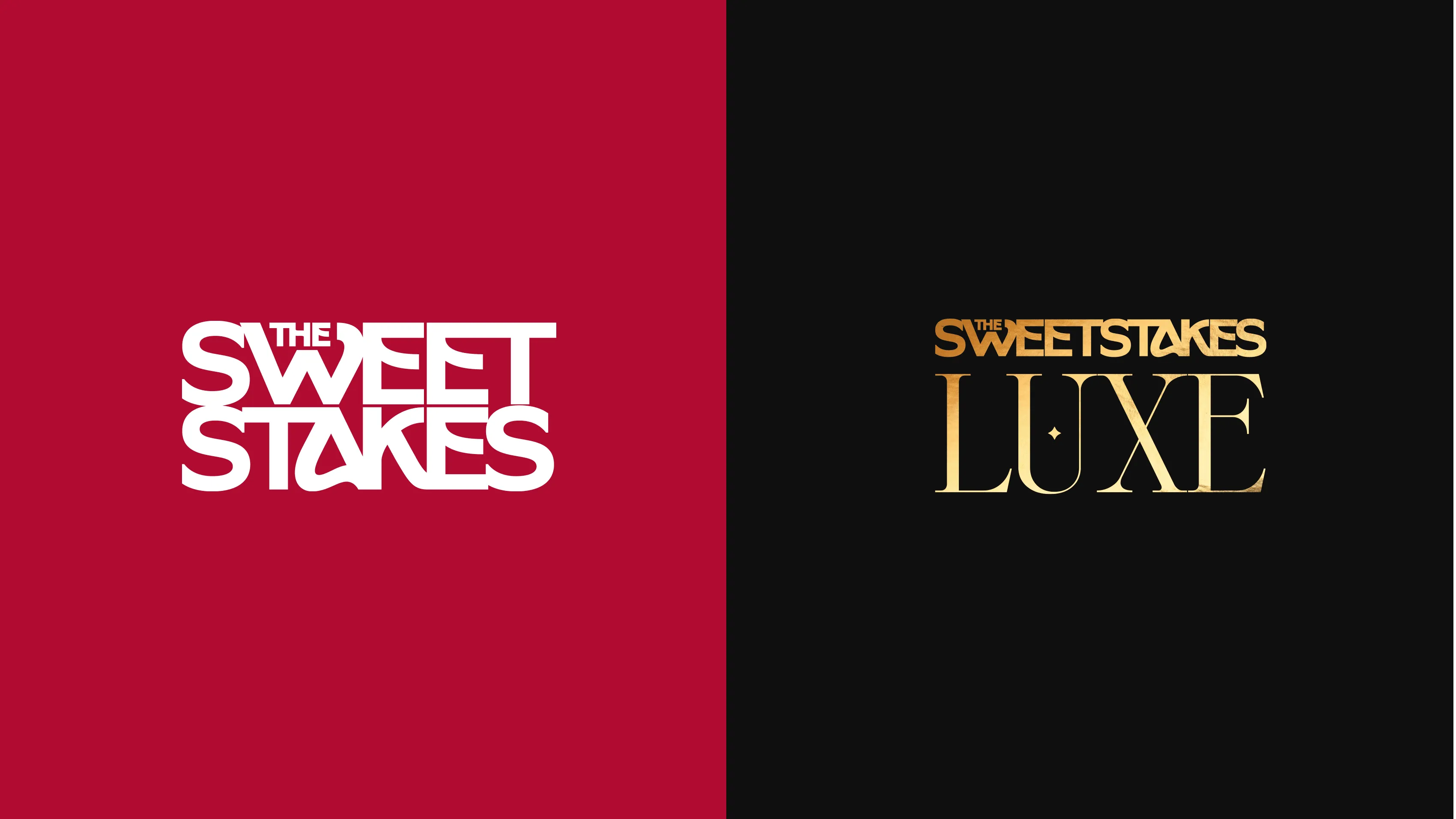
The renaming to The Sweetstakes was a pivotal moment, encapsulating the thrill of competition with the indulgence of desserts. It elevated the brand from a niche donut service to a versatile, high-end dessert experience. The name, combined with our messaging, created a playful yet glamorous identity that could stand out in the competitive events industry.
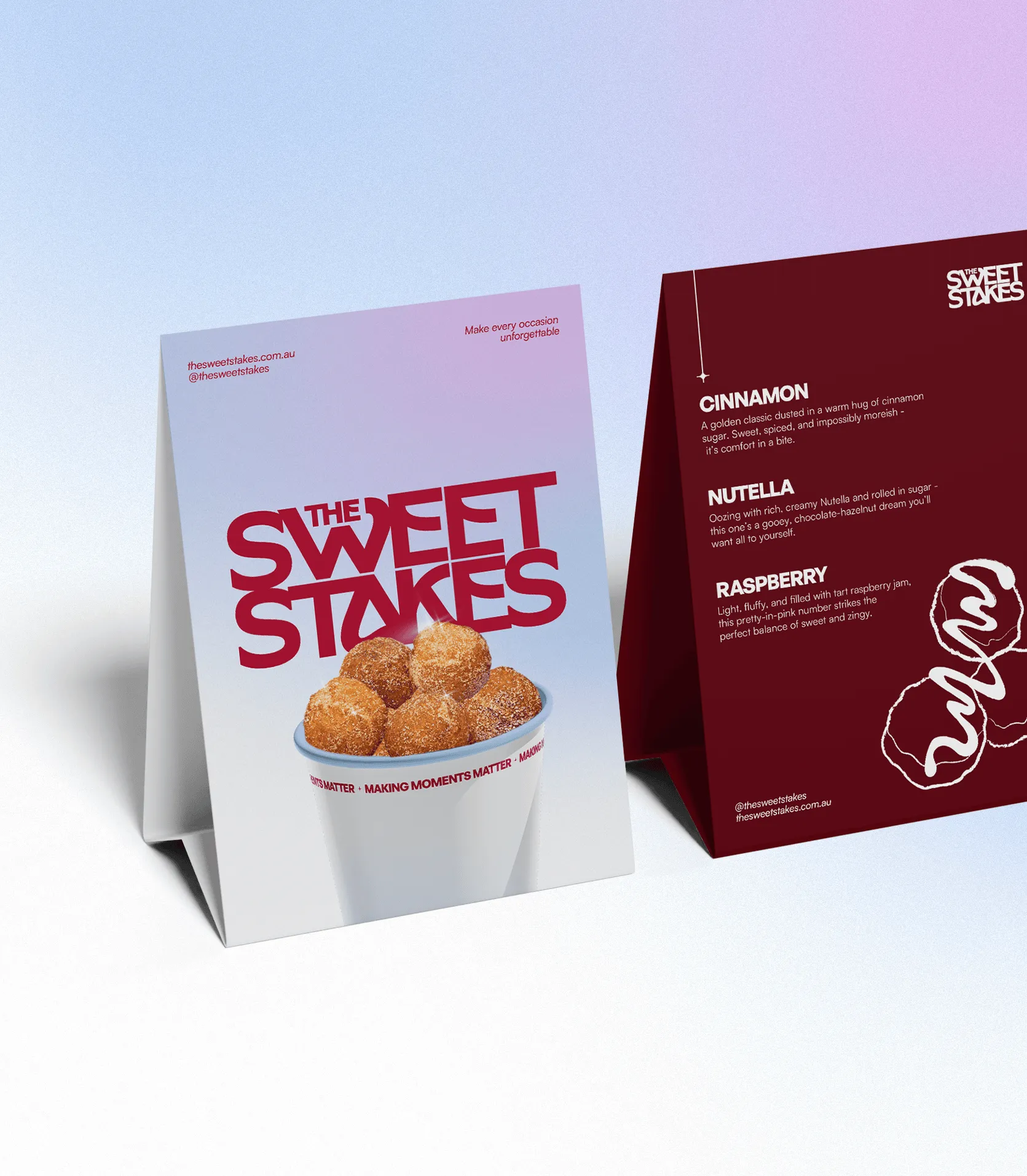
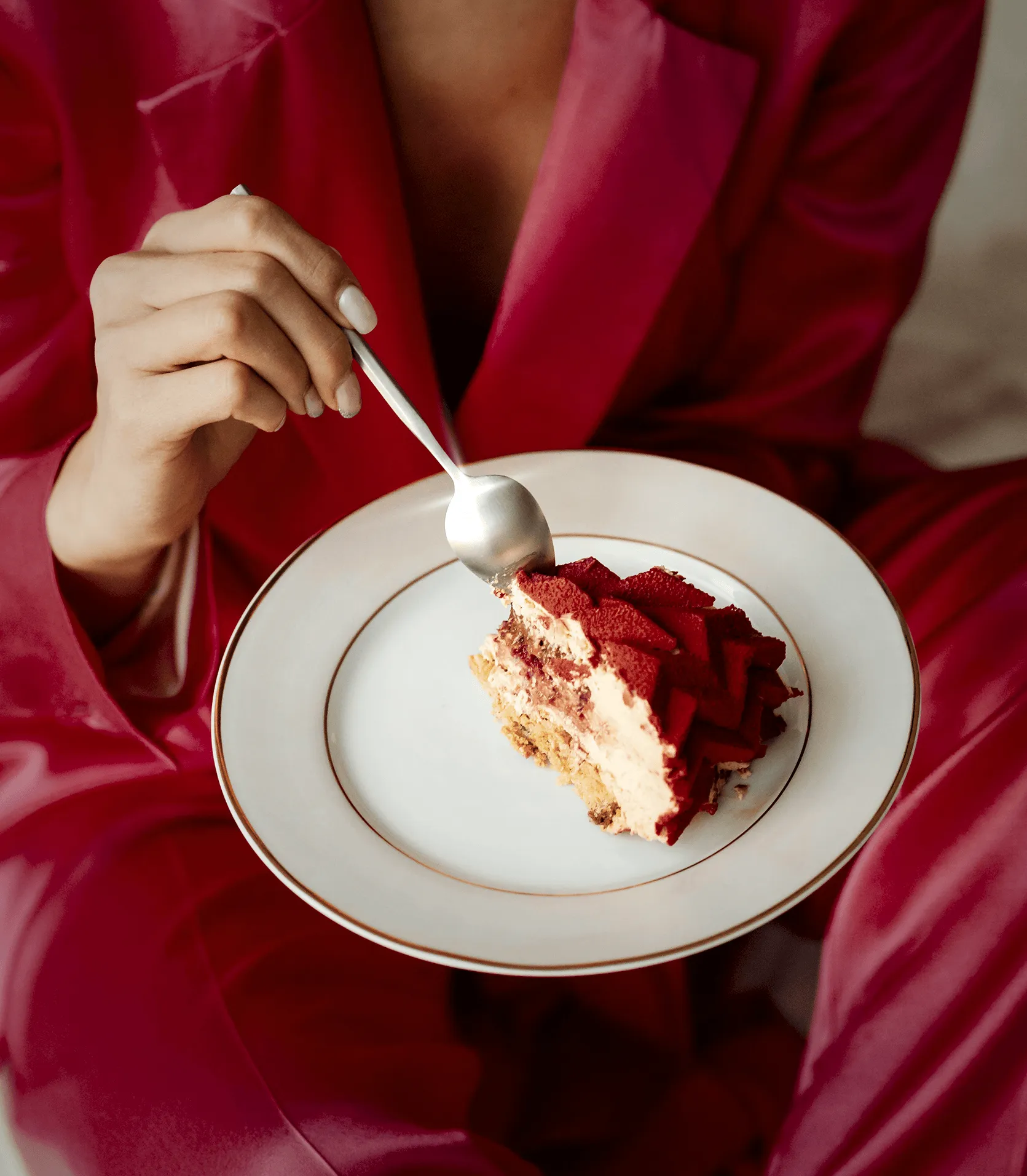
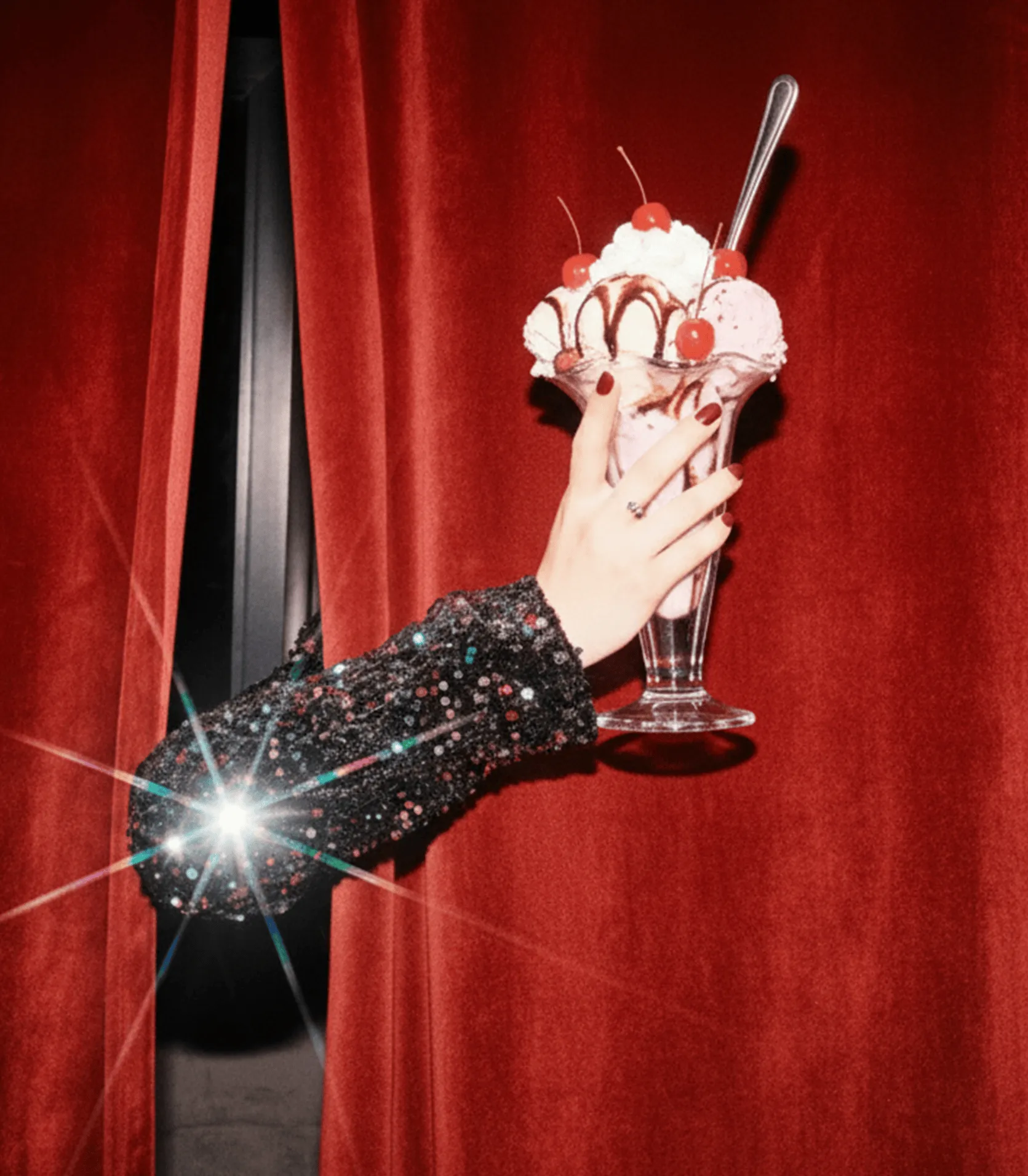
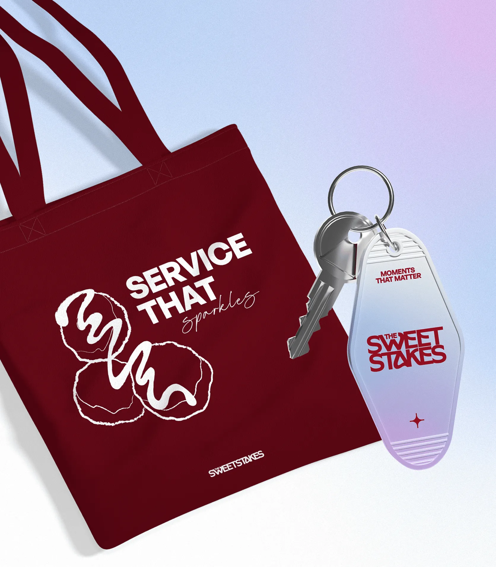
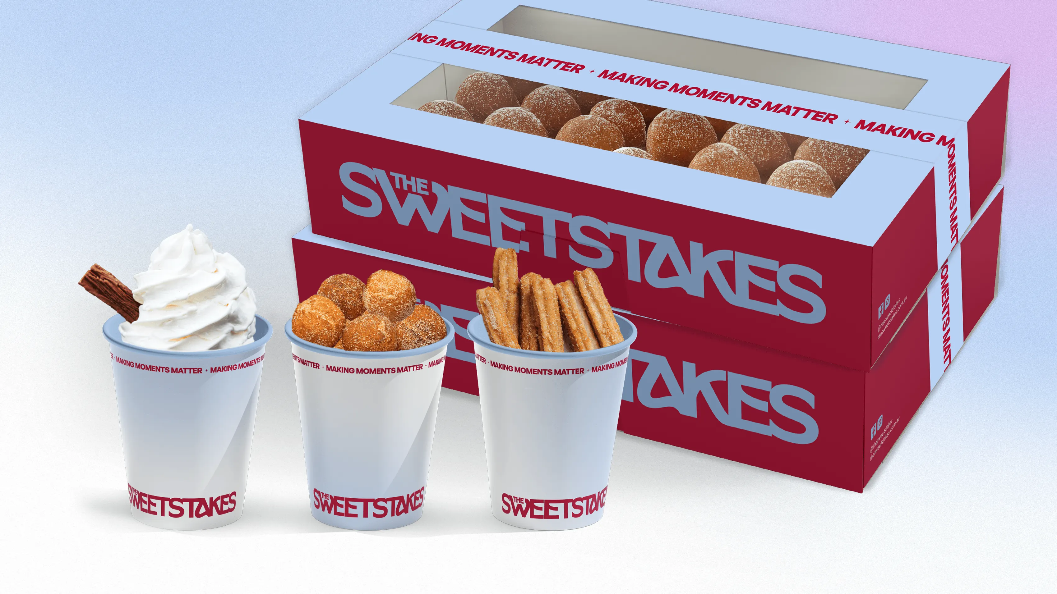
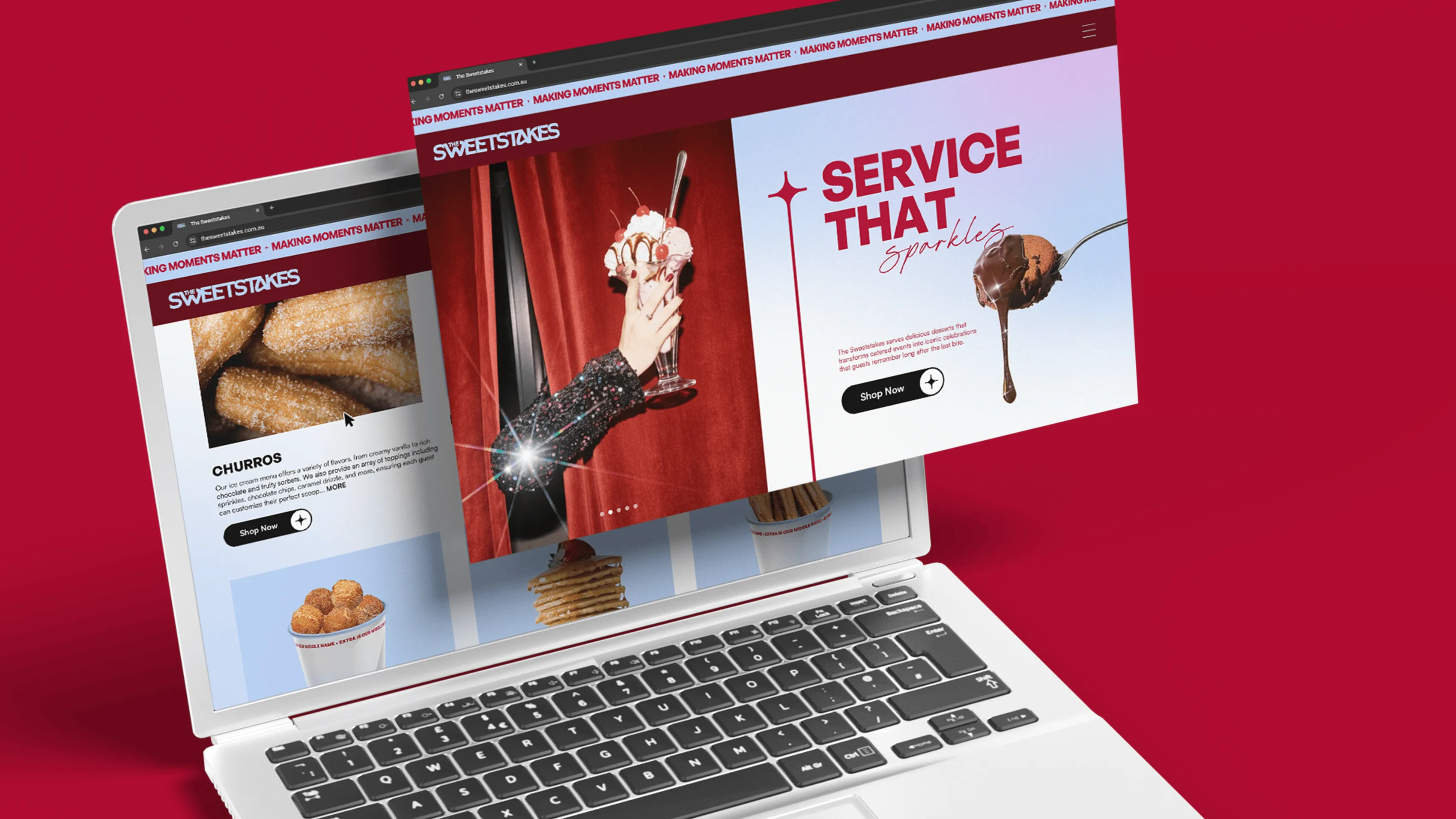
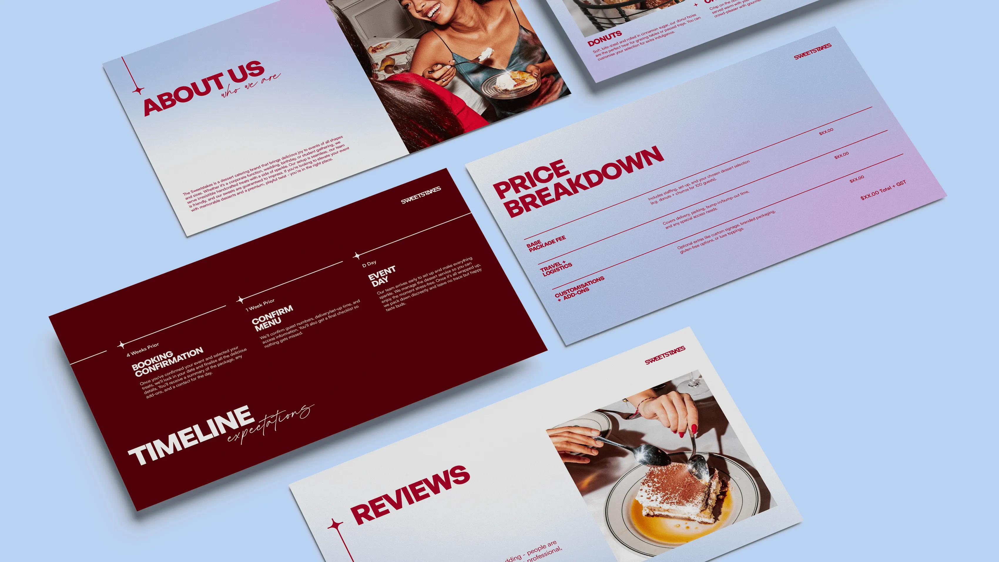
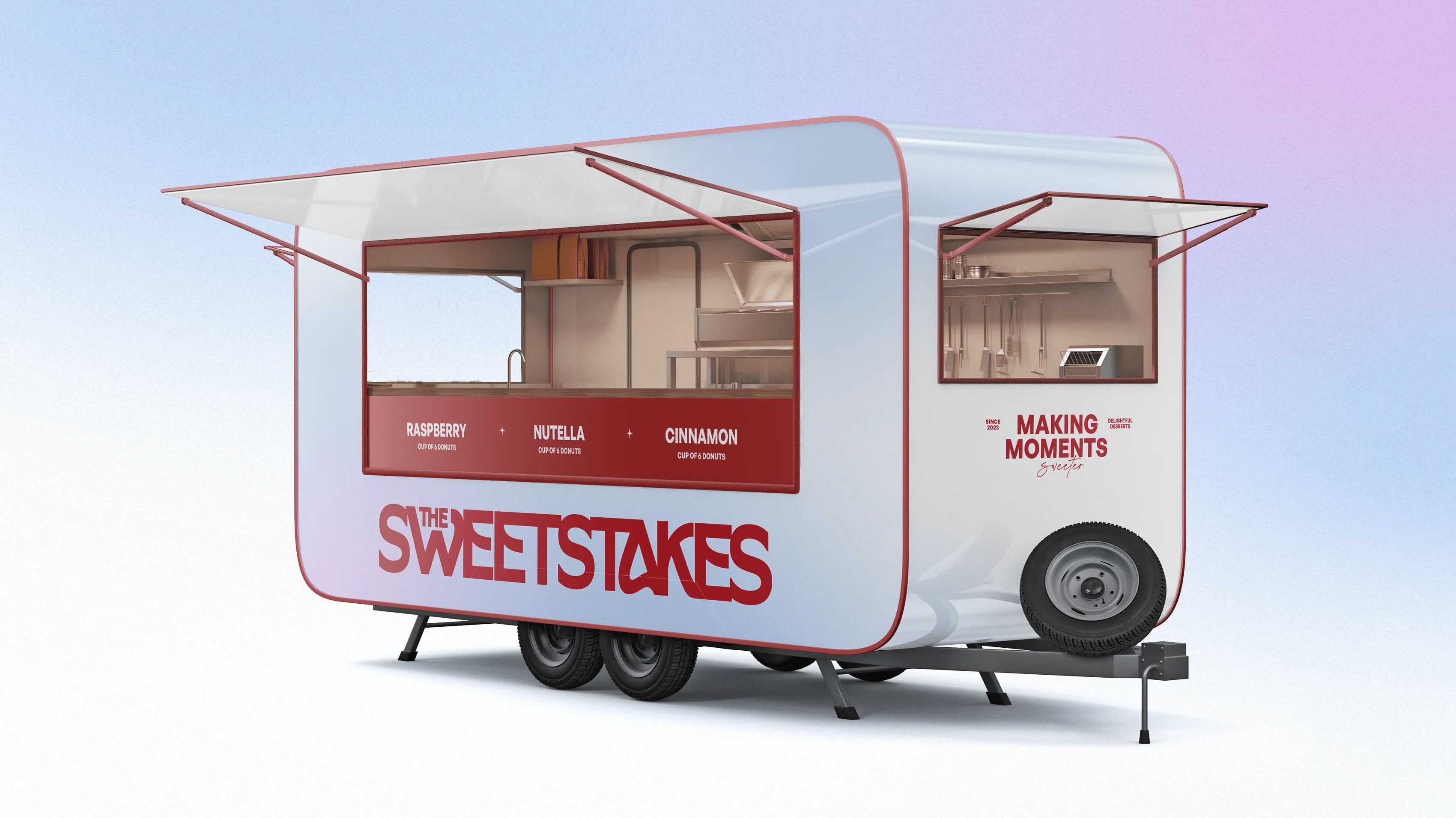
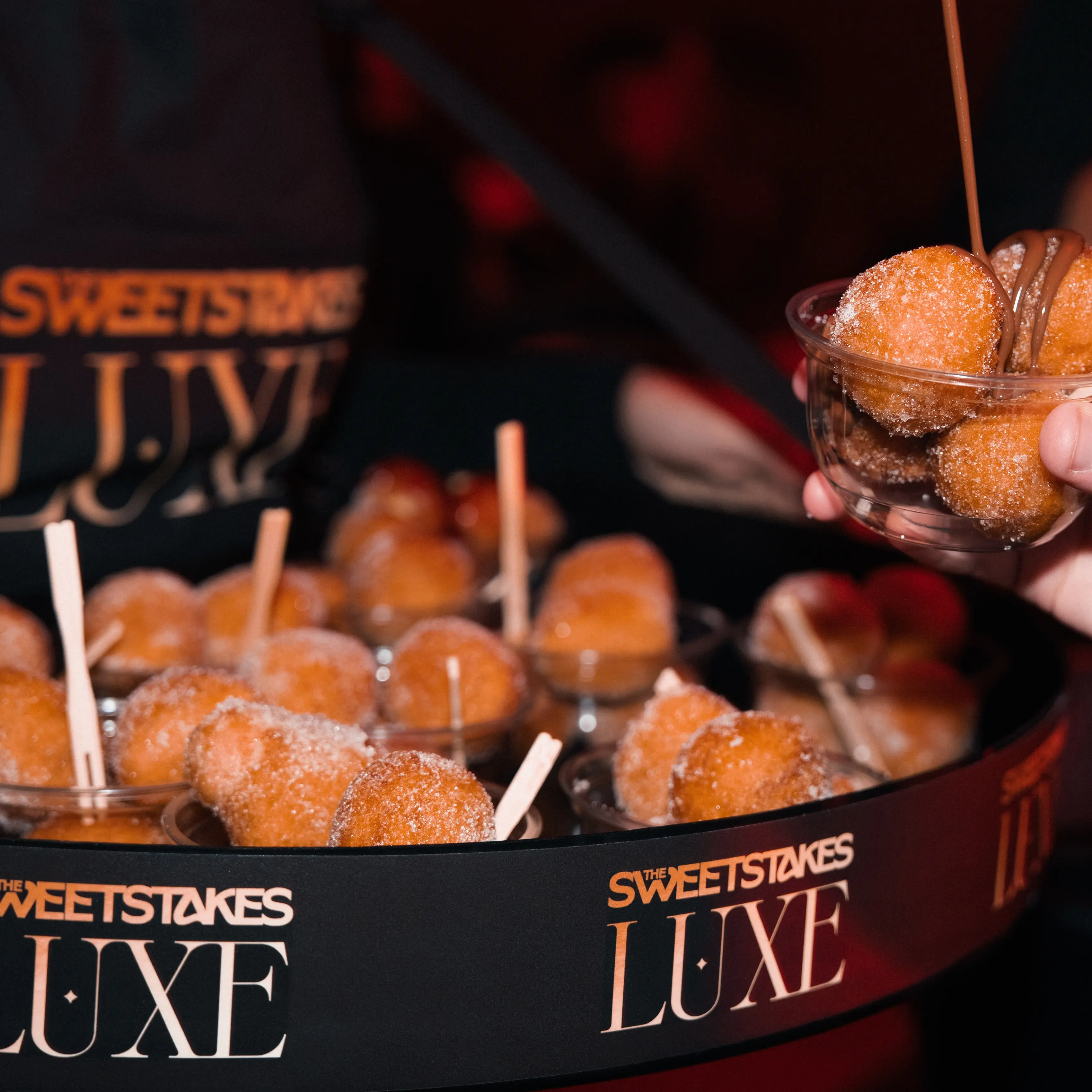
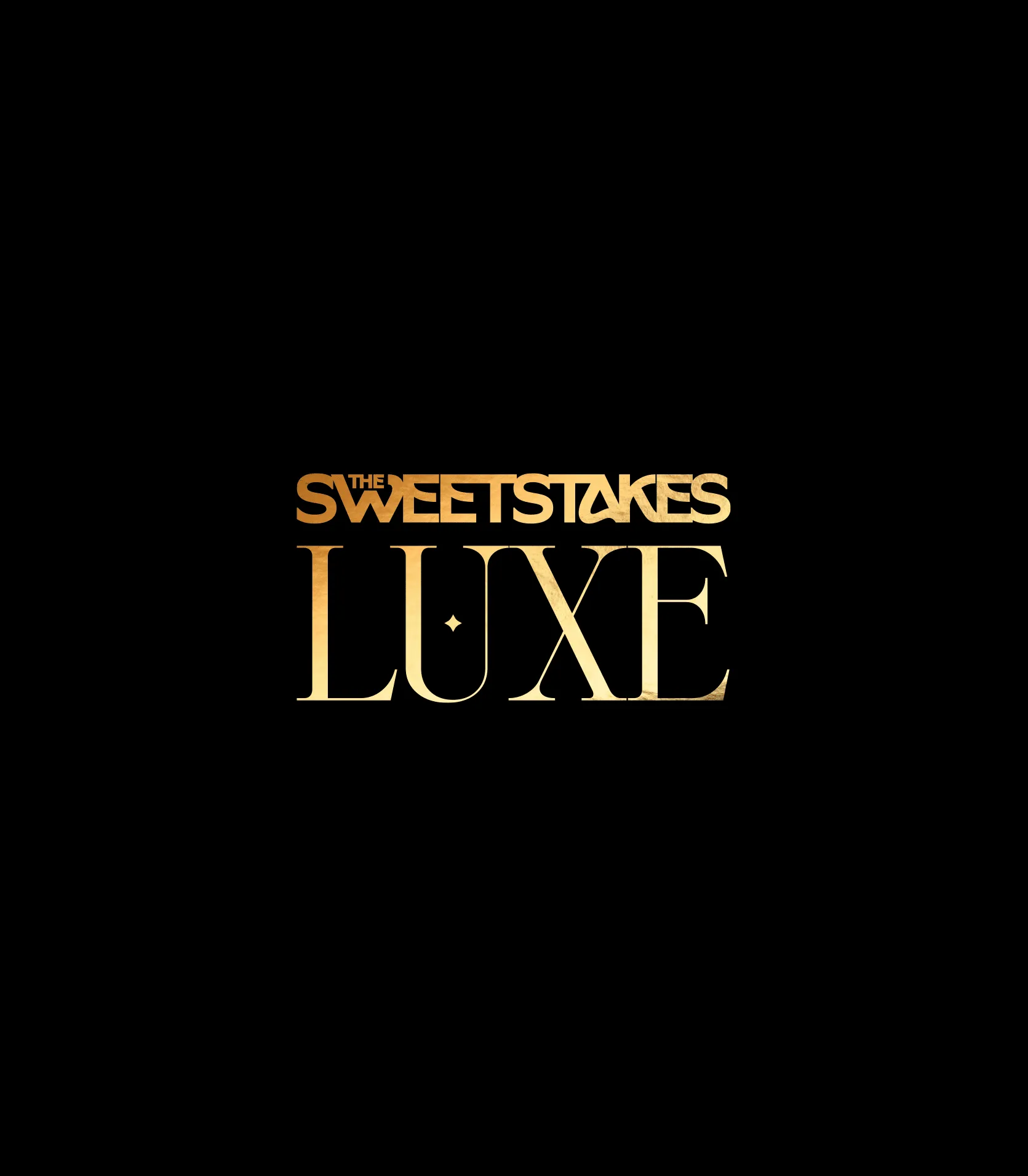
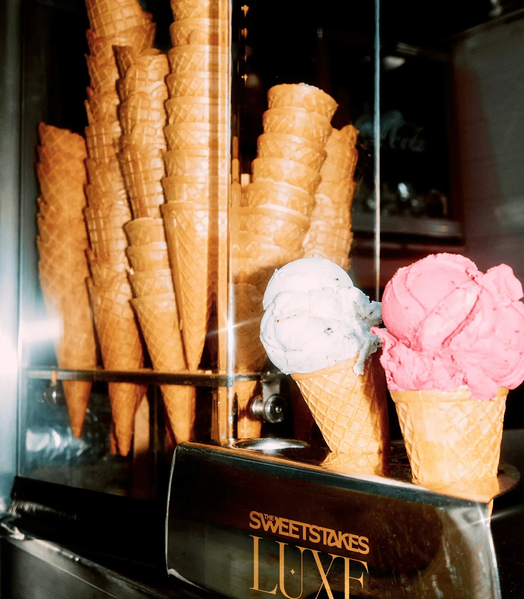
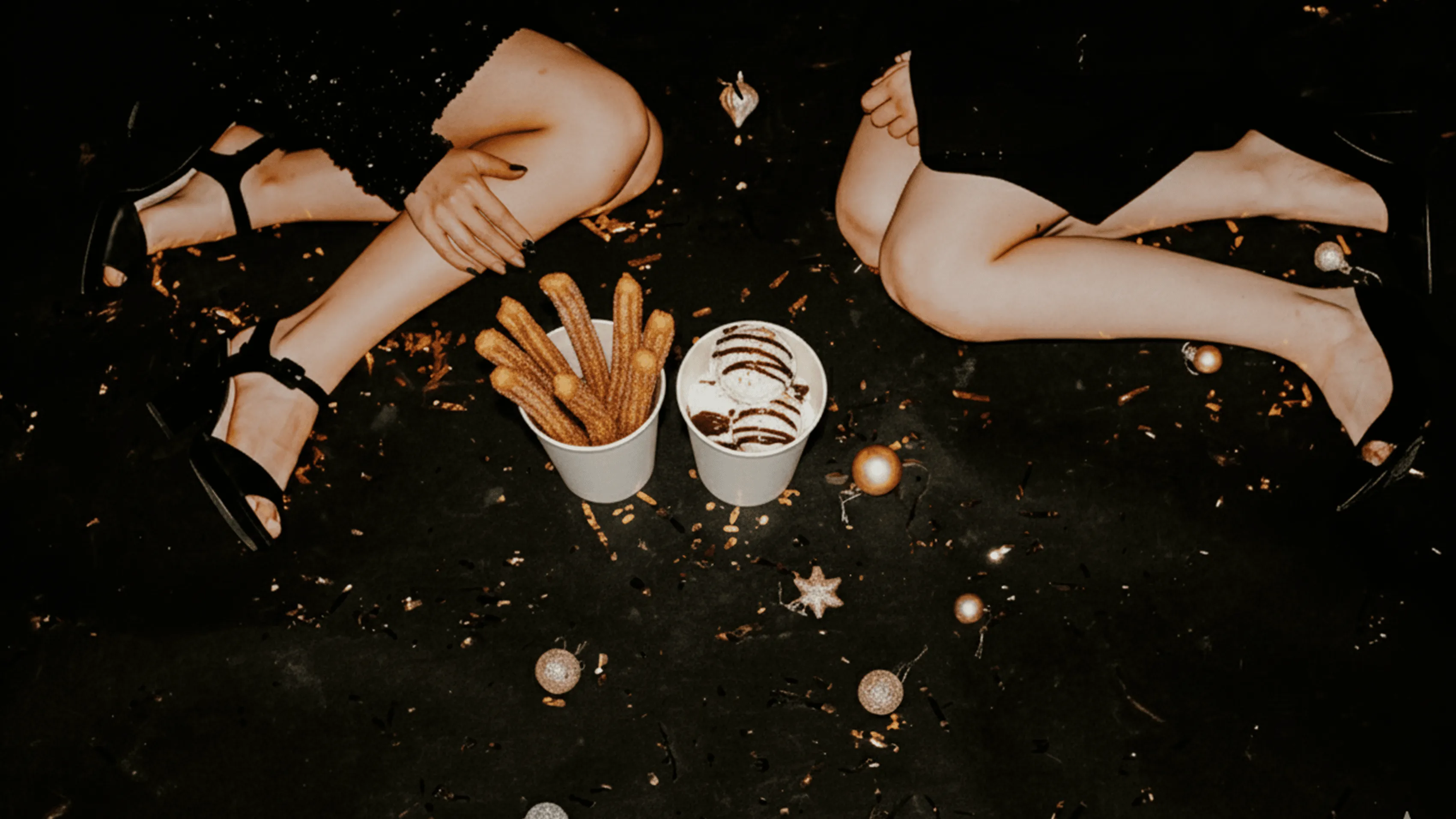
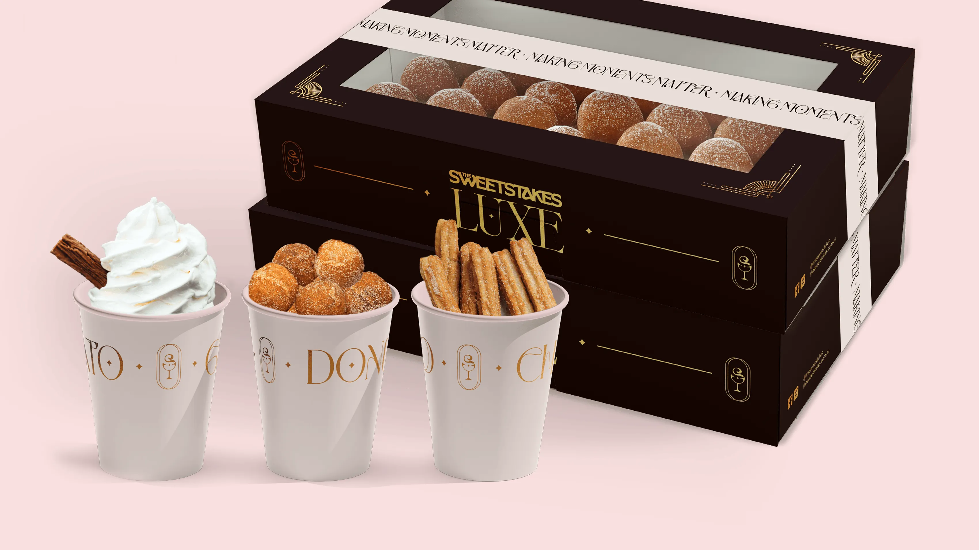
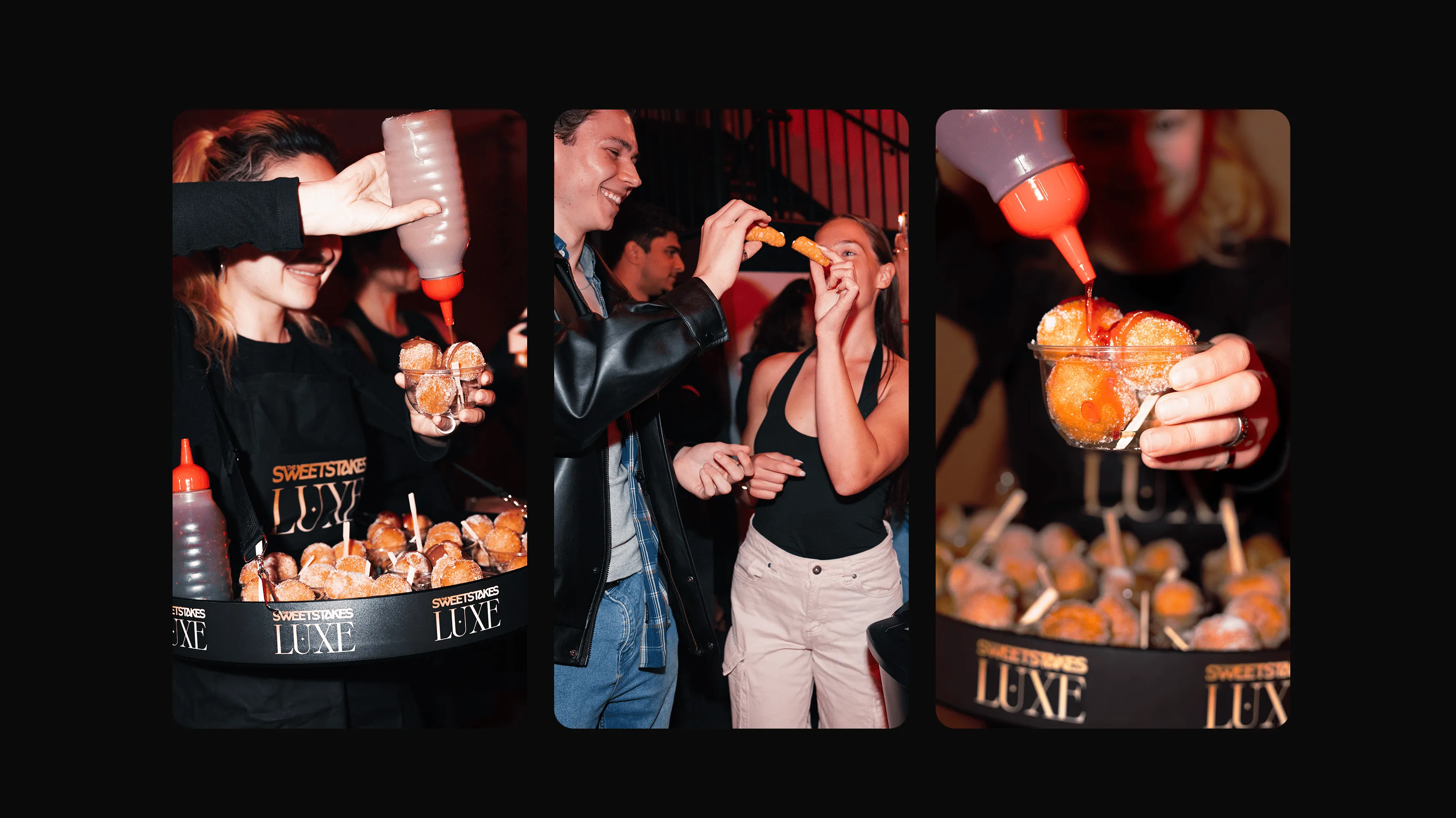
To balance playfulness with sophistication, we create a dual visual suite, The Sweetstakes master brand for vibrant, sugar-filled moments and The Sweetstakes Luxe brand for premium, ceremonial events.
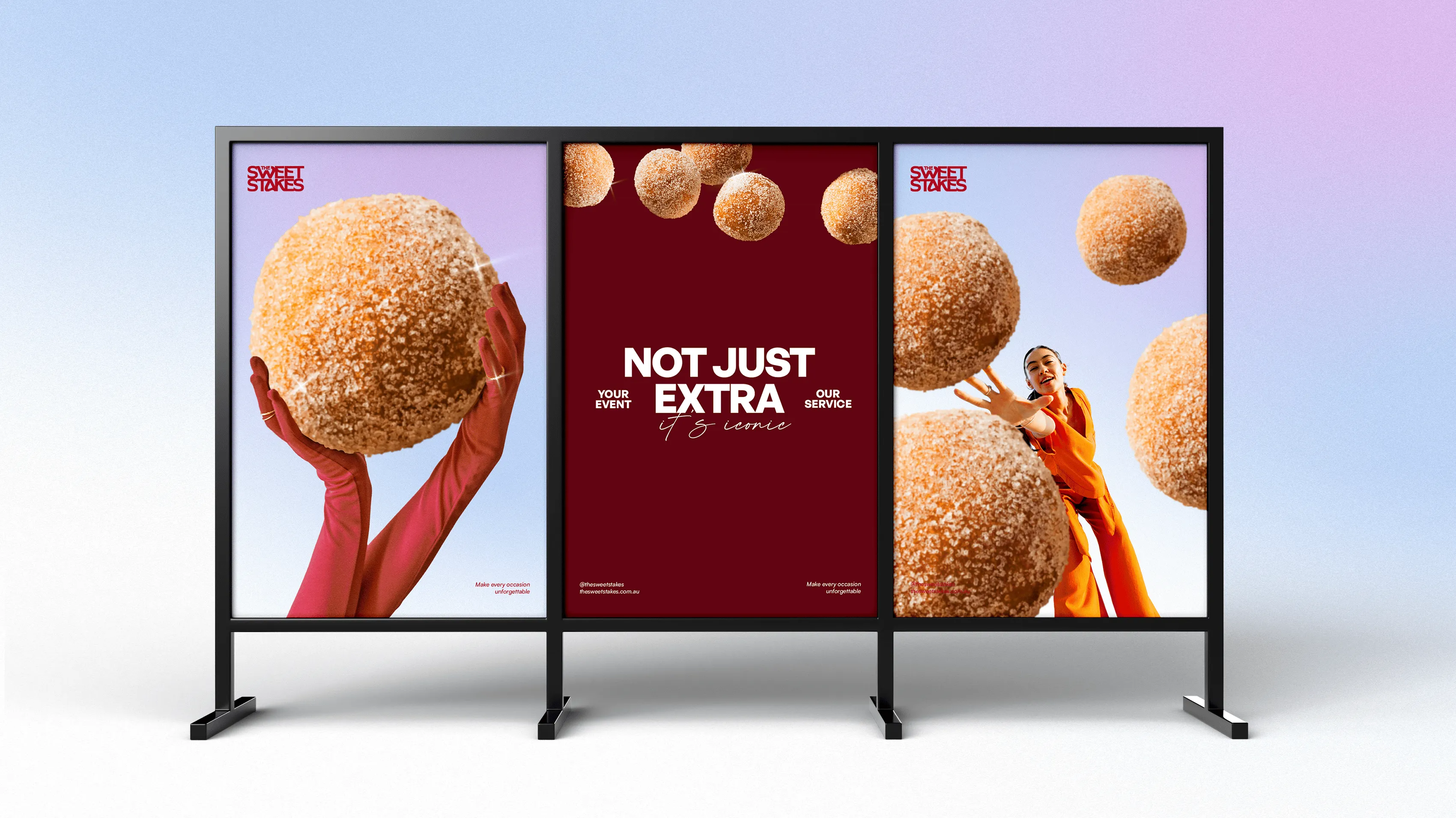
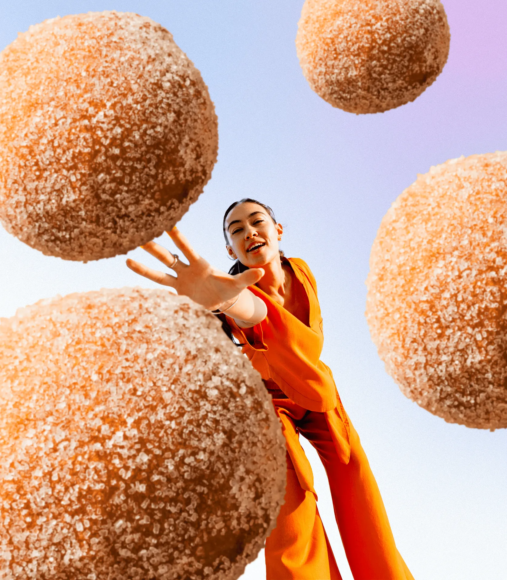
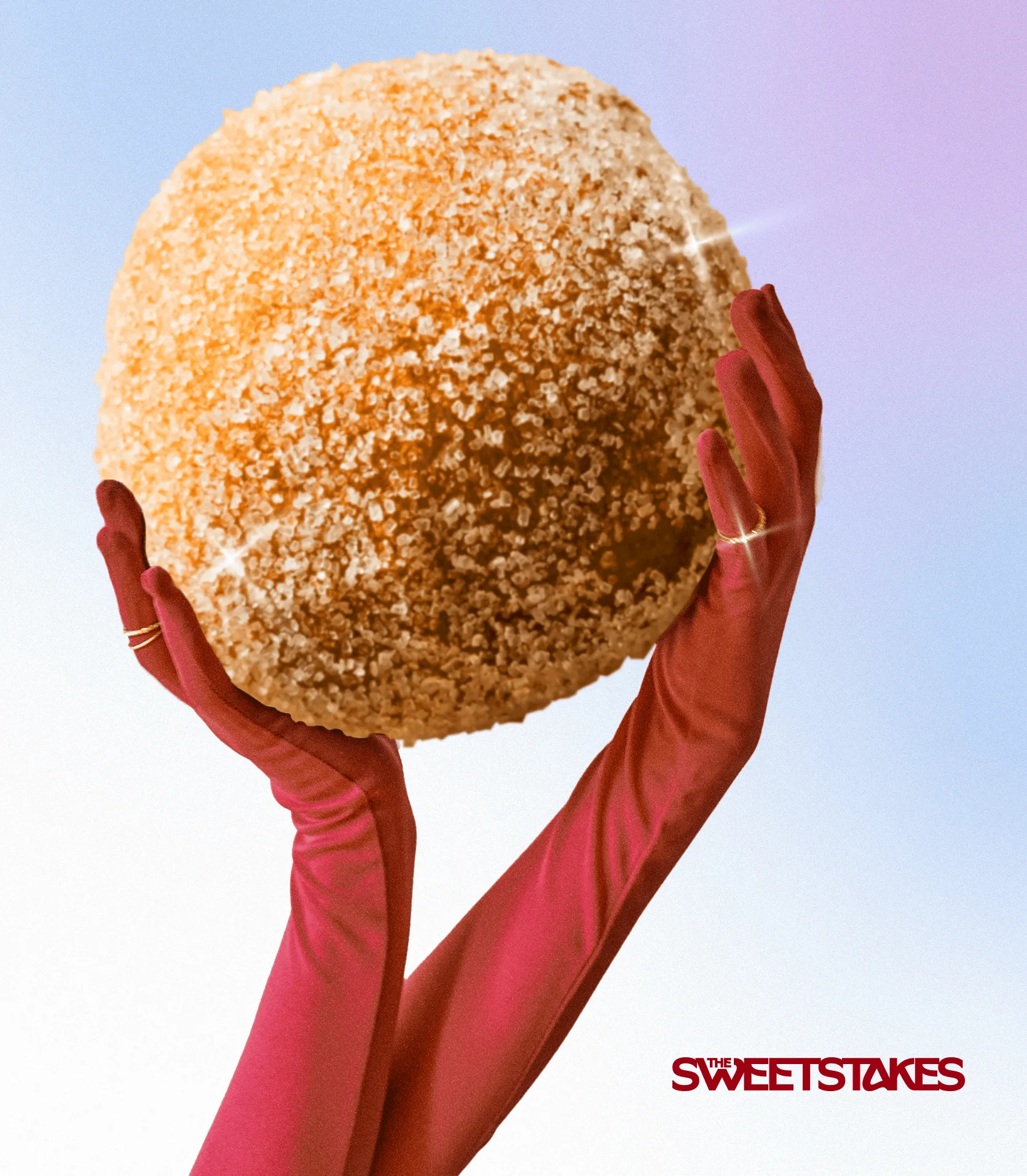
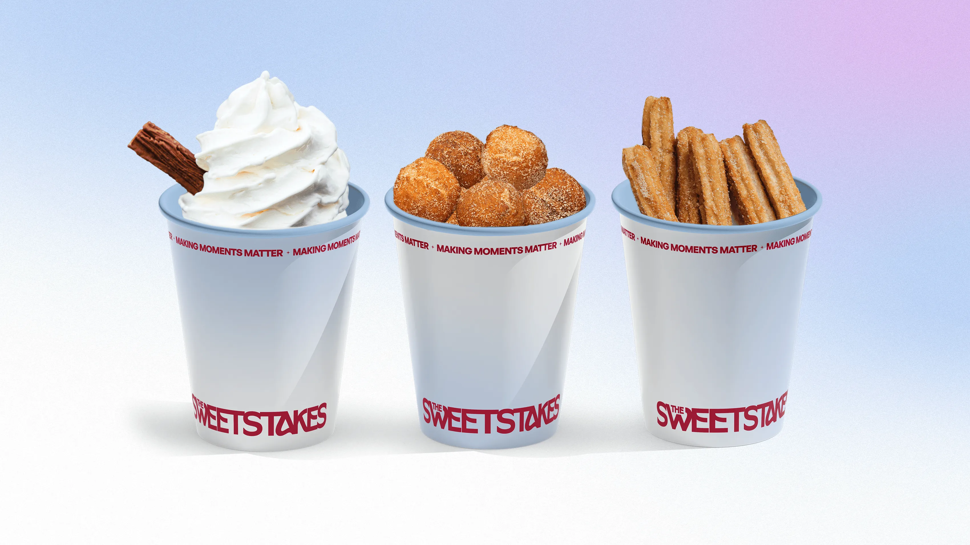
We designed a modern geometric wordmark that anchors both identities, refined colour palettes (Raspberry, Light Blue, White, Crimson) for the master brand and (Black, Dark Chocolate, Blush, Cream, Gold) for the Luxe brand, and a flexible brand kit across trucks, packaging and social content. This ensured consistency, appetite appeal, and a brand experience that felt elevated and irresistibly fun.
THE RESULT
The rebrand transformed The Sweetstakes into a sophisticated, high-energy dessert experience with a clear strategic position and a cohesive visual identity. With a stronger market presence and a distinct creative platform, they’re now equipped to attract higher-value bookings, stand out in premium event spaces, and scale with confidence; knowing customers will return to them time and time again.