Winki Energy
For a brand named after a high-performance wave renown by locals in Torquay, Rivyl needed to craft a brand that would deliver the same feeling as a favourite icon. One that felt as passionate, free-spirited and boldly friendly as it’s founder. One that guarantees you’re in good company.
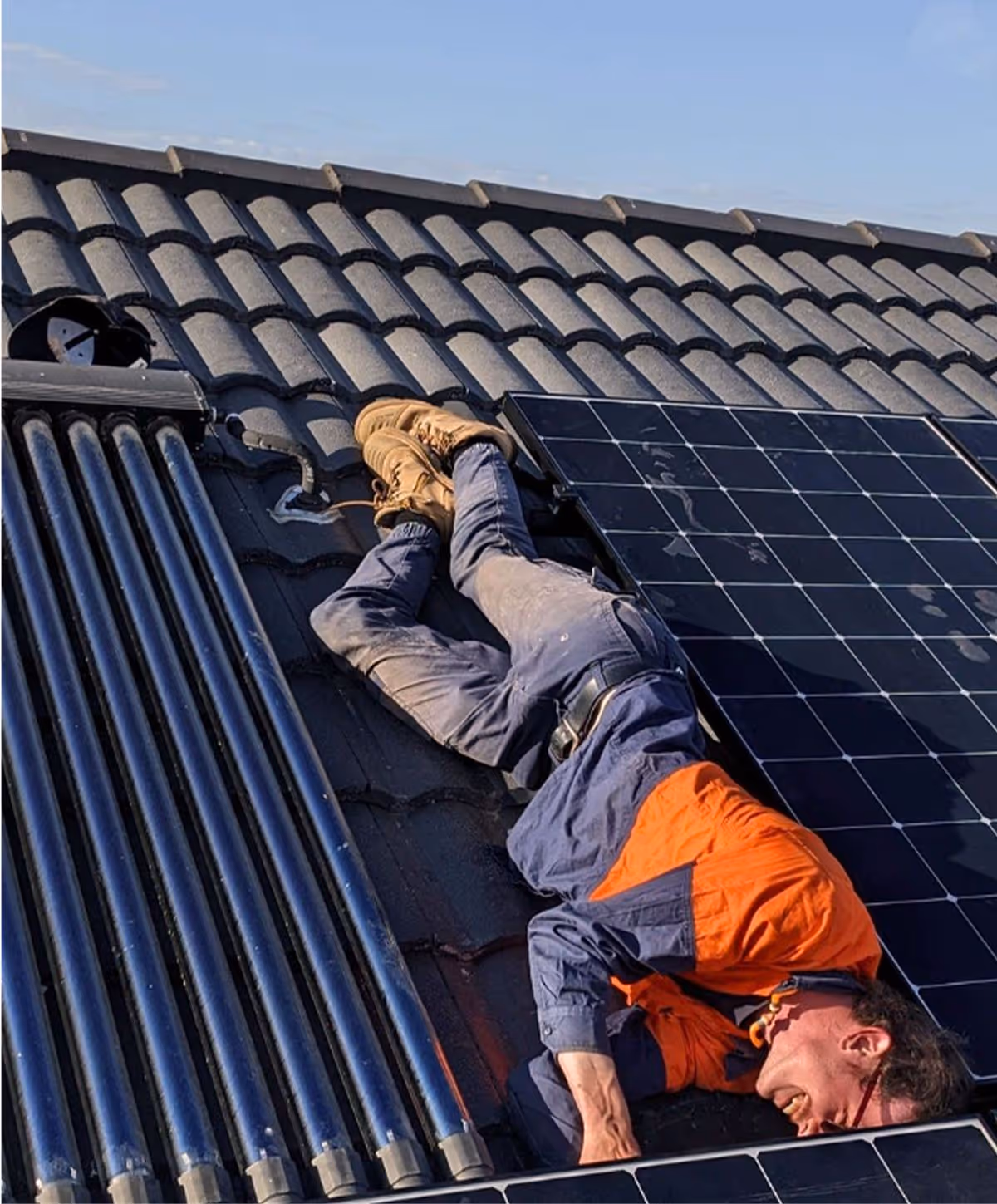
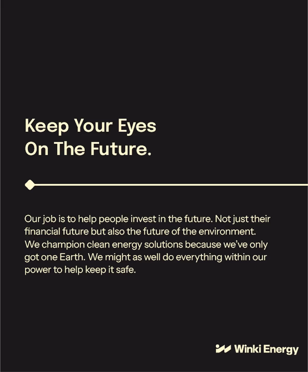
Winki exists to help energy-conscious people invest in the future - for themselves, their bottom line, and the planet. We only have one, after all! They’re here to advance the use of renewable energy in Australia and build relationships along the way. Having already made his mark locally with 10 years of experience as a sparky, Steve was well on his way to building his empire; with strong team growth and solid processes.They just got on with getting things done. Now, the next era of Winki was set to unfold. This is where Rivyl entered the frame.
Inspired by Nature
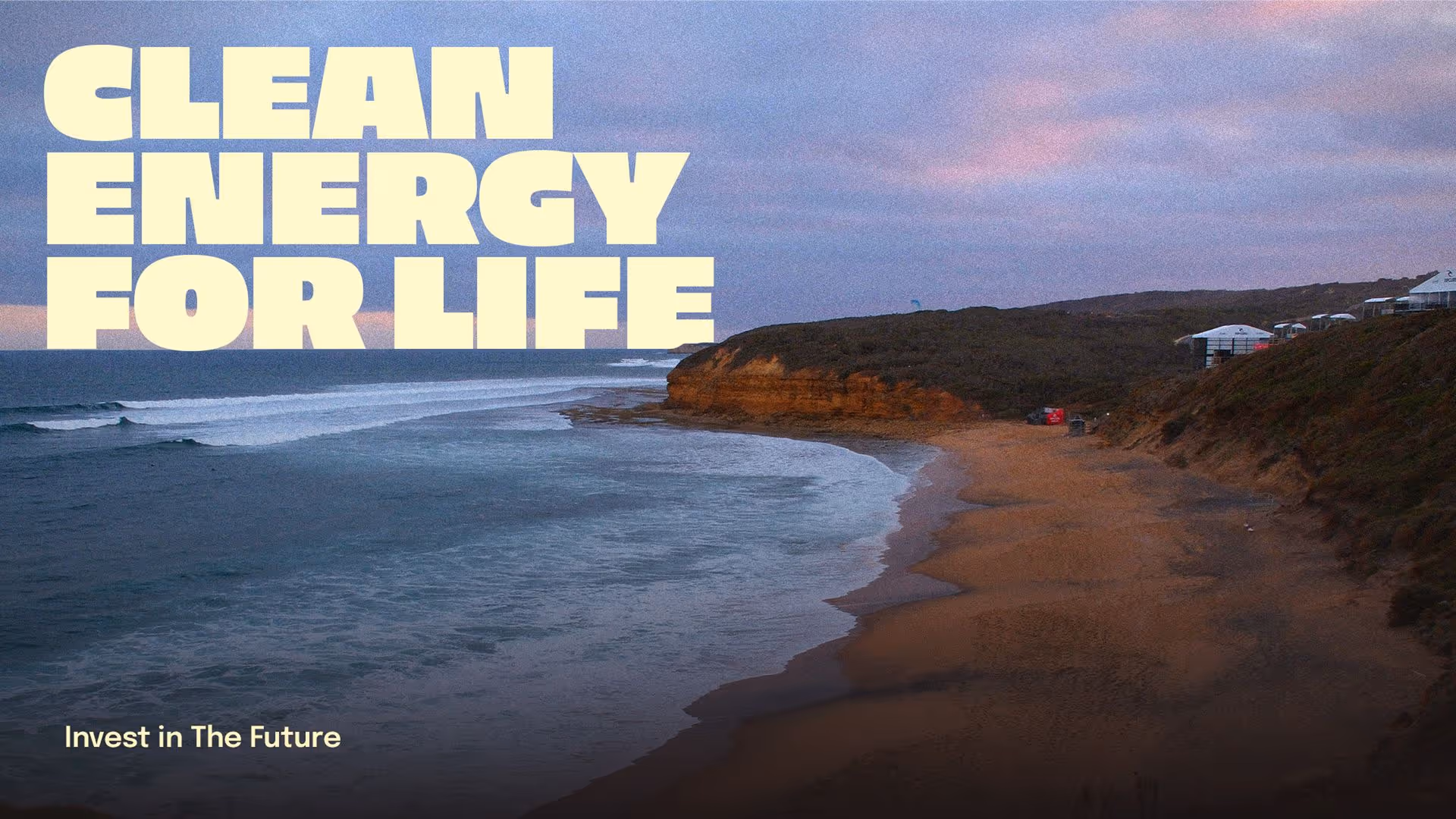
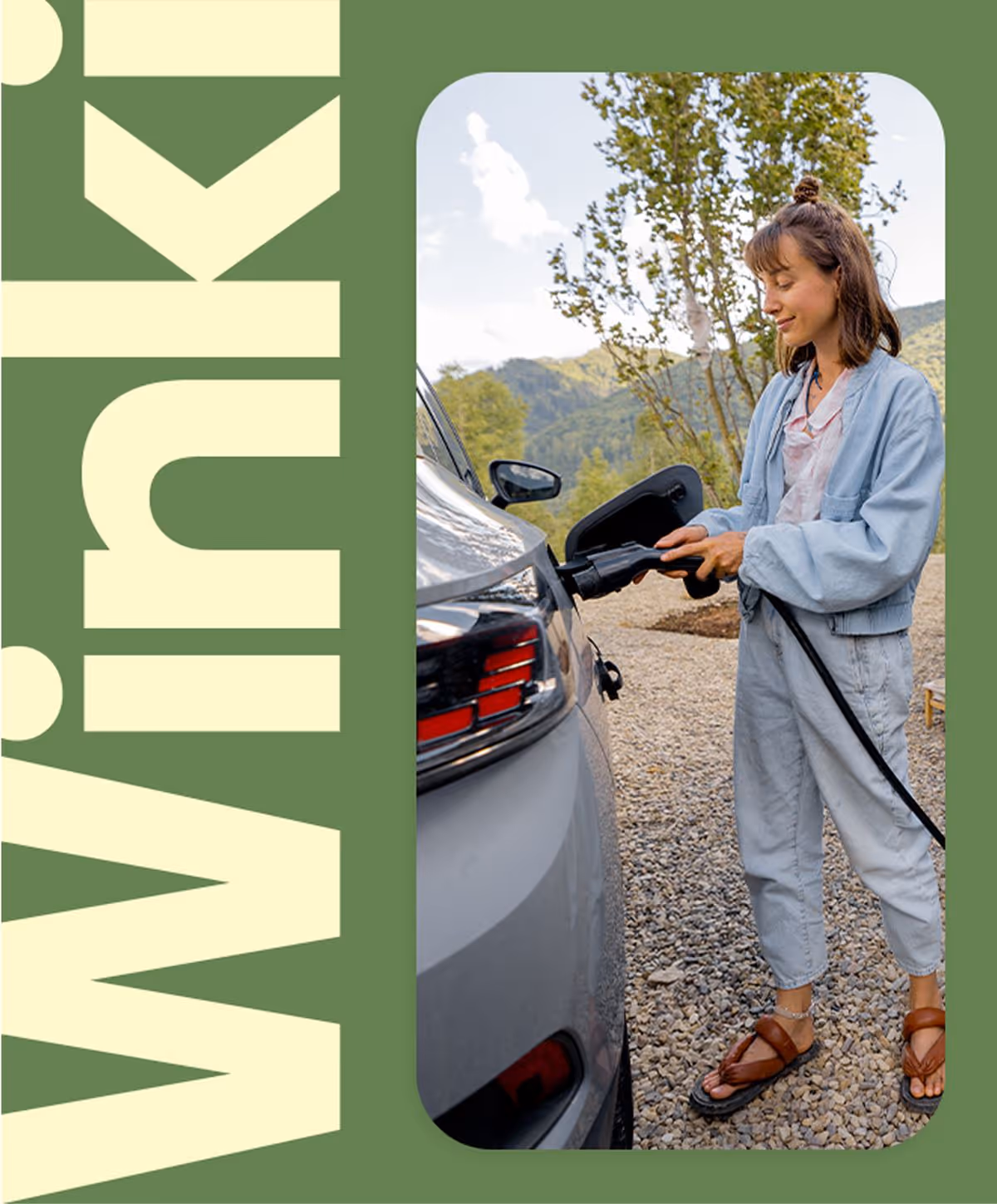
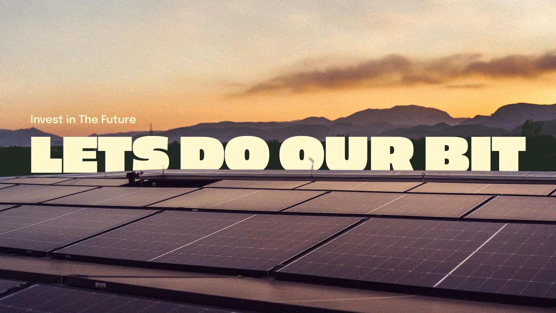
The Winki identity takes its cues from the natural world, inspired by coastal sunsets, clean energy, and the laid-back vibe of beachside living. The palette is warm and grounded, with sun-soaked imagery and nature-inspired tones.
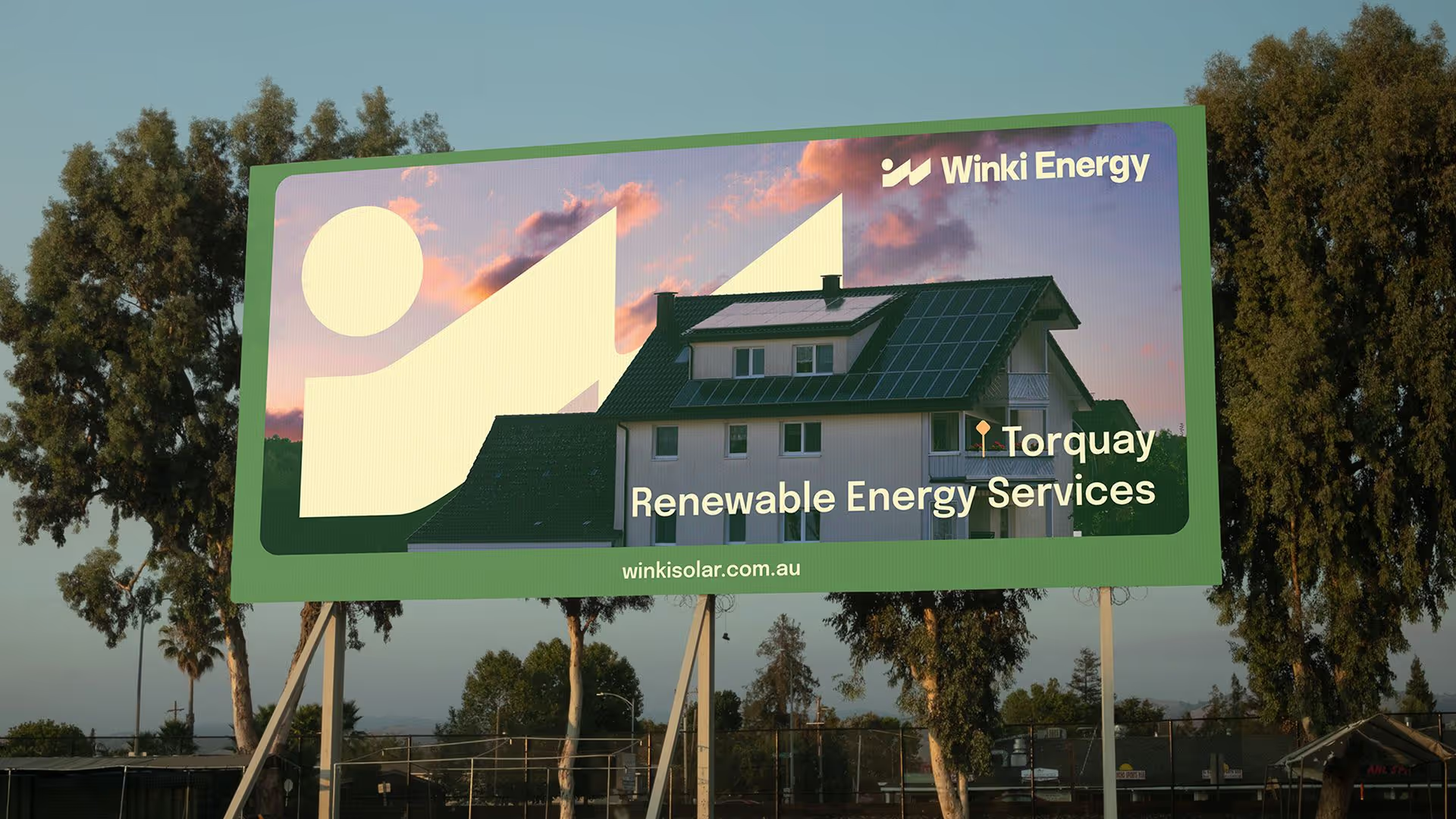
Named after the iconic Winki Pop surf break near Bells Beach in Torquay. That connection to place runs deep. The brand carries the easygoing spirit and surf culture of the region, grounding the business in community and lifestyle.
Named after the iconic Winki Pop surf break near Bells Beach in Torquay. That connection to place runs deep. The brand carries the easygoing spirit and surf culture of the region, grounding the business in community and lifestyle.

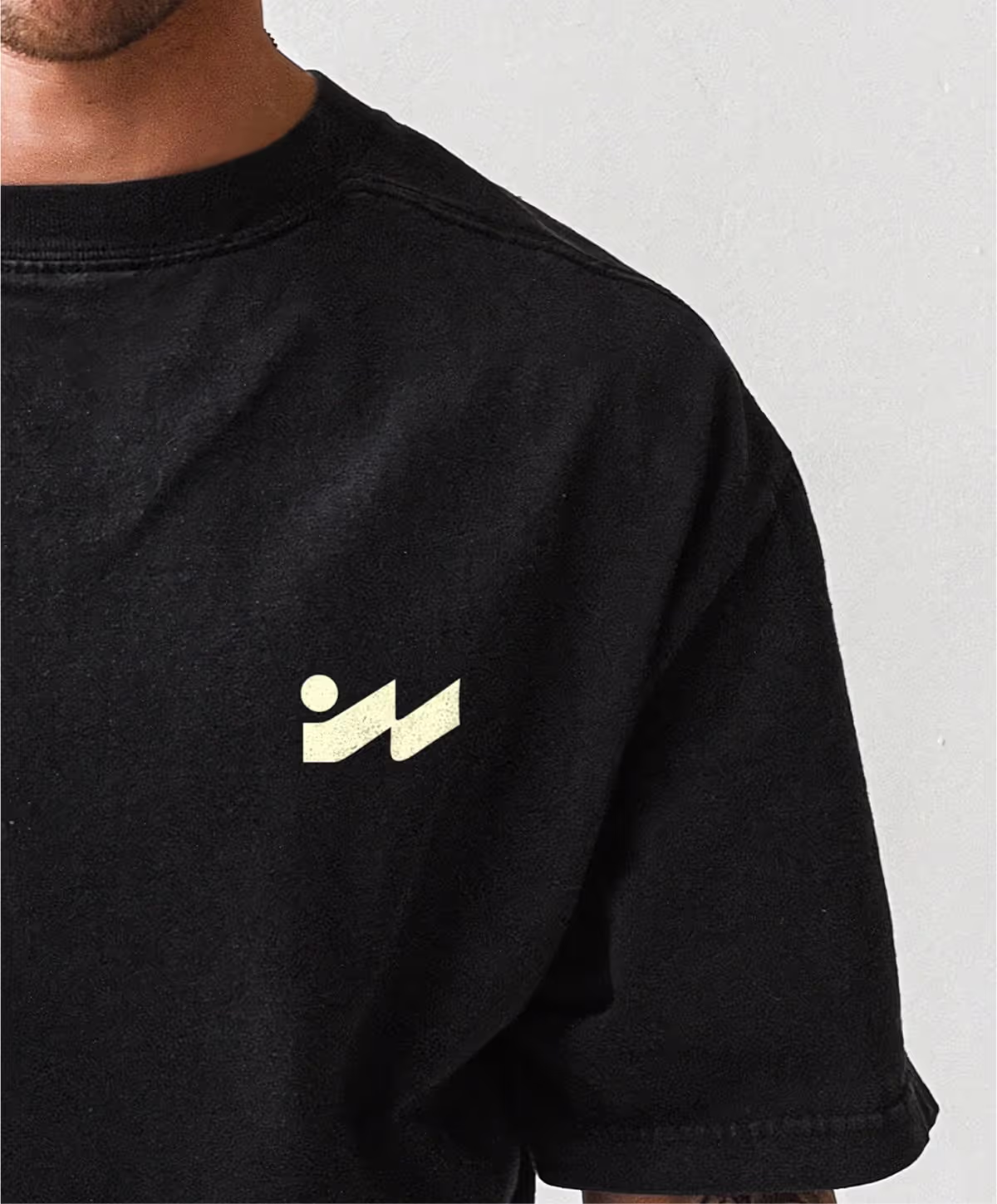
Cool enough to wear
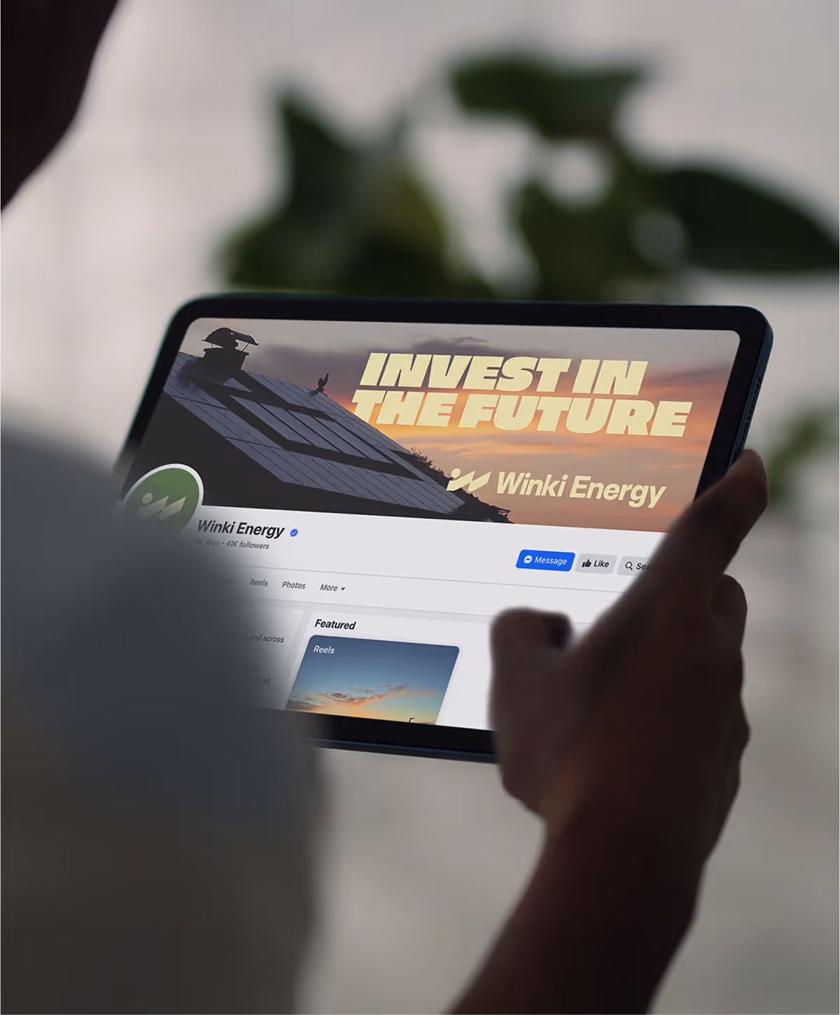
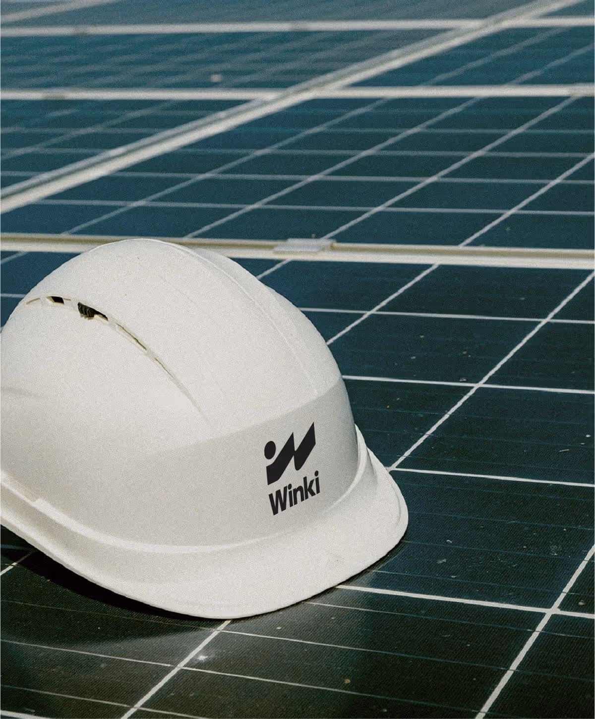
The identity feels more like a lifestyle brand than a traditional trade business. It’s cool enough to wear, grounded enough to trust, and built to connect with a new generation of solar customers.
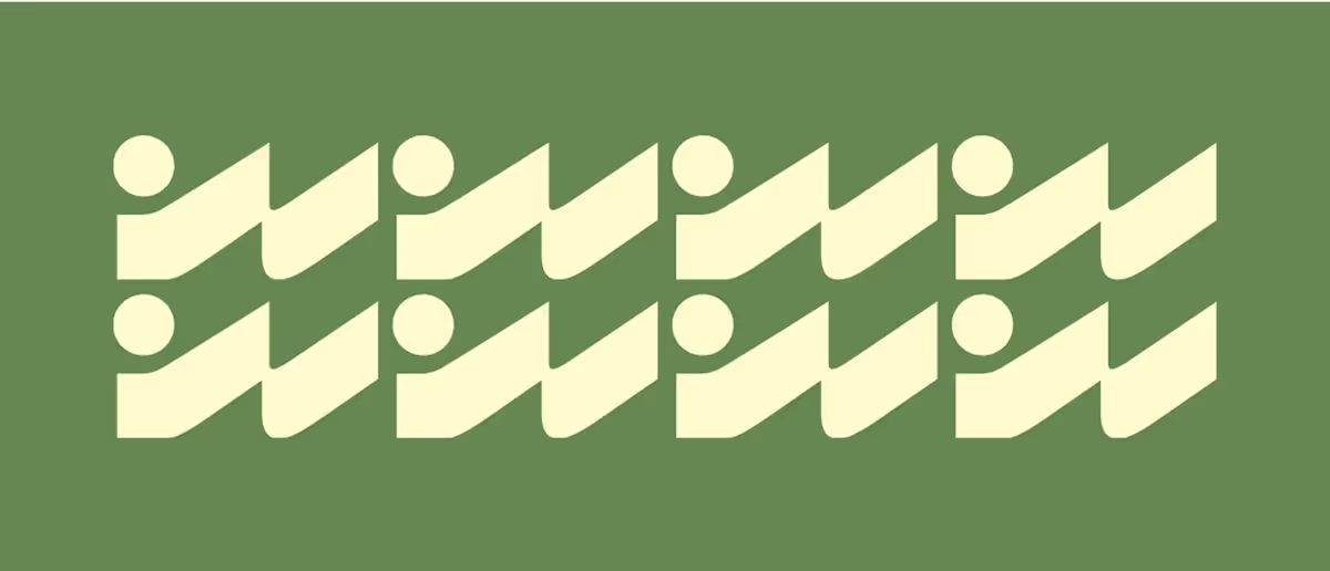
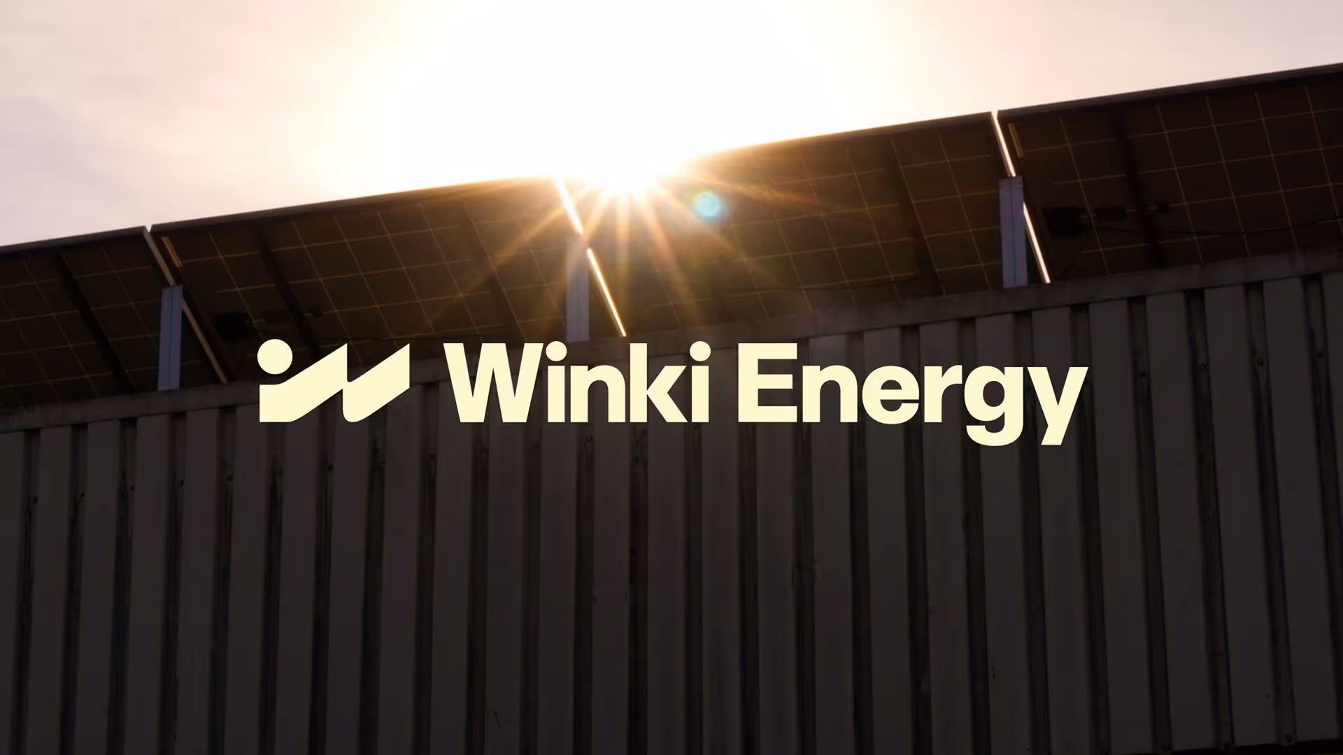
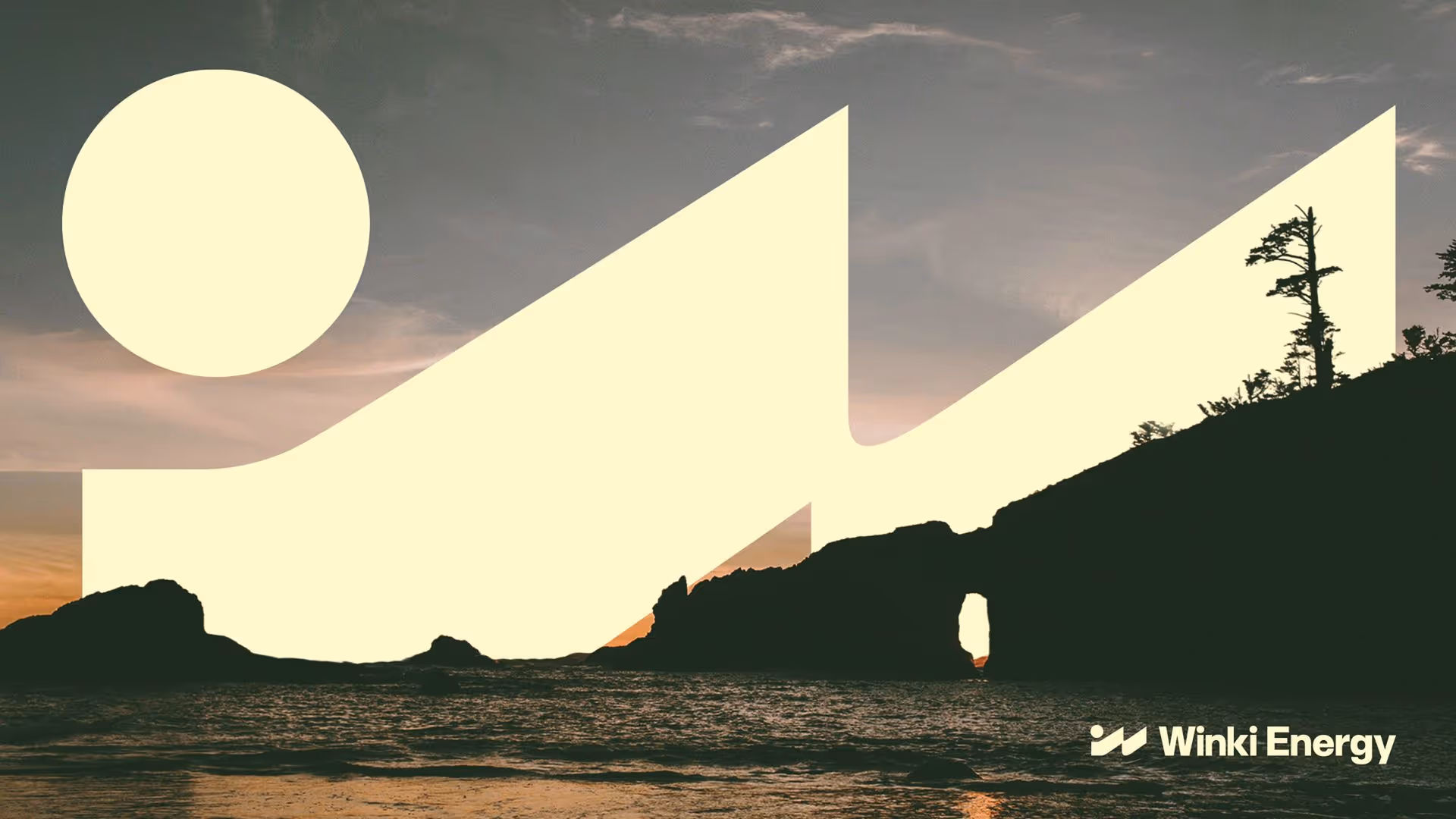
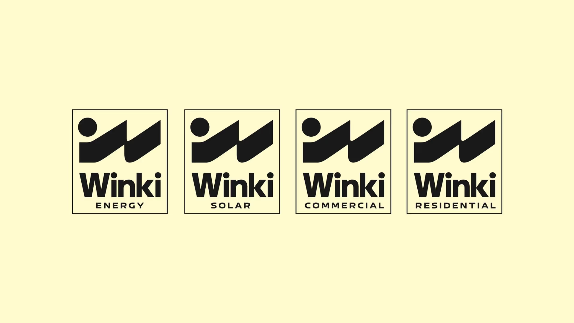
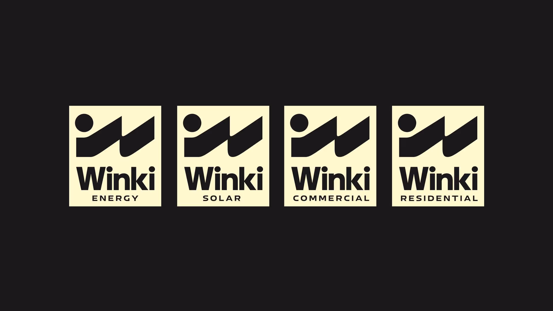
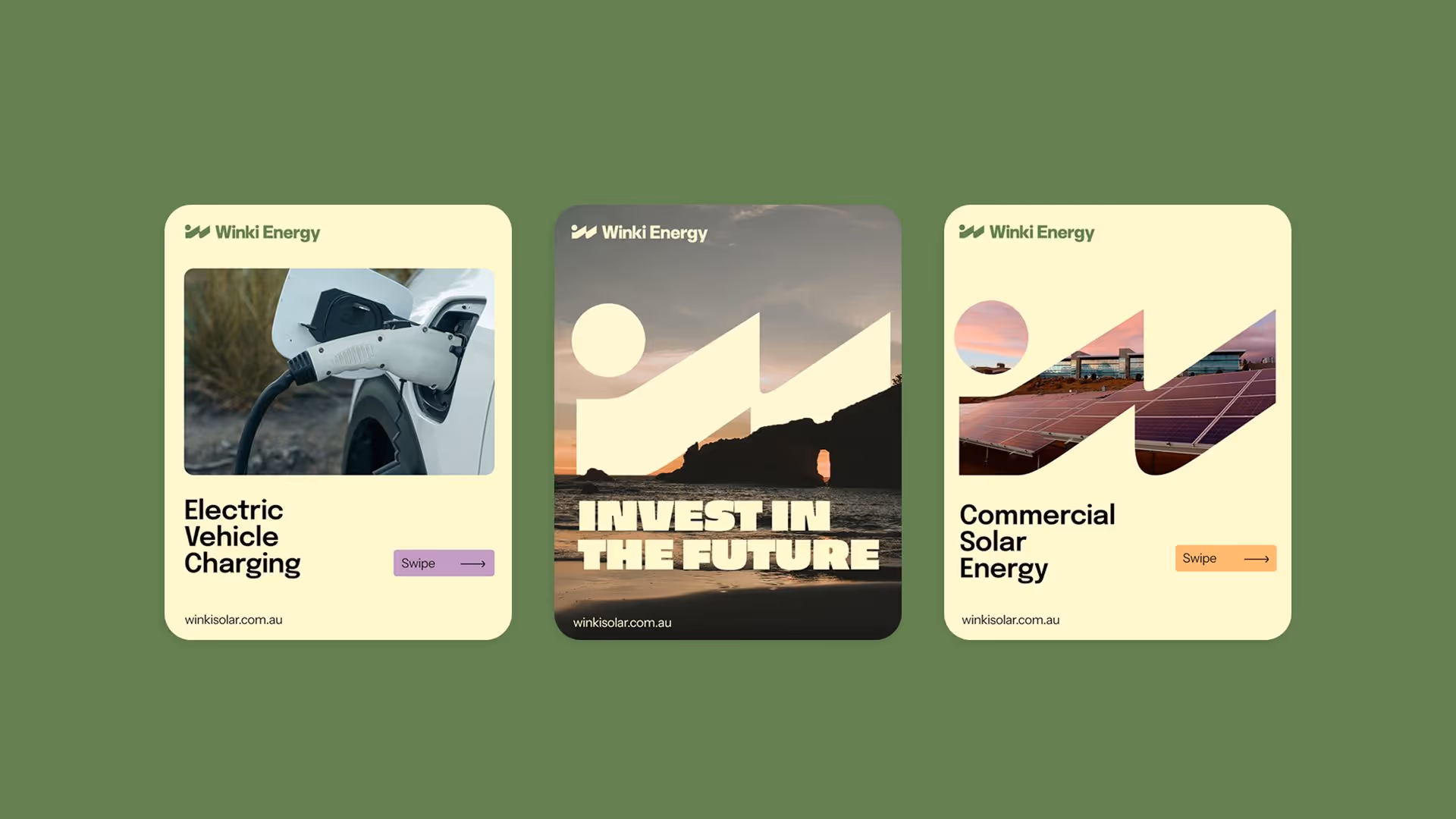
The logo could just as easily sit on a surfboard as it could on a solar install. With its bold, graphic simplicity and coastal energy. The logo draws inspiration from solar panels lined up on a roof, with a nod to the rising and setting sun over rolling waves, a subtle tribute to the brand’s coastal roots. A perfect balance between sun, surf and solar.
The logo could just as easily sit on a surfboard as it could on a solar install. With its bold, graphic simplicity and coastal energy. The logo draws inspiration from solar panels lined up on a roof, with a nod to the rising and setting sun over rolling waves, a subtle tribute to the brand’s coastal roots. A perfect balance between sun, surf and solar.


A logo with meaning
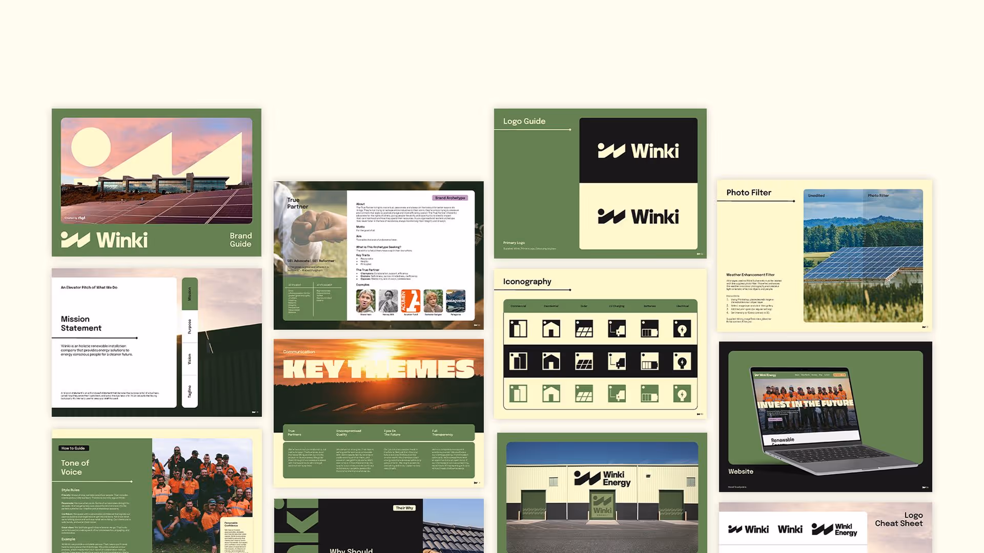
The dynamic colour palette represents the colours of nature; keeping an earthy feel with a focus on sustainability. The palette has a warm, friendly feeling to it but with a modern edge; utilising cream and charcoal as the neutral base tones. Lavender and Apricot represent the colours of the sunrise/sunset, and we chose to use each colour accent to visually separate the commercial and residential sides to the brand.

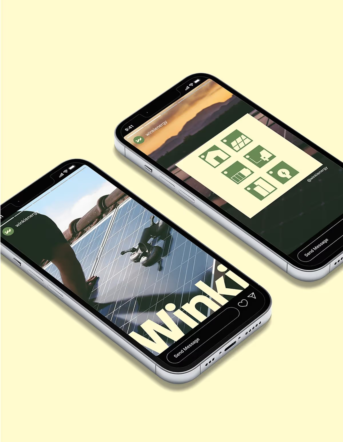

The custom iconography aligns with the logo design, carefully highlighting the circular sun motif to reinforce that key brand identifier. The icons are stripped back to their simplest forms, ensuring we communicate Winki’s no-fuss, fully transparent way of working.
The result truly speaks for itself. A colour palette that pops. An eyecatching logo with iconic meaning. A way of speaking that authentically represents their way of doing things. It’s branding at its finest - effective, intentional, powerfully present in the market.
The result truly speaks for itself. A colour palette that pops. An eyecatching logo with iconic meaning. A way of speaking that authentically represents their way of doing things. It’s branding at its finest - effective, intentional, powerfully present in the market.