.webp)
the art of immersive world-building
The creative home of Commercial Branding

.webp)


Thank you! Your submission has been received!
Oops! Something went wrong while submitting the form.
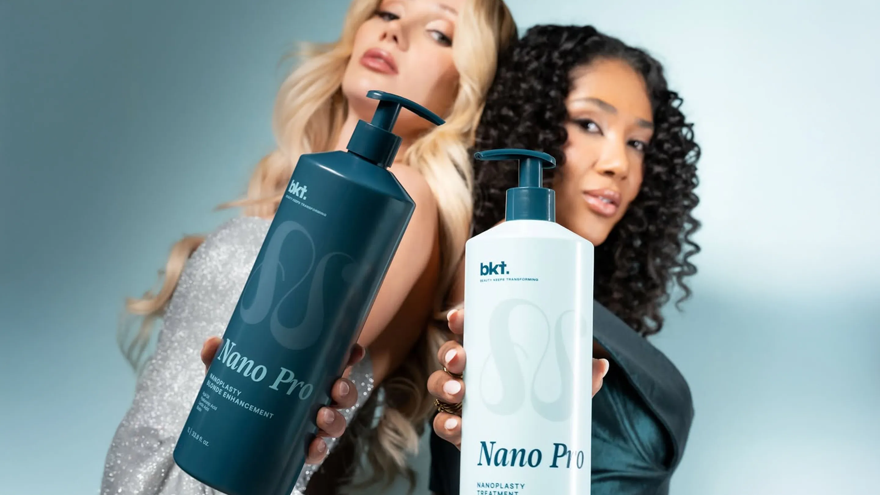
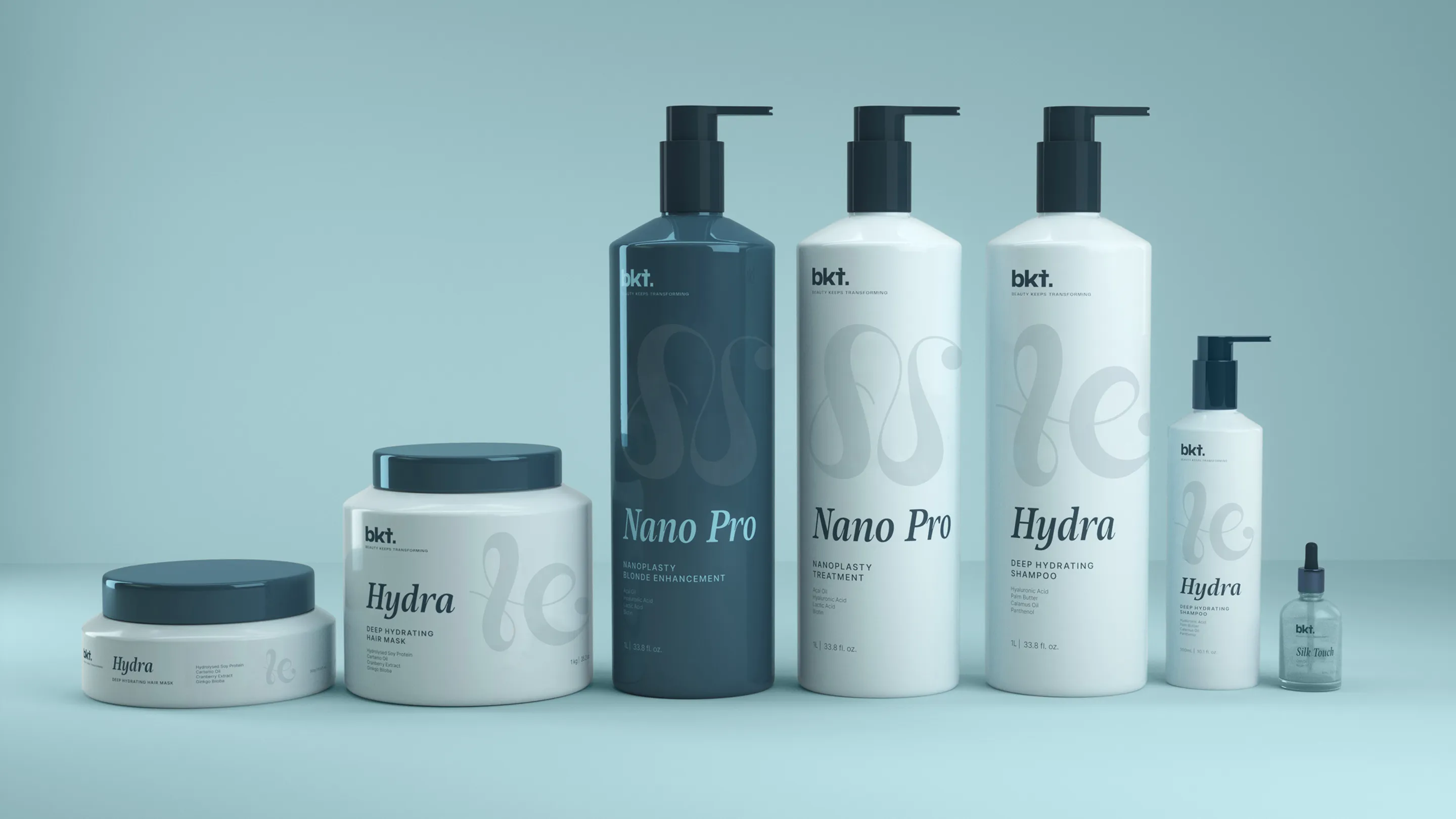
BKT
Beauty & Skincare


Eat with Purpose
Products
Food
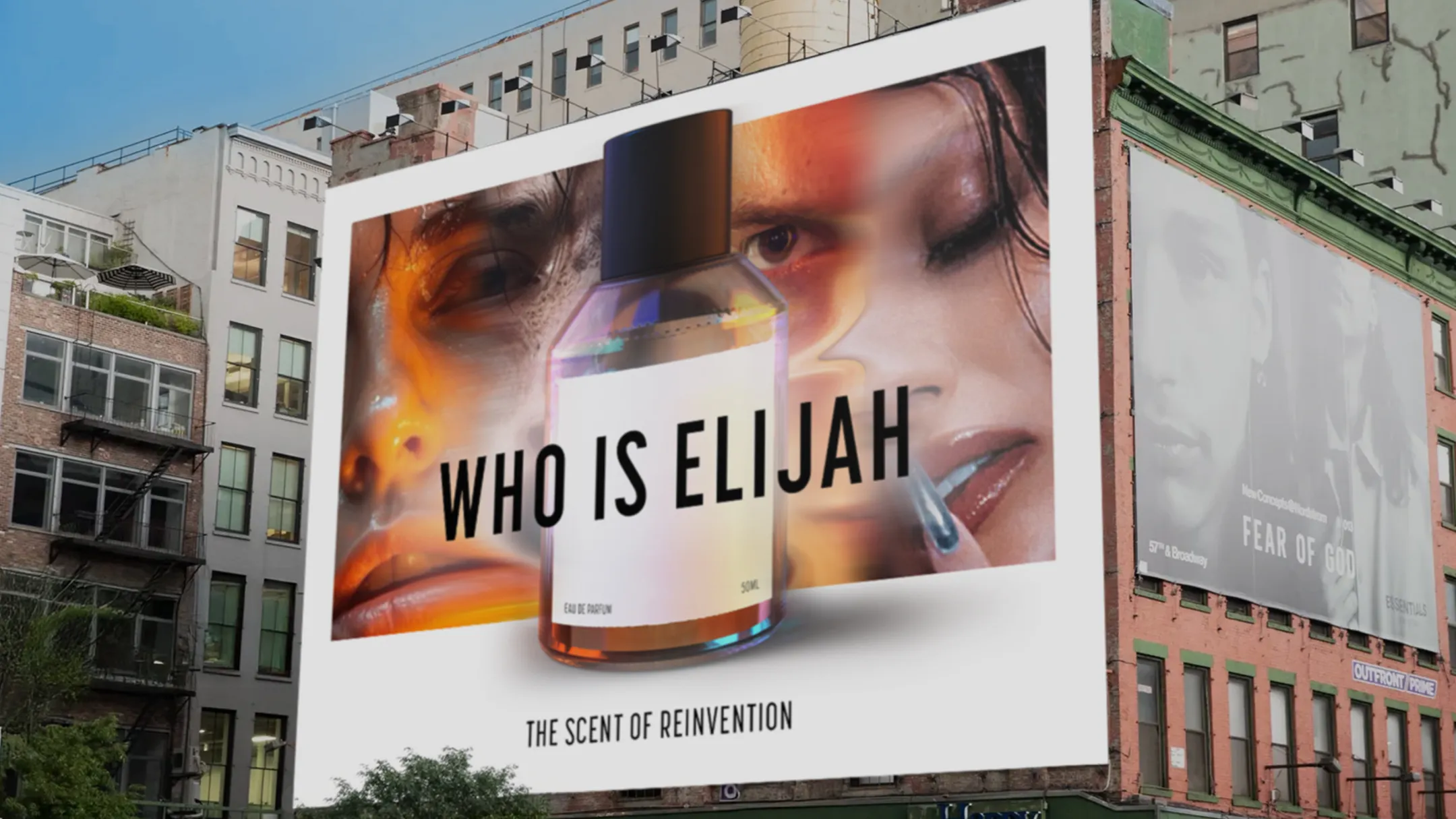
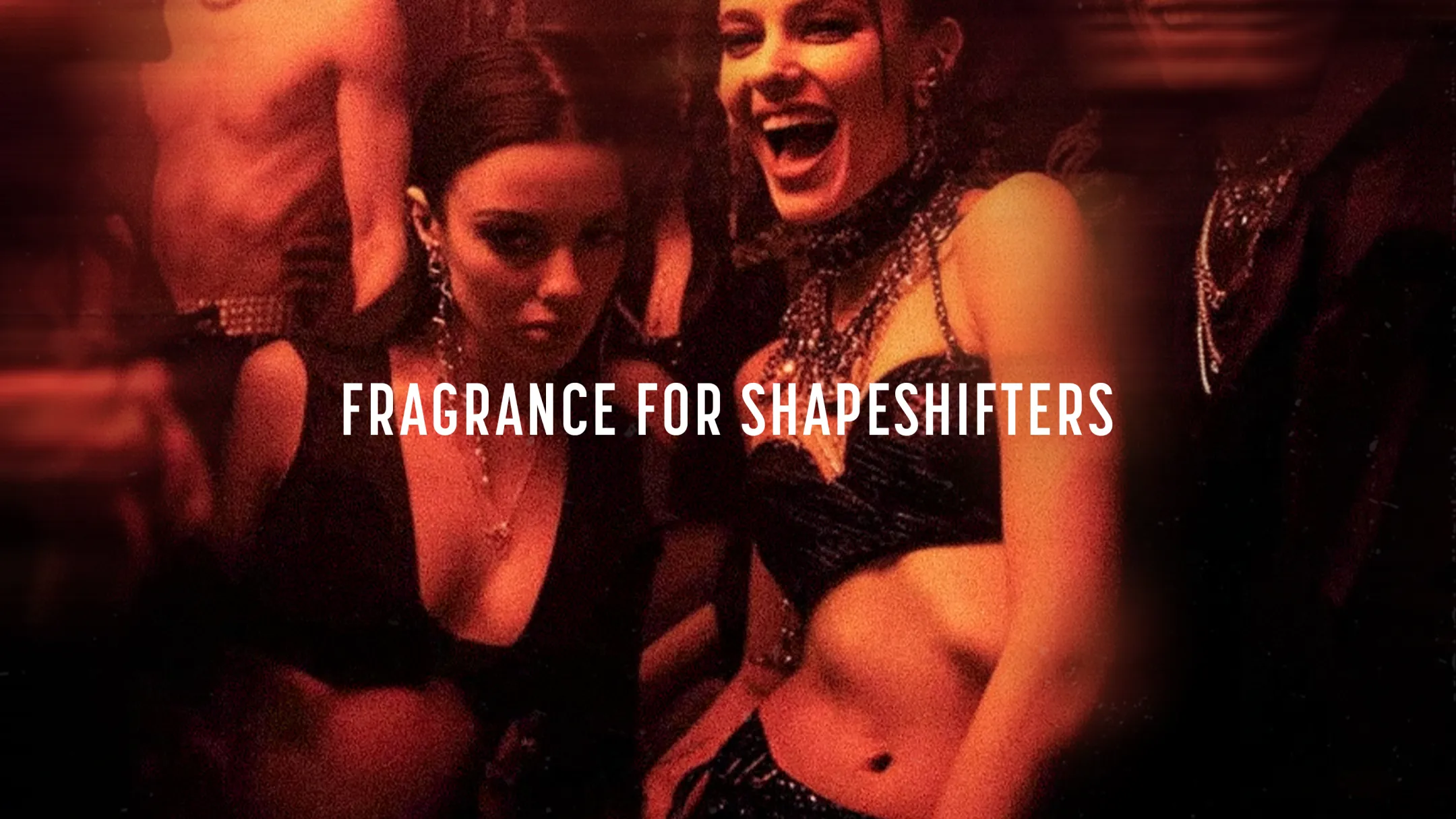
Who is Elijah
Beauty & Skincare
Ecommerce
Products
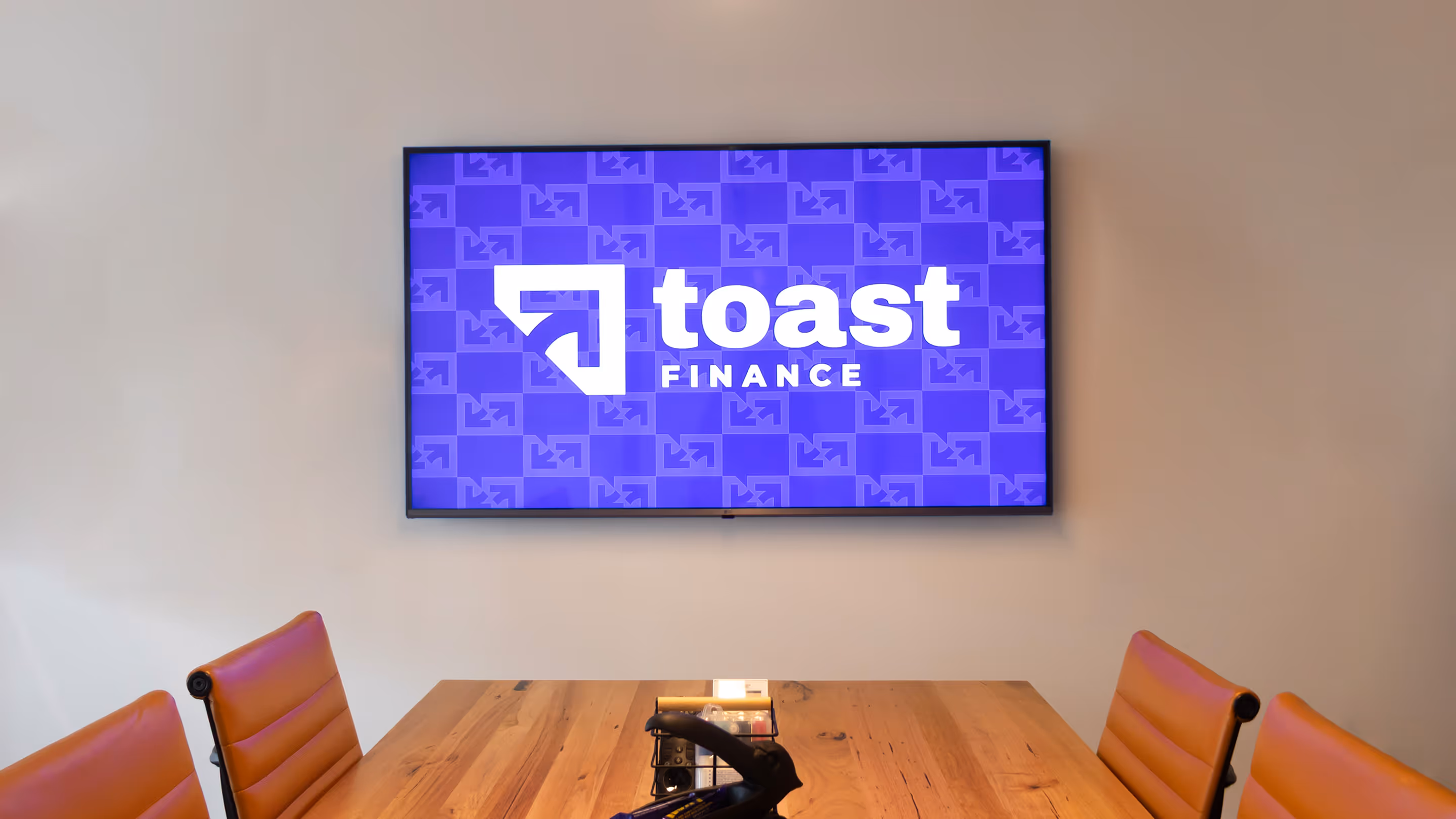
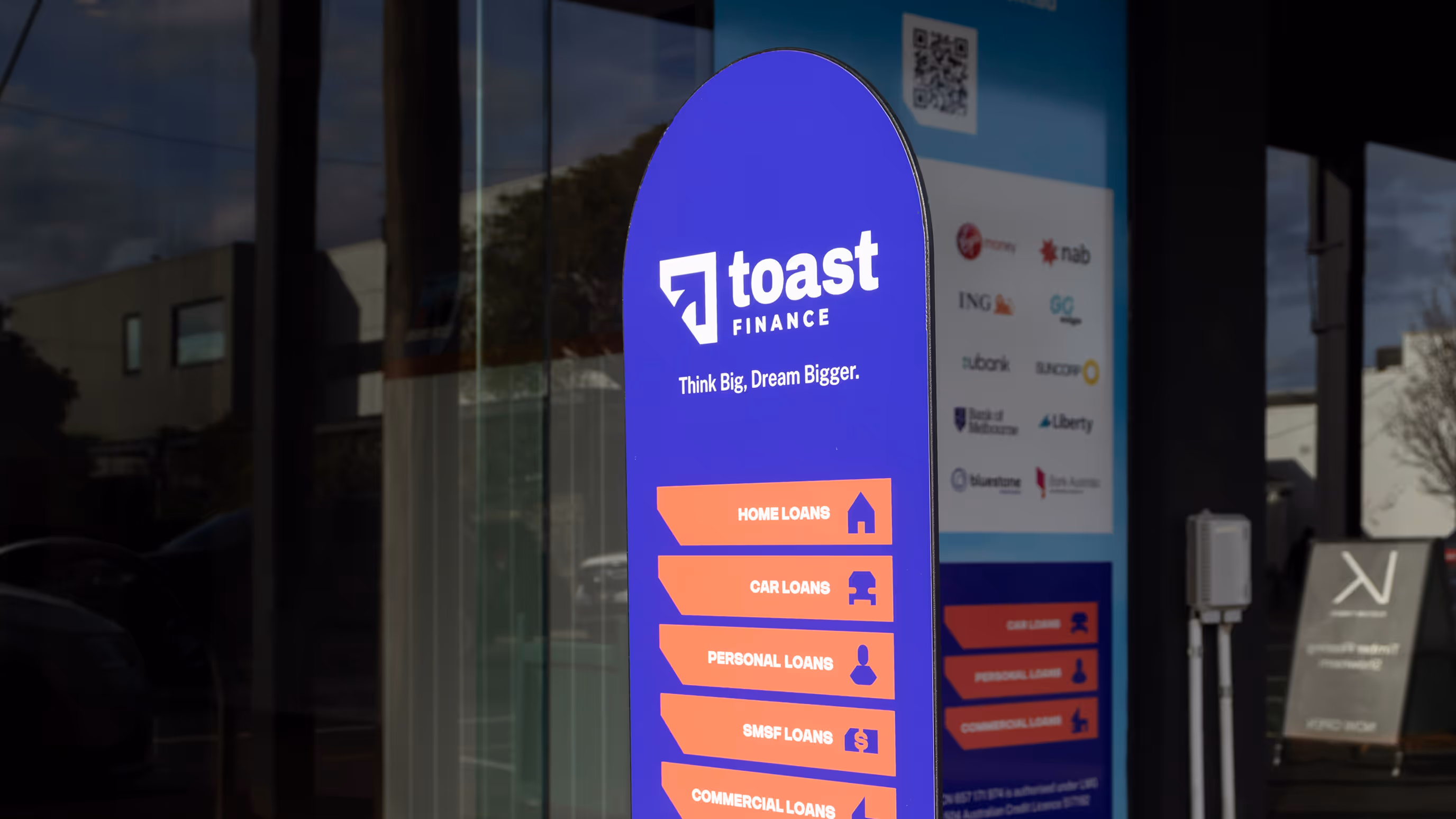
Toast
Finance

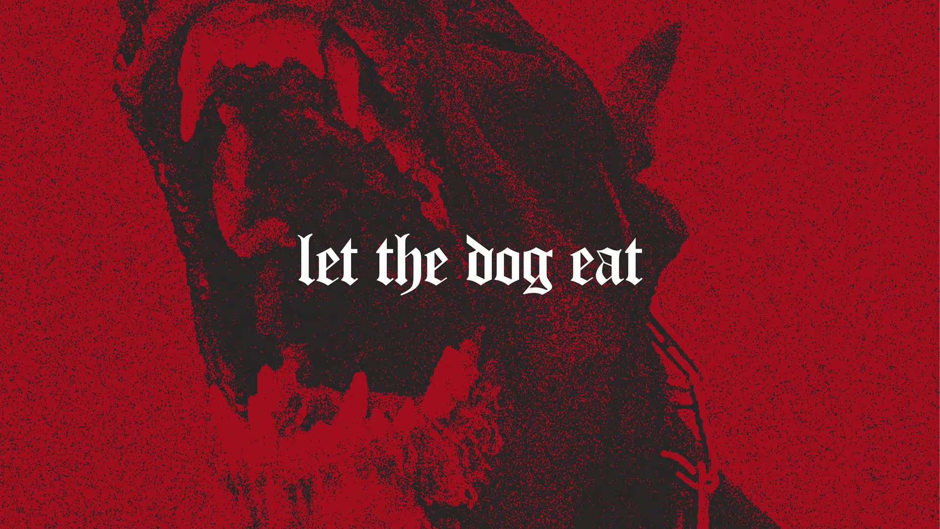
Let The Dog Eat
Apparel & Accessories

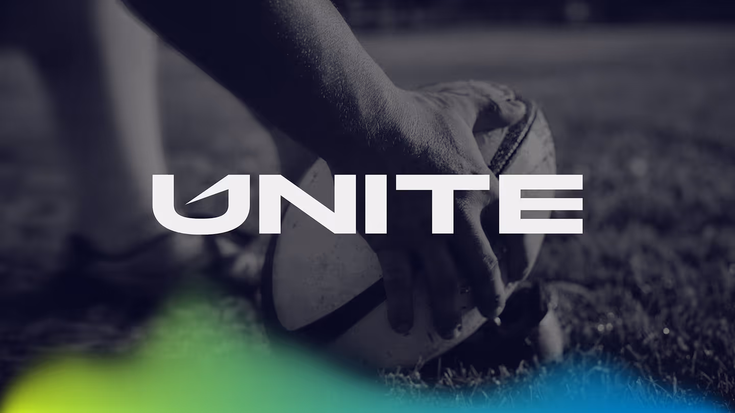
Unite
Marketing
Events
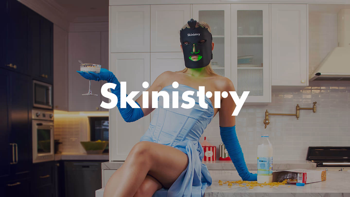
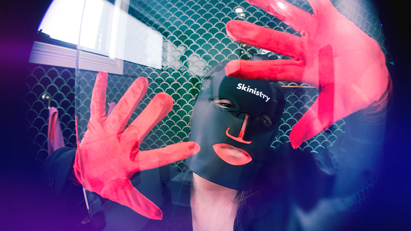
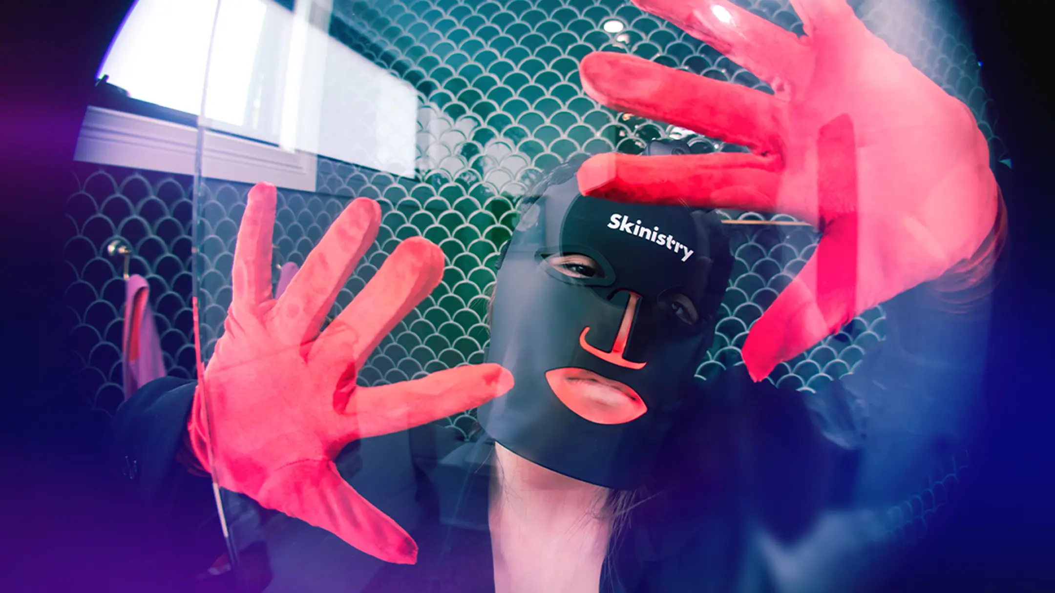
Skinistry
Beauty & Skincare
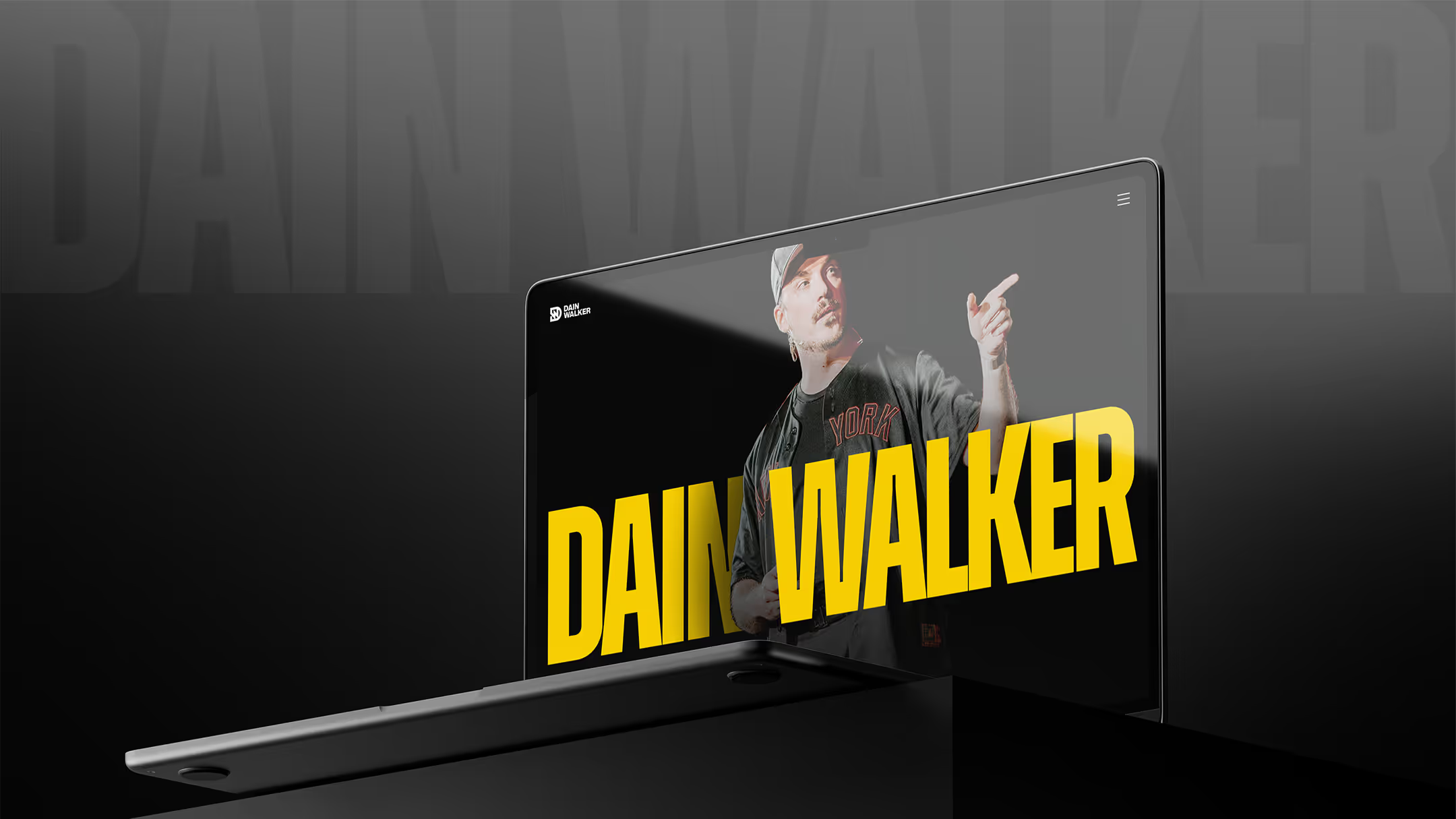

Dain Walker
Personal Brand
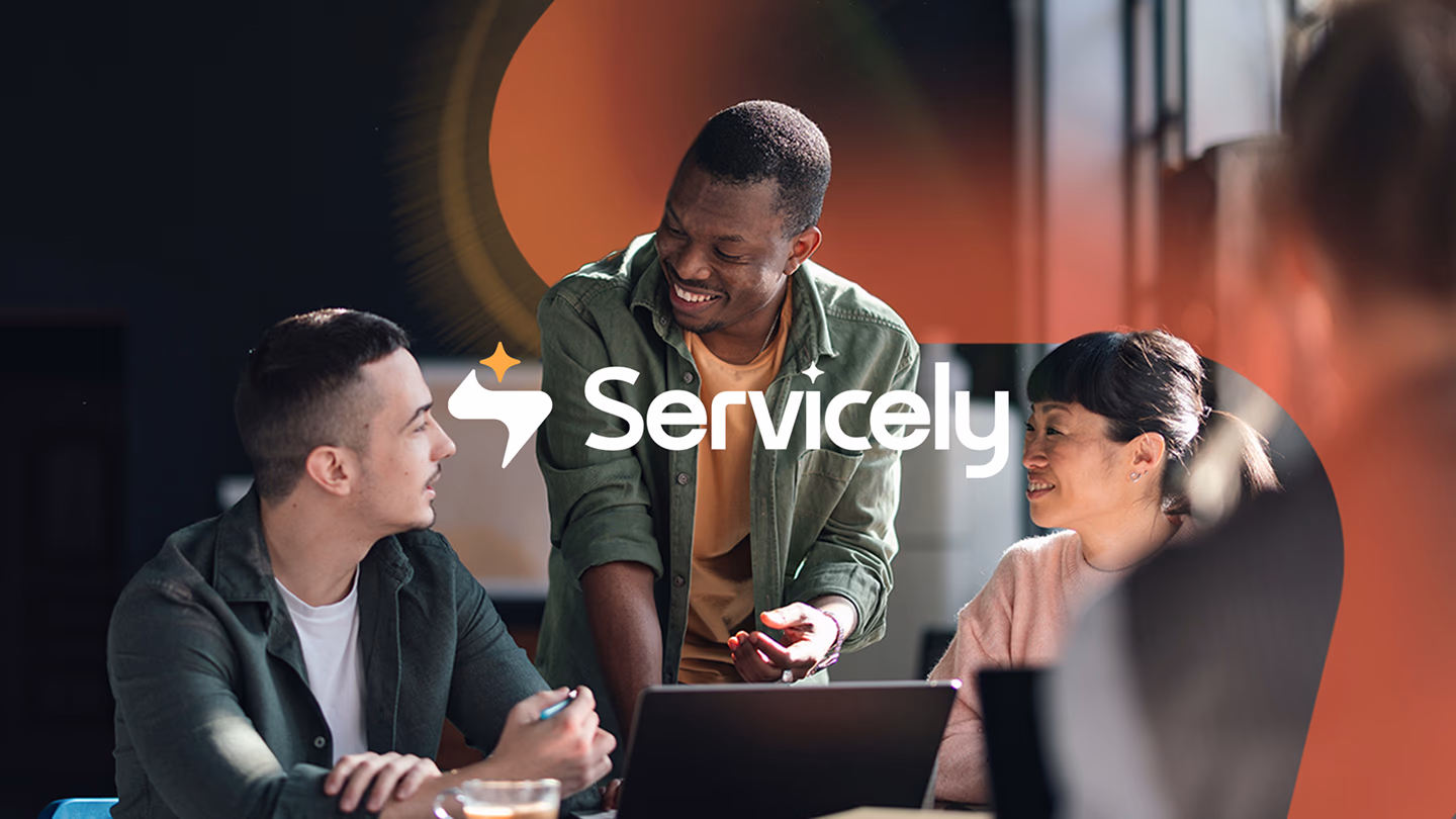

Servicely
Software
B2B Service
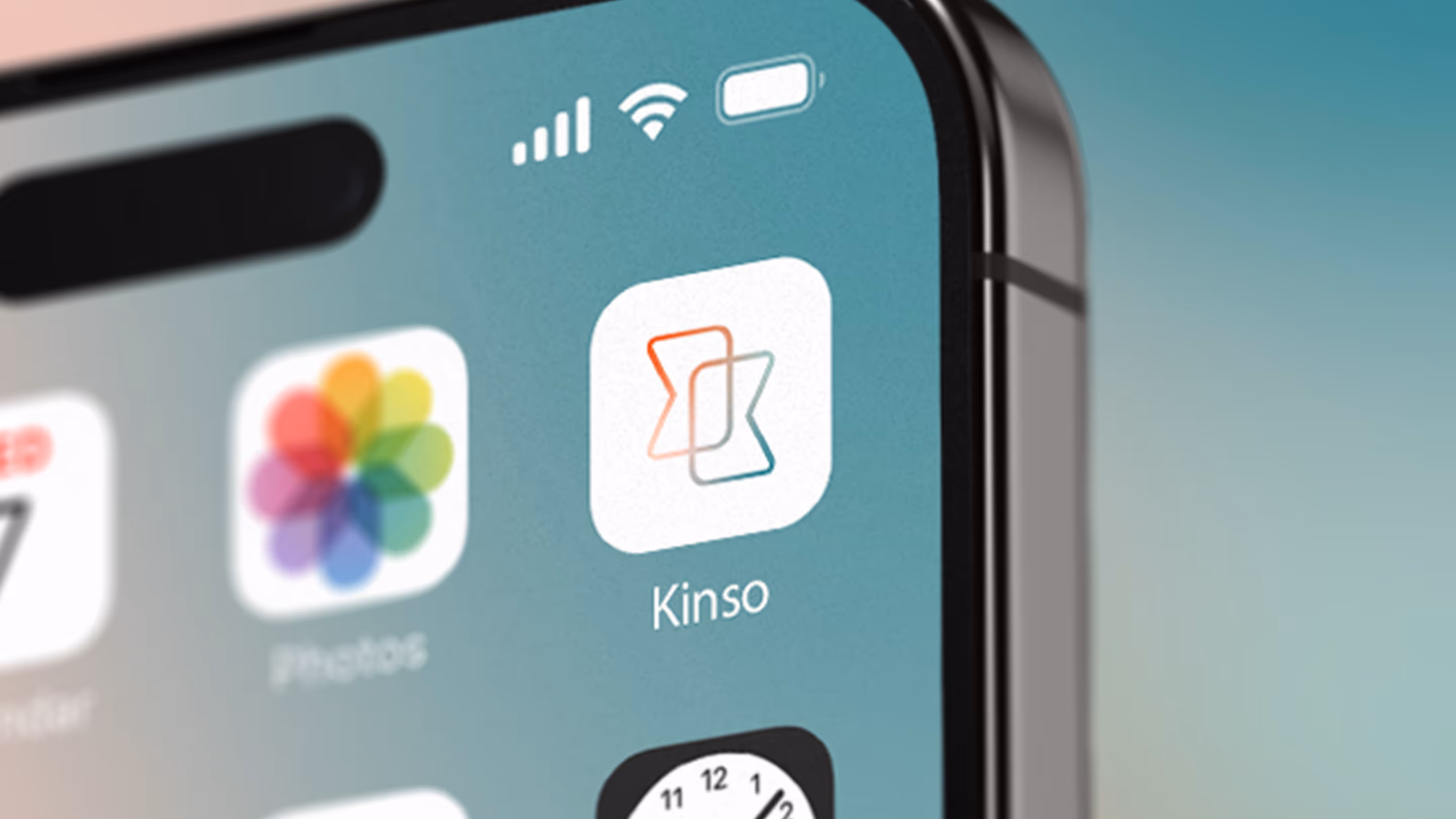

Kinso
Artificial Intelligence
Software
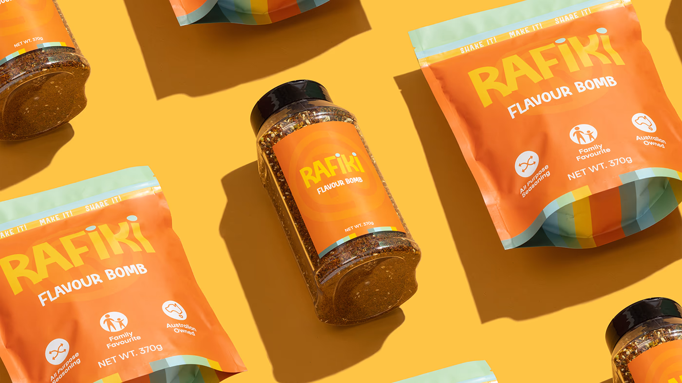
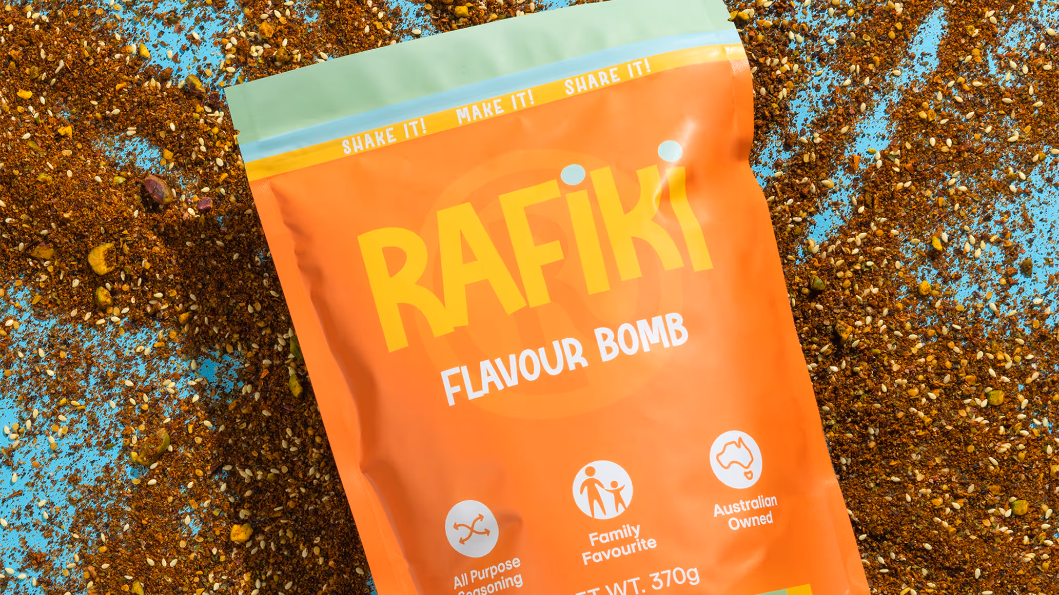
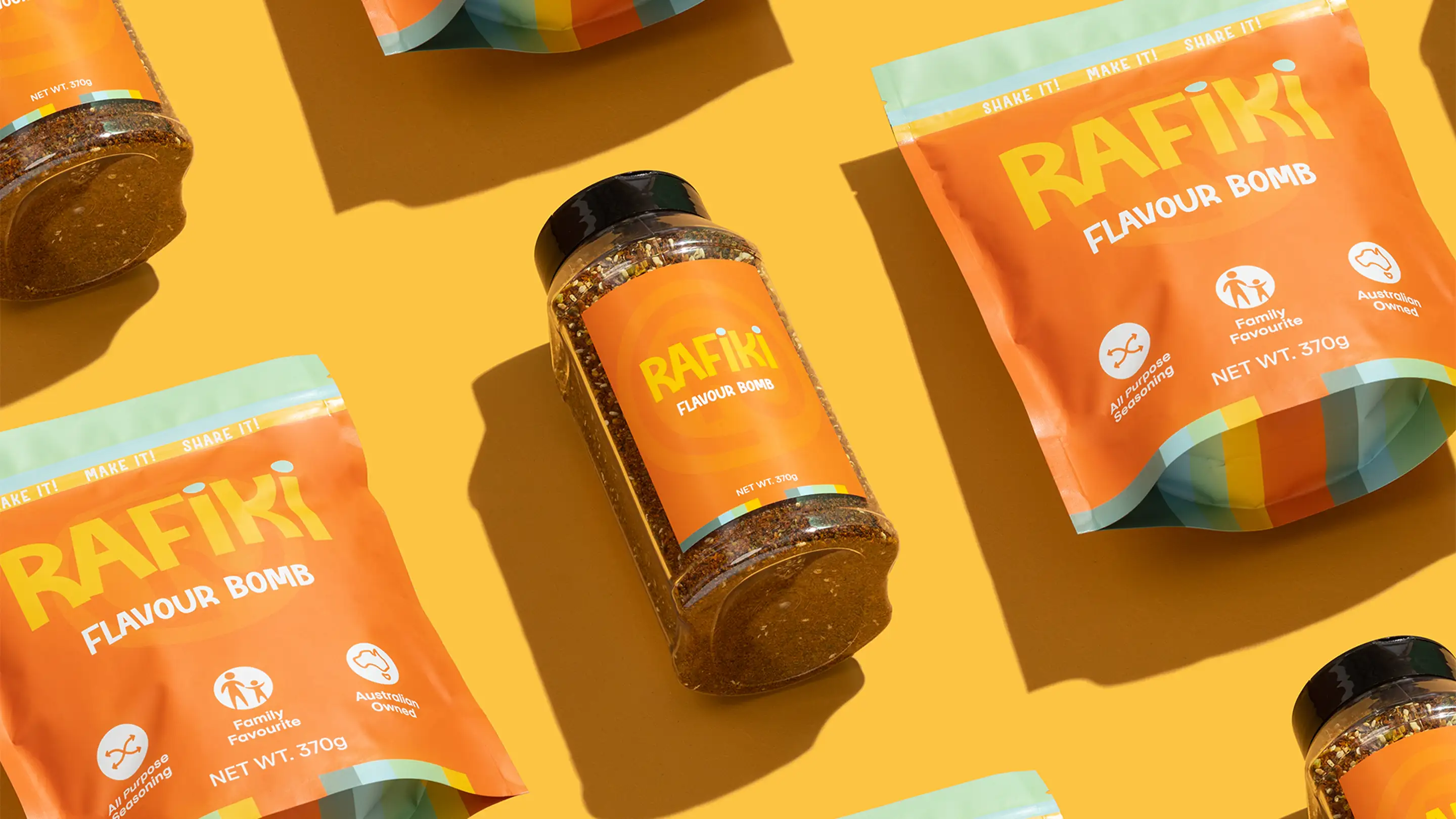
Rafiki
Food
Food
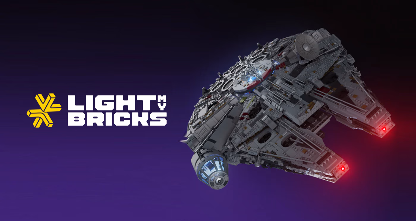
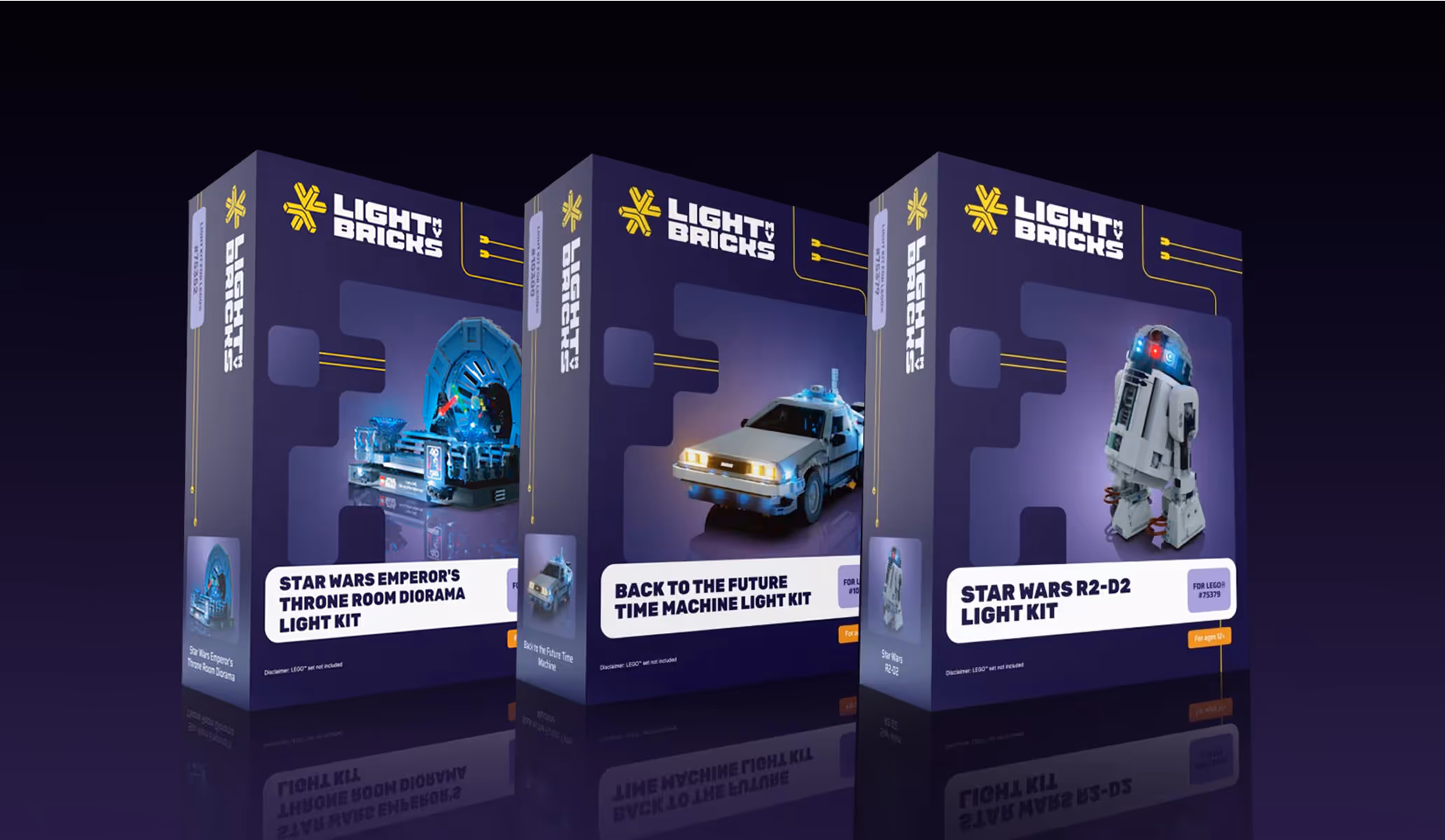
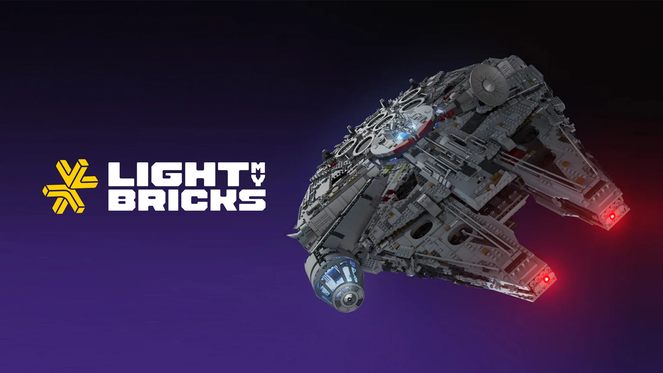
Light My Bricks
Retail
Ecommerce
Products


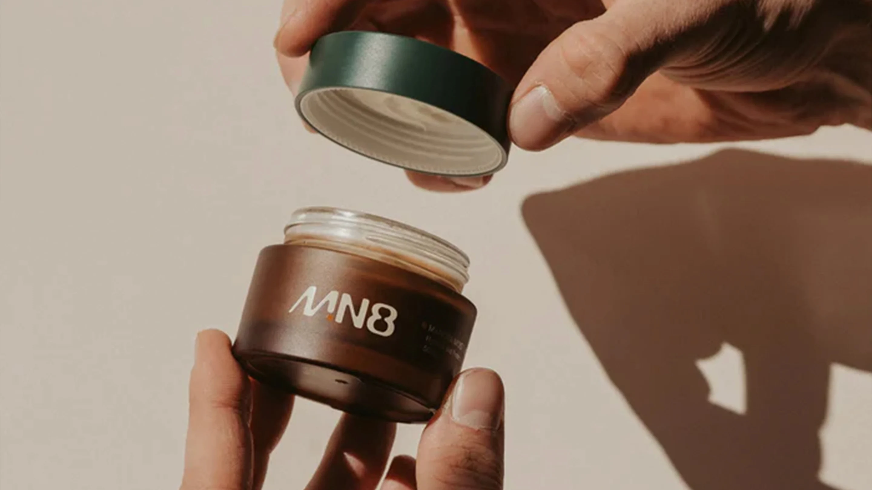
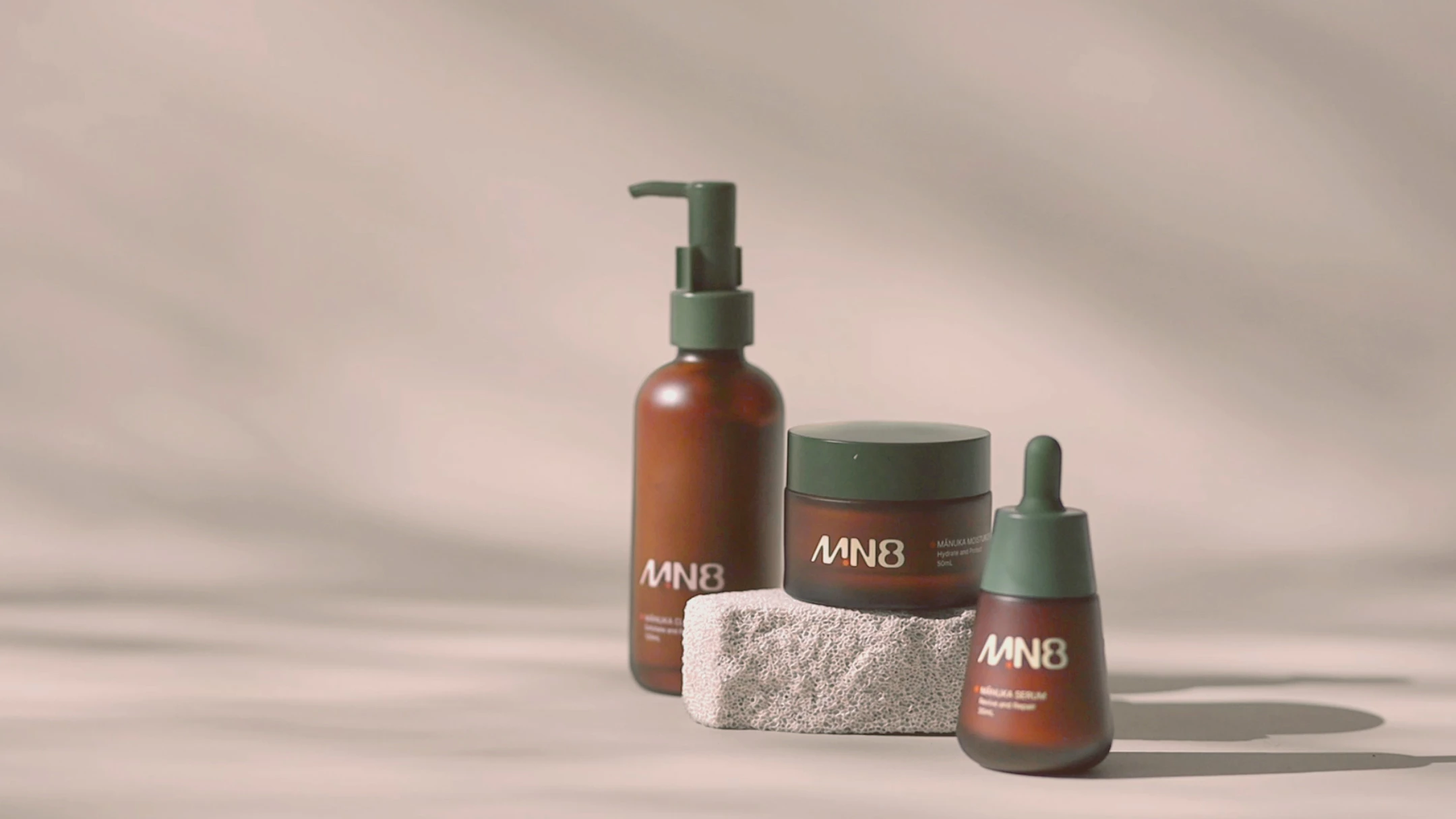
MN8
Beauty & Skincare
Ecommerce
Beauty & Skincare
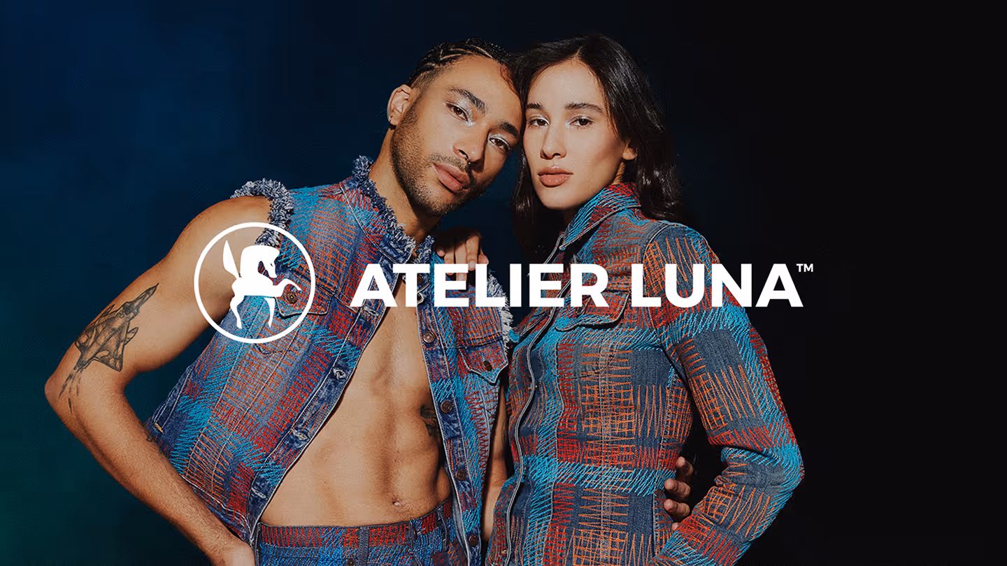
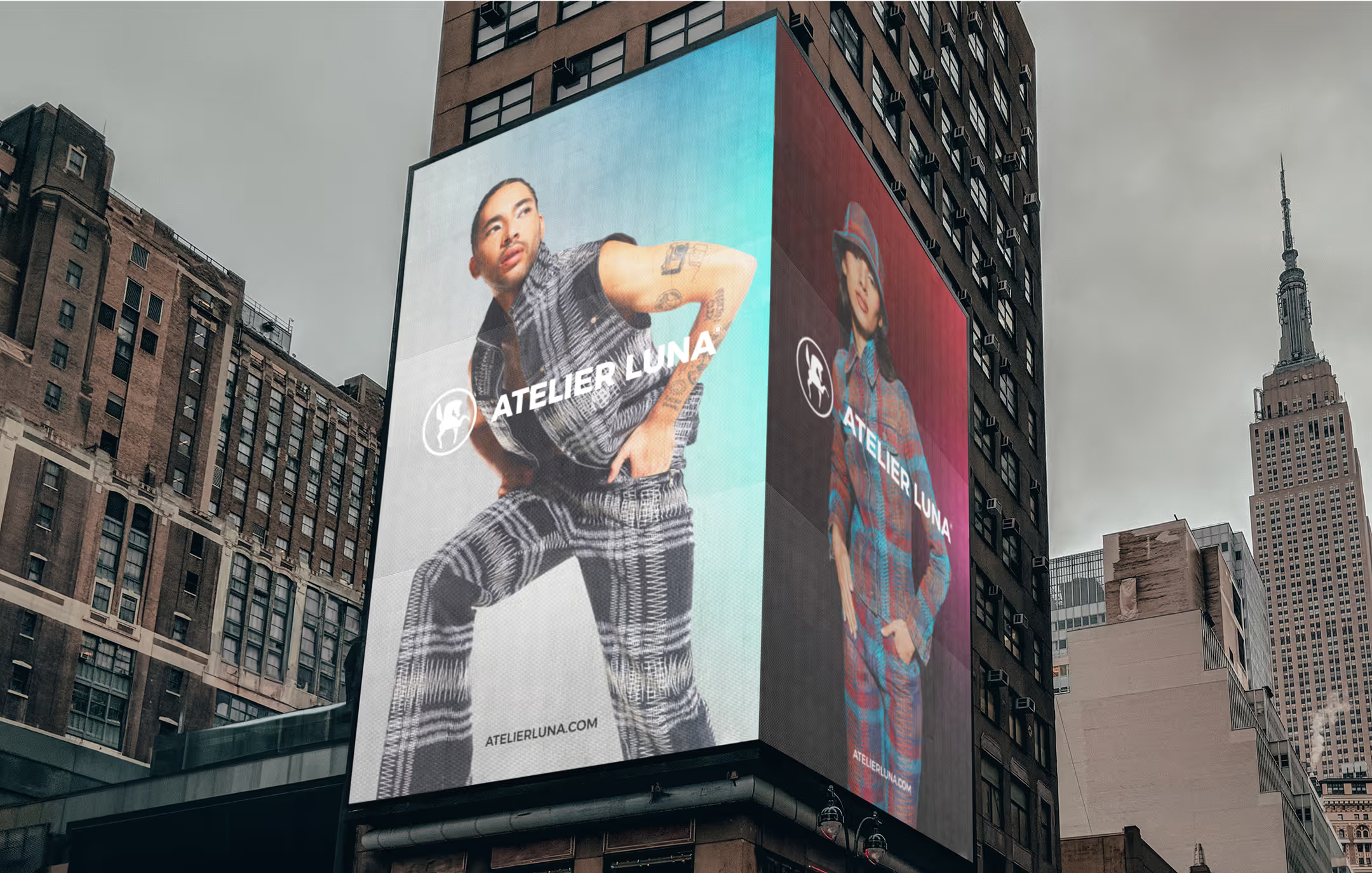
Atelier Luna
Fashion
Apparel & Accessories
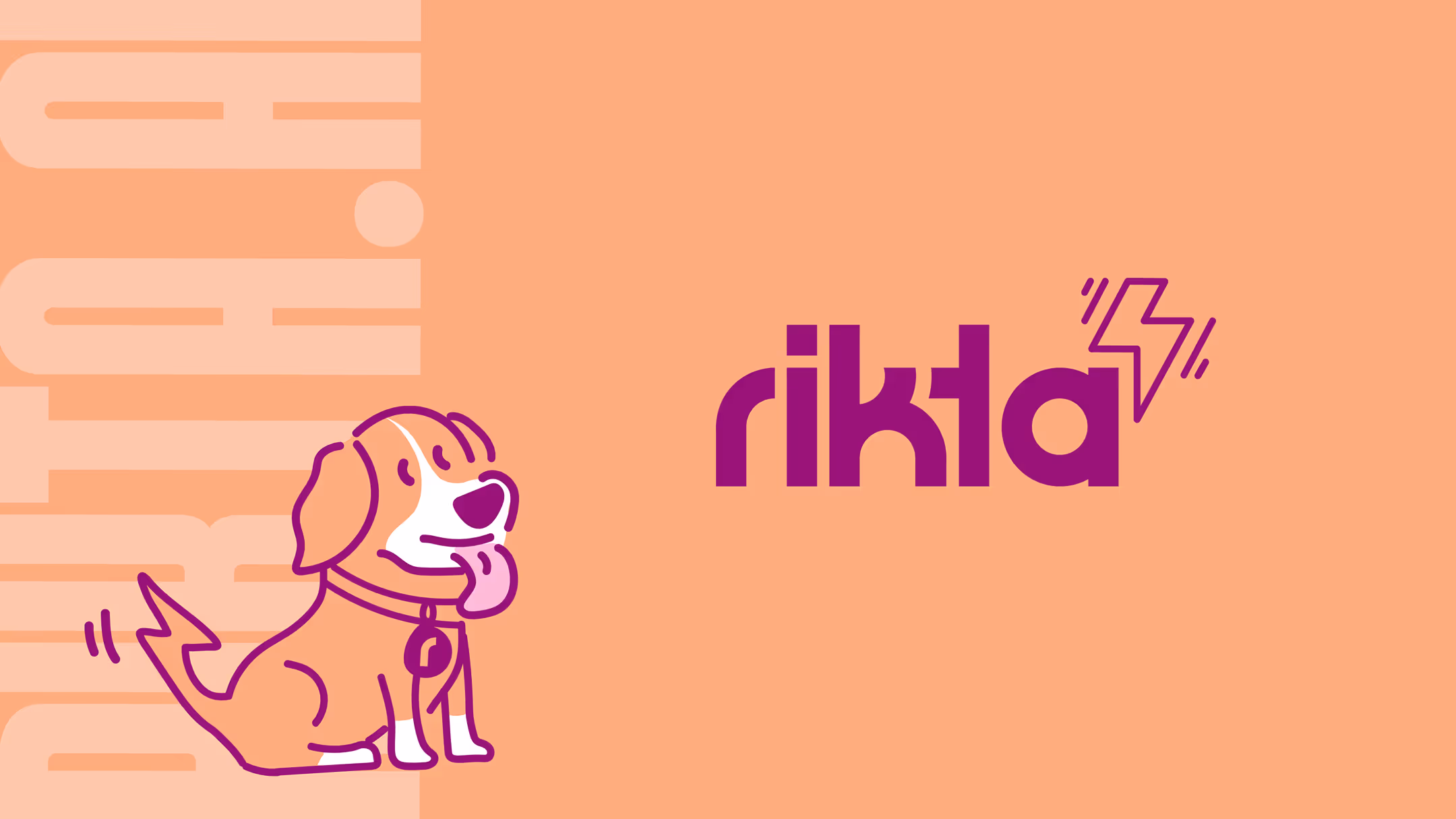
Rikta
Software

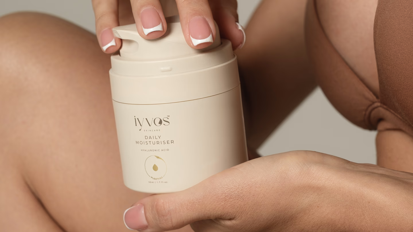
Iyvos
Ecommerce
Beauty & Skincare

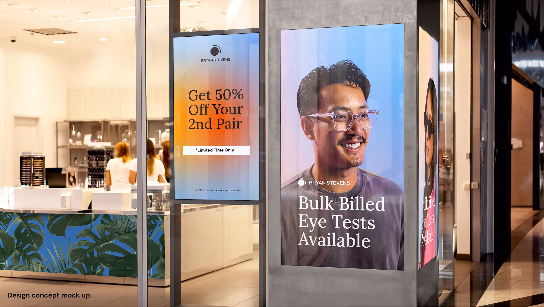
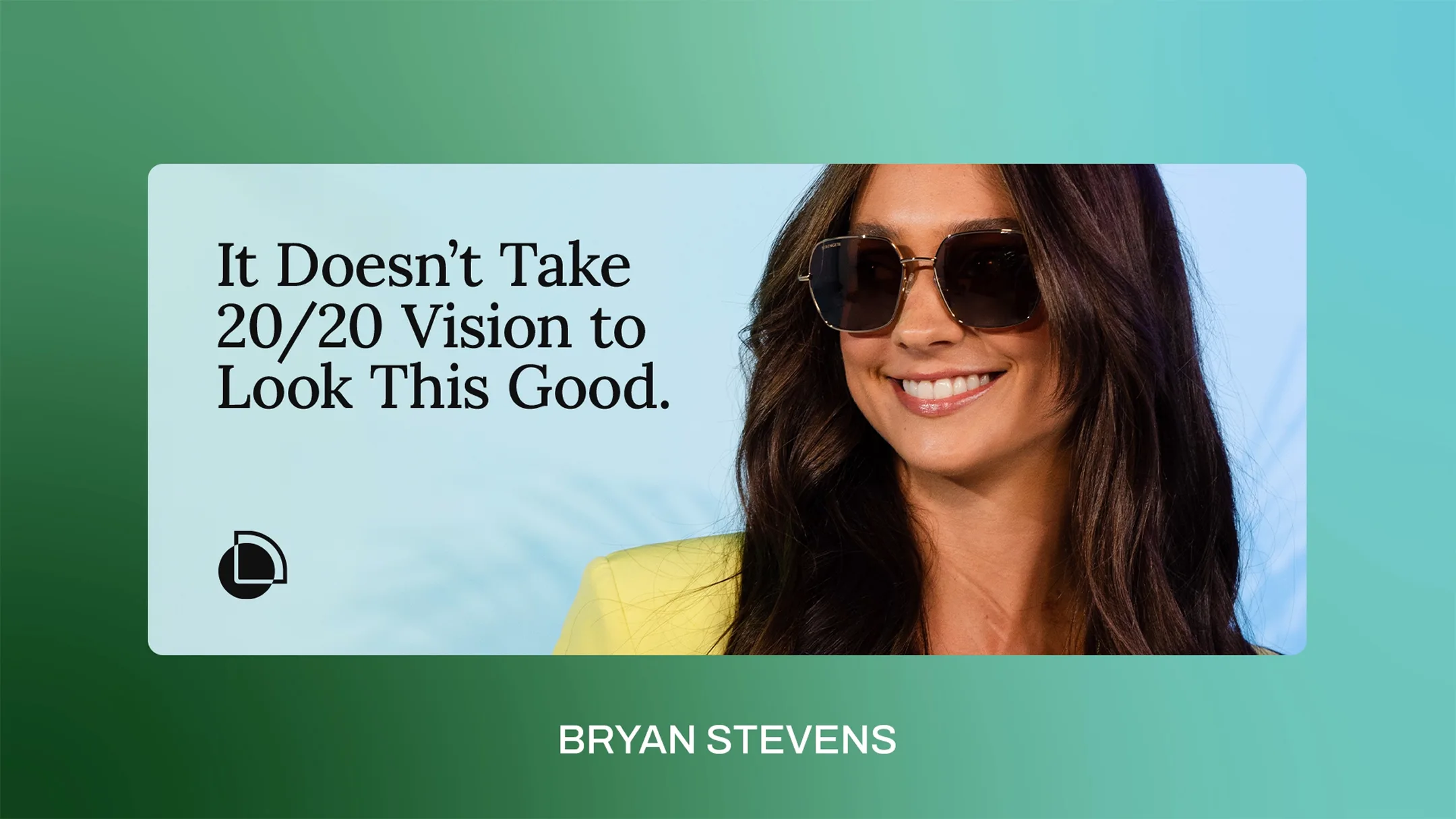
Bryan Stevens
B2C Service
Ecommerce
Products


Winki Energy
Construction
B2C Service
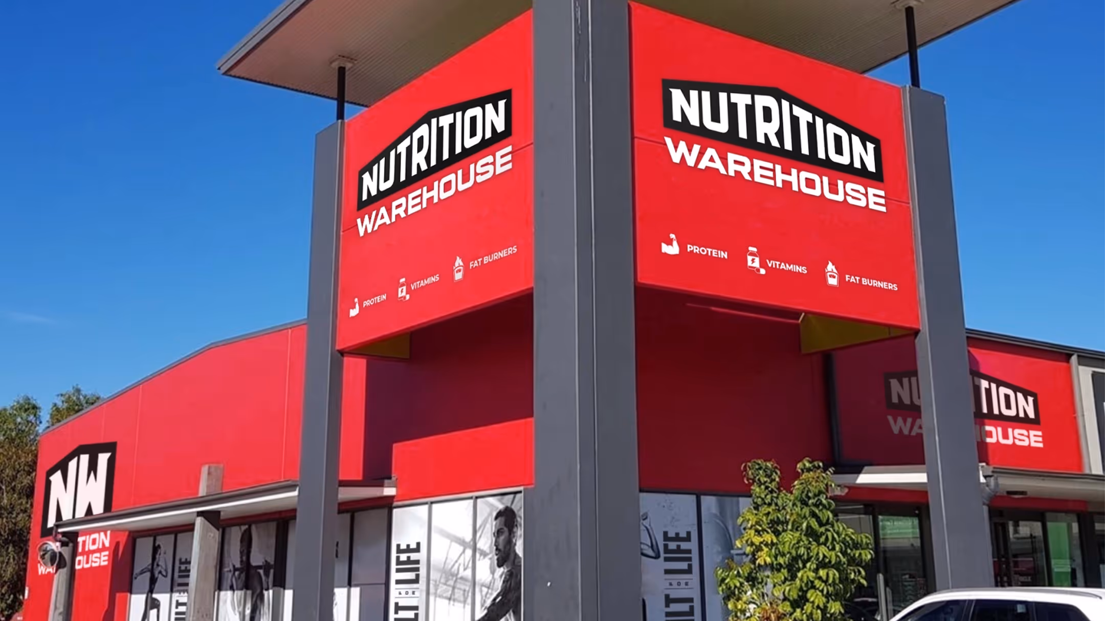

Nutrition Warehouse
Retail
Food
Beverage & Alcohol

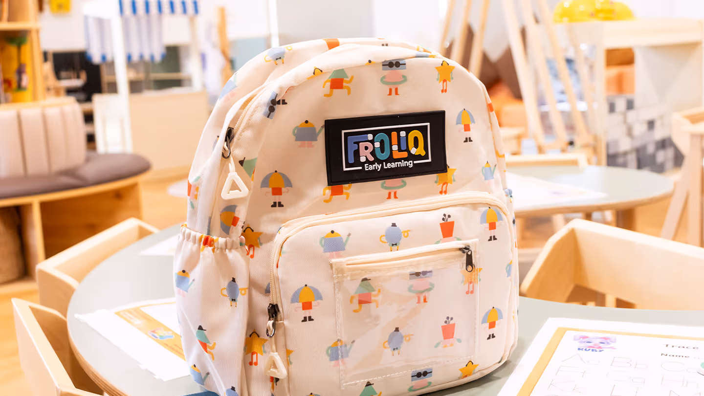
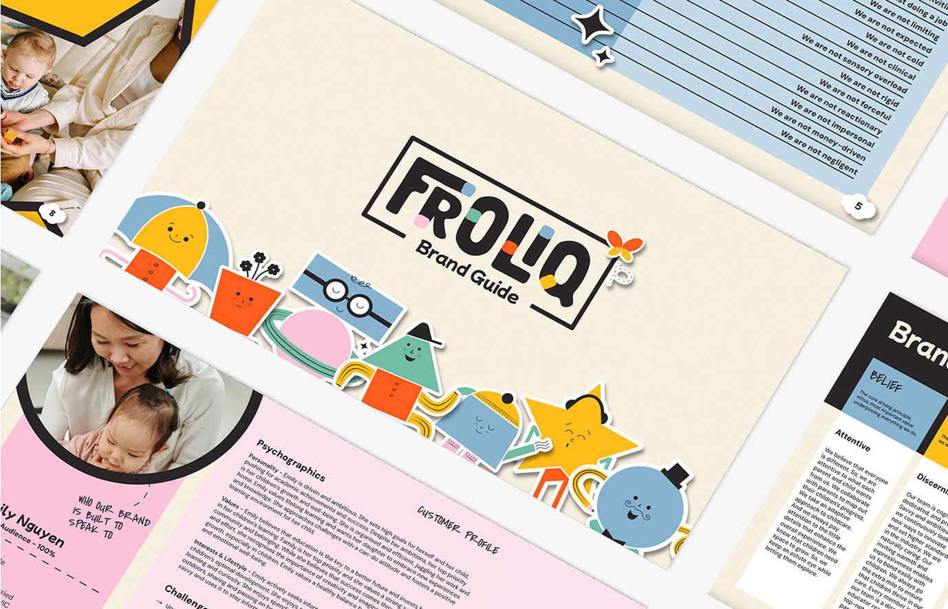
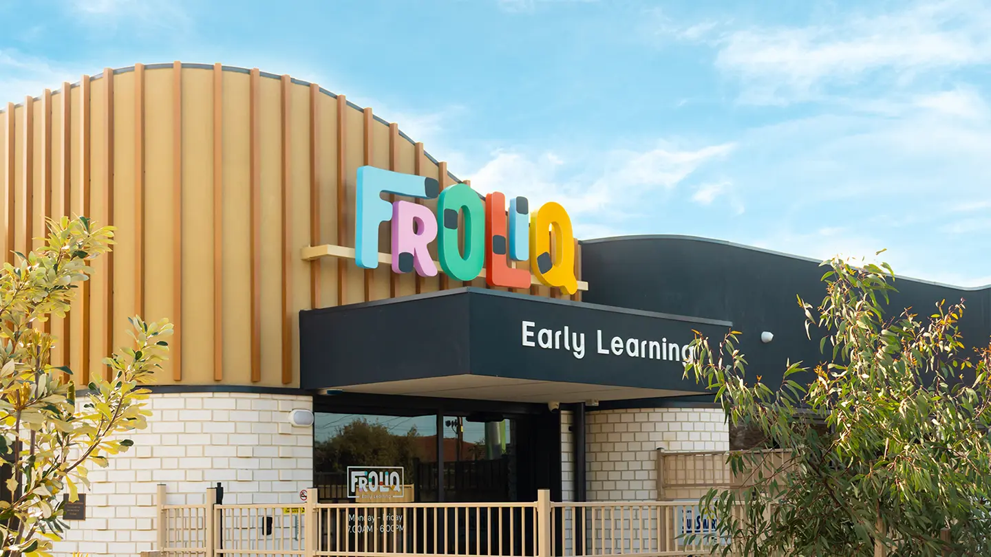
Froliq
Coaching & Education


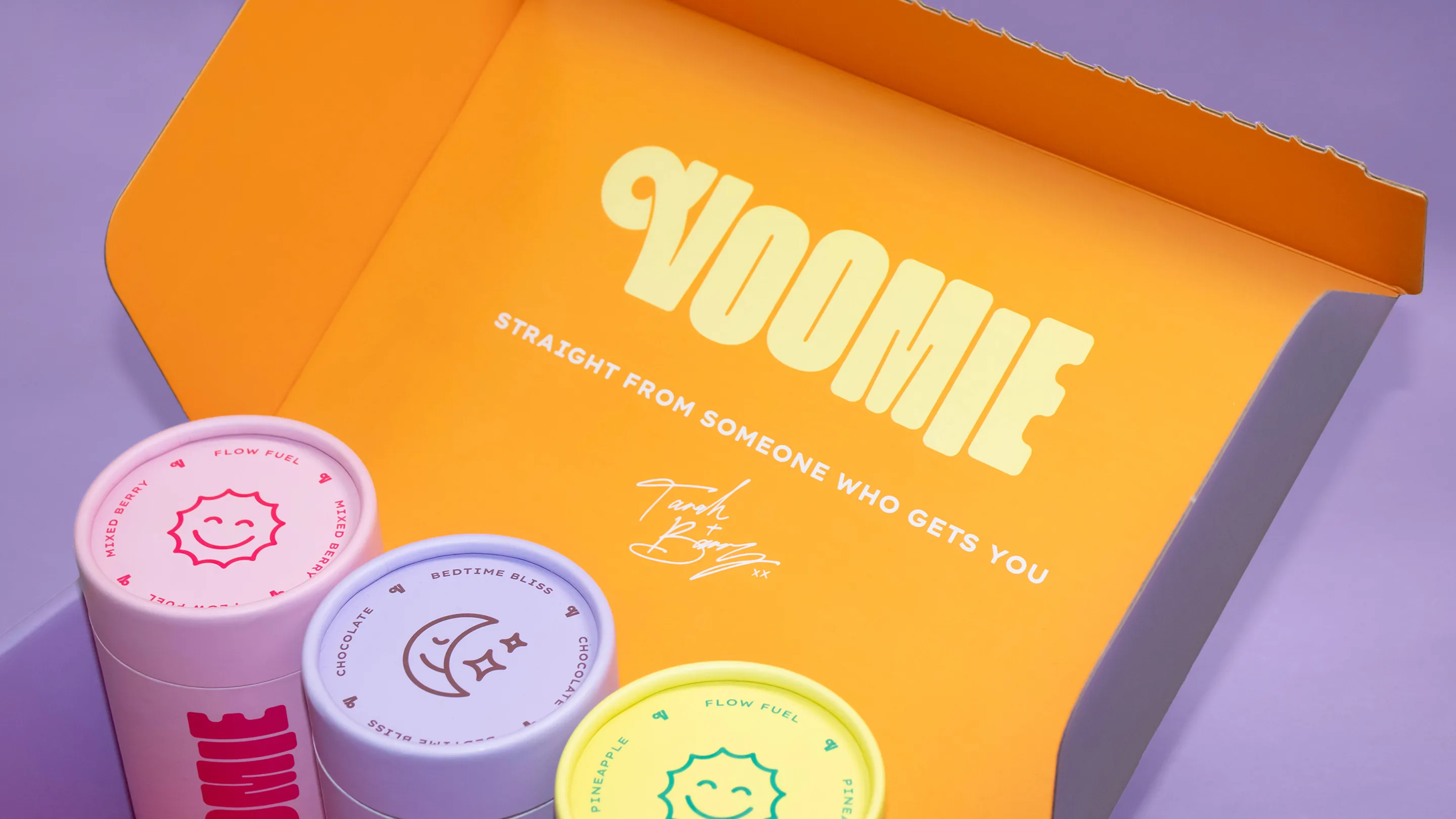
Voomie
Ecommerce
Food
Beverage & Alcohol
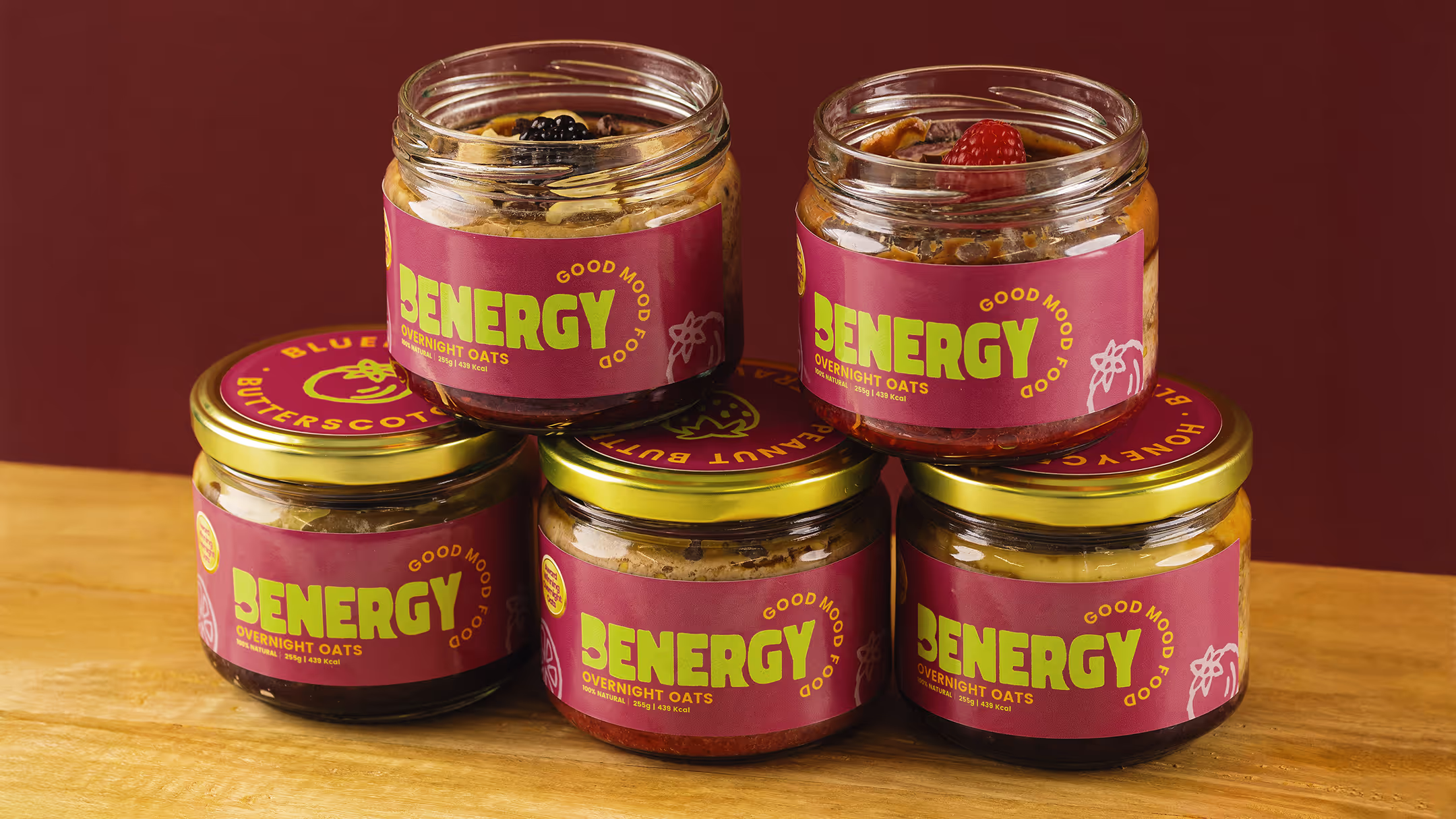
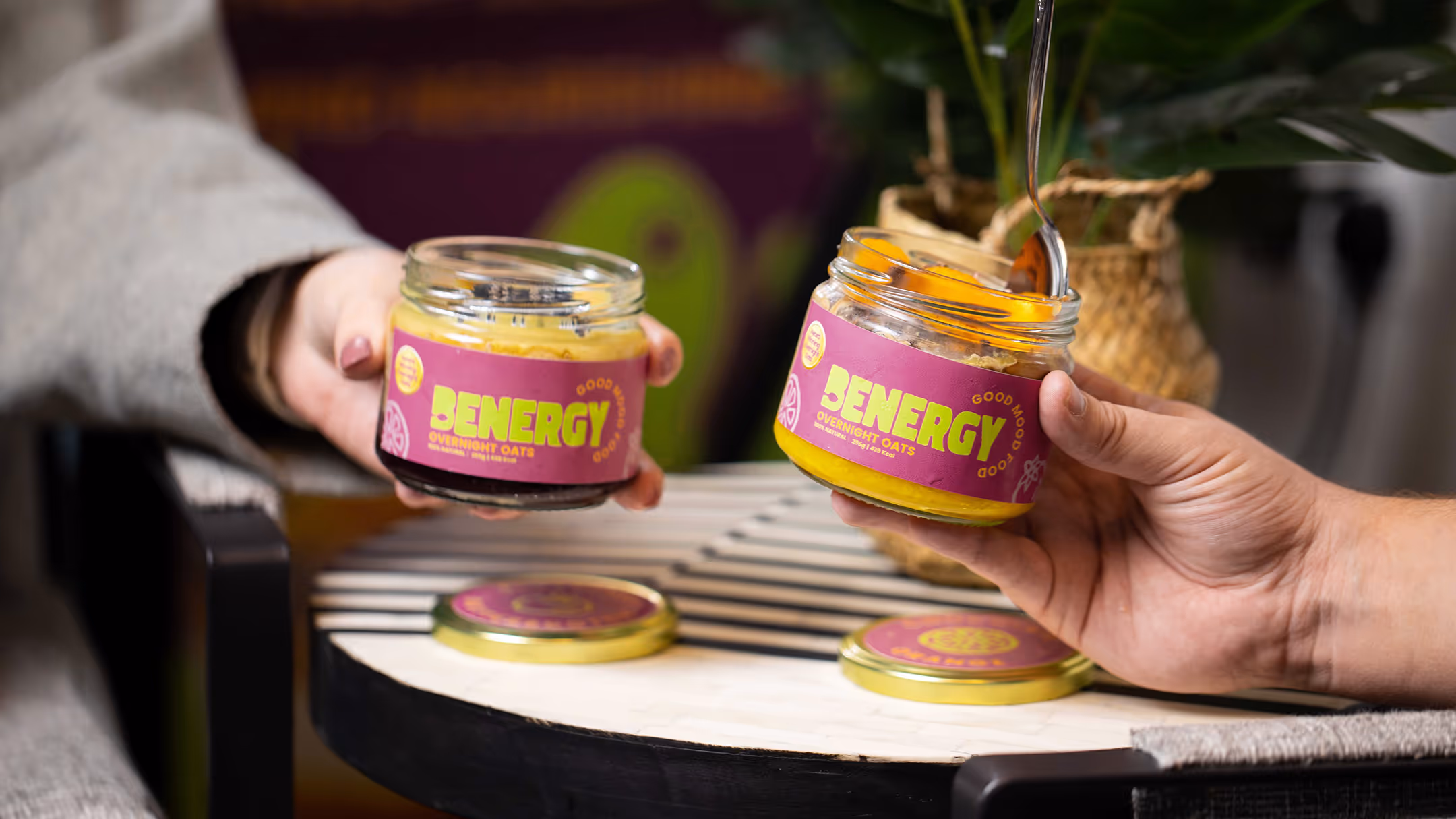
Benergy
Ecommerce
Food
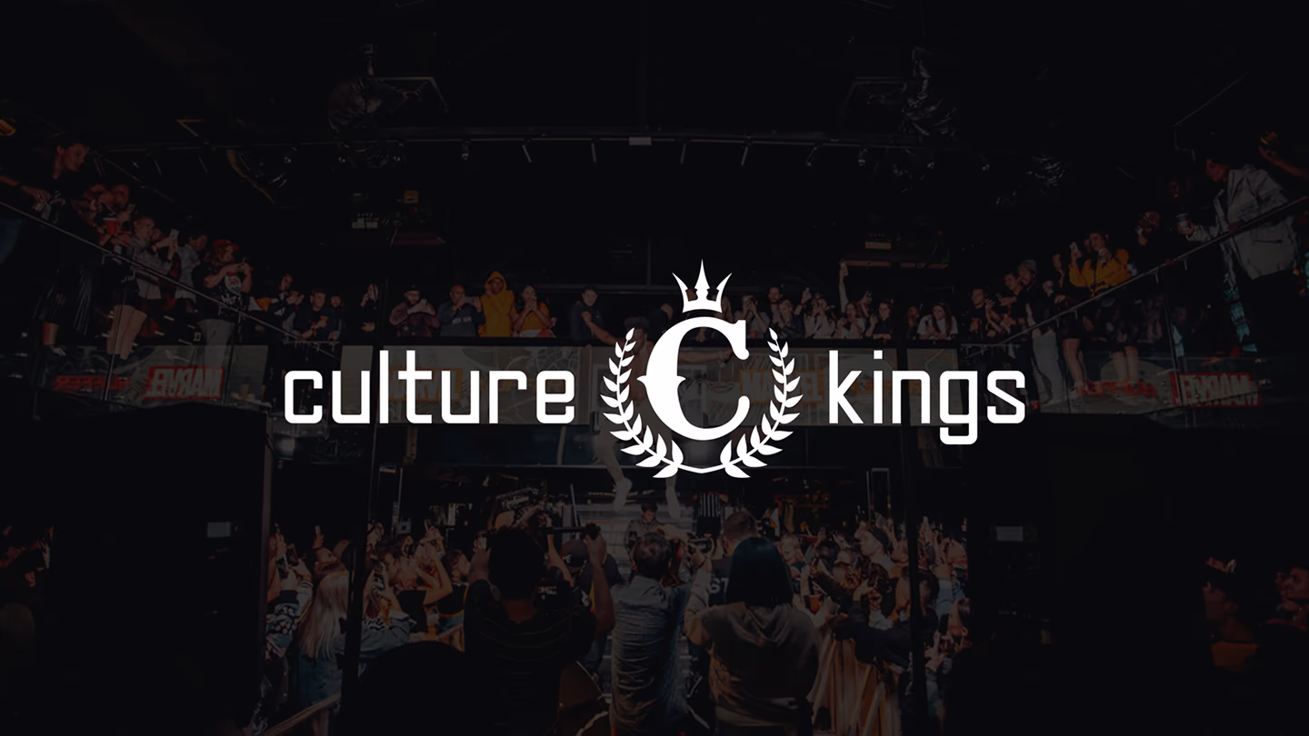
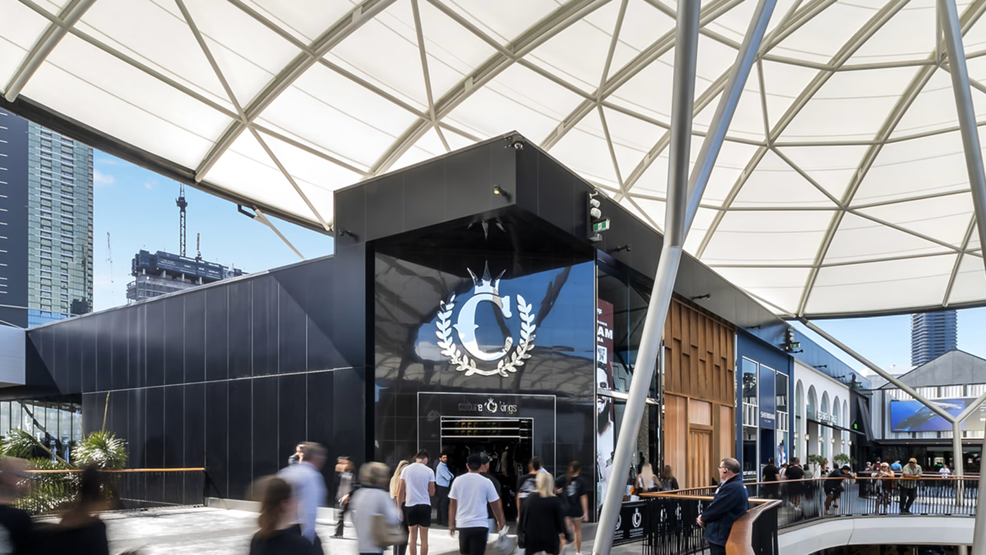
Culture Kings
Apparel & Accessories
Retail
Ecommerce
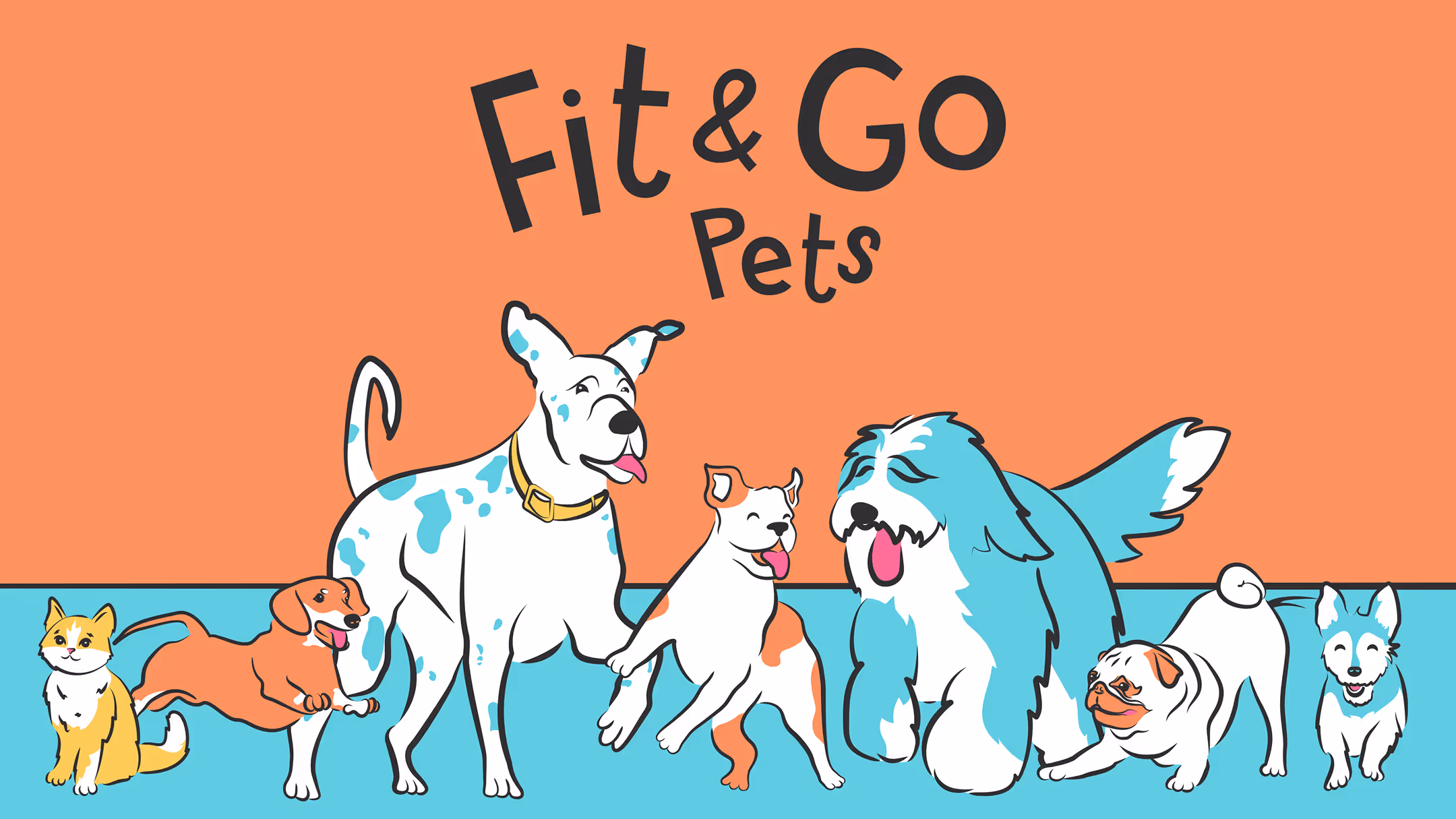
Fit & Go Pets
B2C Service
Thank you! Your submission has been received!
Oops! Something went wrong while submitting the form.
BKT
Luxury
Modern
Minimalistic
Editorial
Eat with Purpose
Minimalistic
Modern
Typographic
Photographic
Who is Elijah
Minimalistic
Abstract
Editorial
Photographic
Toast
Bold & Vibrant
Corporate
Modern
Geometric
Let The Dog Eat
Editorial
Sporty
Gritty & Urban
Typographic
Unite
Sporty
Corporate
Minimalistic
Futuristic
Modern
Skinistry
Futuristic
Abstract
Photographic
Bold & Vibrant
Editorial
Dain Walker
Minimalistic
Modern
Futuristic
Typographic
Photographic
Servicely
Modern
Corporate
Futuristic
Kinso
Artificial Intelligence
Minimalistic
Futuristic
Corporate
Modern
Luxury
Rafiki
Food
Bold & Vibrant
Playful
Photographic
Organic & Natural
Light My Bricks
Retail
Playful
Bold & Vibrant
Geometric
Retro & Vintage
Futuristic
MN8
Beauty & Skincare
Photographic
Editorial
Luxury
Organic & Natural
Minimalistic
Atelier Luna
Fashion
Editorial
Photographic
Modern
Minimalistic
Luxury
Rikta
Bold & Vibrant
Illustrative
Playful
Iyvos
Minimalistic
Luxury
Modern
Abstract
Editorial
Bryan Stevens
Bold & Vibrant
Organic & Natural
Playful
Photographic
Corporate
Winki Energy
Corporate
Abstract
Retro & Vintage
Geometric
Nutrition Warehouse
Gritty & Urban
Sporty
Modern
Froliq
Playful
Illustrative
Geometric
Bold & Vibrant
Voomie
Playful
Bold & Vibrant
Retro & Vintage
Illustrative
Abstract
Benergy
No items found.
Culture Kings
Gritty & Urban
Modern
Photographic
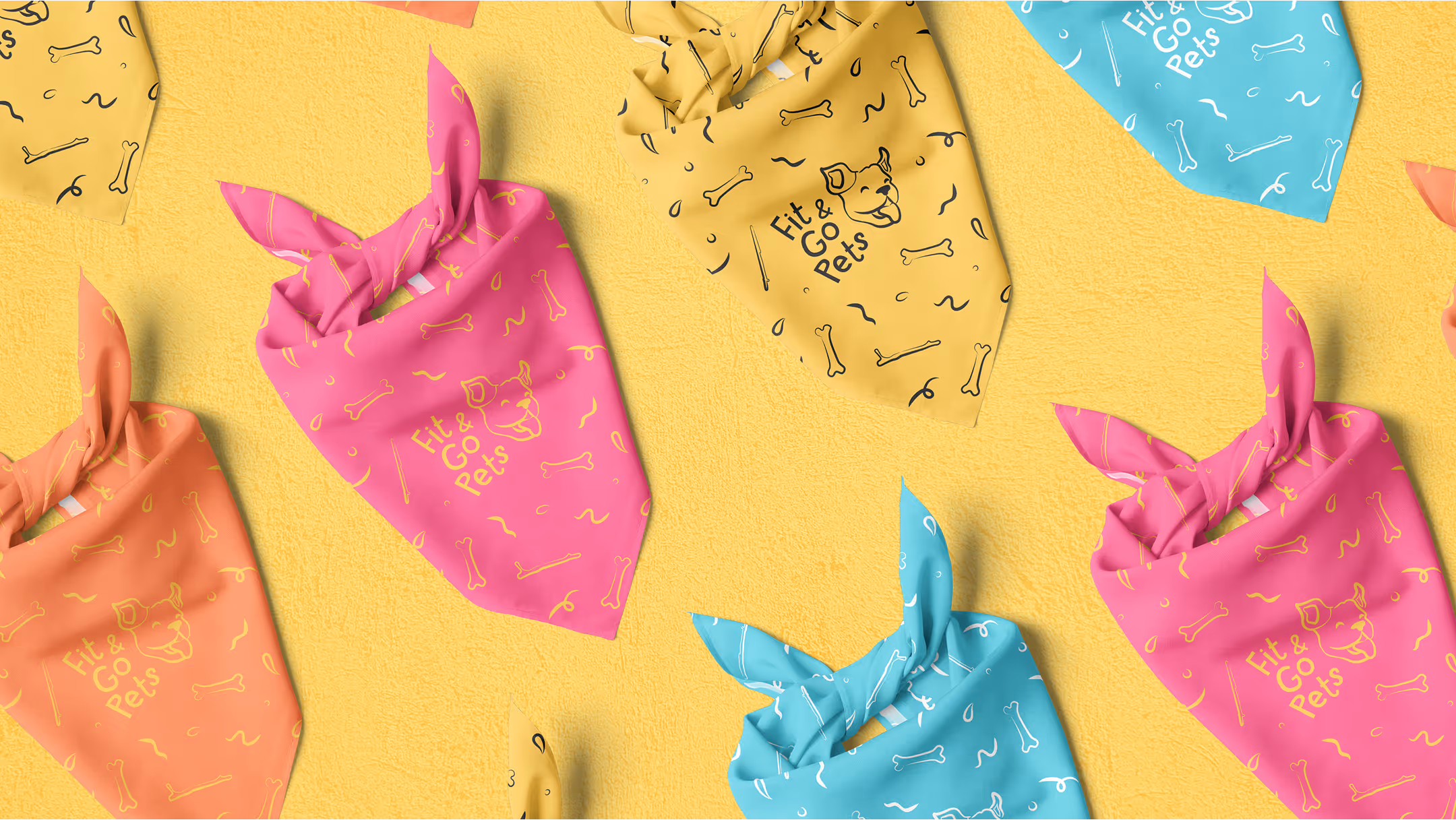
Fit & Go Pets
Bold & Vibrant
Illustrative
Playful
Leading Brands Choose us
testimonials
Hear It from The Real Ones
Where do I start! I've had so much fun working with the team at Rivyl from the initial strategy session to working on brand names and visuals. I have felt like part of the team from the beginning and have been included every step of the way via regular zooms, which I've really enjoyed doing! There is no "here you go do you like it, see ya later" You really are part of the creative team. It's been terrific watching the brand go from an idea to something really exciting! The whole team have been a pleasure to work with and are all so talented! 🤩
We are super happy with the final result from the Rivyl team. They took on our initial ideas and really gave them the Rivyl touch of creativity! Our new brand identity has had amazing feedback from our team internally and our clients. The process was fun and the team were a pleasure to deal with. We received over 70 iterations of our logo which really shows how detail oriented the team are. Thanks again guys from the team at Winki Energy!
Incredible experience with the Rivyl team who helped unpack the vision for my business out of my head and my heart and have helped deliver an incredible brand! Very excited to launch to market soon! THANK YOU Dain, Emma, Luke, Pujan and team!!
The Rivyl team have helped our brand form from an idea to a fully-fledged, about to launch brand. We're extremely happy with their creativity, efforts to bring our vision to a reality plus their communication and advice with us throughout the entire journey. Highly recommended!!
We had an outstanding experience of working with the Rivyl team. We went to the Rivyl with an outdated brand and asked them to help us define our brand strategy. Through a series of thought provoking, fun, creative and inspiring workshops, Rivyl presented us with the concept of a total rebrand much more aligned to our values, culture and mission. From this, they then took us on a journey to develop a new name, brand identity & archetype which culminated in everything we lacked - an end to end brand strategy and new shiny website.Almost two years on. We have a cohesive bran message, which is seeing us win & retain clients, as well as hire amazing people, through a consistent brand voice.
I recently engaged the team at Rivyl for my personal branding needs. From the outset they have exceeded expectations and their internal teams have truly worked in sync to deliver an excellent outcome. Its been a pleasure working with Dain, Rachael, Bianca, Denis, Luke and Esther. I would highly recommend the team at Rivyl.
Rivyl is the gold standard. Teaming up with Rivyl was by far the best decision we have made for our business. The experience was incredible from start to finish. Everyone on their team is an absolute master of their craft and a pleasure to work with. They have given us a deep understanding of who we are as a company, and their branding expertise has transformed how we connect with our audience. The response from our customers as we rolled out our new brand has been overwhelmingly positive. Rivyl's ability to communicate ideas and execute them flawlessly is unmatched. We couldn't be happier with the results!
Had the pleasure of working with Dain, Emma, Luke, Brittany, and Briar on Gym Plus's rebranding. I absolutely love the work they've done. Such a talented team! Choosing to rebrand and partner with Rivyl was the best business decision I've made this year.
Couldn't be happier with how our re-brand turned out. As a team, they are super creative, extraordinary listeners, and just genuinely amazing people to work with. Could not recommend Rivyl highly enough. 12/10!
We had the pleasure of working with Rivyl on several of our brands. This team is incredibly talented. It was a big decision for us, but it will forever be a turning point in our business and one of the best decisions we've made.
Rivyl has exceeded our expectations and have produced some incredible work for our brand refresh, new packaging and website. Working with the team has been so enjoyable, their attention to detail and passion for what they do really shines through. Highly recommend Rivyl, it has been worth every dollar. We’ll be sad to say goodbye when the project is complete, but will definitely be using them as our go to for the future.
Rivyl is next-level. Their ideas are fresh, bold, and always on-brand. Working with them feels effortless—they just get it. Highly recommend for anyone wanting to stand out.
Book in with one of our experts.
Do you have a specific project or partnership opportunity you wish to discuss?
Schedule Your Call