More Than Just Looks: Delving into the Impact of Visual Identity
Find out what visual identity means for a brand and how it differentiates it in the market.

Ready to dive into the fascinating world of visual identity? Visual identity is how a brand presents itself visually – the colors, fonts, images, and logos all work together to create that recognizable look and feel. It's like the outfit your brand wears. Ever pause during your Netflix session and drained in the influence of their visual flair? A punch of vibrant red that not only grabs your attention, it practically hollers, "Buckle up for an epic ride!" This brand incites excitement, passion, and creates an insatiable appetite for top-tier entertainment.
Now, lean in a little closer. Have you noticed something about their font? 'Netflix Sans' they call it—a typeface that's not simply letters on a screen but a signature, a promise of sorts. It's sleek, it's modern, it's everywhere—from the smallest text on your screen to those high-stakes billboards. And let's not forget the logo—the badge of honor. Those bold, stacked characters serve as a cinematic drumroll in our day-to-day streaming rituals, a subtle reminder of Netflix's commitment to maintaining our binge-watching traditions.
What is visual identity?
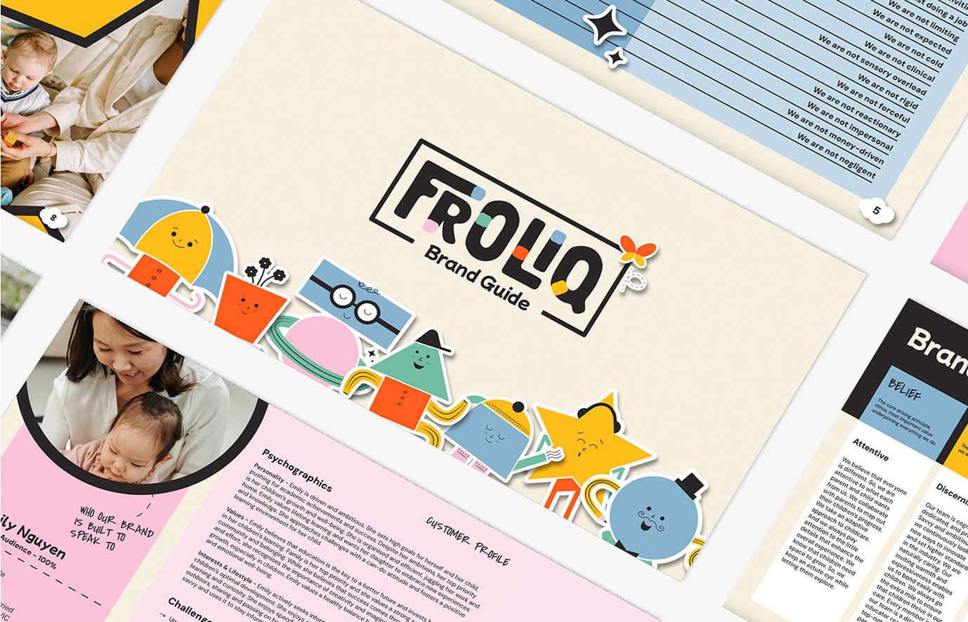
Visual identity comprises all the visual elements, like logo, color scheme, and typography, that represent and differentiate a brand.
What stands out in this narrative is the significance of leaning into visual identity. We are, essentially, creatures drawn to visuals. Research backs up the claim with a whopping statistic: We tend to remember 80% of what we see, contrasting with the measly 20% of what we read. Visual identity is the powerful, silent partner in your marketing scheme giving you more than just the eyeballs—it builds trust. With a well-crafted, consistent visual narrative, your brand subtly whispering, "You can bank on us," presents itself as both reliable and memorable. Because isn't that what stellar branding is? It goes beyond being seen to creating an experience where customers aren't just visitors, they transform into lifelong fans.
Unraveling the Connection: Visual Identity and Brand Identity

Visual Identity vs. Brand Identity:
Visual identity and brand identity are two sides of the same coin, each playing a unique but interconnected role in shaping a brand's identity. Let's break down the key differences:
Visual Identity:
Visual identity is more than just some artsy stuff. It sticks a brand in your mind because you can't stop humming a catchy song. It sets a brand apart, making it instantly recognizable and memorable. And in this digital age where everything is competing for your attention, having a killer visual identity is a game-changer. So, whether you're designing logos, picking colors, or choosing that perfect font, think about how it all comes together to create an epic visual identity for a brand.
Brand Identity:
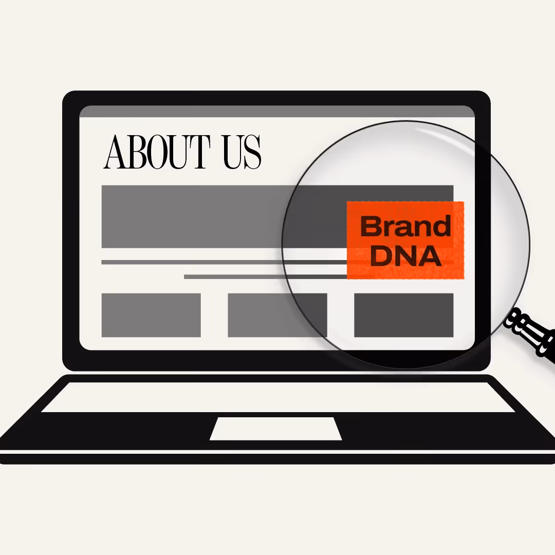
So, what exactly is brand identity? Well, it's like the DNA of a brand – the core values, mission, and personality that make it unique. It sets a brand apart from the crowd and guides how it communicates and connects with people on a deep, emotional level. Brand identity creates a consistent and meaningful brand experience beyond just good looks.
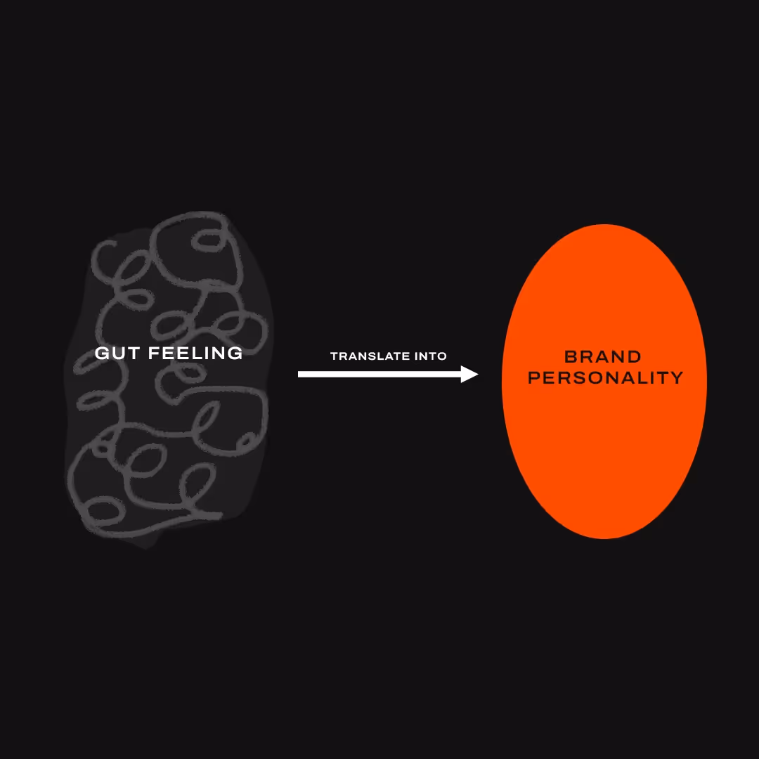
Think about it this way: when you interact with a brand, you get a certain feeling, a vibe that resonates with you. That's brand identity flexing its muscles. You perceive some brands as edgy or fun, while others feel more formal or trustworthy.
Characteristics of a Powerful Visual Identity

The Power of Visual Identity:
Visual identity is like the face of a brand - it's what sets it apart and makes it recognizable. But what makes a visual identity effective? Let's dive into the key features:
- Simplicity: A compelling visual identity is often straightforward enough. Think of iconic logos like Windows, Adidas, or Pepsi. These brands have embraced simplicity, allowing their visuals to stand the test of time and stay etched in our minds.
- Cohesiveness: A solid visual identity is cohesive, meaning all visual elements work seamlessly together. From colors to typography to imagery, everything aligns to create a unified look and feel. This consistency helps in building recognition and reinforcing the brand's core values.
- Authenticity: A compelling visual identity reflects the essence of the brand. It is authentic and communicates the brand's personality, values, and unique position in the market.
- Consistency: A consistent visual identity conveys reliability and professionalism. It shows that a brand pays attention to detail and is committed to delivering a consistent experience. Customers inherently trust brands they perceive as consistent, leading to long-term loyalty.
Key Elements of Visual Identity: A Deep Dive

Graphics and Their Role in Visual Identity:
Think of graphics as the face of your brand - they're the first thing people notice and the main element that sets your brand apart from the rest. A solid visual identity is about making a statement that resonates with your audience and accurately represents your brand's personality and tone. Graphics are an essential part of this. You can create a unique brand identity that gets noticed and stays memorable by using eye-catching visuals like logos, illustrations, and other graphical elements.
Amazon's iconic logo—an arrow bridging "A" to "Z" and doubling as a smile—conveys satisfaction, a vast selection of products, and the promise of a seamless customer experience. This simple, yet profoundly effective imagery, transforms a mere online marketplace into a globally celebrated symbol of endless possibilities and positivity. It's a masterclass in visual storytelling, where each design element is meticulously chosen to reinforce the idea that Amazon isn't just a store, but a journey from "A" to "Z" wrapped in a smile.
But Amazon doesn't stop at the logo. Their strategic use of graphics extends across all platforms and marketing materials, creating a cohesive visual tapestry that enriches the customer's journey. The blend of bold typography, vibrant colors, and crystal-clear product images not only makes scrolling through Amazon a visual treat but also cements the brand's identity in the minds of consumers. Even their packaging—the familiar light brown boxes adorned with the smile logo—plays a critical role in extending the brand's presence into the physical world. Each parcel delivered is not just an item ordered; it's a piece of Amazon's consistent, recognizable, and trusted brand identity brought right to your doorstep. By leveraging well-thought-out graphics, Amazon illustrates the profound impact of visual identity on brand perception and loyalty.
The Importance of Typography and Color Palette:
Typography and color play a significant role in creating a consistent and recognizable brand image. Typography dictates the type of fonts, sizing, and spacing your brand uses in written content. Get creative and choose a typography style that best represents your brand's personality- fun and quirky or sleek and modern. Now comes the fun part: color! Every brand needs a unique color palette that sets it apart. Choose colors that can evoke emotions and complement your graphical elements to make your brand pop.
Google is an excellent example of a company that effectively utilizes typography and color palettes in its logo to create a consistent and recognizable brand image. Google's logo features a custom-designed typeface known as "Product Sans." The typography is clean, simple, and modern, reflecting Google's ethos of simplicity and user-friendliness. The letterforms are slightly rounded and have a playful yet professional appearance, capturing Google's brand personality that is both approachable and innovative.
Google's logo is known for its vibrant and colorful arrangement of letters. The choice of colors - blue, red, yellow, and green - is not just random but symbolic. Each color represents a separate letter in the logo, creating a harmonious and visually appealing composition. The use of primary colors in the Google logo reflects the brand's playful and friendly personality while visually striking and memorable. The color palette evokes a sense of creativity and innovation, aligning with Google's mission to inspire curiosity and make information accessible to all.
The Use of Imagery and Physical Brand Assets:
Brand images, photos, and other visual elements are vital to visual identity. They help establish a look and feel unique to your brand and provide a platform for you to express your brand's personality and tone effectively. Consistent imagery and use of physical brand assets like business cards, packaging, and even employee uniforms can make your brand feel more cohesive and skilled.
Walmart is an excellent example of a company that effectively utilizes imagery and physical brand assets to establish a solid visual identity. Walmart's imagery showcases diverse products, happy customers, and a sense of community. Through its advertising campaigns, social media presence, and website visuals, Walmart uses high-quality images that resonate with its target audience. The imagery often features families, affordable prices, and a wide selection of products to communicate its value proposition as a one-stop shopping destination for all.
To maintain a cohesive brand image, Walmart pays close attention to physical assets like in-store signage, packaging, employee uniforms, and shopping bags. The company's logo, known for its bold font and yellow sunburst design, is prominently displayed on all physical brand assets to create brand recognition and consistency. Walmart's packaging features a clean and simple design with the company's signature blue and yellow color scheme. Using these colors across packaging helps customers quickly identify Walmart products on shelves and reinforces the brand presence outside the store.
Visual Identity in Practice: Real-World Examples

Brands like Magic Spoon & Discord have mastered creating visually appealing and memorable brand images. Let's discover the secrets behind their success and what differentiates them from the competition.
- Magic Spoon - The Power of Playful Imagery
Magic Spoon, the beloved cereal brand tailored for adults, has mastered the art of visual identity with its powerfully playful imagery. Stepping into the cereal aisle, it's hard to miss the vibrant colors and eye-catching designs that set Magic Spoon apart from the plain and mundane cereal boxes surrounding it. By drawing inspiration from cartoons and incorporating playful imagery, Magic Spoon taps into our cherished childhood memories. It's like a trip down memory lane, evoking a sense of whimsy and joy that instantly connects with their target audience. The use of vibrant colors further enhances their visual identity. The punchy hues practically leap off the shelves, demanding attention and inviting hungry eyes to explore what lies within the box. It's a visual feast that stands out, even in a sea of dull and uninteresting cereal boxes.
- Discord - The Magic of Minimalistic Design
Discord, the go-to communication platform for gamers and communities, has embraced the power of minimalistic design in its visual identity. Discord's visual identity exudes simplicity and elegance, from its sleek logo to its clean graphics. Discord's visual identity lies in its minimalistic approach. The absence of clutter allows users to navigate the platform effortlessly. It highlights what truly matters - connecting with others and engaging in meaningful conversations. Gamers and community members prioritize efficiency and functionality, and Discord's sleek design aligns perfectly with these desires. The understated elegance of Discord's visuals lends an air of professionalism to the platform, assuring users that they are in a space built of severe interactions and collaboration.
Unleashing the Power of Visual Identity in Business and Advertising

Visual identity is both the face and the soul of your brand. It's a unique combination of logos, color schemes, typography, and imagery that come together to tell your brand's story in a visually striking and emotionally captivating way. It's that instant recognition, a silent yet powerful conversation between a brand and its audience, that sparks trust and sets you apart in an increasingly crowded online marketplace. Imagine an online platform not just as a virtual storefront but an immersive brand experience. The look and feel of your brand's online presence serve as a crucial touchpoint, creating first impressions, shaping perceptions, and influencing customer decisions.
Now let's talk about Dropbox, a tech titan known for making the complex task of file storage and sharing effortless. The moment you land on their website, you're welcomed by a core visual identity that is simple, clean, and human-friendly. Their logo, an uncomplicated blue box, instantaneously signals storage and seamless collaboration. The soothing color palette and user-centric design echo their commitment to facilitating an organized, clutter-free digital workspace. All these visual elements serve a dual purpose — they not only align perfectly with Dropbox's brand promise but also make every interaction with the brand intuitive and pleasant. Dropbox doesn't stop at creating a visually compelling online presence. They replicate this simplicity and user-friendliness across all brand touchpoints. No matter where you engage with Dropbox — be it their web interface, mobile application, or promotional materials — the experience is always consistent, reinforcing trust and brand recognition.
Creating a Unique Visual Identity: A Step-by-Step Process

Step 1: Define Your Brand's Personality:
To begin, it's essential to understand your brand's personality clearly. Ask yourself: what values and emotions do you want your brand to evoke? Are you aiming for a youthful, fun vibe or a sophisticated and luxurious image?
Step 2: Craft the Perfect Logo:
Your logo is the face of your brand, so it's crucial to get it right. Keep it simple yet memorable, ensuring it reflects your brand's personality. Take your time and experiment with shapes, colors, and typography until you find the logo that truly embodies your brand.
Step 3: Play with Colors:
Colors have a profound impact on our emotions and perception. Choose a color palette that aligns with your brand's personality and conveys the desired emotions. For instance, warm tones like red and orange evoke passion and excitement, while cool blues and greens create a sense of calm and trust. Experiment with various combinations until you find the perfect colors that amplify your brand's visual identity.
Step 4: Typography Matters:
The fonts you choose speak volumes about your brand's essence. Are you sleek and modern? Playful and whimsical? Professional and trustworthy? Select fonts complementing your brand's personality and ensuring readability across various platforms.
Step 5: Visualize Your Brand's World:
Extend your visual identity beyond your logo and typography by developing a style guide with imagery, textures, and patterns. This visual arsenal will help create a cohesive brand experience. Consider the visual elements that enhance your brand's story and create a lasting impression.
Step 6: Embrace Consistency:
Ensure that your visual elements are consistently applied across all your brand's communication channels, including your website, social media, packaging, and print materials. Creating a unified visual language reinforces your brand's identity, builds recognition, and establishes a sense of trust with your audience.
Concluding Thoughts: The Impact of a Successful Visual Identity
Visual identity holds immense potential for brands. It can spark curiosity, create excitement, and convey professionalism. It engages with your audience, fosters a sense of connection, and differentiates your brand from competitors. Embrace the art of visual identity and strive for simplicity, consistency, and striking contrast. Unlock your brand's potential by creating a visual identity that speaks louder than words and leaves an indelible mark in the minds and hearts of your customers.


The Accelerator

Building brands with powerful market presence


Leading Brands Choose us
Book in with one of our experts.